Appearance and Styling
JavaScript RangeNavigator is enriched with lots of customization options for labels, gridlines and slider to develop high quality graphic rich control.
Customize labels
The labels are found along the range, displaying the value of the data it correspond, both on (higher level label) and below (lower level label) the RangeNavigator. RangeNavigator labels are further customized using “font” property in label Settings.
"use strict";
var labelSettings= {
            // customizing higher level labels.
            higherLevel: {
                style: {
                    font: {
                        color: '#ff0000',
                        style: 'Normal',
                        size: '12px',
                        opacity: 1,
                        weight: 'regular'
                    },

                },
            },
            // customizing lower level labels.
            lowerLevel: {
                style: {
                    font: {
                        color: '#ff0000',
                        style: 'Normal',
                        size: '12px',
                        opacity: 1,
                        weight: 'regular'
                    },
                },
            }
};
// ...
var rangeSettings = {
                    start: "2010/1/1", end: "2010/12/31"
};


ReactDOM.render(
                <EJ.RangeNavigator id="range1" labelSettings = {labelSettings}
                 rangeSettings = {rangeSettings}></EJ.RangeNavigator>,
                document.getElementById('range')
);
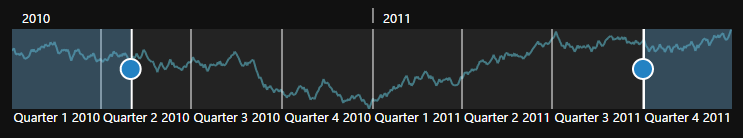
Label Placement
Labels in RangeNavigator are placed inside or outside of the control. You can customize both the higher and lower level labels using labelPlacement property in label setting of RangeNavigator. By default labelPlacement is “outside” for the both higher and lower level labels.
The higher level labels font Color, FontFamily, FontStyle, FontWeight, Opacity and Size can be customized using HigherLevel property.
The lower level labels font Color, FontFamily, FontStyle, FontWeight, Opacity and Size can be customized using LowerLevel property.
The following screen shot illustrates both the lower and higher level labels that are placed outside the control with labelPlacement specified as outside.
"use strict";
var labelSettings= {
higherLevel: {
labelPlacement: "inside",
},
lowerLevel: {
labelPlacement: "inside"
}
};
// ...
var rangeSettings = {
start: "2010/1/1", end: "2010/12/31"
};
ReactDOM.render(
<EJ.RangeNavigator id="range1" labelSettings = {labelSettings}
rangeSettings = {rangeSettings}></EJ.RangeNavigator>,
document.getElementById('range')
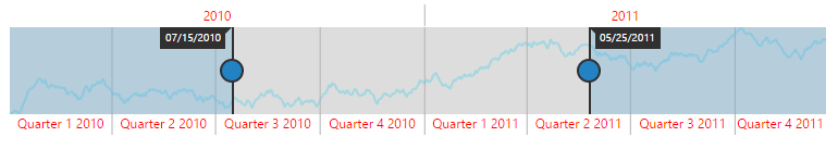
);The following screenshot illustrates a RangeNavigator with labels inside the control after specifying the labelPlacement as inside.
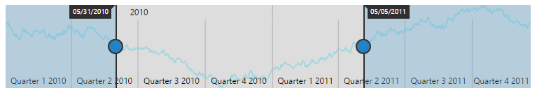
Customize NavigatorStyleSettings
RangeNavigator is customized using NavigatorStyleSettings properties. You can customize the selected and unselected region color using SelectedRegionColor and UnselectedRegionColor, SelectedRegionOpacity and UnselectedRegionOpacity in NavigatorStyleSettings and the thumb of the slider using ThumbColor, ThumbRadius and ThumbStroke in NavigatorStyleSettings. MajorGridLineStyle and MinorGridLineStyle are used to customize the major grid line Color, Visible property and minor gridline Color and Visible. You can customize the Background, Opacity and Border Color, DashArray and Width of navigatorStyleSettings.
Customize Labels
The visibility of labels are enabled by setting Visible in higher level and Visible in lower level. The labels can be aligned by specifying HorizontalAlignment of higher level style and HorizontalAlignment of lower level style.
You can customize the Border Color and Width, Fill, GridLineStyle Color, DashArray and Width, Position property of higher level labels in labelSettings.
You can also customize the Border Color and Width, Fill, GridLineStyle Color, DashArray and Width, Position property for lower level labels of labelSettings.
"use strict";
var navigatorStyleSettings = {
            unselectedRegionColor: "white",
            selectedRegionColor: "#5EABDE",
            thumbColor: "white",
            thumbRadius: 10,
            thumbStroke: "#303030",
            background: "transparent",
            border: {
                color: "black",
                width: 3
            },
            majorGridLineStyle: {
                color: "transparent"
            },
            minorGridLineStyle: {
                color: "transparent"
            }
};
var labelSettings= {
           higherLevel: {
                style: {
                    font: {
                        color: 'black',
                        size: '13px',
                        opacity: 1
                    },
                    horizontalAlignment: "left"
                },
                intervalType: 'years',
                labelPlacement: "inside"
            },
            lowerLevel: {
                style: {
                    font: {
                        color: 'black',
                        size: '12px',
                        opacity: 1
                    },
                    horizontalAlignment: "center"
                },
                intervalType: 'quarters',
                labelPlacement: "inside"
            }
};
ReactDOM.render(
        <EJ.RangeNavigator id="range1" labelSettings = {labelSettings}
        navigatorStyleSettings = {navigatorStyleSettings}></EJ.RangeNavigator>,
        document.getElementById('range')
);
Themes
RangeNavigator theme is a set of pre-defined options that are applied to the control before each RangeNavigator is instantiated. Following predefined themes are available in JavaScript RangeNavigator.
- flat light
- flat dark
- gradient light
- gradient dark
- azure
- azure dark
- lime
- lime dark
- saffron
- saffron dark
- gradient azure
- gradient azure dark
- gradient lime
- gradient lime dark
- gradient saffron
- gradient saffron dark
"use strict";
ReactDOM.render(
        <EJ.RangeNavigator id="range1"  theme = 'saffron'></EJ.RangeNavigator>,
        document.getElementById('range')
);