Custom labels
12 May 201717 minutes to read
Custom labels are the text that can paste in any location of the Linear Gauge. It is used to define the purpose of the gauge.
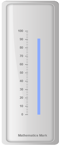
Adding Custom label collection
Custom labels collection can be directly added to the scale object. Refer the following code to add custom labels collection in a Linear Gauge control.
<div id="LinearGauge1"></div>"use strict";
var frame= {
innerWidth: 8,
outerWidth: 10,
backgroundImageUrl: "../images/gauge/Gauge_linear_light.png"
}
var scales=[{
backgroundColor: "transparent",
border: { color: "transparent", width: 0 },
showMarkerPointers: false, showBarPointers: true,
showCustomLabels: true,
//Adding bar pointer collection
barPointers: [{
width: 10, backgroundColor: "#8BABFF",
value: 91, placement: "near", distanceFromScale: 30
}],
//Adding tick collection
ticks: [{
type: "majorinterval", width: 2,
color: "#8c8c8c", distanceFromScale: { x: 7, y: 0 }
},
{
type: "minorinterval", width: 1, height: 6,
color: "#8c8c8c", distanceFromScale: { x: 7, y: 0 }
}],
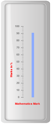
//Adding custom label collection
customLabels: [{
value: "Mathematics Mark", position: { x: 55, y: 97 }
}]
}]
ReactDOM.render(
<EJ.LinearGauge id="lineargauge"
enableAnimation={false} width={500} height= {200} orientation="Horizontal" labelColor="Grey"
//Adding frame object
frame={frame}
//Adding scale collection
scales={scales}
>
</EJ.LinearGauge>,
document.getElementById('LinearGauge1')
);Execute the above code to render the following output.
Basic Customization
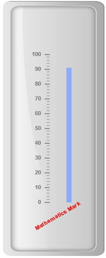
Appearance
-
You can customize custom labels using the properties like textAngle, color and font. The API textAngle is used to display the custom labels in the specified angles and color attribute is used to display the custom labels in specified color. You can use value attribute to set the text value in the custom labels.
-
To display the custom labels, set showCustomLabels as ‘true’. Font option is also available on the custom labels. The basic three properties of fonts such as size, family and style can be achieved by size, fontStyle and fontFamily. You can adjust the opacity of the label with the property opacity and the value of opacity lies between 0 and 1.
<div id="LinearGauge1"></div>"use strict";
var scales = [{
backgroundColor: "transparent",
border: { color: "transparent", width: 0 },
showMarkerPointers: false, showBarPointers: true,
showCustomLabels: true,
//Adding bar pointer collection
barPointers: [
{
width: 10, backgroundColor: "#8BABFF",
value: 91, placement: "near", distanceFromScale: 30
}
],
//Adding tick collection
ticks: [{
type: "majorinterval", width: 2,
color: "#8c8c8c", distanceFromScale: { x: 7, y: 0 }
},
{
type: "minorinterval", width: 1, height: 6,
color: "#8c8c8c", distanceFromScale: { x: 7, y: 0 }
}],
//Adding custom labels
customLabels: [{
position: { x: 55, y: 87 },
value: "Mathematics Mark",
color: "Red",
textAngle: 30,
opacity: 0.5
}]
}];
var frame = {
innerWidth: 8,
outerWidth: 10,
// For setting back ground Image URL
backgroundImageUrl: "Gauge_linear_light.png"
};
ReactDOM.render(
<EJ.LinearGauge id="lineargauge" frame = {frame} scales = {scales} enableAnimation = {false} value = {78} height = {500} width = {200} labelColor = "Grey">
</EJ.LinearGauge>,
document.getElementById('LinearGauge1')
);Execute the above code to render the following output.
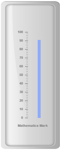
Locating the CustomLabels
To set the location of the custom label in Linear Gauge, position property is used. You can position the custom labels in horizontal and vertical axis using X and Y axis respectively.
<div id="LinearGauge1"></div>"use strict";
var scales = [{
backgroundColor: "transparent",
border: { color: "transparent", width: 0 },
showMarkerPointers: false, showBarPointers: true,
showCustomLabels: true,
//Adding bar pointer collection
barPointers: [
{
width: 10, backgroundColor: "#8BABFF",
value: 91, placement: "near", distanceFromScale: 30
}
],
//Adding ticks collection
ticks: [{
type: "majorinterval", width: 2,
color: "#8c8c8c", distanceFromScale: { x: 7, y: 0 }
},
{
type: "minorinterval", width: 1, height: 6,
color: "#8c8c8c", distanceFromScale: { x: 7, y: 0 }
}],
//Adding custom label collection
customLabels: [
{ value: "Mathematics Mark", position: { x: 55, y: 87 } }]
}];
var frame = {
innerWidth: 8,
outerWidth: 10,
// For setting back ground Image URL
backgroundImageUrl: "Gauge_linear_light.png"
};
ReactDOM.render(
<EJ.LinearGauge id="lineargauge" frame = {frame} scales = {scales} enableAnimation = {false} value = {78} height = {500} width = {200} labelColor = "Grey" >
</EJ.LinearGauge>,
document.getElementById('LinearGauge1')
);Execute the above code to render the following output.
Multiple Custom Labels
You can set multiple custom labels in a single Linear Gauge by adding an array of custom label objects. Refer the following code example for multiple custom label functionality.
<div id="LinearGauge1"></div>"use strict";
var scales = [{
backgroundColor: "transparent",
border: { color: "transparent", width: 0 },
showMarkerPointers: false, showBarPointers: true,
showCustomLabels: true,
//Adding bar pointer collection
barPointers: [
{
width: 10, backgroundColor: "#8BABFF",
value: 91, placement: "near", distanceFromScale: 30
}
],
//Adding ticks collection
ticks: [{
type: "majorinterval", width: 2,
color: "#8c8c8c", distanceFromScale: { x: 7, y: 0 }
},
{
type: "minorinterval", width: 1, height: 6,
color: "#8c8c8c", distanceFromScale: { x: 7, y: 0 }
}],
//Adding custom label collection
customLabels: [
{
value: "Mathematics Mark", position: { x: 55, y: 87 },
color: "Red"
},
{
value: "Marks in %", position: { x: 15, y: 57 },
color: "Red", textAngle: 90
}]
}];
var frame = {
innerWidth: 8,
outerWidth: 10,
// For setting back ground Image URL
backgroundImageUrl: "Gauge_linear_light.png"
};
ReactDOM.render(
<EJ.LinearGauge id="lineargauge" frame = {frame} scales = {scales} enableAnimation = {false} value = {78} height = {500} width = {200} labelColor = "Grey">
</EJ.LinearGauge>,
document.getElementById('LinearGauge1')
);Execute the above code to render the following output.