Tooltip
12 May 20175 minutes to read
Tooltip feature has been added to the Circular Gauge. Circular Gauge has several elements such as pointers, label, customLabel, scales, etc. There is a need for Tooltip feature in the Circular Gauge control because whenever the text hides or overrides with other gauge elements, it may not be fully visible. For resolving those problems Tooltip feature has been implemented in the Circular Gauge control.
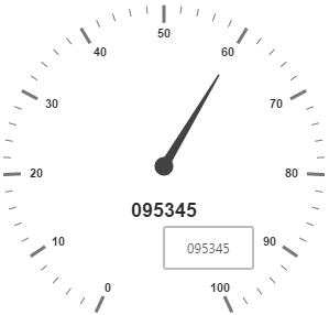
Default Tooltip
Tooltip has three attributes in it. The first two attributes such as showLabelTooltip and showCustomLabelTooltip are for enabling the Tooltip for label as well as custom label in default appearance.
ShowLabelTooltip is to enable the Tooltip for labels and showCustomLabelTooltip is for enabling the Tooltip option for customLabels.
"use strict";
var tooltip = {
        //Enables the label tooltip.
        showLabelTooltip: true,
        //Enables the custom label tooltip.
        showCustomLabelTooltip: true,
    };
    var scales = [{
        showLabels: true,
        radius: 150,
        //Customizes the custom label options.
        customLabels: [{
            value: "095345",
            font: {
                size: "18px",
                fontFamily: "Arial",
                fontStyle: "bold"
            },
            position: { x: 180, y: 220 }
        }],
        //Customizes the pointers options.
        pointers: [{
            value: 60,
            length: 100,
        }]
    }];
ReactDOM.render(
            <ej.circulargauge id="circulargauge1" tooltip={tooltip}
                              scales={scales}></ej.circulargauge>,

            document.getElementById('CircularGauge1')
            );
Execute the above code to render the following output.
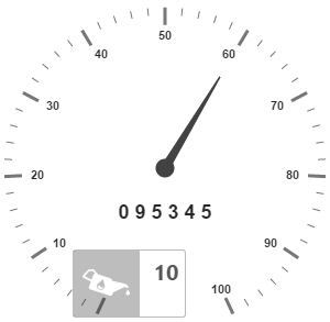
Tooltip Template
In Tooltip option, you can customize the Tooltip window by adding the tooltip template on that page with the help of API TemplateID. Refer to the following code example to know more about Tooltip template.
<div id="Tooltip" style="height: 60px; display: none;">
<div id="icon">
<div id="eficon"></div>
</div>
<div id="value">
<div>
<label id="efpercentage"> #label#</label>
</div>
</div>
</div>
<div id="tooltipGauge"></div>"use strict";
//Defines the tooltip object.
var tooltip ={
// Enables the label tooltip.
showLabelTooltip: true,
// Enables the custom label tooltip.
showCustomLabelTooltip: true,
// Adds tooltip template.
templateID: "Tooltip"
};
// Customizes the scale options.
var scales= [{
showLabels: true,
radius: 150,
// Customizes the custom label options.
customLabels: [{
value: "0 9 5 3 4 5",
font: {
size: "18px",
fontFamily: "Arial",
fontStyle: "bold"
},
position: { x: 180, y: 220 }
}],
// Customizes the pointers options.
pointers: [{
value: 60,
length: 100,
}]
}];
ReactDOM.render(
<EJ.CircularGauge id="default" radius={100} value={55} backgroundColor="transparent" scales={scales}
>
</EJ.CircularGauge>,
document.getElementById('CircularGauge1')
);<style type="text/css">
<!-- Adds the necessary styles here. -->.
</style>Execute the above code to render the following output.