How can I help you?
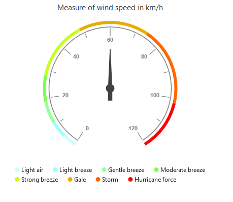
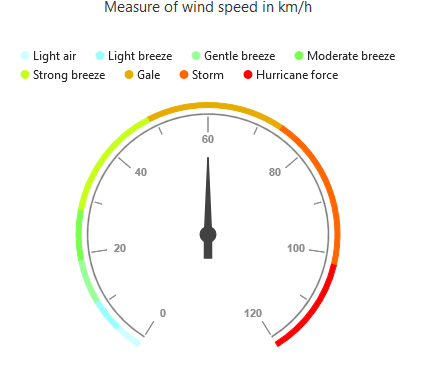
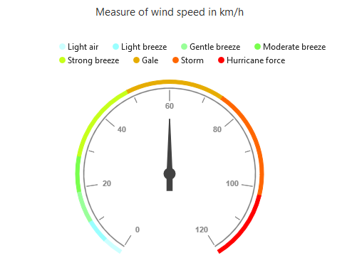
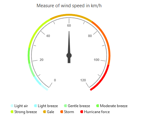
Legend
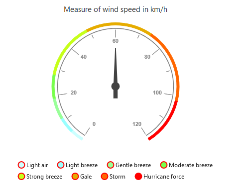
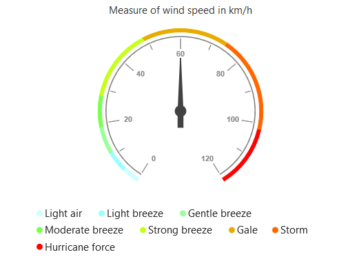
The legend contains the list of the ranges that appear in the circular gauge
Legend Visibility
By default, the legend will not be displayed in the circular gauge. You can enable or disable it by using the visible property of the legend.
var legend = {
	visible: true
}
ReactDOM.render(
    <EJ.CircularGauge id="default"  legend={legend}
    >

    </EJ.CircularGauge>,
		  document.getElementById('gauge')
);
Click here to view the online demo sample for legend in the circular Gauge.
Legend Text
The text displayed in the legend can be customized by using the legendText property present in the ranges of the circular gauge. When the legendText is not specified in the ranges, then the legend item for that particular range will not displayed. By default the legendText value is null .
// ...
var ranges= [{
     legendText:"Light air",
}]
//...

// ...
ReactDOM.render(
    <EJ.CircularGauge id="default"  ranges={ranges}
    >

    </EJ.CircularGauge>,
		  document.getElementById('gauge')
);
Legend Fill and Opacity
You can change the opacity and fill color of legend text using Opacity and Fill property of legend.
var legend = {
	visible: true,
    fill:'blue',
    opacity:0.5
}
ReactDOM.render(
    <EJ.CircularGauge id="default"  legend={legend}
    >

    </EJ.CircularGauge>,
		  document.getElementById('gauge')
);
Position and Align the Legend
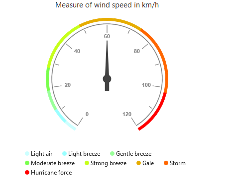
By using the position property, you can position the legend at left, right, top or bottom of the CircularGauge. The legend is positioned at the bottom of the circular gauge, by default.
// ...
var legend= {
    // ...
    //Place the legend at top of the circular gauge
    position: 'top',

}
// ...
ReactDOM.render(
    <EJ.CircularGauge id="default"  legend={legend}
    >

    </EJ.CircularGauge>,
		  document.getElementById('gauge')
);
Legend Alignment
You can align the legend to the center, far or near based on its position by using the alignment property.
// ...
var legend= {
    //...
    //The below two settings will place the legend at the top-right corner of the circular gauge.
    alignment: 'far',
    position: 'top',
}
// ...
ReactDOM.render(
    <EJ.CircularGauge id="default"  legend={legend}
    >

    </EJ.CircularGauge>,
		  document.getElementById('gauge')
);
Customization
Legend shape
To change the legend item shape, you have to specify the desired shape in the shape property of the legend. By default, the shape of the legend is circle.It also supports rectangle,diamond,triangle,slider,line,pentagon,trapezoid and wedge shapes.
// ...
var legend= {
    //...
    //Change legend shape
     shape: 'slider',
}
// ...
ReactDOM.render(
    <EJ.CircularGauge id="default"  legend={legend}
    >

    </EJ.CircularGauge>,
		  document.getElementById('gauge')
);
Legend Item Size and Border
You can change the size of the legend items by using the width and height properties in the itemStyle. To change the legend item border, use border property of the legend itemStyle.
// ...
var legend= {
    //...
    //Change legend items border, height and width
    itemStyle: {width: 13, height: 13, border: { color: "#FF0000", width: 2 } },
}
// ...
ReactDOM.render(
    <EJ.CircularGauge id="default"  legend={legend}
    >

    </EJ.CircularGauge>,
		  document.getElementById('gauge')
);
Legend size
You can change the default legend size by using the size property of the legend.
// ...
var legend= {
    //...
    //Change legend size
    size:{width: '350', height: '100'}
}
// ...
ReactDOM.render(
    <EJ.CircularGauge id="default"  legend={legend}
    >

    </EJ.CircularGauge>,
		  document.getElementById('gauge')
);
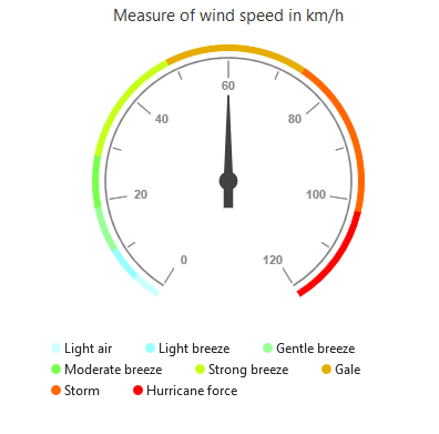
Legend Item Padding
You can control the spacing between the legend items by using the itemPadding option of the legend. The default value is 20.
"use strict";

// ...
var legend= {
    //...
    //Add space between each legend item
    itemPadding: 30,
}
// ...
ReactDOM.render(
    <EJ.CircularGauge id="default"  legend={legend}
    >

    </EJ.CircularGauge>,
		  document.getElementById('gauge')
);
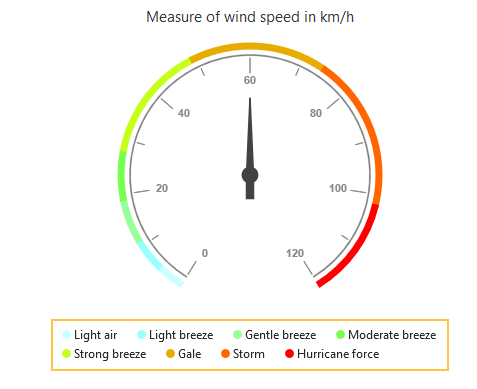
Legend border
You can customize the legend border by using the border option in the legend.
"use strict";

// ...
var legend= {
    //...
    //Set border color and width to legend
    border: {color: "#FFC342", width: 2},
}
// ...
ReactDOM.render(
    <EJ.CircularGauge id="default"  legend={legend}
    >

    </EJ.CircularGauge>,
		  document.getElementById('gauge')
);
Font of the legend text
The font of the legend item text can be customized by using the font property in legend.
// ...
var legend= {
    //...
    //Customize the legend item text
    font: { fontFamily: 'Segoe UI', fontStyle: 'Normal', fontWeight: 'Bold', size: '15px' },
}
// ...
ReactDOM.render(
    <EJ.CircularGauge id="default"  legend={legend}
    >

    </EJ.CircularGauge>,
		  document.getElementById('gauge')
);
Events
Legend Item Render
LegendItemRender event triggers before rendering the legend items. This event is triggered for each legend item in Circular gauge. You can use this event to customize legend item shape or add custom text to legend item dynamically
function onLegendRender(sender) {
    //Get legend item details before rendering
    var legendItem = sender.data;

}
ReactDOM.render(
    <EJ.CircularGauge id="default"
    //Subscribe the legendItemRender event
    legendItemRender={onLegendRender}
    >

    </EJ.CircularGauge>,
		  document.getElementById('gauge')
);
Legend Item Click
You can get the legend item details such as RangeIndex, bounds and shape by subscribing the legendItemClick event of the circular gauge. When the legend item is clicked, it triggers the event and returns the legend information
$("#CircularGauge1").ejCircularGauge({

function onLegendClicked(sender) {
    //Get legend item details on legend item click.
    var legendItem = sender.data;
}
ReactDOM.render(
    <EJ.CircularGauge id="default"
    //Subscribe the legend item click event
    legendItemClick={onLegendClicked}
    >

    </EJ.CircularGauge>,
		  document.getElementById('gauge')
);