Toolbar in .NET MAUI Rich Text Editor
Toolbar position
The .NET MAUI Rich Text Editor allows you to position the toolbar at the top or bottom of the content area
using the ToolbarPosition property, depending on your layout requirements. By default, the toolbar appears at the top on Windows and macOS, and at the bottom on Android and iOS for better accessibility.
xmlns:richTextEditor="clr-namespace:Syncfusion.Maui.RichTextEditor;assembly=Syncfusion.Maui.RichTextEditor"

<richTextEditor:SfRichTextEditor ToolbarPosition="Bottom"/>
using Syncfusion.Maui.RichTextEditor;
SfRichTextEditor richTextEditor = new SfRichTextEditor();
richTextEditor.ToolbarPosition = RichTextEditorToolbarPosition.Bottom;Inline tooltip for link
The link tooltip appears when you click a link in the editor. The Rich Text Editor provides essential tools in the link tooltip, including Open, Edit Link, and Remove Link.

The link quick tooltip automatically disappears after 2 seconds if there is no user interaction.
Customizing the toolbar
The SfRichTextEditor toolbar is highly customizable, allowing you to control its items, styling, and position.
Add or Remove Toolbar Items
By default, the toolbar includes a comprehensive set of formatting tools. You can specify a custom set of items by populating the ToolbarItems collection.
Populating the
ToolbarItemscollection replaces the default toolbar items. Only the items you add will appear in the toolbar.
The following items are available to be added to the ToolbarItems collection:
-
Bold,Italic,Underline,Strikethrough -
SubScript,SuperScript -
FontFamily,FontSize,TextColor,HighlightColor -
ParagraphFormat,Alignment -
NumberList,BulletList -
IncreaseIndent,DecreaseIndent -
Hyperlink,Image,Table -
Undo,Redo Separator
xmlns:richTextEditor="clr-namespace:Syncfusion.Maui.RichTextEditor;assembly=Syncfusion.Maui.RichTextEditor"

<richTextEditor:SfRichTextEditor ShowToolbar="True">
    <richTextEditor:SfRichTextEditor.ToolbarItems>
        <!-- Define a custom set of toolbar items -->
        <richTextEditor:RichTextToolbarItem Type="Bold" />
        <richTextEditor:RichTextToolbarItem Type="Italic" />
        <richTextEditor:RichTextToolbarItem Type="Underline" />
        <richTextEditor:RichTextToolbarItem Type="Separator" />
        <richTextEditor:RichTextToolbarItem Type="NumberList" />
        <richTextEditor:RichTextToolbarItem Type="BulletList" />
    </richTextEditor:SfRichTextEditor.ToolbarItems>
</richTextEditor:SfRichTextEditor>
using Syncfusion.Maui.RichTextEditor;
SfRichTextEditor richTextEditor = new SfRichTextEditor();
richTextEditor.ShowToolbar = true;
richTextEditor.ToolbarItems.Add(new RichTextToolbarItem() { Type = RichTextToolbarOptions.Bold });
richTextEditor.ToolbarItems.Add(new RichTextToolbarItem() { Type = RichTextToolbarOptions.Italic });
richTextEditor.ToolbarItems.Add(new RichTextToolbarItem() { Type = RichTextToolbarOptions.Underline });
richTextEditor.ToolbarItems.Add(new RichTextToolbarItem() { Type = RichTextToolbarOptions.Separator });
richTextEditor.ToolbarItems.Add(new RichTextToolbarItem() { Type = RichTextToolbarOptions.NumberList });
richTextEditor.ToolbarItems.Add(new RichTextToolbarItem() { Type = RichTextToolbarOptions.BulletList });Customize Toolbar Appearance
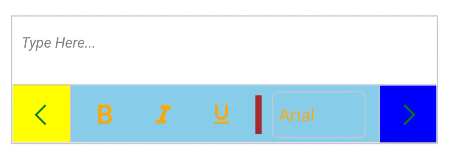
You can customize the visual style of the toolbar using the ToolbarSettings property. This gives you access to the RichTextEditorToolbarSettings object, which has several properties for changing its appearance.
- BackgroundColor: Sets the background color or brush of the toolbar.
- TextColor : Sets the color of the toolbar item icons.
- SeparatorColor: Sets the color of the separator lines between toolbar items.
- SeparatorThickness: Sets the thickness of the separator lines.
- SelectionColor: Sets the color of hovered/selected toolbar items.
When the toolbar items exceed the available width, the toolbar supports horizontal scrolling. The following properties control the scroll button behavior:
-
IsScrollButtonVisible: Sets the visibility of the scroll buttons. The default value is
false. When set totrue, the forward and backward scroll buttons appear only if the toolbar items overflow the available width. - ForwardIconBackground: Sets the background color of the forward scroll icon.
- ForwardIconColor: Sets the color of the forward scroll icon.
- BackwardIconBackground: Sets the background color of the backward scroll icon.
- BackwardIconColor: Sets the color of the backward scroll icon.
The forward and backward scroll buttons are visible only when
IsScrollButtonVisibleis set totrueand the toolbar items overflow the available width.
xmlns:richTextEditor="clr-namespace:Syncfusion.Maui.RichTextEditor;assembly=Syncfusion.Maui.RichTextEditor"

<richTextEditor:SfRichTextEditor ShowToolbar="True">
    <richTextEditor:SfRichTextEditor.ToolbarSettings>
        <richTextEditor:RichTextEditorToolbarSettings BackgroundColor="SkyBlue" SelectionColor="Brown"
                                   TextColor="Orange" IsScrollButtonVisible="True"
                                   SeparatorColor="Brown" SeparatorThickness="5"
                                   ForwardIconBackground="Blue" ForwardIconColor="Green"
                                   BackwardIconBackground="Yellow" BackwardIconColor="Green"/>
    </richTextEditor:SfRichTextEditor.ToolbarSettings>
</richTextEditor:SfRichTextEditor>
using Syncfusion.Maui.RichTextEditor;
using Microsoft.Maui.Graphics;
SfRichTextEditor richTextEditor = new SfRichTextEditor();
richTextEditor.ShowToolbar = true;
richTextEditor.ToolbarSettings = new RichTextEditorToolbarSettings
{
IsScrollButtonVisible = true,
TextColor = Colors.Orange,
BackgroundColor = Colors.SkyBlue,
SelectionColor = Colors.Brown,
SeparatorColor = Colors.Brown,
SeparatorThickness = 5,
ForwardIconBackground = Colors.Blue,
ForwardIconColor = Colors.Green,
BackwardIconBackground = Colors.Yellow,
BackwardIconColor = Colors.Green
};