How can I help you?
Applying Themes in MAUI Toolkit Controls
Syncfusion® themes enable a uniform look and feel across all Syncfusion® controls. This guide provides information on how to apply and customize themes in your applications.
- Applying light and dark themes
- Overriding the default theme
- Creating your own theme
Applying light and dark themes
By default, Syncfusion® supports both light and dark themes through the inclusion of a SyncfusionThemeResourceDictionary.
To apply themes to your application, merge the SyncfusionThemeResourceDictionary item.
Theme resource dictionary
This resource dictionary includes keys and their corresponding color codes for all Syncfusion® controls. Additionally, it contains the VisualTheme property where we can declare the following two theme color values:
- MaterialLight
- MaterialDark
Automatic merging
When using more number of Syncfusion® controls in an application, to make the process easier for merging the control style dictionaries of the controls, the SyncfusionThemeResourceDictionary class has been provided for automatic merging.
<Application xmlns:syncTheme="clr-namespace:Syncfusion.Maui.Toolkit.Themes;assembly=Syncfusion.Maui.Toolkit"
             x:Class="SampleBrowser.Maui.App"
             ...>
<Application.Resources>
        <ResourceDictionary>
            <ResourceDictionary.MergedDictionaries>
                <!-- Theme resource dictionary -->
                <syncTheme:SyncfusionThemeResourceDictionary VisualTheme="MaterialDark"/>
            </ResourceDictionary.MergedDictionaries>
        </ResourceDictionary>
</Application.Resources>

....

</Application>
Overriding the default theme
The theme resource dictionary contains a set of keys that are mapped to the style in control style dictionaries. The default appearance of themes can be customized by overriding the key values.
The following section explains how to override the control specific keys.
Overriding the control specific keys
In addition to the primary keys, the theme resource dictionary also contains the keys that are specific to each controls; these keys can also be overridden. You can find the keys and the UI elements to which they are mapped to all the controls in this documentation.
<Application xmlns:syncTheme="clr-namespace:Syncfusion.Maui.Toolkit.Themes;assembly=Syncfusion.Maui.Toolkit"
             ...>
<Application.Resources>
    <ResourceDictionary>
        <ResourceDictionary.MergedDictionaries>
            <syncTheme:SyncfusionThemeResourceDictionary VisualTheme="MaterialDark"/>
            <ResourceDictionary>
                <Color x:Key="SfSegmentedControlNormalTextColor">Black</Color>
                <Color x:Key="SfSegmentedControlNormalBackground">LimeGreen</Color>
                <Color x:Key="SfSegmentedControlSelectionTextColor">White</Color>
                <Color x:Key="SfSegmentedControlSelectionBackground">Green</Color>
            </ResourceDictionary>
        </ResourceDictionary.MergedDictionaries>
    </ResourceDictionary>
</Application.Resources>

....

</Application>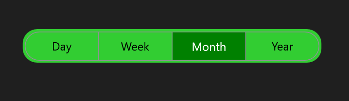
Creating your own theme
You can also create your own theme as an alternative approach to the above methods. To create your own theme, first, you need to merge the resource, whose key name should be “ControlName” + “Theme” based on the controls. For example, the SfChartTheme and SfTextInputLayoutTheme. You can find this key for each control in this documentation. After merging this resource, you need to merge the required color resources based on the UI elements that need to be customized. You can find the keys and the UI elements to which they are mapped to all the controls in this documentation.
Using this approach, you can create your own theme for all the controls or specific controls you need.
<Application xmlns:syncTheme="clr-namespace:Syncfusion.Maui.Toolkit.Themes;assembly=Syncfusion.Maui.Toolkit"
             ...>
 <Application.Resources>
    <ResourceDictionary>
        <ResourceDictionary.MergedDictionaries>
            <syncTheme:SyncfusionThemeResourceDictionary VisualTheme="MaterialDark"/>
            <ResourceDictionary>
                <x:String x:Key="SfSegmentedControlTheme">CommonTheme</x:String>
                <Color x:Key="SfSegmentedControlNormalTextColor">Black</Color>
                <Color x:Key="SfSegmentedControlNormalBackground">LimeGreen</Color>
                <Color x:Key="SfSegmentedControlSelectionTextColor">White</Color>
                <Color x:Key="SfSegmentedControlSelectionBackground">Green</Color>
            </ResourceDictionary>
        </ResourceDictionary.MergedDictionaries>
    </ResourceDictionary>
</Application.Resources>

....

</Application>