How can I help you?
Supported Input Views in .NET MAUI TextInputLayout (SfTextInputLayout)
Input views can be added to the text input layout control by setting the Content property.
Entry
To enter a single line text input, add Entry.
<inputLayout:SfTextInputLayout Hint="Name"
                               HelperText="Enter your name"
                               ContainerType="Outlined">
   <Entry />
</inputLayout:SfTextInputLayout>
var inputLayout = new SfTextInputLayout();
inputLayout.Hint = "Name";
inputLayout.HelperText = "Enter your name";
inputLayout.ContainerType = ContainerType.Outlined;
inputLayout.Content = new Entry();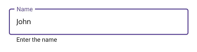
Editor
To enter multi-line text input, add Editor, then set the AutoSize property to TextChanges.
<inputLayout:SfTextInputLayout Hint="About TextInputLayout"
                               HelperText="Enter the brief description of the text input layout"
                               ContainerType="Outlined">
   <Editor />
</inputLayout:SfTextInputLayout>
var inputLayout = new SfTextInputLayout();
inputLayout.Hint = "About TextInputLayout";
inputLayout.HelperText = "Enter the brief description of the text input layout";
inputLayout.Content = new Editor();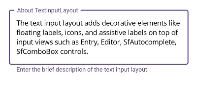
Picker
To initialize the Picker control and launch it in each platform, refer to the getting started with picker documentation.
<inputLayout:SfTextInputLayout Hint="Fruit"
                               HelperText="Select a fruit"
                               ContainerType="Outlined"
                               ContainerBackground="Transparent">
   <Picker SelectedItem="Apple">
        <Picker.ItemsSource>
            <x:Array Type="{x:Type x:String}">
                <x:String>Apple</x:String>
                <x:String>Orange</x:String>
                <x:String>Strawberry</x:String>
            </x:Array>
        </Picker.ItemsSource>
   </Picker>
</inputLayout:SfTextInputLayout>
var inputLayout = new SfTextInputLayout();
inputLayout.Hint = "Fruit";
inputLayout.HelperText = "Select a fruit";
inputLayout.ContainerType = ContainerType.Outlined;
inputLayout.ContainerBackground = Colors.Transparent;
var picker = new Picker();
picker.Items.Add("Apple");
picker.Items.Add("Orange");
picker.Items.Add("Strawberry");
picker.SelectedItem = "Apple";
inputLayout.Content = picker;
NOTE
Windows platform will not support
.NET MAUI Pickeras input view of the text input layout.
TimePicker
To initialize the TimePicker control and launch it in each platform, refer to the getting started with time picker documentation.
<inputLayout:SfTextInputLayout Hint="Time"
                               HelperText="Select a start time"
                               ContainerType="Outlined"
                               ContainerBackground="Transparent">
    <TimePicker/>
 </inputLayout:SfTextInputLayout>
var inputLayout = new SfTextInputLayout();
inputLayout.Hint = "Time";
inputLayout.HelperText = "Select a start time";
inputLayout.ContainerType = ContainerType.Outlined;
inputLayout.ContainerBackground = Colors.Transparent;
inputLayout.Content = new TimePicker();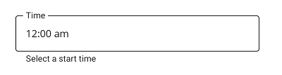
NOTE
Windows platform will not support
.NET MAUI TimePickeras input view of the text input layout.
DatePicker
To initialize the DatePicker control and launch it in each platform, refer to the getting started with date picker documentation.
<inputLayout:SfTextInputLayout Hint="Date of Birth"
                               HelperText="Select birth date"
                               ContainerType="Outlined"
                               ContainerBackground="Transparent">
    <DatePicker/>
</inputLayout:SfTextInputLayout>
var inputLayout = new SfTextInputLayout();
inputLayout.Hint = "Date of Birth";
inputLayout.HelperText = "Select birth date";
inputLayout.ContainerType = ContainerType.Outlined;
inputLayout.ContainerBackground = Colors.Transparent;
inputLayout.Content = new DatePicker();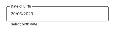
NOTE
Windows platform will not support
.NET MAUI DatePickeras input view of the text input layout.