How can I help you?
Container Type in .NET MAUI Text Input Layout (SfTextInputLayout)
Containers improve the discoverability of input view by creating a contrast between the input view and assistive elements.
Filled
The background of the input view will be filled with container color, and its stroke (at the bottom edge) color and thickness will be changed based on its states. It can be enabled by setting the ContainerType property to Filled.
<inputLayout:SfTextInputLayout Hint="Name"
                               ContainerType="Filled">
    <Entry Text="John"/>
</inputLayout:SfTextInputLayout>
var inputLayout = new SfTextInputLayout();
inputLayout.Hint = "Name";
inputLayout.ContainerType = ContainerType.Filled;
inputLayout.Content = new Entry() { Text = "John" };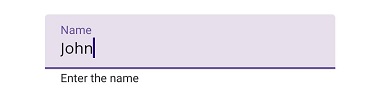
Outlined
When setting the ContainerType property to Outlined, the container will be covered with a rounded-corner border.
<inputLayout:SfTextInputLayout Hint="Name"
                               ContainerType="Outlined">
    <Entry Text="John" />
</inputLayout:SfTextInputLayout>
var inputLayout = new SfTextInputLayout();
inputLayout.Hint = "Name";
inputLayout.ContainerType = ContainerType.Outlined;
inputLayout.Content = new Entry() { Text = "John" };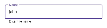
Customize the corner radius of the outline border
When setting the OutlineCornerRadius property to double value, the corner radius of the container will be changed.
<inputLayout:SfTextInputLayout Hint="Name"
                               ContainerType="Outlined"
                               OutlineCornerRadius="8">
    <Entry />
</inputLayout:SfTextInputLayout>
var inputLayout = new SfTextInputLayout();
inputLayout.Hint = "Name";
inputLayout.ContainerType = ContainerType.Outlined;
inputLayout.OutlineCornerRadius = 8;
inputLayout.Content = new Entry();
NOTE
It is applicable for the outline border when setting the container type toOutlined.
Custom Padding
Spaces around the input view can be customized by setting the InputViewPadding property to Thickness value.
<inputLayout:SfTextInputLayout Hint="Padding"
                               InputViewPadding="0,5,0,5"
                               ContainerType="Outlined"
                               HelperText="Top and bottom padding is 5">
    <Entry />
 </inputLayout:SfTextInputLayout>
var inputLayout = new SfTextInputLayout();
inputLayout.Hint = "Padding";
inputLayout.InputViewPadding = new Thickness(0,5,0,5);
inputLayout.ContainerType = ContainerType.Outlined;
inputLayout.HelperText = "Top and bottom padding is 5";
inputLayout.Content = new Entry();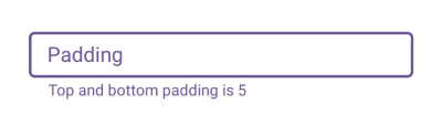
None
When setting the ContainerType property to None, the container will have an empty background and enough spacing.
<inputLayout:SfTextInputLayout Hint="Name"
                               ContainerType="None">
    <Entry Text="John" />
</inputLayout:SfTextInputLayout>
var inputLayout = new SfTextInputLayout();
inputLayout.Hint = "Name";
inputLayout.ContainerType = ContainerType.None;
inputLayout.Content = new Entry() { Text = "John" };