How can I help you?
Visual State Manager in .NET MAUI Tab View (SfTabView)
Use the VisualStateManager to change the properties of the SfTabView control based on visual states defined in your code. The applicable visual states are Selected, Normal, and Disabled.
Refer to the following example to implement Visual State Manager in the SfTabView control. This example demonstrates how to define visual states and apply them to the SfTabView control to change its appearance based on different states:
Additionally, the C# example demonstrates how to create a CustomTabItem class that inherits from SfTabItem. This class sets up the visual states programmatically, allowing for more dynamic control over the visual states.
<ContentPage xmlns="http://schemas.microsoft.com/dotnet/2021/maui"
             xmlns:x="http://schemas.microsoft.com/winfx/2009/xaml"
             x:Class="TabViewMauiSample.MainPage"
             xmlns:tabView="clr-namespace:Syncfusion.Maui.Toolkit.TabView;assembly=Syncfusion.Maui.Toolkit"
             BackgroundColor="{DynamicResource SecondaryColor}">
    <ContentPage.Content>
        <Grid>
            <Grid.Resources>
                <!-- Style for tab buttons -->
                <Style x:Key="tabButton"
                       TargetType="{x:Type Button}">
                    <Setter Property="FontSize"
                            Value="30" />
                    <Setter Property="BackgroundColor"
                            Value="White" />
                    <Setter Property="TextColor"
                            Value="#666666" />
                    <Setter Property="FontAttributes"
                            Value="Bold" />
                    <Setter Property="Margin"
                            Value="{OnPlatform Android='-5', Default='0'}" />
                </Style>
                <!-- Visual State Manager style for SfTabItem -->
                <Style TargetType="tabView:SfTabItem">
                    <Setter Property="VisualStateManager.VisualStateGroups">
                        <VisualStateGroupList>
                            <VisualStateGroup>
                                <VisualState x:Name="Normal">
                                    <VisualState.Setters>
                                        <Setter Property="TextColor"
                                                Value="Black" />
                                        <Setter Property="FontFamily"
                                                Value="Roboto" />
                                    </VisualState.Setters>
                                </VisualState>
                                <VisualState x:Name="Selected">
                                    <VisualState.Setters>
                                        <Setter Property="TextColor"
                                                Value="#6200EE" />
                                        <Setter Property="FontFamily"
                                                Value="Roboto" />
                                    </VisualState.Setters>
                                </VisualState>
                            </VisualStateGroup>
                        </VisualStateGroupList>
                    </Setter>
                </Style>
            </Grid.Resources>

            <!-- SfTabView control -->
            <tabView:SfTabView>
                <!-- Tab item for FAVOURITES -->
                <tabView:SfTabItem Header="FAVOURITES">
                    <tabView:SfTabItem.Content>
                        <Grid>
                            <!-- Gradient background at the bottom -->
                            <Grid Grid.Row="1"
                                  VerticalOptions="End"
                                  HeightRequest="20">
                                <Grid.Background>
                                    <LinearGradientBrush EndPoint="0,1">
                                        <GradientStop Color="Transparent"
                                                      Offset="0.1" />
                                        <GradientStop Color="#EAEAEA"
                                                      Offset="0.8" />
                                        <GradientStop Color="#E5E5E5"
                                                      Offset="1.0" />
                                    </LinearGradientBrush>
                                </Grid.Background>
                            </Grid>
                            <!-- ListView for displaying favorite contacts -->
                            <ListView RowHeight="50">
                                <ListView.ItemsSource>
                                    <x:Array Type="{x:Type x:String}">
                                        <x:String>James</x:String>
                                        <x:String>Richard</x:String>
                                        <x:String>Clara</x:String>
                                        <x:String>Michael</x:String>
                                        <x:String>Alex</x:String>
                                        <x:String>Clara</x:String>
                                    </x:Array>
                                </ListView.ItemsSource>
                                <ListView.ItemTemplate>
                                    <DataTemplate>
                                        <ViewCell>
                                            <Grid ColumnDefinitions="48,*,48,48"
                                                  Margin="10,5">
                                                <!-- Contact image -->
                                                <Image Grid.Column="0"
                                                       WidthRequest="35"
                                                       HeightRequest="35"
                                                       VerticalOptions="Center"
                                                       HorizontalOptions="Center"
                                                       Aspect="AspectFit"
                                                       Source="contact_image" />
                                                <!-- Contact name -->
                                                <Label Grid.Column="1"
                                                       VerticalOptions="Center"
                                                       HorizontalOptions="Start"
                                                       Margin="5,0"
                                                       TextColor="#666666"
                                                       FontSize="16"
                                                       Text="{Binding}" />
                                                <!-- Mail icon -->
                                                <Image Grid.Column="2"
                                                       WidthRequest="35"
                                                       HeightRequest="35"
                                                       VerticalOptions="Center"
                                                       HorizontalOptions="Center"
                                                       Aspect="AspectFit"
                                                       Source="mail" />
                                                <!-- Call icon -->
                                                <Image Grid.Column="3"
                                                       WidthRequest="35"
                                                       HeightRequest="35"
                                                       VerticalOptions="Center"
                                                       HorizontalOptions="Center"
                                                       Aspect="AspectFit"
                                                       Source="call1" />
                                            </Grid>
                                        </ViewCell>
                                    </DataTemplate>
                                </ListView.ItemTemplate>
                            </ListView>
                        </Grid>
                    </tabView:SfTabItem.Content>
                </tabView:SfTabItem>
                <!-- Tab item for RECENTS -->
                <tabView:SfTabItem Header="RECENTS">
                    <tabView:SfTabItem.Content>
                        <Grid BackgroundColor="Green"
                              x:Name="FavoritesGrid" />
                    </tabView:SfTabItem.Content>
                </tabView:SfTabItem>
                <!-- Tab item for CONTACTS -->
                <tabView:SfTabItem Header="CONTACTS">
                    <tabView:SfTabItem.Content>
                        <Grid BackgroundColor="Blue"
                              x:Name="ContactsGrid" />
                    </tabView:SfTabItem.Content>
                </tabView:SfTabItem>
            </tabView:SfTabView>
        </Grid>
    </ContentPage.Content>
 </ContentPage>
public partial class MainPage : ContentPage
{
public MainPage()
{
InitializeComponent();
// Create an instance of the SfTabView control
SfTabView tabView = new SfTabView();
// Create a ListView with sample data
ListView listView = new ListView
{
RowHeight = 50,
ItemsSource = new string[] { "James", "Richard", "Clara", "Michael", "Alex", "Clara" },
ItemTemplate = new DataTemplate(() =>
{
// Define the layout for each item in the ListView
var grid = new Grid
{
ColumnDefinitions =
{
new ColumnDefinition { Width = new GridLength(48) },
new ColumnDefinition { Width = new GridLength(1, GridUnitType.Star) },
new ColumnDefinition { Width = new GridLength(48) },
new ColumnDefinition { Width = new GridLength(48) }
},
Margin = new Thickness(10, 5)
};
// Define the first image in the grid
var image1 = new Image
{
WidthRequest = 35,
HeightRequest = 35,
VerticalOptions = LayoutOptions.Center,
HorizontalOptions = LayoutOptions.Center,
Aspect = Aspect.AspectFit,
Source = "contact_image"
};
// Define the label in the grid
var label = new Label
{
VerticalOptions = LayoutOptions.Center,
HorizontalOptions = LayoutOptions.Start,
Margin = new Thickness(5, 0),
TextColor = Color.FromHex("#666666"),
FontSize = 16
};
label.SetBinding(Label.TextProperty, ".");
// Define the second image in the grid
var image2 = new Image
{
WidthRequest = 35,
HeightRequest = 35,
VerticalOptions = LayoutOptions.Center,
HorizontalOptions = LayoutOptions.Center,
Aspect = Aspect.AspectFit,
Source = "mail"
};
// Define the third image in the grid
var image3 = new Image
{
WidthRequest = 35,
HeightRequest = 35,
VerticalOptions = LayoutOptions.Center,
HorizontalOptions = LayoutOptions.Center,
Aspect = Aspect.AspectFit,
Source = "call1"
};
// Set the column positions for the elements in the grid
Grid.SetColumn(image1, 0);
Grid.SetColumn(label, 1);
Grid.SetColumn(image2, 2);
Grid.SetColumn(image3, 3);
// Add the elements to the grid
grid.Children.Add(image1);
grid.Children.Add(label);
grid.Children.Add(image2);
grid.Children.Add(image3);
// Return a ViewCell containing the grid
return new ViewCell { View = grid };
})
};
// Create grids for the tab contents
Grid favoritesGrid = new Grid { };
favoritesGrid.Children.Add(listView);
Grid recentsGrid = new Grid { BackgroundColor = Colors.Green };
Grid contactsGrid = new Grid { BackgroundColor = Colors.Blue };
// Create a collection of tab items
var tabItems = new TabItemCollection
{
new CustomTabItem()
{
Header = "FAVOURITES",
Content = favoritesGrid
},
new CustomTabItem()
{
Header = "RECENTS",
Content = recentsGrid
},
new CustomTabItem()
{
Header = "CONTACTS",
Content = contactsGrid
}
};
// Set the tab items for the SfTabView
tabView.Items = tabItems;
// Set the content of the page to the SfTabView
this.Content = tabView;
}
}
// We create a `CustomTabItem` class that inherits from `SfTabItem`. This class sets up the visual states programmatically, allowing for more dynamic control over the visual states.
public class CustomTabItem : SfTabItem
{
public CustomTabItem()
{
// Create a list to hold visual state groups
VisualStateGroupList visualStateGroupList = new VisualStateGroupList();
// Create a visual state group for common states
VisualStateGroup commonStateGroup = new VisualStateGroup();
// Define the "Normal" visual state
VisualState normalState = new VisualState
{
Name = "Normal"
};
// Set the text color for the "Normal" state
normalState.Setters.Add(new Setter { Property = SfTabItem.TextColorProperty, Value = Colors.Black });
// Define the "Selected" visual state
VisualState selectedState = new VisualState
{
Name = "Selected"
};
// Set the text color for the "Selected" state
selectedState.Setters.Add(new Setter { Property = SfTabItem.TextColorProperty, Value = Color.FromHex("#6750A4") });
// Add the visual states to the common state group
commonStateGroup.States.Add(normalState);
commonStateGroup.States.Add(selectedState);
// Add the common state group to the visual state group list
visualStateGroupList.Add(commonStateGroup);
// Set the visual state groups for this tab item
VisualStateManager.SetVisualStateGroups(this, visualStateGroupList);
}
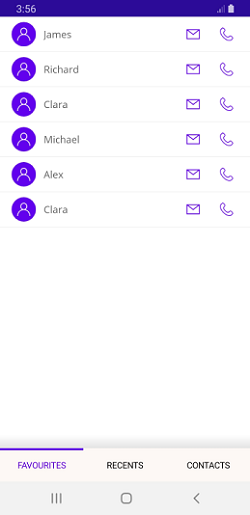
}By using the Visual State Manager, you can easily change the appearance of tab items based on their current state, providing visual feedback to users and enhancing the overall user experience. The following image demonstrating different visual states for tab items.
NOTE
View sample in GitHub.