Customize the Tab Bar in .NET MAUI Tab View (SfTabView)
Tab width options
The .NET MAUI Tab View provides two modes to determine how tab widths are calculated on the tab bar when populated. These options are Default and SizeToContent, settable via the TabWidthMode property.
Default tab width mode
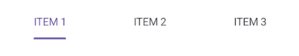
In this mode, the tab width is equally divided based on the available control width, providing a fixed tab bar without scrolling, regardless of tab quantity. Set this mode using the TabWidthMode property set to Default.
NOTE
This mode is recommended for up to four tabs, as more may cause text trimming.
Set the default tab width mode using the following code:
<!-- Define the SfTabView control with the tab width mode set to Default -->
<tabView:SfTabView TabWidthMode="Default" />
// Create an instance of the SfTabView control
SfTabView tabView = new SfTabView();
// Set the tab width mode to default
tabView.TabWidthMode = TabWidthMode.Default;The following image shows the tab bar in default tab width mode.
Based on the text size
The width of a tab is set to fit the text or image that it contains by setting the TabWidthMode as SizeToContent. Scroll is enabled in this mode to access the items that are outside the visible area.
To set the tab width mode to fit the content, use the following code:
<!-- Define the SfTabView control with the tab width mode set to SizeToContent -->
<tabView:SfTabView TabWidthMode="SizeToContent" />
// Create an instance of the SfTabView control
SfTabView tabView = new SfTabView();
// Set the tab width mode to size-to-content
tabView.TabWidthMode = TabWidthMode.SizeToContent;The following image shows the tab bar in size-to-content width mode.

Customize the tab bar height
The height of the tab bar can be customized by setting the TabBarHeight property. The default height is 48.
NOTE
It is recommended to set the
TabBarHeightas 72 while displaying the image and text with ImagePosition as either top or bottom.
To set the tab bar height, use the following code:
<!-- Define the SfTabView control with the tab bar height set to 100 -->
<tabView:SfTabView TabBarHeight="100" />
// Create an instance of the SfTabView control
SfTabView tabView = new SfTabView();
// Set the height of the tab bar to 100
tabView.TabBarHeight = 100;Customize the tab header text alignment
The tab header text alignment can be customized using the HeaderHorizontalTextAlignment property. The default value is Center. This property accepts the following values:
- Start - Text is placed at the beginning of the header tab.
- Center - Text is centered within the header tab
- End - Text is aligned at the end of the header tab.
To set the horizontal text alignment of the tab header, use the following code:
<!-- Define the SfTabView control with the header horizontal text alignment set to Center -->
<tabView:SfTabView HeaderHorizontalTextAlignment="Center" />
// Create an instance of the SfTabView control
SfTabView tabView = new SfTabView();
// Set the horizontal text alignment of the tab headers to center
tabView.HeaderHorizontalTextAlignment = TextAlignment.Center;
Tab header alignment
The .NET MAUI TabView allows header position customization using the TabHeaderAlignment property for enhanced layout flexibility. The default position is Start. Supported values include:
By default, the header is positioned at the Start. This property supports the following values:
- Start - Positions the tab header at the beginning of the Tab View.
- Center - Centers the tab header in the Tab View.
- End - Places the tab header at the end of the Tab View.
NOTE
The TabHeaderAlignment property is applicable only when the TabWidthMode is set to SizeToContent.
<tabView:SfTabView TabHeaderAlignment="Center"/>SfTabView tabView = new SfTabView();
tabView.TabHeaderAlignment = TabHeaderAlignment.Center;Header item spacing
The HeaderItemSpacing property is used to control the spacing between adjacent tab header items in the SfTabView. This property helps improve readability and visual alignment by adjusting the gap between each tab header.
<tabView:SfTabView HeaderItemSpacing="20"/>SfTabView tabView = new SfTabView();
tabView.HeaderItemSpacing= 20 ;Tab bar placement options
The .NET MAUI Tab View provides two options for determining how the tab bar aligns relative to the tab content. The options are top and bottom. This can be done using the TabBarPlacement property.
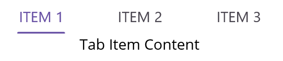
Top
In this option, the tab bar will be placed above the content region of the Tab View. To set the tab bar placement to the top, use the following code:
<!-- Define the SfTabView control with the tab bar placement set to Top -->
<tabView:SfTabView TabBarPlacement="Top" />
// Create an instance of the SfTabView control
SfTabView tabView = new SfTabView();
// Set the tab bar placement to the top
tabView.TabBarPlacement = TabBarPlacement.Top;The following image shows the tab bar placed at the top of the content region.
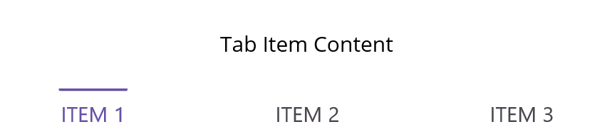
Bottom
In this option, the tab bar will be placed below the content region of the Tab View. To set the tab bar placement to the bottom, use the following code:
<tabView:SfTabView TabBarPlacement="Bottom">// Create an instance of the SfTabView control
SfTabView tabView = new SfTabView();
// Set the tab bar placement to the bottom
tabView.TabBarPlacement = TabBarPlacement.Bottom;The following image illustrates the tab bar placed at the bottom of the content region.
Tab bar background customization
Customize the tab bar background using the TabBarBackground property. You can set a solid color or a gradient color as the background.
Solid color
A solid color can be achieved by assigning the SolidColorBrush to the TabBarBackground, which represents the color of the tab bar background.
To set a solid color as the background, use the following code:
<!-- Define the SfTabView control with the tab bar background color set to LightBlue -->
<tabView:SfTabView TabBarBackground="LightBlue" />
// Create an instance of the SfTabView control
SfTabView tabView = new SfTabView();
// Set the background color of the tab bar to light blue
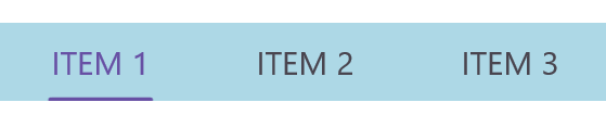
tabView.TabBarBackground = Colors.LightBlue;The following image shows the tab bar with a solid color background.
Gradient color
The background can be customized with a linear gradient and radial gradient as like below example.
<!-- Define the SfTabView control -->
<tabView:SfTabView>
    <!-- Set the tab bar background to a linear gradient brush -->
    <tabView:SfTabView.TabBarBackground>
        <LinearGradientBrush EndPoint="0,1">
            <!-- Define the gradient stops for the linear gradient brush -->
            <GradientStop Color="#009FFF"
                          Offset="0.1" />
            <GradientStop Color="#ec2F4B"
                          Offset="1.0" />
        </LinearGradientBrush>
    </tabView:SfTabView.TabBarBackground>
</tabView:SfTabView>
// Create the first gradient stop with color #009FFF and offset 0.1
Microsoft.Maui.Controls.GradientStop gradientStop1 = new Microsoft.Maui.Controls.GradientStop()
{
Color = Color.FromArgb("#009FFF"),
Offset = (float)0.1,
};
// Create the second gradient stop with color #ec2F4B and offset 1.0
Microsoft.Maui.Controls.GradientStop gradientStop2 = new Microsoft.Maui.Controls.GradientStop()
{
Color = Color.FromArgb("#ec2F4B"),
Offset = (float)1.0,
};
// Create a linear gradient brush with the defined gradient stops
LinearGradientBrush gradientBrush = new LinearGradientBrush()
{
EndPoint = new Point(0, 1),
GradientStops = new GradientStopCollection() { gradientStop1, gradientStop2 }
};
// Create an instance of the SfTabView control and set its tab bar background to the gradient brush
SfTabView tabView = new SfTabView();
tabView.TabBarBackground = gradientBrush;The following image shows the tab bar with a gradient color background.

NOTE
View sample in GitHub.