Customize the Selection Indicator in .NET MAUI Tab View (SfTabView)
23 May 20257 minutes to read
Placement options
The .NET MAUI Tab View provides three options for aligning the selection indicator relative to the tab header item: top, bottom, and fill. You can set the alignment by configuring the IndicatorPlacement property.
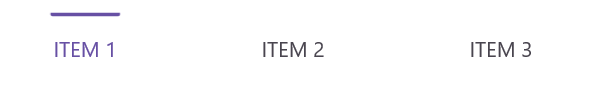
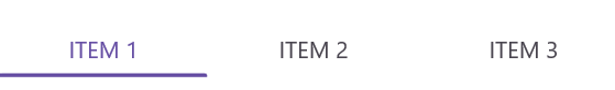
Top
The selection indicator will be positioned at the top of the selected tab. You can set this using the IndicatorPlacement property, as shown in the following code snippets:
<!-- Define the SfTabView control with the indicator placement set to the top -->
<tabView:SfTabView IndicatorPlacement="Top" />
SfTabView tabView = new SfTabView();
tabView.IndicatorPlacement = TabIndicatorPlacement.Top;The following image shows the selection indicator placed at the top of the tab header:
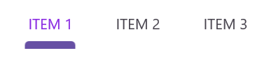
Bottom
The selection indicator will be positioned at the bottom of the selected tab. You can set this using the IndicatorPlacement property, as shown in the following code snippets:
<!-- Define the SfTabView control with the indicator placement set to the bottom -->
<tabView:SfTabView IndicatorPlacement="Bottom"/>
SfTabView tabView = new SfTabView();
tabView.IndicatorPlacement = TabIndicatorPlacement.Bottom;The following image shows the selection indicator placed at the bottom of the tab header:

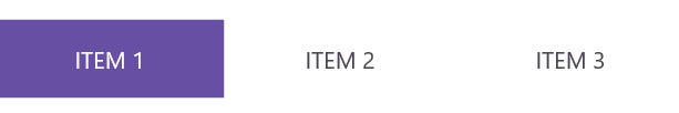
Fill
The selection indicator will fill the selected tab. You can set this using the IndicatorPlacement property, as shown in the following code snippets:
<!-- Define the SfTabView control with the indicator placement set to the fill -->
<tabView:SfTabView IndicatorPlacement="Fill"/>
SfTabView tabView = new SfTabView();
tabView.IndicatorPlacement = TabIndicatorPlacement.Fill;The following image shows the selection indicator filling the entire tab header:
Background customization
The background of the indicator can be customized using the IndicatorBackground property of SfTabView.
Solid color
You can customize the selection indicator’s background color using the IndicatorBackground property of SfTabView. Below are examples of how to set a solid background color using this property in XAML and C#:
<!-- Define the SfTabView control with the indicator background color set to LightBlue -->
<tabView:SfTabView IndicatorBackground="LightBlue"/>
SfTabView tabView = new SfTabView();
tabView.IndicatorBackground = Colors.LightBlue;The following image shows the selection indicator background customization:

Gradient color
You can customize the selection indicator’s background using linear or radial gradients. Below are examples of how to apply these gradients:
<tabView:SfTabView>
    <!-- Set the indicator background to a linear gradient brush -->
    <tabView:SfTabView.IndicatorBackground>
        <LinearGradientBrush EndPoint="0,1">
            <!-- Define the gradient stops for the linear gradient brush -->
            <GradientStop Color="#009FFF"
                          Offset="0.1" />
            <GradientStop Color="#ec2F4B"
                          Offset="1.0" />
        </LinearGradientBrush>
    </tabView:SfTabView.IndicatorBackground>
</tabView:SfTabView>Microsoft.Maui.Controls.GradientStop gradient1 = new Microsoft.Maui.Controls.GradientStop()
{
Color = Color.FromArgb("#009FFF"),
Offset = (float)0.1,
};
Microsoft.Maui.Controls.GradientStop gradient2 = new Microsoft.Maui.Controls.GradientStop()
{
Color = Color.FromArgb("#ec2F4B"),
Offset = (float)1.0,
};
LinearGradientBrush gradientBrush = new LinearGradientBrush()
{
EndPoint = new Point(0, 1),
GradientStops = new GradientStopCollection() { gradient1, gradient2 }
};
SfTabView tabView = new SfTabView();
tabView.IndicatorBackground = gradientBrush;The following image shows the selection indicator with a gradient background:

Indicator width modes
The IndicatorWidthMode property allows customization of the width of the selection indicator. By default, this property is set to Fit, which adjusts the indicator width to fit the content of the header item. You can change the width to stretch across the entire header item by setting the IndicatorWidthMode property to Stretch.
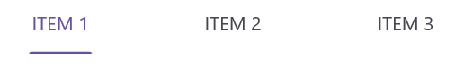
Fit mode
In Fit mode, the indicator width adjusts to fit the content of the header item. The following examples demonstrate how to set the IndicatorWidthMode property to Fit:
<!-- Define the SfTabView control with the indicator width mode set to Fit -->
<tabView:SfTabView IndicatorWidthMode="Fit" />
SfTabView tabView = new SfTabView();
tabView.IndicatorWidthMode = IndicatorWidthMode.Fit;The following image shows the selection indicator with the width mode set to Fit:
Stretch mode
In Stretch mode, the indicator width stretches to cover the entire header item. The following examples demonstrate how to set the IndicatorWidthMode property to Stretch:
<!-- Define the SfTabView control with the indicator width mode set to Stretch -->
<tabView:SfTabView IndicatorWidthMode="Stretch"/>
SfTabView tabView = new SfTabView();
tabView.IndicatorWidthMode = IndicatorWidthMode.Stretch;The following image shows the selection indicator with the width mode set to Stretch:
Indicator corner radius
You can customize the corner radius of the selection indicator using the IndicatorCornerRadius property in the SfTabView.
<!-- Define the SfTabView control with the indicator corner radius set to 5 -->
<tabView:SfTabView IndicatorCornerRadius="5" />
// Create an instance of the SfTabView control
SfTabView tabView = new SfTabView();
// Set the corner radius of the indicator
tabView.IndicatorCornerRadius = 5;The following image shows the selection indicator with the corner radius:
Indicator stroke thickness
You can customize the stroke thickness of the selection indicator using the IndicatorStrokeThickness property in the Tab View.
<tabView:SfTabView IndicatorStrokeThickness ="7">
</tabView:SfTabView>tabView.IndicatorStrokeThickness = 7;