Header Display Mode in .NET MAUI Tab View control (SfTabView)
By default, the Tab View control displays the title of each Tab Item. It can be customized to display in any of the following modes:
- Default
- Image
- Text
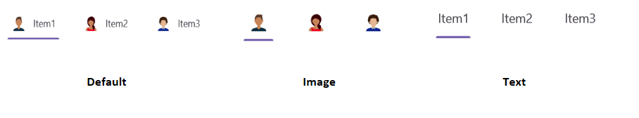
The Tab View can be modified by setting the HeaderDisplayMode property of the .NET MAUI Tab View.
Below are examples of how to use this property in XAML and C#:
<!-- Define the SfTabView control with the default header display mode -->
<tabView:SfTabView HeaderDisplayMode="Default">
    <!-- Define the first tab item with a header and an image source -->
    <tabView:SfTabItem Header="Item1"
                       ImageSource="avatar1.png" />
    <!-- Define the second tab item with a header and an image source -->
    <tabView:SfTabItem Header="Item2"
                       ImageSource="avatar2.png" />
    <!-- Define the third tab item with a header and an image source -->
    <tabView:SfTabItem Header="Item3"
                       ImageSource="avatar3.png" />
</tabView:SfTabView>
// Create an instance of the SfTabView control with default header display mode
SfTabView tabView = new SfTabView
{
HeaderDisplayMode = TabBarDisplayMode.Default
};
// Create the first tab item with a header and image source
SfTabItem tabItem1 = new SfTabItem
{
Header = "Item1",
ImageSource = "avatar1.png"
};
// Create the second tab item with a header and image source
SfTabItem tabItem2 = new SfTabItem
{
Header = "Item2",
ImageSource = "avatar2.png"
};
// Create the third tab item with a header and image source
SfTabItem tabItem3 = new SfTabItem
{
Header = "Item3",
ImageSource = "avatar3.png"
};
// Add the tab items to the SfTabView control
tabView.Items.Add(tabItem1);
tabView.Items.Add(tabItem2);
tabView.Items.Add(tabItem3);NOTE
The HeaderDisplayMode property will only apply if both a Header and an ImageSource are provided for the tab item. If either is missing, the tab item will automatically apply the default mode.