How can I help you?
Center Button Customization in .NET MAUI Tab View (SfTabView)
This section explains how to enable and customize the center button in .NET MAUI SfTabView.
Enable the center button
You can enable the center button in Tab View by setting the IsCenterButtonEnabled property to True.
<tabView:SfTabView x:Name="tabView"
                   IsCenterButtonEnabled="True" />
public MainPage()
{
InitializeComponent();
SfTabView tabView = new SfTabView();
tabView.IsCenterButtonEnabled = true;
this.Content = tabView;
}Customize the center button
You can customize the center button using the properties of CenterButtonSettings. The following properties are used to customize the view of the center button: Background, Stroke, StrokeThickness, CornerRadius, TextColor, Height, Title, FontAttributes, FontFamily, FontSize, Width, ImageSource, ImageSize, and DisplayMode.
<tabView:SfTabView.CenterButtonSettings>
  <tabView:CenterButtonSettings Height="45"
                                Width="45"
                                CornerRadius="50"
                                Background="#6750A4"
                                ImageSize="25"
                                DisplayMode="Image"
                                ImageSource="image.png">
  </tabView:CenterButtonSettings>
</tabView:SfTabView.CenterButtonSettings>
public MainPage()
{
InitializeComponent();
SfTabView tabView = new SfTabView();
CenterButtonSettings centerButtonSettings = new CenterButtonSettings()
{
Height = 45,
Width = 45,
DisplayMode = CenterButtonDisplayMode.Image,
ImageSize = 25,
Background = Color.FromArgb("#6750A4");
CornerRadius = new CornerRadius(50),
ImageSource = "image.png"
};
tabView.CenterButtonSettings = centerButtonSettings;
}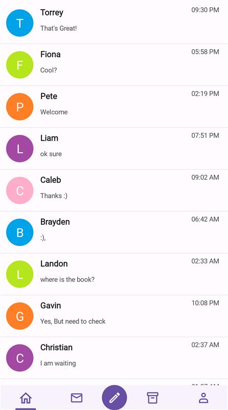
CenterButtonTapped event
When the center button is tapped, the CenterButtonTapped event occurs. Using this event, we can set alert messages.
<tabView:SfTabView CenterButtonTapped="OnCenterButtonTapped">
</tabView:SfTabView>
public MainPage()
{
InitializeComponent();
tabView.CenterButtonTapped += OnCenterButtonTapped;
}
private void OnCenterButtonTapped(object sender, EventArgs e)
{
DisplayAlert("Message", "CenterButton Clicked", "Ok");
}