Polar Line Chart in .NET MAUI Chart
Polar Line Chart
To display a line series in a polar chart, instantiate the PolarLineSeries and include it in the Series collection property of SfPolarChart.
<chart:SfPolarChart>
    <chart:SfPolarChart.PrimaryAxis>
        <chart:CategoryAxis/>
    </chart:SfPolarChart.PrimaryAxis>

    <chart:SfPolarChart.SecondaryAxis>
        <chart:NumericalAxis/>
    </chart:SfPolarChart.SecondaryAxis>

    <chart:PolarLineSeries ItemsSource="{Binding PlantDetails}" XBindingPath="Direction" YBindingPath="Tree"/>
</chart:SfPolarChart>
// Create a new instance of SfPolarChart
SfPolarChart chart = new SfPolarChart();
// Create and set the primary axis (X-axis) as a CategoryAxis
CategoryAxis primaryAxis = new CategoryAxis();
chart.PrimaryAxis = primaryAxis;
// Create and set the secondary axis (Y-axis) as a NumericalAxis
NumericalAxis secondaryAxis = new NumericalAxis();
chart.SecondaryAxis = secondaryAxis;
// Create a new PolarLineSeries and configure its properties
PolarLineSeries series = new PolarLineSeries()
{
ItemsSource = new ViewModel().PlantDetails,
XBindingPath = "Direction",
YBindingPath = "Tree"
};
// Add the configured series to the chart's Series collection
chart.Series.Add(series);
this.Content = chart;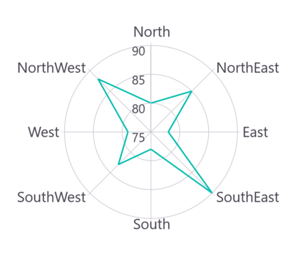
Grid line Type
The GridLineType property used to customize the rendering style of axis grid lines. The default GridLineType is Circle. Switching to the Polygon grid line type transforms the polar chart appearance, resembling a spider or web chart.
<chart:SfPolarChart GridLineType="Polygon">
    . . .
    <chart:PolarLineSeries ItemsSource="{Binding PlantDetails}" XBindingPath="Direction" YBindingPath="Tree"/>
</chart:SfPolarChart>
// Create a new instance of SfPolarChart
SfPolarChart chart = new SfPolarChart();
// Set the grid line type to Polygon
chart.GridLineType = PolarChartGridLineType.Polygon;
// ... (other chart configurations)
// Create a new PolarLineSeries
PolarLineSeries series = new PolarLineSeries()
{
ItemsSource = new ViewModel().PlantDetails,
XBindingPath = "Direction",
YBindingPath = "Tree"
};
// Add the series to the chart's Series collection
chart.Series.Add(series);
this.Content = chart;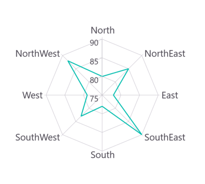
Closed Series
The IsClosed property is used to render the series with or without closed path. The default value of IsClosed is true.
<chart:SfPolarChart>
    . . .
    <chart:PolarLineSeries ItemsSource="{Binding PlantDetails}" XBindingPath="Direction" YBindingPath="Tree"
                           IsClosed="False"/>
</chart:SfPolarChart>
// Create a new instance of SfPolarChart
SfPolarChart chart = new SfPolarChart();
. . .
// Create a new PolarLineSeries
PolarLineSeries series = new PolarLineSeries()
{
ItemsSource = new ViewModel().PlantDetails,
XBindingPath = "Direction",
YBindingPath = "Tree",
// Set whether the line series should be closed or open
// False means the start and end points won't be connected
IsClosed = "False"
};
// Add the series to the chart's Series collection
chart.Series.Add(series);
this.Content = chart;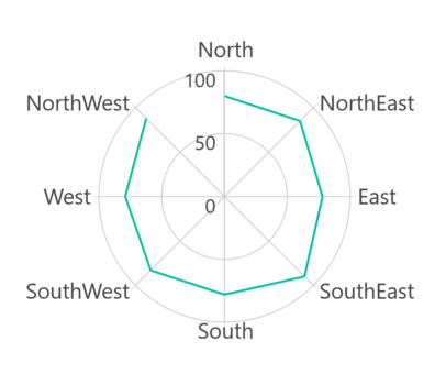
Enable Marker
A marker, also known as a symbol, is used to determine or highlight the position of the data point. To enable markers in the series, set the ShowMarkers property to true.
<chart:SfPolarChart>
    ...
    <chart:PolarLineSeries ItemsSource="{Binding PlantDetails}" XBindingPath="Direction" YBindingPath="Tree"
                           ShowMarkers="True"/>
</chart:SfPolarChart>
// Create a new instance of SfPolarChart
SfPolarChart chart = new SfPolarChart();
...
// Create a new PolarLineSeries
PolarLineSeries series = new PolarLineSeries()
{
ItemsSource = new ViewModel().PlantDetails,
XBindingPath = "Direction",
YBindingPath = "Tree",
ShowMarkers = true // Enable markers at data points
};
// Add the series to the chart's collection of series
chart.Series.Add(series);
this.Content = chart;Marker customization
In order to change the series markers appearance, create an instance of the MarkerSettings property. The following properties are used to customize marker appearance.
-
Type, of type
ShapeType, describes the shape of the series marker. The default value of this property isShapeType.Circle. -
Stroke, of type
Brush, indicates the brush used to paint the marker border. -
StrokeWidth, of type
double, indicates the width of the marker border. -
Fill, of type
Brush, indicates the color of the marker. -
Width, of type
double, indicates the width of the marker. -
Height, of type
double, indicates the height of the marker.
<chart:SfPolarChart>
    ...
    <chart:PolarLineSeries ItemsSource="{Binding PlantDetails}" XBindingPath="Direction" YBindingPath="Tree"
                           ShowMarkers="True">
        <chart:PolarLineSeries.MarkerSettings>
            <chart:ChartMarkerSettings Type="Diamond" Fill="Brown" Stroke="Black"
                                       StrokeWidth="1" Height="8" Width="8"/>
        </chart:PolarLineSeries.MarkerSettings>
    </chart:PolarLineSeries>
</chart:SfPolarChart>
// Create a new SfPolarChart instance
SfPolarChart chart = new SfPolarChart();
...
// Create and configure ChartMarkerSettings
ChartMarkerSettings chartMarker = new ChartMarkerSettings();
chartMarker.Type = ShapeType.Diamond; // Set marker shape to diamond
chartMarker.Fill = Colors.Brown; // Set fill color for markers
chartMarker.Stroke = Colors.Black; // Set outline color for markers
chartMarker.StrokeWidth = 1; // Set outline width for markers
chartMarker.Height = 8; // Set marker height
chartMarker.Width = 8; // Set marker width
// Create a new PolarLineSeries
PolarLineSeries series = new PolarLineSeries()
{
ItemsSource = new ViewModel().PlantDetails,
XBindingPath = "Direction",
YBindingPath = "Tree",
ShowMarkers = true, // Enable markers for data points
MarkerSettings = chartMarker // Apply marker settings to the series
};
// Add the series to the chart
chart.Series.Add(series);
this.Content = chart;