Appearance in .NET MAUI Polar Chart
The appearance of SfPolarChart can be customized using the predefined brushes, custom brushes, and gradient, which allows for the enrichment of the application.
Prerequisite: Ensure that the required NuGet package is installed, the necessary namespaces are imported, and the SfPolarChart control is properly configured in your application. For detailed setup and configuration instructions, refer to the Getting Started guide.
Default PaletteBrushes for chart
By default, the chart applies a set of predefined brushes to the series in a specific order. The following screenshot displays the default appearance of multiple series.
<chart:SfPolarChart>
    <!-- code omitted for brevity -->
    <chart:PolarLineSeries ItemsSource = "{Binding PlantDetails}" XBindingPath = "Direction" YBindingPath = "Tree"/>
    <chart:PolarLineSeries ItemsSource = "{Binding PlantDetails}" XBindingPath = "Direction" YBindingPath = "Weed"/>
    <chart:PolarLineSeries ItemsSource = "{Binding PlantDetails}" XBindingPath = "Direction" YBindingPath = "Flower"/>
</chart:SfPolarChart>
SfPolarChart chart = new SfPolarChart();
// code omitted for brevity
PolarLineSeries series1 = new PolarLineSeries()
{
ItemsSource = new PlantViewModel().PlantDetails,
XBindingPath = "Direction",
YBindingPath = "Tree"
};
PolarLineSeries series2 = new PolarLineSeries()
{
ItemsSource = new PlantViewModel().PlantDetails,
XBindingPath = "Direction",
YBindingPath = "Weed"
};
PolarLineSeries series3 = new PolarLineSeries()
{
ItemsSource = new PlantViewModel().PlantDetails,
XBindingPath = "Direction",
YBindingPath = "Flower"
};
chart.Series.Add(series1);
chart.Series.Add(series2);
chart.Series.Add(series3);
this.Content = chart;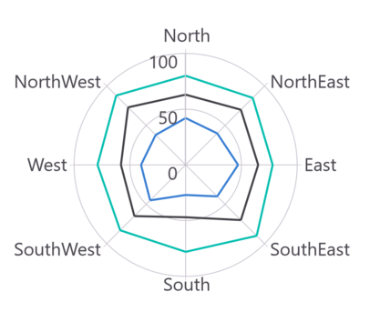
Custom PaletteBrushes
The SfPolarChart provides support for defining custom brushes for the chart in a preferred order using the PaletteBrushes property, as illustrated in the following code example.
<chart:SfPolarChart x:Name = "chart" PaletteBrushes = "{Binding CustomBrushes}">
    <!-- code omitted for brevity -->
</chart:SfPolarChart>
SfPolarChart chart = new SfPolarChart();
List<Brush> CustomBrushes = new List<Brush>()
{
new SolidColorBrush(Color.FromArgb("#25E739")),
new SolidColorBrush(Color.FromArgb("#F4890B")),
new SolidColorBrush(Color.FromArgb("#E2227E"))
};
this.chart.PaletteBrushes = CustomBrushes;
// code omitted for brevity
this.Content = chart;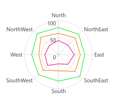
Applying Gradient
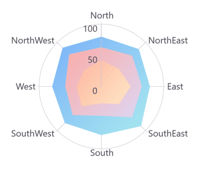
The gradient for the chart can be set using the PaletteBrushes property with the help of LinearGradientBrush or RadialGradientBrush.
The following code sample and screenshot illustrates how to apply the gradient brushes for the series using the PaletteBrushes property.
<chart:SfPolarChart PaletteBrushes = "{Binding CustomBrushes}">
    <!-- code omitted for brevity -->
    <chart:PolarAreaSeries ItemsSource = "{Binding PlantDetails}" XBindingPath = "Direction" YBindingPath = "Tree"/>
    <chart:PolarAreaSeries ItemsSource = "{Binding PlantDetails}" XBindingPath = "Direction" YBindingPath = "Weed"/>
    <chart:PolarAreaSeries ItemsSource = "{Binding PlantDetails}" XBindingPath = "Direction" YBindingPath = "Flower"/>
</chart:SfPolarChart>
public class ViewModel
{
public ObservableCollection<Model> Data { get; set; }
public List<Brush> CustomBrushes { get; set; }
public ViewModel()
{
CustomBrushes = new List<Brush>();
LinearGradientBrush gradientColor1 = new LinearGradientBrush();
gradientColor1.GradientStops = new GradientStopCollection()
{
new GradientStop() { Offset = 1, Color = Color.FromRgb(168, 234, 238) },
new GradientStop() { Offset = 0, Color = Color.FromRgb(123, 176, 249) }
};
LinearGradientBrush gradientColor2 = new LinearGradientBrush();
gradientColor2.GradientStops = new GradientStopCollection()
{
new GradientStop() { Offset = 1, Color = Color.FromRgb(221, 214, 243) },
new GradientStop() { Offset = 0, Color = Color.FromRgb(250, 172, 168) }
};
LinearGradientBrush gradientColor3 = new LinearGradientBrush();
gradientColor3.GradientStops = new GradientStopCollection()
{
new GradientStop() { Offset = 1, Color = Color.FromRgb(255, 231, 199) },
new GradientStop() { Offset = 0, Color = Color.FromRgb(252, 182, 159) }
};
LinearGradientBrush gradientColor4 = new LinearGradientBrush();
gradientColor4.GradientStops = new GradientStopCollection()
{
new GradientStop() { Offset = 1, Color = Color.FromRgb(255, 231, 199) },
new GradientStop() { Offset = 0, Color = Color.FromRgb(252, 182, 159) }
};
LinearGradientBrush gradientColor5 = new LinearGradientBrush();
gradientColor5.GradientStops = new GradientStopCollection()
{
new GradientStop() { Offset = 1, Color = Color.FromRgb(250, 221, 125) },
new GradientStop() { Offset = 0, Color = Color.FromRgb(252, 204, 45) }
};
CustomBrushes.Add(gradientColor1);
CustomBrushes.Add(gradientColor2);
CustomBrushes.Add(gradientColor3);
CustomBrushes.Add(gradientColor4);
CustomBrushes.Add(gradientColor5);
}
// code omitted for brevity
}
Point Color Path
The SfPolarChart supports using the PointColorPath property to assign different colors to each data point. By binding this property to a color field in the data source, each segment can be dynamically styled with its own color.
The following code example demonstrates how to define a data model with a PointColor property and bind it to the chart series.
public class PointColorViewModel
{
    public ObservableCollection<Model> Data { get; set; }

    public PointColorViewModel()
    {
        Data = new ObservableCollection<Model>()
        {
            new(){ XValue = "North", YValue = 80, PointColor = Color.FromArgb("#cbb4e0")},
            new(){ XValue = "NorthEast", YValue = 85, PointColor = Color.FromArgb("#ab80d8")},
            new(){ XValue = "East", YValue = 78, PointColor = Color.FromArgb("#8238c2")},
            new(){ XValue = "SouthEast", YValue = 90, PointColor = Color.FromArgb("#5f209d")},
            new(){ XValue = "South", YValue = 78, PointColor = Color.FromArgb("#441372")},
            new(){ XValue = "SouthWest", YValue = 83, PointColor = Color.FromArgb("#a256de")},
            new(){ XValue = "West", YValue = 79, PointColor = Color.FromArgb("#ba93df")},
            new(){ XValue = "NorthWest", YValue = 88, PointColor = Color.FromArgb("#e1aeff")}
        };
    }
}

public class Model
{
    public string? XValue { get; set; }
    public double YValue { get; set; }
    public Color? PointColor { get; set; }
}
Set ItemsSource to your data collection and map XBindingPath, YBindingPath, and PointColorPath to the corresponding model properties.
<chart:SfPolarChart>
    <!-- code omitted for brevity -->
    <chart:PolarLineSeries ItemsSource = "{Binding Data}"
                           XBindingPath = "XValue"
                           YBindingPath = "YValue"
                           PointColorPath = "PointColor"/>
</chart:SfPolarChart>
SfPolarChart chart = new SfPolarChart();
<!-- code omitted for brevity -->
PolarLineSeries series = new PolarLineSeries()
{
ItemsSource = new PointColorViewModel().Data,
XBindingPath = "XValue",
YBindingPath = "YValue",
PointColorPath = "PointColor"
};
chart.Series.Add(series);
this.Content = chart;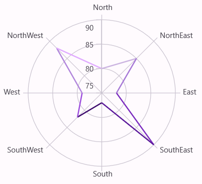
The property is not applicable to the
PolarAreaSeriestype.
The priority for color assignment is as follows:
Fill>PointColorPath>PaletteBrushes.
Plotting Area Customization
SfPolarChart allows you to add any view to the chart plot area, which is useful for adding any relevant data, a watermark, or a color gradient to the background of the chart.
<chart:SfPolarChart>
   <chart:SfPolarChart.PlotAreaBackgroundView>
    	<AbsoluteLayout>
      		<Label Text = "Copyright @ 2001 - 2024 Syncfusion Inc"
		           FontSize = "18"
				   AbsoluteLayout.LayoutBounds = "1,1,-1,-1"
		           AbsoluteLayout.LayoutFlags = "PositionProportional"
		           Opacity = "0.4"/>
       		<Label Text = "CONFIDENTIAL"
			       Rotation = "340"
				   FontSize = "80"
		           FontAttributes = "Bold"
				   TextColor = "Gray"
				   Margin = "10,0,0,0"
	               AbsoluteLayout.LayoutBounds = "0.5,0.5,-1,-1"
		           AbsoluteLayout.LayoutFlags = "PositionProportional"
		           Opacity = "0.3"/>
    	</AbsoluteLayout>
   </chart:SfPolarChart.PlotAreaBackgroundView>
</chart:SfPolarChart>
SfPolarChart chart = new SfPolarChart();
AbsoluteLayout absoluteLayout = new AbsoluteLayout();
var copyRight = new Label()
{
Text = "Copyright @ 2001 - 2024 Syncfusion Inc",
FontSize = 18,
Opacity = 0.4
};
AbsoluteLayout.SetLayoutBounds(copyRight, new Rect(1, 1, -1, -1));
AbsoluteLayout.SetLayoutFlags(copyRight, Microsoft.Maui.Layouts.AbsoluteLayoutFlags.PositionProportional);
absoluteLayout.Children.Add(copyRight);
var watermark = new Label()
{
Text = "CONFIDENTIAL",
Rotation = 340,
FontSize = 80,
FontAttributes = FontAttributes.Bold,
TextColor = Colors.Gray,
Opacity = 0.3
};
AbsoluteLayout.SetLayoutBounds(watermark, new Rect(0.5, 0.5, -1, -1));
AbsoluteLayout.SetLayoutFlags(watermark, Microsoft.Maui.Layouts.AbsoluteLayoutFlags.PositionProportional);
absoluteLayout.Children.Add(watermark);
chart.PlotAreaBackgroundView = absoluteLayout;
this.Content = chart;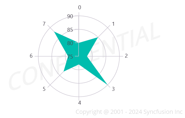
Add a title
The title of the chart provides quick information to the user about the data being plotted in the chart. The Title property is used to set the title for the chart as follows.
<chart:SfPolarChart>
    <chart:SfPolarChart.Title>
        <Label Text = "Plant Analysis" HorizontalTextAlignment = "Center"/>
    </chart:SfPolarChart.Title>
</chart:SfPolarChart>
SfPolarChart chart = new SfPolarChart();
chart.Title = new Label()
{
Text = "Plant Analysis",
HorizontalTextAlignment = TextAlignment.Center
};
this.Content = chart;