Basic Features in .NET MAUI Numeric Entry
Setting Placeholder Text
You can prompt the user with any information using the Placeholder property. Placeholder text will be displayed only when the value of the AllowNull property is true and the value of the NumericEntry control is null. The default value of the Placeholder property is string.Empty (No string will be displayed).
<editors:SfNumericEntry HorizontalOptions="Center"
                     VerticalOptions="Center"
                     Placeholder="Enter input here..." />
SfNumericEntry SfNumericEntry= new SfNumericEntry();
SfNumericEntry.Placeholder = "Enter input here...";
SfNumericEntry.HorizontalOptions = LayoutOptions.Center;
SfNumericEntry.VerticalOptions = LayoutOptions.Center;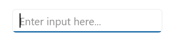
Placeholder Color
The PlaceholderColor property is used to customize the color of the placeholder text in the NumericEntry. By default, the placeholder uses the control’s default text color.
<editors:SfNumericEntry Placeholder="Enter input here..."
                        PlaceholderColor="Gray" />
SfNumericEntry sfNumericEntry = new SfNumericEntry();
sfNumericEntry.Placeholder = "Enter input here...";
sfNumericEntry.PlaceholderColor = Colors.Gray;Clear button visibility
The ShowClearButton property is used to show or hide the clear button in the NumericEntry. By default, visibility of the clear button is enabled.
The clear button appears only when the text box is focused and the
IsEditableproperty value is set to true.
<editors:SfNumericEntry ShowClearButton="True"
                        IsEditable="True"
                        Value="10"/>
SfNumericEntry sfNumericEntry = new SfNumericEntry();
sfNumricEntry.Value=10;
sfNumericEntry.ShowClearButton = true;
sfNumericEntry.IsEditable = true;If IsEditable is true

If IsEditable is false

Clear Button Color
The ClearButtonColor property is used to customize the color of the clear button in the NumericEntry. By default, the clear button uses the control’s default tint.
<editors:SfNumericEntry ShowClearButton="True"
                        IsEditable="True"
                        Value="10"
                        ClearButtonColor="Red" />
SfNumericEntry sfNumericEntry = new SfNumericEntry();
sfNumericEntry.Value = 10;
sfNumericEntry.ShowClearButton = true;
sfNumericEntry.IsEditable = true;
sfNumericEntry.ClearButtonColor = Colors.Red;Value Change Mode
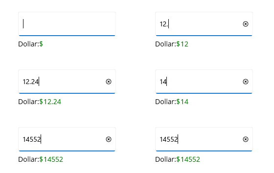
The ValueChangeMode property determine when the values are updated.
The supported value change modes are as follows:
* OnLostFocus - The value will be updated when the editor loses its focus or the focus moved to the next control. By default, the ValueChangeMode is OnLostFocus.
* OnKeyFocus - The value will be updated with each key press.
<VerticalStackLayout Spacing="10" VerticalOptions="Center">
    <editors:SfNumericEntry x:Name="numericEntry"
                            WidthRequest="200"
                            HeightRequest="40"
                            VerticalOptions="Center"
                            ValueChangeMode="OnKeyFocus"
                            Value="50">
    </editors:SfNumericEntry>
    <HorizontalStackLayout Spacing="2" HeightRequest="40" WidthRequest="200">
        <Label Text="Dollar:"  />
        <Label x:Name="valueDisplay"
               TextColor="Green"
               Text="{Binding Path=Value, Source={x:Reference numericEntry}, StringFormat='${0:F2}'}"
               HeightRequest="40" />
    </HorizontalStackLayout>
</VerticalStackLayout>
public partial class MainPage : ContentPage
{
public Label valueDisplay;
public MainPage()
{
InitializeComponent();
var verticalStackLayout = new StackLayout
{
Spacing = 10,
VerticalOptions = LayoutOptions.Center
};
var numericEntry = new SfNumericEntry
{
WidthRequest = 200,
HeightRequest = 40,
VerticalOptions = LayoutOptions.Center,
ValueChangeMode = ValueChangeMode.OnKeyFocus,
Value = 50
};
var horizontalStackLayout = new StackLayout
{
Spacing = 2,
HeightRequest = 40,
WidthRequest = 200
};
var labelDollar = new Label
{
Text = "Dollar:"
};
valueDisplay = new Label
{
Text="$50",
TextColor = Colors.Green
};
numericEntry.ValueChanged += NumericEntry_ValueChanged;
horizontalStackLayout.Children.Add(labelDollar);
horizontalStackLayout.Children.Add(valueDisplay);
verticalStackLayout.Children.Add(numericEntry);
verticalStackLayout.Children.Add(horizontalStackLayout);
Content = verticalStackLayout;
}
private void NumericEntry_ValueChanged(object sender, NumericEntryValueChangedEventArgs e)
{
valueDisplay.Text="$"+e.NewValue.ToString();
}
}
Stroke
The NumericEntry border color can be changed by using the Stroke property. The default Stroke color is Black.
<editors:SfNumericEntry HorizontalOptions="Center"
                        VerticalOptions="Center"
                        Stroke="Red" />
SfNumericEntry sfNumericEntry = new SfNumericEntry();
sfNumericEntry.HorizontalOptions = LayoutOptions.Center;
sfNumericEntry.VerticalOptions = LayoutOptions.Center;
sfNumericEntry.Stroke = Colors.Red;You can find the complete getting started sample of .NET MAUI from this link.
Border visibility
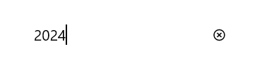
The ShowBorder property of Numeric Entry is used to modify the visibility of the border and its default value is true. The following code example demonstrates how to change the border visibility,
<editors:SfNumericEntry WidthRequest="200"
                        HeightRequest="40"
                        ShowBorder="False"/>
SfNumericEntry sfNumericEntry= new SfNumericEntry();
sfNumericEntry.WidthRequest = 200;
sfNumericEntry.HeightRequest = 40;
sfNumericEntry.ShowBorder = false;The following image illustrates the result of the above code:
TextAlignment
The Numeric Entry provides support to customize the text alignment by using the HorizontalTextAlignment and VerticalTextAlignment properties.
Dynamic changes to the
HorizontalTextAlignmentproperty may not be functioning as expected on Android platform.
<editors:SfNumericEntry WidthRequest="200"
                        HeightRequest="50"
                        HorizontalTextAlignment="Center"
                        VerticalTextAlignment="Start"/>
SfNumericEntry sfNumericEntry= new SfNumericEntry();
sfNumericEntry.WidthRequest = 200;
sfNumericEntry.HeightRequest = 50;
sfNumericEntry.HorizontalTextAlignment = TextAlignment.Center;
sfNumericEntry.VerticalTextAlignment = TextAlignment.Start;The following image illustrates the result of the above code:

Font Customization
The NumericEntry control allows you to customize the appearance of the text using the TextColor, FontSize, FontFamily, and FontAttributes properties.
Text Color
The TextColor property is used to customize the color of the text in the NumericEntry. By default, the control uses its standard text color.
<editors:SfNumericEntry Value="100"
                        TextColor="Blue" />
SfNumericEntry sfNumericEntry = new SfNumericEntry();
sfNumericEntry.Value = 100;
sfNumericEntry.TextColor = Colors.Blue;Font Size
The FontSize property is used to set the size of the text in the NumericEntry. By default, the control uses its standard font size.
<editors:SfNumericEntry Value="100"
                        FontSize="20" />
SfNumericEntry sfNumericEntry = new SfNumericEntry();
sfNumericEntry.Value = 100;
sfNumericEntry.FontSize = 20;Font Family
The FontFamily property is used to set the font family for the text in the NumericEntry. By default, the control uses the platform/default font family.
<editors:SfNumericEntry Value="100"
                        FontFamily="OpenSansRegular" />
SfNumericEntry sfNumericEntry = new SfNumericEntry();
sfNumericEntry.Value = 100;
sfNumericEntry.FontFamily = "OpenSansRegular";Font Attributes
The FontAttributes property is used to set the font style for the text in the NumericEntry. Supported values are Bold, Italic, and None. By default, the control uses its default font attributes.
<editors:SfNumericEntry Value="100"
                        FontAttributes="Bold" />
SfNumericEntry sfNumericEntry = new SfNumericEntry();
sfNumericEntry.Value = 100;
sfNumericEntry.FontAttributes = FontAttributes.Bold;ReturnType
The ReturnType property specifies the return button (e.g., Next, Done, Go) of the keyboard. It helps manage the flow between multiple input fields by defining what happens when the action button is pressed.
You can define the return key type of Numeric Entry by using the ReturnType property.
Default value of ReturnType is
Default.
<editors:SfNumericEntry x:Name="numericEntry"
                        WidthRequest="200"
                        ReturnType="Next"/>
SfNumericEntry sfNumericEntry = new SfNumericEntry();
sfNumericEntry.ReturnType = ReturnType.Next;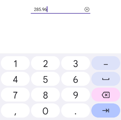
Cursor Position
The CursorPosition property is used to get or set the position of the cursor within the NumericEntry control. The cursor position index starts from 0.
<editors:SfNumericEntry Value="12345"
                        CursorPosition="3" />
SfNumericEntry sfNumericEntry = new SfNumericEntry();
sfNumericEntry.Value = 12345;
sfNumericEntry.CursorPosition = 3;Selection Length
The SelectionLength property is used to get or set the length of the selected text in the NumericEntry control. This can be used with the CursorPosition property to programmatically select a portion of the numeric text.
<editors:SfNumericEntry Value="12345"
                        CursorPosition="1"
                        SelectionLength="3" />
SfNumericEntry sfNumericEntry = new SfNumericEntry();
sfNumericEntry.Value = 12345;
sfNumericEntry.CursorPosition = 1;
sfNumericEntry.SelectionLength = 3;Clear button customization
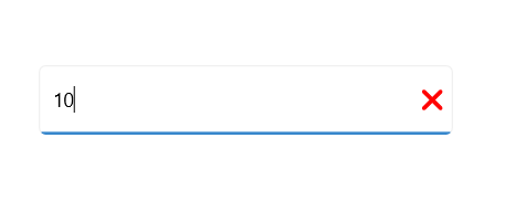
The ClearButtonPath property allows users to set the path for customizing the appearance of the Numeric Entry clear button.
<editors:SfNumericEntry x:Name="numericEntry"
                        ShowClearButton="True"
                        IsEditable="True"
                        Value="10">
            <editors:SfNumericEntry.ClearButtonPath>
                <Path Data="M1.70711 0.292893C1.31658 -0.097631 0.683417 -0.097631 0.292893 0.292893C-0.097631 0.683417 -0.097631 1.31658 0.292893 1.70711L5.58579 7L0.292893 12.2929C-0.097631 12.6834 -0.097631 13.3166 0.292893 13.7071C0.683417 14.0976 1.31658 14.0976 1.70711 13.7071L7 8.41421L12.2929 13.7071C12.6834 14.0976 13.3166 14.0976 13.7071 13.7071C14.0976 13.3166 14.0976 12.6834 13.7071 12.2929L8.41421 7L13.7071 1.70711C14.0976 1.31658 14.0976 0.683417 13.7071 0.292893C13.3166 -0.097631 12.6834 -0.097631 12.2929 0.292893L7 5.58579L1.70711 0.292893Z"
                Fill="Red"
                Stroke="Red"/>
            </editors:SfNumericEntry.ClearButtonPath>
</editors:SfNumericEntry>
private string _customPath = "M1.70711 0.292893C1.31658 -0.097631 0.683417 -0.097631 0.292893 0.292893C-0.097631 0.683417 -0.097631 1.31658 0.292893 1.70711L5.58579 7L0.292893 12.2929C-0.097631 12.6834 -0.097631 13.3166 0.292893 13.7071C0.683417 14.0976 1.31658 14.0976 1.70711 13.7071L7 8.41421L12.2929 13.7071C12.6834 14.0976 13.3166 14.0976 13.7071 13.7071C14.0976 13.3166 14.0976 12.6834 13.7071 12.2929L8.41421 7L13.7071 1.70711C14.0976 1.31658 14.0976 0.683417 13.7071 0.292893C13.3166 -0.097631 12.6834 -0.097631 12.2929 0.292893L7 5.58579L1.70711 0.292893Z";
var converter = new PathGeometryConverter();
var path = new Path()
{
Data = (PathGeometry)converter.ConvertFromInvariantString(_customPath),
Fill = Colors.Red,
Stroke = Colors.Red
};
SfNumericEntry numericEntry = new SfNumericEntry();
numricEntry.Value=10;
numericEntry.ShowClearButton = true;
numericEntry.IsEditable = true;
numericEntry.ClearButtonPath = path;The following image illustrates the result of the above code:
Return Command and Return Command Parameter
-
ReturnCommand, of type ICommand, defines the command to be executed when the return key is pressed. -
ReturnCommandParameter, of type object, specifies the parameter for theReturnCommand.
<ContentPage.BindingContext>
    <local:CommandDemoViewModel/>
</ContentPage.BindingContext>

<editors:SfNumericEntry x:Name="numericEntry"
            ReturnCommand="{Binding AlertCommand}"
            ReturnCommandParameter="Return key is pressed">
</editors:SfNumericEntry>
var viewModel = new CommandDemoViewModel();
SfNumericEntry numericEntry = new SfNumericEntry();
numericEntry.ReturnCommand = viewModel.AlertCommand;
numericEntry.ReturnCommandParameter = "Return key is pressed";//ViewModel.cs
public class CommandDemoViewModel
{
public ICommand AlertCommand => new Command<string>(OnAlertCommandExecuted);
private async void OnAlertCommandExecuted(string parameter)
{
await Application.Current.MainPage.DisplayAlert("Alert", parameter, "OK");
}
}