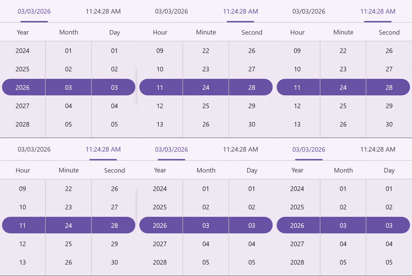
Customizations in .NET MAUI Date Time Picker control
The .NET MAUI Date Time Picker header, column header, footer, and selection views can be customized.
Header Customization
Customize the Date Time Picker header by using the HeaderView property of the SfDateTimePicker.
Date Time Picker header
The Date Time Picker provide pre-defined header text. By default it shows the current date and time. If you want to change the header text using the DateFormat and TimeFormat properties in SfDateTimePicker.
Set the divider color
The SfDateTimePicker control allows you to customize the header divider color by setting the DividerColor property of the DateTimePickerHeaderView.
<picker:SfDateTimePicker>
    <picker:SfDateTimePicker.HeaderView>
        <picker:DateTimePickerHeaderView DividerColor="Red" />
    </picker:SfDateTimePicker.HeaderView>
</picker:SfDateTimePicker>
SfDateTimePicker dateTimePicker = new SfDateTimePicker();
dateTimePicker.HeaderView = new DateTimePickerHeaderView()
{
DividerColor = Colors.Red,
};
this.Content = dateTimePicker;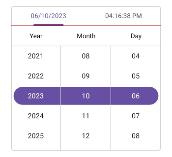
Customization of the header
Customize the header text style and background color of the Date Time picker using the TextStyle and Background properties of the HeaderView in theDateTimePickerHeaderView.
<picker:SfDateTimePicker>
    <picker:SfDateTimePicker.HeaderView>
        <picker:DateTimePickerHeaderView Background="#D3D3D3">
            <picker:DateTimePickerHeaderView.TextStyle>
                <picker:PickerTextStyle FontSize="15" TextColor="Black" />
            </picker:DateTimePickerHeaderView.TextStyle>
        </picker:DateTimePickerHeaderView>
    </picker:SfDateTimePicker.HeaderView>
</picker:SfDateTimePicker>
SfDateTimePicker dateTimePicker = new SfDateTimePicker();
dateTimePicker.HeaderView = new DateTimePickerHeaderView()
{
Background = Color.FromArgb("#D3D3D3"),
TextStyle = new PickerTextStyle()
{
TextColor = Colors.White,
FontSize = 15,
}
};
this.Content = dateTimePicker;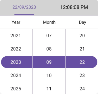
Column Header Customization
Customize the Date Time Picker column header by using the ColumnHeaderView property of the SfDateTimePicker.
Set the custom column header
The SfDateTimePicker provides a custom text to its column header by setting the ColumnHeaderView property of the SfDateTimePicker, which has DayHeaderText, MonthHeaderText, YearHeaderText, HourHeaderText, MinuteHeaderText, SecondHeaderText, MilliSecondHeaderText, and MeridiemHeaderText properties in the DateTimePickerColumnHeaderView. The default value of DayHeaderText is “Day”, MonthHeaderText is “Month”, YearHeaderText is “Year”, HourHeaderText is “Hour”, MinuteHeaderText is “Minute”, SecondHeaderText is “Second”, MilliSecondHeaderText is “MilliSecond”, and MeridiemHeaderText is “string.Empty”.
<picker:SfDateTimePicker>
    <picker:SfDateTimePicker.ColumnHeaderView>
        <picker:DateTimePickerColumnHeaderView
            DayHeaderText="Day Column" MonthHeaderText="Month Column" YearHeaderText="Year Column"
            HourHeaderText="Hour Column" MinuteHeaderText="Minute Column" SecondHeaderText="Second Column" MilliSecondHeaderText="MilliSecond Column" MeridiemHeaderText="Meridiem Column" />
    </picker:SfDateTimePicker.ColumnHeaderView>
</picker:SfDateTimePicker>
SfDateTimePicker dateTimePicker = new SfDateTimePicker();
dateTimePicker.ColumnHeaderView = new DateTimePickerColumnHeaderView()
{
DayHeaderText = "Day Column",
MonthHeaderText = "Month Column",
YearHeaderText = "Year Column",
HourHeaderText = "Hour Column",
MinuteHeaderText = "Minute Column",
SecondHeaderText = "Second Column",
MilliSecondHeaderText = "MilliSecond Column",
MeridiemHeaderText = "Meridiem Column",
};
this.Content = dateTimePicker;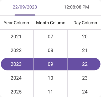
Set the divider color
The SfDateTimePicker control allows you to customize the column header divider color by setting the DividerColor property of the DatePickerColumnHeaderView.
<picker:SfDateTimePicker>
    <picker:SfDateTimePicker.ColumnHeaderView>
        <picker:DateTimePickerColumnHeaderView DividerColor="Red" />
    </picker:SfDateTimePicker.ColumnHeaderView>
</picker:SfDateTimePicker>
SfDateTimePicker dateTimePicker = new SfDateTimePicker();
dateTimePicker.ColumnHeaderView = new DateTimePickerColumnHeaderView()
{
DividerColor = Colors.Red,
};
this.Content = dateTimePicker;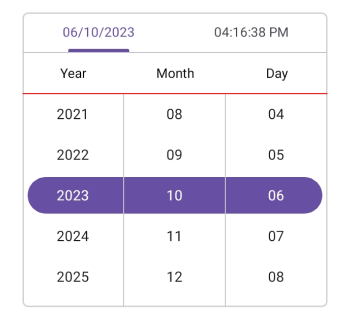
Customization of the column header
Customize the column header view text style and background color of the Date Time Picker using the TextStyle and Background properties of the DateTimePickerColumnHeaderView.
<picker:SfDateTimePicker>
    <picker:SfDateTimePicker.ColumnHeaderView>
        <picker:DateTimePickerColumnHeaderView Background="#D3D3D3">
            <picker:DateTimePickerColumnHeaderView.TextStyle>
                <picker:PickerTextStyle FontSize="15" TextColor="Black" />
            </picker:DateTimePickerColumnHeaderView.TextStyle>
        </picker:DateTimePickerColumnHeaderView>
    </picker:SfDateTimePicker.ColumnHeaderView>
</picker:SfDateTimePicker>
SfDateTimePicker dateTimePicker = new SfDateTimePicker();
dateTimePicker.ColumnHeaderView = new DateTimePickerColumnHeaderView()
{
Background = Color.FromArgb("#D3D3D3"),
TextStyle = new PickerTextStyle()
{
TextColor = Colors.Black,
FontSize = 15,
},
};
this.Content = dateTimePicker;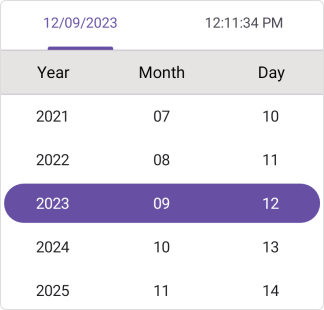
Footer Customization
Customize the Date Time Picker footer view by using the FooterView property of the SfDateTimePicker.
Set the footer text with Ok and Cancel button customizations
In the SfDateTimePicker control, validation buttons (OK and Cancel) can be customized by setting the OkButtonText and CancelButtonText properties of the PickerFooterView. It allows you to confirm or cancel the selected date and time. The OkButtonText can be enabled using the ShowOkButton property in the PickerFooterView. The default value of the OkButtonText property is “OK”, and CancelButtonText is “Cancel”. To enable the footer view, set the Height property of the PickerFooterView to a value greater than 0. The default value of the Height property is 0.
<picker:SfDateTimePicker x:Name="dateTimePicker" >
    <picker:SfDateTimePicker.FooterView >
        <picker:PickerFooterView Height="40" OkButtonText="Save"
                                 CancelButtonText="Exit"/>
    </picker:SfDateTimePicker.FooterView>
</picker:SfDateTimePicker>
SfDateTimePicker dateTimePicker = new SfDateTimePicker();
dateTimePicker.FooterView = new PickerFooterView()
{
Height = 40,
OkButtonText = "Save",
CancelButtonText = "Exit",
};
this.Content = dateTimePicker;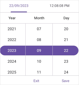
Set the divider color
The SfDateTimePicker control allows you to customize the footer divider color by setting the DividerColor property of the PickerFooterView.
<picker:SfDateTimePicker x:Name="dateTimePicker" >
    <picker:SfDateTimePicker.FooterView >
        <picker:PickerFooterView DividerColor="Red" />
    </picker:SfDateTimePicker.FooterView>
</picker:SfDateTimePicker>
SfDateTimePicker dateTimePicker = new SfDateTimePicker();
dateTimePicker.FooterView = new PickerFooterView()
{
DividerColor = Colors.Red,
};
this.Content = dateTimePicker;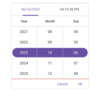
Customization of the footer
Customize the footer text style and background color of the Date Time Picker using the TextStyle and Background properties of the PickerFooterView.
<picker:SfDateTimePicker x:Name="dateTimePicker" >
    <picker:SfDateTimePicker.FooterView >
        <picker:PickerFooterView Background="#D3D3D3">
            <picker:PickerFooterView.TextStyle >
                <picker:PickerTextStyle FontSize="15" TextColor="Black" />
            </picker:PickerFooterView.TextStyle>
        </picker:PickerFooterView>
    </picker:SfDateTimePicker.FooterView>
</picker:SfDateTimePicker>
SfDateTimePicker dateTimePicker = new SfDateTimePicker();
dateTimePicker.FooterView = new PickerFooterView()
{
Background = Color.FromArgb("#D3D3D3"),
TextStyle = new PickerTextStyle()
{
TextColor = Colors.Black,
FontSize = 15,
}
};
this.Content = dateTimePicker;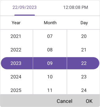
Selection View Customization
Customize the Date Time Picker selection view by using the SelectionView property of the SfDateTimePicker.
Set the selection view
In the SfDateTimePicker control, the corner radius, stroke , and padding can be customized by setting the CornerRadius, Stroke, and Padding properties in the PickerSelectionView.
<picker:SfDateTimePicker x:Name="dateTimePicker" >
    <picker:SfDateTimePicker.SelectionView >
        <picker:PickerSelectionView CornerRadius="10" Stroke="#36454F" Padding="10, 5, 10, 5" Background="#808080" />
    </picker:SfDateTimePicker.SelectionView>
</picker:SfDateTimePicker>
SfDateTimePicker dateTimePicker = new SfDateTimePicker();
dateTimePicker.SelectionView = new PickerSelectionView()
{
CornerRadius = 10,
Stroke = Color.FromArgb("#36454F"),
Pading = new Thickness(10, 5, 10, 5),
Background = Color.FromArgb("#808080"),
};
this.Content = dateTimePicker;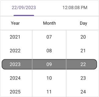
Customization of the selected item
Customize the selected view text style of the Date Time Picker using the SelectedTextStyle property of the SfDateTimePicker.
<picker:SfDateTimePicker x:Name="dateTimePicker" >
    <picker:SfDateTimePicker.SelectedTextStyle >
        <picker:PickerTextStyle FontSize="15" TextColor="White"/>
    </picker:SfDateTimePicker.SelectedTextStyle>
</picker:SfDateTimePicker>
SfDateTimePicker dateTimePicker = new SfDateTimePicker();
dateTimePicker.SelectedTextStyle = new PickerTextStyle()
{
TextStyle = new PickerTextStyle()
{
TextColor = Colors.White,
FontSize = 15,
}
};
this.Content = dateTimePicker;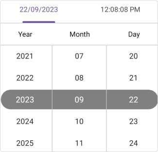
Column divider color
Customize the column divider color using the ColumnDividerColor property in SfDateTimePicker.
<picker:SfDateTimePicker x:Name="dateTimePicker"
                         ColumnDividerColor="Red">
</picker:SfDateTimePicker>
SfDateTimePicker dateTimePicker = new SfDateTimePicker();
dateTimePicker.ColumnDividerColor = Colors.Red;
this.Content = dateTimePicker;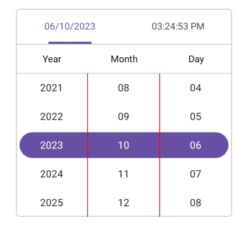
Customization of Active View
Active View
You can control the initial active tab (Date or Time) in the SfDateTimePicker by setting the ActiveView property. This property uses the DateTimePickerView enumeration with two values: Date and Time. The default value is Date.
<picker:SfDateTimePicker ActiveView="Time">

</picker:SfDateTimePicker>
using Syncfusion.Maui.Toolkit.Picker;
. . .
public partial class MainPage : ContentPage
{
public MainPage()
{
InitializeComponent();
SfDateTimePicker sfDateTimePicker = new SfDateTimePicker();
sfDateTimePicker.ActiveView = DateTimePickerView.Time;
this.Content = sfDateTimePicker;
}
}