How can I help you?
Customization in .NET MAUI Bottom Sheet (SfBottomSheet)
A Bottom Sheet consists of several elements that can be customized to enhance its appearance and functionality.
Popup mode
The IsModal property controls whether background interaction is disabled when a Bottom Sheet is open. When set to True, a gray overlay blocks interaction with the background, and tapping it closes the sheet. When set to False, the overlay is invisible, allowing users to interact with the content behind the sheet.
<bottomSheet:SfBottomSheet x:Name="bottomSheet" IsModal="True">
    <bottomSheet:SfBottomSheet.BottomSheetContent>
        <!--Add your content here-->
    </bottomSheet:SfBottomSheet.BottomSheetContent>
</bottomSheet:SfBottomSheet>
SfBottomSheet bottomSheet = new SfBottomSheet
{
IsModal = true
};
State
The state of the Bottom Sheet can be controlled using the State property. The default value is Hidden. This property accepts the following values:
- FullExpanded - The sheet will expand to cover the full screen.
- HalfExpanded - The sheet will expand to cover half of the screen.
- Collapsed - The sheet will remain collapsed at the bottom of the screen.
- Hidden - The sheet will remain hidden.
The State property works together with the AllowedState property to control the allowed states of the Bottom Sheet.
<bottomSheet:SfBottomSheet x:Name="bottomSheet" State="FullExpanded">
    <bottomSheet:SfBottomSheet.BottomSheetContent>
        <!--Add your content here-->
    </bottomSheet:SfBottomSheet.BottomSheetContent>
</bottomSheet:SfBottomSheet>
SfBottomSheet bottomSheet = new SfBottomSheet();
bottomSheet.State = BottomSheetState.FullExpanded;Allowed state
The Bottom Sheet allows controlling the transition between states using the AllowedState property. The default value is All, which allows transitions between all available states. This property accepts the following values:
- FullExpanded - Allows transitions only between FullExpanded and Collapsed states.
- HalfExpanded - Allows transitions only between HalfExpanded and Collapsed states.
- All - Allows transitions between all available states (FullExpanded, HalfExpanded, Collapsed, and Hidden).
<bottomSheet:SfBottonSheet x:Name="bottomSheet" AllowedState="HalfExpanded" >
    <bottomSheet:SfBottonSheet.BottomSheetContent>
        <!--Add your content here-->
    </bottomSheet:SfBottonSheet.BottomSheetContent>
</bottomSheet:SfBottonSheet>
SfBottomSheet bottomSheet = new SfBottomSheet();
bottomSheet.AllowedState = BottomSheetAllowedState.HalfExpanded;Overlay tap to collapse
The CollapseOnOverlayTap property enables the Bottom Sheet to collapse when the user taps on the overlay (outside the sheet). This enhances user interaction by allowing easy dismissal of the sheet without fully closing it.
<bottomSheet:SfBottomSheet x:Name="bottomSheet" CollapseOnOverlayTap="True">
    <bottomSheet:SfBottomSheet.BottomSheetContent>
        <!--Add your content here-->
    </bottomSheet:SfBottomSheet.BottomSheetContent>
</bottomSheet:SfBottomSheet>
SfBottomSheet bottomSheet = new SfBottomSheet();
bottomSheet.CollapseOnOverlayTap = true;
Content padding
The ContentPadding property of the Bottom Sheet adds space around the content, creating a gap between the Bottom Sheet content and the edges.
<bottomSheet:SfBottomSheet x:Name="bottomSheet" ContentPadding="15">
    <bottomSheet:SfBottomSheet.BottomSheetContent>
        <!--Add your content here-->
    </bottomSheet:SfBottomSheet.BottomSheetContent>
</bottomSheet:SfBottomSheet>
SfBottomSheet bottomSheet = new SfBottomSheet();
bottomSheet.ContentPadding = new Thickness(15);Background
The Background property allows you to customize the background color of the Bottom Sheet.
<bottomSheet:SfBottomSheet x:Name="bottomSheet" Background="Beige">
    <bottomSheet:SfBottomSheet.BottomSheetContent>
        <!--Add your content here-->
    </bottomSheet:SfBottomSheet.BottomSheetContent>
</bottomSheet:SfBottomSheet>
SfBottomSheet bottomSheet = new SfBottomSheet
{
Background = Colors.Beige
};
Corner radius
The CornerRadius property allows you to add a corner radius to the Bottom Sheet.
<bottomSheet:SfBottomSheet x:Name="bottomSheet" CornerRadius="15, 15, 0, 0">
    <bottomSheet:SfBottomSheet.BottomSheetContent>
        <!--Add your content here-->
    </bottomSheet:SfBottomSheet.BottomSheetContent>
</bottomSheet:SfBottomSheet>
SfBottomSheet bottomSheet = new SfBottomSheet
{
CornerRadius = new CornerRadius(15, 15, 0, 0)
};
Adjust the height
Full expanded height
The FullExpandedRatio property adjusts the height of the Bottom Sheet when it is in the FullExpanded state. The default value is 1. You can set a value between 0.1 and 1 to adjust the height.
<bottomSheet:SfBottomSheet x:Name="bottomSheet" FullExpandedRatio="0.8" State="FullExpanded">
 <bottomSheet:SfBottomSheet.BottomSheetContent>
     <!--Add your content here-->
 </bottomSheet:SfBottomSheet.BottomSheetContent>
</bottomSheet:SfBottomSheet>
SfBottomSheet bottomSheet = new SfBottomSheet();
bottomSheet.FullExpandedRatio = 0.8;
bottomSheet.State = BottomSheetState.FullExpanded;Half expanded height
The HalfExpandedRatio property adjusts the height of the Bottom Sheet when it is in the HalfExpanded state. The default value is 0.5. You can set a value between 0.1 and 0.9 to adjust the height.
<bottomSheet:SfBottomSheet x:Name="bottomSheet" HalfExpandedRatio="0.7" State="HalfExpanded">
    <bottomSheet:SfBottomSheet.BottomSheetContent>
        <!--Add your content here-->
    </bottomSheet:SfBottomSheet.BottomSheetContent>
</bottomSheet:SfBottomSheet>
SfBottomSheet bottomSheet = new SfBottomSheet();
bottomSheet.HalfExpandedRatio = 0.7;
bottomSheet.State = BottomSheetState.HalfExpanded;Collapsed height
The CollapsedHeight property allows you to specify the height of the Bottom Sheet when it is in the Collapsed state. The default value is 100.
<bottomSheet:SfBottomSheet x:Name="bottomSheet" CollapsedHeight="150">
    <bottomSheet:SfBottomSheet.BottomSheetContent>
        <!--Add your content here-->
    </bottomSheet:SfBottomSheet.BottomSheetContent>
</bottomSheet:SfBottomSheet>
SfBottomSheet bottomSheet = new SfBottomSheet();
bottomSheet.CollapsedHeight = 150;Adjust the width
The ContentWidthMode property allows you to adjust the width of the Bottom Sheet. The default value is Full.
- Full - The sheet will occupy the entire screen width.
- Custom - The sheet will adjust its width based on the value set in the BottomSheetContentWidth property.
The BottomSheetContentWidth property allows you to adjust the width of the Bottom Sheet when it is in Custom content width mode. The default value is 300.
<bottomSheet:SfBottomSheet x:Name="bottomSheet" ContentWidthMode="Custom" BottomSheetContentWidth="500">
    <bottomSheet:SfBottomSheet.BottomSheetContent>
        <!--Add your content here-->
    </bottomSheet:SfBottomSheet.BottomSheetContent>
</bottomSheet:SfBottomSheet>
SfBottomSheet bottomSheet = new SfBottomSheet
{
ContentWidthMode = BottomSheetContentWidthMode.Custom,
BottomSheetContentWidth = 500
};
Grabber customization
Show grabber
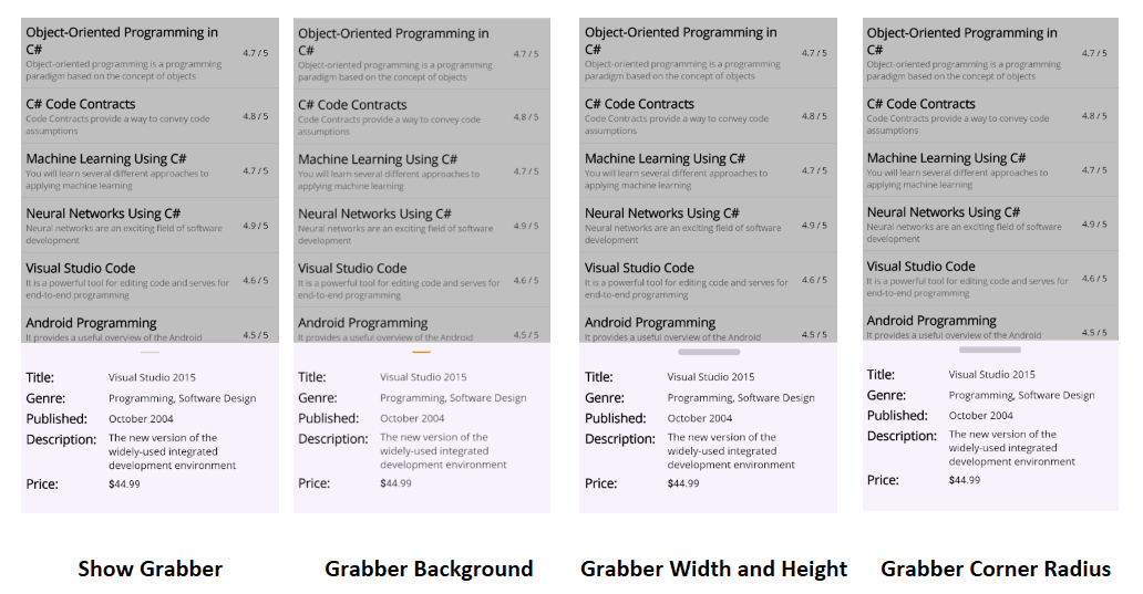
The ShowGrabber property enables users to interact with the Bottom Sheet by dragging it up and down. By default, the ShowGrabber property is set to true.
<bottomSheet:SfBottomSheet x:Name="bottomSheet" ShowGrabber="True">
    <bottomSheet:SfBottomSheet.BottomSheetContent>
        <!--Add your content here-->
    </bottomSheet:SfBottomSheet.BottomSheetContent>
</bottomSheet:SfBottomSheet>
SfBottomSheet bottomSheet = new SfBottomSheet
{
ShowGrabber = true
};Grabber width and Grabber height
The GrabberWidth and GrabberHeight properties of the Bottom Sheet specify the width and height of the grabber element. By default, the GrabberWidth property is set to 32, and the GrabberHeight property is set to 4.
<bottomSheet:SfBottomSheet x:Name="bottomSheet" GrabberHeight="12" GrabberWidth="100">
    <bottomSheet:SfBottomSheet.BottomSheetContent>
        <!--Add your content here-->
    </bottomSheet:SfBottomSheet.BottomSheetContent>
</bottomSheet:SfBottomSheet>
SfBottomSheet bottomSheet = new SfBottomSheet
{
GrabberHeight = 12,
GrabberWidth = 100
};Grabber corner radius
The GrabberCornerRadius property allows you to customize the corner radius of the grabber element in the Bottom Sheet. By adjusting this property, you can create rounded corners for the grabber.
<bottomSheet:SfBottomSheet x:Name="bottomSheet" GrabberCornerRadius="3">
    <bottomSheet:SfBottomSheet.BottomSheetContent>
        <!--Add your content here-->
    </bottomSheet:SfBottomSheet.BottomSheetContent>
</bottomSheet:SfBottomSheet>
SfBottomSheet bottomSheet = new SfBottomSheet
{
GrabberCornerRadius = new CornerRadius(3)
};Grabber background
The GrabberBackground property allows you to customize the background color of the grabber in the Bottom Sheet.
<bottomSheet:SfBottomSheet x:Name="bottomSheet" GrabberBackground="Red">
    <bottomSheet:SfBottomSheet.BottomSheetContent>
        <!--Add your content here-->
    </bottomSheet:SfBottomSheet.BottomSheetContent>
</bottomSheet:SfBottomSheet>
SfBottomSheet bottomSheet = new SfBottomSheet
{
GrabberBackground = Colors.Red
};
Grabber area height
The GrabberAreaHeight feature in the Bottom Sheet control allows developers to adjust the height of the drag area, thus enhancing both usability and appearance.
<bottomSheet:SfBottomSheet x:Name="bottomSheet" GrabberAreaHeight="100">
    <bottomSheet:SfBottomSheet.BottomSheetContent>
        <!--Add your content here-->
    </bottomSheet:SfBottomSheet.BottomSheetContent>
</bottomSheet:SfBottomSheet>
SfBottomSheet bottomSheet = new SfBottomSheet
{
GrabberAreaHeight = 100
};