Getting Started with MAUI Accordion
This section guides you through setting up and configuring a Accordion in your .NET MAUI application. Follow the steps below to add a basic Accordion to your project.
Prerequisites
Before proceeding, ensure the following are set up:
- Install .NET 9 SDK or later.
- Set up a .NET MAUI environment with Visual Studio 2022 v17.12 or later.
Step 1: Create a new .NET MAUI project
- Go to File > New > Project and choose the .NET MAUI App template.
- Name the project and choose a location. Then click Next.
- Select the .NET framework version and click Create.
Step 2: Install the Syncfusion® .NET MAUI Toolkit NuGet package
- In Solution Explorer, right-click the project and choose Manage NuGet Packages.
- Search for Syncfusion.Maui.Toolkit and install the latest version.
- Ensure the necessary dependencies are installed correctly, and the project is restored.
Prerequisites
Before proceeding, ensure the following are set up:
- Install .NET 9 SDK or later.
- Set up a .NET MAUI environment with Visual Studio Code.
- Ensure that the .NET MAUI workloads are installed and configured as described here.
Step 1: Create a new .NET MAUI project
- Open the command palette by pressing
Ctrl+Shift+Pand type .NET:New Project and enter. - Choose the .NET MAUI App template.
- Select the project location, type the project name and press Enter.
- Then choose Create project.
Step 2: Install the Syncfusion® .NET MAUI Toolkit NuGet package
- Press Ctrl + ` (backtick) to open the integrated terminal in Visual Studio Code.
- Ensure you’re in the project root directory where your .csproj file is located.
- Run the command
dotnet add package Syncfusion.Maui.Toolkitto install the Syncfusion® .NET MAUI Toolkit NuGet package. - To ensure all dependencies are installed, run
dotnet restore.
Prerequisites
Before proceeding, ensure the following are set up:
- Install .NET 9 SDK or later.
- Set up a .NET MAUI environment with JetBrains Rider 2024.3 or later.
- Make sure the MAUI workloads are installed and configured as described here.
Step 1: Create a new .NET MAUI project
- Go to File > New Solution, Select .NET (C#) and choose the .NET MAUI App template.
- Enter the Project Name, Solution Name, and Location.
- Select the .NET framework version and click Create.
Step 2: Install the Syncfusion® MAUI Toolkit NuGet package
- In Solution Explorer, right-click the project and choose Manage NuGet Packages.
- Search for Syncfusion.Maui.Toolkit and install the latest version.
- Ensure the necessary dependencies are installed correctly, and the project is restored. If not, Open the Terminal in Rider and manually run:
dotnet restore
Step 3: Register Syncfusion handler
Make sure to add the namespace.
using Syncfusion.Maui.Toolkit.Hosting;Register the Syncfusion toolkit handler in your CreateMauiApp method of MauiProgram.cs file to use Syncfusion controls.
builder.ConfigureSyncfusionToolkit();Step 4: Import Accordion namespace
Add the following namespace in your XAML or C#.
xmlns:syncfusion="clr-namespace:Syncfusion.Maui.Toolkit.Accordion;assembly=Syncfusion.Maui.Toolkit"using Syncfusion.Maui.Toolkit.Accordion;Step 5: Add an Accordion component
Create an AccordionItem instance containing a header and content, and then add it to the Items collection of SfAccordion.
In this example, a Grid is loaded in both the header and content of accordion items.
NOTE
When loading Label as direct children of
HeaderorContentofAccordionItem, then it will lead to an exception. So, loadLabelinsideGridto overcome the crash.
<syncfusion:SfAccordion>
<syncfusion:SfAccordion.Items>
<syncfusion:AccordionItem>
<syncfusion:AccordionItem.Header>
<Grid HeightRequest="48">
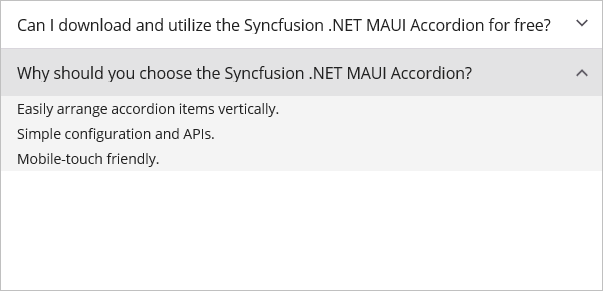
<Label Text="Can I download and utilize the Syncfusion .NET MAUI Accordion for free?"
Margin="16,14,0,14" />
</Grid>
</syncfusion:AccordionItem.Header>
<syncfusion:AccordionItem.Content>
<Grid BackgroundColor="#f4f4f4"
RowDefinitions="Auto">
<Label Text="No, this is a commercial product and requires a paid license. However, a free community license is also available for companies and individuals whose organizations have less than $1 million USD in annual gross revenue, 5 or fewer developers, and 10 or fewer total employees."
Margin="16,3,0,3"
FontSize="12" />
</Grid>
</syncfusion:AccordionItem.Content>
</syncfusion:AccordionItem>
<syncfusion:AccordionItem>
<syncfusion:AccordionItem.Header>
<Grid HeightRequest="48">
<Label Text="Why should you choose the Syncfusion .NET MAUI Accordion?"
Margin="16,14,0,14" />
</Grid>
</syncfusion:AccordionItem.Header>
<syncfusion:AccordionItem.Content>
<Grid BackgroundColor="#f4f4f4"
RowDefinitions="Auto,Auto,Auto">
<Label Grid.Row="0"
Text="Easily arrange accordion items vertically."
FontSize="12"
Margin="16,3,0,3" />
<Label Grid.Row="1"
Text="Simple configuration and APIs."
FontSize="12"
Margin="16,3,0,3" />
<Label Grid.Row="2"
Text="Mobile-touch friendly."
FontSize="12"
Margin="16,3,0,3" />
</Grid>
</syncfusion:AccordionItem.Content>
</syncfusion:AccordionItem>
</syncfusion:SfAccordion.Items>
</syncfusion:SfAccordion>var accordion = new SfAccordion
{
Margin = new Thickness(0, 50, 0, 0)
};
var item1 = new AccordionItem();
item1.Header = new Grid
{
HeightRequest = 48,
Children =
{
new Label
{
Text = "Can I download and utilize the Syncfusion .NET MAUI Accordion for free?",
Margin = new Thickness(16,14,0,14)
}
}
};
var contentGrid1 = new Grid
{
BackgroundColor = Color.FromArgb("#f4f4f4"),
RowDefinitions =
{
new RowDefinition { Height = GridLength.Auto }
}
};
var contentLabel1 = new Label
{
Text = "No, this is a commercial product and requires a paid license. However, a free community license is also available for companies and individuals whose organizations have less than $1 million USD in annual gross revenue, 5 or fewer developers, and 10 or fewer total employees.",
Margin = new Thickness(16, 3, 0, 3),
FontSize = 12
};
Grid.SetRow(contentLabel1, 0);
contentGrid1.Children.Add(contentLabel1);
item1.Content = contentGrid1;
var item2 = new AccordionItem();
item2.Header = new Grid
{
HeightRequest = 48,
Children =
{
new Label
{
Text = "Why should you choose the Syncfusion .NET MAUI Accordion?",
Margin = new Thickness(16,14,0,14)
}
}
};
var contentGrid2 = new Grid
{
BackgroundColor = Color.FromArgb("#f4f4f4"),
RowDefinitions =
{
new RowDefinition { Height = GridLength.Auto },
new RowDefinition { Height = GridLength.Auto },
new RowDefinition { Height = GridLength.Auto }
}
};
var label1 = new Label
{
Text = "Easily arrange accordion items vertically.",
FontSize = 12,
Margin = new Thickness(16, 3, 0, 3)
};
Grid.SetRow(label1, 0);
var label2 = new Label
{
Text = "Simple configuration and APIs.",
FontSize = 12,
Margin = new Thickness(16, 3, 0, 3)
};
Grid.SetRow(label2, 1);
var label3 = new Label
{
Text = "Mobile-touch friendly.",
FontSize = 12,
Margin = new Thickness(16, 3, 0, 3)
};
Grid.SetRow(label3, 2);
contentGrid2.Children.Add(label1);
contentGrid2.Children.Add(label2);
contentGrid2.Children.Add(label3);
item2.Content = contentGrid2;
accordion.Items.Add(item1);
accordion.Items.Add(item2);
Content = accordion;The following screenshot illustrates the result of the above code.
NOTE
When adding the template control inside the
Gridwith a height set toAuto, the child element will not receive the height changes at runtime. Since theSfAccordionis a template-based control, the default height value cannot be determined. Therefore, it is recommended to provide theHorizontalOptionsandVerticalOptionsasFillAndExpandoptions for the control.
You can download the Accordion Getting Started sample from here.