How can I help you?
Drag and Drop Support
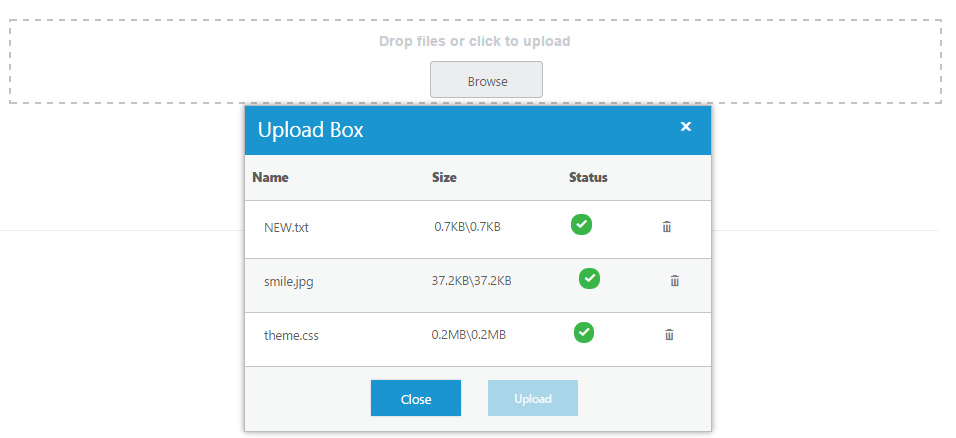
The Uploadbox control provides the drag and drop support. You can simply drag-and-drop files, directly from the computer and can be dropped into the droppable area. A list of files can be dragged and dropped when you enable the multipleFilesSelection.
The following screenshot displays the drag and drop support.

Enable drag and drop
You can enable or disable drag and drop by using the allowDragAndDrop property. By default, the allowDragAndDrop property is set as false in the Uploadbox control. You can enable drag and drop by setting the allowDragAndDrop property as true. When you want to drag and drop multiple files, you can enable multiple file selection by setting multipleFilesSelection as true in the Uploadbox control.
The following steps explain how to enable the drag and drop in the Uploadbox control.
In the HTML page, add a <div> element to enable the drag and drop in Uploadbox control.
<div class="frame">
    <div class="control">
        <div id="Uploadbox"></div>
    </div>
</div>// Initialize the UploadBox by using the following code example.
$(function () {
// declaration
$("#Uploadbox").ejUploadbox({
saveUrl: "http://js.syncfusion.com/demos/web/uploadbox/saveFiles.ashx",
removeUrl: "http://js.syncfusion.com/demos/web/uploadbox/removeFiles.ashx",
allowDragAndDrop: true,
multipleFilesSelection: true
});
});To know about file action, refer to the following link: https://help.syncfusion.com/js/uploadbox/file-actions
In CSS, configure the custom styles for drag and drop.
<style>
    .frame {
        width: 500px;
        height: 100px;
        margin-top: 10%;
    }

    .control {
        width: 100%;
        height: 100%;
    }
</style>
The following screenshot displays the output for the above code.
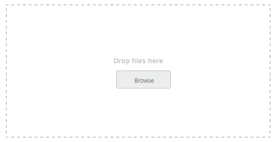
Drag Area text
You can change the drag area text by using the dragAreaText property. By default, the dragAreaText (string) property is Drop files or click to upload in the Uploadbox control.
In the HTML page, add a <div> element to enable the drag and drop in the Uploadbox control.
<div class="frame">
    <div class="control">
        <div id="Uploadbox"></div>
    </div>
</div>// Initialize the UploadBox using the following code example.
$(function () {
// declaration
$("#Uploadbox").ejUploadbox({
saveUrl: "http://js.syncfusion.com/demos/web/uploadbox/saveFiles.ashx",
removeUrl: "http://js.syncfusion.com/demos/web/uploadbox/removeFiles.ashx",
allowDragAndDrop: true,
dragAreaText: "Drop files here",
multipleFilesSelection: true
});
});In CSS, configure the custom styles for drag and drop.
<style>
    .frame {
        width: 500px;
        height: 100px;
        margin-top: 10%;
    }

    .control {
        width: 100%;
        height: 100%;
    }
</style>
The following screenshot displays the output for the above code.

Adjust Drop area size
The Uploadbox control provides the ability to change or adjust the drop area size. The dropAreaHeight and dropAreaWidth properties in the Uploadbox control allows you to set the maximum height and maximum width for the drop area. The value set to this property is string or number type.
The following steps explain you on how to adjust the Drop Area Size.
In the HTML page, add a <div> element to enable the drag and drop in Uploadbox control.
<div class="control">
    <div id="Uploadbox"></div>
</div>// Initialize the Uploadbox using the following code example.
$(function () {
// declaration
$("#Uploadbox").ejUploadbox({
saveUrl: "http://js.syncfusion.com/demos/web/uploadbox/saveFiles.ashx",
removeUrl: "http://js.syncfusion.com/demos/web/uploadbox/removeFiles.ashx",
allowDragAndDrop: true,
multipleFilesSelection: true,
dropAreaHeight: "300px",
dropAreaWidth: "600px"
});
});The following screenshot displays the output for the above code.
Drop area with Browse button behavior
You can click anywhere in the droppable area to browse and upload the files. The droppable area behaves like a browse button.
Droppable area behavior
Enable the allowDragAndDrop property to achieve this feature. Next, set the showBrowseButton as false in Uploadbox Control.
The following steps explain the droppable area containing the browse button behavior.
In the HTML page, add a <div> element to enable drag and drop in the Uploadbox control.
<div class="frame">
    <div class="control">
        <div id="Uploadbox"></div>
    </div>
</div>// Initialize the Uploadbox by using the following code example.
$(function () {
// declaration
$("#Uploadbox").ejUploadbox({
saveUrl: "http://js.syncfusion.com/demos/web/uploadbox/saveFiles.ashx",
removeUrl: "http://js.syncfusion.com/demos/web/uploadbox/removeFiles.ashx",
allowDragAndDrop: true,
showBrowseButton: false,
multipleFilesSelection: true
});
});In CSS, configure the custom styles for drag and drop.
<style>
    .frame {
        width: 500px;
        height: 100px;
        margin-top: 10%;
    }

    .control {
        width: 100%;
        height: 100%;
    }
</style>
The following screenshot displays the output for the above code.