How can I help you?
Tooltip
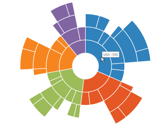
ToolTip allows you to display any information over a sunburst segment. It appears when mouse hovered over or touch any chart segment. By default, it displays the corresponding segment category name and its value
you can set the visible property as true or false.
$("#chart").ejSunburstChart ({
    //...
	tooltip: {visible: true},
    //..

   });
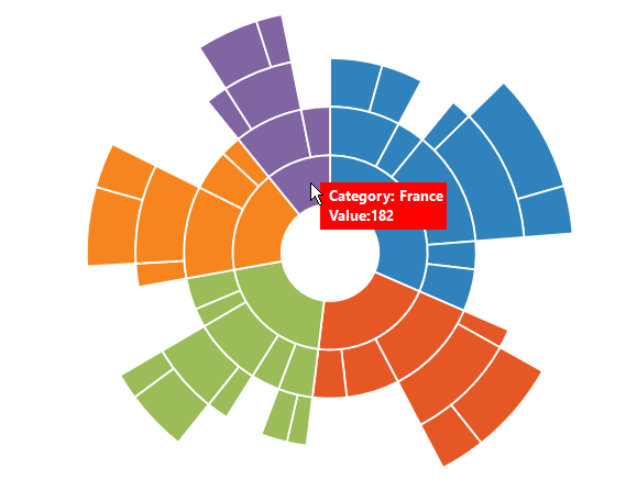
Tooltip Template
HTML elements can be displayed in the tooltip by using the template property of the tooltip. The template property takes the value of the id attribute of the HTML element. You can use this format #point.x# and #point.y# as place holders in the HTML element to display the x and y values of the corresponding point.
<div id="Tooltip" style="display: none;">
<div id="value" style="background-color:red;padding-top:3px;padding-right:3px">
<div>
<label id="efpercentage" style="color:white">
Category: #point.x#
<br /> Value:#point.y#
</label>
</div>
</div>
</div>
$("#chart").ejSunburstChart ({
tooltip: { visible: true,
template:"Tooltip"},
});
Customize the appearance of tooltip
-
The
fillandborderoptions are used to customize the background color and border of the tooltip respectively. -
You can change this default border of the tooltip by using the
widthandcoloroptions. -
The opacity of the tooltip are customized by using the
opacityproperties.Thefontoption in the tooltip is used to customize the font of the tooltip text. -
Using font property, you can customize
font color,font family,font style,font weight,opacity,sizeoptions.
$("#container").ejSunburstChart({
            // ...

                 tooltip: {
                       //Change tooltip color and border
                       fill: '#FF9933',
                       border: { width: 1, color: "#993300" },
                       font: {color:"black",fontWeight:"bold",size:"15px"}
                       // ...
                 }

            // ...
        });