How can I help you?
Templates
The ComboBox has been provided with several options to customize each list item, group title, selected value, header, and footer elements.
Item template
The content of each list item within the ComboBox can be customized with the help of itemTemplate property.
In the following sample, each list item is split into two columns to display relevant data’s.
<input type="text" tabindex="1" id="list" />var empList = [
{ text: 'John Linden', eimg: '7', status: 'Available', country: 'USA' },
{ text: 'Erik Linden', eimg: '3', status: 'Available', country: 'England' },
{ text: 'Louis', eimg: '6', status: 'Available', country: 'England' },
{ text: "Lawrence", eimg: "5", status: "Available", country: 'USA' }
];
$(function () {
$('#list').ejComboBox({
dataSource: empList,
fields: { text: 'text', value : 'country'},
itemTemplate:"<span><span class='name'>${text}</span><span class ='city'>${country}</span></span>",
placeholder: 'Select an employee'
});
});<style>
#loader {
color: #008cff;
height: 40px;
width: 30%;
position: absolute;
top: 45%;
left: 45%;
}
.city{
right: 15px;
position: absolute;
}
</style>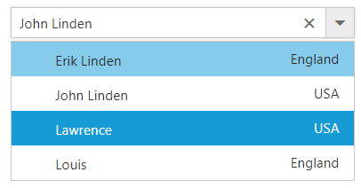
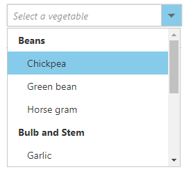
Group template
The group header title under which appropriate sub-items are categorized can also be customize with the help of groupTemplate property.
This template is common for both inline and floating group header template.
In the following sample, vegetables are grouped according to the category.
<input type="text" tabindex="1" id="list" />var datasource = [
{ vegetable: 'Cabbage', category: 'Leafy and Salad' }, { vegetable: 'Spinach', category: 'Leafy and Salad' },
{ vegetable: 'Wheatgrass', category: 'Leafy and Salad' }, { vegetable: 'Yarrow', category: 'Leafy and Salad' },
{ vegetable: 'Chickpea', category: 'Beans' }, { vegetable: 'Green bean', category: 'Beans' },
{ vegetable: 'Horse gram', category: 'Beans' }, { vegetable: 'Garlic', category: 'Bulb and Stem' },
{ vegetable: 'Nopal', category: 'Bulb and Stem' }, { vegetable: 'Onion', category: 'Bulb and Stem' }
];
$(function () {
$('#list').ejComboBox({
dataSource: datasource,
fields: { groupBy: 'category', text: 'vegetable',value: 'vegetable' },
placeholder: 'Select a vegetable',
groupTemplate:"<strong>${category}</strong>",
width: '250px',
popupHeight: '200px',
popupWidth: '250px'
});
});
Header template
The header element is shown statically at the top of the popup list items within the ComboBox, and any custom element can be placed as a header element using the headerTemplate property.
In the following sample, the list items and its headers are designed and displayed as two columns similar to multiple columns of the grid.
<input type="text" tabindex="1" id="list" />var empList = [
{ text: 'John Linden', eimg: '7', status: 'Available', country: 'USA' },
{ text: 'Erik Linden', eimg: '3', status: 'Available', country: 'England' },
{ text: 'Louis', eimg: '6', status: 'Available', country: 'England' },
{ text: "Lawrence", eimg: "5", status: "Available", country: 'USA' }
];
$(function () {
$('#list').ejComboBox({
dataSource: empList,
fields: { text: 'text', value : 'country'},
itemTemplate:"<span><span class='name'>${text}</span><span class ='city'>${country}</span></span>",
//set the value to header template
headerTemplate:"<span class='head'><span class='name'>Name</span><span class='city'>City</span></span>",
placeholder: 'Select an employee'
});
});<style>
#loader {
color: #008cff;
height: 40px;
width: 30%;
position: absolute;
top: 45%;
left: 45%;
}
.head, .item{
display: table;
width:100%;
margin:auto;
}
.head{
height: 40px;
font-size:15px;
font-weight:600;
}
.name, .city{
display: table-cell;
vertical-align: middle;
width: 50%;
}
.head .name {
text-indent: 16px;
}
.head .city {
text-indent: 10px;
}
.city{
right: 15px;
position: absolute;
}
</style>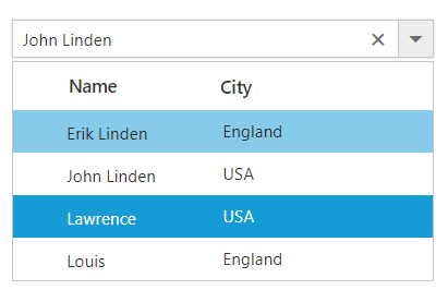
Footer template
The ComboBox has options to show a footer element at the bottom of the list items in the popup list. Here, you can place any custom element as a footer element using the footerTemplate property.
In the following sample, footer element displays the total number of list items present in the ComboBox.
<input type="text" tabindex="1" id="list" /><script type="text/javascript">
var sportsData = ['Badminton', 'Cricket', 'Football', 'Golf'];
$(function () {
$("#list").ejComboBox({
//set the data to dataSource property
dataSource: sportsData,
// set placeholder to ComboBox input element
placeholder: "Select a game",
//set the value to footer template
footerTemplate:"<span class='foot'> Total list items: "+ sportsData.length +"</span>"
});
});
</script><style>
#container {
visibility: hidden;
}
#loader {
color: #008cff;
height: 40px;
width: 30%;
position: absolute;
top: 45%;
left: 45%;
}
.foot{
text-indent: 1.2em;
display: block;
font-size: 15px;
line-height: 40px;
border-top: 1px solid #e0e0e0;
}
</style>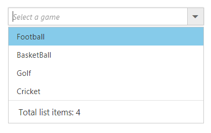
No records template
The ComboBox is provided with support to custom design the popup list content when no data is found and no matches found on search with the help of noRecordsTemplate property.
In the following sample, popup list content displays the notification of no data available.
<input type="text" tabindex="1" id="list" />var empList = [ ];
$(function () {
$('#list').ejComboBox({
dataSource: empList,
fields: { text: 'text', value : 'country'},
noRecordsTemplate:"<span class='norecord'> NO DATA AVAILABLE</span>"
placeholder: 'Select an employee'
});
});<style>
.norecord:before{
content: '\e7c3';
font-family: 'e-icons';
font-size: 18px;
margin-left: -25px;
margin-top: -3px;
position: absolute;
}
</style>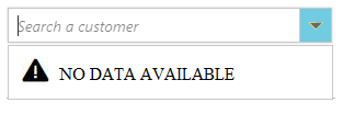
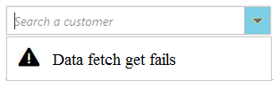
Action failure template
There is also an option to custom design the popup list content when the data fetch request fails at the remote server. This can be achieved using the actionFailureTemplate property.
In the following sample, when the data fetch request fails, the ComboBox displays the notification.
<input type="text" tabindex="1" id="list" /><script type="text/javascript">
// DataManager creation
var dataManger = ej.DataManager({
url: window.baseurl + "Wcf/Northwind.svc/", crossDomain: true
});
// Query creation
var query = ej.Query()
.from("Customers").take(6);
$(function () {
$('#list').ejComboBox({
dataSource: dataManger,
placeholder: 'Select a customer',
fields: { text: "CustomerID",value: "CustomerID" },
placeholder: "Select a customer",
//set the value to action failure template
actionFailureTemplate:"<span class='action-failure'> Data fetch get fails</span>",
query: query,
width: "100%"
});
});
</script><style>
.action-failure:before{
content: '\e7c4';
font-family: 'e-icons';
font-size: 18px;
margin-top: -4px;
position: absolute;
margin-left: -25px;
}
</style>