Cards in WinUI Kanban Board
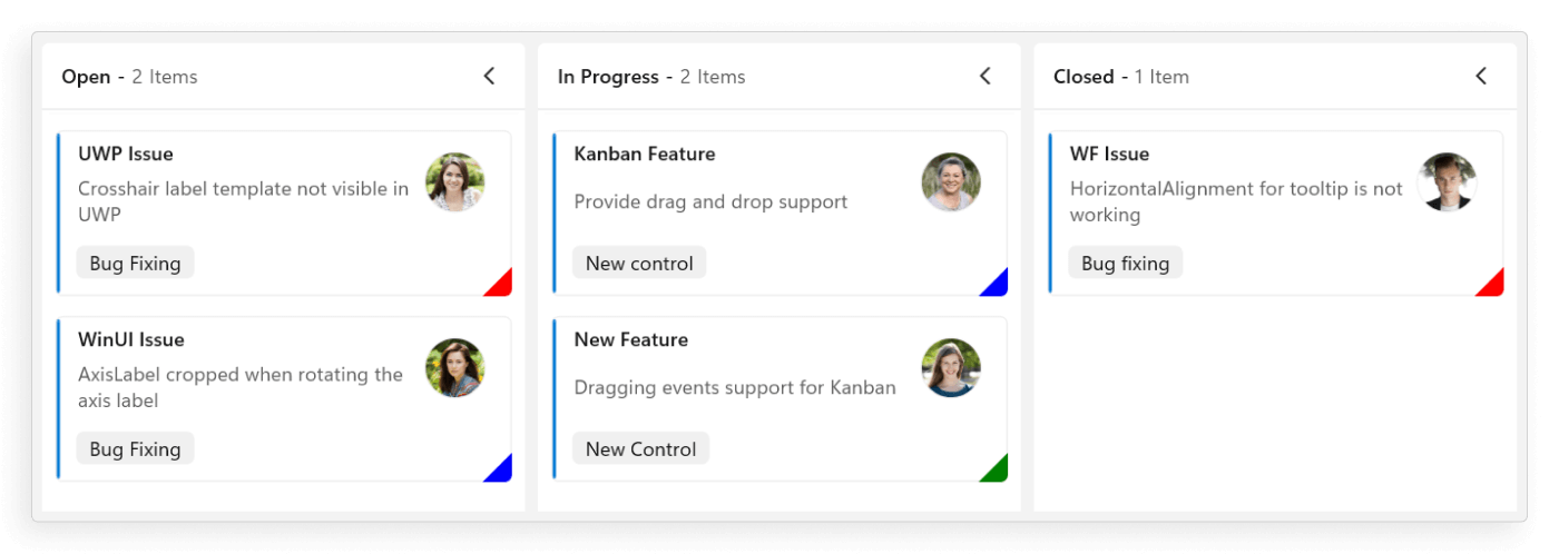
Cards visually represent tasks and their progression through various stages. The default UI of each card can be customized using the following properties of the KanbanModel.
- Title - Sets the title of the card.
- Description - Sets the description text of the card.
- Category - Sets the category of the card, determining which column it will be placed in.
- Assignee - Defines the assignee associated with the card in the KanbanModel.
- Image - Sets the image for the card, which is displayed on the right side in the default card template.
- IndicatorColorKey - Specifies the indicator color for the card, commonly used for categorize or prioritize card based on color key values.
- Id - Sets the unique ID of the card.
- Tags - Specifies the tags for the card, displayed at the bottom of the default card template.
Below is an example that shows how to define values in the KanbanModel.
new KanbanModel()
{
    Title = "UWP Issue",
    Id = "651",
    Description = "Crosshair label template not visible in UWP",
    Category = "Open",
    IndicatorColorKey = "High",
    Tags = new List() { "Bug Fixing" },
    Image = new Image
    {
        Source = new BitmapImage(new Uri("ms-appx:///Assets/Kanban/People_Circle1.png"))
    }
};
The following code snippet defines the colors for each key.
<kanban:SfKanban x:Name="kanban"
                 ItemsSource="{Binding TaskDetails}">
    <kanban:SfKanban.DataContext>
        <local:ViewModel/>
    </kanban:SfKanban.DataContext>
    <kanban:SfKanban.IndicatorColorPalette>
        <kanban:KanbanColorMapping Key="Low" Color="Blue"/>
        <kanban:KanbanColorMapping Key="Normal" Color="Green"/>
        <kanban:KanbanColorMapping Key="High" Color="Red"/>
    </kanban:SfKanban.IndicatorColorPalette>
</kanban:SfKanban>this.kanban.ItemsSource = new ViewModel().TaskDetails;
List<KanbanColorMapping> indicatorColorPalette = new List();
indicatorColorPalette.Add(new KanbanColorMapping() { Key="Low", Color = Colors.Blue });
indicatorColorPalette.Add(new KanbanColorMapping() { Key= "Normal", Color = Colors.Green });
indicatorColorPalette.Add(new KanbanColorMapping() { Key= "High", Color = Colors.Red });
this.kanban.IndicatorColorPalette = indicatorColorPalette;
public class ViewModel
{
    #region Properties

    /// <summary>
    /// Gets or sets the collection of <see cref="KanbanModel"/> objects representing tasks in various stages.
    /// </summary>
    public ObservableCollection<KanbanModel> TaskDetails { get; set; }

    #endregion

    #region Constructor

    /// <summary>
    /// Initializes a new instance of the <see cref="ViewModel"/> class.
    /// </summary>
    public ViewModel()
    {
        this.TaskDetails = this.GetTaskDetails();
    }

    #endregion

    #region Private methods

    /// <summary>
    /// Method to get the kanban model collections.
    /// </summary>
    /// <returns>The kanban model collections.</returns>
    private ObservableCollection<KanbanModel> GetTaskDetails()
    {
        var taskDetails = new ObservableCollection<KanbanModel>();
        string path = @"ms-appx:///";

        KanbanModel taskDetail = new KanbanModel();
        taskDetail.Title = "UWP Issue";
        taskDetail.Id = "651";
        taskDetail.Description = "Crosshair label template not visible in UWP";
        taskDetail.Category = "Open";
        taskDetail.IndicatorColorKey = "High";
        taskDetail.Tags = new List<string>() { "Bug Fixing" };
        taskDetail.Image = new Image
        {
            Source = new BitmapImage(new Uri("ms-appx:///Assets/Kanban/People_Circle1.png"))
        };

        taskDetails.Add(taskDetail);

        taskDetail = new KanbanModel();
        taskDetail.Title = "WinUI Issue";
        taskDetail.Id = "646";
        taskDetail.Description = "AxisLabel cropped when rotating the axis label";
        taskDetail.Category = "Open";
        taskDetail.IndicatorColorKey = "Low";
        taskDetail.Tags = new List<string>() { "Bug Fixing" };
        taskDetail.Image = new Image
        {
            Source = new BitmapImage(new Uri(path + "Assets/Kanban/People_Circle2.png"))
        };

        taskDetails.Add(taskDetail);

        taskDetail = new KanbanModel();
        taskDetail.Title = "Kanban Feature";
        taskDetail.Id = "25678";
        taskDetail.Description = "Provide drag and drop support";
        taskDetail.Category = "In Progress";
        taskDetail.IndicatorColorKey = "Low";
        taskDetail.Tags = new List<string>() { "New control" };
        taskDetail.Image = new Image
        {
            Source = new BitmapImage(new Uri(path + "Assets/Kanban/People_Circle3.png"))
        };

        taskDetails.Add(taskDetail);

        taskDetail = new KanbanModel();
        taskDetail.Title = "New Feature";
        taskDetail.Id = "29574";
        taskDetail.Description = "Dragging events support for Kanban";
        taskDetail.Category = "In Progress";
        taskDetail.IndicatorColorKey = "Normal";
        taskDetail.Tags = new List<string>() { "New Control" };
        taskDetail.Image = new Image
        {
            Source = new BitmapImage(new Uri(path + "Assets/Kanban/People_Circle4.png"))
        };

        taskDetails.Add(taskDetail);

        taskDetail = new KanbanModel();
        taskDetail.Title = "WF Issue";
        taskDetail.Id = "1254";
        taskDetail.Description = "HorizontalAlignment for tooltip is not working";
        taskDetail.Category = "Closed";
        taskDetail.IndicatorColorKey = "High";
        taskDetail.Tags = new List<string>() { "Bug fixing" };
        taskDetail.Image = new Image
        {
            Source = new BitmapImage(new Uri(path + "Assets/Kanban/People_Circle5.png"))
        };

        taskDetails.Add(taskDetail);
        return taskDetails;
    }

    #endregion
}
Card appearance customization
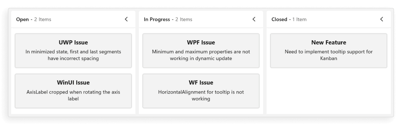
The card appearance customization can be achieved by using the CardTemplate and CardTemplateSelector properties in the SfKanban.
Customize card appearance using DataTemplate
You can replace the entire card template with your own design and customize its appearance using the CardTemplate property in SfKanban.
The following code snippet demonstrates, how to use the CardTemplate property to apply a custom template to kanban cards.
<kanban:SfKanban x:Name="kanban"
                 ItemsSource="{Binding TaskDetails}">
    <kanban:SfKanban.CardTemplate>
        <DataTemplate>
            <Border BorderBrush="LightGray" BorderThickness="1" CornerRadius="3" Background="#F3F3F2">
                <StackPanel Margin="10">
                    <TextBlock Text="{Binding Title}" TextAlignment="Center" FontWeight="Bold" FontSize="14" />
                    <TextBlock Text="{Binding Description}" TextAlignment="Center" FontSize="12" TextWrapping="Wrap" Margin="5" />
                </StackPanel>
            </Border>
        </DataTemplate>
    </kanban:SfKanban.CardTemplate>
    <kanban:SfKanban.DataContext>
        <local:ViewModel/>
    </kanban:SfKanban.DataContext>
</kanban:SfKanban>this.kanban.ItemsSource = new ViewModel().TaskDetails;public class ViewModel
{
#region Properties
/// <summary>
/// Gets or sets the collection of <see cref="KanbanModel"/> objects representing tasks in various stages.
/// </summary>
public ObservableCollection<KanbanModel> TaskDetails { get; set; }
#endregion
#region Constructor
/// <summary>
/// Initializes a new instance of the <see cref="ViewModel"/> class.
/// </summary>
public ViewModel()
{
this.TaskDetails = this.GetTaskDetails();
}
#endregion
#region Private methods
/// <summary>
/// Method to get the kanban model collections.
/// </summary>
/// <returns>The kanban model collections.</returns>
private ObservableCollection<KanbanModel> GetTaskDetails()
{
var taskDetails = new ObservableCollection<KanbanModel>();
string path = @"ms-appx:///";
KanbanModel taskDetail = new KanbanModel();
taskDetail.Title = "UWP Issue";
taskDetail.Id = "651";
taskDetail.Description = "In minimized state, first and last segments have incorrect spacing";
taskDetail.Category = "Open";
taskDetail.IndicatorColorKey = "High";
taskDetail.Tags = new List<string>() { "Bug Fixing" };
taskDetail.Image = new Image
{
Source = new BitmapImage(new Uri("ms-appx:///Assets/Kanban/People_Circle1.png"))
};
taskDetails.Add(taskDetail);
taskDetail = new KanbanModel();
taskDetail.Title = "WinUI Issue";
taskDetail.Id = "646";
taskDetail.Description = "AxisLabel cropped when rotating the axis label";
taskDetail.Category = "Open";
taskDetail.IndicatorColorKey = "Low";
taskDetail.Tags = new List<string>() { "Bug Fixing" };
taskDetail.Image = new Image
{
Source = new BitmapImage(new Uri(path + "Assets/Kanban/People_Circle2.png"))
};
taskDetails.Add(taskDetail);
taskDetail = new KanbanModel();
taskDetail.Title = "WPF Issue";
taskDetail.Id = "25678";
taskDetail.Description = "Minimum and maximum properties are not working in dynamic update";
taskDetail.Category = "In Progress";
taskDetail.IndicatorColorKey = "Low";
taskDetail.Tags = new List<string>() { "New control" };
taskDetail.Image = new Image
{
Source = new BitmapImage(new Uri(path + "Assets/Kanban/People_Circle3.png"))
};
taskDetails.Add(taskDetail);
taskDetail = new KanbanModel();
taskDetail.Title = "WF Issue";
taskDetail.Id = "1254";
taskDetail.Description = "HorizontalAlignment for tooltip is not working";
taskDetail.Category = "In Progress";
taskDetail.IndicatorColorKey = "High";
taskDetail.Tags = new List<string>() { "Bug fixing" };
taskDetail.Image = new Image
{
Source = new BitmapImage(new Uri(path + "Assets/Kanban/People_Circle5.png"))
};
taskDetails.Add(taskDetail);
taskDetail = new KanbanModel();
taskDetail.Title = "New Feature";
taskDetail.Id = "29574";
taskDetail.Description = "Need to implement tooltip support for Kanban";
taskDetail.Category = "Closed";
taskDetail.IndicatorColorKey = "Normal";
taskDetail.Tags = new List<string>() { "New Control" };
taskDetail.Image = new Image
{
Source = new BitmapImage(new Uri(path + "Assets/Kanban/People_Circle4.png"))
};
taskDetails.Add(taskDetail);
return taskDetails;
}
#endregion
}
Customize card appearance using DataTemplateSelector
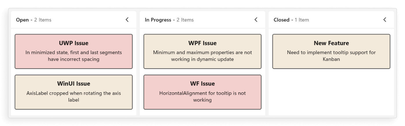
You can customize the card appearance by using the CardTemplateSelector property in the SfKanban. The DataTemplateSelector can choose a DataTemplate at runtime based on the value of a data-bound to kanban card appearance by using the CardTemplateSelector. It allows you to choose a different data template for each card, as well as to customize the appearance of a particular card based on certain conditions.
<Grid>
    <Grid.DataContext>
        <local:ViewModel/>
    </Grid.DataContext>
    <Grid.Resources>
        <DataTemplate x:Key="highPriorityTemplate">
            <Border BorderBrush="Black" BorderThickness="1" CornerRadius="3" Background="#F3CFCE">
                <StackPanel Margin="10">
                    <TextBlock Text="{Binding Title}" FontWeight="Bold" TextAlignment="Center" FontSize="14" />
                    <TextBlock Text="{Binding Description}" FontSize="12" TextAlignment="Center" TextWrapping="Wrap" Margin="5" />
                </StackPanel>
            </Border>
        </DataTemplate>
        <DataTemplate x:Key="defaultTemplate">
            <Border BorderBrush="Black" BorderThickness="1" CornerRadius="3" Background="#F3EADC">
                <StackPanel Margin="10">
                    <TextBlock Text="{Binding Title}" FontWeight="Bold" TextAlignment="Center" FontSize="14" />
                    <TextBlock Text="{Binding Description}" FontSize="12" TextAlignment="Center" TextWrapping="Wrap" Margin="5" />
                </StackPanel>
            </Border>
        </DataTemplate>
        <local:KanbanCardTemplateSelector x:Key="cardTemplateSelector"
                                          HighPriorityTemplate="{StaticResource highPriorityTemplate}"
                                          DefaultTemplate="{StaticResource defaultTemplate}"/>
    </Grid.Resources>

    <kanban:SfKanban x:Name="kanban"
                     CardTemplateSelector="{StaticResource cardTemplateSelector}"
                     ItemsSource="{Binding TaskDetails}">
    </kanban:SfKanban>
</Grid>
public class KanbanCardTemplateSelector : DataTemplateSelector
{
public DataTemplate HighPriorityTemplate { get; set; }
public DataTemplate DefaultTemplate { get; set; }
protected override DataTemplate SelectTemplateCore(object item, DependencyObject container)
{
var task = item as KanbanModel;
if (task != null && task.IndicatorColorKey == "High")
{
return HighPriorityTemplate;
}
return DefaultTemplate;
}
}public class ViewModel
{
#region Properties
/// <summary>
/// Gets or sets the collection of <see cref="KanbanModel"/> objects representing tasks in various stages.
/// </summary>
public ObservableCollection<KanbanModel> TaskDetails { get; set; }
#endregion
#region Constructor
/// <summary>
/// Initializes a new instance of the <see cref="ViewModel"/> class.
/// </summary>
public ViewModel()
{
this.TaskDetails = this.GetTaskDetails();
}
#endregion
#region Private methods
/// <summary>
/// Method to get the kanban model collections.
/// </summary>
/// <returns>The kanban model collections.</returns>
private ObservableCollection<KanbanModel> GetTaskDetails()
{
var taskDetails = new ObservableCollection<KanbanModel>();
string path = @"ms-appx:///";
KanbanModel taskDetail = new KanbanModel();
taskDetail.Title = "UWP Issue";
taskDetail.Id = "651";
taskDetail.Description = "In minimized state, first and last segments have incorrect spacing";
taskDetail.Category = "Open";
taskDetail.IndicatorColorKey = "High";
taskDetail.Tags = new List<string>() { "Bug Fixing" };
taskDetail.Image = new Image
{
Source = new BitmapImage(new Uri("ms-appx:///Assets/Kanban/People_Circle1.png"))
};
taskDetails.Add(taskDetail);
taskDetail = new KanbanModel();
taskDetail.Title = "WinUI Issue";
taskDetail.Id = "646";
taskDetail.Description = "AxisLabel cropped when rotating the axis label";
taskDetail.Category = "Open";
taskDetail.IndicatorColorKey = "Low";
taskDetail.Tags = new List<string>() { "Bug Fixing" };
taskDetail.Image = new Image
{
Source = new BitmapImage(new Uri(path + "Assets/Kanban/People_Circle2.png"))
};
taskDetails.Add(taskDetail);
taskDetail = new KanbanModel();
taskDetail.Title = "WPF Issue";
taskDetail.Id = "25678";
taskDetail.Description = "Minimum and maximum properties are not working in dynamic update";
taskDetail.Category = "In Progress";
taskDetail.IndicatorColorKey = "Low";
taskDetail.Tags = new List<string>() { "New control" };
taskDetail.Image = new Image
{
Source = new BitmapImage(new Uri(path + "Assets/Kanban/People_Circle3.png"))
};
taskDetails.Add(taskDetail);
taskDetail = new KanbanModel();
taskDetail.Title = "WF Issue";
taskDetail.Id = "1254";
taskDetail.Description = "HorizontalAlignment for tooltip is not working";
taskDetail.Category = "In Progress";
taskDetail.IndicatorColorKey = "High";
taskDetail.Tags = new List<string>() { "Bug fixing" };
taskDetail.Image = new Image
{
Source = new BitmapImage(new Uri(path + "Assets/Kanban/People_Circle5.png"))
};
taskDetails.Add(taskDetail);
taskDetail = new KanbanModel();
taskDetail.Title = "New Feature";
taskDetail.Id = "29574";
taskDetail.Description = "Need to implement tooltip support for Kanban";
taskDetail.Category = "Closed";
taskDetail.IndicatorColorKey = "Normal";
taskDetail.Tags = new List<string>() { "New Control" };
taskDetail.Image = new Image
{
Source = new BitmapImage(new Uri(path + "Assets/Kanban/People_Circle4.png"))
};
taskDetails.Add(taskDetail);
return taskDetails;
}
#endregion
}
The
DataContextfor both the CardTemplate and CardTemplateSelector properties in the SfKanban is set to KanbanModel.
Cards tooltip
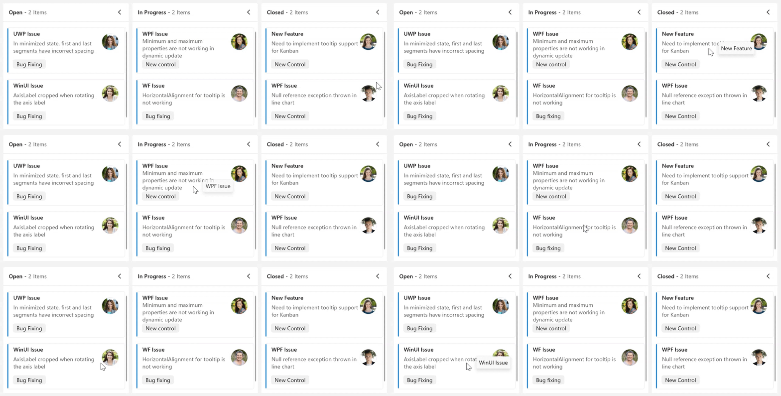
An interactive tooltip provides additional details about the cards on hovering the mouse over them.
Enable tooltip for cards
To enable tooltip for the cards, use IsToolTipEnabled property of SfKanban. By default, IsToolTipEnabled is set to false. To provide users with additional information or context about cards, simply set this property to true.
<kanban:SfKanban x:Name="kanban"
                 IsToolTipEnabled="True"
                 ItemsSource="{Binding TaskDetails}">
    <kanban:SfKanban.DataContext>
        <local:ViewModel/>
    </kanban:SfKanban.DataContext>
</kanban:SfKanban>this.kanban.IsToolTipEnabled = true;public class ViewModel
{
#region Properties
/// <summary>
/// Gets or sets the collection of <see cref="KanbanModel"/> objects representing tasks in various stages.
/// </summary>
public ObservableCollection<KanbanModel> TaskDetails { get; set; }
#endregion
#region Constructor
/// <summary>
/// Initializes a new instance of the <see cref="ViewModel"/> class.
/// </summary>
public ViewModel()
{
this.TaskDetails = this.GetTaskDetails();
}
#endregion
#region Private methods
/// <summary>
/// Method to get the kanban model collections.
/// </summary>
/// <returns>The kanban model collections.</returns>
private ObservableCollection<KanbanModel> GetTaskDetails()
{
var taskDetails = new ObservableCollection<KanbanModel>();
KanbanModel taskDetail = new KanbanModel();
taskDetail.Title = "UWP Issue";
taskDetail.Id = "651";
taskDetail.Description = "In minimized state, first and last segments have incorrect spacing";
taskDetail.Category = "Open";
taskDetail.IndicatorColorKey = "High";
taskDetail.Tags = new List<string>() { "Bug Fixing" };
taskDetails.Add(taskDetail);
taskDetail = new KanbanModel();
taskDetail.Title = "WinUI Issue";
taskDetail.Id = "646";
taskDetail.Description = "AxisLabel cropped when rotating the axis label";
taskDetail.Category = "Open";
taskDetail.IndicatorColorKey = "Low";
taskDetail.Tags = new List<string>() { "Bug Fixing" };
taskDetails.Add(taskDetail);
taskDetail = new KanbanModel();
taskDetail.Title = "WPF Issue";
taskDetail.Id = "25678";
taskDetail.Description = "Minimum and maximum properties are not working in dynamic update";
taskDetail.Category = "In Progress";
taskDetail.IndicatorColorKey = "Low";
taskDetail.Tags = new List<string>() { "New control" };
taskDetails.Add(taskDetail);
taskDetail = new KanbanModel();
taskDetail.Title = "WF Issue";
taskDetail.Id = "1254";
taskDetail.Description = "HorizontalAlignment for tooltip is not working";
taskDetail.Category = "In Progress";
taskDetail.IndicatorColorKey = "High";
taskDetail.Tags = new List<string>() { "Bug fixing" };
taskDetails.Add(taskDetail);
taskDetail = new KanbanModel();
taskDetail.Title = "New Feature";
taskDetail.Id = "29574";
taskDetail.Description = "Need to implement tooltip support for Kanban";
taskDetail.Category = "Closed";
taskDetail.IndicatorColorKey = "Normal";
taskDetail.Tags = new List<string>() { "New Control" };
taskDetails.Add(taskDetail);
taskDetail = new KanbanModel();
taskDetail.Title = "WPF Issue";
taskDetail.Id = "29477";
taskDetail.Description = "Null reference exception thrown in line chart";
taskDetail.Category = "Closed";
taskDetail.IndicatorColorKey = "Normal";
taskDetail.Tags = new List<string>() { "New Control" };
taskDetails.Add(taskDetail);
return taskDetails;
}
#endregion
}
Customize tooltip appearance
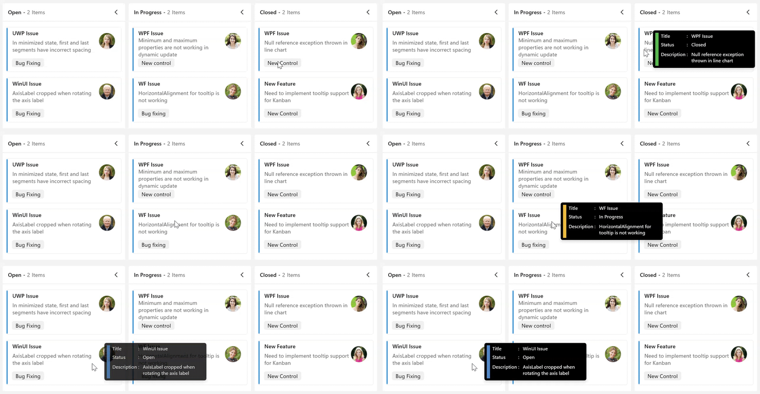
You can customize the tooltip appearance by using the ToolTipTemplate property in the SfKanban.
The following code example shows the usage of DataTemplate.
<kanban:SfKanban x:Name="kanban"
                 IsToolTipEnabled="True"
                 ItemsSource="{Binding TaskDetails}">
    <kanban:SfKanban.ToolTipTemplate>
        <DataTemplate>
            <Border Background="Black" CornerRadius="4" Padding="5">
                <Grid>
                    <Grid.ColumnDefinitions>
                        <ColumnDefinition Width="Auto" />
                        <ColumnDefinition Width="*" />
                    </Grid.ColumnDefinitions>
                    <Rectangle Fill="{Binding IndicatorColorKey}"
                               Grid.Column="0"
                               VerticalAlignment="Stretch"
                               HorizontalAlignment="Left"
                               Width="7"
                               Margin="0,0,5,0" />
                    <Grid Grid.Column="1">
                        <Grid.ColumnDefinitions>
                            <ColumnDefinition Width="5*"/>
                            <ColumnDefinition Width="5*"/>
                        </Grid.ColumnDefinitions>
                        <Grid.RowDefinitions >
                            <RowDefinition Height="*"/>
                            <RowDefinition Height="*"/>
                            <RowDefinition Height="*"/>
                        </Grid.RowDefinitions>
                        <TextBlock Text="Title :" FontSize="10.5" Grid.Row="0" Grid.Column="0"
                                   Margin="0,0,0,5" Foreground="White" />
                        <TextBlock Text="{Binding  Title}" Grid.Row="0" Grid.Column="1" FontSize="10.5"
                                   Margin="8,0,0,5" Foreground="White" />
                        <TextBlock Text="Status :" Margin="0,0,0,8" Grid.Row="1" Grid.Column="0"
                                   FontSize="10.5" Foreground="White" />
                        <TextBlock Text="{Binding Category}" Grid.Row="1" Grid.Column="1" FontSize="10.5"
                                   Margin="8,0,0,5" Foreground="White" />
                        <TextBlock Text="Description :" Grid.Row="2" Grid.Column="0"
                                   FontSize="10.5" Foreground="White" />
                        <TextBlock Text="{Binding Description}" Margin="8,0,0,5" Width="150" TextWrapping="Wrap"
                                   TextTrimming="CharacterEllipsis" FontSize="10.5" Grid.Row="2" Grid.Column="1" Foreground="White" />
                    </Grid>
                </Grid>
            </Border>
        </DataTemplate>
    </kanban:SfKanban.ToolTipTemplate>
    <kanban:SfKanban.DataContext>
        <local:ViewModel/>
    </kanban:SfKanban.DataContext>
</kanban:SfKanban>this.kanban.IsToolTipEnabled = true;
this.kanban.ItemsSource = new ViewModel().TaskDetails;public class ViewModel
{
#region Properties
/// <summary>
/// Gets or sets the collection of <see cref="KanbanModel"/> objects representing tasks in various stages.
/// </summary>
public ObservableCollection<KanbanModel> TaskDetails { get; set; }
#endregion
#region Constructor
/// <summary>
/// Initializes a new instance of the <see cref="ViewModel"/> class.
/// </summary>
public ViewModel()
{
this.TaskDetails = this.GetTaskDetails();
}
#endregion
#region Private methods
/// <summary>
/// Method to get the kanban model collections.
/// </summary>
/// <returns>The kanban model collections.</returns>
private ObservableCollection<KanbanModel> GetTaskDetails()
{
var taskDetails = new ObservableCollection<KanbanModel>();
KanbanModel taskDetail = new KanbanModel();
taskDetail.Title = "UWP Issue";
taskDetail.Id = "651";
taskDetail.Description = "In minimized state, first and last segments have incorrect spacing";
taskDetail.Category = "Open";
taskDetail.IndicatorColorKey = "#FFECB93C";
taskDetail.Tags = new List<string>() { "Bug Fixing" };
taskDetails.Add(taskDetail);
taskDetail = new KanbanModel();
taskDetail.Title = "WinUI Issue";
taskDetail.Id = "646";
taskDetail.Description = "AxisLabel cropped when rotating the axis label";
taskDetail.Category = "Open";
taskDetail.IndicatorColorKey = "#FF5187C6";
taskDetail.Tags = new List<string>() { "Bug Fixing" };
taskDetails.Add(taskDetail);
taskDetail = new KanbanModel();
taskDetail.Title = "WPF Issue";
taskDetail.Id = "25678";
taskDetail.Description = "Minimum and maximum properties are not working in dynamic update";
taskDetail.Category = "In Progress";
taskDetail.IndicatorColorKey = "#FF5187C6";
taskDetail.Tags = new List<string>() { "New control" };
taskDetails.Add(taskDetail);
taskDetail = new KanbanModel();
taskDetail.Title = "WF Issue";
taskDetail.Id = "1254";
taskDetail.Description = "HorizontalAlignment for tooltip is not working";
taskDetail.Category = "In Progress";
taskDetail.IndicatorColorKey = "#FFECB93C";
taskDetail.Tags = new List<string>() { "Bug fixing" };
taskDetails.Add(taskDetail);
taskDetail = new KanbanModel();
taskDetail.Title = "New Feature";
taskDetail.Id = "29574";
taskDetail.Description = "Need to implement tooltip support for Kanban";
taskDetail.Category = "Closed";
taskDetail.IndicatorColorKey = "#FF57B94C";
taskDetail.Tags = new List<string>() { "New Control" };
taskDetails.Add(taskDetail);
taskDetail = new KanbanModel();
taskDetail.Title = "WPF Issue";
taskDetail.Id = "29477";
taskDetail.Description = "Null reference exception thrown in line chart";
taskDetail.Category = "Closed";
taskDetail.IndicatorColorKey = "#FF57B94C";
taskDetail.Tags = new List<string>() { "New Control" };
taskDetails.Add(taskDetail);
return taskDetails;
}
#endregion
}
This property will only be applicable when IsToolTipEnabled is set to
true.
Card selection
The SfKanban control supports selecting a single card or multiple cards at a time and performing drag-and-drop operations on the selection. The selection mode is configured through the CardSelectionType property. The CardSelectionType property accepts the values Single, Multiple and None.
Single card selection
The CardSelectionType property is set to Single when only one card needs to be selected at any given time. With this mode, selecting a different card automatically clears the previous selection, keeping the focus on a single task.
<kanban:SfKanban x:Name="kanban"
                 CardSelectionType="Single"
                 ItemsSource="{Binding TaskDetails}">
    <kanban:SfKanban.DataContext>
        <local:ViewModel/>
    </kanban:SfKanban.DataContext>
</kanban:SfKanban>this.kanban.CardSelectionType = KanbanCardSelectionType.Single;
this.kanban.ItemsSource = new ViewModel().TaskDetails;Multiple card selection
The CardSelectionType property is set to Multiple to enable selecting more than one card at a time. The control supports the following keyboard and mouse interactions for building a selection:
- Use Ctrl + Click to add or remove an individual card from the current selection.
- Use Shift + Click to select a range of cards within the same column.
- Use Shift + Up Arrow and Shift + Down Arrow to extend or reduce the current selection range within a column.
<kanban:SfKanban x:Name="kanban"
                 CardSelectionType="Multiple"
                 ItemsSource="{Binding TaskDetails}">
    <kanban:SfKanban.DataContext>
        <local:ViewModel/>
    </kanban:SfKanban.DataContext>
</kanban:SfKanban>this.kanban.CardSelectionType = KanbanCardSelectionType.Multiple;
this.kanban.ItemsSource = new ViewModel().TaskDetails;Multi-card drag and drop
When CardSelectionType is set to Multiple, the entire selection can be dragged and dropped as a single operation. This enables bulk-moving related work items between stages without losing their relative order.
The following behaviors are supported for multi-card drag and drop:
- Moves every selected card in a single drag operation.
- Preserves the relative order of the selected cards after the drop.
- Supports moving cards between columns and across swimlanes.
- Validates workflow restrictions for all selected cards before completing the drop operation.
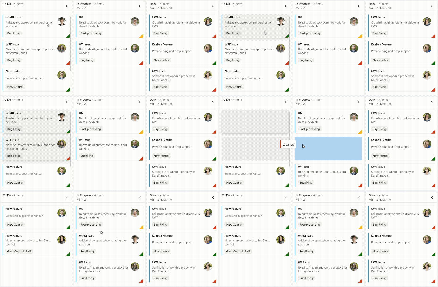
Multi-card drag and drop is enabled only when
CardSelectionTypeis set toMultiple. All selected cards are moved together in a single drag operation, and the relative order of the selected cards is preserved after the drop. If the drop target violates aWorkflowsrestriction for any card in the selection, the entire drag-and-drop operation is canceled.