Columns Configuration and Workflow Stages in ASP.NET MVC Kanban
The Kanban columns represent the each stage of the process. The column definitions are used as the DataSource schema in the Kanban. The Kanban operations such as drag-and-drop, swimlane, and toggle columns are performed based on column definitions.
Single-key mapping
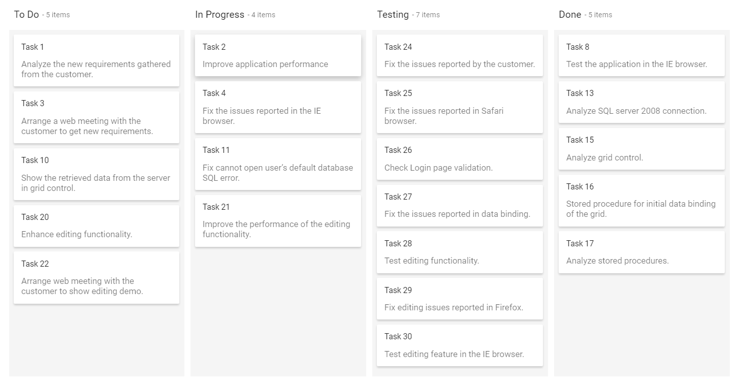
Kanban columns are categorized by mapping the Key from the datasource using the KeyField property. The corresponding Value in the datasource is mapped inside the columns KeyField. Based on this categorization, Kanban columns are split on this board.
The
KeyFieldproperty is mandatory to render the columns in the Kanban board.
@Html.EJS().Kanban("kanban").KeyField("Status").DataSource((IEnumerable<object>)ViewBag.data).Columns(col =>
            {
           col.HeaderText("To Do").KeyField("Open").Add();
           col.HeaderText("In Progress").KeyField("InProgress").Add();
           col.HeaderText("Testing").KeyField("Testing").Add();
           col.HeaderText("Done").KeyField("Close").Add();
       }).CardSettings(card =>  {
           card.ContentField("Summary").HeaderField("Id");
       }).Render()
public class KanbanDataModels
{
public string Id { get; set; }
public string Title { get; set; }
public string Status { get; set; }
public string Summary { get; set; }
public string Type { get; set; }
public string Priority { get; set; }
public string Tags { get; set; }
public Double Estimate { get; set; }
public string Assignee { get; set; }
public int RankId { get; set; }
public string Color { get; set; }
public List<KanbanDataModels> KanbanTasks()
{
List<KanbanDataModels> TaskDetails = new List<KanbanDataModels>();
TaskDetails.Add(new KanbanDataModels { Id = "Task 1", Title = "Task - 29001", Status = "Open", Summary = "Analyze the new requirements gathered from the customer.", Type = "Story", Priority = "Low", Tags = "Analyze,Customer", Estimate = 3.5, Assignee = "Nancy Davloio", RankId = 1, Color = "#8b447a" });
TaskDetails.Add(new KanbanDataModels { Id = "Task 2", Title = "Task - 29002", Status = "InProgress", Summary = "Improve application performance", Type = "Improvement", Priority = "Normal", Tags = "Improvement", Estimate = 6, Assignee = "Andrew Fuller", RankId = 1, Color = "#7d7297" });
TaskDetails.Add(new KanbanDataModels { Id = "Task 3", Title = "Task - 29003", Status = "Open", Summary = "Arrange a web meeting with the customer to get new requirements.", Type = "Others", Priority = "Critical", Tags = "Meeting", Estimate = 5.5, Assignee = "Janet Leverling", RankId = 2, Color = "#27AE60" });
TaskDetails.Add(new KanbanDataModels { Id = "Task 4", Title = "Task - 29004", Status = "InProgress", Summary = "Fix the issues reported in the IE browser.", Type = "Bug", Priority = "Release Breaker", Tags = "IE", Estimate = 2.5, Assignee = "Janet Leverling", RankId = 2, Color = "#cc0000" });
TaskDetails.Add(new KanbanDataModels { Id = "Task 5", Title = "Task - 29005", Status = "Review", Summary = "Fix the issues reported by the customer.", Type = "Bug", Priority = "Low", Tags = "Customer", Estimate = 3.5, Assignee = "Steven walker", RankId = 1, Color = "#cc0000" });
TaskDetails.Add(new KanbanDataModels { Id = "Task 6", Title = "Task - 29007", Status = "Validate", Summary = "Validate new requirements", Type = "Improvement", Priority = "Low", Tags = "Validation", Estimate = 1.5, Assignee = "Robert King", RankId = 1, Color = "#7d7297" });
TaskDetails.Add(new KanbanDataModels { Id = "Task 7", Title = "Task - 29009", Status = "Review", Summary = "Fix the issues reported in Safari browser.", Type = "Bug", Priority = "Release Breaker", Tags = "Fix,Safari", Estimate = 1.5, Assignee = "Nancy Davloio", RankId = 2, Color = "#cc0000" });
TaskDetails.Add(new KanbanDataModels { Id = "Task 8", Title = "Task - 29010", Status = "Close", Summary = "Test the application in the IE browser.", Type = "Story", Priority = "Low", Tags = "Review,IE", Estimate = 5.5, Assignee = "Margaret hamilt", RankId = 3, Color = "#8b447a" });
TaskDetails.Add(new KanbanDataModels { Id = "Task 9", Title = "Task - 29011", Status = "Validate", Summary = "Validate the issues reported by the customer.", Type = "Story", Priority = "High", Tags = "Validation,Fix", Estimate = 1, Assignee = "Steven walker", RankId = 1, Color = "#8b447a" });
TaskDetails.Add(new KanbanDataModels { Id = "Task 10", Title = "Task - 29015", Status = "Open", Summary = "Show the retrieved data from the server in grid control.", Type = "Story", Priority = "High", Tags = "Database,SQL", Estimate = 5.5, Assignee = "Margaret hamilt", RankId = 4, Color = "#8b447a" });
TaskDetails.Add(new KanbanDataModels { Id = "Task 11", Title = "Task - 29016", Status = "InProgress", Summary = "Fix cannot open user’s default database SQL error.", Priority = "Critical", Type = "Bug", Tags = "Database,Sql2008", Estimate = 2.5, Assignee = "Janet Leverling", RankId = 4, Color = "#cc0000" });
TaskDetails.Add(new KanbanDataModels { Id = "Task 12", Title = "Task - 29017", Status = "Review", Summary = "Fix the issues reported in data binding.", Type = "Story", Priority = "Normal", Tags = "Databinding", Estimate = 3.5, Assignee = "Janet Leverling", RankId = 4, Color = "#8b447a" });
TaskDetails.Add(new KanbanDataModels { Id = "Task 13", Title = "Task - 29018", Status = "Close", Summary = "Analyze SQL server 2008 connection.", Type = "Story", Priority = "Release Breaker", Tags = "Grid,Sql", Estimate = 2, Assignee = "Andrew Fuller", RankId = 4, Color = "#8b447a" });
TaskDetails.Add(new KanbanDataModels { Id = "Task 14", Title = "Task - 29019", Status = "Validate", Summary = "Validate databinding issues.", Type = "Story", Priority = "Low", Tags = "Validation", Estimate = 1.5, Assignee = "Margaret hamilt", RankId = 1, Color = "#8b447a" });
TaskDetails.Add(new KanbanDataModels { Id = "Task 15", Title = "Task - 29020", Status = "Close", Summary = "Analyze grid control.", Type = "Story", Priority = "High", Tags = "Analyze", Estimate = 2.5, Assignee = "Margaret hamilt", RankId = 5, Color = "#8b447a" });
TaskDetails.Add(new KanbanDataModels { Id = "Task 16", Title = "Task - 29021", Status = "Close", Summary = "Stored procedure for initial data binding of the grid.", Type = "Others", Priority = "Release Breaker", Tags = "Databinding", Estimate = 1.5, Assignee = "Steven walker", RankId = 6, Color = "#27AE60" });
TaskDetails.Add(new KanbanDataModels { Id = "Task 17", Title = "Task - 29022", Status = "Close", Summary = "Analyze stored procedures.", Type = "Story", Priority = "Release Breaker", Tags = "Procedures", Estimate = 5.5, Assignee = "Janet Leverling", RankId = 7, Color = "#8b447a" });
TaskDetails.Add(new KanbanDataModels { Id = "Task 18", Title = "Task - 29023", Status = "Validate", Summary = "Validate editing issues.", Type = "Story", Priority = "Critical", Tags = "Editing", Estimate = 1, Assignee = "Nancy Davloio", RankId = 1, Color = "#8b447a" });
TaskDetails.Add(new KanbanDataModels { Id = "Task 19", Title = "Task - 29024", Status = "Review", Summary = "Test editing functionality.", Type = "Story", Priority = "Normal", Tags = "Editing,Test", Estimate = 0.5, Assignee = "Nancy Davloio", RankId = 5, Color = "#8b447a" });
TaskDetails.Add(new KanbanDataModels { Id = "Task 20", Title = "Task - 29025", Status = "Open", Summary = "Enhance editing functionality.", Type = "Improvement", Priority = "Low", Tags = "Editing", Estimate = 3.5, Assignee = "Andrew Fuller", RankId = 5, Color = "#7d7297" });
TaskDetails.Add(new KanbanDataModels { Id = "Task 21", Title = "Task - 29026", Status = "InProgress", Summary = "Improve the performance of the editing functionality.", Type = "Epic", Priority = "High", Tags = "Performance", Estimate = 6, Assignee = "Nancy Davloio", RankId = 5, Color = "#6d7492" });
TaskDetails.Add(new KanbanDataModels { Id = "Task 22", Title = "Task - 29027", Status = "Open", Summary = "Arrange web meeting with the customer to show editing demo.", Type = "Others", Priority = "High", Tags = "Meeting,Editing", Estimate = 5.5, Assignee = "Steven walker", RankId = 6, Color = "#27AE60" });
TaskDetails.Add(new KanbanDataModels { Id = "Task 23", Title = "Task - 29029", Status = "Review", Summary = "Fix the editing issues reported by the customer.", Type = "Bug", Priority = "Low", Tags = "Editing,Fix", Estimate = 3.5, Assignee = "Janet Leverling", RankId = 6, Color = "#cc0000" });
TaskDetails.Add(new KanbanDataModels { Id = "Task 24", Title = "Task - 29030", Status = "Testing", Summary = "Fix the issues reported by the customer.", Type = "Bug", Priority = "Critical", Tags = "Customer", Estimate = 3.5, Assignee = "Steven walker", RankId = 1 });
TaskDetails.Add(new KanbanDataModels { Id = "Task 25", Title = "Task - 29031", Status = "Testing", Summary = "Fix the issues reported in Safari browser.", Type = "Bug", Priority = "Release Breaker", Tags = "Fix,Safari", Estimate = 1.5, Assignee = "Nancy Davloio", RankId = 2 });
TaskDetails.Add(new KanbanDataModels { Id = "Task 26", Title = "Task - 29032", Status = "Testing", Summary = "Check Login page validation.", Type = "Story", Priority = "Release Breaker", Tags = "Testing", Estimate = 0.5, Assignee = "Michael Suyama", RankId = 3 });
TaskDetails.Add(new KanbanDataModels { Id = "Task 27", Title = "Task - 29033", Status = "Testing", Summary = "Fix the issues reported in data binding.", Type = "Story", Priority = "Normal", Tags = "Databinding", Estimate = 3.5, Assignee = "Janet Leverling", RankId = 4 });
TaskDetails.Add(new KanbanDataModels { Id = "Task 28", Title = "Task - 29034", Status = "Testing", Summary = "Test editing functionality.", Type = "Story", Priority = "Normal", Tags = "Editing,Test", Estimate = 0.5, Assignee = "Nancy Davloio", RankId = 5 });
TaskDetails.Add(new KanbanDataModels { Id = "Task 29", Title = "Task - 29035", Status = "Testing", Summary = "Fix editing issues reported in Firefox.", Type = "Bug", Priority = "Critical", Tags = "Editing,Fix", Estimate = 1.5, Assignee = "Robert King", RankId = 7 });
TaskDetails.Add(new KanbanDataModels { Id = "Task 30", Title = "Task - 29036", Status = "Testing", Summary = "Test editing feature in the IE browser.", Type = "Story", Priority = "Normal", Tags = "Testing", Estimate = 5.5, Assignee = "Janet Leverling", RankId = 10 });
return TaskDetails;
}
}public class HomeController : Controller
{
public ActionResult Index()
{
ViewBag.data = new KanbanDataModels().KanbanTasks();
return View();
}
}Output be like the below.
Multi-key mapping
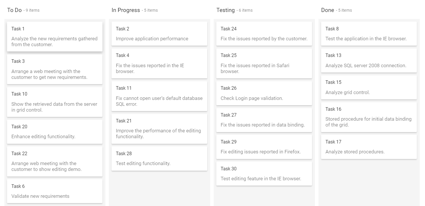
Kanban board allows to render a single column by mapping multiple keys using KeyField property. In below sample, specified the multiple keys(Open, Validate) to a single column.
@Html.EJS().Kanban("kanban").KeyField("Status").DataSource((IEnumerable<object>)ViewBag.data).Columns(col =>
            {
           col.HeaderText("To Do").KeyField("Open, Validate").Add();
           col.HeaderText("In Progress").KeyField("InProgress").Add();
           col.HeaderText("Testing").KeyField("Testing").Add();
           col.HeaderText("Done").KeyField("Close").Add();
       }).CardSettings(card =>  {
           card.ContentField("Summary").HeaderField("Id");
       }).Render()
public class KanbanDataModels
{
public string Id { get; set; }
public string Title { get; set; }
public string Status { get; set; }
public string Summary { get; set; }
public string Type { get; set; }
public string Priority { get; set; }
public string Tags { get; set; }
public Double Estimate { get; set; }
public string Assignee { get; set; }
public int RankId { get; set; }
public string Color { get; set; }
public List<KanbanDataModels> KanbanTasks()
{
List<KanbanDataModels> TaskDetails = new List<KanbanDataModels>();
TaskDetails.Add(new KanbanDataModels { Id = "Task 1", Title = "Task - 29001", Status = "Open", Summary = "Analyze the new requirements gathered from the customer.", Type = "Story", Priority = "Low", Tags = "Analyze,Customer", Estimate = 3.5, Assignee = "Nancy Davloio", RankId = 1, Color = "#8b447a" });
TaskDetails.Add(new KanbanDataModels { Id = "Task 2", Title = "Task - 29002", Status = "InProgress", Summary = "Improve application performance", Type = "Improvement", Priority = "Normal", Tags = "Improvement", Estimate = 6, Assignee = "Andrew Fuller", RankId = 1, Color = "#7d7297" });
TaskDetails.Add(new KanbanDataModels { Id = "Task 3", Title = "Task - 29003", Status = "Open", Summary = "Arrange a web meeting with the customer to get new requirements.", Type = "Others", Priority = "Critical", Tags = "Meeting", Estimate = 5.5, Assignee = "Janet Leverling", RankId = 2, Color = "#27AE60" });
TaskDetails.Add(new KanbanDataModels { Id = "Task 4", Title = "Task - 29004", Status = "InProgress", Summary = "Fix the issues reported in the IE browser.", Type = "Bug", Priority = "Release Breaker", Tags = "IE", Estimate = 2.5, Assignee = "Janet Leverling", RankId = 2, Color = "#cc0000" });
TaskDetails.Add(new KanbanDataModels { Id = "Task 5", Title = "Task - 29005", Status = "Review", Summary = "Fix the issues reported by the customer.", Type = "Bug", Priority = "Low", Tags = "Customer", Estimate = 3.5, Assignee = "Steven walker", RankId = 1, Color = "#cc0000" });
TaskDetails.Add(new KanbanDataModels { Id = "Task 6", Title = "Task - 29007", Status = "Validate", Summary = "Validate new requirements", Type = "Improvement", Priority = "Low", Tags = "Validation", Estimate = 1.5, Assignee = "Robert King", RankId = 1, Color = "#7d7297" });
TaskDetails.Add(new KanbanDataModels { Id = "Task 7", Title = "Task - 29009", Status = "Review", Summary = "Fix the issues reported in Safari browser.", Type = "Bug", Priority = "Release Breaker", Tags = "Fix,Safari", Estimate = 1.5, Assignee = "Nancy Davloio", RankId = 2, Color = "#cc0000" });
TaskDetails.Add(new KanbanDataModels { Id = "Task 8", Title = "Task - 29010", Status = "Close", Summary = "Test the application in the IE browser.", Type = "Story", Priority = "Low", Tags = "Review,IE", Estimate = 5.5, Assignee = "Margaret hamilt", RankId = 3, Color = "#8b447a" });
TaskDetails.Add(new KanbanDataModels { Id = "Task 9", Title = "Task - 29011", Status = "Validate", Summary = "Validate the issues reported by the customer.", Type = "Story", Priority = "High", Tags = "Validation,Fix", Estimate = 1, Assignee = "Steven walker", RankId = 1, Color = "#8b447a" });
TaskDetails.Add(new KanbanDataModels { Id = "Task 10", Title = "Task - 29015", Status = "Open", Summary = "Show the retrieved data from the server in grid control.", Type = "Story", Priority = "High", Tags = "Database,SQL", Estimate = 5.5, Assignee = "Margaret hamilt", RankId = 4, Color = "#8b447a" });
TaskDetails.Add(new KanbanDataModels { Id = "Task 11", Title = "Task - 29016", Status = "InProgress", Summary = "Fix cannot open user’s default database SQL error.", Priority = "Critical", Type = "Bug", Tags = "Database,Sql2008", Estimate = 2.5, Assignee = "Janet Leverling", RankId = 4, Color = "#cc0000" });
TaskDetails.Add(new KanbanDataModels { Id = "Task 12", Title = "Task - 29017", Status = "Review", Summary = "Fix the issues reported in data binding.", Type = "Story", Priority = "Normal", Tags = "Databinding", Estimate = 3.5, Assignee = "Janet Leverling", RankId = 4, Color = "#8b447a" });
TaskDetails.Add(new KanbanDataModels { Id = "Task 13", Title = "Task - 29018", Status = "Close", Summary = "Analyze SQL server 2008 connection.", Type = "Story", Priority = "Release Breaker", Tags = "Grid,Sql", Estimate = 2, Assignee = "Andrew Fuller", RankId = 4, Color = "#8b447a" });
TaskDetails.Add(new KanbanDataModels { Id = "Task 14", Title = "Task - 29019", Status = "Validate", Summary = "Validate databinding issues.", Type = "Story", Priority = "Low", Tags = "Validation", Estimate = 1.5, Assignee = "Margaret hamilt", RankId = 1, Color = "#8b447a" });
TaskDetails.Add(new KanbanDataModels { Id = "Task 15", Title = "Task - 29020", Status = "Close", Summary = "Analyze grid control.", Type = "Story", Priority = "High", Tags = "Analyze", Estimate = 2.5, Assignee = "Margaret hamilt", RankId = 5, Color = "#8b447a" });
TaskDetails.Add(new KanbanDataModels { Id = "Task 16", Title = "Task - 29021", Status = "Close", Summary = "Stored procedure for initial data binding of the grid.", Type = "Others", Priority = "Release Breaker", Tags = "Databinding", Estimate = 1.5, Assignee = "Steven walker", RankId = 6, Color = "#27AE60" });
TaskDetails.Add(new KanbanDataModels { Id = "Task 17", Title = "Task - 29022", Status = "Close", Summary = "Analyze stored procedures.", Type = "Story", Priority = "Release Breaker", Tags = "Procedures", Estimate = 5.5, Assignee = "Janet Leverling", RankId = 7, Color = "#8b447a" });
TaskDetails.Add(new KanbanDataModels { Id = "Task 18", Title = "Task - 29023", Status = "Validate", Summary = "Validate editing issues.", Type = "Story", Priority = "Critical", Tags = "Editing", Estimate = 1, Assignee = "Nancy Davloio", RankId = 1, Color = "#8b447a" });
TaskDetails.Add(new KanbanDataModels { Id = "Task 19", Title = "Task - 29024", Status = "Review", Summary = "Test editing functionality.", Type = "Story", Priority = "Normal", Tags = "Editing,Test", Estimate = 0.5, Assignee = "Nancy Davloio", RankId = 5, Color = "#8b447a" });
TaskDetails.Add(new KanbanDataModels { Id = "Task 20", Title = "Task - 29025", Status = "Open", Summary = "Enhance editing functionality.", Type = "Improvement", Priority = "Low", Tags = "Editing", Estimate = 3.5, Assignee = "Andrew Fuller", RankId = 5, Color = "#7d7297" });
TaskDetails.Add(new KanbanDataModels { Id = "Task 21", Title = "Task - 29026", Status = "InProgress", Summary = "Improve the performance of the editing functionality.", Type = "Epic", Priority = "High", Tags = "Performance", Estimate = 6, Assignee = "Nancy Davloio", RankId = 5, Color = "#6d7492" });
TaskDetails.Add(new KanbanDataModels { Id = "Task 22", Title = "Task - 29027", Status = "Open", Summary = "Arrange web meeting with the customer to show editing demo.", Type = "Others", Priority = "High", Tags = "Meeting,Editing", Estimate = 5.5, Assignee = "Steven walker", RankId = 6, Color = "#27AE60" });
TaskDetails.Add(new KanbanDataModels { Id = "Task 23", Title = "Task - 29029", Status = "Review", Summary = "Fix the editing issues reported by the customer.", Type = "Bug", Priority = "Low", Tags = "Editing,Fix", Estimate = 3.5, Assignee = "Janet Leverling", RankId = 6, Color = "#cc0000" });
TaskDetails.Add(new KanbanDataModels { Id = "Task 24", Title = "Task - 29030", Status = "Testing", Summary = "Fix the issues reported by the customer.", Type = "Bug", Priority = "Critical", Tags = "Customer", Estimate = 3.5, Assignee = "Steven walker", RankId = 1 });
TaskDetails.Add(new KanbanDataModels { Id = "Task 25", Title = "Task - 29031", Status = "Testing", Summary = "Fix the issues reported in Safari browser.", Type = "Bug", Priority = "Release Breaker", Tags = "Fix,Safari", Estimate = 1.5, Assignee = "Nancy Davloio", RankId = 2 });
TaskDetails.Add(new KanbanDataModels { Id = "Task 26", Title = "Task - 29032", Status = "Testing", Summary = "Check Login page validation.", Type = "Story", Priority = "Release Breaker", Tags = "Testing", Estimate = 0.5, Assignee = "Michael Suyama", RankId = 3 });
TaskDetails.Add(new KanbanDataModels { Id = "Task 27", Title = "Task - 29033", Status = "Testing", Summary = "Fix the issues reported in data binding.", Type = "Story", Priority = "Normal", Tags = "Databinding", Estimate = 3.5, Assignee = "Janet Leverling", RankId = 4 });
TaskDetails.Add(new KanbanDataModels { Id = "Task 28", Title = "Task - 29034", Status = "Testing", Summary = "Test editing functionality.", Type = "Story", Priority = "Normal", Tags = "Editing,Test", Estimate = 0.5, Assignee = "Nancy Davloio", RankId = 5 });
TaskDetails.Add(new KanbanDataModels { Id = "Task 29", Title = "Task - 29035", Status = "Testing", Summary = "Fix editing issues reported in Firefox.", Type = "Bug", Priority = "Critical", Tags = "Editing,Fix", Estimate = 1.5, Assignee = "Robert King", RankId = 7 });
TaskDetails.Add(new KanbanDataModels { Id = "Task 30", Title = "Task - 29036", Status = "Testing", Summary = "Test editing feature in the IE browser.", Type = "Story", Priority = "Normal", Tags = "Testing", Estimate = 5.5, Assignee = "Janet Leverling", RankId = 10 });
return TaskDetails;
}
}public class HomeController : Controller
{
public ActionResult Index()
{
ViewBag.data = new KanbanDataModels().KanbanTasks();
return View();
}
}Output be like the below.
Header text
You can provide the column header text of Kanban columns using the HeaderText property. If you have not specified any header text, it will render the header without any text.
Header template
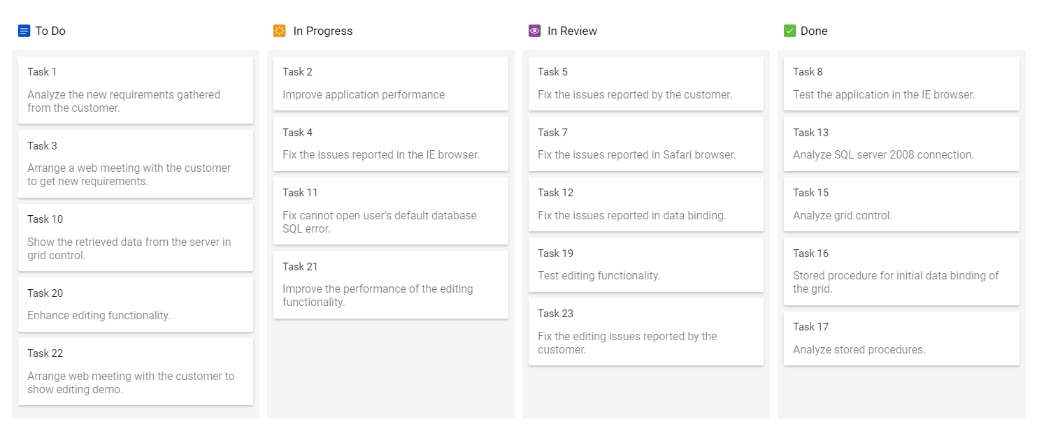
You can customize the column header with any HTML or CSS element using the Template property as shown in the following code.
You can get the following columns data when using header template.
- keyField
- headerText
- minCount
- maxCount
- allowToggle
- isExpanded
- showItemCount
- count
<div>
@Html.EJS().Kanban("kanban").KeyField("Status").DataSource((IEnumerable<object>)ViewBag.data).Columns(col =>
            {
           col.HeaderText("To Do").KeyField("Open").Template("#headerTemplate").Add();
           col.HeaderText("In Progress").KeyField("InProgress").Template("#headerTemplate").Add();
           col.HeaderText("In Review").KeyField("Review").Template("#headerTemplate").Add();
           col.HeaderText("Done").KeyField("Close").Template("#headerTemplate").Add();
       }).CardSettings(card =>  {
           card.ContentField("Summary").HeaderField("Id");
       }).Render()
</div>
<script id="headerTemplate" type="text/x-jsrender">
    <div class="header-template-wrap">
        <div class="header-icon e-icons ${keyField}"></div>
        <div class="header-text">${headerText}</div>
    </div>
</script>
<style type="text/css">
    .e-kanban .header-template-wrap {
        display: inline-flex;
        font-size: 15px;
        font-weight: 400;
    }

        .e-kanban .header-template-wrap .header-icon {
            font-family: 'Kanban priority icons';
            margin-top: 3px;
            width: 10%;
        }

        .e-kanban .header-template-wrap .header-text {
            margin-left: 15px;
        }

    .e-kanban.e-rtl .header-template-wrap .header-text {
        margin-right: 15px;
    }

    .e-kanban .card-header {
        padding-left: 12px;
    }

    .e-kanban .Open::before {
        content: '\e700';
        color: #0251cc;
        font-size: 16px;
    }

    .e-kanban .InProgress::before {
        content: '\e703';
        color: #ea9713;
        font-size: 16px;
    }

    .e-kanban .Review::before {
        content: '\e701';
        color: #8e4399;
        font-size: 16px;
    }

    .e-kanban .Close::before {
        content: '\e702';
        color: #63ba3c;
        font-size: 16px;
    }

    @@font-face {
        font-family: 'Kanban priority icons';
        src: url(data:application/x-font-ttf;charset=utf-8;base64,AAEAAAAKAIAAAwAgT1MvMj1tSfUAAAEoAAAAVmNtYXDnE+dkAAABlAAAADxnbHlmg4weAgAAAdwAAAhQaGVhZBfH57sAAADQAAAANmhoZWEIVQQGAAAArAAAACRobXR4FAAAAAAAAYAAAAAUbG9jYQNeBi4AAAHQAAAADG1heHABGAFgAAABCAAAACBuYW1lH65UOQAACiwAAALNcG9zdFsyKlEAAAz8AAAAUgABAAAEAAAAAFwEAAAAAAAD+AABAAAAAAAAAAAAAAAAAAAABQABAAAAAQAA7pb8lF8PPPUACwQAAAAAANpY0WMAAAAA2ljRYwAAAAAD+AP4AAAACAACAAAAAAAAAAEAAAAFAVQACQAAAAAAAgAAAAoACgAAAP8AAAAAAAAAAQQAAZAABQAAAokCzAAAAI8CiQLMAAAB6wAyAQgAAAIABQMAAAAAAAAAAAAAAAAAAAAAAAAAAAAAUGZFZABA5wDnAwQAAAAAXAQAAAAAAAABAAAAAAAABAAAAAQAAAAEAAAABAAAAAQAAAAAAAACAAAAAwAAABQAAwABAAAAFAAEACgAAAAEAAQAAQAA5wP//wAA5wD//wAAAAEABAAAAAEAAgADAAQAAAAAAMwCBgKSBCgABAAAAAAD+AP4ACEAQwBlAKkAAAEfBw8HIS8HPwclHwcPByEvBz8HJR8HDwchLwc/BycRHw8hPw8RLw8hDw4CXgcGBQUEAwEBAQEDBAUFBgf+hgYGBQUEAwEBAQEDBAUFBgYCOAYGBQUEAwEBAQEDBAUFBgb9yAYGBQUEAwEBAQEDBAUFBgYCOAYGBQUEAwEBAQEDBAUFBgb9yAYGBQUEAwEBAQEDBAUFBgbcAQIDBQUHCAkKCgsMDQ0ODQLgDQ4NDQwLCgoJCAcFBQMCAQECAwUFBwgJCgoLDA0NDg39IA0ODQ0MCwoKCQgHBQUDAgFDAQEDBAUFBgYHBgUFBAMBAQEBAwQFBQYHBgYFBQQDAQG9AQEDBAUFBgcGBgUFBAMBAQEBAwQFBQYGBwYFBQQDAQG9AQEDBAUFBgYHBgUFBAMBAQEBAwQFBQYHBgYFBQQDAQGz/SANDg0NDAsKCgkIBwUFAwIBAQIDBQUHCAkKCgsMDQ0ODQLgDQ4NDQwLCgoJCAcFBQMCAQECAwUFBwgJCgoLDA0NDgAABAAAAAAD+AP4AD8AggDUARgAAAEfBw8PLw41Pw8fBicPDx8PMz8OLxAHNzMfEhUPESsBLxA9AT8UJREfDyE/DxEvDyEPDgJlCAcGBgQCAgEBAgMEBQcHCAkJCwsMDAwNDgwNDAsLCgkICAYFAwMBAQMDBQUHBwgJCQoLCwwMDA4MDAwLCgqEDg8PDw4PDw8VFBQUExMTEhUWFhYXFxgYEhMSERISEREUEBEREBESERkZGRgXFxcXEA8QEBAREREWFxYVFhUWFhIeFAsXGBkYGRkYGSATExISEhIRBQMBAgICHBkaGhscGx0UExMTExMTExoUFRQVFBUVHBoaGhkYGRkEAgIDGBQVFhYXFxcREREQEREQEQ8ODv4aAQIDBQUHCAkKCgsMDQ0ODQLgDQ4NDQwLCgoJCAcFBQMCAQECAwUFBwgJCgoLDA0NDg39IA0ODQ0MCwoKCQgHBQUDAgJXCQoKCwsMDAwNDAwMCgsJCQgHBgUEAwIBAQIDBQUHCAkJCgsMCw0MDQwLDAoLCQkJBwcGBQQCAgEBAgMEBQYIWQMEBQYGBwgJDg4PERETExUYFxUTEhAPDgkIBwUFAwEBAgIEBQYHCA0QEBMUFhcaEREQDw8NDQ0PDQsJCAYEAwEBMAIEBggJDA4PFg8PERESFBQHBwYGBgUEIBsZFhUTERAJCAYGBAMCAgQFBggJChAREhUWGBoeCAUFBAYHGxcVFBMREQ8KCQgHBgYEBAMCAYT9IA0ODQ0MCwoKCQgHBQUDAgEBAgMFBQcICQoKCwwNDQ4NAuANDg0NDAsKCgkIBwUFAwIBAQIDBQUHCAkKCgsMDQ0OAAIAAAAAA/gD+AArAG8AAAEfAhUPAwEPAy8INT8GMx8DAT8DHwIlER8PIT8PES8PIQ8OAvMEAwIBAQME/r8FBQYGBgYFBXkEAwEBAgMEBQUGBgYGBgViASoFBgYGBgYF/RoBAgMFBQcICQoKCwwNDQ4NAuANDg0NDAsKCgkIBwUFAwIBAQIDBQUHCAkKCgsMDQ0ODf0gDQ4NDQwLCgoJCAcFBQMCArQFBgYGBgYFBf7FBAMBAQEBAwR2BQUGBgYGBgUEAwEBAgMEYAElBAMBAQEBA7j9IA0ODQ0MCwoKCQgHBQUDAgEBAgMFBQcICQoKCwwNDQ4NAuANDg0NDAsKCgkIBwUFAwIBAQIDBQUHCAkKCgsMDQ0OAAAJAAAAAAP4A/gAIQBDAGUAhwCpAMsA7QEPAVMAAAEVDwcvBzU/Bx8GNx8EDwYrAS8GPQE/BTsBHwEFHwMPBysBLwU9AT8GOwEfASUfBw8HIy8HPwchHwcPByMvBz8HJR8DDwcrAS8FPQE/BjsBHwEFHwMdAQ8FKwEvBz8GOwEfASUVDwcvBzU/Bx8GJREfDyE/DxEvDyEPDgIgAQIDBAQGBgYGBgYEBAMCAQECAwQEBgYGBgYGBAQDAopiBAMCAQECAwQFBQYGBgYFBWIEAwICAwQFBQYGBgYF/t8EAwIBAQIDBGIFBQYGBgYFBQQDAgIDBGIFBQYGBgYFAdwHBgUFBAMBAQEBAwQFBQYHigYGBgQEAwIBAQIDBAQGBgb+YAYGBgQEAwIBAQIDBAQGBgaKBwYFBQQDAQEBAQMEBQUGBwJlBAMCAQECAwRiBQUGBgYGBQUEAwICAwRiBQUGBgYGBf4bYgQDAgIDBAUFBgYGBgUFYgQDAgEBAgMEBQUGBgYGBQEEAQIDBAQGBgYGBgYEBAMCAQECAwQEBgYGBgYGBAQDAv3pAQIDBQUHCAkKCgsMDQ0ODQLgDQ4NDQwLCgoJCAcFBQMCAQECAwUFBwgJCgoLDA0NDg39IA0ODQ0MCwoKCQgHBQUDAgEwigcGBQUEAwEBAQEDBAUFBgeKBgYGBAQDAgEBAgMEBAYGTWIFBQYGBgYFBQQDAgIDBGIFBQYGBgYFBQQDAgIDBAUFBgYGBgUFYgQDAgIDBAUFBgYGBgUFYgQDAgIDmQECAwQEBgYGBgYGBAQDAgEBAgMEBAYGBgYGBgQEAwIBAQIDBAQGBgYGBgYEBAMCAQECAwQEBgYGBgYGBAQDAgHrBQUGBgYGBQViBAMCAgMEBQUGBgYGBQViBAMCAgMEYgUFBgYGBgUFBAMCAgMEYgUFBgYGBgUFBAMCAgNLigYGBgQEAwIBAQIDBAQGBgaKBwYFBQQDAQEBAQMEBQUGD/0gDQ4NDQwLCgoJCAcFBQMCAQECAwUFBwgJCgoLDA0NDg0C4A0ODQ0MCwoKCQgHBQUDAgEBAgMFBQcICQoKCwwNDQ4AAAAAEgDeAAEAAAAAAAAAAQAAAAEAAAAAAAEAFQABAAEAAAAAAAIABwAWAAEAAAAAAAMAFQAdAAEAAAAAAAQAFQAyAAEAAAAAAAUACwBHAAEAAAAAAAYAFQBSAAEAAAAAAAoALABnAAEAAAAAAAsAEgCTAAMAAQQJAAAAAgClAAMAAQQJAAEAKgCnAAMAAQQJAAIADgDRAAMAAQQJAAMAKgDfAAMAAQQJAAQAKgEJAAMAAQQJAAUAFgEzAAMAAQQJAAYAKgFJAAMAAQQJAAoAWAFzAAMAAQQJAAsAJAHLIEthbmJhbiBwcmlvcml0eSBpY29uc1JlZ3VsYXJLYW5iYW4gcHJpb3JpdHkgaWNvbnNLYW5iYW4gcHJpb3JpdHkgaWNvbnNWZXJzaW9uIDEuMEthbmJhbiBwcmlvcml0eSBpY29uc0ZvbnQgZ2VuZXJhdGVkIHVzaW5nIFN5bmNmdXNpb24gTWV0cm8gU3R1ZGlvd3d3LnN5bmNmdXNpb24uY29tACAASwBhAG4AYgBhAG4AIABwAHIAaQBvAHIAaQB0AHkAIABpAGMAbwBuAHMAUgBlAGcAdQBsAGEAcgBLAGEAbgBiAGEAbgAgAHAAcgBpAG8AcgBpAHQAeQAgAGkAYwBvAG4AcwBLAGEAbgBiAGEAbgAgAHAAcgBpAG8AcgBpAHQAeQAgAGkAYwBvAG4AcwBWAGUAcgBzAGkAbwBuACAAMQAuADAASwBhAG4AYgBhAG4AIABwAHIAaQBvAHIAaQB0AHkAIABpAGMAbwBuAHMARgBvAG4AdAAgAGcAZQBuAGUAcgBhAHQAZQBkACAAdQBzAGkAbgBnACAAUwB5AG4AYwBmAHUAcwBpAG8AbgAgAE0AZQB0AHIAbwAgAFMAdAB1AGQAaQBvAHcAdwB3AC4AcwB5AG4AYwBmAHUAcwBpAG8AbgAuAGMAbwBtAAAAAAIAAAAAAAAACgAAAAAAAAAAAAAAAAAAAAAAAAAAAAAABQECAQMBBAEFAQYACFRvZG9saXN0BlJldmlldwlDb21wbGV0ZWQIUHJvZ3Jlc3MAAAAA) format('truetype');
        font-weight: normal;
        font-style: normal;
    }

    [class^="sf-icon-"],
    [class*=" sf-icon-"] {
        font-family: 'Kanban priority icons' !important;
        speak: none;
        font-size: 55px;
        font-style: normal;
        font-weight: normal;
        font-variant: normal;
        text-transform: none;
        line-height: 1;
        -webkit-font-smoothing: antialiased;
        -moz-osx-font-smoothing: grayscale;
    }
</style>
public class KanbanDataModels
{
public string Id { get; set; }
public string Title { get; set; }
public string Status { get; set; }
public string Summary { get; set; }
public string Type { get; set; }
public string Priority { get; set; }
public string Tags { get; set; }
public Double Estimate { get; set; }
public string Assignee { get; set; }
public int RankId { get; set; }
public string Color { get; set; }
public List<KanbanDataModels> KanbanTasks()
{
List<KanbanDataModels> TaskDetails = new List<KanbanDataModels>();
TaskDetails.Add(new KanbanDataModels { Id = "Task 1", Title = "Task - 29001", Status = "Open", Summary = "Analyze the new requirements gathered from the customer.", Type = "Story", Priority = "Low", Tags = "Analyze,Customer", Estimate = 3.5, Assignee = "Nancy Davloio", RankId = 1, Color = "#8b447a" });
TaskDetails.Add(new KanbanDataModels { Id = "Task 2", Title = "Task - 29002", Status = "InProgress", Summary = "Improve application performance", Type = "Improvement", Priority = "Normal", Tags = "Improvement", Estimate = 6, Assignee = "Andrew Fuller", RankId = 1, Color = "#7d7297" });
TaskDetails.Add(new KanbanDataModels { Id = "Task 3", Title = "Task - 29003", Status = "Open", Summary = "Arrange a web meeting with the customer to get new requirements.", Type = "Others", Priority = "Critical", Tags = "Meeting", Estimate = 5.5, Assignee = "Janet Leverling", RankId = 2, Color = "#27AE60" });
TaskDetails.Add(new KanbanDataModels { Id = "Task 4", Title = "Task - 29004", Status = "InProgress", Summary = "Fix the issues reported in the IE browser.", Type = "Bug", Priority = "Release Breaker", Tags = "IE", Estimate = 2.5, Assignee = "Janet Leverling", RankId = 2, Color = "#cc0000" });
TaskDetails.Add(new KanbanDataModels { Id = "Task 5", Title = "Task - 29005", Status = "Review", Summary = "Fix the issues reported by the customer.", Type = "Bug", Priority = "Low", Tags = "Customer", Estimate = 3.5, Assignee = "Steven walker", RankId = 1, Color = "#cc0000" });
TaskDetails.Add(new KanbanDataModels { Id = "Task 6", Title = "Task - 29007", Status = "Validate", Summary = "Validate new requirements", Type = "Improvement", Priority = "Low", Tags = "Validation", Estimate = 1.5, Assignee = "Robert King", RankId = 1, Color = "#7d7297" });
TaskDetails.Add(new KanbanDataModels { Id = "Task 7", Title = "Task - 29009", Status = "Review", Summary = "Fix the issues reported in Safari browser.", Type = "Bug", Priority = "Release Breaker", Tags = "Fix,Safari", Estimate = 1.5, Assignee = "Nancy Davloio", RankId = 2, Color = "#cc0000" });
TaskDetails.Add(new KanbanDataModels { Id = "Task 8", Title = "Task - 29010", Status = "Close", Summary = "Test the application in the IE browser.", Type = "Story", Priority = "Low", Tags = "Review,IE", Estimate = 5.5, Assignee = "Margaret hamilt", RankId = 3, Color = "#8b447a" });
TaskDetails.Add(new KanbanDataModels { Id = "Task 9", Title = "Task - 29011", Status = "Validate", Summary = "Validate the issues reported by the customer.", Type = "Story", Priority = "High", Tags = "Validation,Fix", Estimate = 1, Assignee = "Steven walker", RankId = 1, Color = "#8b447a" });
TaskDetails.Add(new KanbanDataModels { Id = "Task 10", Title = "Task - 29015", Status = "Open", Summary = "Show the retrieved data from the server in grid control.", Type = "Story", Priority = "High", Tags = "Database,SQL", Estimate = 5.5, Assignee = "Margaret hamilt", RankId = 4, Color = "#8b447a" });
TaskDetails.Add(new KanbanDataModels { Id = "Task 11", Title = "Task - 29016", Status = "InProgress", Summary = "Fix cannot open user’s default database SQL error.", Priority = "Critical", Type = "Bug", Tags = "Database,Sql2008", Estimate = 2.5, Assignee = "Janet Leverling", RankId = 4, Color = "#cc0000" });
TaskDetails.Add(new KanbanDataModels { Id = "Task 12", Title = "Task - 29017", Status = "Review", Summary = "Fix the issues reported in data binding.", Type = "Story", Priority = "Normal", Tags = "Databinding", Estimate = 3.5, Assignee = "Janet Leverling", RankId = 4, Color = "#8b447a" });
TaskDetails.Add(new KanbanDataModels { Id = "Task 13", Title = "Task - 29018", Status = "Close", Summary = "Analyze SQL server 2008 connection.", Type = "Story", Priority = "Release Breaker", Tags = "Grid,Sql", Estimate = 2, Assignee = "Andrew Fuller", RankId = 4, Color = "#8b447a" });
TaskDetails.Add(new KanbanDataModels { Id = "Task 14", Title = "Task - 29019", Status = "Validate", Summary = "Validate databinding issues.", Type = "Story", Priority = "Low", Tags = "Validation", Estimate = 1.5, Assignee = "Margaret hamilt", RankId = 1, Color = "#8b447a" });
TaskDetails.Add(new KanbanDataModels { Id = "Task 15", Title = "Task - 29020", Status = "Close", Summary = "Analyze grid control.", Type = "Story", Priority = "High", Tags = "Analyze", Estimate = 2.5, Assignee = "Margaret hamilt", RankId = 5, Color = "#8b447a" });
TaskDetails.Add(new KanbanDataModels { Id = "Task 16", Title = "Task - 29021", Status = "Close", Summary = "Stored procedure for initial data binding of the grid.", Type = "Others", Priority = "Release Breaker", Tags = "Databinding", Estimate = 1.5, Assignee = "Steven walker", RankId = 6, Color = "#27AE60" });
TaskDetails.Add(new KanbanDataModels { Id = "Task 17", Title = "Task - 29022", Status = "Close", Summary = "Analyze stored procedures.", Type = "Story", Priority = "Release Breaker", Tags = "Procedures", Estimate = 5.5, Assignee = "Janet Leverling", RankId = 7, Color = "#8b447a" });
TaskDetails.Add(new KanbanDataModels { Id = "Task 18", Title = "Task - 29023", Status = "Validate", Summary = "Validate editing issues.", Type = "Story", Priority = "Critical", Tags = "Editing", Estimate = 1, Assignee = "Nancy Davloio", RankId = 1, Color = "#8b447a" });
TaskDetails.Add(new KanbanDataModels { Id = "Task 19", Title = "Task - 29024", Status = "Review", Summary = "Test editing functionality.", Type = "Story", Priority = "Normal", Tags = "Editing,Test", Estimate = 0.5, Assignee = "Nancy Davloio", RankId = 5, Color = "#8b447a" });
TaskDetails.Add(new KanbanDataModels { Id = "Task 20", Title = "Task - 29025", Status = "Open", Summary = "Enhance editing functionality.", Type = "Improvement", Priority = "Low", Tags = "Editing", Estimate = 3.5, Assignee = "Andrew Fuller", RankId = 5, Color = "#7d7297" });
TaskDetails.Add(new KanbanDataModels { Id = "Task 21", Title = "Task - 29026", Status = "InProgress", Summary = "Improve the performance of the editing functionality.", Type = "Epic", Priority = "High", Tags = "Performance", Estimate = 6, Assignee = "Nancy Davloio", RankId = 5, Color = "#6d7492" });
TaskDetails.Add(new KanbanDataModels { Id = "Task 22", Title = "Task - 29027", Status = "Open", Summary = "Arrange web meeting with the customer to show editing demo.", Type = "Others", Priority = "High", Tags = "Meeting,Editing", Estimate = 5.5, Assignee = "Steven walker", RankId = 6, Color = "#27AE60" });
TaskDetails.Add(new KanbanDataModels { Id = "Task 23", Title = "Task - 29029", Status = "Review", Summary = "Fix the editing issues reported by the customer.", Type = "Bug", Priority = "Low", Tags = "Editing,Fix", Estimate = 3.5, Assignee = "Janet Leverling", RankId = 6, Color = "#cc0000" });
TaskDetails.Add(new KanbanDataModels { Id = "Task 24", Title = "Task - 29030", Status = "Testing", Summary = "Fix the issues reported by the customer.", Type = "Bug", Priority = "Critical", Tags = "Customer", Estimate = 3.5, Assignee = "Steven walker", RankId = 1 });
TaskDetails.Add(new KanbanDataModels { Id = "Task 25", Title = "Task - 29031", Status = "Testing", Summary = "Fix the issues reported in Safari browser.", Type = "Bug", Priority = "Release Breaker", Tags = "Fix,Safari", Estimate = 1.5, Assignee = "Nancy Davloio", RankId = 2 });
TaskDetails.Add(new KanbanDataModels { Id = "Task 26", Title = "Task - 29032", Status = "Testing", Summary = "Check Login page validation.", Type = "Story", Priority = "Release Breaker", Tags = "Testing", Estimate = 0.5, Assignee = "Michael Suyama", RankId = 3 });
TaskDetails.Add(new KanbanDataModels { Id = "Task 27", Title = "Task - 29033", Status = "Testing", Summary = "Fix the issues reported in data binding.", Type = "Story", Priority = "Normal", Tags = "Databinding", Estimate = 3.5, Assignee = "Janet Leverling", RankId = 4 });
TaskDetails.Add(new KanbanDataModels { Id = "Task 28", Title = "Task - 29034", Status = "Testing", Summary = "Test editing functionality.", Type = "Story", Priority = "Normal", Tags = "Editing,Test", Estimate = 0.5, Assignee = "Nancy Davloio", RankId = 5 });
TaskDetails.Add(new KanbanDataModels { Id = "Task 29", Title = "Task - 29035", Status = "Testing", Summary = "Fix editing issues reported in Firefox.", Type = "Bug", Priority = "Critical", Tags = "Editing,Fix", Estimate = 1.5, Assignee = "Robert King", RankId = 7 });
TaskDetails.Add(new KanbanDataModels { Id = "Task 30", Title = "Task - 29036", Status = "Testing", Summary = "Test editing feature in the IE browser.", Type = "Story", Priority = "Normal", Tags = "Testing", Estimate = 5.5, Assignee = "Janet Leverling", RankId = 10 });
return TaskDetails;
}
}public class HomeController : Controller
{
public ActionResult Index()
{
ViewBag.data = new KanbanDataModels().KanbanTasks();
return View();
}
}Output be like the below.
Toggle columns
Kanban allows to expand or collapse its columns using AllowToggle inside the Columns property. When enable the property, it will render the expand or collapse icon to the column header.
By default, collapsed column width is set to
50px.
<div>
@Html.EJS().Kanban("kanban").KeyField("Status").DataSource((IEnumerable<object>)ViewBag.data).Columns(col=> {
           col.HeaderText("To Do").KeyField("Open").AllowToggle(true).Add();
           col.HeaderText("In Progress").KeyField("InProgress").AllowToggle(true).Add();
           col.HeaderText("Testing").KeyField("Testing").AllowToggle(true).Add();
           col.HeaderText("Done").KeyField("Close").AllowToggle(true).Add();
       }).CardSettings(card => {
           card.ContentField("Summary").HeaderField("Id");
       }).Render()
</div>
public class KanbanDataModels
{
public string Id { get; set; }
public string Title { get; set; }
public string Status { get; set; }
public string Summary { get; set; }
public string Type { get; set; }
public string Priority { get; set; }
public string Tags { get; set; }
public Double Estimate { get; set; }
public string Assignee { get; set; }
public int RankId { get; set; }
public string Color { get; set; }
public List<KanbanDataModels> KanbanTasks()
{
List<KanbanDataModels> TaskDetails = new List<KanbanDataModels>();
TaskDetails.Add(new KanbanDataModels { Id = "Task 1", Title = "Task - 29001", Status = "Open", Summary = "Analyze the new requirements gathered from the customer.", Type = "Story", Priority = "Low", Tags = "Analyze,Customer", Estimate = 3.5, Assignee = "Nancy Davloio", RankId = 1, Color = "#8b447a" });
TaskDetails.Add(new KanbanDataModels { Id = "Task 2", Title = "Task - 29002", Status = "InProgress", Summary = "Improve application performance", Type = "Improvement", Priority = "Normal", Tags = "Improvement", Estimate = 6, Assignee = "Andrew Fuller", RankId = 1, Color = "#7d7297" });
TaskDetails.Add(new KanbanDataModels { Id = "Task 3", Title = "Task - 29003", Status = "Open", Summary = "Arrange a web meeting with the customer to get new requirements.", Type = "Others", Priority = "Critical", Tags = "Meeting", Estimate = 5.5, Assignee = "Janet Leverling", RankId = 2, Color = "#27AE60" });
TaskDetails.Add(new KanbanDataModels { Id = "Task 4", Title = "Task - 29004", Status = "InProgress", Summary = "Fix the issues reported in the IE browser.", Type = "Bug", Priority = "Release Breaker", Tags = "IE", Estimate = 2.5, Assignee = "Janet Leverling", RankId = 2, Color = "#cc0000" });
TaskDetails.Add(new KanbanDataModels { Id = "Task 5", Title = "Task - 29005", Status = "Review", Summary = "Fix the issues reported by the customer.", Type = "Bug", Priority = "Low", Tags = "Customer", Estimate = 3.5, Assignee = "Steven walker", RankId = 1, Color = "#cc0000" });
TaskDetails.Add(new KanbanDataModels { Id = "Task 6", Title = "Task - 29007", Status = "Validate", Summary = "Validate new requirements", Type = "Improvement", Priority = "Low", Tags = "Validation", Estimate = 1.5, Assignee = "Robert King", RankId = 1, Color = "#7d7297" });
TaskDetails.Add(new KanbanDataModels { Id = "Task 7", Title = "Task - 29009", Status = "Review", Summary = "Fix the issues reported in Safari browser.", Type = "Bug", Priority = "Release Breaker", Tags = "Fix,Safari", Estimate = 1.5, Assignee = "Nancy Davloio", RankId = 2, Color = "#cc0000" });
TaskDetails.Add(new KanbanDataModels { Id = "Task 8", Title = "Task - 29010", Status = "Close", Summary = "Test the application in the IE browser.", Type = "Story", Priority = "Low", Tags = "Review,IE", Estimate = 5.5, Assignee = "Margaret hamilt", RankId = 3, Color = "#8b447a" });
TaskDetails.Add(new KanbanDataModels { Id = "Task 9", Title = "Task - 29011", Status = "Validate", Summary = "Validate the issues reported by the customer.", Type = "Story", Priority = "High", Tags = "Validation,Fix", Estimate = 1, Assignee = "Steven walker", RankId = 1, Color = "#8b447a" });
TaskDetails.Add(new KanbanDataModels { Id = "Task 10", Title = "Task - 29015", Status = "Open", Summary = "Show the retrieved data from the server in grid control.", Type = "Story", Priority = "High", Tags = "Database,SQL", Estimate = 5.5, Assignee = "Margaret hamilt", RankId = 4, Color = "#8b447a" });
TaskDetails.Add(new KanbanDataModels { Id = "Task 11", Title = "Task - 29016", Status = "InProgress", Summary = "Fix cannot open user’s default database SQL error.", Priority = "Critical", Type = "Bug", Tags = "Database,Sql2008", Estimate = 2.5, Assignee = "Janet Leverling", RankId = 4, Color = "#cc0000" });
TaskDetails.Add(new KanbanDataModels { Id = "Task 12", Title = "Task - 29017", Status = "Review", Summary = "Fix the issues reported in data binding.", Type = "Story", Priority = "Normal", Tags = "Databinding", Estimate = 3.5, Assignee = "Janet Leverling", RankId = 4, Color = "#8b447a" });
TaskDetails.Add(new KanbanDataModels { Id = "Task 13", Title = "Task - 29018", Status = "Close", Summary = "Analyze SQL server 2008 connection.", Type = "Story", Priority = "Release Breaker", Tags = "Grid,Sql", Estimate = 2, Assignee = "Andrew Fuller", RankId = 4, Color = "#8b447a" });
TaskDetails.Add(new KanbanDataModels { Id = "Task 14", Title = "Task - 29019", Status = "Validate", Summary = "Validate databinding issues.", Type = "Story", Priority = "Low", Tags = "Validation", Estimate = 1.5, Assignee = "Margaret hamilt", RankId = 1, Color = "#8b447a" });
TaskDetails.Add(new KanbanDataModels { Id = "Task 15", Title = "Task - 29020", Status = "Close", Summary = "Analyze grid control.", Type = "Story", Priority = "High", Tags = "Analyze", Estimate = 2.5, Assignee = "Margaret hamilt", RankId = 5, Color = "#8b447a" });
TaskDetails.Add(new KanbanDataModels { Id = "Task 16", Title = "Task - 29021", Status = "Close", Summary = "Stored procedure for initial data binding of the grid.", Type = "Others", Priority = "Release Breaker", Tags = "Databinding", Estimate = 1.5, Assignee = "Steven walker", RankId = 6, Color = "#27AE60" });
TaskDetails.Add(new KanbanDataModels { Id = "Task 17", Title = "Task - 29022", Status = "Close", Summary = "Analyze stored procedures.", Type = "Story", Priority = "Release Breaker", Tags = "Procedures", Estimate = 5.5, Assignee = "Janet Leverling", RankId = 7, Color = "#8b447a" });
TaskDetails.Add(new KanbanDataModels { Id = "Task 18", Title = "Task - 29023", Status = "Validate", Summary = "Validate editing issues.", Type = "Story", Priority = "Critical", Tags = "Editing", Estimate = 1, Assignee = "Nancy Davloio", RankId = 1, Color = "#8b447a" });
TaskDetails.Add(new KanbanDataModels { Id = "Task 19", Title = "Task - 29024", Status = "Review", Summary = "Test editing functionality.", Type = "Story", Priority = "Normal", Tags = "Editing,Test", Estimate = 0.5, Assignee = "Nancy Davloio", RankId = 5, Color = "#8b447a" });
TaskDetails.Add(new KanbanDataModels { Id = "Task 20", Title = "Task - 29025", Status = "Open", Summary = "Enhance editing functionality.", Type = "Improvement", Priority = "Low", Tags = "Editing", Estimate = 3.5, Assignee = "Andrew Fuller", RankId = 5, Color = "#7d7297" });
TaskDetails.Add(new KanbanDataModels { Id = "Task 21", Title = "Task - 29026", Status = "InProgress", Summary = "Improve the performance of the editing functionality.", Type = "Epic", Priority = "High", Tags = "Performance", Estimate = 6, Assignee = "Nancy Davloio", RankId = 5, Color = "#6d7492" });
TaskDetails.Add(new KanbanDataModels { Id = "Task 22", Title = "Task - 29027", Status = "Open", Summary = "Arrange web meeting with the customer to show editing demo.", Type = "Others", Priority = "High", Tags = "Meeting,Editing", Estimate = 5.5, Assignee = "Steven walker", RankId = 6, Color = "#27AE60" });
TaskDetails.Add(new KanbanDataModels { Id = "Task 23", Title = "Task - 29029", Status = "Review", Summary = "Fix the editing issues reported by the customer.", Type = "Bug", Priority = "Low", Tags = "Editing,Fix", Estimate = 3.5, Assignee = "Janet Leverling", RankId = 6, Color = "#cc0000" });
TaskDetails.Add(new KanbanDataModels { Id = "Task 24", Title = "Task - 29030", Status = "Testing", Summary = "Fix the issues reported by the customer.", Type = "Bug", Priority = "Critical", Tags = "Customer", Estimate = 3.5, Assignee = "Steven walker", RankId = 1 });
TaskDetails.Add(new KanbanDataModels { Id = "Task 25", Title = "Task - 29031", Status = "Testing", Summary = "Fix the issues reported in Safari browser.", Type = "Bug", Priority = "Release Breaker", Tags = "Fix,Safari", Estimate = 1.5, Assignee = "Nancy Davloio", RankId = 2 });
TaskDetails.Add(new KanbanDataModels { Id = "Task 26", Title = "Task - 29032", Status = "Testing", Summary = "Check Login page validation.", Type = "Story", Priority = "Release Breaker", Tags = "Testing", Estimate = 0.5, Assignee = "Michael Suyama", RankId = 3 });
TaskDetails.Add(new KanbanDataModels { Id = "Task 27", Title = "Task - 29033", Status = "Testing", Summary = "Fix the issues reported in data binding.", Type = "Story", Priority = "Normal", Tags = "Databinding", Estimate = 3.5, Assignee = "Janet Leverling", RankId = 4 });
TaskDetails.Add(new KanbanDataModels { Id = "Task 28", Title = "Task - 29034", Status = "Testing", Summary = "Test editing functionality.", Type = "Story", Priority = "Normal", Tags = "Editing,Test", Estimate = 0.5, Assignee = "Nancy Davloio", RankId = 5 });
TaskDetails.Add(new KanbanDataModels { Id = "Task 29", Title = "Task - 29035", Status = "Testing", Summary = "Fix editing issues reported in Firefox.", Type = "Bug", Priority = "Critical", Tags = "Editing,Fix", Estimate = 1.5, Assignee = "Robert King", RankId = 7 });
TaskDetails.Add(new KanbanDataModels { Id = "Task 30", Title = "Task - 29036", Status = "Testing", Summary = "Test editing feature in the IE browser.", Type = "Story", Priority = "Normal", Tags = "Testing", Estimate = 5.5, Assignee = "Janet Leverling", RankId = 10 });
return TaskDetails;
}
}public class HomeController : Controller
{
public ActionResult Index()
{
ViewBag.data = new KanbanDataModels().KanbanTasks();
return View();
}
}Output be like the below.
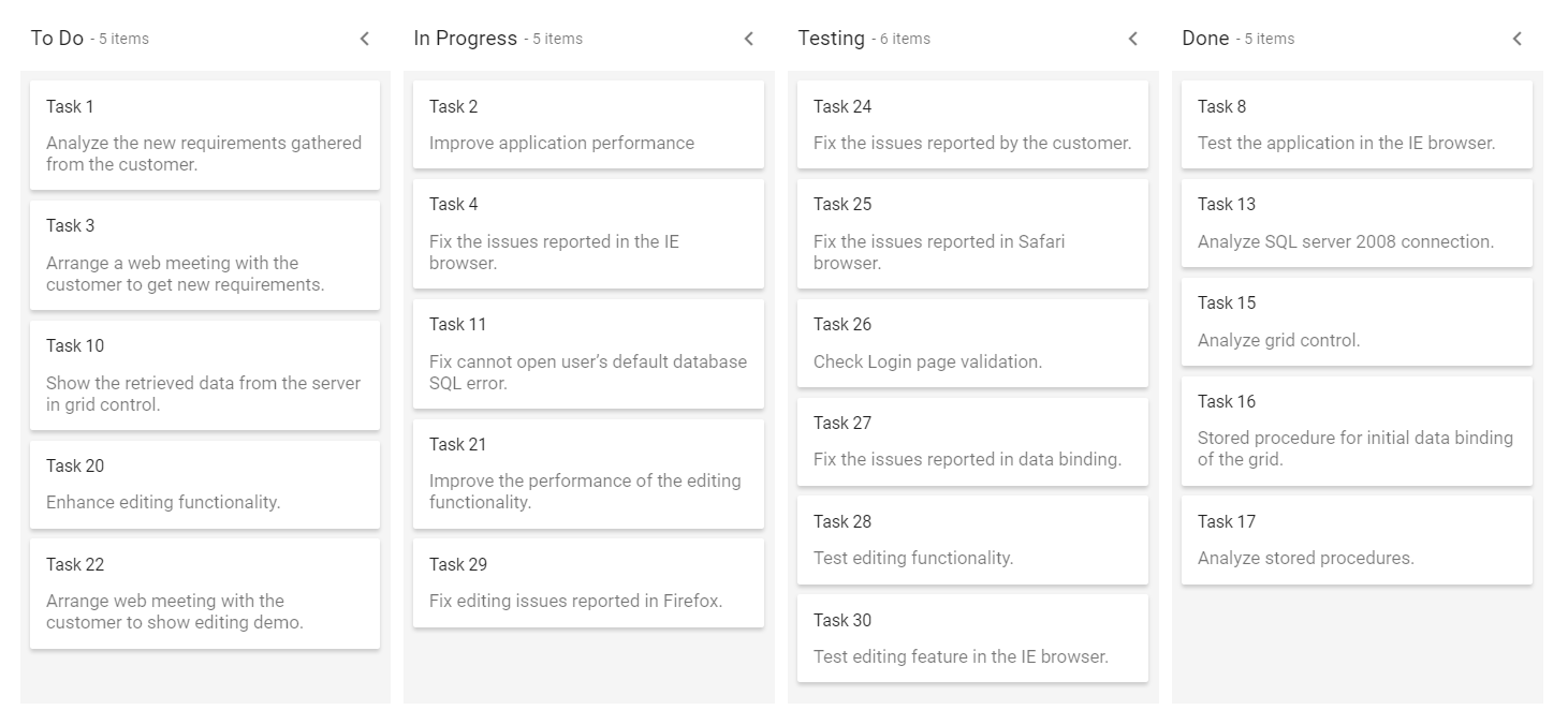
Initially collapsed column
By default, all columns are on expanded state when loading the Kanban board initially. But, you can render the columns with collapsed state using the IsExpanded property.
The
IsExpandedproperty only works when enabling theAllowToggleproperty on particular column.
In the following example, the To Do column is collapsed on initialization of Kanban board.
<div>
@Html.EJS().Kanban("kanban").KeyField("Status").DataSource((IEnumerable<object>)ViewBag.data).Columns(col=> {
           col.HeaderText("To Do").KeyField("Open").AllowToggle(true).IsExpanded(false).Add();
           col.HeaderText("In Progress").KeyField("InProgress").AllowToggle(true).Add();
           col.HeaderText("Testing").KeyField("Testing").AllowToggle(true).IsExpanded(false).Add();
           col.HeaderText("Done").KeyField("Close").AllowToggle(true).Add();
       }).CardSettings(card =>  {
           card.ContentField("Summary").HeaderField("Id");
       }).Render()
</div>
public class KanbanDataModels
{
public string Id { get; set; }
public string Title { get; set; }
public string Status { get; set; }
public string Summary { get; set; }
public string Type { get; set; }
public string Priority { get; set; }
public string Tags { get; set; }
public Double Estimate { get; set; }
public string Assignee { get; set; }
public int RankId { get; set; }
public string Color { get; set; }
public List<KanbanDataModels> KanbanTasks()
{
List<KanbanDataModels> TaskDetails = new List<KanbanDataModels>();
TaskDetails.Add(new KanbanDataModels { Id = "Task 1", Title = "Task - 29001", Status = "Open", Summary = "Analyze the new requirements gathered from the customer.", Type = "Story", Priority = "Low", Tags = "Analyze,Customer", Estimate = 3.5, Assignee = "Nancy Davloio", RankId = 1, Color = "#8b447a" });
TaskDetails.Add(new KanbanDataModels { Id = "Task 2", Title = "Task - 29002", Status = "InProgress", Summary = "Improve application performance", Type = "Improvement", Priority = "Normal", Tags = "Improvement", Estimate = 6, Assignee = "Andrew Fuller", RankId = 1, Color = "#7d7297" });
TaskDetails.Add(new KanbanDataModels { Id = "Task 3", Title = "Task - 29003", Status = "Open", Summary = "Arrange a web meeting with the customer to get new requirements.", Type = "Others", Priority = "Critical", Tags = "Meeting", Estimate = 5.5, Assignee = "Janet Leverling", RankId = 2, Color = "#27AE60" });
TaskDetails.Add(new KanbanDataModels { Id = "Task 4", Title = "Task - 29004", Status = "InProgress", Summary = "Fix the issues reported in the IE browser.", Type = "Bug", Priority = "Release Breaker", Tags = "IE", Estimate = 2.5, Assignee = "Janet Leverling", RankId = 2, Color = "#cc0000" });
TaskDetails.Add(new KanbanDataModels { Id = "Task 5", Title = "Task - 29005", Status = "Review", Summary = "Fix the issues reported by the customer.", Type = "Bug", Priority = "Low", Tags = "Customer", Estimate = 3.5, Assignee = "Steven walker", RankId = 1, Color = "#cc0000" });
TaskDetails.Add(new KanbanDataModels { Id = "Task 6", Title = "Task - 29007", Status = "Validate", Summary = "Validate new requirements", Type = "Improvement", Priority = "Low", Tags = "Validation", Estimate = 1.5, Assignee = "Robert King", RankId = 1, Color = "#7d7297" });
TaskDetails.Add(new KanbanDataModels { Id = "Task 7", Title = "Task - 29009", Status = "Review", Summary = "Fix the issues reported in Safari browser.", Type = "Bug", Priority = "Release Breaker", Tags = "Fix,Safari", Estimate = 1.5, Assignee = "Nancy Davloio", RankId = 2, Color = "#cc0000" });
TaskDetails.Add(new KanbanDataModels { Id = "Task 8", Title = "Task - 29010", Status = "Close", Summary = "Test the application in the IE browser.", Type = "Story", Priority = "Low", Tags = "Review,IE", Estimate = 5.5, Assignee = "Margaret hamilt", RankId = 3, Color = "#8b447a" });
TaskDetails.Add(new KanbanDataModels { Id = "Task 9", Title = "Task - 29011", Status = "Validate", Summary = "Validate the issues reported by the customer.", Type = "Story", Priority = "High", Tags = "Validation,Fix", Estimate = 1, Assignee = "Steven walker", RankId = 1, Color = "#8b447a" });
TaskDetails.Add(new KanbanDataModels { Id = "Task 10", Title = "Task - 29015", Status = "Open", Summary = "Show the retrieved data from the server in grid control.", Type = "Story", Priority = "High", Tags = "Database,SQL", Estimate = 5.5, Assignee = "Margaret hamilt", RankId = 4, Color = "#8b447a" });
TaskDetails.Add(new KanbanDataModels { Id = "Task 11", Title = "Task - 29016", Status = "InProgress", Summary = "Fix cannot open user’s default database SQL error.", Priority = "Critical", Type = "Bug", Tags = "Database,Sql2008", Estimate = 2.5, Assignee = "Janet Leverling", RankId = 4, Color = "#cc0000" });
TaskDetails.Add(new KanbanDataModels { Id = "Task 12", Title = "Task - 29017", Status = "Review", Summary = "Fix the issues reported in data binding.", Type = "Story", Priority = "Normal", Tags = "Databinding", Estimate = 3.5, Assignee = "Janet Leverling", RankId = 4, Color = "#8b447a" });
TaskDetails.Add(new KanbanDataModels { Id = "Task 13", Title = "Task - 29018", Status = "Close", Summary = "Analyze SQL server 2008 connection.", Type = "Story", Priority = "Release Breaker", Tags = "Grid,Sql", Estimate = 2, Assignee = "Andrew Fuller", RankId = 4, Color = "#8b447a" });
TaskDetails.Add(new KanbanDataModels { Id = "Task 14", Title = "Task - 29019", Status = "Validate", Summary = "Validate databinding issues.", Type = "Story", Priority = "Low", Tags = "Validation", Estimate = 1.5, Assignee = "Margaret hamilt", RankId = 1, Color = "#8b447a" });
TaskDetails.Add(new KanbanDataModels { Id = "Task 15", Title = "Task - 29020", Status = "Close", Summary = "Analyze grid control.", Type = "Story", Priority = "High", Tags = "Analyze", Estimate = 2.5, Assignee = "Margaret hamilt", RankId = 5, Color = "#8b447a" });
TaskDetails.Add(new KanbanDataModels { Id = "Task 16", Title = "Task - 29021", Status = "Close", Summary = "Stored procedure for initial data binding of the grid.", Type = "Others", Priority = "Release Breaker", Tags = "Databinding", Estimate = 1.5, Assignee = "Steven walker", RankId = 6, Color = "#27AE60" });
TaskDetails.Add(new KanbanDataModels { Id = "Task 17", Title = "Task - 29022", Status = "Close", Summary = "Analyze stored procedures.", Type = "Story", Priority = "Release Breaker", Tags = "Procedures", Estimate = 5.5, Assignee = "Janet Leverling", RankId = 7, Color = "#8b447a" });
TaskDetails.Add(new KanbanDataModels { Id = "Task 18", Title = "Task - 29023", Status = "Validate", Summary = "Validate editing issues.", Type = "Story", Priority = "Critical", Tags = "Editing", Estimate = 1, Assignee = "Nancy Davloio", RankId = 1, Color = "#8b447a" });
TaskDetails.Add(new KanbanDataModels { Id = "Task 19", Title = "Task - 29024", Status = "Review", Summary = "Test editing functionality.", Type = "Story", Priority = "Normal", Tags = "Editing,Test", Estimate = 0.5, Assignee = "Nancy Davloio", RankId = 5, Color = "#8b447a" });
TaskDetails.Add(new KanbanDataModels { Id = "Task 20", Title = "Task - 29025", Status = "Open", Summary = "Enhance editing functionality.", Type = "Improvement", Priority = "Low", Tags = "Editing", Estimate = 3.5, Assignee = "Andrew Fuller", RankId = 5, Color = "#7d7297" });
TaskDetails.Add(new KanbanDataModels { Id = "Task 21", Title = "Task - 29026", Status = "InProgress", Summary = "Improve the performance of the editing functionality.", Type = "Epic", Priority = "High", Tags = "Performance", Estimate = 6, Assignee = "Nancy Davloio", RankId = 5, Color = "#6d7492" });
TaskDetails.Add(new KanbanDataModels { Id = "Task 22", Title = "Task - 29027", Status = "Open", Summary = "Arrange web meeting with the customer to show editing demo.", Type = "Others", Priority = "High", Tags = "Meeting,Editing", Estimate = 5.5, Assignee = "Steven walker", RankId = 6, Color = "#27AE60" });
TaskDetails.Add(new KanbanDataModels { Id = "Task 23", Title = "Task - 29029", Status = "Review", Summary = "Fix the editing issues reported by the customer.", Type = "Bug", Priority = "Low", Tags = "Editing,Fix", Estimate = 3.5, Assignee = "Janet Leverling", RankId = 6, Color = "#cc0000" });
TaskDetails.Add(new KanbanDataModels { Id = "Task 24", Title = "Task - 29030", Status = "Testing", Summary = "Fix the issues reported by the customer.", Type = "Bug", Priority = "Critical", Tags = "Customer", Estimate = 3.5, Assignee = "Steven walker", RankId = 1 });
TaskDetails.Add(new KanbanDataModels { Id = "Task 25", Title = "Task - 29031", Status = "Testing", Summary = "Fix the issues reported in Safari browser.", Type = "Bug", Priority = "Release Breaker", Tags = "Fix,Safari", Estimate = 1.5, Assignee = "Nancy Davloio", RankId = 2 });
TaskDetails.Add(new KanbanDataModels { Id = "Task 26", Title = "Task - 29032", Status = "Testing", Summary = "Check Login page validation.", Type = "Story", Priority = "Release Breaker", Tags = "Testing", Estimate = 0.5, Assignee = "Michael Suyama", RankId = 3 });
TaskDetails.Add(new KanbanDataModels { Id = "Task 27", Title = "Task - 29033", Status = "Testing", Summary = "Fix the issues reported in data binding.", Type = "Story", Priority = "Normal", Tags = "Databinding", Estimate = 3.5, Assignee = "Janet Leverling", RankId = 4 });
TaskDetails.Add(new KanbanDataModels { Id = "Task 28", Title = "Task - 29034", Status = "Testing", Summary = "Test editing functionality.", Type = "Story", Priority = "Normal", Tags = "Editing,Test", Estimate = 0.5, Assignee = "Nancy Davloio", RankId = 5 });
TaskDetails.Add(new KanbanDataModels { Id = "Task 29", Title = "Task - 29035", Status = "Testing", Summary = "Fix editing issues reported in Firefox.", Type = "Bug", Priority = "Critical", Tags = "Editing,Fix", Estimate = 1.5, Assignee = "Robert King", RankId = 7 });
TaskDetails.Add(new KanbanDataModels { Id = "Task 30", Title = "Task - 29036", Status = "Testing", Summary = "Test editing feature in the IE browser.", Type = "Story", Priority = "Normal", Tags = "Testing", Estimate = 5.5, Assignee = "Janet Leverling", RankId = 10 });
return TaskDetails;
}
}public class HomeController : Controller
{
public ActionResult Index()
{
ViewBag.data = new KanbanDataModels().KanbanTasks();
return View();
}
}Output be like the below.
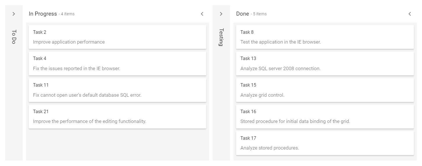
Drag and Drop
The Kanban component allows dynamic column reordering through drag-and-drop interactions. To enable this, set the [allowColumnDragAndDrop] property to true. Once enabled, users can rearrange columns by dragging a column header to a new position, with visual feedback highlighting potential drop locations.
@model List<KanbanSample.Controllers.KanbanDataModels>

@Html.EJS().Kanban("kanban").KeyField("Status").AllowColumnDragAndDrop(true).DataSource((IEnumerable<object>)Model).Columns(col =>
		{
	   col.HeaderText("To Do").KeyField("Open").Add();
	   col.HeaderText("In Progress").KeyField("InProgress").Add();
	   col.HeaderText("Testing").KeyField("Testing").Add();
	   col.HeaderText("Done").KeyField("Close").Add();
   }).CardSettings(card =>  {
	   card.ContentField("Summary").HeaderField("Id");
   }).Render()
public class KanbanDataModels
{
public string Id { get; set; }
public string Title { get; set; }
public string Status { get; set; }
public string Summary { get; set; }
public string Type { get; set; }
public string Priority { get; set; }
public string Tags { get; set; }
public Double Estimate { get; set; }
public string Assignee { get; set; }
public int RankId { get; set; }
public string Color { get; set; }
public List<KanbanDataModels> KanbanTasks()
{
List<KanbanDataModels> TaskDetails = new List<KanbanDataModels>();
TaskDetails.Add(new KanbanDataModels { Id = "Task 1", Title = "Task - 29001", Status = "Open", Summary = "Analyze the new requirements gathered from the customer.", Type = "Story", Priority = "Low", Tags = "Analyze,Customer", Estimate = 3.5, Assignee = "Nancy Davloio", RankId = 1, Color = "#8b447a" });
TaskDetails.Add(new KanbanDataModels { Id = "Task 2", Title = "Task - 29002", Status = "InProgress", Summary = "Improve application performance", Type = "Improvement", Priority = "Normal", Tags = "Improvement", Estimate = 6, Assignee = "Andrew Fuller", RankId = 1, Color = "#7d7297" });
TaskDetails.Add(new KanbanDataModels { Id = "Task 3", Title = "Task - 29003", Status = "Open", Summary = "Arrange a web meeting with the customer to get new requirements.", Type = "Others", Priority = "Critical", Tags = "Meeting", Estimate = 5.5, Assignee = "Janet Leverling", RankId = 2, Color = "#27AE60" });
TaskDetails.Add(new KanbanDataModels { Id = "Task 4", Title = "Task - 29004", Status = "InProgress", Summary = "Fix the issues reported in the IE browser.", Type = "Bug", Priority = "Release Breaker", Tags = "IE", Estimate = 2.5, Assignee = "Janet Leverling", RankId = 2, Color = "#cc0000" });
TaskDetails.Add(new KanbanDataModels { Id = "Task 5", Title = "Task - 29005", Status = "Review", Summary = "Fix the issues reported by the customer.", Type = "Bug", Priority = "Low", Tags = "Customer", Estimate = 3.5, Assignee = "Steven walker", RankId = 1, Color = "#cc0000" });
TaskDetails.Add(new KanbanDataModels { Id = "Task 6", Title = "Task - 29007", Status = "Validate", Summary = "Validate new requirements", Type = "Improvement", Priority = "Low", Tags = "Validation", Estimate = 1.5, Assignee = "Robert King", RankId = 1, Color = "#7d7297" });
TaskDetails.Add(new KanbanDataModels { Id = "Task 7", Title = "Task - 29009", Status = "Review", Summary = "Fix the issues reported in Safari browser.", Type = "Bug", Priority = "Release Breaker", Tags = "Fix,Safari", Estimate = 1.5, Assignee = "Nancy Davloio", RankId = 2, Color = "#cc0000" });
TaskDetails.Add(new KanbanDataModels { Id = "Task 8", Title = "Task - 29010", Status = "Close", Summary = "Test the application in the IE browser.", Type = "Story", Priority = "Low", Tags = "Review,IE", Estimate = 5.5, Assignee = "Margaret hamilt", RankId = 3, Color = "#8b447a" });
TaskDetails.Add(new KanbanDataModels { Id = "Task 9", Title = "Task - 29011", Status = "Validate", Summary = "Validate the issues reported by the customer.", Type = "Story", Priority = "High", Tags = "Validation,Fix", Estimate = 1, Assignee = "Steven walker", RankId = 1, Color = "#8b447a" });
TaskDetails.Add(new KanbanDataModels { Id = "Task 10", Title = "Task - 29015", Status = "Open", Summary = "Show the retrieved data from the server in grid control.", Type = "Story", Priority = "High", Tags = "Database,SQL", Estimate = 5.5, Assignee = "Margaret hamilt", RankId = 4, Color = "#8b447a" });
TaskDetails.Add(new KanbanDataModels { Id = "Task 11", Title = "Task - 29016", Status = "InProgress", Summary = "Fix cannot open user’s default database SQL error.", Priority = "Critical", Type = "Bug", Tags = "Database,Sql2008", Estimate = 2.5, Assignee = "Janet Leverling", RankId = 4, Color = "#cc0000" });
TaskDetails.Add(new KanbanDataModels { Id = "Task 12", Title = "Task - 29017", Status = "Review", Summary = "Fix the issues reported in data binding.", Type = "Story", Priority = "Normal", Tags = "Databinding", Estimate = 3.5, Assignee = "Janet Leverling", RankId = 4, Color = "#8b447a" });
TaskDetails.Add(new KanbanDataModels { Id = "Task 13", Title = "Task - 29018", Status = "Close", Summary = "Analyze SQL server 2008 connection.", Type = "Story", Priority = "Release Breaker", Tags = "Grid,Sql", Estimate = 2, Assignee = "Andrew Fuller", RankId = 4, Color = "#8b447a" });
TaskDetails.Add(new KanbanDataModels { Id = "Task 14", Title = "Task - 29019", Status = "Validate", Summary = "Validate databinding issues.", Type = "Story", Priority = "Low", Tags = "Validation", Estimate = 1.5, Assignee = "Margaret hamilt", RankId = 1, Color = "#8b447a" });
TaskDetails.Add(new KanbanDataModels { Id = "Task 15", Title = "Task - 29020", Status = "Close", Summary = "Analyze grid control.", Type = "Story", Priority = "High", Tags = "Analyze", Estimate = 2.5, Assignee = "Margaret hamilt", RankId = 5, Color = "#8b447a" });
TaskDetails.Add(new KanbanDataModels { Id = "Task 16", Title = "Task - 29021", Status = "Close", Summary = "Stored procedure for initial data binding of the grid.", Type = "Others", Priority = "Release Breaker", Tags = "Databinding", Estimate = 1.5, Assignee = "Steven walker", RankId = 6, Color = "#27AE60" });
TaskDetails.Add(new KanbanDataModels { Id = "Task 17", Title = "Task - 29022", Status = "Close", Summary = "Analyze stored procedures.", Type = "Story", Priority = "Release Breaker", Tags = "Procedures", Estimate = 5.5, Assignee = "Janet Leverling", RankId = 7, Color = "#8b447a" });
TaskDetails.Add(new KanbanDataModels { Id = "Task 18", Title = "Task - 29023", Status = "Validate", Summary = "Validate editing issues.", Type = "Story", Priority = "Critical", Tags = "Editing", Estimate = 1, Assignee = "Nancy Davloio", RankId = 1, Color = "#8b447a" });
TaskDetails.Add(new KanbanDataModels { Id = "Task 19", Title = "Task - 29024", Status = "Review", Summary = "Test editing functionality.", Type = "Story", Priority = "Normal", Tags = "Editing,Test", Estimate = 0.5, Assignee = "Nancy Davloio", RankId = 5, Color = "#8b447a" });
TaskDetails.Add(new KanbanDataModels { Id = "Task 20", Title = "Task - 29025", Status = "Open", Summary = "Enhance editing functionality.", Type = "Improvement", Priority = "Low", Tags = "Editing", Estimate = 3.5, Assignee = "Andrew Fuller", RankId = 5, Color = "#7d7297" });
TaskDetails.Add(new KanbanDataModels { Id = "Task 21", Title = "Task - 29026", Status = "InProgress", Summary = "Improve the performance of the editing functionality.", Type = "Epic", Priority = "High", Tags = "Performance", Estimate = 6, Assignee = "Nancy Davloio", RankId = 5, Color = "#6d7492" });
TaskDetails.Add(new KanbanDataModels { Id = "Task 22", Title = "Task - 29027", Status = "Open", Summary = "Arrange web meeting with the customer to show editing demo.", Type = "Others", Priority = "High", Tags = "Meeting,Editing", Estimate = 5.5, Assignee = "Steven walker", RankId = 6, Color = "#27AE60" });
TaskDetails.Add(new KanbanDataModels { Id = "Task 23", Title = "Task - 29029", Status = "Review", Summary = "Fix the editing issues reported by the customer.", Type = "Bug", Priority = "Low", Tags = "Editing,Fix", Estimate = 3.5, Assignee = "Janet Leverling", RankId = 6, Color = "#cc0000" });
TaskDetails.Add(new KanbanDataModels { Id = "Task 24", Title = "Task - 29030", Status = "Testing", Summary = "Fix the issues reported by the customer.", Type = "Bug", Priority = "Critical", Tags = "Customer", Estimate = 3.5, Assignee = "Steven walker", RankId = 1 });
TaskDetails.Add(new KanbanDataModels { Id = "Task 25", Title = "Task - 29031", Status = "Testing", Summary = "Fix the issues reported in Safari browser.", Type = "Bug", Priority = "Release Breaker", Tags = "Fix,Safari", Estimate = 1.5, Assignee = "Nancy Davloio", RankId = 2 });
TaskDetails.Add(new KanbanDataModels { Id = "Task 26", Title = "Task - 29032", Status = "Testing", Summary = "Check Login page validation.", Type = "Story", Priority = "Release Breaker", Tags = "Testing", Estimate = 0.5, Assignee = "Michael Suyama", RankId = 3 });
TaskDetails.Add(new KanbanDataModels { Id = "Task 27", Title = "Task - 29033", Status = "Testing", Summary = "Fix the issues reported in data binding.", Type = "Story", Priority = "Normal", Tags = "Databinding", Estimate = 3.5, Assignee = "Janet Leverling", RankId = 4 });
TaskDetails.Add(new KanbanDataModels { Id = "Task 28", Title = "Task - 29034", Status = "Testing", Summary = "Test editing functionality.", Type = "Story", Priority = "Normal", Tags = "Editing,Test", Estimate = 0.5, Assignee = "Nancy Davloio", RankId = 5 });
TaskDetails.Add(new KanbanDataModels { Id = "Task 29", Title = "Task - 29035", Status = "Testing", Summary = "Fix editing issues reported in Firefox.", Type = "Bug", Priority = "Critical", Tags = "Editing,Fix", Estimate = 1.5, Assignee = "Robert King", RankId = 7 });
TaskDetails.Add(new KanbanDataModels { Id = "Task 30", Title = "Task - 29036", Status = "Testing", Summary = "Test editing feature in the IE browser.", Type = "Story", Priority = "Normal", Tags = "Testing", Estimate = 5.5, Assignee = "Janet Leverling", RankId = 10 });
return TaskDetails;
}
}public class HomeController : Controller
{
public ActionResult Index()
{
ViewBag.data = new KanbanDataModels().KanbanTasks();
return View();
}
}Stacked headers
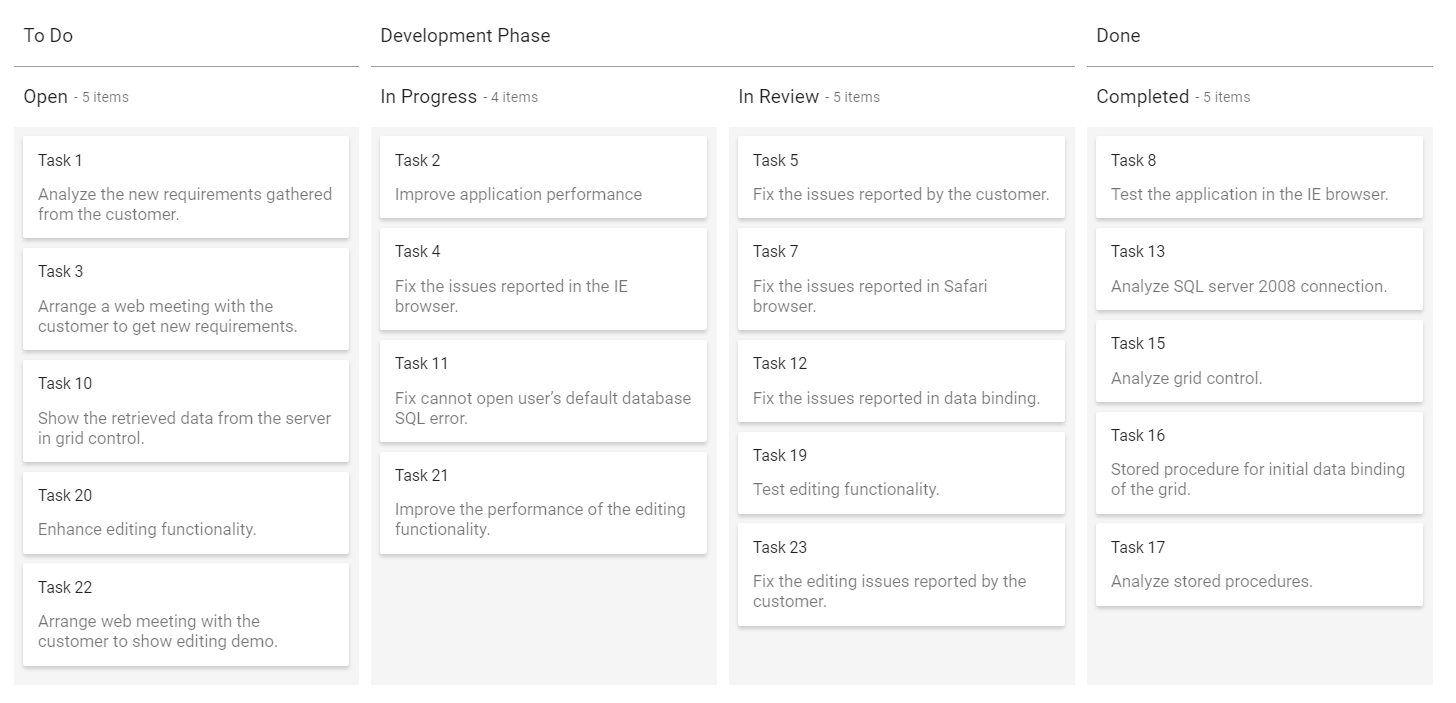
Stacked headers are the additional headers to column header that will group the similar columns.
Define the grouping of columns Key value to the KeyFields property and provide the custom header text name to grouped columns using the Text property, which is placed inside the StackedHeaders property.
In the following code, the kanban columns ‘InProgress, Review’ are grouped under ‘Development phase’ category.
@Html.EJS().Kanban("kanban").KeyField("Status").DataSource((IEnumerable<object>)ViewBag.data).Columns(col=> {
       col.HeaderText("Open").KeyField("Open").Add();
       col.HeaderText("In Progress").KeyField("InProgress").Add();
       col.HeaderText("In Review").KeyField("Review").Add();
       col.HeaderText("Completed").KeyField("Close").Add();
       }).CardSettings(card =>  {
       card.ContentField("Summary").HeaderField("Id");
       }).StackedHeaders(stackedHeaders => {
       stackedHeaders.Text("To Do").KeyFields("Open").Add();
       stackedHeaders.Text("Development Phase").KeyFields("InProgress,Review").Add();
       stackedHeaders.Text("Done").KeyFields("Close").Add(); }).Render()
public class KanbanDataModels
{
public string Id { get; set; }
public string Title { get; set; }
public string Status { get; set; }
public string Summary { get; set; }
public string Type { get; set; }
public string Priority { get; set; }
public string Tags { get; set; }
public Double Estimate { get; set; }
public string Assignee { get; set; }
public int RankId { get; set; }
public string Color { get; set; }
public List<KanbanDataModels> KanbanTasks()
{
List<KanbanDataModels> TaskDetails = new List<KanbanDataModels>();
TaskDetails.Add(new KanbanDataModels { Id = "Task 1", Title = "Task - 29001", Status = "Open", Summary = "Analyze the new requirements gathered from the customer.", Type = "Story", Priority = "Low", Tags = "Analyze,Customer", Estimate = 3.5, Assignee = "Nancy Davloio", RankId = 1, Color = "#8b447a" });
TaskDetails.Add(new KanbanDataModels { Id = "Task 2", Title = "Task - 29002", Status = "InProgress", Summary = "Improve application performance", Type = "Improvement", Priority = "Normal", Tags = "Improvement", Estimate = 6, Assignee = "Andrew Fuller", RankId = 1, Color = "#7d7297" });
TaskDetails.Add(new KanbanDataModels { Id = "Task 3", Title = "Task - 29003", Status = "Open", Summary = "Arrange a web meeting with the customer to get new requirements.", Type = "Others", Priority = "Critical", Tags = "Meeting", Estimate = 5.5, Assignee = "Janet Leverling", RankId = 2, Color = "#27AE60" });
TaskDetails.Add(new KanbanDataModels { Id = "Task 4", Title = "Task - 29004", Status = "InProgress", Summary = "Fix the issues reported in the IE browser.", Type = "Bug", Priority = "Release Breaker", Tags = "IE", Estimate = 2.5, Assignee = "Janet Leverling", RankId = 2, Color = "#cc0000" });
TaskDetails.Add(new KanbanDataModels { Id = "Task 5", Title = "Task - 29005", Status = "Review", Summary = "Fix the issues reported by the customer.", Type = "Bug", Priority = "Low", Tags = "Customer", Estimate = 3.5, Assignee = "Steven walker", RankId = 1, Color = "#cc0000" });
TaskDetails.Add(new KanbanDataModels { Id = "Task 6", Title = "Task - 29007", Status = "Validate", Summary = "Validate new requirements", Type = "Improvement", Priority = "Low", Tags = "Validation", Estimate = 1.5, Assignee = "Robert King", RankId = 1, Color = "#7d7297" });
TaskDetails.Add(new KanbanDataModels { Id = "Task 7", Title = "Task - 29009", Status = "Review", Summary = "Fix the issues reported in Safari browser.", Type = "Bug", Priority = "Release Breaker", Tags = "Fix,Safari", Estimate = 1.5, Assignee = "Nancy Davloio", RankId = 2, Color = "#cc0000" });
TaskDetails.Add(new KanbanDataModels { Id = "Task 8", Title = "Task - 29010", Status = "Close", Summary = "Test the application in the IE browser.", Type = "Story", Priority = "Low", Tags = "Review,IE", Estimate = 5.5, Assignee = "Margaret hamilt", RankId = 3, Color = "#8b447a" });
TaskDetails.Add(new KanbanDataModels { Id = "Task 9", Title = "Task - 29011", Status = "Validate", Summary = "Validate the issues reported by the customer.", Type = "Story", Priority = "High", Tags = "Validation,Fix", Estimate = 1, Assignee = "Steven walker", RankId = 1, Color = "#8b447a" });
TaskDetails.Add(new KanbanDataModels { Id = "Task 10", Title = "Task - 29015", Status = "Open", Summary = "Show the retrieved data from the server in grid control.", Type = "Story", Priority = "High", Tags = "Database,SQL", Estimate = 5.5, Assignee = "Margaret hamilt", RankId = 4, Color = "#8b447a" });
TaskDetails.Add(new KanbanDataModels { Id = "Task 11", Title = "Task - 29016", Status = "InProgress", Summary = "Fix cannot open user’s default database SQL error.", Priority = "Critical", Type = "Bug", Tags = "Database,Sql2008", Estimate = 2.5, Assignee = "Janet Leverling", RankId = 4, Color = "#cc0000" });
TaskDetails.Add(new KanbanDataModels { Id = "Task 12", Title = "Task - 29017", Status = "Review", Summary = "Fix the issues reported in data binding.", Type = "Story", Priority = "Normal", Tags = "Databinding", Estimate = 3.5, Assignee = "Janet Leverling", RankId = 4, Color = "#8b447a" });
TaskDetails.Add(new KanbanDataModels { Id = "Task 13", Title = "Task - 29018", Status = "Close", Summary = "Analyze SQL server 2008 connection.", Type = "Story", Priority = "Release Breaker", Tags = "Grid,Sql", Estimate = 2, Assignee = "Andrew Fuller", RankId = 4, Color = "#8b447a" });
TaskDetails.Add(new KanbanDataModels { Id = "Task 14", Title = "Task - 29019", Status = "Validate", Summary = "Validate databinding issues.", Type = "Story", Priority = "Low", Tags = "Validation", Estimate = 1.5, Assignee = "Margaret hamilt", RankId = 1, Color = "#8b447a" });
TaskDetails.Add(new KanbanDataModels { Id = "Task 15", Title = "Task - 29020", Status = "Close", Summary = "Analyze grid control.", Type = "Story", Priority = "High", Tags = "Analyze", Estimate = 2.5, Assignee = "Margaret hamilt", RankId = 5, Color = "#8b447a" });
TaskDetails.Add(new KanbanDataModels { Id = "Task 16", Title = "Task - 29021", Status = "Close", Summary = "Stored procedure for initial data binding of the grid.", Type = "Others", Priority = "Release Breaker", Tags = "Databinding", Estimate = 1.5, Assignee = "Steven walker", RankId = 6, Color = "#27AE60" });
TaskDetails.Add(new KanbanDataModels { Id = "Task 17", Title = "Task - 29022", Status = "Close", Summary = "Analyze stored procedures.", Type = "Story", Priority = "Release Breaker", Tags = "Procedures", Estimate = 5.5, Assignee = "Janet Leverling", RankId = 7, Color = "#8b447a" });
TaskDetails.Add(new KanbanDataModels { Id = "Task 18", Title = "Task - 29023", Status = "Validate", Summary = "Validate editing issues.", Type = "Story", Priority = "Critical", Tags = "Editing", Estimate = 1, Assignee = "Nancy Davloio", RankId = 1, Color = "#8b447a" });
TaskDetails.Add(new KanbanDataModels { Id = "Task 19", Title = "Task - 29024", Status = "Review", Summary = "Test editing functionality.", Type = "Story", Priority = "Normal", Tags = "Editing,Test", Estimate = 0.5, Assignee = "Nancy Davloio", RankId = 5, Color = "#8b447a" });
TaskDetails.Add(new KanbanDataModels { Id = "Task 20", Title = "Task - 29025", Status = "Open", Summary = "Enhance editing functionality.", Type = "Improvement", Priority = "Low", Tags = "Editing", Estimate = 3.5, Assignee = "Andrew Fuller", RankId = 5, Color = "#7d7297" });
TaskDetails.Add(new KanbanDataModels { Id = "Task 21", Title = "Task - 29026", Status = "InProgress", Summary = "Improve the performance of the editing functionality.", Type = "Epic", Priority = "High", Tags = "Performance", Estimate = 6, Assignee = "Nancy Davloio", RankId = 5, Color = "#6d7492" });
TaskDetails.Add(new KanbanDataModels { Id = "Task 22", Title = "Task - 29027", Status = "Open", Summary = "Arrange web meeting with the customer to show editing demo.", Type = "Others", Priority = "High", Tags = "Meeting,Editing", Estimate = 5.5, Assignee = "Steven walker", RankId = 6, Color = "#27AE60" });
TaskDetails.Add(new KanbanDataModels { Id = "Task 23", Title = "Task - 29029", Status = "Review", Summary = "Fix the editing issues reported by the customer.", Type = "Bug", Priority = "Low", Tags = "Editing,Fix", Estimate = 3.5, Assignee = "Janet Leverling", RankId = 6, Color = "#cc0000" });
TaskDetails.Add(new KanbanDataModels { Id = "Task 24", Title = "Task - 29030", Status = "Testing", Summary = "Fix the issues reported by the customer.", Type = "Bug", Priority = "Critical", Tags = "Customer", Estimate = 3.5, Assignee = "Steven walker", RankId = 1 });
TaskDetails.Add(new KanbanDataModels { Id = "Task 25", Title = "Task - 29031", Status = "Testing", Summary = "Fix the issues reported in Safari browser.", Type = "Bug", Priority = "Release Breaker", Tags = "Fix,Safari", Estimate = 1.5, Assignee = "Nancy Davloio", RankId = 2 });
TaskDetails.Add(new KanbanDataModels { Id = "Task 26", Title = "Task - 29032", Status = "Testing", Summary = "Check Login page validation.", Type = "Story", Priority = "Release Breaker", Tags = "Testing", Estimate = 0.5, Assignee = "Michael Suyama", RankId = 3 });
TaskDetails.Add(new KanbanDataModels { Id = "Task 27", Title = "Task - 29033", Status = "Testing", Summary = "Fix the issues reported in data binding.", Type = "Story", Priority = "Normal", Tags = "Databinding", Estimate = 3.5, Assignee = "Janet Leverling", RankId = 4 });
TaskDetails.Add(new KanbanDataModels { Id = "Task 28", Title = "Task - 29034", Status = "Testing", Summary = "Test editing functionality.", Type = "Story", Priority = "Normal", Tags = "Editing,Test", Estimate = 0.5, Assignee = "Nancy Davloio", RankId = 5 });
TaskDetails.Add(new KanbanDataModels { Id = "Task 29", Title = "Task - 29035", Status = "Testing", Summary = "Fix editing issues reported in Firefox.", Type = "Bug", Priority = "Critical", Tags = "Editing,Fix", Estimate = 1.5, Assignee = "Robert King", RankId = 7 });
TaskDetails.Add(new KanbanDataModels { Id = "Task 30", Title = "Task - 29036", Status = "Testing", Summary = "Test editing feature in the IE browser.", Type = "Story", Priority = "Normal", Tags = "Testing", Estimate = 5.5, Assignee = "Janet Leverling", RankId = 10 });
return TaskDetails;
}
}public class HomeController : Controller
{
public ActionResult Index()
{
ViewBag.data = new KanbanDataModels().KanbanTasks();
return View();
}
}Output be like the below.