Columns in Kanban Board
18 Nov 20182 minutes to read
The Kanban columns represent the each stage of the process. The column definitions are used as the dataSource schema in the Kanban. The Kanban operations such as drag-and-drop, swimlane, and toggle columns are performed based on column definitions.
Single-key mapping
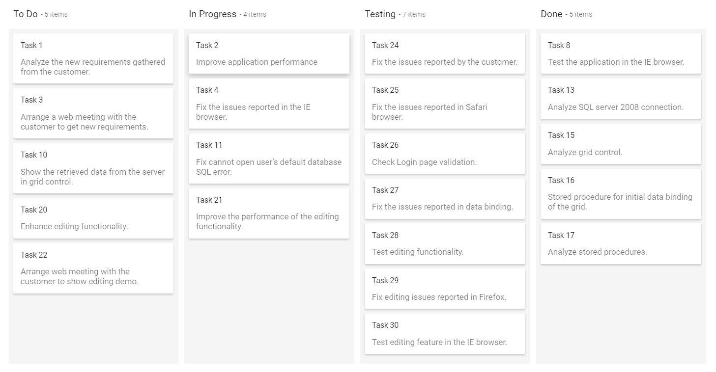
Kanban columns are categorized by mapping the key from the datasource using the keyField property. The corresponding value in the datasource is mapped inside the columns keyField. Based on this categorization, Kanban columns are split on this board.
NOTE
The
keyFieldproperty is mandatory to render the columns in the Kanban board.
Output be like the below.
Multi-key mapping
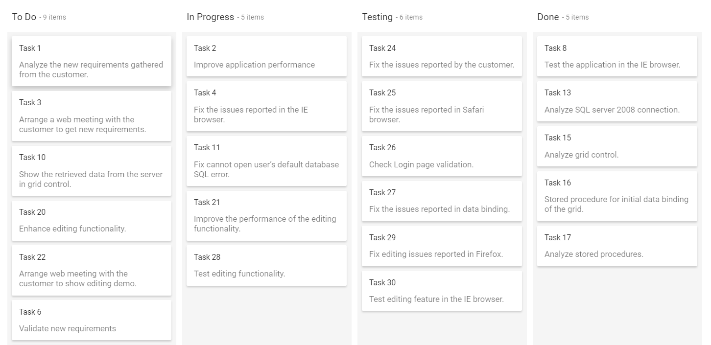
Kanban board allows to render a single column by mapping multiple keys using keyField property. In below sample, specified the multiple keys(Open, Validate) to a single column.
Output be like the below.
Header text
You can provide the column header text of Kanban columns using the headerText property. If you have not specified any header text, it will render the header without any text.
Header template
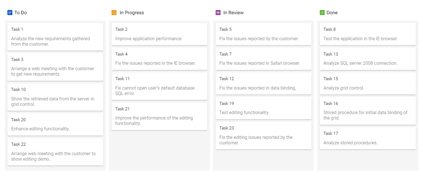
You can customize the column header with any HTML or CSS element using the template property as shown in the following code.
Output be like the below.
Toggle columns
Kanban allows to expand or collapse its columns using allowToggle inside the columns property. When enable the property, it will render the expand or collapse icon to the column header.
NOTE
By default, collapsed column width is set to
50px.
Output be like the below.
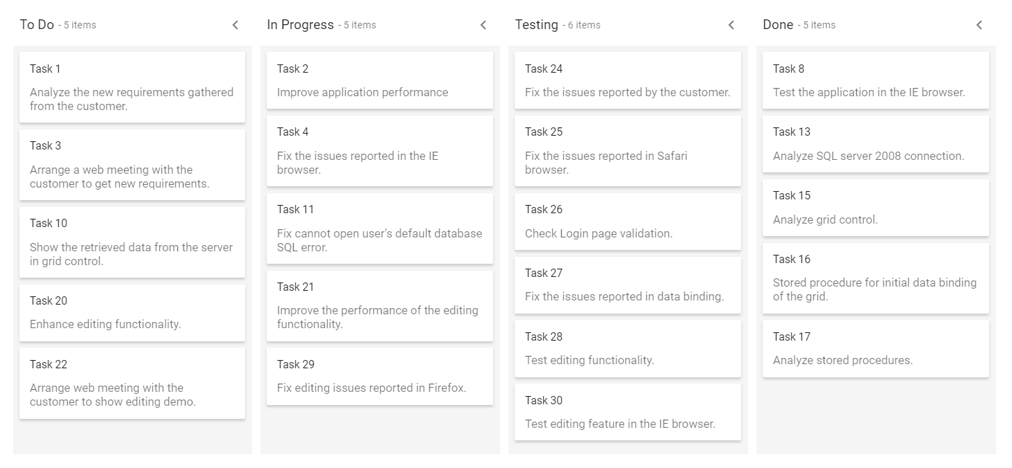
Initially collapsed column
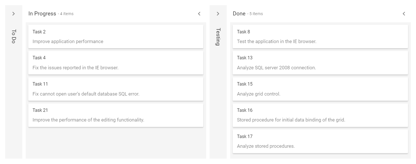
By default, all columns are on expanded state when loading the Kanban board initially. But, you can render the columns with collapsed state using the isExpanded property.
NOTE
The
isExpandedproperty only works when enabling theallowToggleproperty on particular column.
In the following example, the To Do column is collapsed on initialization of Kanban board.
Output be like the below.
Drag and Drop
The Kanban component allows dynamic column reordering through drag-and-drop interactions. To enable this, set the [allowColumnDragAndDrop] property to true. Once enabled, users can rearrange columns by dragging a column header to a new position, with visual feedback highlighting potential drop locations.
Stacked headers
Stacked headers are the additional headers to column header that will group the similar columns.
Define the grouping of columns Key value to the keyFields property and provide the custom header text name to grouped columns using the text property, which is placed inside the stackedHeaders property.
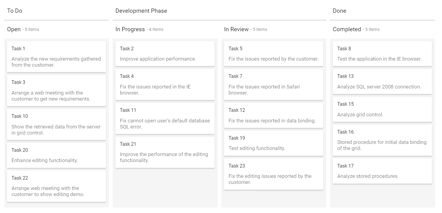
In the following code, the kanban columns ‘InProgress, Review’ are grouped under ‘Development phase’ category.
Output be like the below.