Taskbar Customization with Templates in ASP.NET Core Gantt Chart
Taskbar template
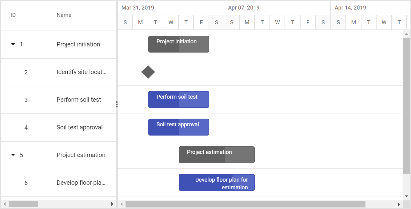
You can design your own taskbars to view the tasks in Gantt by using TaskbarTemplate property. And it is possible to map the template script element’s ID value to this property. It is also possible to customize the parent taskbars and milestones with custom templates by using ParentTaskbarTemplate and MilestoneTemplate properties.
<ejs-gantt id='Gantt' dataSource="ViewBag.dataSource" height="450px" rowHeight="60" parentTaskbarTemplate="#ParentTaskbarTemplate"
                taskbarTemplate="#TaskbarTemplate" milestoneTemplate="#MilestoneTemplate">
            <e-gantt-taskfields id="TaskId" name="TaskName" startDate="StartDate" endDate="EndDate" duration="Duration" progress="Progress" child="SubTasks">
            </e-gantt-taskfields>
        </ejs-gantt>

	<script type="text/x-jsrender" id="TaskbarTemplate">
        <div class="e-gantt-child-taskbar-inner-div e-gantt-child-taskbar" style="height:100%">
            <div class="e-gantt-child-progressbar-inner-div e-gantt-child-progressbar" style="width:${ganttProperties.progressWidth}px;height:100%">
                <span class="e-task-label" style="position: absolute; z-index: 1; font-size: 12px; color: white; top: 5px; left: 10px; font-family: " Segoe UI"; overflow: hidden; text-overflow: ellipsis; width: 40%; cursor: move;">${taskData.TaskName}</span>
            </div>
        </div>
    </script>

    <script type="text/x-jsrender" id="ParentTaskbarTemplate">
        <div class="e-gantt-parent-taskbar-inner-div e-gantt-parent-taskbar" style="height:100%">
            <div class="e-gantt-parent-progressbar-inner-div e-gantt-parent-progressbar" style="width:${ganttProperties.progressWidth}px;height:100%">
                <span class="e-task-label" style="position: absolute; z-index: 1; font-size: 12px; color: white; top: 5px; left: 10px; font-family: " Segoe UI"; overflow: hidden; text-overflow: ellipsis; width: 40%; cursor: move;">${taskData.TaskName}</span>
            </div>
        </div>
	</script>

    <script type="text/x-jsrender" id="MilestoneTemplate">
        <div class="e-gantt-milestone" style="position:absolute;">
            <div class="e-milestone-top" style="border-right-width:15px;border-left-width:15px;border-bottom-width:15px;"></div>
            <div class="e-milestone-bottom" style="top:15px;border-right-width:15px; border-left-width:15px; border-top-width:15px;">
            </div>
        </div>
    </script>
public IActionResult Index()
{
ViewBag.DataSource = GanttData.ProjectNewData();
return View();
}
Taskbar customization
Taskbar Height
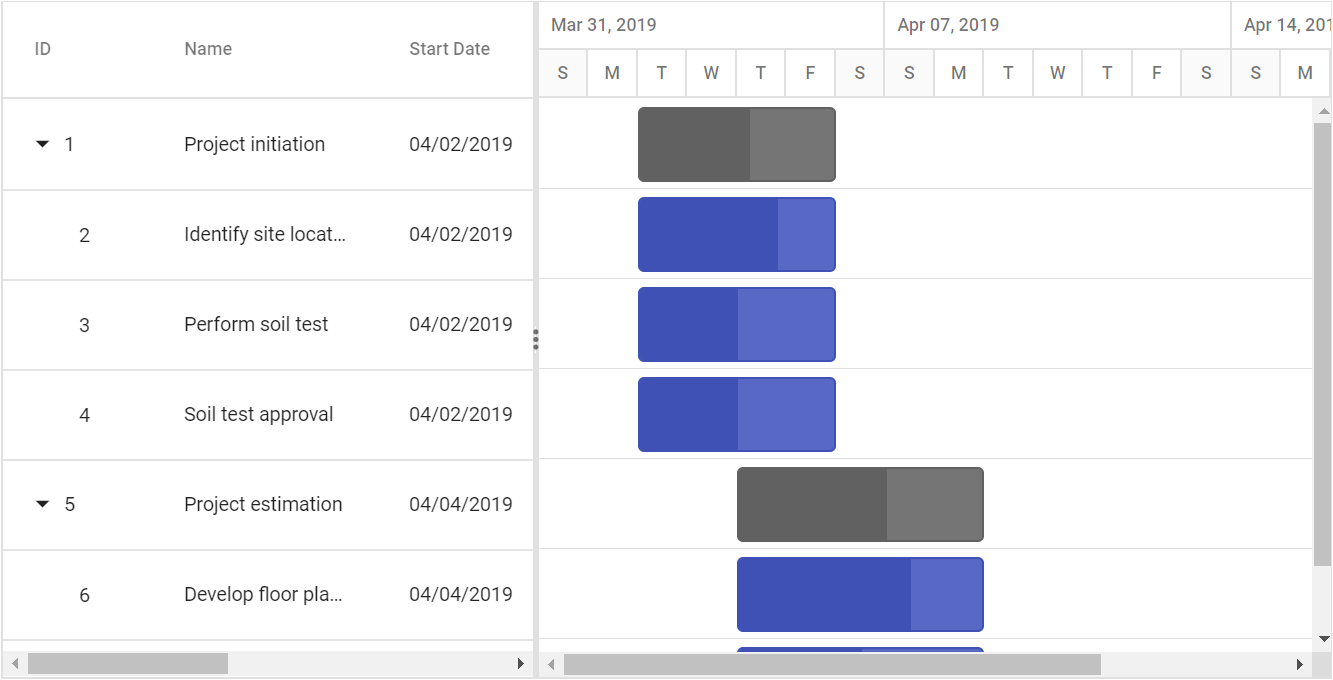
Height of child taskbars and parent taskbars can be customized by using TaskbarHeight property. The following code example shows how to use the property.
<ejs-gantt id='Gantt' dataSource="ViewBag.dataSource" height="450px" rowHeight="60" taskbarHeight="50">
            <e-gantt-taskfields id="TaskId" name="TaskName" startDate="StartDate" endDate="EndDate" duration="Duration" progress="Progress" child="SubTasks">
            </e-gantt-taskfields>
        </ejs-gantt>
public IActionResult Index()
{
ViewBag.DataSource = GanttData.ProjectNewData();
return View();
}
The
TaskbarHeightvalue should be lower than theRowHeightproperty value and these properties accept only pixel values.
Conditional formatting
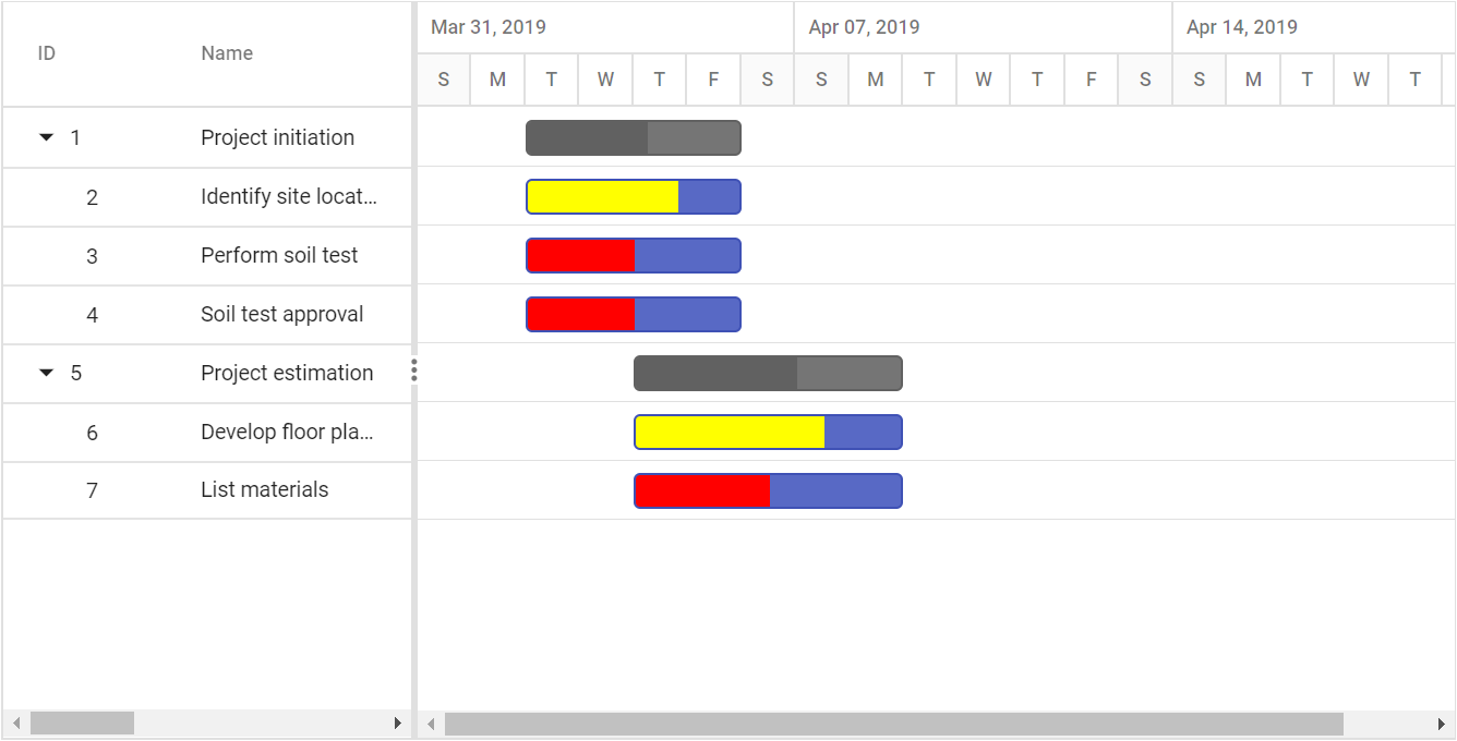
The default taskbar UI can be replaced with custom templates using the QueryTaskbarInfo event. The following code example shows customizing the taskbar UI based on task progress values in the Gantt control.
<ejs-gantt id='Gantt' dataSource="ViewBag.dataSource" height="450px" queryTaskbarInfo="queryTaskbarInfo">
                <e-gantt-taskfields id="TaskId" name="TaskName" startDate="StartDate" endDate="EndDate" duration="Duration" progress="Progress" child="SubTasks">
                </e-gantt-taskfields>
        </ejs-gantt>

		<script>
          function queryTaskbarInfo(args) {
            if (args.data.Progress == 50) {
                args.progressBarBgColor = "red";
            } else if (args.data.Progress == 70) {
                args.progressBarBgColor = "yellow";
            } else if (args.data.Progress == 80) {
                args.progressBarBgColor = "lightgreen";
            }
          }
		</script>
public IActionResult Index()
{
ViewBag.DataSource = ganttData();
return View();
}
public static List<GanttDataSource> ganttData()
{
List<GanttDataSource> GanttDataSourceCollection = new List<GanttDataSource>();
GanttDataSource Record1 = new GanttDataSource()
{
TaskId = 1,
TaskName = "Project initiation",
StartDate = new DateTime(2019, 04, 02),
EndDate = new DateTime(2019, 04, 21),
SubTasks = new List<GanttDataSource>(),
};
GanttDataSource Child1 = new GanttDataSource()
{
TaskId = 2,
TaskName = "Identify site location",
StartDate = new DateTime(2019, 04, 02),
Duration = 4,
Progress = 70,
};
GanttDataSource Child2 = new GanttDataSource()
{
TaskId = 3,
TaskName = "Perform soil test",
StartDate = new DateTime(2019, 04, 02),
Duration = 4,
Progress = 50
};
GanttDataSource Child3 = new GanttDataSource()
{
TaskId = 4,
TaskName = "Soil test approval",
StartDate = new DateTime(2019, 04, 02),
Duration = 4,
Progress = 50
};
Record1.SubTasks.Add(Child1);
Record1.SubTasks.Add(Child2);
Record1.SubTasks.Add(Child3);
GanttDataSource Record2 = new GanttDataSource()
{
TaskId = 5,
TaskName = "Project estimation",
StartDate = new DateTime(2019, 04, 02),
EndDate = new DateTime(2019, 04, 21),
SubTasks = new List<GanttDataSource>()
};
GanttDataSource Child4 = new GanttDataSource()
{
TaskId = 6,
TaskName = "Develop floor plan for estimation",
StartDate = new DateTime(2019, 04, 04),
Duration = 3,
Progress = 70
};
GanttDataSource Child5 = new GanttDataSource()
{
TaskId = 7,
TaskName = "List materials",
StartDate = new DateTime(2019, 04, 04),
Duration = 3,
Progress = 50
};
Record2.SubTasks.Add(Child4);
Record2.SubTasks.Add(Child5);
GanttDataSourceCollection.Add(Record1);
GanttDataSourceCollection.Add(Record2);
return GanttDataSourceCollection;
}
public class GanttDataSource
{
public int TaskId { get; set; }
public string TaskName { get; set; }
public DateTime StartDate { get; set; }
public DateTime EndDate { get; set; }
public int? Duration { get; set; }
public int Progress { get; set; }
public List<GanttDataSource> SubTasks { get; set; }
}
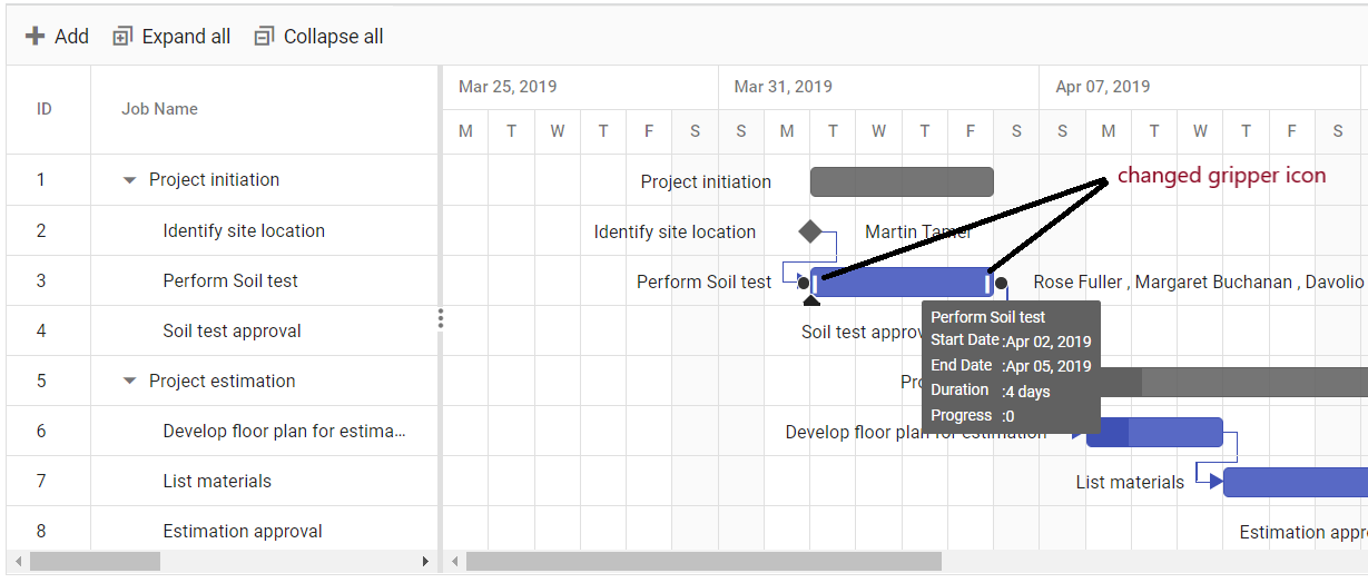
Change gripper icon in taskbar
You can change the gripper icon in the taskbar by applying styles to their respective class elements.
<ejs-gantt id='Gantt' dataSource="GanttDataSourceCollection">
   <e-gantt-taskfields id="TaskId" name="TaskName" startDate="StartDate" endDate="EndDate" duration="Duration" progress="Progress" dependency="Predecessor" child="SubTasks">
   </e-gantt-taskfields>
  <e-gantt-editsettings allowTaskbarEditing="true"></e-gantt-editsettings>
</ejs-gantt>

<style>
/* change gripper icon */
.e-gantt .e-left-resize-gripper::before, .e-gantt .e-right-resize-gripper::before {
    content: '\e934';
}

.e-gantt .e-left-resize-gripper, .e-gantt .e-right-resize-gripper {
    transform: rotate(90deg);
}
</style
public IActionResult Index()
{
ViewBag.DataSource = GanttData.ProjectNewData();
return View();
}
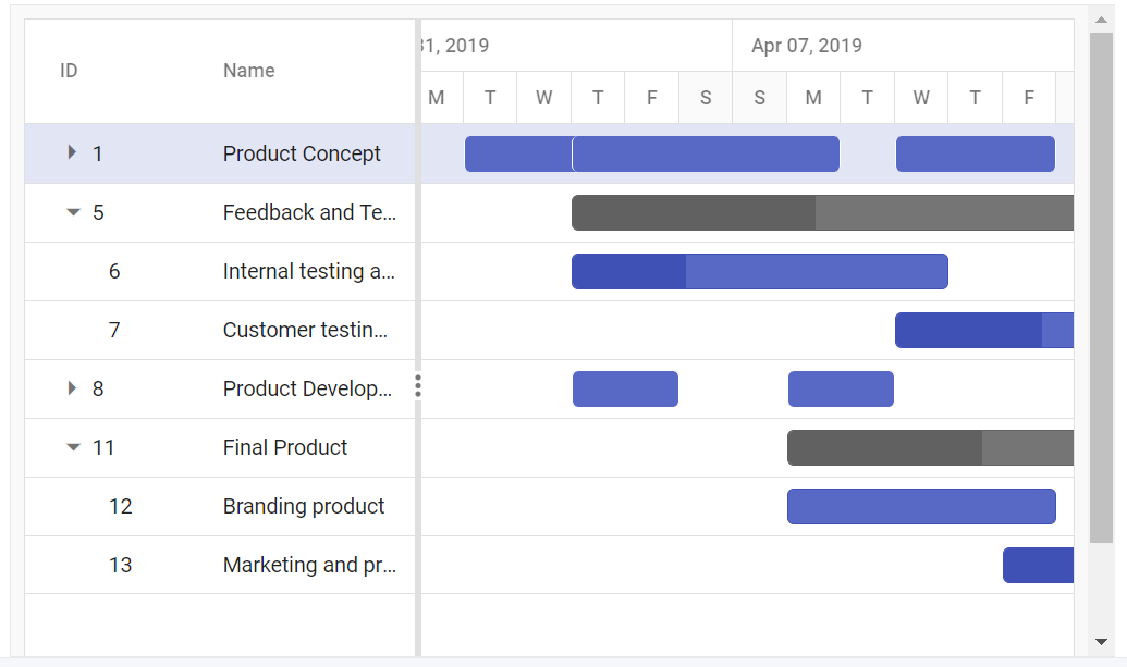
Multi Taskbar support in project view
The Gantt component, supports rendering multi-taskbars in the project view. With this feature the parent taskbar, when it is collapsed, visually summarize the progress of all its child taskbars.
This feature can be enabled by setting the EnableMultiTaskbar property value to true.
The following code example shows how to use this property.
<ejs-gantt id='Gantt' dataSource="ViewBag.DataSource" enableMultiTaskbar="true" height="450px">
                    <e-gantt-taskfields id="TaskId" name="TaskName" startDate="StartDate" duration="Duration" child="SubTasks" progress="Progress"
                        endDate="EndDate" expandState="isExpand">
                    </e-gantt-taskfields>
                </ejs-gantt>
public IActionResult Index()
{
ViewBag.DataSource = projectViewMultiTaskData();
return View();
}
public static List<GanttDataSource> projectViewMultiTaskData()
{
List<GanttDataSource> GanttDataSourceCollection = new List<GanttDataSource>();
GanttDataSource Record1 = new GanttDataSource()
{
TaskId = 1,
TaskName = "Product Concept",
StartDate = new DateTime(2019, 04, 02),
EndDate = new DateTime(2019, 04, 21),
isExpand = false,
SubTasks = new List<GanttDataSource>(),
};
GanttDataSource Child1 = new GanttDataSource()
{
TaskId = 2,
TaskName = "Defining the product and its usage",
StartDate = new DateTime(2019, 04, 02),
Duration = 3,
Progress = 30
};
GanttDataSource Child2 = new GanttDataSource()
{
TaskId = 3,
TaskName = "Defining target audience",
StartDate = new DateTime(2019, 04, 04),
Duration = 3,
};
GanttDataSource Child3 = new GanttDataSource()
{
TaskId = 4,
TaskName = "Prepare product sketch and notes",
StartDate = new DateTime(2019, 04, 10),
Duration = 3,
Progress = 30
};
Record1.SubTasks.Add(Child1);
Record1.SubTasks.Add(Child2);
Record1.SubTasks.Add(Child3);
GanttDataSource Record2 = new GanttDataSource()
{
TaskId = 5,
TaskName = "Feedback and Testing",
StartDate = new DateTime(2019, 04, 04),
EndDate = new DateTime(2019, 04, 21),
isExpand = true,
SubTasks = new List<GanttDataSource>()
};
GanttDataSource Child4 = new GanttDataSource()
{
TaskId = 6,
TaskName = "Internal testing and feedback",
StartDate = new DateTime(2019, 04, 04),
Duration = 5,
Progress = 30
};
GanttDataSource Child5 = new GanttDataSource()
{
TaskId = 7,
TaskName = "Customer testing and feedback",
StartDate = new DateTime(2019, 04, 10),
Duration = 7,
Progress = 30
};
Record2.SubTasks.Add(Child4);
Record2.SubTasks.Add(Child5);
GanttDataSource Record3 = new GanttDataSource()
{
TaskId = 8,
TaskName = "Product Development",
StartDate = new DateTime(2019, 04, 04),
EndDate = new DateTime(2019, 04, 21),
isExpand = false,
SubTasks = new List<GanttDataSource>()
};
GanttDataSource Child6 = new GanttDataSource()
{
TaskId = 9,
TaskName = "Important improvements",
StartDate = new DateTime(2019, 04, 04),
Duration = 2,
Progress = 30
};
GanttDataSource Child7 = new GanttDataSource()
{
TaskId = 10,
TaskName = "Address any unforeseen issues",
StartDate = new DateTime(2019, 04, 06),
Duration = 2,
Progress = 30
};
Record2.SubTasks.Add(Child6);
Record2.SubTasks.Add(Child7);
GanttDataSource Record4 = new GanttDataSource()
{
TaskId = 11,
TaskName = "Final Product",
StartDate = new DateTime(2019, 04, 04),
EndDate = new DateTime(2019, 04, 21),
isExpand = false,
SubTasks = new List<GanttDataSource>()
};
GanttDataSource Child8 = new GanttDataSource()
{
TaskId = 12,
TaskName = "Branding product",
StartDate = new DateTime(2019, 04, 06),
Duration = 5
};
GanttDataSource Child9 = new GanttDataSource()
{
TaskId = 13,
TaskName = "Marketing and pre-sales",
StartDate = new DateTime(2019, 04, 12),
Duration = 10,
Progress = 30
};
Record2.SubTasks.Add(Child8);
Record2.SubTasks.Add(Child9);
GanttDataSourceCollection.Add(Record1);
GanttDataSourceCollection.Add(Record2);
GanttDataSourceCollection.Add(Record3);
GanttDataSourceCollection.Add(Record4);
return GanttDataSourceCollection;
}
public class GanttDataSource
{
public int TaskId { get; set; }
public string TaskName { get; set; }
public DateTime StartDate { get; set; }
public DateTime EndDate { get; set; }
public int? Duration { get; set; }
public DateTime BaselineStartDate { get; set; }
public DateTime BaselineEndDate { get; set; }
public int Progress { get; set; }
public bool isExpand { get; set; }
public List<GanttDataSource> SubTasks { get; set; }
}
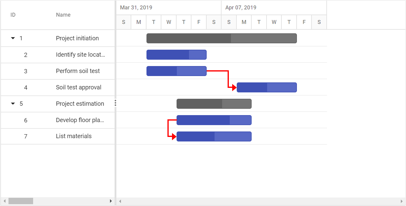
Connector lines
The width and background color of connector lines in Gantt can be customized using the ConnectorLineWidth and ConnectorLineBackground properties. The following code example shows how to use these properties.
<ejs-gantt id='Gantt' dataSource="ViewBag.dataSource" height="450px" connectorLineWidth="3" connectorLineBackground="red">
            <e-gantt-taskfields id="TaskId" name="TaskName" startDate="StartDate" endDate="EndDate" duration="Duration" progress="Progress" dependency="Dependency" child="SubTasks">
            </e-gantt-taskfields>
    </ejs-gantt>
public IActionResult Index()
{
ViewBag.DataSource = ganttData();
return View();
}
public static List<GanttDataSource> ganttData()
{
List<GanttDataSource> GanttDataSourceCollection = new List<GanttDataSource>();
GanttDataSource Record1 = new GanttDataSource()
{
TaskId = 1,
TaskName = "Project initiation",
StartDate = new DateTime(2019, 04, 02),
EndDate = new DateTime(2019, 04, 21),
SubTasks = new List<GanttDataSource>(),
};
GanttDataSource Child1 = new GanttDataSource()
{
TaskId = 2,
TaskName = "Identify site location",
StartDate = new DateTime(2019, 04, 02),
Duration = 4,
Progress = 70,
};
GanttDataSource Child2 = new GanttDataSource()
{
TaskId = 3,
TaskName = "Perform soil test",
StartDate = new DateTime(2019, 04, 02),
Duration = 4,
Progress = 50
};
GanttDataSource Child3 = new GanttDataSource()
{
TaskId = 4,
TaskName = "Soil test approval",
StartDate = new DateTime(2019, 04, 02),
Duration = 4,
Progress = 50,
Dependency="3FS"
};
Record1.SubTasks.Add(Child1);
Record1.SubTasks.Add(Child2);
Record1.SubTasks.Add(Child3);
GanttDataSource Record2 = new GanttDataSource()
{
TaskId = 5,
TaskName = "Project estimation",
StartDate = new DateTime(2019, 04, 02),
EndDate = new DateTime(2019, 04, 21),
SubTasks = new List<GanttDataSource>()
};
GanttDataSource Child4 = new GanttDataSource()
{
TaskId = 6,
TaskName = "Develop floor plan for estimation",
StartDate = new DateTime(2019, 04, 04),
Duration = 3,
Progress = 70
};
GanttDataSource Child5 = new GanttDataSource()
{
TaskId = 7,
TaskName = "List materials",
StartDate = new DateTime(2019, 04, 04),
Duration = 3,
Progress = 50,
Dependency = "6SS"
};
Record2.SubTasks.Add(Child4);
Record2.SubTasks.Add(Child5);
GanttDataSourceCollection.Add(Record1);
GanttDataSourceCollection.Add(Record2);
return GanttDataSourceCollection;
}
public class GanttDataSource
{
public int TaskId { get; set; }
public string TaskName { get; set; }
public string Dependency { get; set; }
public DateTime StartDate { get; set; }
public DateTime EndDate { get; set; }
public int? Duration { get; set; }
public int Progress { get; set; }
public List<GanttDataSource> SubTasks { get; set; }
}
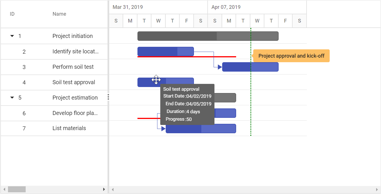
Tooltip
In the Gantt control, you can enable or disable the mouse hover tooltip for the following UI elements using the TooltipSettings.ShowTooltip property:
- Taskbar
- Connector line
- Baseline
- Event marker
<style>
        .e-gantt .e-gantt-chart .e-custom-event-marker {
            width: 1px;
            border-left: 2px green dotted;
        }
     </style>

		        <ejs-gantt id='Gantt' dataSource="ViewBag.DataSource" height="450px" renderBaseline="true" baselineColor="red">
                    <e-gantt-taskfields id="TaskId" name="TaskName" startDate="StartDate" dependency="Predecessor"
                          endDate="EndDate" baselineStartDate="BaselineStartDate" baselineEndDate="BaselineEndDate" progress="Progress" duration="Duration" child="SubTasks">
                    </e-gantt-taskfields>
                    <e-gantt-eventmarkers>
                        <e-gantt-eventmarker day="04/10/2019" label="Project approval and kick-off" cssClass="e-custom-event-marker"></e-gantt-eventmarker>
                    </e-gantt-eventmarkers>
                </ejs-gantt>
public IActionResult Index()
{
ViewBag.DataSource = ganttData();
return View();
}
public static List<GanttDataSource> ganttData()
{
List<GanttDataSource> GanttDataSourceCollection = new List<GanttDataSource>();
GanttDataSource Record1 = new GanttDataSource()
{
TaskId = 1,
TaskName = "Project initiation",
StartDate = new DateTime(2019, 04, 02),
EndDate = new DateTime(2019, 04, 21),
SubTasks = new List<GanttDataSource>(),
};
GanttDataSource Child1 = new GanttDataSource()
{
TaskId = 2,
TaskName = "Identify site location",
StartDate = new DateTime(2019, 04, 02),
Duration = 4,
BaselineStartDate= new DateTime(2019, 04, 02),
BaselineEndDate = new DateTime(2019, 04, 08),
Progress = 70
};
GanttDataSource Child2 = new GanttDataSource()
{
TaskId = 3,
TaskName = "Perform soil test",
StartDate = new DateTime(2019, 04, 02),
Duration = 4,
Predecessor="2FS",
Progress = 50
};
GanttDataSource Child3 = new GanttDataSource()
{
TaskId = 4,
TaskName = "Soil test approval",
StartDate = new DateTime(2019, 04, 02),
Duration =4,
Progress = 50
};
Record1.SubTasks.Add(Child1);
Record1.SubTasks.Add(Child2);
Record1.SubTasks.Add(Child3);
GanttDataSource Record2 = new GanttDataSource()
{
TaskId = 5,
TaskName = "Project estimation",
StartDate = new DateTime(2019, 04, 02),
EndDate = new DateTime(2019, 04, 21),
SubTasks = new List<GanttDataSource>()
};
GanttDataSource Child4 = new GanttDataSource()
{
TaskId = 6,
TaskName = "Develop floor plan for estimation",
StartDate = new DateTime(2019, 04, 04),
Duration = 3,
Progress = 70,
BaselineStartDate = new DateTime(2019, 04, 02),
BaselineEndDate = new DateTime(2019, 04, 06),
};
GanttDataSource Child5 = new GanttDataSource()
{
TaskId = 7,
TaskName = "List materials",
StartDate = new DateTime(2019, 04, 04),
Duration = 3,
Predecessor = "6SS",
Progress = 50
};
Record2.SubTasks.Add(Child4);
Record2.SubTasks.Add(Child5);
GanttDataSourceCollection.Add(Record1);
GanttDataSourceCollection.Add(Record2);
return GanttDataSourceCollection;
}
public class GanttDataSource
{
public int TaskId { get; set; }
public string TaskName { get; set; }
public DateTime StartDate { get; set; }
public DateTime EndDate { get; set; }
public DateTime? BaselineStartDate { get; set; }
public DateTime? BaselineEndDate { get; set; }
public int? Duration { get; set; }
public int Progress { get; set; }
public string Predecessor { get; set; }
public List<GanttDataSource> SubTasks { get; set; }
}
Taskbar Tooltip
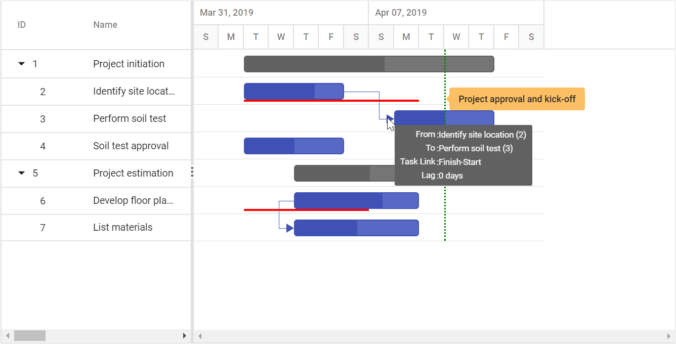
Dependency Tooltip
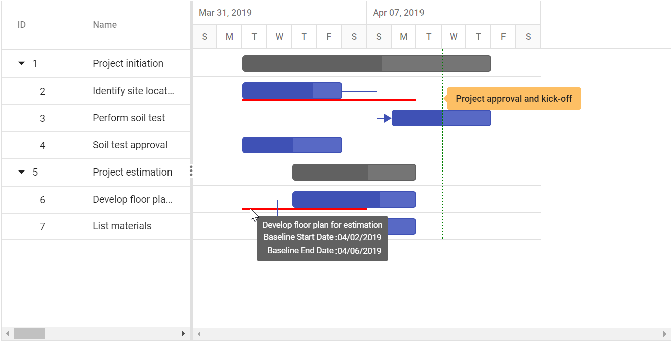
Baseline Tooltip
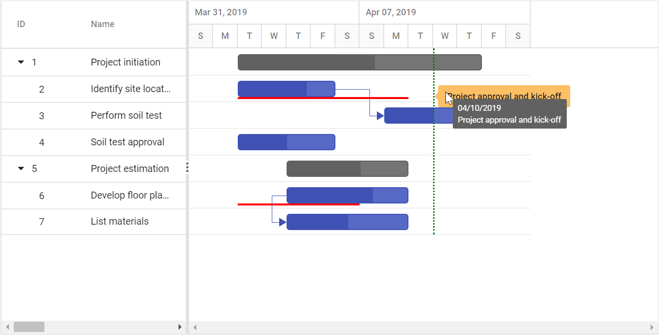
Event Marker Tooltip
The default value of the
TooltipSettings.ShowTooltipproperty is true.
Tooltip template
Taskbar tooltip
The default tooltip in the Gantt control can be customized using the TooltipSettings.Taskbar property. You can map the template script element’s ID value or template string directly to this property.
<ejs-gantt id='Gantt' dataSource="ViewBag.DataSource" height="450px">
                    <e-gantt-taskfields id="TaskId" name="TaskName" startDate="StartDate" endDate="EndDate" duration="Duration" progress="Progress" child="SubTasks">
                    </e-gantt-taskfields>
                    <e-gantt-tooltipsettings taskbar="#taskbarTooltip">
                    </e-gantt-tooltipsettings>
                </ejs-gantt>

 <script type="text/x-jsrender" id="taskbarTooltip">
        <div>TaskID: ${TaskId}</div>
 </script>
public IActionResult Index()
{
ViewBag.DataSource = GanttData.ProjectNewData();
return View();
}The below screenshot shows the output of above code example.
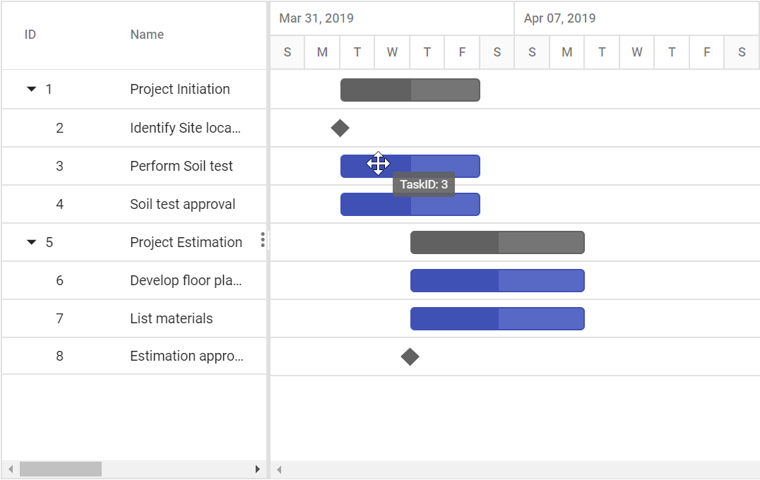
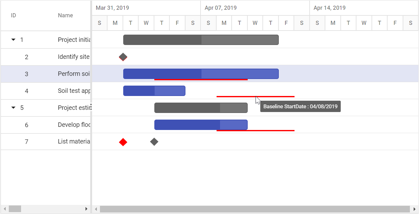
Baseline tooltip
A baseline tooltip can be customized using the TooltipSettings.Baseline property. The following code example shows how to customize the baseline tooltip in Gantt.
<ejs-gantt id='Gantt' dataSource="ViewBag.DataSource" height="450px" renderBaseline="true" baselineColor="red">
                    <e-gantt-taskfields id="TaskId" baselineStartDate="BaselineStartDate" baselineEndDate="BaselineEndDate" name="TaskName" startDate="StartDate" endDate="EndDate" duration="Duration" progress="Progress" child="SubTasks">
                    </e-gantt-taskfields>
                    <e-gantt-tooltipsettings baseline="#baselineTemplate">
                    </e-gantt-tooltipsettings>
                </ejs-gantt>

<script type="text/x-jsrender" id="baselineTemplate">
        <div>Baseline StartDate : ${this.getFormatedDate(BaselineStartDate)}</div>
</script>
public IActionResult Index()
{
ViewBag.DataSource = ganttData();
return View();
public static List<GanttDataSource> ganttData()
{
List<GanttDataSource> GanttDataSourceCollection = new List<GanttDataSource>();
GanttDataSource Record1 = new GanttDataSource()
{
TaskId = 1,
TaskName = "Project initiation",
StartDate = new DateTime(2019, 04, 02),
EndDate = new DateTime(2019, 04, 21),
SubTasks = new List<GanttDataSource>(),
};
GanttDataSource Child1 = new GanttDataSource()
{
TaskId = 2,
TaskName = "Identify site location",
StartDate = new DateTime(2019, 04, 02),
BaselineStartDate = new DateTime(2019, 04, 02),
BaselineEndDate = new DateTime(2019, 04, 02),
Duration = 0,
Progress = 70,
};
GanttDataSource Child2 = new GanttDataSource()
{
TaskId = 3,
TaskName = "Perform soil test",
StartDate = new DateTime(2019, 04, 02),
BaselineStartDate = new DateTime(2019, 04, 04),
BaselineEndDate = new DateTime(2019, 04, 09),
Duration = 8,
Progress = 50
};
GanttDataSource Child3 = new GanttDataSource()
{
TaskId = 4,
TaskName = "Soil test approval",
StartDate = new DateTime(2019, 04, 02),
BaselineStartDate = new DateTime(2019, 04, 08),
BaselineEndDate = new DateTime(2019, 04, 12),
Duration = 4,
Progress = 50
};
Record1.SubTasks.Add(Child1);
Record1.SubTasks.Add(Child2);
Record1.SubTasks.Add(Child3);
GanttDataSource Record2 = new GanttDataSource()
{
TaskId = 5,
TaskName = "Project estimation",
StartDate = new DateTime(2019, 04, 02),
EndDate = new DateTime(2019, 04, 21),
SubTasks = new List<GanttDataSource>()
};
GanttDataSource Child4 = new GanttDataSource()
{
TaskId = 6,
TaskName = "Develop floor plan for estimation",
StartDate = new DateTime(2019, 04, 04),
BaselineStartDate = new DateTime(2019, 04, 08),
BaselineEndDate = new DateTime(2019, 04, 12),
Duration = 4,
Progress = 70
};
GanttDataSource Child5 = new GanttDataSource()
{
TaskId = 7,
TaskName = "List materials",
StartDate = new DateTime(2019, 04, 04),
BaselineStartDate = new DateTime(2019, 04, 02),
BaselineEndDate = new DateTime(2019, 04, 02),
Duration = 0,
Progress = 50
};
Record2.SubTasks.Add(Child4);
Record2.SubTasks.Add(Child5);
GanttDataSourceCollection.Add(Record1);
GanttDataSourceCollection.Add(Record2);
return GanttDataSourceCollection;
}
public class GanttDataSource
{
public int TaskId { get; set; }
public string TaskName { get; set; }
public DateTime StartDate { get; set; }
public DateTime EndDate { get; set; }
public int? Duration { get; set; }
public DateTime? BaselineStartDate { get; set; }
public DateTime? BaselineEndDate { get; set; }
public int Progress { get; set; }
public List<GanttDataSource> SubTasks { get; set; }
}}The following screenshot shows the template for baseline in Gantt.
Connector line tooltip
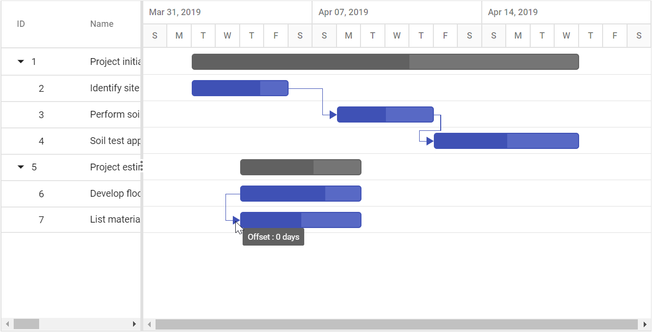
The default connector line tooltip in the Gantt control can be customized using the TooltipSettings.ConnectorLine property. You can map the value to this property as template script element ID or template string format. The following code example shows how to use the TooltipSettings.ConnectorLine property.
<ejs-gantt id='Gantt' dataSource="ViewBag.DataSource" height="450px">
                    <e-gantt-taskfields id="TaskId" name="TaskName" startDate="StartDate" progress="Progress" dependency="Predecessor" duration="Duration" child="SubTasks">
                    </e-gantt-taskfields>
                    <e-gantt-tooltipsettings connectorLine="#dependencyLineTooltip">
                    </e-gantt-tooltipsettings>
                </ejs-gantt>

 <script type="text/x-jsrender" id="dependencyLineTooltip">
        <div>Offset : ${offsetString}</div>
</script>
public IActionResult Index()
{
ViewBag.DataSource = ganttData();
return View();
}
public static List<GanttDataSource> ganttData()
{
List<GanttDataSource> GanttDataSourceCollection = new List<GanttDataSource>();
GanttDataSource Record1 = new GanttDataSource()
{
TaskId = 1,
TaskName = "Project initiation",
StartDate = new DateTime(2019, 04, 02),
EndDate = new DateTime(2019, 04, 21),
SubTasks = new List<GanttDataSource>(),
};
GanttDataSource Child1 = new GanttDataSource()
{
TaskId = 2,
TaskName = "Identify site location",
StartDate = new DateTime(2019, 04, 02),
Duration = 4,
Progress = 70,
};
GanttDataSource Child2 = new GanttDataSource()
{
TaskId = 3,
TaskName = "Perform soil test",
StartDate = new DateTime(2019, 04, 02),
Duration = 4,
Progress = 50,
Predecessor = "2FS"
};
GanttDataSource Child3 = new GanttDataSource()
{
TaskId = 4,
TaskName = "Soil test approval",
StartDate = new DateTime(2019, 04, 02),
Duration = 4,
Progress = 50,
Predecessor = "3FS"
};
Record1.SubTasks.Add(Child1);
Record1.SubTasks.Add(Child2);
Record1.SubTasks.Add(Child3);
GanttDataSource Record2 = new GanttDataSource()
{
TaskId = 5,
TaskName = "Project estimation",
StartDate = new DateTime(2019, 04, 02),
EndDate = new DateTime(2019, 04, 21),
SubTasks = new List<GanttDataSource>()
};
GanttDataSource Child4 = new GanttDataSource()
{
TaskId = 6,
TaskName = "Develop floor plan for estimation",
StartDate = new DateTime(2019, 04, 04),
Duration = 3,
Progress = 70
};
GanttDataSource Child5 = new GanttDataSource()
{
TaskId = 7,
TaskName = "List materials",
StartDate = new DateTime(2019, 04, 04),
Duration = 3,
Progress = 50,
Predecessor = "6SS"
};
Record2.SubTasks.Add(Child4);
Record2.SubTasks.Add(Child5);
GanttDataSourceCollection.Add(Record1);
GanttDataSourceCollection.Add(Record2);
return GanttDataSourceCollection;
}
public class GanttDataSource
{
public int TaskId { get; set; }
public string TaskName { get; set; }
public string Predecessor { get; set; }
public DateTime StartDate { get; set; }
public DateTime EndDate { get; set; }
public int? Duration { get; set; }
public int Progress { get; set; }
public List<GanttDataSource> SubTasks { get; set; }
}The below screenshot shows the output of above code example.
Timeline tooltip
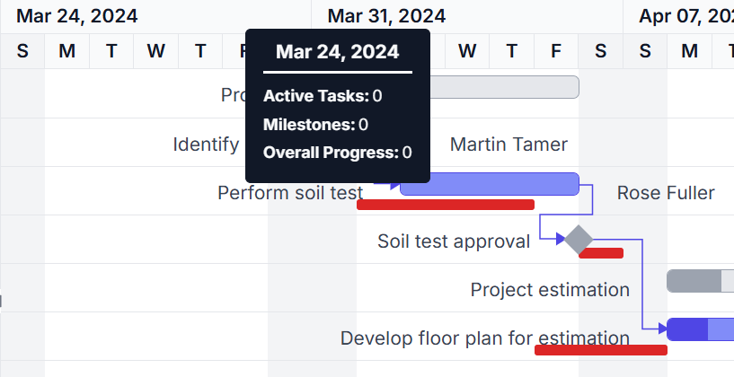
A timeline tooltip can be customized using the TooltipSettings.Timeline property. This allows modifying the appearance and content of the tooltip displayed over the timeline. The following code example shows how to customize the timeline tooltip in Gantt.
<ejs-gantt id='Gantt' dataSource="ViewBag.DataSource" height="450px">
                    <e-gantt-taskfields id="TaskId" name="TaskName" startDate="StartDate" endDate="EndDate" duration="Duration" progress="Progress" child="SubTasks">
                    </e-gantt-taskfields>
                    <e-gantt-tooltipsettings timeline="#timelineTooltip">
                    </e-gantt-tooltipsettings>
                </ejs-gantt>


 <script type="text/x-jsrender" id="timelineTooltip">
        ${if(tier == 'topTier')}
            <div>${topTierTooltip(value, date, tier)}</div>
        ${/if}
        ${if(tier == 'bottomTier')}
            <div>${bottomTierTooltip(date, tier)}</div>
        ${/if}
    </script>

    <script>
        function getTooltipData(startDate, endDate, tier) {
        var gantt = document.getElementsByClassName('e-gantt')[0].ej2_instances[0];
        var activeTasks;
        if (tier === 'topTier') {
            activeTasks = gantt.currentViewData.filter(function(task) {
                var taskStart = new Date(task.StartDate);
                var taskEnd = new Date(task.EndDate);
                taskStart.setHours(0, 0, 0, 0);
                taskEnd.setHours(0, 0, 0, 0);
                return taskStart >= startDate && taskEnd <= endDate;
            });
        }
        else {
            activeTasks = gantt.currentViewData.filter(function(task) {
                var taskStart = new Date(task.StartDate);
                var taskEnd = new Date(task.EndDate);
                taskStart.setHours(0, 0, 0, 0);
                taskEnd.setHours(0, 0, 0, 0);
                return taskStart.getTime() === startDate.getTime() && taskEnd.getTime() === endDate.getTime();
            });
        }
        var milestones = activeTasks.filter(function(task) {
            return task.Duration === 0;
        });
        var totalProgress = activeTasks.reduce(function(acc, task) {
            return acc + (task.Progress ? task.Progress : 0);
        }, 0);
        var overallProgress = (activeTasks.length > 0) ? (totalProgress / activeTasks.length).toFixed(2) : 0;
        return {
            activeTasks: activeTasks.length,
            milestones: milestones.length,
            overallProgress: overallProgress
        };
    }
    function topTierTooltip(value, date, tier) {
        var gantt = document.getElementsByClassName('e-gantt')[0].ej2_instances[0];
        var endDate;
        var startdate = new Date(date);
        if (gantt.timelineSettings.topTier.unit) {
            endDate = new Date(startdate.getTime());
            endDate.setDate(startdate.getDate() + 6);
        }
        var data = getTooltipData(startdate, endDate,tier);
        return generateTooltipMarkup(value, data);
    }
    function generateTooltipMarkup(label, tooltipData) {
                return (
                    '<div style="padding: 5px;">' +
                    '<div style="padding-bottom: 9px; text-align: center; border-bottom: 2px solid white';">' +
                    '<span style="font-weight: bold; font-size: 14px;">' + label + '</span>' +
                    '</div>' +
                    '<div style="display: flex; padding-bottom: 5px; padding-top: 9px">' +
                    '<span style="font-weight: bold;">Active Tasks:</span>' +
                    '<span style="padding-left: 2px;">' + tooltipData.activeTasks + '</span>' +
                    '</div>' +
                    '<div style="display: flex; padding-bottom: 5px;">' +
                    '<span style="font-weight: bold;">Milestones:</span>' +
                    '<span style="padding-left: 2px;">' + tooltipData.milestones + '</span>' +
                    '</div>' +
                    '<div style="display: flex; padding-bottom: 5px;">' +
                    '<span style="font-weight: bold;">Overall Progress:</span>' +
                    '<span style="padding-left: 2px;">' + tooltipData.overallProgress + '</span>' +
                    '</div>' +
                    '</div>'
                );
    }
    function bottomTierTooltip(date, tier) {
        var gantt = document.getElementsByClassName('e-gantt')[0].ej2_instances[0];
        var startdate = new Date(date);
        if (gantt.timelineSettings.bottomTier.unit) {
            endDate = new Date(startdate.getTime());
        }
        var data = getTooltipData(startdate, endDate,tier);
        return generateTooltipMarkup(date, data);
    }

</script>
public IActionResult Index()
{
ViewBag.DataSource = GanttData.ProjectNewData();
return View();
}The below screenshot shows the output of above code example.