Styles and Templates in UWP DOCX Editor
30 Aug 202610 minutes to read
This section describes the styles and templates for the SfRichTextBoxAdv control. The control template defines the structure of the SfRichTextBoxAdv control and the style defines its visual appearance. You can modify the default control template to define a unique appearance for the control.
Default style and template
The following XAML shows the default style and template for the SfRichTextBoxAdv control.
<Style TargetType="RichTextBoxAdv:SfRichTextBoxAdv" xmlns:RichTextBoxAdv="using:Syncfusion.UI.Xaml.RichTextBoxAdv">
    <Setter Property="Template">
        <Setter.Value>
            <ControlTemplate TargetType="RichTextBoxAdv:SfRichTextBoxAdv">
                <Border Background="{TemplateBinding Background}" BorderBrush="{TemplateBinding BorderBrush}" BorderThickness="{TemplateBinding BorderThickness}">
                    <Grid>
                        <Grid.ColumnDefinitions>
                            <ColumnDefinition Width="Auto"/>
                            <ColumnDefinition Width="*"/>
                        </Grid.ColumnDefinitions>
                        <Grid x:Name="OptionsPane" Visibility="Collapsed"/>
                        <Grid Grid.Column="1">
                            <Grid.ColumnDefinitions>
                                <ColumnDefinition Width="*"/>
                                <ColumnDefinition Width="Auto"/>
                            </Grid.ColumnDefinitions>
                            <Grid.RowDefinitions>
                                <RowDefinition Height="*"/>
                                <RowDefinition Height="Auto"/>
                            </Grid.RowDefinitions>
                            <ContentControl x:Name="content" HorizontalAlignment="Stretch" VerticalAlignment="Stretch" Grid.Row="0" Grid.Column="0" />
                            <ScrollBar x:Name="HorizontalScrollBar" Grid.Column="0" Height="16" Visibility="Collapsed" IsTabStop="False" Minimum="0" Orientation="Horizontal" Grid.Row="1"/>
                            <ScrollBar x:Name="VerticalScrollBar" Grid.Column="1" IsTabStop="False" Visibility="Collapsed" Minimum="0" Orientation="Vertical" Grid.Row="0" Width="16"/>
                        </Grid>
                    </Grid>
                </Border>
            </ControlTemplate>
        </Setter.Value>
    </Setter>
</Style>
NOTE
In the control template, you are allowed to reorder the template parts and to add your own elements. However, when changing the control template, you should be careful to include all required parts. Required template parts are marked with the
x:Nameattribute. Omission of required parts may impact some of the functionality.
Styling SfRichTextBoxAdv
You can define a custom style for the SfRichTextBoxAdv control either by creating an empty style and setting it up yourself, or by copying the default style and modifying it.
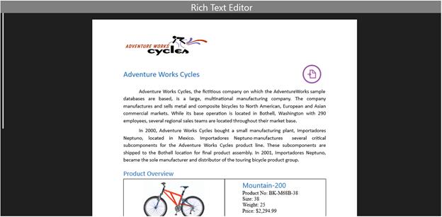
The following example demonstrates how to customize the style for the SfRichTextBoxAdv control.
<Style x:Key="RichTextBoxAdvCustomStyle" TargetType="RichTextBoxAdv:SfRichTextBoxAdv" xmlns:RichTextBoxAdv="using:Syncfusion.UI.Xaml.RichTextBoxAdv">
    <Setter Property="BorderThickness" Value="1"/>
    <Setter Property="Template">
        <Setter.Value>
            <ControlTemplate TargetType="RichTextBoxAdv:SfRichTextBoxAdv">
                <Border Background="{TemplateBinding Background}" BorderBrush="{TemplateBinding BorderBrush}" BorderThickness="{TemplateBinding BorderThickness}">
                    <Grid>
                        <Grid.RowDefinitions>
                            <RowDefinition Height="Auto"/>
                            <RowDefinition Height="*"/>
                        </Grid.RowDefinitions>
                        <Grid.ColumnDefinitions>
                            <ColumnDefinition Width="Auto"/>
                            <ColumnDefinition Width="*"/>
                        </Grid.ColumnDefinitions>
                        <Border Background="Gray" Grid.Row="0" Grid.Column="0" Grid.ColumnSpan="2">
                            <TextBlock Text="Rich Text Editor" FontSize="28" HorizontalAlignment="Center" Foreground="White"/>
                        </Border>
                        <Grid x:Name="OptionsPane" Visibility="Collapsed" Grid.Row="1" Grid.Column="0"/>
                        <Grid Grid.Row="1" Grid.Column="1">
                            <Grid.ColumnDefinitions>
                                <ColumnDefinition Width="Auto"/>
                                <ColumnDefinition Width="*"/>
                            </Grid.ColumnDefinitions>
                            <Grid.RowDefinitions>
                                <RowDefinition Height="*"/>
                                <RowDefinition Height="Auto"/>
                            </Grid.RowDefinitions>
                            <ContentControl x:Name="content" HorizontalAlignment="Stretch" VerticalAlignment="Stretch" Grid.Row="0" Grid.Column="1" />
                            <ScrollBar x:Name="HorizontalScrollBar" Grid.Column="0" Height="16" Visibility="Collapsed" IsTabStop="False" Minimum="0" Orientation="Horizontal" Grid.Row="1"/>
                            <ScrollBar x:Name="VerticalScrollBar" Grid.Column="0" IsTabStop="False" Visibility="Collapsed" Minimum="0" Orientation="Vertical" Grid.Row="0" Width="16"/>
                        </Grid>
                    </Grid>
                </Border>
            </ControlTemplate>
        </Setter.Value>
    </Setter>
</Style>
The following XAML example demonstrates how to apply the custom style to the SfRichTextBoxAdv control.
<RichTextBoxAdv:SfRichTextBoxAdv x:Name="richTextBoxAdv" ManipulationMode="All" Style="{StaticResource RichTextBoxAdvCustomStyle}" xmlns:RichTextBoxAdv="using:Syncfusion.UI.Xaml.RichTextBoxAdv"/>The following screenshot shows the SfRichTextBoxAdv control with the customized style.