Getting Started with Vue 3 Diagram Component
18 Nov 20186 minutes to read
This section explains how to create a Vue 3 application from scratch and build a simple diagram using the Vue Diagram component.
In Vue 3, developers can choose between two APIs for building components:
-
The
Composition APIis a modern approach that allows you to organize and reuse logic using functions. It enables better code organization and scalability, especially for complex applications. -
The
Options APIis the traditional approach where component logic is defined using options such as data, methods, computed properties, watchers, and life cycle hooks.
To create, edit, and view interactive diagrams using the Vue Diagram component, refer to the video below.
Prerequisites
Before getting started, ensure that your development environment meets the system requirements for Syncfusion® Vue UI components
Before You Begin
This guide uses a Vue 3 project created with Vite using the JavaScript template, which provides fast builds and an optimized development experience.
The main files used in this guide are:
-
src/App.vue— Defines the root Vue component and renders the Diagram component. -
src/main.js— Application entry point. -
index.html— Root HTML file.
NOTE
In a Vite Vue 3 application, the root component is commonly generated as
src/App.vue.
NOTE
This guide uses the Composition API with
<script setup>, which is the recommended approach for Vue 3 applications.
Step 1: Set up the Vue 3 environment
Use Vite to create and manage Vue 3 applications. Vite provides a fast development environment and optimized builds for modern Vue applications.
Step 2: Create a Vue 3 application
Create a new Vue 3 application using the following command.
npm create vite@latest my-diagram-app -- --template vue
If Vite prompts you to install dependencies and start the project immediately, select No. The Syncfusion package is installed in a later step.
Navigate to the project folder:
cd my-diagram-app
Install the application dependencies:
npm install
NOTE
If you prefer TypeScript instead of JavaScript, create the application using
npm create vite@latest my-diagram-app -- --template vue-ts.
Step 3: Install the Vue Diagram package
All Syncfusion Essential® JS 2 packages are available in the npmjs.com registry.
Install the Vue Diagram package using the following command:
npm install @syncfusion/ej2-vue-diagrams --save
NOTE
Installing
@syncfusion/ej2-vue-diagramsautomatically installs the required dependency packages.
Step 4: Add the required styles
The Diagram component needs Syncfusion® theme styles to display correctly. Add the styles using one of the following options.
Option 1: Add styles from a theme package
Syncfusion® theme packages include ready-to-use styles for supported components. Install the Tailwind 3 theme package using the following command:
npm install @syncfusion/ej2-tailwind3-theme --save
Add the following import to the src/App.vue file:
<style>
  @import "../node_modules/@syncfusion/ej2-tailwind3-theme/styles/diagram/index.css";
</style>
Option 2: Add CSS References from component packages
After installing the diagram package, the required CSS files are available in the corresponding Syncfusion packages under the node_modules/@syncfusion directory. Add the following CSS references to the src/App.vue file:
<style>
  @import '../node_modules/@syncfusion/ej2-base/styles/tailwind3.css';
  @import '../node_modules/@syncfusion/ej2-popups/styles/tailwind3.css';
  @import '../node_modules/@syncfusion/ej2-navigations/styles/tailwind3.css';
  @import '../node_modules/@syncfusion/ej2-vue-diagrams/styles/tailwind3.css';
</style>
NOTE
Syncfusion® provides multiple built-in themes. If your application uses a different theme, replace the tailwind3.css references with the corresponding theme file, such as material3.css.
Step 5: Add the Diagram component
Import DiagramComponent from @syncfusion/ej2-vue-diagrams and use it in your component. Then add the ejs-diagram element to the template.
Update the src/App.vue file as follows:
<template>
  <ejs-diagram
    id="diagram"
    width="100%"
    height="580px"
  />
</template>

<script setup>
 import { DiagramComponent as EjsDiagram } from '@syncfusion/ej2-vue-diagrams';
</script>

<style>
 @import '../node_modules/@syncfusion/ej2-base/styles/tailwind3.css';
 @import '../node_modules/@syncfusion/ej2-popups/styles/tailwind3.css';
 @import '../node_modules/@syncfusion/ej2-navigations/styles/tailwind3.css';
 @import '../node_modules/@syncfusion/ej2-vue-diagrams/styles/tailwind3.css';
</style>
At this stage, the Diagram component renders an empty canvas.
NOTE
The Diagram component must have a valid height. If the height is not set, the Diagram canvas may not be visible.
NOTE
In a Vite Vue application, the root element is defined in
index.htmlas<div id="app"></div>, and the application is mounted fromsrc/main.js.
Step 6: Create your first Diagram with nodes and connectors
This section explains how to create a simple flowchart by adding nodes, customizing their appearance, and connecting them using connectors.
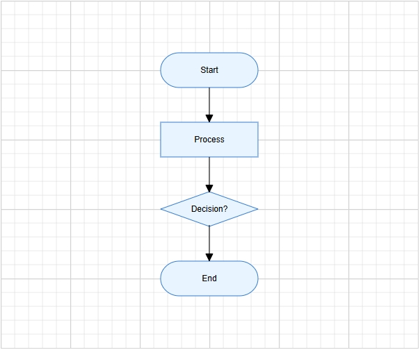
The following example creates a flowchart with four nodes: Start, Process, Decision, and End. It also applies common node and connector settings using the getNodeDefaults and getConnectorDefaults properties.
Update the src/App.vue file as follows:
<template>
  <ejs-diagram
    id="diagram"
    width="100%"
    height="580px"
    :nodes="nodes"
    :connectors="connectors"
    :getNodeDefaults="nodeDefaults"
    :getConnectorDefaults="connectorDefaults"
  />
</template>

<script setup>
import { DiagramComponent as EjsDiagram } from '@syncfusion/ej2-vue-diagrams';

const terminator = {
  type: 'Flow',
  shape: 'Terminator'
};

const process = {
  type: 'Flow',
  shape: 'Process'
};

const decision = {
  type: 'Flow',
  shape: 'Decision'
};

const nodes = [
  {
    id: 'node1',
    offsetX: 300,
    offsetY: 100,
    shape: terminator,
    annotations: [
      {
        content: 'Start'
      }
    ]
  },
  {
    id: 'node2',
    offsetX: 300,
    offsetY: 200,
    shape: process,
    annotations: [
      {
        content: 'Process'
      }
    ]
  },
  {
    id: 'node3',
    offsetX: 300,
    offsetY: 300,
    shape: decision,
    annotations: [
      {
        content: 'Decision?'
      }
    ]
  },
  {
    id: 'node4',
    offsetX: 300,
    offsetY: 400,
    shape: terminator,
    annotations: [
      {
        content: 'End'
      }
    ]
  }
];

const connectors = [
  {
    id: 'connector1',
    sourceID: 'node1',
    targetID: 'node2'
  },
  {
    id: 'connector2',
    sourceID: 'node2',
    targetID: 'node3'
  },
  {
    id: 'connector3',
    sourceID: 'node3',
    targetID: 'node4'
  }
];

function nodeDefaults(node) {
  node.width = 140;
  node.height = 50;
  node.style = {
    fill: '#E8F4FF',
    strokeColor: '#357BD2'
  };
  return node;
}

function connectorDefaults(connector) {
  connector.type = 'Orthogonal';
  connector.targetDecorator = {
    shape: 'Arrow',
    width: 10,
    height: 10
  };
  return connector;
}
</script>


<style>
 @import '../node_modules/@syncfusion/ej2-base/styles/tailwind3.css';
 @import '../node_modules/@syncfusion/ej2-popups/styles/tailwind3.css';
 @import '../node_modules/@syncfusion/ej2-navigations/styles/tailwind3.css';
 @import '../node_modules/@syncfusion/ej2-vue-diagrams/styles/tailwind3.css';
</style>
In this example:
-
offsetXandoffsetYdefine the position of each node. -
shapedefines the node shape configuration, andFlowShapeModel.shapespecifies flowchart shapes such asTerminator,Process, orDecision. - The
annotationsproperty adds text inside each node using thecontentfield. -
sourceIDandtargetIDdefine the connection between nodes. -
getNodeDefaultsapplies common width, height, fill color, and stroke color to all nodes. -
getConnectorDefaultsapplies common connector settings, such as orthogonal routing and target arrows.
Step 7: Run the application
Run the application using the following command:
npm run dev
Open the generated local URL in the browser. The application displays the flowchart diagram as shown below:
NOTE
Looking for the full Vue Diagram component overview, features, pricing, and documentation? Visit the Vue Diagram page.