Label Appearance in React Diagram
Overview
The React Diagram component provides comprehensive styling options to customize label appearance. Labels can be enhanced with various font properties, colors, decorations, and visual effects to match application requirements.
Font styling properties such as fontSize, fontFamily, color control the basic text appearance. Additional text formatting is available through the bold, italic, and textDecoration properties to style the label’s text.
Background and border styling can be applied using the fill, strokeColor, and strokeWidth properties to define the background color and border color of the annotation, and the opacity property controls label transparency.
The visibility property enables or disables label display.
The following code demonstrates comprehensive label appearance customization:
import * as React from "react";
import * as ReactDOM from "react-dom";
import { DiagramComponent } from "@syncfusion/ej2-react-diagrams";
// A node is created and stored in nodes array.
let node = [{
        id: 'node1',
        // Position of the node
        offsetX: 250,
        offsetY: 250,
        // Size of the node
        width: 100,
        height: 100,
        // Sets the annotation for the node
        annotations: [{
            content: 'Annotation visibility true',
            style: {
              color: 'blue',
              bold: true,
              italic: true,
              fontSize: 15,
              fontFamily: 'TimesNewRoman',
              fill: 'orange',
              opacity: 0.6,
            },
            visibility: true,
          },
          {
            content: 'Annotation visibility false',
            offset: { x: 0.5, y: 1 },
            style: {
              color: 'blue',
              bold: true,
              italic: true,
              fontSize: 15,
              fontFamily: 'TimesNewRoman',
              fill: 'orange',
              opacity: 0.6,
            },
            visibility: false,
          }]
    }];
// initialize Diagram component
function App() {
    return (<DiagramComponent id="container" width={'100%'} height={'600px'} nodes={node}/>);
}
const root = ReactDOM.createRoot(document.getElementById('diagram'));
root.render(<App />);
import * as React from "react";
import * as ReactDOM from "react-dom";
import {
DiagramComponent,
NodeModel
} from "@syncfusion/ej2-react-diagrams";
// A node is created and stored in nodes array.
let node: NodeModel[] = [{
id: 'node1',
// Position of the node
offsetX: 250,
offsetY: 250,
// Size of the node
width: 100,
height: 100,
// Sets the annotation for the node
annotations: [{
content: 'Annotation visibility true',
style: {
color: 'blue',
bold: true,
italic: true,
fontSize: 15,
fontFamily: 'TimesNewRoman',
fill: 'orange',
opacity: 0.6,
},
visibility: true,
},
{
content: 'Annotation visibility false',
offset: { x: 0.5, y: 1 },
style: {
color: 'blue',
bold: true,
italic: true,
fontSize: 15,
fontFamily: 'TimesNewRoman',
fill: 'orange',
opacity: 0.6,
},
visibility: false,
}]
}];
// initialize Diagram component
function App() {
return (
<DiagramComponent
id="container"
width={'100%'}
height={'600px'}
nodes={node}
/>
);
}
const root = ReactDOM.createRoot(document.getElementById('diagram'));
root.render(<App />);Horizontal and vertical alignment
Label positioning within nodes and connectors can be precisely controlled through horizontal and vertical alignment properties. The following table illustrates all possible alignment combinations with offset (0, 0):
| Horizontal Alignment | Vertical Alignment | Output with Offset(0,0) |
|---|---|---|
| Left | Top | 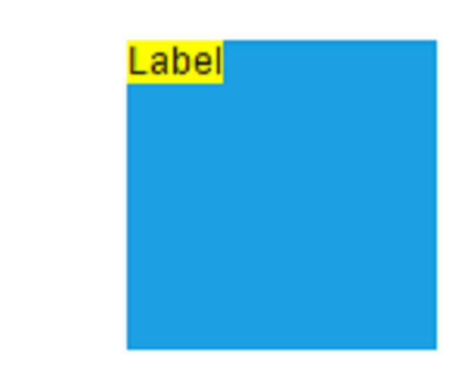 |
| Center | Top | 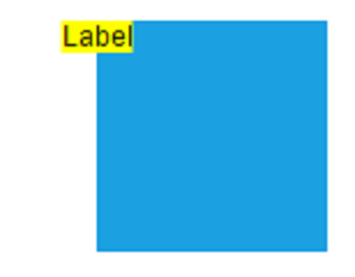 |
| Right | Top | 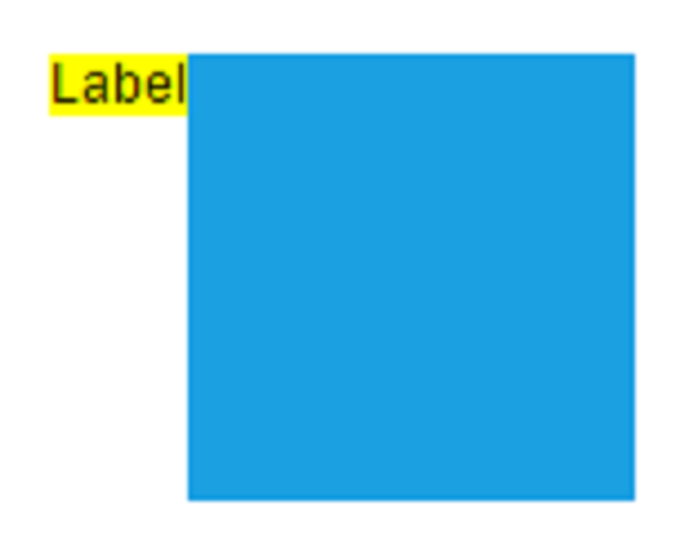 |
| Left | Center | 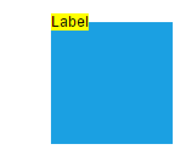 |
| Center | Center | 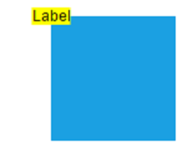 |
| Right | Center | 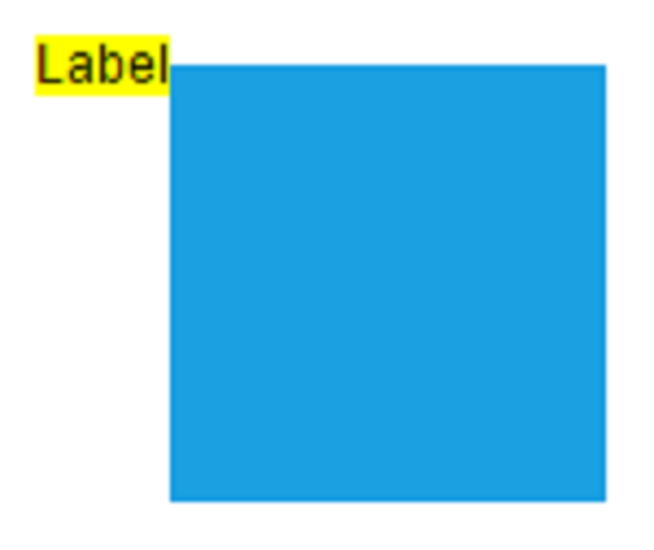 |
| Left | Bottom | 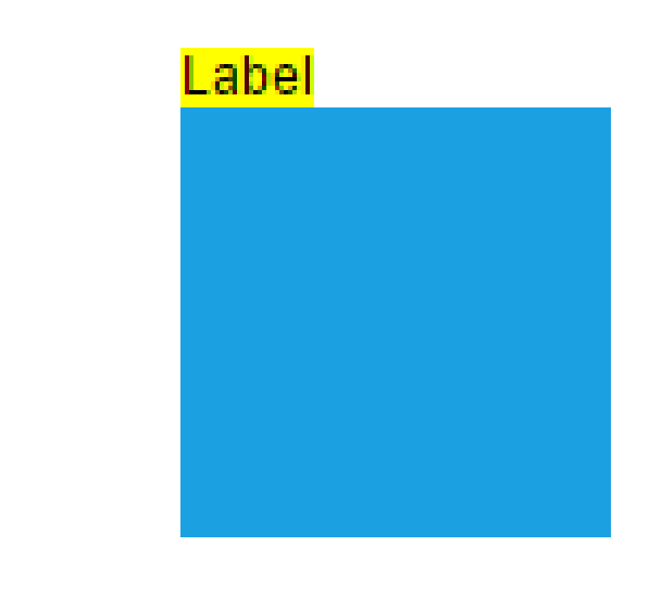 |
| Center | Bottom | 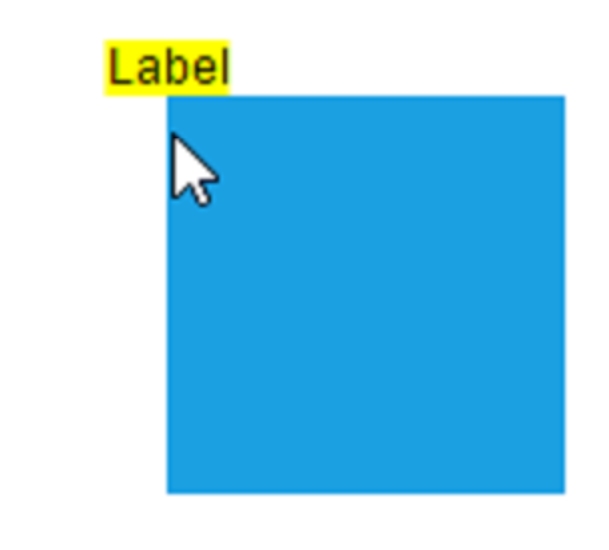 |
| Right | Bottom | 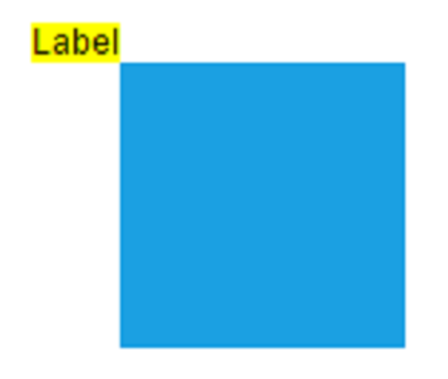 |
The following code example shows how to configure label alignment:
import * as React from "react";
import * as ReactDOM from "react-dom";
import { DiagramComponent } from "@syncfusion/ej2-react-diagrams";
// A node is created and stored in nodes array.
let node = [{
        // Position of the node
        offsetX: 250,
        offsetY: 250,
        // Size of the node
        width: 100,
        height: 100,
        // Sets the annotation for the node
        annotations: [{
                content: 'Annotation',
                // Sets the horizontal alignment as left
                horizontalAlignment: 'Left',
                // Sets the vertical alignment as Center
                verticalAlignment: 'Center'
            }]
    }];
// initialize Diagram component
function App() {
    return (<DiagramComponent id="container" width={'100%'} height={'600px'} nodes={node}/>);
}
const root = ReactDOM.createRoot(document.getElementById('diagram'));
root.render(<App />);
import * as React from "react";
import * as ReactDOM from "react-dom";
import {
DiagramComponent,
NodeModel
} from "@syncfusion/ej2-react-diagrams";
// A node is created and stored in nodes array.
let node: NodeModel[] = [{
// Position of the node
offsetX: 250,
offsetY: 250,
// Size of the node
width: 100,
height: 100,
// Sets the annotation for the node
annotations: [{
content: 'Annotation',
// Sets the horizontal alignment as left
horizontalAlignment: 'Left',
// Sets the vertical alignment as Center
verticalAlignment: 'Center'
}]
}];
// initialize Diagram component
function App() {
return (
<DiagramComponent
id="container"
width={'100%'}
height={'600px'}
nodes={node}
/>
);
}
const root = ReactDOM.createRoot(document.getElementById('diagram'));
root.render(<App />);Annotation Margin
The Margin property adds spacing around labels by specifying absolute values for any or all four sides. This property works in conjunction with offset, horizontal alignment, and vertical alignment to achieve precise label positioning.
The following example demonstrates label positioning using margin values.
import * as React from "react";
import * as ReactDOM from "react-dom";
import { DiagramComponent } from "@syncfusion/ej2-react-diagrams";
// A node is created and stored in nodes array.
let node = [{
        id: 'node1',
        // Position of the node
        offsetX: 100,
        offsetY: 100,
        // Size of the node
        width: 100,
        height: 100,
        // Sets the annotation for the connector
        annotations: [{
                content: 'Task1',
                // Sets the margin for the content
                margin: {
                    top: 10
                },
                horizontalAlignment: 'Center',
                verticalAlignment: 'Top',
                offset: {
                    x: 0.5,
                    y: 1
                }
            }]
}];
let connector = [
    {
      sourcePoint: { x: 200, y: 100 },
      targetPoint: { x: 500, y: 300 },
      type: 'Orthogonal',
      //Path annotation offset
      annotations: [
        {
          content: 'annotation',
          offset: 0.2,
          margin: { left: 40 },
        },
      ],
    },
  ];
// initialize Diagram component
function App() {
    return (<DiagramComponent id="container" width={'100%'} height={'600px'} nodes={node} connectors={connector}/>);
}
const root = ReactDOM.createRoot(document.getElementById('diagram'));
root.render(<App />);
import * as React from "react";
import * as ReactDOM from "react-dom";
import {
DiagramComponent,
NodeModel
} from "@syncfusion/ej2-react-diagrams";
// A node is created and stored in nodes array.
let node: NodeModel[] = [{
id: 'node1',
// Position of the node
offsetX: 100,
offsetY: 100,
// Size of the node
width: 100,
height: 100,
// Sets the annotation for the connector
annotations: [{
content: 'Task1',
// Sets the margin for the content
margin: {
top: 10
},
horizontalAlignment: 'Center',
verticalAlignment: 'Top',
offset: {
x: 0.5,
y: 1
}
}]
}];
let connector: ConnectorModel[] = [
{
sourcePoint: { x: 200, y: 100 },
targetPoint: { x: 500, y: 300 },
type: 'Orthogonal',
//Path annotation offset
annotations: [
{
content: 'annotation',
offset: 0.2,
margin: { left: 40 },
},
],
},
];
// initialize Diagram component
function App() {
return (
<DiagramComponent
id="container"
width={'100%'}
height={'600px'}
nodes={node}
connectors={connector}
/>
);
}
const root = ReactDOM.createRoot(document.getElementById('diagram'));
root.render(<App />);Hyperlink
Labels can include an interactive hyperlink for both nodes and connectors. The hyperlink object is configured inside the annotation entry of either a node’s or a connector’s annotations collection — the same properties apply in both cases. Hyperlink behavior and appearance can be customized with several properties.
The link property defines the URL the hyperlink navigates to, and the hyperlinkOpenState property controls how the hyperlink opens. Valid values are NewWindow (opens in a new browser tab/window) and SameTab (opens in the same browser tab).
Hyperlink appearance is controlled through the content property for display text, color for text color, and textDecoration for styling effects like Underline, LineThrough, Overline.
The following example shows hyperlink implementation and customization:
import * as React from "react";
import * as ReactDOM from "react-dom";
import { DiagramComponent } from "@syncfusion/ej2-react-diagrams";
// A node is created and stored in nodes array.
let node = [{
    id: 'node1',
    // Position of the node
    offsetX: 100,
    offsetY: 100,
    // Size of the node
    width: 100,
    height: 100,
    // Sets the annotation for the Node
    annotations: [{
            hyperlink: {
                link: 'https://google.com',
                //Set the link to open in the current tab
                hyperlinkOpenState: 'NewWindow'
            }
        }]
    }];
    let connector = [
        {
          sourcePoint: { x: 300, y: 200 },
          targetPoint: { x: 500, y: 300 },
          type: 'Orthogonal',
          //Path annotation offset
          annotations: [
            {
              hyperlink: {
                link: 'https://google.com',
                hyperlinkOpenState: 'NewWindow',
                content: 'Google',
                color: 'orange',
                textDecoration: 'Overline',
              },
            },
          ],
        },
      ];
// initialize Diagram component
function App() {
    return (<DiagramComponent id="container" width={'100%'} height={'600px'} nodes={node} connectors={connector}/>);
}
const root = ReactDOM.createRoot(document.getElementById('diagram'));
root.render(<App />);
import * as React from "react";
import * as ReactDOM from "react-dom";
import {
DiagramComponent,
NodeModel,
ConnectorModel
} from "@syncfusion/ej2-react-diagrams";
// A node is created and stored in nodes array.
let node: NodeModel[] = [{
id: 'node1',
// Position of the node
offsetX: 100,
offsetY: 100,
// Size of the node
width: 100,
height: 100,
// Sets the annotation for the Node
annotations: [{
hyperlink: {
link: 'https://google.com',
//Set the link to open in the current tab
hyperlinkOpenState:'NewWindow'
}
}]
}];
let connector: ConnectorModel[] = [
{
sourcePoint: { x: 300, y: 200 },
targetPoint: { x: 500, y: 300 },
type: 'Orthogonal',
//Path annotation offset
annotations: [
{
hyperlink: {
link: 'https://google.com',
hyperlinkOpenState: 'NewWindow',
content: 'Google',
color: 'orange',
textDecoration: 'Overline',
},
},
],
},
];
// initialize Diagram component
function App() {
return (
<DiagramComponent
id="container"
width={'100%'}
height={'600px'}
nodes={node}
connectors={connector}
/>
);
}
const root = ReactDOM.createRoot(document.getElementById('diagram'));
root.render(<App />);Rotate Annotation
Labels can be rotated to any angle using the rotateAngle property, which is available on both node (Shape) and connector (Path) annotations. This feature is useful for creating dynamic label orientations that match specific design requirements.
The following example demonstrates label rotation:
import * as React from "react";
import * as ReactDOM from "react-dom";
import { DiagramComponent } from "@syncfusion/ej2-react-diagrams";
// A node is created and stored in nodes array.
let node = [{
        // Position of the node
        offsetX: 250,
        offsetY: 250,
        // Size of the node
        width: 100,
        height: 100,
        // Sets the annotation for the node
        annotations: [{
                content: 'Annotation',
                // Sets the horizontal alignment as left
                rotateAngle: 45,
            }]
    }];
// initialize Diagram component
function App() {
    return (<DiagramComponent id="container" width={'100%'} height={'600px'} nodes={node}/>);
}
const root = ReactDOM.createRoot(document.getElementById('diagram'));
root.render(<App />);
import * as React from "react";
import * as ReactDOM from "react-dom";
import {
DiagramComponent,
NodeModel
} from "@syncfusion/ej2-react-diagrams";
// A node is created and stored in nodes array.
let node: NodeModel[] = [{
// Position of the node
offsetX: 250,
offsetY: 250,
// Size of the node
width: 100,
height: 100,
// Sets the annotation for the node
annotations: [{
content: 'Annotation',
// Sets the horizontal alignment as left
rotateAngle: 45,
}]
}];
// initialize Diagram component
function App() {
return (
<DiagramComponent
id="container"
width={'100%'}
height={'600px'}
nodes={node}
/>
);
}
const root = ReactDOM.createRoot(document.getElementById('diagram'));
root.render(<App />);Template support for Annotation
Diagram provides template support for annotation. You can either define a string template and assign it to template property of annotation or define a annotation template in html file and assign it to the annotationTemplate property of the diagram.
String template
For string template you should define a SVG/HTML content as string in the annotation’s template property.
The following code illustrates how to define a template in annotation.
import * as React from "react";
import * as ReactDOM from "react-dom";
import { DiagramComponent } from "@syncfusion/ej2-react-diagrams";
// A node is created and stored in nodes array.
let node = [{
        id: 'node1',
        // Position of the node
        offsetX: 100,
        offsetY: 100,
        // Size of the node
        width: 100,
        height: 100,
        // Sets the annotation for the Node
        annotations: [{
                // Set an template for annotation
                template: '<div><input type="button" value="Submit"></div>'
            }]
    }];
let connector = [{
        sourcePoint: {
            x: 300,
            y: 100
        },
        targetPoint: {
            x: 400,
            y: 300
        },
        type: 'Orthogonal',
        style: {
            strokeColor: '#6BA5D7'
        },
        // Sets the Annotation for the Connector
        annotations: [{
                // Set an template for annotation
                height: 60, width: 100,
                template: '<div><input type="button" value="Submit"></div>'
            }]
    }];
// initialize Diagram component
function App() {
    return (<DiagramComponent id="container" width={'100%'} height={'600px'} nodes={node} connectors={connector}/>);
}
const root = ReactDOM.createRoot(document.getElementById('diagram'));
root.render(<App />);
import * as React from "react";
import * as ReactDOM from "react-dom";
import {
DiagramComponent,
NodeModel,
ConnectorModel
} from "@syncfusion/ej2-react-diagrams";
// A node is created and stored in nodes array.
let node: NodeModel[] = [{
id: 'node1',
// Position of the node
offsetX: 100,
offsetY: 100,
// Size of the node
width: 100,
height: 100,
// Sets the annotation for the Node
annotations: [{
// Set an template for annotation
template: '<div><input type="button" value="Submit"></div>'
}]
}];
let connector: ConnectorModel[] = [{
sourcePoint: {
x: 300,
y: 100
},
targetPoint: {
x: 400,
y: 300
},
type: 'Orthogonal',
style: {
strokeColor: '#6BA5D7'
},
// Sets the Annotation for the Connector
annotations: [{
// Set an template for annotation
height: 60, width: 100,
template: '<div><input type="button" value="Submit"></div>'
}]
}];
// initialize Diagram component
function App() {
return (
<DiagramComponent
id="container"
width={'100%'}
height={'600px'}
nodes={node}
connectors={connector}
/>
);
}
const root = ReactDOM.createRoot(document.getElementById('diagram'));
root.render(<App />);Specify width and height for labels when using templates to ensure proper alignment and rendering.
Annotation template
HTML-based templates provide more complex content structures by defining a template inside a <script> tag and assigning its ID to the annotationTemplate property of the diagram. This template system works with both nodes and connectors.
Define the template markup inside a <script> tag with a unique id, then bind that id to the diagram’s annotationTemplate property. The following code demonstrates HTML template usage for labels:
import * as React from "react";
import * as ReactDOM from "react-dom";
import { DiagramComponent } from "@syncfusion/ej2-react-diagrams";
// A node is created and stored in nodes array.
let node = [{
        id: 'node1',
        // Position of the node
        offsetX: 100,
        offsetY: 100,
        // Size of the node
        width: 100,
        height: 100,
        // Sets the annotation for the Node
        annotations: [{
                id: 'Node', width: 100, height: 50
            }]
    }];
let connector = [{
        id: 'connector1',
        sourcePoint: {
            x: 300,
            y: 100
        },
        targetPoint: {
            x: 400,
            y: 300
        },
        type: 'Orthogonal',
        // Sets the Annotation for the Connector
        annotations: [{
                // Set an template for annotation
                id: 'Connector', height: 50, width: 100,
            }]
    }];
// initialize Diagram component
function App() {
    return (
    <div>
        <script id="annotationTemplate">
            <div style=>
                <input  style= type = "button" value="${id}"/>
            </div>
        </script>
        <DiagramComponent id="container" width={'100%'} height={'600px'} nodes={node} connectors={connector} annotationTemplate='#annotationTemplate'/>
    </div>);
}
const root = ReactDOM.createRoot(document.getElementById('diagram'));
root.render(<App />);
import * as React from "react";
import * as ReactDOM from "react-dom";
import {
DiagramComponent,
NodeModel,
ConnectorModel
} from "@syncfusion/ej2-react-diagrams";
// A node is created and stored in nodes array.
let node: NodeModel[] = [{
id: 'node1',
// Position of the node
offsetX: 100,
offsetY: 100,
// Size of the node
width: 100,
height: 100,
// Sets the annotation for the Node
annotations: [{
id: 'Node', width: 100, height: 50
}]
}];
let connector: ConnectorModel[] = [{
id: 'connector1',
sourcePoint: {
x: 300,
y: 100
},
targetPoint: {
x: 400,
y: 300
},
type: 'Orthogonal',
// Sets the Annotation for the Connector
annotations: [{
// Set an template for annotation
id: 'Connector', height: 50, width: 100,
}]
}];
// initialize Diagram component
function App() {
return (
<div>
<script id="annotationTemplate">
<div style=>
<input style= type = "button" value="${id}"/>
</div>
</script>
<DiagramComponent id="container" width={'100%'} height={'600px'} nodes={node} connectors={connector} annotationTemplate='#annotationTemplate'/>
</div>
);
}
const root = ReactDOM.createRoot(document.getElementById('diagram'));
root.render(<App />);Functional template
Define a function that returns a string template and assign that method to the annotationTemplate property of the diagram. Inside the function, customize the output based on the id of the annotation.
The following code illustrates how to define a functional template.
import * as React from "react";
import * as ReactDOM from "react-dom";
import { DiagramComponent } from "@syncfusion/ej2-react-diagrams";
// A node is created and stored in nodes array.
let node = [{
    id: 'node1',
    // Position of the node
    offsetX: 100,
    offsetY: 100,
    // Size of the node
    width: 100,
    height: 100,
    // Sets the annotation for the Node
    annotations: [{
        id: 'Node', width: 100, height: 50
    }]
}];
let connector = [{
    id: 'connector1',
    sourcePoint: {
        x: 300,
        y: 100
    },
    targetPoint: {
        x: 400,
        y: 300
    },
    type: 'Orthogonal',
    // Sets the Annotation for the Connector
    annotations: [{
            // Set an template for annotation
            id: 'Connector', height: 50, width: 100,
        }]
}];
function diagramTemplate(props) {
    return (<div style=>
    <input  style= type = "button" value={props.id}/>
    </div>);
}
// initialize Diagram component
function App() {
    return (
        <DiagramComponent id="container" width={'100%'} height={'600px'} nodes={node} connectors={connector} annotationTemplate={diagramTemplate.bind(this)}/>
    );
}
const root = ReactDOM.createRoot(document.getElementById('diagram'));
root.render(<App />);
import * as React from "react";
import * as ReactDOM from "react-dom";
import {
DiagramComponent,
NodeModel,
ConnectorModel
} from "@syncfusion/ej2-react-diagrams";
// A node is created and stored in nodes array.
let node: NodeModel[] = [{
id: 'node1',
// Position of the node
offsetX: 100,
offsetY: 100,
// Size of the node
width: 100,
height: 100,
// Sets the annotation for the Node
annotations: [{
id: 'Node', width: 100, height: 50
}]
}];
let connector: ConnectorModel[] = [{
id: 'connector1',
sourcePoint: {
x: 300,
y: 100
},
targetPoint: {
x: 400,
y: 300
},
type: 'Orthogonal',
// Sets the Annotation for the Connector
annotations: [{
// Set an template for annotation
id: 'Connector', height: 50, width: 100,
}]
}];
function diagramTemplate(props: any) {
return (<div style=>
<input style= type = "button" value={props.id}/>
</div>);
}
// initialize Diagram component
function App() {
return (
<DiagramComponent id="container" width={'100%'} height={'600px'} nodes={node} connectors={connector} annotationTemplate={diagramTemplate.bind(this)}/>
);
}
const root = ReactDOM.createRoot(document.getElementById('diagram'));
root.render(<App />);Text align
The textAlign property controls text alignment within the label boundaries. Available alignment options include left, right, center, and justify, providing flexibility for various content layouts.
The following code demonstrates text alignment configuration:
import * as React from "react";
import * as ReactDOM from "react-dom";
import { DiagramComponent } from "@syncfusion/ej2-react-diagrams";
// A node is created and stored in nodes array.
let node = [{
    id: 'node1',
    // Position of the node
    offsetX: 100,
    offsetY: 100,
    // Size of the node
    width: 100,
    height: 100,
    // Sets the annotation for the NOde
    annotations: [
      {
        content: 'Text align is set as Right',
        // Sets the textAlign as left for the content
        style: {
          textAlign: 'Right',
        },
      },
    ],
  },
  {
    id: 'node2',
    // Position of the node
    offsetX: 300,
    offsetY: 100,
    // Size of the node
    width: 100,
    height: 100,
    // Sets the annotation for the NOde
    annotations: [
      {
        content: 'Text align is set as Center',
        // Sets the textAlign as left for the content
        style: {
          textAlign: 'Center',
        },
      },
    ],
  },
  {
    id: 'node3',
    // Position of the node
    offsetX: 500,
    offsetY: 100,
    // Size of the node
    width: 100,
    height: 100,
    // Sets the annotation for the NOde
    annotations: [
      {
        content: 'Text align is set as Left',
        // Sets the textAlign as left for the content
        style: {
          textAlign: 'Left',
        },
      },
    ],
  },
  {
    id: 'node4',
    // Position of the node
    offsetX: 700,
    offsetY: 100,
    // Size of the node
    width: 100,
    height: 100,
    // Sets the annotation for the NOde
    annotations: [
      {
        content: 'Text align is set as Justify',
        // Sets the textAlign as left for the content
        style: {
          textAlign: 'Justify',
        },
      },
    ],
  },];
  let connectors = [
    {
      sourcePoint: { x: 100, y: 200 },
      targetPoint: { x: 300, y: 300 },
      type: 'Orthogonal',
      //Path annotation offset
      annotations: [
        {
          content: 'long annotation content for connector anntoation',
          width: 100,
          offset: 0.2,
          style: { textAlign: 'Right' },
        },
      ],
    },
    {
      sourcePoint: { x: 300, y: 200 },
      targetPoint: { x: 500, y: 300 },
      type: 'Orthogonal',
      //Path annotation offset
      annotations: [
        {
          content: 'long annotation content for connector anntoation',
          width: 100,
          offset: 0.2,
          style: { textAlign: 'Center' },
        },
      ],
    },
    {
      sourcePoint: { x: 500, y: 200 },
      targetPoint: { x: 700, y: 300 },
      type: 'Orthogonal',
      //Path annotation offset
      annotations: [
        {
          content: 'long annotation content for connector anntoation',
          width: 100,
          offset: 0.2,
          style: { textAlign: 'Left' },
        },
      ],
    },
    {
      sourcePoint: { x: 700, y: 200 },
      targetPoint: { x: 900, y: 300 },
      type: 'Orthogonal',
      //Path annotation offset
      annotations: [
        {
          content: 'long annotation content for connector anntoation',
          width: 100,
          offset: 0.2,
          style: { textAlign: 'Justify' },
        },
      ],
    },
  ];
// initialize Diagram component
function App() {
    return (<DiagramComponent id="container" width={'100%'} height={'600px'} nodes={node} connectors={connectors}/>);
}
const root = ReactDOM.createRoot(document.getElementById('diagram'));
root.render(<App />);
import * as React from "react";
import * as ReactDOM from "react-dom";
import {
DiagramComponent,
NodeModel,
ConnectorModel
} from "@syncfusion/ej2-react-diagrams";
// A node is created and stored in nodes array.
let node: NodeModel[] = [{
id: 'node1',
// Position of the node
offsetX: 100,
offsetY: 100,
// Size of the node
width: 100,
height: 100,
// Sets the annotation for the NOde
annotations: [
{
content: 'Text align is set as Right',
// Sets the textAlign as left for the content
style: {
textAlign: 'Right',
},
},
],
},
{
id: 'node2',
// Position of the node
offsetX: 300,
offsetY: 100,
// Size of the node
width: 100,
height: 100,
// Sets the annotation for the NOde
annotations: [
{
content: 'Text align is set as Center',
// Sets the textAlign as left for the content
style: {
textAlign: 'Center',
},
},
],
},
{
id: 'node3',
// Position of the node
offsetX: 500,
offsetY: 100,
// Size of the node
width: 100,
height: 100,
// Sets the annotation for the NOde
annotations: [
{
content: 'Text align is set as Left',
// Sets the textAlign as left for the content
style: {
textAlign: 'Left',
},
},
],
},
{
id: 'node4',
// Position of the node
offsetX: 700,
offsetY: 100,
// Size of the node
width: 100,
height: 100,
// Sets the annotation for the NOde
annotations: [
{
content: 'Text align is set as Justify',
// Sets the textAlign as left for the content
style: {
textAlign: 'Justify',
},
},
],
},];
let connectors: ConnectorModel[] = [
{
sourcePoint: { x: 100, y: 200 },
targetPoint: { x: 300, y: 300 },
type: 'Orthogonal',
//Path annotation offset
annotations: [
{
content: 'long annotation content for connector anntoation',
width: 100,
offset: 0.2,
style: { textAlign: 'Right' },
},
],
},
{
sourcePoint: { x: 300, y: 200 },
targetPoint: { x: 500, y: 300 },
type: 'Orthogonal',
//Path annotation offset
annotations: [
{
content: 'long annotation content for connector anntoation',
width: 100,
offset: 0.2,
style: { textAlign: 'Center' },
},
],
},
{
sourcePoint: { x: 500, y: 200 },
targetPoint: { x: 700, y: 300 },
type: 'Orthogonal',
//Path annotation offset
annotations: [
{
content: 'long annotation content for connector anntoation',
width: 100,
offset: 0.2,
style: { textAlign: 'Left' },
},
],
},
{
sourcePoint: { x: 700, y: 200 },
targetPoint: { x: 900, y: 300 },
type: 'Orthogonal',
//Path annotation offset
annotations: [
{
content: 'long annotation content for connector anntoation',
width: 100,
offset: 0.2,
style: { textAlign: 'Justify' },
},
],
},
];
// initialize Diagram component
function App() {
return (
<DiagramComponent
id="container"
width={'100%'}
height={'600px'}
nodes={node}
connectors={connectors}
/>
);
}
const root = ReactDOM.createRoot(document.getElementById('diagram'));
root.render(<App />);The following table shows the different text alignment.
| Text Align | Output image |
|---|---|
| Right | 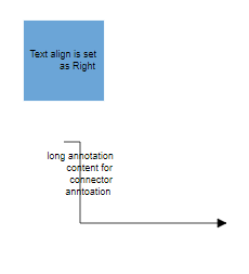 |
| Left | 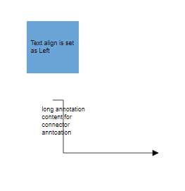 |
| Center | 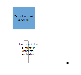 |
| Justify | 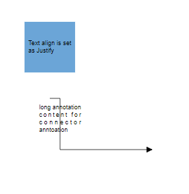 |
Text Wrapping
When label text exceeds node or connector boundaries, the text wrapping property controls how content is handled. Text can be wrapped into multiple lines based on the specified wrapping behavior.
The following code shows text wrapping implementation:
import * as React from "react";
import * as ReactDOM from "react-dom";
import { DiagramComponent } from "@syncfusion/ej2-react-diagrams";
// A node is created and stored in nodes array.
let node = [{
    id: 'node1',
    // Position of the node
    offsetX: 100,
    offsetY: 100,
    // Size of the node
    width: 100,
    height: 100,
    //Sets the annotation for the node
    annotations: [
      {
        content: 'Annotation Text WrapWithOverflow',
        // Sets the style for the text wrapping
        style: {
          textWrapping: 'WrapWithOverflow',
        },
      },
    ],
  },
  {
    id: 'node2',
    // Position of the node
    offsetX: 300,
    offsetY: 100,
    // Size of the node
    width: 100,
    height: 100,
    //Sets the annotation for the node
    annotations: [
      {
        content: 'Annotation Text Wrap',
        // Sets the style for the text wrapping
        style: {
          textWrapping: 'Wrap',
        },
      },
    ],
  },
  {
    id: 'node3',
    // Position of the node
    offsetX: 500,
    offsetY: 100,
    // Size of the node
    width: 100,
    height: 100,
    //Sets the annotation for the node
    annotations: [
      {
        content: 'Annotation Text NoWrap',
        // Sets the style for the text wrapping
        style: {
          textWrapping: 'NoWrap',
        },
      },
    ],
  },];
// initialize Diagram component
function App() {
    return (<DiagramComponent id="container" width={'100%'} height={'600px'} nodes={node}/>);
}
const root = ReactDOM.createRoot(document.getElementById('diagram'));
root.render(<App />);
import * as React from "react";
import * as ReactDOM from "react-dom";
import {
DiagramComponent,
NodeModel
} from "@syncfusion/ej2-react-diagrams";
// A node is created and stored in nodes array.
let node: NodeModel[] = [{
id: 'node1',
// Position of the node
offsetX: 100,
offsetY: 100,
// Size of the node
width: 100,
height: 100,
//Sets the annotation for the node
annotations: [
{
content: 'Annotation Text WrapWithOverflow',
// Sets the style for the text wrapping
style: {
textWrapping: 'WrapWithOverflow',
},
},
],
},
{
id: 'node2',
// Position of the node
offsetX: 300,
offsetY: 100,
// Size of the node
width: 100,
height: 100,
//Sets the annotation for the node
annotations: [
{
content: 'Annotation Text Wrap',
// Sets the style for the text wrapping
style: {
textWrapping: 'Wrap',
},
},
],
},
{
id: 'node3',
// Position of the node
offsetX: 500,
offsetY: 100,
// Size of the node
width: 100,
height: 100,
//Sets the annotation for the node
annotations: [
{
content: 'Annotation Text NoWrap',
// Sets the style for the text wrapping
style: {
textWrapping: 'NoWrap',
},
},
],
},];
// initialize Diagram component
function App() {
return (
<DiagramComponent
id="container"
width={'100%'}
height={'600px'}
nodes={node}
/>
);
}
const root = ReactDOM.createRoot(document.getElementById('diagram'));
root.render(<App />);| Value | Description | Image |
|---|---|---|
| No Wrap | Text will not be wrapped. | 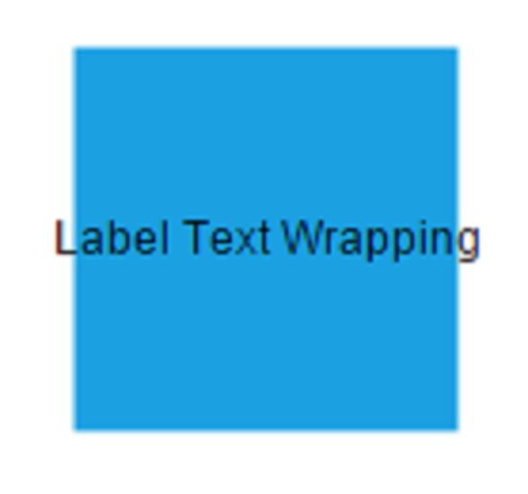 |
| Wrap | Text-wrapping occurs, when the text overflows beyond the available node width. | 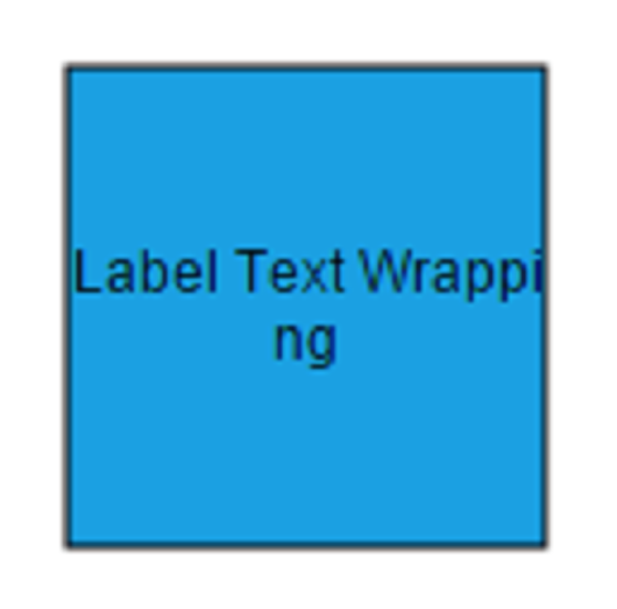 |
| WrapWithOverflow (Default) | Text wrapping occurs with overflow allowed for very long words that cannot be broken. | 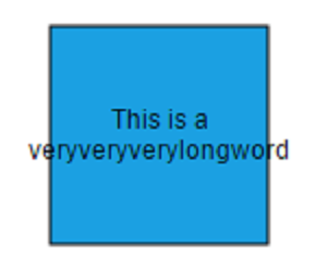 |
Text overflow
The label’s TextOverflow property manages content display when text exceeds the available label space. This property works in conjunction with text wrapping to provide comprehensive text handling.
Available overflow options include:
- Clip - Overflowing content beyond node boundaries is removed.
- Ellipsis - Overflowing content is replaced with three dots (…).
- Wrap - Content renders with vertical overflow and horizontal wrapping.
The types of text overflow are shown in the following table.
| TextOverflow | output image |
|---|---|
| Clip | 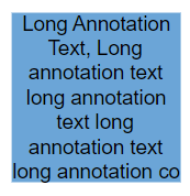 |
| Ellipsis | 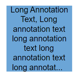 |
| Wrap(Default) | 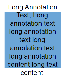 |
import * as React from "react";
import * as ReactDOM from "react-dom";
import { DiagramComponent } from "@syncfusion/ej2-react-diagrams";
// A node is created and stored in nodes array.
let node = [{
    // Position of the node
    offsetX: 100,
    offsetY: 100,
    // Size of the node
    width: 100,
    height: 100,
    annotations: [
      {
        content: 'Clip Wrap',
        offset: { x: 0.5, y: 1.4 },
      },
      {
        content:
          'Long Annotation Text, Long annotation text long annotation text long annotation text long annotation text long annotation text long annotation text',
        style: { textOverflow: 'Clip', textWrapping: 'Wrap' },
      },
    ],
  },
  {
    // Position of the node
    offsetX: 300,
    offsetY: 100,
    // Size of the node
    width: 100,
    height: 100,
    annotations: [
      {
        content: 'Clip NoWrap',
        offset: { x: 0.5, y: 1.4 },
      },
      {
        content:
          'Long Annotation Text, Long annotation text long annotation text long annotation text long annotation text',
        style: { textOverflow: 'Clip', textWrapping: 'NoWrap' },
      },
    ],
  },
  {
    // Position of the node
    offsetX: 500,
    offsetY: 100,
    // Size of the node
    width: 100,
    height: 100,
    annotations: [
      {
        content: 'Clip WrapWithOverflow',
        offset: { x: 0.5, y: 1.4 },
      },
      {
        content:
          'Long Annotation Text, Long annotation text long annotation text long annotation text long annotation text',
        style: { textOverflow: 'Clip', textWrapping: 'WrapWithOverflow' },
      },
    ],
  },

  {
    // Position of the node
    offsetX: 100,
    offsetY: 300,
    // Size of the node
    width: 100,
    height: 100,
    annotations: [
      {
        content: 'Ellipsis Wrap',
        offset: { x: 0.5, y: 1.4 },
      },
      {
        content:
          'Long Annotation Text, Long annotation text long annotation text long annotation text long annotation text long annotation text long annotation text',
        style: { textOverflow: 'Ellipsis', textWrapping: 'Wrap' },
      },
    ],
  },
  {
    // Position of the node
    offsetX: 300,
    offsetY: 300,
    // Size of the node
    width: 100,
    height: 100,
    annotations: [
      {
        content: 'Ellipsis NoWrap',
        offset: { x: 0.5, y: 1.4 },
      },
      {
        content:
          'Long Annotation Text, Long annotation text long annotation text long annotation text long annotation text',
        style: { textOverflow: 'Ellipsis', textWrapping: 'NoWrap' },
      },
    ],
  },
  {
    // Position of the node
    offsetX: 500,
    offsetY: 300,
    // Size of the node
    width: 100,
    height: 100,
    annotations: [
      {
        content: 'Ellipsis WrapWithOverflow',
        offset: { x: 0.5, y: 1.4 },
      },
      {
        content:
          'Long Annotation Text, Long annotation text long annotation text long annotation text long annotation text',
        style: { textOverflow: 'Ellipsis', textWrapping: 'WrapWithOverflow' },
      },
    ],
  },

  {
    // Position of the node
    offsetX: 100,
    offsetY: 700,
    // Size of the node
    width: 100,
    height: 100,
    annotations: [
      {
        content: 'Wrap Wrap',
        offset: { x: 0.5, y: 1.4 },
      },
      {
        content:
          'Long Annotation Text, Long annotation text long annotation text long annotation text long annotation text long annotation text long annotation text',
        style: { textOverflow: 'Wrap', textWrapping: 'Wrap' },
      },
    ],
  },
  {
    // Position of the node
    offsetX: 300,
    offsetY: 500,
    // Size of the node
    width: 100,
    height: 100,
    annotations: [
      {
        content: 'Wrap NoWrap',
        offset: { x: 0.5, y: 1.4 },
      },
      {
        content:
          'Long Annotation Text, Long annotation text long annotation text long annotation text long annotation text',
        style: { textOverflow: 'Wrap', textWrapping: 'NoWrap' },
      },
    ],
  },
  {
    // Position of the node
    offsetX: 500,
    offsetY: 700,
    // Size of the node
    width: 100,
    height: 100,
    annotations: [
      {
        content: 'Wrap WrapWithOverflow',
        offset: { x: 0.5, y: 1.4 },
      },
      {
        content:
          'Long Annotation Text, Long annotation text long annotation text long annotation text long annotation text',
        style: { textOverflow: 'Wrap', textWrapping: 'WrapWithOverflow' },
      },
    ],
  },];
// initialize Diagram component
function App() {
    return (<DiagramComponent id="container" width={'100%'} height={'600px'} nodes={node}/>);
}
const root = ReactDOM.createRoot(document.getElementById('diagram'));
root.render(<App />);
import * as React from "react";
import * as ReactDOM from "react-dom";
import {
DiagramComponent,
NodeModel
} from "@syncfusion/ej2-react-diagrams";
// A node is created and stored in nodes array.
let node: NodeModel[] = [{
// Position of the node
offsetX: 100,
offsetY: 100,
// Size of the node
width: 100,
height: 100,
annotations: [
{
content: 'Clip Wrap',
offset: { x: 0.5, y: 1.4 },
},
{
content:
'Long Annotation Text, Long annotation text long annotation text long annotation text long annotation text long annotation text long annotation text',
style: { textOverflow: 'Clip', textWrapping: 'Wrap' },
},
],
},
{
// Position of the node
offsetX: 300,
offsetY: 100,
// Size of the node
width: 100,
height: 100,
annotations: [
{
content: 'Clip NoWrap',
offset: { x: 0.5, y: 1.4 },
},
{
content:
'Long Annotation Text, Long annotation text long annotation text long annotation text long annotation text',
style: { textOverflow: 'Clip', textWrapping: 'NoWrap' },
},
],
},
{
// Position of the node
offsetX: 500,
offsetY: 100,
// Size of the node
width: 100,
height: 100,
annotations: [
{
content: 'Clip WrapWithOverflow',
offset: { x: 0.5, y: 1.4 },
},
{
content:
'Long Annotation Text, Long annotation text long annotation text long annotation text long annotation text',
style: { textOverflow: 'Clip', textWrapping: 'WrapWithOverflow' },
},
],
},
{
// Position of the node
offsetX: 100,
offsetY: 300,
// Size of the node
width: 100,
height: 100,
annotations: [
{
content: 'Ellipsis Wrap',
offset: { x: 0.5, y: 1.4 },
},
{
content:
'Long Annotation Text, Long annotation text long annotation text long annotation text long annotation text long annotation text long annotation text',
style: { textOverflow: 'Ellipsis', textWrapping: 'Wrap' },
},
],
},
{
// Position of the node
offsetX: 300,
offsetY: 300,
// Size of the node
width: 100,
height: 100,
annotations: [
{
content: 'Ellipsis NoWrap',
offset: { x: 0.5, y: 1.4 },
},
{
content:
'Long Annotation Text, Long annotation text long annotation text long annotation text long annotation text',
style: { textOverflow: 'Ellipsis', textWrapping: 'NoWrap' },
},
],
},
{
// Position of the node
offsetX: 500,
offsetY: 300,
// Size of the node
width: 100,
height: 100,
annotations: [
{
content: 'Ellipsis WrapWithOverflow',
offset: { x: 0.5, y: 1.4 },
},
{
content:
'Long Annotation Text, Long annotation text long annotation text long annotation text long annotation text',
style: { textOverflow: 'Ellipsis', textWrapping: 'WrapWithOverflow' },
},
],
},
{
// Position of the node
offsetX: 100,
offsetY: 700,
// Size of the node
width: 100,
height: 100,
annotations: [
{
content: 'Wrap Wrap',
offset: { x: 0.5, y: 1.4 },
},
{
content:
'Long Annotation Text, Long annotation text long annotation text long annotation text long annotation text long annotation text long annotation text',
style: { textOverflow: 'Wrap', textWrapping: 'Wrap' },
},
],
},
{
// Position of the node
offsetX: 300,
offsetY: 500,
// Size of the node
width: 100,
height: 100,
annotations: [
{
content: 'Wrap NoWrap',
offset: { x: 0.5, y: 1.4 },
},
{
content:
'Long Annotation Text, Long annotation text long annotation text long annotation text long annotation text',
style: { textOverflow: 'Wrap', textWrapping: 'NoWrap' },
},
],
},
{
// Position of the node
offsetX: 500,
offsetY: 700,
// Size of the node
width: 100,
height: 100,
annotations: [
{
content: 'Wrap WrapWithOverflow',
offset: { x: 0.5, y: 1.4 },
},
{
content:
'Long Annotation Text, Long annotation text long annotation text long annotation text long annotation text',
style: { textOverflow: 'Wrap', textWrapping: 'WrapWithOverflow' },
},
],
}];
// initialize Diagram component
function App() {
return (
<DiagramComponent
id="container"
width={'100%'}
height={'600px'}
nodes={node}
/>
);
}
const root = ReactDOM.createRoot(document.getElementById('diagram'));
root.render(<App />);