Getting Started with Blazor Diagram in Blazor Web App
This section briefly explains how to include the Blazor Diagram component in your Blazor Web App using Visual Studio, Visual Studio Code, or the .NET CLI.
The Blazor Diagram component requires .NET 8.0 or later and a modern browser with ES6 and WebAssembly support. The
Syncfusion.Blazor.Diagrampackage is compatible with theServer,WebAssembly, andAutointeractive render modes.
Ready to streamline your Blazor development?
Discover the full potential of Blazor components with AI Coding Assistants. Effortlessly integrate, configure, and enhance your projects with intelligent, context-aware code suggestions, streamlined setups, and real-time insights—all seamlessly integrated into your preferred AI-powered IDEs like VS Code, Cursor, CodeStudio and more. Explore AI Coding Assistants
Using .NET CLI Templates
Quickly set up a Blazor application using the preconfigured Syncfusion Web App Template.
First, install the template using the .NET CLI.
dotnet new install Syncfusion.Blazor.WebApp.TemplatesNext, create a new project with following command.
dotnet new syncfusionblazorwebapp --name MyApp --interactivity Server --all-interactive Globaldotnet new syncfusionblazorwebapp --name MyApp --interactivity WebAssembly --all-interactive Globaldotnet new syncfusionblazorwebapp --name MyApp --interactivity Auto --all-interactive GlobalIf you prefer per-page/component interactivity instead of global interactivity, replace
--all-interactive Globalwith--all-interactive PerPage/component(or omit the--all-interactiveflag).
After creating the project, navigate to the main project folder (for example, MyApp) and run the following command.
cd MyApp
dotnet run
cd MyApp
dotnet runcd MyApp
cd MyApp
dotnet runManually creating a new Blazor Web App
Create a Blazor Web App using Visual Studio via Microsoft Templates or the Syncfusion® Blazor Extension. For detailed instructions, refer to the Blazor Web App Getting Started documentation.
Run the following command to create a new Blazor Web App.
dotnet new blazor -o BlazorWebApp --interactivity Auto
cd BlazorWebApp
cd BlazorWebApp.Client
Alternatively, create a Blazor Web App using Visual Studio Code via Microsoft Templates, the Syncfusion® Blazor Extension, or the C# Dev Kit extension.
Configure the appropriate Interactive render mode and Interactivity location while creating a Blazor Web App. For detailed information, refer to the interactive render mode documentation.
Install the required Blazor packages
Install the Syncfusion.Blazor.Diagram and Syncfusion.Blazor.Themes NuGet packages. All Syncfusion Blazor packages are available on nuget.org. See the NuGet packages topic for details. If using the WebAssembly or Auto render modes in the Blazor Web App, install these packages in the .Client project.
- Go to Tools → NuGet Package Manager → Manage NuGet Packages for Solution.
- Search the required NuGet packages (
Syncfusion.Blazor.DiagramandSyncfusion.Blazor.Themes) and install them.
Alternatively, you can install the same packages using the Package Manager Console with the following commands.
Install-Package Syncfusion.Blazor.Diagram -Version 35.1.37
Install-Package Syncfusion.Blazor.Themes -Version 35.1.37
Open the terminal and run the following commands.
dotnet add package Syncfusion.Blazor.Diagram --version 35.1.37
dotnet add package Syncfusion.Blazor.Themes --version 35.1.37
Add import namespaces
After the packages are installed, open the ~/_Imports.razor file and import the Syncfusion.Blazor and Syncfusion.Blazor.Diagram namespaces.
@using Syncfusion.Blazor
@using Syncfusion.Blazor.Diagram
Register the Blazor service
Open the Program.cs file in Blazor Web App and register the Blazor service and include the required namespace reference using Syncfusion.Blazor; at the top. If the Interactive Render Mode is set to WebAssembly or Auto, register the Blazor service in Program.cs files of both the server and client projects in your Blazor Web App.
builder.Services.AddSyncfusionBlazor();Add stylesheet and script resources
The theme stylesheet and script can be accessed from NuGet through Static Web Assets. Include the stylesheet at the end of the <head> section in the App.razor file.
<link href="_content/Syncfusion.Blazor.Themes/fluent2.css" rel="stylesheet" />Include the required script references at the end of the <body> section in the App.razor file to enable Diagram functionality.
<script src="_content/Syncfusion.Blazor.Diagram/scripts/sf-diagramcomponent.min.js" type="text/javascript"></script>Add Blazor Diagram Component
Open a Razor file located in the ~/Pages/*.razor (for example, Home.razor) and add the Blazor Diagram component inside the .Client project razor file.
If the interactivity location is set to
Per page/componentin the Web App, define a render mode at the top of the razor file. (For example,InteractiveServer,InteractiveWebAssemblyorInteractiveAuto). If the Interactivity is set toGlobalwithAutoorWebAssembly, the render mode is automatically configured in theApp.razorfile by default.
@rendermode InteractiveAuto
@using Syncfusion.Blazor.Diagram

<SfDiagramComponent Width="100%" Height="600px"/>
The
@using Syncfusion.Blazor.Diagramdirective can be omitted if it is already declared in~/_Imports.razor(as described in the previous step).
The following table shows which render mode to choose for each hosting model:
| Hosting model | Render mode | Use case |
|---|---|---|
| Server | @rendermode InteractiveServer |
Server-side rendering with SignalR. |
| WebAssembly | @rendermode InteractiveWebAssembly |
Client-side rendering, no server required after first load. |
| Auto | @rendermode InteractiveAuto |
WebAssembly on first visit, then Server for subsequent visits. |
Create your first Diagram with nodes and connectors
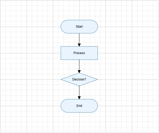
This section explains how to create a simple flowchart by adding nodes, customizing their appearance, and connecting them using connectors.
The following example creates a flowchart with four nodes: Start, Process, Decision, and End. It also applies common node and connector settings using the NodeCreating and ConnectorCreating properties.
<SfDiagramComponent Width="100%" Height="600px" Nodes="@nodes" Connectors="@connectors" NodeCreating="@NodeCreating" ConnectorCreating="@ConnectorCreating" />

@code {
    DiagramObjectCollection<Node> nodes;
    DiagramObjectCollection<Connector> connectors;
    protected override void OnInitialized()
    {
        nodes = new DiagramObjectCollection<Node>()
        {
            new Node()
            {
               ID = "node1", OffsetX = 300, OffsetY = 100,
               Shape = new FlowShape() { Type = NodeShapes.Flow, Shape = NodeFlowShapes.Terminator },
               Annotations = new DiagramObjectCollection<ShapeAnnotation>()
               {
                  new ShapeAnnotation(){ Content = "Start" }
               }
            },
            new Node()
            {
               ID = "node2", OffsetX = 300, OffsetY = 200,
               Shape = new FlowShape() { Type = NodeShapes.Flow, Shape = NodeFlowShapes.Process },
               Annotations = new DiagramObjectCollection<ShapeAnnotation>()
               {
                  new ShapeAnnotation(){ Content = "Process" }
               }
            },
            new Node()
            {
               ID = "node3", OffsetX = 300, OffsetY = 300,
               Shape = new FlowShape() { Type = NodeShapes.Flow, Shape = NodeFlowShapes.Decision },
               Annotations = new DiagramObjectCollection<ShapeAnnotation>()
               {
                  new ShapeAnnotation(){ Content = "Decision?" }
               }
            },
            new Node()
            {
               ID = "node4", OffsetX = 300, OffsetY = 400,
               Shape = new FlowShape() { Type = NodeShapes.Flow, Shape = NodeFlowShapes.Terminator },
               Annotations = new DiagramObjectCollection<ShapeAnnotation>()
               {
                  new ShapeAnnotation(){ Content = "End" }
               }
            }
        };
        connectors = new DiagramObjectCollection<Connector>()
        {
            new Connector()
            {
                ID = "connector1",
                SourceID = "node1",
                TargetID = "node2",
            },
            new Connector()
            {
                ID = "connector2",
                SourceID = "node2",
                TargetID = "node3",
            },
            new Connector()
            {
                ID = "connector3",
                SourceID = "node3",
                TargetID = "node4",
            },
        };
    }

    private void NodeCreating(IDiagramObject obj)
    {
        Node node = obj as Node;
        node.Style = new ShapeStyle() { Fill = "#E8F4FF", StrokeColor = "#357BD2" };
        node.Width = 140;
        node.Height = 50;
    }

    private void ConnectorCreating(IDiagramObject obj)
    {
        (obj as Connector).Type = ConnectorSegmentType.Orthogonal;
    }
}
A complete working sample can be downloaded from GitHub
In this example:
-
OffsetXandOffsetYdefine the position of each node. -
Shapedefines the node shape configuration, andFlowShape.Shapespecifies flowchart shapes such as Terminator, Process, or Decision. -
ShapeAnnotationadds text inside each node using theContentproperty. -
SourceIDandTargetIDconnect one node to another. -
NodeCreatingapplies common width, height, fill color, and stroke color to all nodes. -
ConnectorCreatingapplies common connector settings, such as orthogonal routing.
Run the application
Press Ctrl+F5 (Windows) or ⌘+F5 (macOS) to launch the application. The Blazor Diagram component will render in your default web browser.
Open the terminal and navigate to the main project folder (for example, BlazorWebApp) and run the following command.
cd ..
cd BlazorWebApp
dotnet run