Settings in UWP Digital Gauge
Other elements and behaviors in SfDigitalGauge can be customized as well.
They are:
- Character Spacing
- Character Stroke
- Segment Thickness
- RTL (Right to Left) Support
- Dimmed Brush Stroke
- Dimmed Brush Opacity
Character Spacing
The distance between the characters can be set by using the CharactersSpacing property. The default value is 10, and the valid range is any non-negative numeric value.
<syncfusion:SfDigitalGauge Value="SYNCFUSION" CharactersSpacing="50"/>SfDigitalGauge digital = new SfDigitalGauge();
digital.Value = "SYNCFUSION";
digital.CharacterSpacing = 50;
this.Grid.Children.Add(digital);
Character Stroke
The stroke of the character can be changed by the CharacterStroke property. The default value is Red.
<syncfusion:SfDigitalGauge Value="SYNCFUSION" CharacterType="SegmentFourteen" CharacterStroke="Yellow" />SfDigitalGauge digital = new SfDigitalGauge();
digital.Value = "SYNCFUSION";
digital.CharacterType = CharacterType.SegmentFourteen;
digital.CharacterStroke = new SolidColorBrush(Colors.Yellow);
this.Grid.Children.Add(digital);
Segment Thickness
You can adjust the thickness of the segment using the SegmentThickness property. The default value is 2, and the valid range is any positive numeric value.
<syncfusion:SfDigitalGauge Value="SYNCFUSION" CharacterType="SegmentFourteen" SegmentThickness="5"/>SfDigitalGauge digital = new SfDigitalGauge();
digital.Value = "SYNCFUSION";
digital.SegmentThickness = 5;
digital.CharacterType = CharacterType.SegmentFourteen;
this.Grid.Children.Add(digital);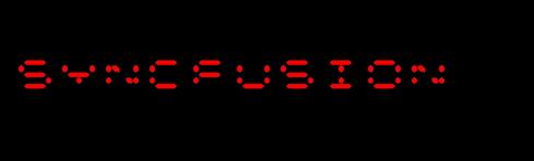
RTL (Right to Left) support
The Characters are aligned using the EnableRTLFormat property. The default value of EnableRTLFormat is false.
<syncfusion:SfDigitalGauge Value="SYNCFUSION" CharacterType="SegmentFourteen" EnableRTLFormat="True" />SfDigitalGauge digital = new SfDigitalGauge();
digital.Value = "SYNCFUSION";
digital.EnableRTLFormat = true;
digital.CharacterType = CharacterType.SegmentFourteen;
this.Grid.Children.Add(digital);
Dimmed Brush stroke
The DimmedBrush property is used to apply a brush to the dimmed (inactive) segments of the digital gauge. The dimmed segments are the segments that are not part of the active character being displayed. This property helps the dimmed segments blend with the background of the digital gauge. The default value is Transparent.
<syncfusion:SfDigitalGauge Value="SYNCFUSION" CharacterType="SegmentFourteen" DimmedBrush="White" />SfDigitalGauge digital = new SfDigitalGauge();
digital.Value = "SYNCFUSION";
digital.DimmedBrush = new SolidColorBrush(Colors.White);
digital.CharacterType = CharacterType.SegmentFourteen;
this.Grid.Children.Add(digital);
Dimmed Brush opacity
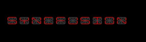
The DimmedBrushOpacity property is used to set the opacity of the dimmed segment brush. The default value is 50, and the valid range is 0 to 100 (percentage).
<syncfusion:SfDigitalGauge Value="SYNCFUSION" DimmedBrush="White" DimmedBrushOpacity="20" CharacterType="SegmentFourteen" />SfDigitalGauge digital = new SfDigitalGauge();
digital.Value = "SYNCFUSION";
digital.DimmedBrush = new SolidColorBrush(Colors.White);
digital.CharacterType = CharacterType.SegmentFourteen;
digital.DimmedBrushOpacity = 20;
this.Grid.Children.Add(digital);