Pie and Doughnut Chart in Blazor
Pie Chart
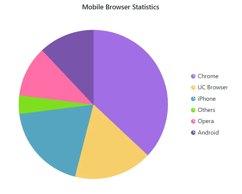
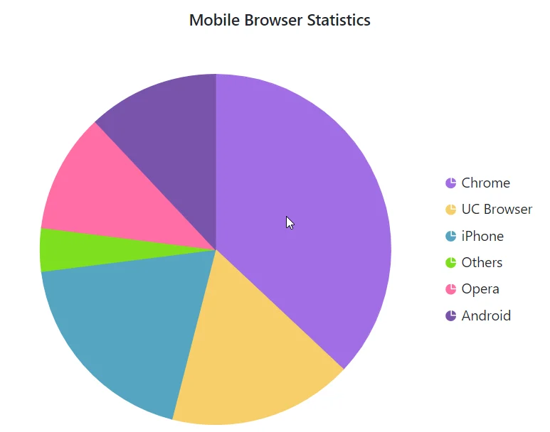
The Pie Chart is used to represent numeric proportional data in divided slices. To render a Pie Chart, set the series Type as Pie.
@using Syncfusion.Blazor.Charts

<SfAccumulationChart Title="Mobile Browser Statistics">
    <AccumulationChartSeriesCollection>
        <AccumulationChartSeries DataSource="@StatisticsDetails" XName="Browser" YName="Users"
                                 Name="Browser">
        </AccumulationChartSeries>
    </AccumulationChartSeriesCollection>

    <AccumulationChartLegendSettings Visible="true"></AccumulationChartLegendSettings>
</SfAccumulationChart>

@code{
    public class Statistics
    {
        public string Browser { get; set; }
        public double Users { get; set; }
    }

    public List<Statistics> StatisticsDetails = new List<Statistics>
    {
        new Statistics { Browser = "Chrome", Users = 37 },
        new Statistics { Browser = "UC Browser", Users = 17 },
        new Statistics { Browser = "iPhone", Users = 19 },
        new Statistics { Browser = "Others", Users = 4  },
        new Statistics { Browser = "Opera", Users = 11 },
        new Statistics { Browser = "Android", Users = 12 },
    };
}
Radius customization
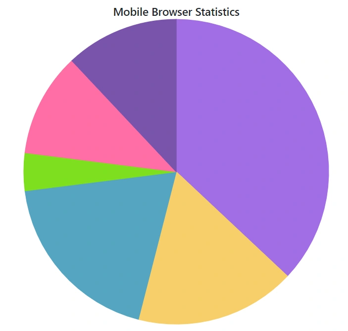
The radius of the pie series will be set to 80% of its size (minimum of chart width and height) by default. The Radius property of the series can be used to customize the radius of the pie chart.
@using Syncfusion.Blazor.Charts

<SfAccumulationChart Title="Mobile Browser Statistics">
    <AccumulationChartSeriesCollection>
        <AccumulationChartSeries DataSource="@StatisticsDetails" XName="Browser" YName="Users"
                                 Name="Browser" Radius="100%">
        </AccumulationChartSeries>
    </AccumulationChartSeriesCollection>

    <AccumulationChartLegendSettings Visible="false"></AccumulationChartLegendSettings>
</SfAccumulationChart>

@code{
    public class Statistics
    {
        public string Browser { get; set; }
        public double Users { get; set; }
    }

    public List<Statistics> StatisticsDetails = new List<Statistics>
    {
        new Statistics { Browser = "Chrome", Users = 37 },
        new Statistics { Browser = "UC Browser", Users = 17 },
        new Statistics { Browser = "iPhone", Users = 19 },
        new Statistics { Browser = "Others", Users = 4  },
        new Statistics { Browser = "Opera", Users = 11 },
        new Statistics { Browser = "Android", Users = 12 },
    };
}
Pie center
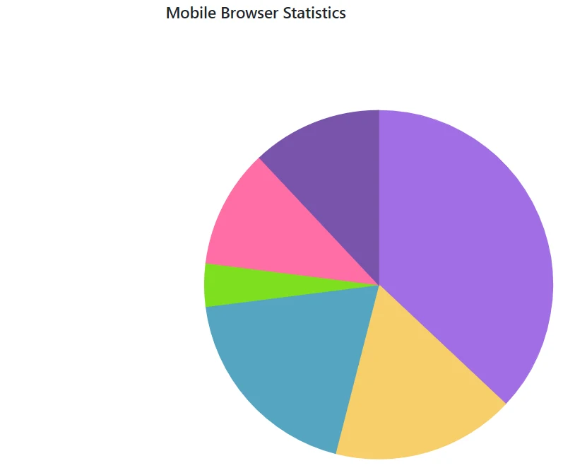
The center x and center y can be used to change the pie’s center position. The pie series’ center x and center y are set to 50% by default. The AccumulationChartCenter property of the series can be used to customize this.
@using Syncfusion.Blazor.Charts

<SfAccumulationChart EnableAnimation="false" Title="Mobile Browser Statistics">
    <AccumulationChartCenter X="70%" Y="60%" />

    <AccumulationChartSeriesCollection>
        <AccumulationChartSeries DataSource="@StatisticsDetails" XName="Browser" YName="Users" />
    </AccumulationChartSeriesCollection>

    <AccumulationChartLegendSettings Visible="false" />

</SfAccumulationChart>

@code{
    public class Statistics
    {
        public string Browser { get; set; }
        public double Users { get; set; }
    }

    public List<Statistics> StatisticsDetails = new List<Statistics>
    {
        new Statistics { Browser = "Chrome", Users = 37 },
        new Statistics { Browser = "UC Browser", Users = 17 },
        new Statistics { Browser = "iPhone", Users = 19 },
        new Statistics { Browser = "Others", Users = 4  },
        new Statistics { Browser = "Opera", Users = 11 },
        new Statistics { Browser = "Android", Users = 12 },
    };
}
Various Radius Pie Chart
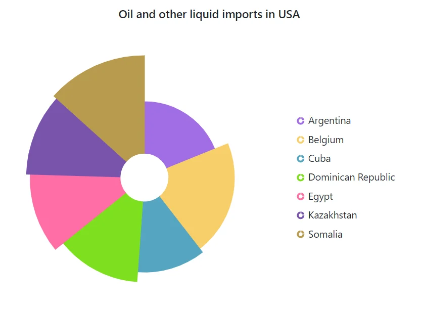
The Radius mapping can be used to render the slice with different radius.
@using Syncfusion.Blazor.Charts

<SfAccumulationChart Title="Oil and other liquid imports in USA" EnableAnimation="true" EnableSmartLabels="true">
    <AccumulationChartLegendSettings Visible="true"></AccumulationChartLegendSettings>

    <AccumulationChartSeriesCollection>
        <AccumulationChartSeries DataSource="@StatisticsDetails" XName="Browser" YName="Users"
                                 InnerRadius="20%" Radius="R">
        </AccumulationChartSeries>
    </AccumulationChartSeriesCollection>
</SfAccumulationChart>

@code{
    public class Statistics
    {
        public string Browser { get; set; }
        public double Users { get; set; }
        public string R { get; set; }
    }

    public List<Statistics> StatisticsDetails = new List<Statistics>
    {
        new Statistics { Browser = "Argentina", Users = 505370, R = "100"},
        new Statistics { Browser = "Belgium",    Users = 551500, R = "118.7"},
        new Statistics { Browser = "Cuba",  Users = 312685 , R = "124.6"},
        new Statistics { Browser = "Dominican Republic", Users = 350000 , R = "137.5"},
        new Statistics { Browser = "Egypt", Users = 301000 , R = "150.8"},
        new Statistics { Browser = "Kazakhstan", Users = 300000, R = "155.5"},
        new Statistics { Browser = "Somalia",  Users = 357022, R = "160.6"}
    };
}
Doughnut chart
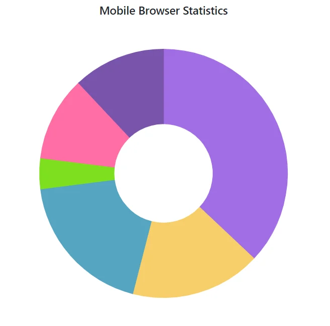
The doughnut chart can be created by setting the InnerRadius property of the Pie Chart to a value ranging from 0% to 100%.
@using Syncfusion.Blazor.Charts

<SfAccumulationChart Title="Mobile Browser Statistics">
    <AccumulationChartSeriesCollection>
        <AccumulationChartSeries DataSource="@StatisticsDetails" XName="Browser" YName="Users"
                                 Name="Browser" InnerRadius="40%">
        </AccumulationChartSeries>
    </AccumulationChartSeriesCollection>

    <AccumulationChartLegendSettings Visible="false"></AccumulationChartLegendSettings>
</SfAccumulationChart>

@code{
    public class Statistics
    {
        public string Browser { get; set; }
        public double Users { get; set; }
    }

    public List<Statistics> StatisticsDetails = new List<Statistics>
	{
        new Statistics { Browser = "Chrome", Users = 37 },
        new Statistics { Browser = "UC Browser", Users = 17 },
        new Statistics { Browser = "iPhone", Users = 19 },
        new Statistics { Browser = "Others", Users = 4  },
        new Statistics { Browser = "Opera", Users = 11 },
        new Statistics { Browser = "Android", Users = 12 },
    };
}
Multiple Doughnut Charts
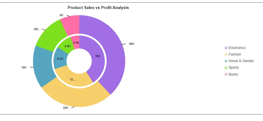
You can create multiple doughnut charts within a single chart by adding multiple series with different InnerRadius and Radius values. This lets you compare multiple data sets within the same categories. Each series can carry its own data, colors, and customizations. The MappingKey property in AccumulationChartLegendSettings groups legend items by a specified field from the data source, so points with matching MappingKey values appear as a single legend entry instead of one entry per series. To create the nested effect, the outer series uses a larger Radius with a non-zero InnerRadius (a ring), while the inner series uses a smaller Radius with InnerRadius equal to Radius (a solid disc).
@using Syncfusion.Blazor.Charts

<SfAccumulationChart Title="Product Sales vs Profit Analysis" >

    <AccumulationChartSeriesCollection>
        <AccumulationChartSeries DataSource="@TotalSalesData" XName="@nameof(ProductData.X)" YName="@nameof(ProductData.Y)" Name="Total Sales" Type="@AccumulationType.Pie" Radius="90%" InnerRadius="60%" TooltipMappingName="@nameof(ProductData.X)">

            <AccumulationDataLabelSettings Visible="true" Name="@nameof(ProductData.Text)" Position="@AccumulationLabelPosition.Outside">
                <AccumulationChartConnector Type="@ConnectorType.Curve" Color="black" Width="2" DashArray="2,1" Length="5" />
            </AccumulationDataLabelSettings>

            <AccumulationChartAnimation Enable="false" />
        </AccumulationChartSeries>

        <AccumulationChartSeries DataSource="@TotalProfitData" XName="@nameof(ProductData.X)" YName="@nameof(ProductData.Y)" Name="Total Profit" Type="@AccumulationType.Pie" Radius="50%" InnerRadius="50%" TooltipMappingName="@nameof(ProductData.X)">

            <AccumulationDataLabelSettings Visible="true" Name="@nameof(ProductData.Text)" Position="@AccumulationLabelPosition.Inside">
                <AccumulationChartConnector Type="@ConnectorType.Curve" Color="black" Width="2" DashArray="2,1" Length="5" />
            </AccumulationDataLabelSettings>
            <AccumulationChartAnimation Enable="false" />
        </AccumulationChartSeries>
    </AccumulationChartSeriesCollection>

    <AccumulationChartTooltipSettings Enable="true" Format="<b>${point.x}</b><br/>Value: <b>$${point.y}</b><br/>Percentage: <b>${point.percentage}%</b>" />

    <AccumulationChartLegendSettings Visible="true" MappingKey="@nameof(ProductData.X)" />

    <AccumulationChartBorder Color="#333" Width="2" />
</SfAccumulationChart>

@code {
    private List<ProductData> TotalSalesData { get; set; } = new()
        {
        new() { X = "Electronics",  Y = 45000, Text = "45K" },
        new() { X = "Fashion",      Y = 32000, Text = "32K" },
        new() { X = "Home & Garden", Y = 18000, Text = "18K" },
        new() { X = "Sports",       Y = 15000, Text = "15K" },
        new() { X = "Books",        Y = 8000,  Text = "8K" }
    };

    private List<ProductData> TotalProfitData { get; set; } = new()
    {
        new() { X = "Electronics",  Y = 18000, Text = "18K" },
        new() { X = "Fashion",      Y = 12800, Text = "12.8K" },
        new() { X = "Home & Garden", Y = 6300, Text = "6.3K"},
        new() { X = "Sports",       Y = 4500,  Text = "4.5K" },
        new() { X = "Books",        Y = 2400,  Text = "2.4K"}
    };

    public class ProductData
    {
        public string X { get; set; } = string.Empty;
        public double Y { get; set; }
        public string Text { get; set; } = string.Empty;
    }
}
Start and end angles
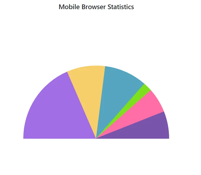
The StartAngle and EndAngle properties can be used to customize the start and end angles of the pie series. StartAngle is set to 0 degrees by default, and EndAngle is set to 360 degrees by default. Semi-pie series can be achieved by customizing these properties.
@using Syncfusion.Blazor.Charts

<SfAccumulationChart Title="Mobile Browser Statistics">
    <AccumulationChartSeriesCollection>
        <AccumulationChartSeries DataSource="@StatisticsDetails" XName="Browser" YName="Users"
                                 StartAngle="270" EndAngle="90">
        </AccumulationChartSeries>
    </AccumulationChartSeriesCollection>

    <AccumulationChartLegendSettings Visible="false">
    </AccumulationChartLegendSettings>
</SfAccumulationChart>

@code{
    public class Statistics
    {
        public string Browser { get; set; }
        public double Users { get; set; }
    }

    public List<Statistics> StatisticsDetails = new List<Statistics>
	{
        new Statistics { Browser = "Chrome", Users = 37 },
        new Statistics { Browser = "UC Browser", Users = 17 },
        new Statistics { Browser = "iPhone", Users = 19 },
        new Statistics { Browser = "Others", Users = 4  },
        new Statistics { Browser = "Opera", Users = 11 },
        new Statistics { Browser = "Android", Users = 12 },
    };
}
Color and text mapping
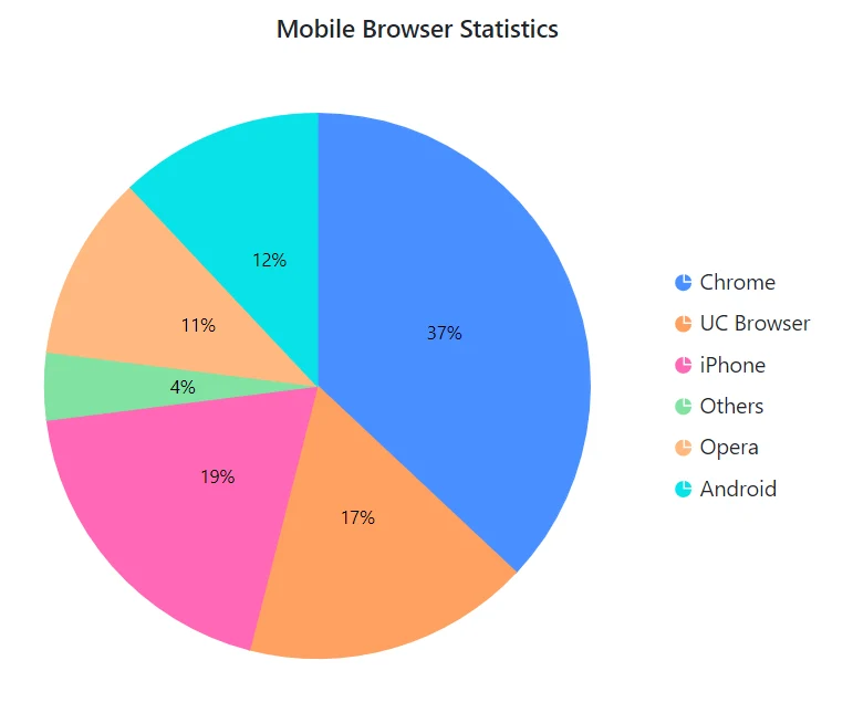
PointColorMapping in series and Name in datalabel can be used to map the fill color and text from the data source to the chart.
@using Syncfusion.Blazor.Charts

<SfAccumulationChart Title="Mobile Browser Statistics">
    <AccumulationChartLegendSettings Visible="true"></AccumulationChartLegendSettings>

    <AccumulationChartSeriesCollection>
        <AccumulationChartSeries DataSource="@StatisticsDetails" XName="Browser" YName="Users" Name="Browser" PointColorMapping="Fill">
            <AccumulationDataLabelSettings Visible="true" Name="Text"></AccumulationDataLabelSettings>
        </AccumulationChartSeries>
    </AccumulationChartSeriesCollection>
</SfAccumulationChart>

@code{
    public class Statistics
    {
        public string Browser { get; set; }
        public double Users { get; set; }
        public string Fill { get; set; }
        public string Text { get; set; }
    }

    public List<Statistics> StatisticsDetails = new List<Statistics>
{
         new Statistics { Browser = "Chrome", Users = 37, Text= "37%", Fill="#498fff" },
         new Statistics { Browser = "UC Browser", Users = 17, Text= "17%", Fill="#ffa060" },
         new Statistics { Browser = "iPhone", Users = 19, Text= "19%", Fill="#ff68b6" },
         new Statistics { Browser = "Others", Users = 4, Text= "4%", Fill="#81e2a1"  },
         new Statistics { Browser = "Opera", Users = 11, Text= "11%", Fill="#ffb980" },
         new Statistics { Browser = "Android", Users = 12, Text= "12%", Fill="#09e1e8" },
    };
}
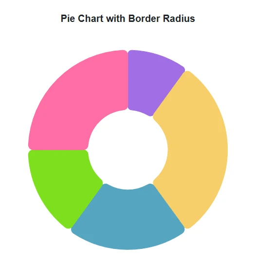
Border radius
The corners of all the slices in the pie/donut chart series can be rounded using the BorderRadius property within the AccumulationChartSeries.
@using Syncfusion.Blazor.Charts

<SfAccumulationChart Title="Pie Chart with Border Radius">
    <AccumulationChartSeriesCollection>
        <AccumulationChartSeries DataSource="@DonutChartPoints" XName="Food" YName="Amount" InnerRadius="40%" BorderRadius="8">
        </AccumulationChartSeries>
    </AccumulationChartSeriesCollection>
    <AccumulationChartLegendSettings Visible="false"></AccumulationChartLegendSettings>
</SfAccumulationChart>

@code {
    public List<DonutData> DonutChartPoints { get; set; } = new List<DonutData>
    {
        new DonutData { Food = "Milk", Amount = 10, DataLabelMappingName = "Milk: 10%"},
        new DonutData { Food = "Rice", Amount = 30, DataLabelMappingName = "Rice: 30%"},
        new DonutData { Food = "Cereals", Amount = 20, DataLabelMappingName = "Cereals: 20%"},
        new DonutData { Food = "Water", Amount = 15, DataLabelMappingName = "Water: 15%"},
        new DonutData { Food = "Vegetables", Amount = 25, DataLabelMappingName = "Vegetables: 25%"},
    };
    public class DonutData
    {
        public string Food { get; set; }
        public double Amount { get; set; }
        public string DataLabelMappingName { get; set; }
    }
}
Hide pie or doughnut border
When the mouse hovers over the pie/doughnut chart, the border appears by default. The border can be turned off by setting the EnableBorderOnMouseMove property to false.
@using Syncfusion.Blazor.Charts

<SfAccumulationChart Title="Mobile Browser Statistics" EnableBorderOnMouseMove="false">
    <AccumulationChartLegendSettings Visible="true"></AccumulationChartLegendSettings>

    <AccumulationChartSeriesCollection>
        <AccumulationChartSeries DataSource="@StatisticsDetails" XName="Browser" YName="Users" Name="Browser">
        </AccumulationChartSeries>
    </AccumulationChartSeriesCollection>
</SfAccumulationChart>

@code{
    public class Statistics
    {
        public string Browser { get; set; }
        public double Users { get; set; }
    }

    public List<Statistics> StatisticsDetails = new List<Statistics>
	{
        new Statistics { Browser = "Chrome", Users = 37 },
        new Statistics { Browser = "UC Browser", Users = 17 },
        new Statistics { Browser = "iPhone", Users = 19 },
        new Statistics { Browser = "Others", Users = 4  },
        new Statistics { Browser = "Opera", Users = 11 },
        new Statistics { Browser = "Android", Users = 12 },
    };
}
Refer to the Blazor Charts feature tour page for its groundbreaking feature representations and also explore the Blazor Accumulation Chart Example to know various features of accumulation charts and how it is used to represent numeric proportional data.