User Interactions in ASP.NET Core Maps
Zooming
The zooming feature is used to zoom in and out of Maps to show in-depth information. It is controlled by the ZoomFactor property of the MapsZoomSettings of the Maps. The ZoomFactor is increased or decrease dynamically based on zoom in and out interaction.
Enable zooming
Zooming of Maps is enabled by setting the Enable property of MapsZoomSettings to true.
Enable panning
To enable the panning feature, set the EnablePanning property of MapsZoomSettings to true.
@using Syncfusion.EJ2;
    <ejs-maps id="maps">
        <e-maps-zoomsettings enable="true" EnablePanning="true"></e-maps-zoomsettings>
        <e-maps-layers>
            <e-maps-layer shapeData="ViewBag.world_map">
            </e-maps-layer>
        </e-maps-layers>
    </ejs-maps>
using System;
using System.Collections.Generic;
using System.Diagnostics;
using System.Linq;
using System.Threading.Tasks;
using Microsoft.AspNetCore.Mvc;
using EJ2_Core_Application.Models;
using Newtonsoft.Json;
namespace EJ2_Core_Application.Controllers
{
public class HomeController : Controller
{
public IActionResult Index()
{
ViewBag.world_map = GetWorldMap();
ViewBag.worldMap = GetMap();
return View();
}
public object GetWorldMap()
{
string allText = System.IO.File.ReadAllText("./wwwroot/scripts/MapsData/WorldMap.js");
return JsonConvert.DeserializeObject(allText);
}
public object GetMap()
{
string allText = System.IO.File.ReadAllText(Server.MapPath("~/App_Data/WorldMap.json"));
return JsonConvert.DeserializeObject(allText, typeof(object));
}
}
}Various type of zooming
Zooming can be performed in following types:
Zooming toolbar
By default, the toolbar is rendered with zoom-in, zoom-out, and reset options when it is set to true in the Enable property of MapsZoomSettings.
The following options are available in toolbar.
- Zoom - Provides rectangular zoom support.
- ZoomIn - Zoom in the Maps.
- ZoomOut - Zoom out the Maps.
- Pan - Switches to panning if rectangular zoom is activated.
- Reset - Restores the Maps to the default view.
@using Syncfusion.EJ2;

@{
    var toolbar = new string[] { "Zoom", "ZoomIn", "ZoomOut", "Pan", "Reset" };
}
<div id="control-section">
    <ejs-maps id="maps">
        <e-maps-zoomsettings enable="true" toolbars="toolbar"></e-maps-zoomsettings>
        <e-maps-layers>
            <e-maps-layer shapeData="ViewBag.world_map">
            </e-maps-layer>
        </e-maps-layers>
    </ejs-maps>
</div>
using System;
using System.Collections.Generic;
using System.Diagnostics;
using System.Linq;
using System.Threading.Tasks;
using Microsoft.AspNetCore.Mvc;
using EJ2_Core_Application.Models;
using Newtonsoft.Json;
namespace EJ2_Core_Application.Controllers
{
public class HomeController : Controller
{
public IActionResult Index()
{
ViewBag.world_map = GetWorldMap();
ViewBag.worldMap = GetMap();
return View();
}
public object GetWorldMap()
{
string allText = System.IO.File.ReadAllText("./wwwroot/scripts/MapsData/WorldMap.js");
return JsonConvert.DeserializeObject(allText);
}
public object GetMap()
{
string allText = System.IO.File.ReadAllText(Server.MapPath("~/App_Data/WorldMap.json"));
return JsonConvert.DeserializeObject(allText, typeof(object));
}
}
}Pinch zooming
To enable or disable the pinch zooming, use the PinchZooming property in MapsZoomSettings.
@using Syncfusion.EJ2;
<div id="control-section">
    <ejs-maps id="maps">
        <e-maps-zoomsettings enable="true" PinchZooming="true"></e-maps-zoomsettings>
        <e-maps-layers>
            <e-maps-layer shapeData="ViewBag.world_map">
            </e-maps-layer>
        </e-maps-layers>
    </ejs-maps>
</div>
using System;
using System.Collections.Generic;
using System.Diagnostics;
using System.Linq;
using System.Threading.Tasks;
using Microsoft.AspNetCore.Mvc;
using EJ2_Core_Application.Models;
using Newtonsoft.Json;
namespace EJ2_Core_Application.Controllers
{
public class HomeController : Controller
{
public IActionResult Index()
{
ViewBag.world_map = GetWorldMap();
ViewBag.worldMap = GetMap();
return View();
}
public object GetWorldMap()
{
string allText = System.IO.File.ReadAllText("./wwwroot/scripts/MapsData/WorldMap.js");
return JsonConvert.DeserializeObject(allText);
}
public object GetMap()
{
string allText = System.IO.File.ReadAllText(Server.MapPath("~/App_Data/WorldMap.json"));
return JsonConvert.DeserializeObject(allText, typeof(object));
}
}
}Single-click zooming
To enable or disable the single-click zooming, use the ZoomOnClick property in MapsZoomSettings.
@using Syncfusion.EJ2;
<div id="control-section">
    <ejs-maps id="maps">
        <e-maps-zoomsettings enable="true" ZoomOnClick="true"></e-maps-zoomsettings>
        <e-maps-layers>
            <e-maps-layer shapeData="ViewBag.world_map">
            </e-maps-layer>
        </e-maps-layers>
    </ejs-maps>
</div>
using System;
using System.Collections.Generic;
using System.Diagnostics;
using System.Linq;
using System.Threading.Tasks;
using Microsoft.AspNetCore.Mvc;
using EJ2_Core_Application.Models;
using Newtonsoft.Json;
namespace EJ2_Core_Application.Controllers
{
public class HomeController : Controller
{
public IActionResult Index()
{
ViewBag.world_map = GetWorldMap();
ViewBag.worldMap = GetMap();
return View();
}
public object GetWorldMap()
{
string allText = System.IO.File.ReadAllText("./wwwroot/scripts/MapsData/WorldMap.js");
return JsonConvert.DeserializeObject(allText);
}
public object GetMap()
{
string allText = System.IO.File.ReadAllText(Server.MapPath("~/App_Data/WorldMap.json"));
return JsonConvert.DeserializeObject(allText, typeof(object));
}
}
}Double-click zooming
To enable or disable the double-click zooming, use the DoubleClickZoom property in MapsZoomSettings.
@using Syncfusion.EJ2;
<div id="control-section">
    <ejs-maps id="maps">
        <e-maps-zoomsettings enable="true" DoubleClickZoom="true"></e-maps-zoomsettings>
        <e-maps-layers>
            <e-maps-layer shapeData="ViewBag.world_map">
            </e-maps-layer>
        </e-maps-layers>
    </ejs-maps>
</div>
using System;
using System.Collections.Generic;
using System.Diagnostics;
using System.Linq;
using System.Threading.Tasks;
using Microsoft.AspNetCore.Mvc;
using EJ2_Core_Application.Models;
using Newtonsoft.Json;
namespace EJ2_Core_Application.Controllers
{
public class HomeController : Controller
{
public IActionResult Index()
{
ViewBag.world_map = GetWorldMap();
ViewBag.worldMap = GetMap();
return View();
}
public object GetWorldMap()
{
string allText = System.IO.File.ReadAllText("./wwwroot/scripts/MapsData/WorldMap.js");
return JsonConvert.DeserializeObject(allText);
}
public object GetMap()
{
string allText = System.IO.File.ReadAllText(Server.MapPath("~/App_Data/WorldMap.json"));
return JsonConvert.DeserializeObject(allText, typeof(object));
}
}
}Mouse wheel zooming
To enable or disable mouse wheel zooming, use the MouseWheelZoom property in MapsZoomSettings.
@using Syncfusion.EJ2;
<div id="control-section">
    <ejs-maps id="maps">
        <e-maps-zoomsettings enable="true" MouseWheelZoom="true"></e-maps-zoomsettings>
        <e-maps-layers>
            <e-maps-layer shapeData="ViewBag.world_map">
            </e-maps-layer>
        </e-maps-layers>
    </ejs-maps>
</div>
using System;
using System.Collections.Generic;
using System.Diagnostics;
using System.Linq;
using System.Threading.Tasks;
using Microsoft.AspNetCore.Mvc;
using EJ2_Core_Application.Models;
using Newtonsoft.Json;
namespace EJ2_Core_Application.Controllers
{
public class HomeController : Controller
{
public IActionResult Index()
{
ViewBag.world_map = GetWorldMap();
ViewBag.worldMap = GetMap();
return View();
}
public object GetWorldMap()
{
string allText = System.IO.File.ReadAllText("./wwwroot/scripts/MapsData/WorldMap.js");
return JsonConvert.DeserializeObject(allText);
}
public object GetMap()
{
string allText = System.IO.File.ReadAllText(Server.MapPath("~/App_Data/WorldMap.json"));
return JsonConvert.DeserializeObject(allText, typeof(object));
}
}
}Selection zooming
To enable or disable selection zooming, use the EnableSelectionZooming property in MapsZoomSettings. The EnablePanning property must be set to false to enable the selection zooming in Maps.
@using Syncfusion.EJ2;
<div id="control-section">
    <ejs-maps id="maps">
        <e-maps-zoomsettings enable="true" EnableSelectionZooming="true" EnablePanning="false"></e-maps-zoomsettings>
        <e-maps-layers>
            <e-maps-layer shapeData="ViewBag.world_map">
            </e-maps-layer>
        </e-maps-layers>
    </ejs-maps>
</div>
using System;
using System.Collections.Generic;
using System.Diagnostics;
using System.Linq;
using System.Threading.Tasks;
using Microsoft.AspNetCore.Mvc;
using EJ2_Core_Application.Models;
using Newtonsoft.Json;
namespace EJ2_Core_Application.Controllers
{
public class HomeController : Controller
{
public IActionResult Index()
{
ViewBag.world_map = GetWorldMap();
ViewBag.worldMap = GetMap();
return View();
}
public object GetWorldMap()
{
string allText = System.IO.File.ReadAllText("./wwwroot/scripts/MapsData/WorldMap.js");
return JsonConvert.DeserializeObject(allText);
}
public object GetMap()
{
string allText = System.IO.File.ReadAllText(Server.MapPath("~/App_Data/WorldMap.json"));
return JsonConvert.DeserializeObject(allText, typeof(object));
}
}
}Setting minimum and maximum values for zoom factor
The zooming range can be adjusted using the MinZoom and MaxZoom properties in MapsZoomSettings. The minZoom value is set to 1 by default, and the maxZoom value is set to 10.
@using Syncfusion.EJ2;
<div id="control-section">
    <ejs-maps id="maps">
        <e-maps-zoomsettings enable="true" minZoom=2 maxZoom=12></e-maps-zoomsettings>
        <e-maps-layers>
            <e-maps-layer shapeData="ViewBag.world_map">
            </e-maps-layer>
        </e-maps-layers>
    </ejs-maps>
</div>
using System;
using System.Collections.Generic;
using System.Diagnostics;
using System.Linq;
using System.Threading.Tasks;
using Microsoft.AspNetCore.Mvc;
using EJ2_Core_Application.Models;
using Newtonsoft.Json;
namespace EJ2_Core_Application.Controllers
{
public class HomeController : Controller
{
public IActionResult Index()
{
ViewBag.world_map = GetWorldMap();
ViewBag.worldMap = GetMap();
return View();
}
public object GetWorldMap()
{
string allText = System.IO.File.ReadAllText("./wwwroot/scripts/MapsData/WorldMap.js");
return JsonConvert.DeserializeObject(allText);
}
public object GetMap()
{
string allText = System.IO.File.ReadAllText(Server.MapPath("~/App_Data/WorldMap.json"));
return JsonConvert.DeserializeObject(allText, typeof(object));
}
}
}Zooming with animation
To zoom in or zoom out the Maps with animation, use the AnimationDuration property in MapsLayer.
@using Syncfusion.EJ2;
<div id="control-section">
    <ejs-maps id="maps">
        <e-maps-zoomsettings enable="true"></e-maps-zoomsettings>
        <e-maps-layers>
            <e-maps-layer shapeData="ViewBag.world_map" AnimationDuration="500">
            </e-maps-layer>
        </e-maps-layers>
    </ejs-maps>
</div>
using System;
using System.Collections.Generic;
using System.Diagnostics;
using System.Linq;
using System.Threading.Tasks;
using Microsoft.AspNetCore.Mvc;
using EJ2_Core_Application.Models;
using Newtonsoft.Json;
namespace EJ2_Core_Application.Controllers
{
public class HomeController : Controller
{
public IActionResult Index()
{
ViewBag.world_map = GetWorldMap();
ViewBag.worldMap = GetMap();
return View();
}
public object GetWorldMap()
{
string allText = System.IO.File.ReadAllText("./wwwroot/scripts/MapsData/WorldMap.js");
return JsonConvert.DeserializeObject(allText);
}
public object GetMap()
{
string allText = System.IO.File.ReadAllText(Server.MapPath("~/App_Data/WorldMap.json"));
return JsonConvert.DeserializeObject(allText, typeof(object));
}
}
}Customizing the zoom toolbar
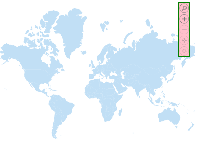
The zoom toolbar can be customized by using the toolbarSettings option in the zoomSettings. The following properties can be used to customize the zoom toolbar.
-
backgroundColor- It is used to customize the background color of the zoom toolbar. -
borderOpacity- It is used to customize the opacity of the border of the zoom toolbar. -
borderWidth- It is used to customize the thickness of the border of the zoom toolbar. -
borderColor- It is used to customize the color of the border of the zoom toolbar. -
horizontalAlignment- It is used to position the zoom toolbar in near, far, and center positions to customize its horizontal placement. -
verticalAlignment- It is used to position the zoom toolbar in near, far, and center positions to customize its vertical placement. -
orientation- It is used to change the orientation (horizontal/vertical) of the zoom toolbar.
@using Syncfusion.EJ2;

<div id="control-section">
    <ejs-maps id="maps" load="load">
        <e-maps-zoomsettings enable="true"></e-maps-zoomsettings>
        <e-maps-layers>
            <e-maps-layer shapeData="ViewBag.world_map">
                <e-layersettings-shapesettings fill="#C1DFF5"></e-layersettings-shapesettings>
            </e-maps-layer>
        </e-maps-layers>
    </ejs-maps>
</div>

<script>
    function load(args) {
        var maps = document.getElementById('maps').ej2_instances[0];
        maps.zoomSettings.toolbarSettings.orientation ="Vertical";
        maps.zoomSettings.toolbarSettings.backgroundColor = "pink";
        maps.zoomSettings.toolbarSettings.borderWidth = 3;
        maps.zoomSettings.toolbarSettings.borderColor = "green";
        maps.zoomSettings.toolbarSettings.verticalAlignment = "Near";
        maps.zoomSettings.toolbarSettings.buttonSettings.toolbarItems = ['Zoom', 'ZoomIn', 'ZoomOut', 'Pan', 'Reset'];
    }
</script>
using System;
using System.Collections.Generic;
using System.Diagnostics;
using System.Linq;
using System.Threading.Tasks;
using Microsoft.AspNetCore.Mvc;
using EJ2_Core_Application.Models;
using Newtonsoft.Json;
namespace EJ2_Core_Application.Controllers
{
public class HomeController : Controller
{
public IActionResult Index()
{
ViewBag.world_map = GetWorldMap();
ViewBag.worldMap = GetMap();
return View();
}
public object GetWorldMap()
{
string allText = System.IO.File.ReadAllText("./wwwroot/scripts/MapsData/WorldMap.js");
return JsonConvert.DeserializeObject(allText);
}
public object GetMap()
{
string allText = System.IO.File.ReadAllText(Server.MapPath("~/App_Data/WorldMap.json"));
return JsonConvert.DeserializeObject(allText, typeof(object));
}
}
}
Customizing the buttons in the zoom toolbar
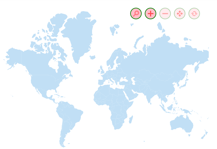
The appearance of the buttons in the zoom toolbar can be customized by using the buttonSettings option in the toolbarSettings of the zoomSettings property. The following properties can be used to customize the zoom toolbar buttons.
-
fill- It is used to set the background color of the buttons. -
color- It is used to customize the color of the icons inside the button. -
borderOpacity- It is used to set the opacity of the border of the zoom toolbar buttons. -
borderWidth- It is used to set the thickness of the border of the zoom toolbar buttons. -
borderColor- It is used to set the color of the border of the zoom toolbar buttons. -
radius- It is used to set the size of the button. -
selectionColor- It is used to set the color of the icons inside the button when selection is performed. -
highlightColor- It is used to change the color of the button when the mouse is hovered over it. -
padding- It is used to change the padding space between each button. -
opacity- It is used to change the opacity of the button. -
toolbarItems- It is used to change the items that should be displayed in the zoom toolbar. By default, zoom-in, zoom-out, and reset buttons will be available. Other options include selection zoom and panning.
@using Syncfusion.EJ2;

<div id="control-section">
    <ejs-maps id="maps" load="load">
        <e-maps-zoomsettings enable="true"></e-maps-zoomsettings>
        <e-maps-layers>
            <e-maps-layer shapeData="ViewBag.world_map">
                <e-layersettings-shapesettings fill="#C1DFF5"></e-layersettings-shapesettings>
            </e-maps-layer>
        </e-maps-layers>
    </ejs-maps>
</div>

<script>
    function load(args) {
        var maps = document.getElementById('maps').ej2_instances[0];
        maps.zoomSettings.toolbarSettings.buttonSettings.fill = "pink";
        maps.zoomSettings.toolbarSettings.buttonSettings.padding = 10;
        maps.zoomSettings.toolbarSettings.buttonSettings.color = "red";
        maps.zoomSettings.toolbarSettings.buttonSettings.borderColor = "green";
        maps.zoomSettings.toolbarSettings.buttonSettings.radius = 35;
        maps.zoomSettings.toolbarSettings.buttonSettings.selectionColor = "#d55e5e";
        maps.zoomSettings.toolbarSettings.buttonSettings.selectionColor = "#5ed59a";
        maps.zoomSettings.toolbarSettings.buttonSettings.opacity = 0.6;
        maps.zoomSettings.toolbarSettings.buttonSettings.borderWidth = 2;
        maps.zoomSettings.toolbarSettings.buttonSettings.toolbarItems = ['Zoom', 'ZoomIn', 'ZoomOut', 'Pan', 'Reset'];
    }
</script>
using System;
using System.Collections.Generic;
using System.Diagnostics;
using System.Linq;
using System.Threading.Tasks;
using Microsoft.AspNetCore.Mvc;
using EJ2_Core_Application.Models;
using Newtonsoft.Json;
namespace EJ2_Core_Application.Controllers
{
public class HomeController : Controller
{
public IActionResult Index()
{
ViewBag.world_map = GetWorldMap();
ViewBag.worldMap = GetMap();
return View();
}
public object GetWorldMap()
{
string allText = System.IO.File.ReadAllText("./wwwroot/scripts/MapsData/WorldMap.js");
return JsonConvert.DeserializeObject(allText);
}
public object GetMap()
{
string allText = System.IO.File.ReadAllText(Server.MapPath("~/App_Data/WorldMap.json"));
return JsonConvert.DeserializeObject(allText, typeof(object));
}
}
}
Customizing the tooltip of the zoom toolbar
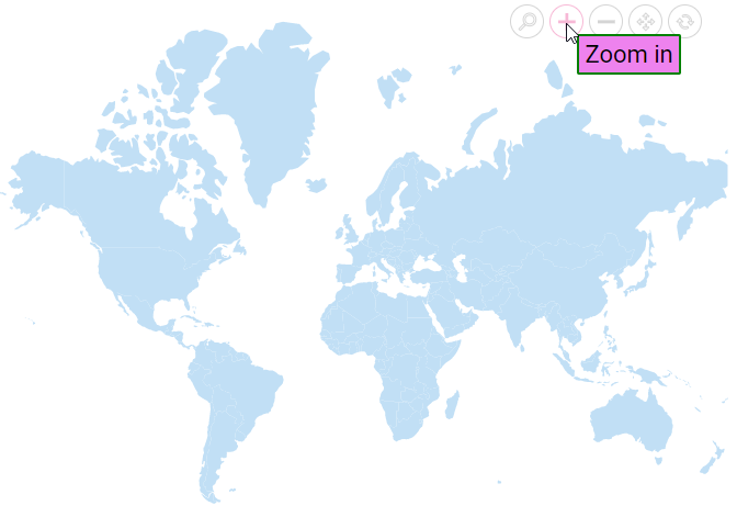
The appearance of the tooltip of the zoom toolbar can be customized by using the tooltipSettings option in the toolbarSettings of the zoomSettings property. The following properties are available to customize the zoom toolbar tooltip.
-
visible- Enables or disables the tooltip of the zoom toolbar. -
fill- It is used to change the background color of the tooltip of the zoom toolbar. -
borderOpacity- It is used to change the opacity of the border of the zoom toolbar’s tooltip. -
borderWidth- It is used to change the thickness of the border of the zoom toolbar’s tooltip. -
borderColor- It is used to change the color of the border of the zoom toolbar’s tooltip. -
fontColor- It is used to change the color of the text in the tooltip of the zoom toolbar. -
fontFamily- It is used to change the font family of the text in the tooltip of the zoom toolbar. -
fontStyle- It is used to change the font style of the text in the tooltip of the zoom toolbar. -
fontWeight- It is used to change the font weight of the text in the tooltip of the zoom toolbar. -
fontSize- It is used to change the size of the text in the tooltip of the zoom toolbar. -
fontOpacity- It is used to change the opacity of the text in the tooltip of the zoom toolbar.
@using Syncfusion.EJ2;

<div id="control-section">
    <ejs-maps id="maps" load="load">
        <e-maps-zoomsettings enable="true"></e-maps-zoomsettings>
        <e-maps-layers>
            <e-maps-layer shapeData="ViewBag.world_map">
                <e-layersettings-shapesettings fill="#C1DFF5"></e-layersettings-shapesettings>
            </e-maps-layer>
        </e-maps-layers>
    </ejs-maps>
</div>

<script>
    function load(args) {
        var maps = document.getElementById('maps').ej2_instances[0];
        maps.zoomSettings.toolbarSettings.tooltipSettings.visible = true;
        maps.zoomSettings.toolbarSettings.tooltipSettings.borderWidth = 2;
        maps.zoomSettings.toolbarSettings.tooltipSettings.borderColor = "green";
        maps.zoomSettings.toolbarSettings.tooltipSettings.fontColor = "black";
        maps.zoomSettings.toolbarSettings.tooltipSettings.fill = "violet";
        maps.zoomSettings.toolbarSettings.tooltipSettings.fontFamily = "Times New Roman";
        maps.zoomSettings.toolbarSettings.tooltipSettings.fontWeight = 200;
        maps.zoomSettings.toolbarSettings.tooltipSettings.fontSize = "22px";
        maps.zoomSettings.toolbarSettings.tooltipSettings.fontOpacity = 1;
        maps.zoomSettings.toolbarSettings.buttonSettings.toolbarItems = ['Zoom', 'ZoomIn', 'ZoomOut', 'Pan', 'Reset'];
    }
</script>
using System;
using System.Collections.Generic;
using System.Diagnostics;
using System.Linq;
using System.Threading.Tasks;
using Microsoft.AspNetCore.Mvc;
using EJ2_Core_Application.Models;
using Newtonsoft.Json;
namespace EJ2_Core_Application.Controllers
{
public class HomeController : Controller
{
public IActionResult Index()
{
ViewBag.world_map = GetWorldMap();
ViewBag.worldMap = GetMap();
return View();
}
public object GetWorldMap()
{
string allText = System.IO.File.ReadAllText("./wwwroot/scripts/MapsData/WorldMap.js");
return JsonConvert.DeserializeObject(allText);
}
public object GetMap()
{
string allText = System.IO.File.ReadAllText(Server.MapPath("~/App_Data/WorldMap.json"));
return JsonConvert.DeserializeObject(allText, typeof(object));
}
}
}
Selection
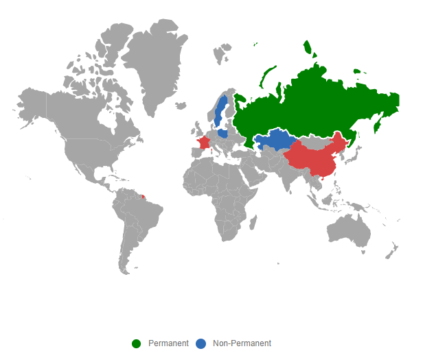
Each shape in the Maps can be selected and deselected during interaction with the shapes. Selection is enabled by setting the Enable property of MapsSelectionSettings to true.
The following properties are available to customize the selection of Maps elements such as shapes, bubbles, markers and legends.
-
Border- To customize the color, width and opacity of the border of which element is selected in Maps. -
Fill- Applies the color for the element that is selected. -
Opacity- To customize the transparency for the element that is selected. -
EnableMultiSelect- To enable or disable the selection for multiple shapes or markers or bubbles in the Maps.
By tapping on the specific legend, the shapes which are bounded to the selected legend is also selected and vice versa.
@using Syncfusion.EJ2.Maps;
@{
    var select = new Syncfusion.EJ2.Maps.MapsSelectionSettings
    {
        Enable = true,
        Fill = "green",
        Border = new Syncfusion.EJ2.Maps.MapsBorder
        {
            Color = "white",
            Width = 2,
            Opacity = 1
        }
    };
    var data = new[]
    {
        new { Country= "China", Membership= "Permanent" },
        new { Country= "France", Membership= "Permanent" },
        new { Country= "Russia", Membership= "Permanent" },
        new { Country= "Kazakhstan", Membership= "Non-Permanent" },
        new { Country= "Poland", Membership= "Non-Permanent" },
        new { Country= "Sweden", Membership= "Non-Permanent" }
    };
    var colormapping = new List<Syncfusion.EJ2.Maps.MapsColorMapping> {
        new  MapsColorMapping{ Color = "#D84444",Value= "Permanent"  },
        new MapsColorMapping { Color= "#316DB5", Value = "Non-Permanent" }
    };
}
@using Syncfusion.EJ2;
<div id="control-section">
    <ejs-maps id="maps">
        <e-maps-legendsettings visible="true"></e-maps-legendsettings>
        <e-maps-layers>
            <e-maps-layer shapeData="ViewBag.world_map" shapeDataPath="Country" shapePropertyPath='new[] { "name" }' dataSource="data" selectionSettings="select">
                <e-layersettings-shapesettings colorValuePath="Membership" colorMapping="colormapping">
                </e-layersettings-shapesettings>
            </e-maps-layer>
        </e-maps-layers>
    </ejs-maps>
</div>
using System;
using System.Collections.Generic;
using System.Diagnostics;
using System.Linq;
using System.Threading.Tasks;
using Microsoft.AspNetCore.Mvc;
using EJ2_Core_Application.Models;
using Newtonsoft.Json;
namespace EJ2_Core_Application.Controllers
{
public class HomeController : Controller
{
public IActionResult Index()
{
ViewBag.world_map = GetWorldMap();
ViewBag.worldMap = GetMap();
return View();
}
public object GetWorldMap()
{
string allText = System.IO.File.ReadAllText("./wwwroot/scripts/MapsData/WorldMap.js");
return JsonConvert.DeserializeObject(allText);
}
public object GetMap()
{
string allText = System.IO.File.ReadAllText(Server.MapPath("~/App_Data/WorldMap.json"));
return JsonConvert.DeserializeObject(allText, typeof(object));
}
}
}
Enable selection for bubbles
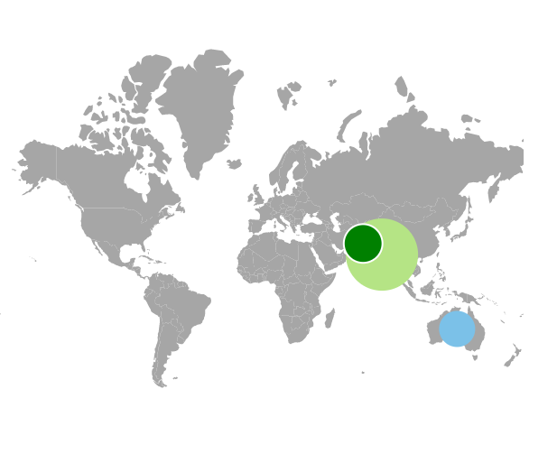
To enable the selection for bubbles in Maps, set the MapsSelectionSettings in MapsBubble and set the Enable property of MapsSelectionSettings as true.
@using Syncfusion.EJ2.Maps;

@{
    var select = new Syncfusion.EJ2.Maps.MapsSelectionSettings
    {
        Enable = true,
        Fill = "green",
        Border = new Syncfusion.EJ2.Maps.MapsBorder
        {
            Color = "white",
            Width = 2,
            Opacity = 1
        }

    };
    var data = new[]
    {
            new { name= "India", population= "38332521" },
            new { name= "Australia", population= "383521" },
            new { name= "Pakistan", population= "3090416" }
    };
}
<ejs-maps id="maps">
    <e-maps-layers>
        <e-maps-layer shapeData="ViewBag.world_map" shapeDataPath="name" shapePropertyPath='new[] { "name" }'>
            <e-layersettings-bubbles>
                <e-layersettings-bubble visible="true" minRadius="20" maxRadius="40" dataSource="data"
                                        valuePath="population" selectionSettings="select"></e-layersettings-bubble>
            </e-layersettings-bubbles>
        </e-maps-layer>
    </e-maps-layers>
</ejs-maps>
using System;
using System.Collections.Generic;
using System.Diagnostics;
using System.Linq;
using System.Threading.Tasks;
using Microsoft.AspNetCore.Mvc;
using EJ2_Core_Application.Models;
using Newtonsoft.Json;
namespace EJ2_Core_Application.Controllers
{
public class HomeController : Controller
{
public IActionResult Index()
{
ViewBag.worldmap = GetWorldMap();
ViewBag.worldMap = GetMap();
List<BubbleData> data = new List<BubbleData>
{
new BubbleData { name= "India", population= "38332521" },
new BubbleData { name= "Australia", population= "383521" },
new BubbleData { name= "Pakistan", population= "3090416" }
};
ViewBag.bubbleData = data;
return View();
}
public object GetWorldMap()
{
string allText = System.IO.File.ReadAllText("./wwwroot/scripts/MapsData/WorldMap.js");
return JsonConvert.DeserializeObject(allText);
}
public object GetMap()
{
string allText = System.IO.File.ReadAllText(Server.MapPath("~/App_Data/WorldMap.json"));
return JsonConvert.DeserializeObject(allText, typeof(object));
}
public class BubbleData
{
public string name { get; set; }
public string population { get; set; }
}
}
}
Enable selection for markers
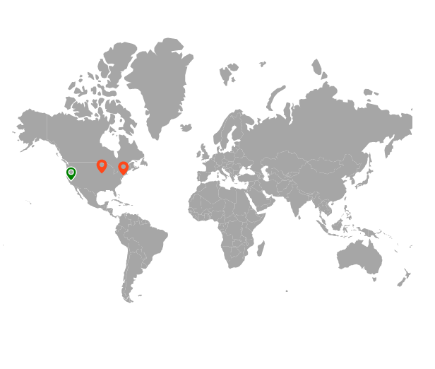
To enable the selection for markers in Maps, set the MapsSelectionSettings in the MapsMarker and set the Enable property of the MapsSelectionSettings as true.
@{
    var select = new Syncfusion.EJ2.Maps.MapsSelectionSettings
    {
        Enable = true,
        Fill = "green",
        Border = new Syncfusion.EJ2.Maps.MapsBorder
        {
            Color = "white",
            Width = 2,
            Opacity = 1
        }
    };
    var data = new[]
    {
        new {latitude= 37.0000, longitude= -120.0000, city= "California" },
        new {latitude= 40.7127, longitude= -74.0059, city= "New York" },
        new {latitude= 42.0000, longitude= -93.0000, city= "Iowa" }
    };
}
@using Syncfusion.EJ2.Maps;
<div id="control-section">
    <ejs-maps id="maps">
        <e-maps-layers>
            <e-maps-layer shapeData="ViewBag.world_map">
                <e-layersettings-markers>
                    <e-layersettings-marker visible="true" shape="Balloon" dataSource="data"
                                            height="20" width="20" selectionSettings="select"></e-layersettings-marker>
                </e-layersettings-markers>
            </e-maps-layer>
        </e-maps-layers>
    </ejs-maps>
</div>
using System;
using System.Collections.Generic;
using System.Diagnostics;
using System.Linq;
using System.Threading.Tasks;
using Microsoft.AspNetCore.Mvc;
using EJ2_Core_Application.Models;
using Newtonsoft.Json;
namespace EJ2_Core_Application.Controllers
{
public class HomeController : Controller
{
public IActionResult Index()
{
ViewBag.world_map = GetWorldMap();
ViewBag.worldMap = GetMap();
return View();
}
public object GetWorldMap()
{
string allText = System.IO.File.ReadAllText("./wwwroot/scripts/MapsData/WorldMap.js");
return JsonConvert.DeserializeObject(allText);
}
public object GetMap()
{
string allText = System.IO.File.ReadAllText(Server.MapPath("~/App_Data/WorldMap.json"));
return JsonConvert.DeserializeObject(allText, typeof(object));
}
}
}
Enable selection for polygons
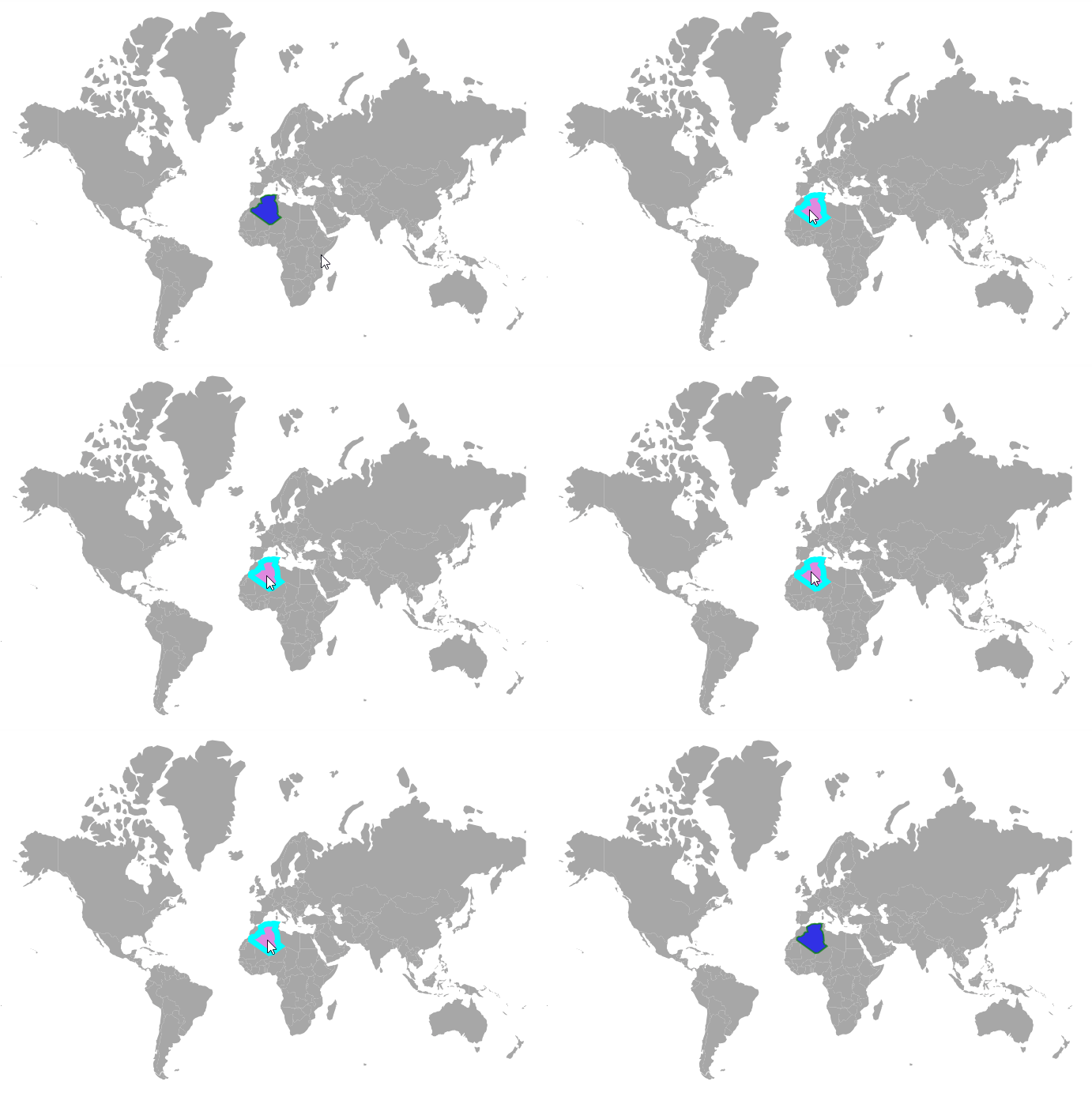
When the enable property of selectionSettings is set to true, the polygon shapes can be selected via user interaction. The following properties are available in selectionSettings to customize the polygon shape when it is selected.
- enableMultiSelect - It is used to enable multiple selection of polygon shapes.
- fill - It is used to change the color of the selected polygon shape.
- opacity - It is used to change the opacity of the selected polygon shape.
- border - This property is used to change the color, width, and opacity of the border of the selected polygon shape.
The following example shows how to select the polygon shape in the geometry map.
@using Syncfusion.EJ2.Maps

@{
    var data = new[]
    {
        new { longitude = -1.8920678947185365, latitude = 35.06195799239681 },
        new { longitude = -1.6479633699113947, latitude = 33.58989612266137 },
        new { longitude = -1.4201220366858252, latitude = 32.819439646045254 },
        new { longitude = -1.197974596225663, latitude = 32.26940895444655 },
        new { longitude = -2.891112397949655, latitude = 32.10303058820031 },
        new { longitude = -3.8246984550501963, latitude = 31.34551662687602 },
        new { longitude = -3.720166273688733, latitude = 30.758086682848685 },
        new { longitude = -5.6571886081189575, latitude = 29.613582597203006 },
        new { longitude = -7.423353242214745, latitude = 29.44328441403087 },
        new { longitude = -8.6048931685323, latitude = 28.761444633616776 },
        new { longitude = -8.695726975465703, latitude = 27.353491085576195 },
        new { longitude = 3.837867279970908, latitude = 19.15916564839422 },
        new { longitude = 6.0705408799045415, latitude = 19.48749097192868 },
        new { longitude = 12.055736352807713, latitude = 23.694596786078293 },
        new { longitude = 11.272522332402986, latitude = 24.289329186946034 },
        new { longitude = 10.30872578261932, latitude = 24.65419958524693 },
        new { longitude = 9.910236690050027, latitude = 25.48943950947175 },
        new { longitude = 9.432639882414293, latitude = 26.398372489836902 },
        new { longitude = 9.898266456582292, latitude = 26.73489453809293 },
        new { longitude = 9.560243026853641, latitude = 30.31040379467153 },
        new { longitude = 8.943853847283322, latitude = 32.350324876652195 },
        new { longitude = 7.57004059025715, latitude = 33.75071049019398 },
        new { longitude = 8.0906322609153, latitude = 34.69043151009983 },
        new { longitude = 8.363285449347273, latitude = 35.38654406371319 },
        new { longitude = 8.26139549449448, latitude = 36.44751078733985 },
        new { longitude = 8.61100824823302, latitude = 36.881913362940196 },
        new { longitude = 7.4216488925819135, latitude = 37.021408008916254 },
        new { longitude = 6.461182254165351, latitude = 36.99092409199429 },
        new { longitude = 5.297178918070159, latitude = 36.69985479014656 },
        new { longitude = 3.6718056161224695, latitude = 36.86470546831693 },
        new { longitude = 1.2050052555659931, latitude = 36.57658056301722 },
        new { longitude = -0.26968570003779746, latitude = 35.806903541813625 },
        new { longitude = -0.995191786435754, latitude = 35.58466127904214 },
        new { longitude = -1.8920678947185365, latitude = 35.06195799239681 }
    };


    var polygons = new List<Syncfusion.EJ2.Maps.MapsPolygon>
    {
        new MapsPolygon{ Points=data, Fill="blue", Opacity=0.7, BorderColor="green", BorderOpacity=0.7, BorderWidth=2 }
    };

    var highlight = new Syncfusion.EJ2.Maps.MapsHighlightSettings
    {
         Enable = true, Fill = "blue", Opacity = 0.7,
         Border = new MapsBorder
         {
             Color ="green",
             Opacity = 0.7,
             Width=2
         }
    };

    var selection = new Syncfusion.EJ2.Maps.MapsSelectionSettings
    {
        Enable = true,
        Fill = "violet",
        EnableMultiSelect = false,
        Opacity = 0.8,
        Border = new MapsBorder
        {
            Color = "cyan",
            Opacity = 1,
            Width = 7
        }
    };

}

<ejs-maps id="maps">
    <e-maps-layers>
        <e-maps-layer shapeData="ViewBag.worldmap"  >
            <e-layersettings-polygonsettings polygons="polygons" highlightsettings="highlight" selectionsettings="selection">
            </e-layersettings-polygonsettings>
        </e-maps-layer>
    </e-maps-layers>
</ejs-maps>
using Newtonsoft.Json;
using Syncfusion.EJ2.Charts;
namespace EJ2_Core_Application.Controllers
{
public class HomeController : Controller
{
public IActionResult Index()
{
ViewBag.worldmap = GetWorldMap();
ViewBag.world_map = GetMap();
return View();
}
// To access the data in Core
public object GetWorldMap()
{
string allText = System.IO.File.ReadAllText("./wwwroot/scripts/MapsData/WorldMap.js");
return JsonConvert.DeserializeObject(allText);
}
// To access the data in MVC
public object GetMap()
{
string allText = System.IO.File.ReadAllText(Server.MapPath("~/App_Data/WorldMap.json"));
return JsonConvert.DeserializeObject(allText, typeof(object));
}
}
}
Public method for the shape selection
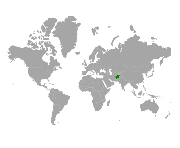
The shapeSelection method can be used to select each shape in the Maps. LayerIndex, propertyName, country name, and selected value as a boolean state(true / false) are the input parameters for this method.
@{
    var select = new Syncfusion.EJ2.Maps.MapsSelectionSettings
    {
        Enable = true,
        Fill = "green",
        Border = new Syncfusion.EJ2.Maps.MapsBorder
        {
            Color = "white",
            Width = 2,
            Opacity = 1
        }

    };
}
@using Syncfusion.EJ2;
<div id="map">
    <button id="selection">Selection</button>
    <button id="unselection">UnSelection</button>
    <ejs-maps id="maps" load="onMapLoad">
        <e-maps-layers>
            <e-maps-layer shapeData=" ViewBag.world_map" selectionSettings="select">
            </e-maps-layer>
        </e-maps-layers>
    </ejs-maps>
</div>

<script>
    function onMapLoad(args) {
        window.maps = args.maps;
    }
    window.onload = function () {
        document.getElementById('selection').onclick = () => {
            window.maps.shapeSelection(0, "continent", "Asia", true);
        };
        document.getElementById('unselection').onclick = () => {
            window.maps.shapeSelection(0, "continent", "Asia", false);
        };
    };
</script>
using System;
using System.Collections.Generic;
using System.Diagnostics;
using System.Linq;
using System.Threading.Tasks;
using Microsoft.AspNetCore.Mvc;
using EJ2_Core_Application.Models;
using Newtonsoft.Json;
namespace EJ2_Core_Application.Controllers
{
public class HomeController : Controller
{
public IActionResult Index()
{
ViewBag.world_map = GetWorldMap();
ViewBag.worldMap = GetMap();
return View();
}
public object GetWorldMap()
{
string allText = System.IO.File.ReadAllText("./wwwroot/scripts/MapsData/WorldMap.js");
return JsonConvert.DeserializeObject(allText);
}
public object GetMap()
{
string allText = System.IO.File.ReadAllText(Server.MapPath("~/App_Data/WorldMap.json"));
return JsonConvert.DeserializeObject(allText, typeof(object));
}
}
}
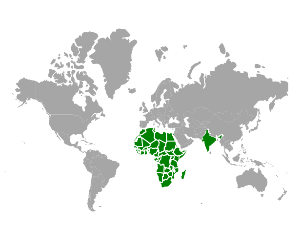
Initial shape selection
The shape is initially selected using the MapsInitialShapeSelection, and the values are mapped to the ShapePath and ShapeValue.
@using Syncfusion.EJ2.Maps;
<ejs-maps id="maps">
    <e-maps-layers>
        <e-maps-layer shapeData="ViewBag.world_map">
            <e-layersettings-initialshapeselections>
                <e-layersettings-initialshapeselection shapePath="continent", shapeValue="Africa"></e-layersettings-initialshapeselection>
                <e-layersettings-initialshapeselection shapePath="name", shapeValue="India"></e-layersettings-initialshapeselection>
            </e-layersettings-initialshapeselections>
            <e-layersettings-selectionsettings enable="true" fill="green">
                <e-layers-selection-border color="White" width="2" opacity="1"> </e-layers-selection-border>
            </e-layersettings-selectionsettings>
        </e-maps-layer>
    </e-maps-layers>
</ejs-maps>
using System;
using System.Collections.Generic;
using System.Linq;
using System.Web;
using System.Web.Mvc;
using Syncfusion.EJ2.Maps;
using System.Web.Script.Serialization;
using Newtonsoft.Json;
using Newtonsoft.Json.Linq;
using EJ2MVCSampleBrowser.Models;
namespace EJ2MVCSampleBrowser.Controllers.Maps
{
public partial class MapsController : Controller
{
public IActionResult Index()
{
ViewBag.world_map = GetWorldMap();
ViewBag.worldMap = GetMap();
return View();
}
public object GetWorldMap()
{
string allText = System.IO.File.ReadAllText("./wwwroot/scripts/MapsData/WorldMap.js");
return JsonConvert.DeserializeObject(allText);
}
public object GetMap()
{
string allText = System.IO.File.ReadAllText(Server.MapPath("~/App_Data/WorldMap.json"));
return JsonConvert.DeserializeObject(allText, typeof(object));
}
}
}
Initial marker selection
Using the InitialMarkerSelection, the marker shape can be selected initially. Markers render based on the Latitude and Longitude values.
@{
    var select = new Syncfusion.EJ2.Maps.MapsSelectionSettings
    {
        Enable = true,
        Fill = "green",
        Border = new Syncfusion.EJ2.Maps.MapsBorder
        {
            Color = "white",
            Width = 2,
            Opacity = 1
        }
    };
    var point = new double[] { 42.0000, -93.0000 };
    var data = new[]
    {
        new {latitude= 37.0000, longitude= -120.0000, city= "California" },
        new {latitude= 40.7127, longitude= -74.0059, city= "New York" },
        new {latitude= 42.0000, longitude= -93.0000, city= "Iowa" }
    };
}
@using Syncfusion.EJ2.Maps;
<div id="control-section">
    <ejs-maps id="maps">
        <e-maps-layers>
            <e-maps-layer shapeData="ViewBag.world_map">
                <e-layersettings-markers>
                    <e-layersettings-marker visible="true" shape="Balloon" dataSource="data"
                                            selectionSettings="select" initialMarkerSelection="point"
                                            height="20" width="20" fill="green">
                    </e-layersettings-marker>
                </e-layersettings-markers>
            </e-maps-layer>
        </e-maps-layers>
    </ejs-maps>
</div>
using System;
using System.Collections.Generic;
using System.Diagnostics;
using System.Linq;
using System.Threading.Tasks;
using Microsoft.AspNetCore.Mvc;
using EJ2_Core_Application.Models;
using Newtonsoft.Json;
namespace EJ2_Core_Application.Controllers
{
public class HomeController : Controller
{
public IActionResult Index()
{
ViewBag.world_map = GetWorldMap();
ViewBag.worldMap = GetMap();
return View();
}
public object GetWorldMap()
{
string allText = System.IO.File.ReadAllText("./wwwroot/scripts/MapsData/WorldMap.js");
return JsonConvert.DeserializeObject(allText);
}
public object GetMap()
{
string allText = System.IO.File.ReadAllText(Server.MapPath("~/App_Data/WorldMap.json"));
return JsonConvert.DeserializeObject(allText, typeof(object));
}
}
}Highlight
Each shape in the Maps can be highlighted during mouse hover on the Maps elements such as shapes, bubbles, markers and legends. Highlight is enabled by setting the Enable property of MapsHighlightSettings to true.
The following properties are available to customize the highlight of Maps elements such as shapes, bubbles, markers and legends.
-
Border- To customize the color, width and opacity of the border of which element is highlighted in Maps. -
Fill- Applies the color for the element that is highlighted. -
Opacity- To customize the transparency for the element that is highlighted.
Hovering on the specific legend, the shapes which are bounded to the selected legend is also highlighted and vice versa.
@using Syncfusion.EJ2.Maps;
@{
    var highlight = new Syncfusion.EJ2.Maps.MapsHighlightSettings
    {
        Enable = true,
        Fill = "green",
        Border = new Syncfusion.EJ2.Maps.MapsBorder
        {
            Color = "white",
            Width = 2,
            Opacity = 1
        }
    };
    var data = new[]
    {
        new { Country= "China", Membership= "Permanent" },
        new { Country= "France", Membership= "Permanent" },
        new { Country= "Russia", Membership= "Permanent" },
        new { Country= "Kazakhstan", Membership= "Non-Permanent" },
        new { Country= "Poland", Membership= "Non-Permanent" },
        new { Country= "Sweden", Membership= "Non-Permanent" }
    };
    var colormapping = new List<Syncfusion.EJ2.Maps.MapsColorMapping> {
        new  MapsColorMapping{ Color = "#D84444",Value= "Permanent"  },
        new MapsColorMapping { Color= "#316DB5", Value = "Non-Permanent" }
    };
}
@using Syncfusion.EJ2;
<div id="control-section">
    <ejs-maps id="maps">
        <e-maps-legendsettings visible="true"></e-maps-legendsettings>
        <e-maps-layers>
            <e-maps-layer shapeData="ViewBag.world_map" shapeDataPath="Country" shapePropertyPath='new[] { "name" }' dataSource="data" highlightSettings="highlight">
                <e-layersettings-shapesettings colorValuePath="Membership" colorMapping="colormapping">
                </e-layersettings-shapesettings>
            </e-maps-layer>
        </e-maps-layers>
    </ejs-maps>
</div>
using System;
using System.Collections.Generic;
using System.Diagnostics;
using System.Linq;
using System.Threading.Tasks;
using Microsoft.AspNetCore.Mvc;
using EJ2_Core_Application.Models;
using Newtonsoft.Json;
namespace EJ2_Core_Application.Controllers
{
public class HomeController : Controller
{
public IActionResult Index()
{
ViewBag.world_map = GetWorldMap();
ViewBag.worldMap = GetMap();
return View();
}
public object GetWorldMap()
{
string allText = System.IO.File.ReadAllText("./wwwroot/scripts/MapsData/worldmap.js");
return JsonConvert.DeserializeObject(allText);
}
public object GetMap()
{
string allText = System.IO.File.ReadAllText(Server.MapPath("~/App_Data/WorldMap.json"));
return JsonConvert.DeserializeObject(allText, typeof(object));
}
}
}
Enable highlight for bubbles
To enable the highlight for bubbles in Maps, set the MapsHighlightSettings in MapsBubble and set the Enable property of MapsHighlightSettings as true.
@using Syncfusion.EJ2.Maps;

@{
    var highlight = new Syncfusion.EJ2.Maps.MapsHighlightSettings
    {
        Enable = true,
        Fill = "green",
        Border = new Syncfusion.EJ2.Maps.MapsBorder
        {
            Color = "white",
            Width = 2,
            Opacity = 1
        }

    };
    var data = new[]
    {
            new { name= "India", population= "38332521" },
            new { name= "Australia", population= "383521" },
            new { name= "Pakistan", population= "3090416" }
    };
}
<ejs-maps id="maps">
    <e-maps-layers>
        <e-maps-layer shapeData="ViewBag.worldmap" shapeDataPath="name" shapePropertyPath='new[] { "name" }'>
            <e-layersettings-bubbles>
                <e-layersettings-bubble visible="true" minRadius="20" maxRadius="40" dataSource="data"
                                        valuePath="population" highlightSettings="highlight"></e-layersettings-bubble>
            </e-layersettings-bubbles>
        </e-maps-layer>
    </e-maps-layers>
</ejs-maps>
using System;
using System.Collections.Generic;
using System.Diagnostics;
using System.Linq;
using System.Threading.Tasks;
using Microsoft.AspNetCore.Mvc;
using EJ2_Core_Application.Models;
using Newtonsoft.Json;
namespace EJ2_Core_Application.Controllers
{
public class HomeController : Controller
{
public IActionResult Index()
{
ViewBag.worldmap = GetWorldMap();
ViewBag.worldMap = GetMap();
return View();
}
public object GetWorldMap()
{
string allText = System.IO.File.ReadAllText("./wwwroot/scripts/MapsData/worldmap.js");
return JsonConvert.DeserializeObject(allText);
}
public object GetMap()
{
string allText = System.IO.File.ReadAllText(Server.MapPath("~/App_Data/WorldMap.json"));
return JsonConvert.DeserializeObject(allText, typeof(object));
}
}
}
Enable highlight for markers
To enable the highlight for markers in Maps, set the MapsHighlightSettings in MapsMarker and set the Enable property of MapsHighlightSettings as true.
@{
    var highlight = new Syncfusion.EJ2.Maps.MapsHighlightSettings
    {
        Enable = true,
        Fill = "green",
        Border = new Syncfusion.EJ2.Maps.MapsBorder
        {
            Color = "white",
            Width = 2,
            Opacity = 1
        }
    };
    var data = new[]
    {
        new {latitude= 37.0000, longitude= -120.0000, city= "California" },
        new {latitude= 40.7127, longitude= -74.0059, city= "New York" },
        new {latitude= 42.0000, longitude= -93.0000, city= "Iowa" }
    };
}
@using Syncfusion.EJ2.Maps;
<div id="control-section">
    <ejs-maps id="maps">
        <e-maps-layers>
            <e-maps-layer shapeData="ViewBag.worldmap">
                <e-layersettings-markers>
                    <e-layersettings-marker visible="true" shape="Balloon" dataSource="data"
                                            height="20" width="20" highlightSettings="highlight"></e-layersettings-marker>
                </e-layersettings-markers>
            </e-maps-layer>
        </e-maps-layers>
    </ejs-maps>
</div>
using System;
using System.Collections.Generic;
using System.Diagnostics;
using System.Linq;
using System.Threading.Tasks;
using Microsoft.AspNetCore.Mvc;
using EJ2_Core_Application.Models;
using Newtonsoft.Json;
namespace EJ2_Core_Application.Controllers
{
public class HomeController : Controller
{
public IActionResult Index()
{
ViewBag.world_map = GetWorldMap();
ViewBag.worldMap = GetMap();
return View();
}
public object GetWorldMap()
{
string allText = System.IO.File.ReadAllText("./wwwroot/scripts/MapsData/worldmap.js");
return JsonConvert.DeserializeObject(allText);
}
public object GetMap()
{
string allText = System.IO.File.ReadAllText(Server.MapPath("~/App_Data/WorldMap.json"));
return JsonConvert.DeserializeObject(allText, typeof(object));
}
}
}
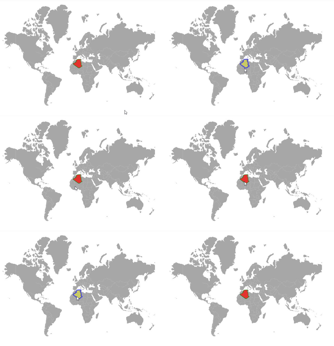
Enable highlight for polygons
The polygon shapes can be highlighted via user interaction if the enable property of highlightSettings is set to true. The following properties are available in highlightSettings to customize the polygon shape when it is highlighted.
- fill - It is used to change the color of the highlighted polygon shape.
- opacity - It is used to change the opacity of the highlighted polygon shape.
- border - This property is used to change the color, width, and opacity of the border of the highlighted polygon shape.
The following example shows how to highlight a polygon shape on a geometry map.
@using Syncfusion.EJ2.Maps

@{
    var data = new[]
    {
        new { longitude = -1.8920678947185365, latitude = 35.06195799239681 },
        new { longitude = -1.6479633699113947, latitude = 33.58989612266137 },
        new { longitude = -1.4201220366858252, latitude = 32.819439646045254 },
        new { longitude = -1.197974596225663, latitude = 32.26940895444655 },
        new { longitude = -2.891112397949655, latitude = 32.10303058820031 },
        new { longitude = -3.8246984550501963, latitude = 31.34551662687602 },
        new { longitude = -3.720166273688733, latitude = 30.758086682848685 },
        new { longitude = -5.6571886081189575, latitude = 29.613582597203006 },
        new { longitude = -7.423353242214745, latitude = 29.44328441403087 },
        new { longitude = -8.6048931685323, latitude = 28.761444633616776 },
        new { longitude = -8.695726975465703, latitude = 27.353491085576195 },
        new { longitude = 3.837867279970908, latitude = 19.15916564839422 },
        new { longitude = 6.0705408799045415, latitude = 19.48749097192868 },
        new { longitude = 12.055736352807713, latitude = 23.694596786078293 },
        new { longitude = 11.272522332402986, latitude = 24.289329186946034 },
        new { longitude = 10.30872578261932, latitude = 24.65419958524693 },
        new { longitude = 9.910236690050027, latitude = 25.48943950947175 },
        new { longitude = 9.432639882414293, latitude = 26.398372489836902 },
        new { longitude = 9.898266456582292, latitude = 26.73489453809293 },
        new { longitude = 9.560243026853641, latitude = 30.31040379467153 },
        new { longitude = 8.943853847283322, latitude = 32.350324876652195 },
        new { longitude = 7.57004059025715, latitude = 33.75071049019398 },
        new { longitude = 8.0906322609153, latitude = 34.69043151009983 },
        new { longitude = 8.363285449347273, latitude = 35.38654406371319 },
        new { longitude = 8.26139549449448, latitude = 36.44751078733985 },
        new { longitude = 8.61100824823302, latitude = 36.881913362940196 },
        new { longitude = 7.4216488925819135, latitude = 37.021408008916254 },
        new { longitude = 6.461182254165351, latitude = 36.99092409199429 },
        new { longitude = 5.297178918070159, latitude = 36.69985479014656 },
        new { longitude = 3.6718056161224695, latitude = 36.86470546831693 },
        new { longitude = 1.2050052555659931, latitude = 36.57658056301722 },
        new { longitude = -0.26968570003779746, latitude = 35.806903541813625 },
        new { longitude = -0.995191786435754, latitude = 35.58466127904214 },
        new { longitude = -1.8920678947185365, latitude = 35.06195799239681 }
    };


    var polygons = new List<Syncfusion.EJ2.Maps.MapsPolygon>
    {
        new MapsPolygon{ Points=data, Fill="blue", Opacity=0.7, BorderColor="green", BorderOpacity=0.7, BorderWidth=2 }
    };

    var highlight = new Syncfusion.EJ2.Maps.MapsHighlightSettings
    {
         Enable = true, Fill = "yellow", Opacity = 0.4,
         Border = new MapsBorder
         {
             Color ="blue",
             Opacity = 0.6,
             Width=4
         }
    };

    var selection = new Syncfusion.EJ2.Maps.MapsSelectionSettings
    {
        Enable = true,
        Fill = "red",
        EnableMultiSelect = false,
        Opacity = 0.7,
        Border = new MapsBorder
        {
            Color = "green",
            Opacity = 0.7,
            Width = 2
        }
    };

}

<ejs-maps id="maps">
    <e-maps-layers>
        <e-maps-layer shapeData="ViewBag.worldmap"  >
            <e-layersettings-polygonsettings polygons="polygons" highlightsettings="highlight" selectionsettings="selection">
            </e-layersettings-polygonsettings>
        </e-maps-layer>
    </e-maps-layers>
</ejs-maps>
using Newtonsoft.Json;
using Syncfusion.EJ2.Charts;
namespace EJ2_Core_Application.Controllers
{
public class HomeController : Controller
{
public IActionResult Index()
{
ViewBag.worldmap = GetWorldMap();
ViewBag.world_map = GetMap();
return View();
}
// To access the data in Core
public object GetWorldMap()
{
string allText = System.IO.File.ReadAllText("./wwwroot/scripts/MapsData/WorldMap.js");
return JsonConvert.DeserializeObject(allText);
}
// To access the data in MVC
public object GetMap()
{
string allText = System.IO.File.ReadAllText(Server.MapPath("~/App_Data/WorldMap.json"));
return JsonConvert.DeserializeObject(allText, typeof(object));
}
}
}
Tooltip
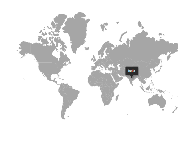
On mouse over or touch end event, the tooltip is used to get more information about the layer, bubble, or marker. It can be enabled separately for layer or bubble or marker by using the Visible property of MapsTooltipSettings as true. The ValuePath property in the tooltip takes the field name that presents in data source and displays that value as tooltip text. The TooltipDisplayMode property is used to change the display mode of the tooltip in Maps. Following display modes of tooltip are available in the Maps component. By default, TooltipDisplayMode is set to MouseMove.
@{
    var tooltip = new Syncfusion.EJ2.Maps.MapsTooltipSettings
    {
        Visible = true,
        ValuePath = "name"
    };
}
@using Syncfusion.EJ2;
<div id="control-section">
    <ejs-maps id="maps">
        <e-maps-layers>
            <e-maps-layer shapeData="ViewBag.world_map" tooltipSettings="tooltip">
            </e-maps-layer>
        </e-maps-layers>
    </ejs-maps>
</div>
using System;
using System.Collections.Generic;
using System.Diagnostics;
using System.Linq;
using System.Threading.Tasks;
using Microsoft.AspNetCore.Mvc;
using EJ2_Core_Application.Models;
using Newtonsoft.Json;
namespace EJ2_Core_Application.Controllers
{
public class HomeController : Controller
{
public IActionResult Index()
{
ViewBag.world_map = GetWorldMap();
ViewBag.worldMap = GetMap();
return View();
}
public object GetWorldMap()
{
string allText = System.IO.File.ReadAllText("./wwwroot/scripts/MapsData/WorldMap.js");
return JsonConvert.DeserializeObject(allText);
}
public object GetMap()
{
string allText = System.IO.File.ReadAllText(Server.MapPath("~/App_Data/WorldMap.json"));
return JsonConvert.DeserializeObject(allText, typeof(object));
}
}
}
Customization
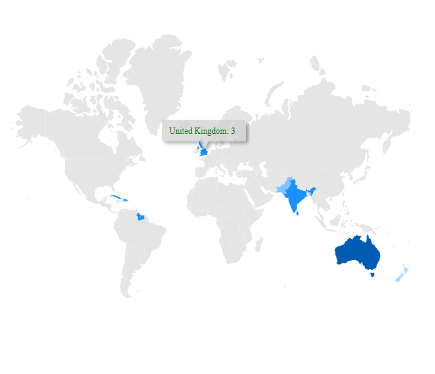
The following properties are available in the MapsTooltipSettings to customize the tooltip of the Maps component.
-
Border- To customize the color, width and opacity of the border of the tooltip in layers, markers, and bubbles of Maps. -
Fill- Applies the color of the tooltip in layers, markers, and bubbles of Maps. -
Format- To customize the format of the tooltip in layers, markers, and bubbles of Maps -
TextStyle- To customize the style of the text in the tooltip for layers, markers, and bubbles of Maps.
@using Syncfusion.EJ2.Maps;

@{
    var tooltip = new Syncfusion.EJ2.Maps.MapsTooltipSettings
    {
        Visible = true,
        ValuePath = "name",
        Format = "${name}: ${value1}",
        Fill = "#D0D0D0",
        TextStyle = new MapsFont
        {
            Color = "green",
            FontFamily = "Times New Roman",
            FontStyle = "Sans-serif"
        }
    };
    var colormapping = new List<Syncfusion.EJ2.Maps.MapsColorMapping> {
        new  MapsColorMapping{ Color = "#b3daff",Value= "1"  },
        new MapsColorMapping { Color= "#80c1ff", Value = "2" },
        new MapsColorMapping { Color= "#1a90ff", Value = "3" },
        new MapsColorMapping { Color= "#005cb3", Value = "7" }
    };
    var data = new[]
    {
        new { name= "India", value1= "3", value2="2", country="India" },
        new { name= "Dominican Rep.", value1= "3", value2="2", country="West Indies" },
        new { name= "Cuba", value1= "3", value2="2", country="West Indies" },
        new { name= "Jamaica", value1= "3", value2="2", country="West Indies" },
        new { name= "Haiti", value1= "3", value2="2", country="West Indies" },
        new { name= "Guyana", value1= "3", value2="2", country="West Indies" },
        new { name= "Suriname", value1= "3", value2="2", country="West Indies" },
        new { name= "Trinidad and Tobago", value1= "3", value2="2", country="West Indies" },
        new { name= "Sri Lanka", value1= "3", value2="1", country="Sri Lanka" },
        new { name= "United Kingdom", value1= "3", value2="0", country="England" },
        new { name= "Pakistan", value1= "2", value2="1", country="Pakistan" },
        new { name= "New Zealand", value1= "1", value2="0", country="New Zealand" },
        new { name= "Australia", value1= "7", value2="5", country="Australia" },
    };
}
<div id="control-section">
    <ejs-maps id="maps" tooltipRender="tooltipRender">
        <e-maps-layers>
            <e-maps-layer shapeData="ViewBag.world_map" dataSource="data" shapeDataPath="name" shapePropertyPath='new[] { "name" }' tooltipSettings="tooltip">
                <e-layersettings-shapesettings fill="#E5E5E5" colorValuePath="value1" colorMapping="colormapping"></e-layersettings-shapesettings>
            </e-maps-layer>
        </e-maps-layers>
    </ejs-maps>
</div>

<script>
    function tooltipRender(args) {
        if (!args.options['data']) {
            args.cancel = true;
        }
    }
</script>
using System;
using System.Collections.Generic;
using System.Diagnostics;
using System.Linq;
using System.Threading.Tasks;
using Microsoft.AspNetCore.Mvc;
using EJ2_Core_Application.Models;
using Newtonsoft.Json;
namespace EJ2_Core_Application.Controllers
{
public class HomeController : Controller
{
public IActionResult Index()
{
ViewBag.worldmap = GetWorldMap();
ViewBag.worldMap = GetMap();
return View();
}
public object GetWorldMap()
{
string allText = System.IO.File.ReadAllText("./wwwroot/scripts/MapsData/WorldMap.js");
return JsonConvert.DeserializeObject(allText);
}
public object GetMap()
{
string allText = System.IO.File.ReadAllText(Server.MapPath("~/App_Data/WorldMap.json"));
return JsonConvert.DeserializeObject(allText, typeof(object));
}
}
}
Tooltip template
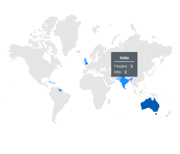
The HTML element can be rendered in the tooltip of the Maps using the Template property of the MapsTooltipSettings. In the following example, ${value1} and ${value2} are the place holders in the HTML element to display the value1 and value2 values of the corresponding shape.
@using Syncfusion.EJ2.Maps;

@{
    var tooltip = new Syncfusion.EJ2.Maps.MapsTooltipSettings
    {
        Visible = true,
        ValuePath = "name",
        Template = "#template"
    };
    var colormapping = new List<Syncfusion.EJ2.Maps.MapsColorMapping> {
        new  MapsColorMapping{ Color = "#b3daff",Value= "1"  },
        new MapsColorMapping { Color= "#80c1ff", Value = "2" },
        new MapsColorMapping { Color= "#1a90ff", Value = "3" },
        new MapsColorMapping { Color= "#005cb3", Value = "7" }
    };
    var data = new[]
    {
        new { name= "India", value1= "3", value2="2", country="India" },
        new { name= "Dominican Rep.", value1= "3", value2="2", country="West Indies" },
        new { name= "Cuba", value1= "3", value2="2", country="West Indies" },
        new { name= "Jamaica", value1= "3", value2="2", country="West Indies" },
        new { name= "Haiti", value1= "3", value2="2", country="West Indies" },
        new { name= "Guyana", value1= "3", value2="2", country="West Indies" },
        new { name= "Suriname", value1= "3", value2="2", country="West Indies" },
        new { name= "Trinidad and Tobago", value1= "3", value2="2", country="West Indies" },
        new { name= "Sri Lanka", value1= "3", value2="1", country="Sri Lanka" },
        new { name= "United Kingdom", value1= "3", value2="0", country="England" },
        new { name= "Pakistan", value1= "2", value2="1", country="Pakistan" },
        new { name= "New Zealand", value1= "1", value2="0", country="New Zealand" },
        new { name= "Australia", value1= "7", value2="5", country="Australia" },
    };
}
<div id="control-section">
    <ejs-maps id="maps" tooltipRender="tooltipRender">
        <e-maps-layers>
            <e-maps-layer shapeData="ViewBag.world_map" dataSource="data" shapeDataPath="name" shapePropertyPath='new[] { "name" }' tooltipSettings="tooltip">
                <e-layersettings-shapesettings fill="#E5E5E5" colorValuePath="value1" colorMapping="colormapping"></e-layersettings-shapesettings>
            </e-maps-layer>
        </e-maps-layers>
    </ejs-maps>
    <div id="template" style="display:none">
        <div class="toolback">
            <div class="listing2">
                <center>
                    ${country}
                </center>
            </div>
            <hr style="margin-top: 2px;margin-bottom:5px;border:0.5px solid #DDDDDD">
            <div>
                <span class="listing1">Finalist : </span><span class="listing2">${value1}</span>
            </div>
            <div>
                <span class="listing1">Win : </span><span class="listing2">${value2}</span>
            </div>
        </div>
    </div>
</div>

<script>
    function tooltipRender(args) {
        if (!args.options['data']) {
            args.cancel = true;
        }
    }
</script>
<style>
    .toolback {
        border - radius: 4px;
        border: 1px #abb9c6;
        opacity: 90%;
        background: rgba(53, 63, 76, 0.90);
        box-shadow: 0px 2px 2px rgba(0, 0, 0, 0.40);
        padding-bottom: 5px;
        padding-top: 10px;
        padding-left: 10px;
        padding-right: 10px;
        width: 90px;
    }
    .listing1 {
        font - size:13px;
        color: #cccccc
    }
    .listing2 {
        font - size:13px;
        color: #ffffff;
        font-weight: 500;
    }
</style>
using System;
using System.Collections.Generic;
using System.Diagnostics;
using System.Linq;
using System.Threading.Tasks;
using Microsoft.AspNetCore.Mvc;
using EJ2_Core_Application.Models;
using Newtonsoft.Json;
namespace EJ2_Core_Application.Controllers
{
public class HomeController : Controller
{
public IActionResult Index()
{
ViewBag.world_map = GetWorldMap();
ViewBag.worldMap = GetMap();
return View();
}
public object GetWorldMap()
{
string allText = System.IO.File.ReadAllText("./wwwroot/scripts/MapsData/WorldMap.js");
return JsonConvert.DeserializeObject(allText);
}
public object GetMap()
{
string allText = System.IO.File.ReadAllText(Server.MapPath("~/App_Data/WorldMap.json"));
return JsonConvert.DeserializeObject(allText, typeof(object));
}
}
}
Changing duration in mobile devices
To change the duration of the tooltips and tooltip templates in mobile devices, you can use the Duration property in MapsTooltipSettings. By default, this property is set to 2000 milliseconds. Setting the value to 0 will keep the tooltip visible indefinitely. If it is greater than 0, the tooltip will be removed after the specified time.
@using Syncfusion.EJ2.Maps;

@{
    var tooltip = new Syncfusion.EJ2.Maps.MapsTooltipSettings
    {
        Visible = true,
        ValuePath = "name",
        Fill = "#D0D0D0",
        TextStyle = new MapsFont
        {
            Color = "green",
            FontFamily = "Times New Roman",
            FontStyle = "Sans-serif"
        },
        Duration = 3000
    };
}
<div id="control-section">
    <ejs-maps id="maps">
        <e-maps-layers>
            <e-maps-layer shapeData="ViewBag.worldMap" tooltipSettings="tooltip">
            </e-maps-layer>
        </e-maps-layers>
    </ejs-maps>
</div>
using System;
using System.Collections.Generic;
using System.Diagnostics;
using System.Linq;
using System.Threading.Tasks;
using Microsoft.AspNetCore.Mvc;
using EJ2_Core_Application.Models;
using Newtonsoft.Json;
namespace EJ2_Core_Application.Controllers
{
public class HomeController : Controller
{
public IActionResult Index()
{
ViewBag.worldmap = GetWorldMap();
ViewBag.worldMap = GetMap();
return View();
}
public object GetWorldMap()
{
string allText = System.IO.File.ReadAllText("./wwwroot/scripts/MapsData/WorldMap.js");
return JsonConvert.DeserializeObject(allText);
}
public object GetMap()
{
string allText = System.IO.File.ReadAllText(Server.MapPath("~/App_Data/WorldMap.json"));
return JsonConvert.DeserializeObject(allText, typeof(object));
}
}
}