Markers in ASP.NET Core Maps
Markers are notes that are used to leave a message on the Maps. It indicates or marks a specific location with desired symbols on the Maps. It can be enabled by setting the Visible property of the MapsMarker to true.
Adding marker
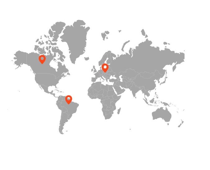
To add the markers, the DataSource property of the MapsMarker has a list of objects that contains the data for markers. Using this property, any number of markers can be added to the layers of the Maps. By default, it displays the markers based on the specified latitude and longitude in the given data source. Each data source object contains the following list of properties.
- latitude - The latitude point which determines the X location of the marker.
- longitude - The longitude point which determines the Y location of the marker.
@using Syncfusion.EJ2.Maps;
@{
    var propertyPath = new[] { "name" };
    var data = new[]
    {
        new {latitude = 49.95121990866204, longitude =  18.468749999999998},
        new {latitude =  59.88893689676585, longitude =  -109.3359375},
        new {latitude =  -6.64607562172573, longitude =  -55.54687499999999}
    };
}

<ejs-maps id="maps">
    <e-maps-layers>
        <e-maps-layer shapeData="ViewBag.worldmap">
         <e-layersettings-markers>
             <e-layersettings-marker visible="true" animationDuration="0" dataSource="data" height="20" width="20"></e-layersettings-marker>
         </e-layersettings-markers>
        </e-maps-layer>
    </e-maps-layers>
</ejs-maps>
using System;
using System.Collections.Generic;
using System.Diagnostics;
using System.Linq;
using System.Threading.Tasks;
using Microsoft.AspNetCore.Mvc;
using EJ2_Core_Application.Models;
using Newtonsoft.Json;
namespace EJ2_Core_Application.Controllers
{
public class HomeController : Controller
{
public IActionResult Index()
{
ViewBag.worldmap = GetWorldMap();
ViewBag.world_map = GetMap();
return View();
}
public object GetWorldMap()
{
string allText = System.IO.File.ReadAllText("./wwwroot/scripts/MapsData/WorldMap.js");
return JsonConvert.DeserializeObject(allText);
}
public object GetMap()
{
string allText = System.IO.File.ReadAllText(Server.MapPath("~/App_Data/WorldMap.json"));
return JsonConvert.DeserializeObject(allText, typeof(object));
}
}
}
Adding marker template
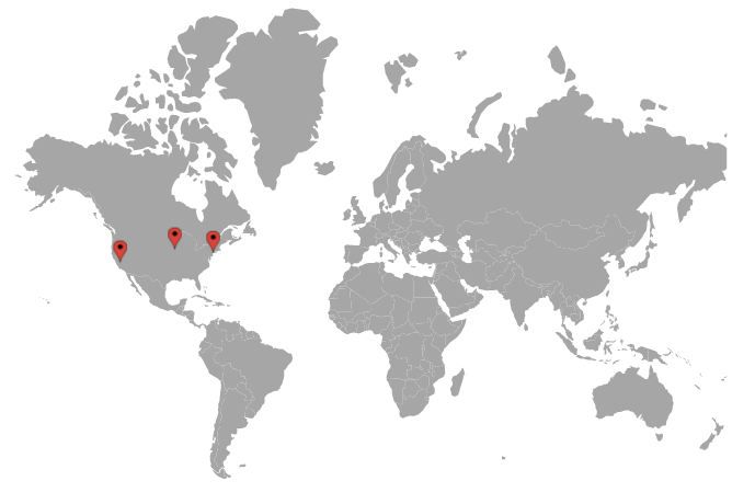
The Marker can be added as a template in the Maps component. The Template property of the MapsMarker is used to set the HTML element or id of an element as a template.
@{
    var data = new[]
    {
            new {latitude= 37.0000, longitude= -120.0000, city= "California" },
            new {latitude= 40.7127, longitude= -74.0059, city= "New York" },
            new {latitude= 42.0000, longitude= -93.0000, city= "Iowa" }
       };
    var marker = new List<MapsMarker>
    {
        new MapsMarker{Visible=true, Template="#template", DataSource=data}
    };

    }

@using Syncfusion.EJ2.Maps;
@using Syncfusion.EJ2;
<div id="control-section">
    <ejs-maps id="maps">
        <e-maps-layers>
            <e-maps-layer shapeData="ViewBag.worldmap" markerSettings="marker"></e-maps-layer>
        </e-maps-layers>
    </ejs-maps>
</div>
<div id="template" style="display: none;">
    <div>
        <div style="margin-left:8px;height:45px;width:120px;margin-top:-23px;">
            <label style="color:black;margin-left:15px;font-weight:normal;">\{\{\:city\}\}</label>
        </div>
    </div>
</div>
using System;
using System.Collections.Generic;
using System.Diagnostics;
using System.Linq;
using System.Threading.Tasks;
using Microsoft.AspNetCore.Mvc;
using EJ2_Core_Application.Models;
using Newtonsoft.Json;
namespace EJ2_Core_Application.Controllers
{
public class HomeController : Controller
{
public IActionResult Index()
{
ViewBag.worldmap = GetWorldMap();
ViewBag.world_map = GetMap();
return View();
}
public object GetWorldMap()
{
string allText = System.IO.File.ReadAllText("./wwwroot/scripts/MapsData/WorldMap.js");
return JsonConvert.DeserializeObject(allText);
}
public object GetMap()
{
string allText = System.IO.File.ReadAllText(Server.MapPath("~/App_Data/WorldMap.json"));
return JsonConvert.DeserializeObject(allText, typeof(object));
}
}
}
Customization
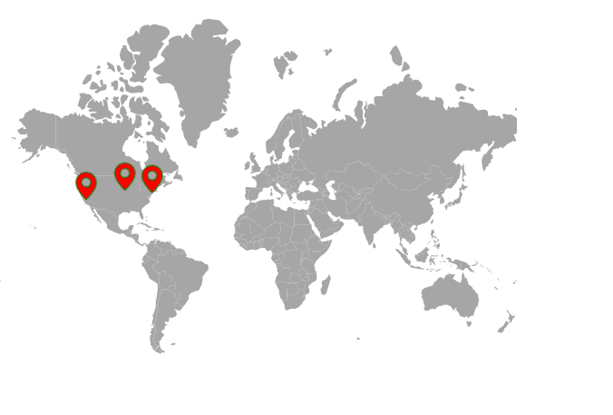
The following properties are available in MapsMarker class to customize the Markers of the Maps component.
-
Border- To customize the color, width and opacity of the border for the markers in Maps. -
Fill- To apply the color for markers in Maps. -
DashArray- To define the pattern of dashes and gaps that is applied to the outline of the markers in Maps. -
Height- To customize the height of the markers in Maps. -
Width- To customize the width of the markers in Maps. -
Offset- To customize the position of the markers in Maps. -
Opacity- To customize the transparency of the markers in Maps. -
AnimationDelay- To change the time delay in the transition for markers. -
AnimationDuration- To change the time duration of animation for markers.
@using Syncfusion.EJ2.Maps;
@{
    var data = new[]
    {
        new {latitude = 37.0000, longitude = -120.0000, city= "California"},
        new {latitude = 40.7127, longitude = -74.0059, city= "New York"},
        new {latitude = 42.000, longitude = -93.000, city= "Iowa"}
    };
    var border = new MapsBorder
    {
        Color = "green",
        Width = 2,
        Opacity = 1
    };
}

<ejs-maps id="maps">
    <e-maps-layers>
        <e-maps-layer shapeData="ViewBag.worldmap">
            <e-layersettings-markers>
                <e-layersettings-marker visible="true" fill="red" dashArray="1" height="20" width="20"
                                        animationDelay="100" animationDuration="1000" dataSource="data"
                                        shape="Balloon" border="border"></e-layersettings-marker>
            </e-layersettings-markers>
        </e-maps-layer>
    </e-maps-layers>
</ejs-maps>
using System;
using System.Collections.Generic;
using System.Diagnostics;
using System.Linq;
using System.Threading.Tasks;
using Microsoft.AspNetCore.Mvc;
using EJ2_Core_Application.Models;
using Newtonsoft.Json;
namespace EJ2_Core_Application.Controllers
{
public class HomeController : Controller
{
public IActionResult Index()
{
ViewBag.worldmap = GetWorldMap();
ViewBag.world_map = GetMap();
return View();
}
public object GetWorldMap()
{
string allText = System.IO.File.ReadAllText("./wwwroot/scripts/MapsData/WorldMap.js");
return JsonConvert.DeserializeObject(allText);
}
public object GetMap()
{
string allText = System.IO.File.ReadAllText(Server.MapPath("~/App_Data/WorldMap.json"));
return JsonConvert.DeserializeObject(allText, typeof(object));
}
}
}
Marker shapes
The Maps component supports the following marker shapes. To set the shape of the marker, the Shape property in MapsMarker is used.
- Balloon
- Circle
- Cross
- Diamond
- Image
- Rectangle
- Start
- Triangle
- VerticalLine
- HorizontalLine
Rendering marker shape as image
To render a marker as an image in Maps, set the Shape property of MapsMarker as Image and specify the path of the image to ImageUrl property. There is another way to render a marker as an image using the ImageUrlValuePath property of the MapsMarker. Bind the field name that contains the path of the image in the data source to the ImageUrlValuePath property.
@using Syncfusion.EJ2.Maps;
@{
    var data = new[]
    {
        new {latitude = 37.0000, longitude = -120.0000, city= "California"},
        new {latitude = 40.7127, longitude = -74.0059, city= "New York"},
        new {latitude = 42.000, longitude = -93.000, city= "Iowa"}
    };
}

<ejs-maps id="maps">
    <e-maps-layers>
        <e-maps-layer shapeData="ViewBag.worldmap">
            <e-layersettings-markers>
                <e-layersettings-marker visible="true" fill="red" dataSource="data"
                                        shape="Image" height="20" width="20"
                                        imageUrl="~/ballon.png"></e-layersettings-marker>
            </e-layersettings-markers>
        </e-maps-layer>
    </e-maps-layers>
</ejs-maps>
using System;
using System.Collections.Generic;
using System.Diagnostics;
using System.Linq;
using System.Threading.Tasks;
using Microsoft.AspNetCore.Mvc;
using EJ2_Core_Application.Models;
using Newtonsoft.Json;
namespace EJ2_Core_Application.Controllers
{
public class HomeController : Controller
{
public IActionResult Index()
{
ViewBag.worldmap = GetWorldMap();
ViewBag.world_map = GetMap();
return View();
}
public object GetWorldMap()
{
string allText = System.IO.File.ReadAllText("./wwwroot/scripts/MapsData/WorldMap.js");
return JsonConvert.DeserializeObject(allText);
}
public object GetMap()
{
string allText = System.IO.File.ReadAllText(Server.MapPath("~/App_Data/WorldMap.json"));
return JsonConvert.DeserializeObject(allText, typeof(object));
}
}
}
Multiple marker groups
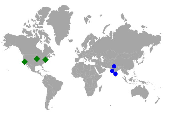
Multiple groups of markers can be added in the Maps by adding multiple MapsMarker in the MapsMarkers and customization for the markers can be done with the MapsMarker.
@using Syncfusion.EJ2.Maps;
@{
    var data = new[]
    {
        new {latitude = 37.0000, longitude = -120.0000, city= "California"},
        new {latitude = 40.7127, longitude = -74.0059, city= "New York"},
        new {latitude = 42.000, longitude = -93.000, city= "Iowa"}
    };

    var data1 = new[]
   {
        new {latitude = 19.228825, longitude =  72.854118, city= "Mumbai"},
        new {latitude = 28.610001, longitude = 77.230003, city= "Delhi"},
        new {latitude = 13.067439, longitude = 80.237617, city= "Chennai"}
    };
}

<ejs-maps id="maps">
    <e-maps-layers>
        <e-maps-layer shapeData="ViewBag.worldmap">
            <e-layersettings-markers>
                <e-layersettings-marker visible="true" fill="green" shape="Diamond" width="15" height="15" dataSource="data"></e-layersettings-marker>
                <e-layersettings-marker visible="true" fill="blue" shape="Circle" width="10" height="10" dataSource="data1"></e-layersettings-marker>
            </e-layersettings-markers>
        </e-maps-layer>
    </e-maps-layers>
</ejs-maps>
using System;
using System.Collections.Generic;
using System.Diagnostics;
using System.Linq;
using System.Threading.Tasks;
using Microsoft.AspNetCore.Mvc;
using EJ2_Core_Application.Models;
using Newtonsoft.Json;
namespace EJ2_Core_Application.Controllers
{
public class HomeController : Controller
{
public IActionResult Index()
{
ViewBag.worldmap = GetWorldMap();
ViewBag.world_map = GetMap();
return View();
}
public object GetWorldMap()
{
string allText = System.IO.File.ReadAllText("./wwwroot/scripts/MapsData/WorldMap.js");
return JsonConvert.DeserializeObject(allText);
}
public object GetMap()
{
string allText = System.IO.File.ReadAllText(Server.MapPath("~/App_Data/WorldMap.json"));
return JsonConvert.DeserializeObject(allText, typeof(object));
}
}
}
Customize marker shapes from data source
Bind different colors and shapes to the marker from data source
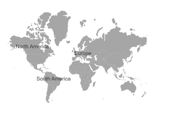
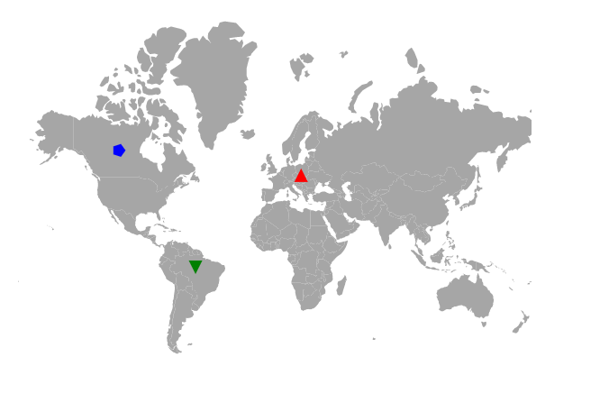
Using the ShapeValuePath and ColorValuePath properties, the color and shape of the marker can be applied from the given data source. Bind the data source to the DataSource property of the MapsMarker class and set the field names that contains the shape and color values in the data source to the ShapeValuePath and ColorValuePath properties.
@using Syncfusion.EJ2.Maps;
@{
    var data = new[]
    {
        new {latitude =  49.95121990866204, longitude = 18.468749999999998, name="Europe", color="red",
        shape="Triangle"},
        new {latitude =  59.88893689676585, longitude = -109.3359375, name="North America", color="blue",
        shape="Pentagon"},
        new {latitude =  -6.64607562172573, longitude = -55.54687499999999, name="South America", color="green",
        shape="InvertedTriangle"}
    };
}
<ejs-maps id="maps">
    <e-maps-layers>
        <e-maps-layer shapeData="ViewBag.worldmap">
            <e-layersettings-markers>
                <e-layersettings-marker visible="true" shapeValuePath="shape" colorValuePath="color" dataSource="data">
                </e-layersettings-marker>
            </e-layersettings-markers>
        </e-maps-layer>
    </e-maps-layers>
</ejs-maps>
using System;
using System.Collections.Generic;
using System.Linq;
using System.Web;
using System.Web.Mvc;
using Syncfusion.EJ2.Maps;
using System.Web.Script.Serialization;
using Newtonsoft.Json;
using Newtonsoft.Json.Linq;
using EJ2MVCSampleBrowser.Models;
namespace EJ2MVCSampleBrowser.Controllers.Maps
{
public partial class MapsController : Controller
{
// GET: MarkerClustering
public ActionResult MarkerClustering()
{
ViewBag.worldmap = GetWorldMap();
ViewBag.world_map = GetMap();
return View();
}
public object GetWorldMap()
{
string allText = System.IO.File.ReadAllText("./wwwroot/scripts/MapsData/WorldMap.js");
return JsonConvert.DeserializeObject(allText);
}
public object GetMap()
{
string allText = System.IO.File.ReadAllText(Server.MapPath("~/App_Data/WorldMap.json"));
return JsonConvert.DeserializeObject(allText, typeof(object));
}
}
}
Setting value path from the data source
The latitude and longitude values are used to determine the location of each marker in the Maps. The LatitudeValuePath and LongitudeValuePath properties are used to specify the value path that presents in the data source of the marker. In the following example, the field name from the data source is set to the LatitudeValuePath and LongitudeValuePath properties.
@using Syncfusion.EJ2.Maps;
@{
    var data = new[]
    {
        new {latitude = 49.95121990866204, longitude =  18.468749999999998},
        new {latitude =  59.88893689676585, longitude =  -109.3359375},
        new {latitude =  -6.64607562172573, longitude =  -55.54687499999999}
    };
}
<ejs-maps id="maps">
    <e-maps-layers>
        <e-maps-layer shapeData="ViewBag.worldmap">
            <e-layersettings-markers>
                <e-layersettings-marker visible="true" latitudeValuePath="latitude" longitudeValuePath="longitude" dataSource="data">
                </e-layersettings-marker>
            </e-layersettings-markers>
        </e-maps-layer>
    </e-maps-layers>
</ejs-maps>
using System;
using System.Collections.Generic;
using System.Diagnostics;
using System.Linq;
using System.Threading.Tasks;
using Microsoft.AspNetCore.Mvc;
using EJ2_Core_Application.Models;
using Newtonsoft.Json;
namespace EJ2_Core_Application.Controllers
{
public class HomeController : Controller
{
public IActionResult Index()
{
ViewBag.worldmap = GetWorldMap();
ViewBag.world_map = GetMap();
return View();
}
public object GetWorldMap()
{
string allText = System.IO.File.ReadAllText("./wwwroot/scripts/MapsData/WorldMap.js");
return JsonConvert.DeserializeObject(allText);
}
public object GetMap()
{
string allText = System.IO.File.ReadAllText(Server.MapPath("~/App_Data/WorldMap.json"));
return JsonConvert.DeserializeObject(allText, typeof(object));
}
}
}
Setting different sizes for markers individually
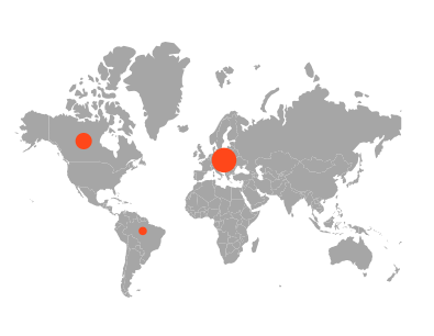
The size of the markers in a marker group can be customized using the widthValuePath and heightValuePath properties, which allow the user to change the width and height of the markers based on values from the given data source. Bind the data source to the dataSource property of the e-layersettings-marker tag, and specify the field names containing the width and height values in the data source for the widthValuePath and heightValuePath properties.
@using Syncfusion.EJ2.Maps;
@{
    var data = new[]
    {
        new {latitude = 49.95121990866204, longitude =  18.468749999999998, width = 30, height = 30 },
        new {latitude =  59.88893689676585, longitude =  -109.3359375, width = 20, height = 20 },
        new {latitude =  -6.64607562172573, longitude =  -55.54687499999999, width = 10, height = 10 }
    };
}
<ejs-maps id="maps">
    <e-maps-layers>
        <e-maps-layer shapeData="ViewBag.worldmap">
            <e-layersettings-markers>
                <e-layersettings-marker visible="true" shape="Circle" widthValuePath="width" heightValuePath="height" dataSource="data">
                </e-layersettings-marker>
            </e-layersettings-markers>
        </e-maps-layer>
    </e-maps-layers>
</ejs-maps>
using System;
using System.Collections.Generic;
using System.Diagnostics;
using System.Linq;
using System.Threading.Tasks;
using Microsoft.AspNetCore.Mvc;
using EJ2_Core_Application.Models;
using Newtonsoft.Json;
namespace EJ2_Core_Application.Controllers
{
public class HomeController : Controller
{
public IActionResult Index()
{
ViewBag.worldmap = GetWorldMap();
ViewBag.world_map = GetMap();
return View();
}
public object GetWorldMap()
{
string allText = System.IO.File.ReadAllText("./wwwroot/scripts/MapsData/WorldMap.js");
return JsonConvert.DeserializeObject(allText);
}
public object GetMap()
{
string allText = System.IO.File.ReadAllText(Server.MapPath("~/App_Data/WorldMap.json"));
return JsonConvert.DeserializeObject(allText, typeof(object));
}
}
}
Repositioning the marker using drag and drop
The markers on the map can be dragged and dropped to change their position. To enable marker drag and drop, set the enableDrag property to true in the markerSettings property.
@using Syncfusion.EJ2.Maps;
@{
    var data = new[]
    {
        new { latitude = 49.95121990866204, longitude = 18.468749999999998, name= "MarkerOne" },
        new { latitude = 59.88893689676585, longitude = -109.3359375, name="MarkerTwo"},
        new { latitude = -6.64607562172573, longitude = -55.54687499999999 , name="MarkerThree"},
        new { latitude = 23.644385824912135, longitude= 77.83189239539234  , name= "MarkerFour"},
        new { latitude = 63.66569332894224, longitude= 98.2225173953924 , name= "MarkerFive"}
    };
    var border = new MapsBorder
            {
                Color = "#285255",
                Width = 2,
                Opacity = 1
            };
    var tooltip = new MapsTooltipSettings
    {
        Visible = true,
        ValuePath = "name"
    };
}
<ejs-maps id="container">
    <e-maps-layers>
        <e-maps-layer shapeData="ViewBag.worldmap">
            <e-layersettings-shapesettings fill="#C3E6ED"></e-layersettings-shapesettings>
            <e-layersettings-markers>
                <e-layersettings-marker visible="true" enableDrag="true" height="20" width="20"
                                        animationDuration="0" dataSource="data"
                                        shape="Balloon" border="border" tooltipSettings="tooltip">
                </e-layersettings-marker>
            </e-layersettings-markers>
        </e-maps-layer>
    </e-maps-layers>
</ejs-maps>
using System;
using System.Collections.Generic;
using System.Diagnostics;
using System.Linq;
using System.Threading.Tasks;
using Microsoft.AspNetCore.Mvc;
using EJ2_Core_Application.Models;
using Newtonsoft.Json;
namespace EJ2_Core_Application.Controllers
{
public class HomeController : Controller
{
public IActionResult Index()
{
ViewBag.worldmap = GetWorldMap();
ViewBag.world_map = GetMap();
return View();
}
public object GetWorldMap()
{
string allText = System.IO.File.ReadAllText("./wwwroot/scripts/MapsData/WorldMap.js");
return JsonConvert.DeserializeObject(allText);
}
public object GetMap()
{
string allText = System.IO.File.ReadAllText(Server.MapPath("~/App_Data/WorldMap.json"));
return JsonConvert.DeserializeObject(allText, typeof(object));
}
}
}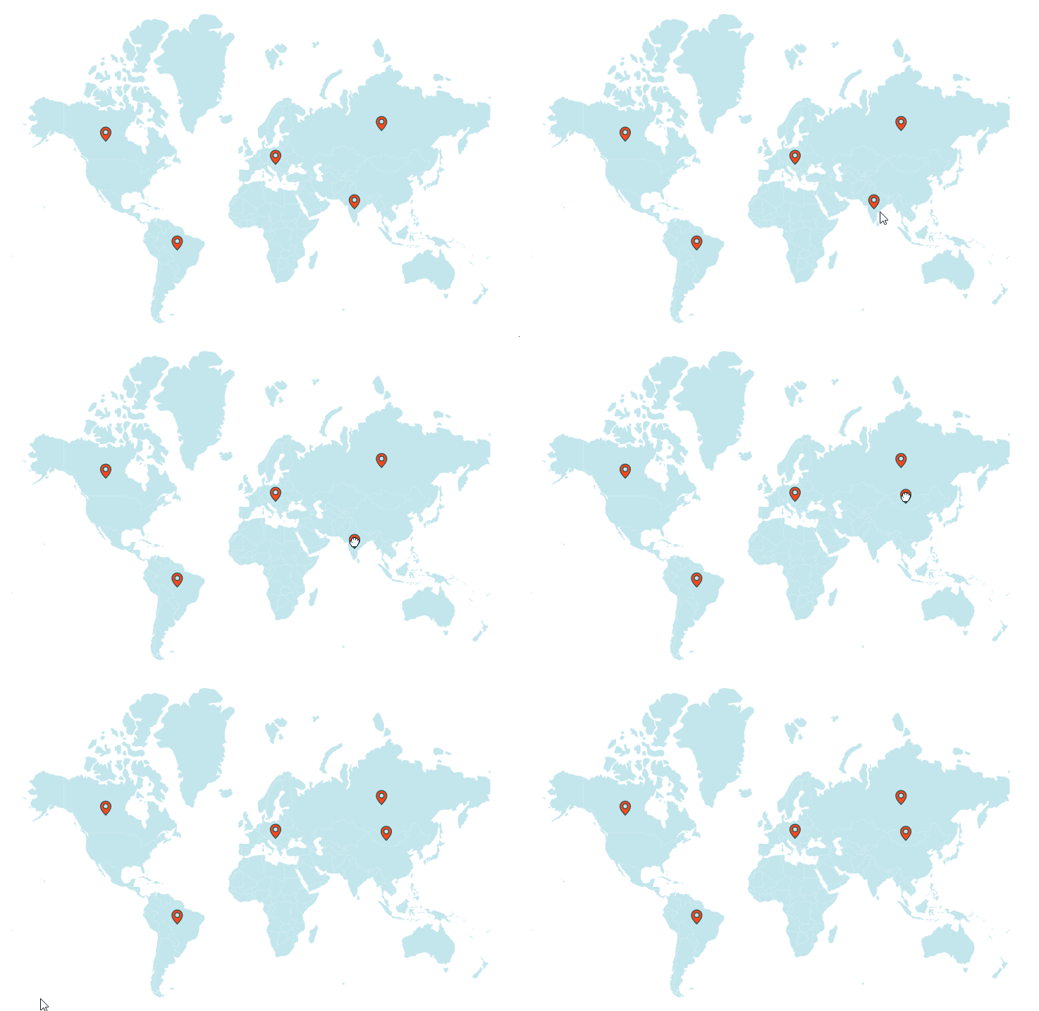
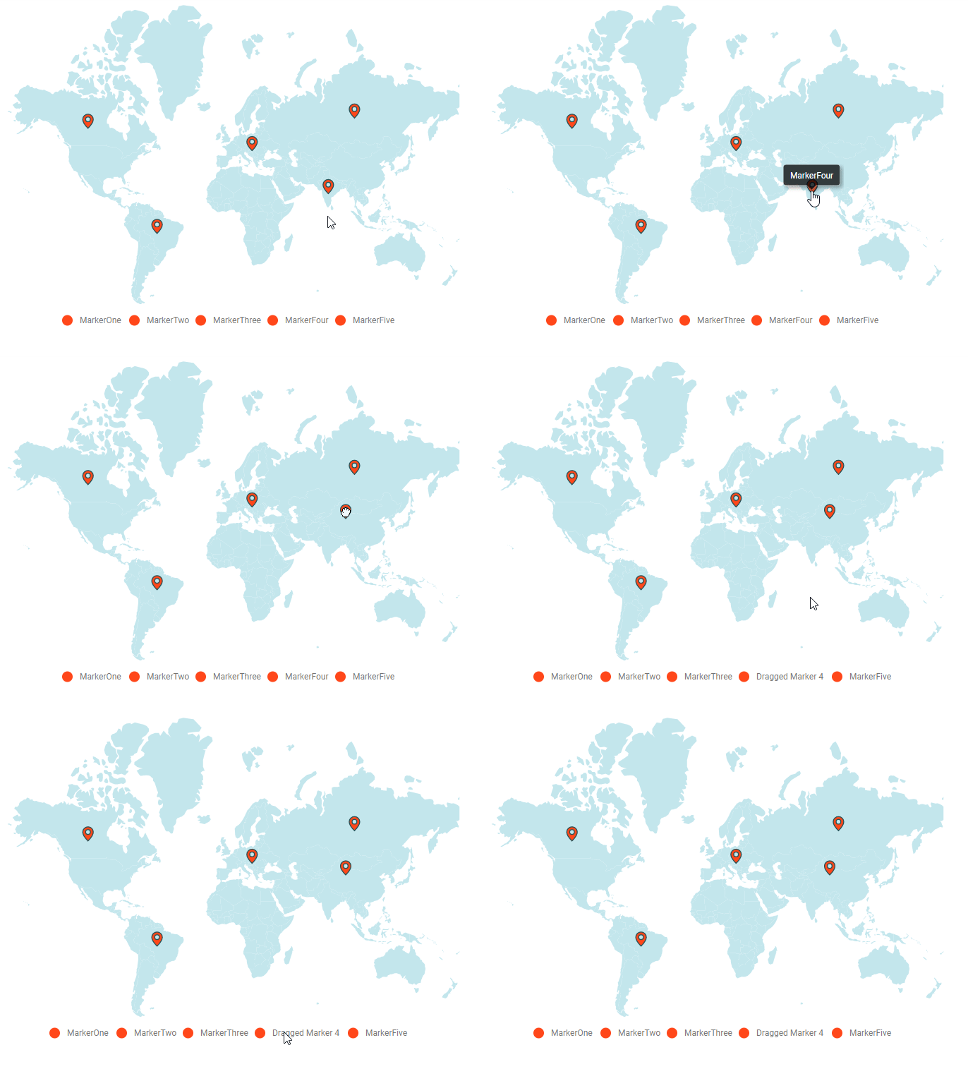
The data of the drag and dropped marker in the marker data source can be customized using the markerDragStart and markerDragEnd events. When you change the appropriate marker data, the tooltip and legend item text of that marker are automatically updated. The following properties are available in the event argument of the marker drag events.
| Argument Name | Description |
|---|---|
| dataIndex | It represents the index of the data of the dragged marker in the marker data source. |
| latitude | It represents the latitude coordinate point of the dragged marker. |
| longitude | It represents the longitude coordinate point for the dragged marker. |
| markerIndex | It represents the index of the marker setting. |
| layerIndex | It represents the index of the layer in which the marker belongs. |
| name | It represents the name of the event. |
| x | It represents the horizontal location of the mouse pointer on the map when the drag action is performed. |
| y | It represents the vertical location of the mouse pointer on the map when the drag action is performed. |
The following example shows how to use marker drag events to customize the data of the drag and dropped marker in the marker data source.
@using Syncfusion.EJ2.Maps;
@{
    var data = new[]
    {
        new { latitude = 49.95121990866204, longitude = 18.468749999999998, name= "MarkerOne" },
        new { latitude = 59.88893689676585, longitude = -109.3359375, name="MarkerTwo"},
        new { latitude = -6.64607562172573, longitude = -55.54687499999999 , name="MarkerThree"},
        new { latitude = 23.644385824912135, longitude= 77.83189239539234  , name= "MarkerFour"},
        new { latitude = 63.66569332894224, longitude= 98.2225173953924 , name= "MarkerFive"}
    };
    var border = new MapsBorder
            {
                Color = "#285255",
                Width = 2,
                Opacity = 1
            };
    var tooltip = new MapsTooltipSettings
    {
        Visible = true,
        ValuePath = "name"
    };
}
<ejs-maps id="container" markerDragStart="markerDragStart" markerDragEnd="markerDragEnd">
    <e-maps-legendsettings visible="true" type="Markers">
        <e-legendsettings-shapeborder width="2" color="#285255"></e-legendsettings-shapeborder>
    </e-maps-legendsettings>
    <e-maps-layers>
        <e-maps-layer shapeData="ViewBag.worldmap">
            <e-layersettings-shapesettings fill="#C3E6ED"></e-layersettings-shapesettings>
            <e-layersettings-markers>
                <e-layersettings-marker visible="true" legendText="name" enableDrag="true" height="20" width="20"
                                        animationDuration="0" dataSource="data"
                                        shape="Balloon" border="border" tooltipSettings="tooltip">
                </e-layersettings-marker>
            </e-layersettings-markers>
        </e-maps-layer>
    </e-maps-layers>
</ejs-maps>

<script>
    function markerDragStart(args){
      // When the marker begins to move on the map, the event is triggered.
    }

    function markerDragEnd(args) {
        // When the marker on the map stops dragging, the event is triggered.
        var mapsInstance = document.getElementById('container').ej2_instances[0];
        mapsInstance.layers[args.layerIndex].markerSettings[args.markerIndex].dataSource[args.dataIndex].name = 'Dragged Marker ' + (args.dataIndex + 1);
        mapsInstance.refresh();
    }
</script>
using System;
using System.Collections.Generic;
using System.Diagnostics;
using System.Linq;
using System.Threading.Tasks;
using Microsoft.AspNetCore.Mvc;
using EJ2_Core_Application.Models;
using Newtonsoft.Json;
namespace EJ2_Core_Application.Controllers
{
public class HomeController : Controller
{
public IActionResult Index()
{
ViewBag.worldmap = GetWorldMap();
ViewBag.world_map = GetMap();
return View();
}
public object GetWorldMap()
{
string allText = System.IO.File.ReadAllText("./wwwroot/scripts/MapsData/WorldMap.js");
return JsonConvert.DeserializeObject(allText);
}
public object GetMap()
{
string allText = System.IO.File.ReadAllText(Server.MapPath("~/App_Data/WorldMap.json"));
return JsonConvert.DeserializeObject(allText, typeof(object));
}
}
}
Marker zooming
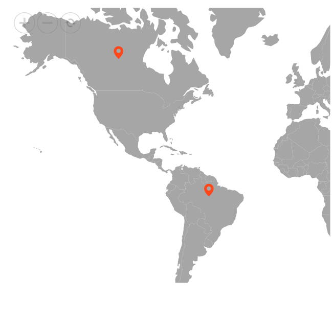
The Maps can be initially scaled to the center value based on the marker distance. This can be achieved by setting the ShouldZoomInitially property in MapsZoomSettings as true.
@{
    var data = new[]
    {
            new {latitude= 49.95121990866204, longitude= 18.468749999999998, name= "Europe" },
            new {latitude= 59.88893689676585, longitude= -109.3359375, name= "North America" },
            new {latitude= -6.64607562172573, longitude= -55.54687499999999, name= "South America" }
       };
    var marker = new List<MapsMarker>
    {
        new MapsMarker{Visible=true, DataSource=data}
    };
    var toolbarSettings = new { horizontalAlignment = "Near"};
    }

@using Syncfusion.EJ2.Maps;
@using Syncfusion.EJ2;
<div id="control-section">
    <ejs-maps id="maps">
    <e-maps-zoomsettings enable="true" shouldZoomInitially="true" toolbarSettings="toolbarSettings"></e-maps-zoomsettings>
        <e-maps-layers>
            <e-maps-layer shapeData="ViewBag.worldmap" markerSettings="marker"></e-maps-layer>
        </e-maps-layers>
    </ejs-maps>
</div>
using System;
using System.Collections.Generic;
using System.Diagnostics;
using System.Linq;
using System.Threading.Tasks;
using Microsoft.AspNetCore.Mvc;
using EJ2_Core_Application.Models;
using Newtonsoft.Json;
namespace EJ2_Core_Application.Controllers
{
public class HomeController : Controller
{
public IActionResult Index()
{
ViewBag.worldmap = GetWorldMap();
ViewBag.world_map = GetMap();
return View();
}
public object GetWorldMap()
{
string allText = System.IO.File.ReadAllText("./wwwroot/scripts/MapsData/WorldMap.js");
return JsonConvert.DeserializeObject(allText);
}
public object GetMap()
{
string allText = System.IO.File.ReadAllText(Server.MapPath("~/App_Data/WorldMap.json"));
return JsonConvert.DeserializeObject(allText, typeof(object));
}
}
}
Marker clustering
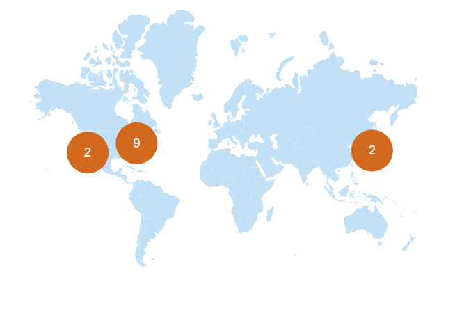
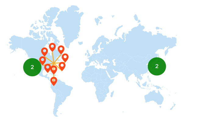
Maps support hiding and clustering markers when they overlap. The number on a cluster indicates how many overlapping markers it contains. When zooming into any cluster location on the map, the number on the cluster decreases, and individual markers become visible. When zooming out, the overlapping markers increase, causing them to cluster again, which increases the count on the cluster.
To enable clustering for markers within a layer, set the AllowClustering property of MarkerClusterSettings in the MapsLayer to true. Customization of clustering can be done using the MarkerClusterSettings property.
@using Syncfusion.EJ2.Maps;
@{
    var titleStyle = new MapsFont
    {
        Size = "16px",
    };
    var cluster = new MapsMarkerClusterSettings
    {
        AllowClustering = true,
        Height = 40,
        Width = 40,
        Shape = Syncfusion.EJ2.Maps.MarkerType.Circle,
        LabelStyle = new MapsFont
        {
            Color = "White"
        }

    };
    var tooltip = new MapsTooltipSettings
    {
        Visible = true,
        ValuePath = "city"
    };

}
<div class="control-section">
    <ejs-maps id="maps">
        <e-maps-titlesettings alignment="@Syncfusion.EJ2.Maps.Alignment.Center" text="Top 50 largest cities in the World" textStyle="titleStyle"></e-maps-titlesettings>
        <e-maps-zoomsettings enable="true"></e-maps-zoomsettings>
        <e-maps-layers>
            <e-maps-layer shapeData="ViewBag.shapeData" markerClusterSettings="cluster">
                <e-layersettings-shapesettings fill="#C1DFF5"></e-layersettings-shapesettings>
                <e-layersettings-markers>
                    <e-layersettings-marker visible="true" shape="Balloon" height="20" width="20" animationDuration="0" tooltipSettings="tooltip" dataSource="ViewBag.ClusterData"></e-layersettings-marker>
                </e-layersettings-markers>

            </e-maps-layer>
        </e-maps-layers>
    </ejs-maps>
</div>
using System;
using System.Collections.Generic;
using System.Linq;
using System.Web;
using System.Web.Mvc;
using Syncfusion.EJ2.Maps;
using System.Web.Script.Serialization;
using Newtonsoft.Json;
using Newtonsoft.Json.Linq;
using EJ2MVCSampleBrowser.Models;
namespace EJ2MVCSampleBrowser.Controllers.Maps
{
public partial class MapsController : Controller
{
// GET: MarkerClustering
public ActionResult MarkerClustering()
{
ViewBag.shapeData = this.GetWorldMap();
ViewBag.shape_Data = this.GetWMap();
ViewBag.ClusterData = this.ClusterData();
ViewBag.Cluster_data = this.getData();
return View();
}
public object ClusterData()
{
string allText = System.IO.File.ReadAllText(Server.MapPath("~/App_Data/MapData/ClusterData.json"));
return JsonConvert.DeserializeObject(allText, typeof(object));
}
public object GetWorldMap()
{
string allText = System.IO.File.ReadAllText("./wwwroot/scripts/MapsData/WorldMap.js");
return JsonConvert.DeserializeObject(allText);
}
public object getData()
{
string allText = System.IO.File.ReadAllText(Server.MapPath("./wwwroot/scripts/MapsData/ClusterData.json"));
return JsonConvert.DeserializeObject(allText, typeof(object));
}
public object GetWMap()
{
string allText = System.IO.File.ReadAllText(Server.MapPath("~/App_Data/WorldMap.json"));
return JsonConvert.DeserializeObject(allText, typeof(object));
}
}
}
Customization of marker cluster
The following properties are available to customize the marker clustering in the Maps component.
-
Border- To customize the color, width and opacity of the border of cluster in Maps. -
ConnectorLineSettings- To customize the connector line in cluster separating the markers. -
DashArray- To customize the dash array for the marker cluster in Maps. -
Fill- Applies the color of the cluster in Maps. -
Height- To customize the height of the marker cluster in Maps. -
ImageUrl- To customize the URL path for the marker cluster when the cluster shape is set as image in Maps. -
LabelStyle- To customize the text in marker cluster. -
Offset- To customize the offset position for the marker cluster in Maps. -
Opacity- To customize the opacity of the marker cluster. -
Shape- To customize the shape for the cluster of markers. -
Width- To customize the width of the marker cluster in Maps.
@using Syncfusion.EJ2.Maps;
@{
    var titleStyle = new MapsFont
    {
        Size = "16px",
    };
    var cluster = new MapsMarkerClusterSettings
    {
        AllowClustering = true,
        Height = 40,
        Width = 40,
        Fill = "green",
        Opacity = 0.9,
        AllowClusterExpand = true,
        Shape = Syncfusion.EJ2.Maps.MarkerType.Circle,
        LabelStyle = new MapsFont
        {
            Color = "White"
        },
        ConnectorLineSettings = new MapsConnectorLineSettings
        {
            Color = "orange",
            Opacity = 0.8,
            Width = 2
        }
    };
    var tooltip = new MapsTooltipSettings
    {
        Visible = true,
        ValuePath = "city"
    };

}
<div class="control-section">
    <ejs-maps id="maps" format="n" useGroupingSeparator="true" height="600" width="400">
        <e-maps-titlesettings alignment="@Syncfusion.EJ2.Maps.Alignment.Center" text="Top 50 largest cities in the World" textStyle="titleStyle"></e-maps-titlesettings>
        <e-maps-zoomsettings enable="true"></e-maps-zoomsettings>
        <e-maps-layers>
            <e-maps-layer shapeData="ViewBag.shapeData" markerClusterSettings="cluster">
                <e-layersettings-shapesettings fill="#C1DFF5"></e-layersettings-shapesettings>
                <e-layersettings-markers>
                    <e-layersettings-marker visible="true" shape="Balloon" height="20" width="20" animationDuration="0" tooltipSettings="tooltip" dataSource="ViewBag.ClusterData"></e-layersettings-marker>
                </e-layersettings-markers>

            </e-maps-layer>
        </e-maps-layers>
    </ejs-maps>
</div>
using System;
using System.Collections.Generic;
using System.Linq;
using System.Web;
using System.Web.Mvc;
using Syncfusion.EJ2.Maps;
using System.Web.Script.Serialization;
using Newtonsoft.Json;
using Newtonsoft.Json.Linq;
using EJ2MVCSampleBrowser.Models;
namespace EJ2MVCSampleBrowser.Controllers.Maps
{
public partial class MapsController : Controller
{
// GET: MarkerClustering
public ActionResult MarkerClustering()
{
ViewBag.shapeData = this.GetWorldMap();
ViewBag.ClusterData = this.ClusterData();
return View();
}
public object ClusterData()
{
string allText = System.IO.File.ReadAllText(Server.MapPath("~/App_Data/MapData/ClusterData.json"));
return JsonConvert.DeserializeObject(allText, typeof(object));
}
public object GetWorldMap()
{
string allText = System.IO.File.ReadAllText("./wwwroot/scripts/MapsData/WorldMap.js");
return JsonConvert.DeserializeObject(allText);
}
}
}
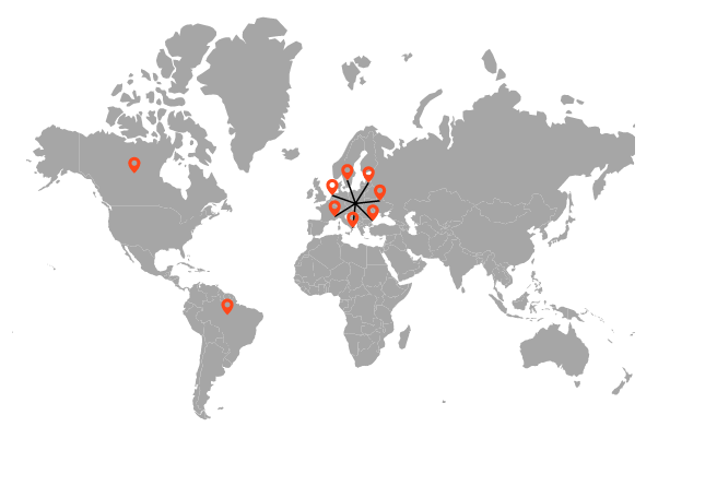
Expanding the marker cluster
The cluster is formed by grouping an identical and non-identical marker from the surrounding area. By clicking on the cluster and setting the AllowClusterExpand property in MapsMarkerClusterSettings as true to expand the identical markers. If zooming is performed in any of the locations of the cluster, the number on the cluster will decrease and the overlapping marker will be split into an individual marker on the map. When performing zoom out, it will increase the marker count and then cluster it again.
@using Syncfusion.EJ2.Maps;
@{
    var cluster = new MapsMarkerClusterSettings
    {
        AllowClustering = true,
        AllowClusterExpand = true,
        Height = 40,
        Width = 40,
        LabelStyle = new MapsFont
        {
            Color = "White"
        }
    };
    var data = new[]
{
        new { latitude= 49.95121990866204, longitude= 18.468749999999998, name="Europe" },
        new { latitude= 49.95121990866204, longitude= 18.468749999999998, name="Europe" },
        new { latitude= 49.95121990866204, longitude= 18.468749999999998, name="Europe" },
        new { latitude= 49.95121990866204, longitude= 18.468749999999998, name="Europe" },
        new { latitude= 49.95121990866204, longitude= 18.468749999999998, name="Europe" },
        new { latitude= 49.95121990866204, longitude= 18.468749999999998, name="Europe" },
        new { latitude= 49.95121990866204, longitude= 18.468749999999998, name="Europe" },
        new { latitude= 59.88893689676585, longitude= -109.3359375, name="North America" },
        new { latitude= -6.64607562172573, longitude= -55.54687499999999, name="South America"}
    };
}
<div class="control-section">
    <ejs-maps id="maps">
        <e-maps-zoomsettings enable="true" mouseWheelZoom="true"></e-maps-zoomsettings>
        <e-maps-layers>
            <e-maps-layer shapeData="ViewBag.shapeData" markerClusterSettings="cluster">
                <e-layersettings-markers>
                    <e-layersettings-marker visible="true" dataSource="data"></e-layersettings-marker>
                </e-layersettings-markers>
            </e-maps-layer>
        </e-maps-layers>
    </ejs-maps>
</div>
using System;
using System.Collections.Generic;
using System.Linq;
using System.Web;
using System.Web.Mvc;
using Syncfusion.EJ2.Maps;
using System.Web.Script.Serialization;
using Newtonsoft.Json;
using Newtonsoft.Json.Linq;
using EJ2MVCSampleBrowser.Models;
namespace EJ2MVCSampleBrowser.Controllers.Maps
{
public partial class MapsController : Controller
{
// GET: MarkerClustering
public ActionResult MarkerClustering()
{
ViewBag.shapeData = GetWorldMap();
ViewBag.clusterdata = GetClusterData();
return View();
}
public object GetWorldMap()
{
string allText = System.IO.File.ReadAllText("./wwwroot/scripts/MapsData/WorldMap.js");
return JsonConvert.DeserializeObject(allText);
}
public object GetClusterData()
{
string text = System.IO.File.ReadAllText("./wwwroot/scripts/MapsData/ClusterData.js");
return JsonConvert.DeserializeObject(text, typeof(object));
}
}
}
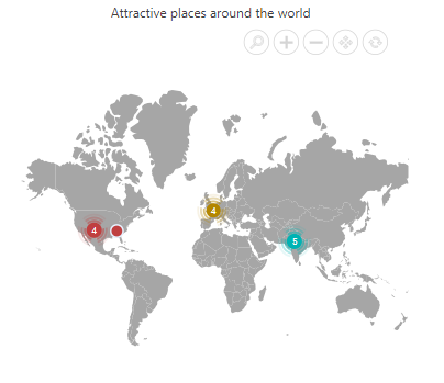
Clustering markers within each marker group
Marker clustering can be enabled for each marker group in the map by using the ClusterSettings property within the markerSettings property in the e-maps-layer. This allows for individual customization of clusters for each marker group which group markers that are located near each other to reduce clutter and improve readability. When the AllowClustering property is set to true, the markers within each group are clustered and visually represented as separate clusters. As users zoom in, the clusters expand to reveal individual markers, enabling more detailed exploration. Clusters can also be expanded manually by setting the AllowClusterExpand property to true. The appearance of the clusters and their expansion behavior can be customized using the ClusterSettings property, similar to the MarkerClusterSettings property, as explained in the sections above.
When the
ClusterSettingsproperty is enabled for an individual marker group, theMarkerClusterSettingsproperty within the layers becomes ineffective.
@using Syncfusion.EJ2.Maps;

@{
    var TextStyle = new MapsFont { Size = "16px", FontFamily = "inherit" };
    var Markers = new List<Syncfusion.EJ2.Maps.MapsMarker>
    {

        new Syncfusion.EJ2.Maps.MapsMarker
        {
            Visible = true, Height = 15, Width = 15, Shape = MarkerType.Circle, AnimationDuration = 0, Fill="#b38600",
            DataSource = new [] {
                new { latitude= 48.8584, longitude= 2.2945, name= "Eiffel Tower", state= "Paris", country= "France" },
                new { latitude= 48.8606, longitude= 2.3376, name= "Louvre Museum", state= "Paris", country= "France" },
                new { latitude= 48.8529, longitude= 2.3500, name= "Notre-Dame Cathedral", state= "Paris", country= "France" },
                new { latitude= 48.6360, longitude= 1.5115, name= "Mont Saint-Michel", state= "Normandy", country= "France" }
            },
            Border = new MapsBorder {
                 Color = "#e6f2ff",
                 Width = 2,
                 Opacity = 1
            },
            ClusterSettings = new Syncfusion.EJ2.Maps.MapsMarkerClusterSettings
            {
                AllowClustering = true,
                AllowDeepClustering= false,
                AllowClusterExpand= true,
                Shape= MarkerType.Image,
                Height= 40, Width= 40,
                LabelStyle= new MapsFont {
                    Color= "white",
                    Size= "10px"
                },
                ImageUrl= "../styles/images/maps/cluster-france.svg"
            },
            TooltipSettings = new MapsTooltipSettings{ Visible=true, ValuePath="name", Format= "<b>Name:</b> ${name} <br/> <b>State:</b> ${state} <br/> <b>Country:</b> ${country}" },
        },
        new Syncfusion.EJ2.Maps.MapsMarker
        {
            Visible = true, Height = 15, Width = 15, Shape = MarkerType.Circle, AnimationDuration = 0, Fill="#bf4040",
            DataSource = new [] {
               new { latitude= 35.019028, longitude= -85.339439, name= "Ruby Falls", state= "Tennessee", country= "United States of America" },
               new { latitude= 35.654613, longitude= -105.996979, name= "Meow Wolf Santa Fe", state= "New Mexico", country= "United States of America" },
               new { latitude= 36.107216, longitude= -115.175804, name= "City Center of Las Vegas", state= "Nevada", country= "United States of America" },
               new { latitude= 36.879047, longitude= -111.510498, name= "Horseshoe Bend", state= "Arizona", country= "United States of America" },
               new { latitude= 36.011955, longitude= -113.810951, name= "Grand Canyon West Skywalk", state= "Arizona", country= "United States of America" }
            },
            Border = new MapsBorder {
                 Color = "#e6f2ff",
                 Width = 2,
                 Opacity = 1
            },
            ClusterSettings = new Syncfusion.EJ2.Maps.MapsMarkerClusterSettings
            {
                AllowClustering = true,
                AllowDeepClustering= false,
                AllowClusterExpand= true,
                Shape= MarkerType.Image,
                Height= 40, Width= 40,
                LabelStyle= new MapsFont {
                    Color= "white",
                    Size= "10px"
                },
                ImageUrl= "../styles/images/maps/cluster-usa.svg"
            },
            TooltipSettings = new MapsTooltipSettings{ Visible=true, ValuePath="name", Format= "<b>Name:</b> ${name} <br/> <b>State:</b> ${state} <br/> <b>Country:</b> ${country}" },
        },
        new Syncfusion.EJ2.Maps.MapsMarker
        {
            Visible = true, Height = 15, Width = 15, Shape = MarkerType.Circle, AnimationDuration = 0, Fill="#00b3b3",
            DataSource = new [] {
              new { latitude= 26.985901, longitude= 75.850700, name= "Amber Fort, Amer", state= "Rajastan", country= "India" },
              new { latitude= 22.957390, longitude= 77.625275, name= "Bhimbetka, Raisen District", state= "Madhya Pradesh", country= "India" },
              new { latitude= 26.809330, longitude= 75.540527, name= "Bagru Fort, Bagru", state= "Rajasthan", country= "India" },
              new { latitude= 25.489504, longitude= 80.330116, name= "Kalinjar Fort, Banda", state= "Uttar Pradesh", country= "India" },
              new { latitude= 27.988890, longitude= 76.388336, name= "Neemrana", state= "Rajasthan", country= "India" }
            },
            Border = new MapsBorder {
                 Color = "#e6f2ff",
                 Width = 2,
                 Opacity = 1
            },
            ClusterSettings = new Syncfusion.EJ2.Maps.MapsMarkerClusterSettings
            {
                AllowClustering = true,
                AllowDeepClustering= false,
                AllowClusterExpand= true,
                Shape= MarkerType.Image,
                Height= 40, Width= 40,
                LabelStyle= new MapsFont {
                    Color= "white",
                    Size= "10px"
                },
                ImageUrl= "../styles/images/maps/cluster-india.svg"
            },
            TooltipSettings = new MapsTooltipSettings{ Visible=true, ValuePath="name", Format= "<b>Name:</b> ${name} <br/> <b>State:</b> ${state} <br/> <b>Country:</b> ${country}" },
        }
    };
}

<div class="control-section">
    <ejs-maps id="maps" width="100%" load="window.onMapLoad">
        <e-maps-titlesettings alignment="@Syncfusion.EJ2.Maps.Alignment.Center" text="Attractive places around the world" textStyle="@TextStyle">
        </e-maps-titlesettings>
        <e-maps-zoomsettings enable="true"></e-maps-zoomsettings>
        <e-maps-layers>
            <e-maps-layer shapeData="ViewBag.worldmap" markerSettings="@Markers">
            </e-maps-layer>
        </e-maps-layers>
    </ejs-maps>
</div>

<script>
    var allowLoading = true;
    function onMapLoad(args) {
        if (allowLoading) {
            allowLoading = false;
            args.maps.zoomSettings.toolbarSettings.buttonSettings.toolbarItems = ['Zoom', 'ZoomIn', 'ZoomOut', 'Pan', 'Reset'];
        }
    }
</script>
using System;
using System.Collections.Generic;
using System.Linq;
using System.Web;
using System.Web.Mvc;
using Syncfusion.EJ2.Maps;
using System.Web.Script.Serialization;
using Newtonsoft.Json;
using Newtonsoft.Json.Linq;
using EJ2MVCSampleBrowser.Models;
namespace EJ2MVCSampleBrowser.Controllers.Maps
{
public partial class MapsController : Controller
{
// GET: MarkerClustering
public ActionResult MarkerClustering()
{
ViewBag.worldmap = this.GetWorldMap();
ViewBag.world_map = this.GetMap();
return View();
}
public object GetWorldMap()
{
string allText = System.IO.File.ReadAllText("wwwroot/scripts/MapsData/WorldMap.json");
return JsonConvert.DeserializeObject(allText);
}
public object GetMap()
{
string allText = System.IO.File.ReadAllText(Server.MapPath("~/App_Data/WorldMap.json"));
return JsonConvert.DeserializeObject(allText, typeof(object));
}
}
}
Tooltip for marker
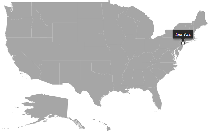
Tooltip is used to display more information about a marker on mouse over or touch end event. This can be enabled separately for marker by setting the Visible property of MapsTooltipSettings to true. The ValuePath property in the MapsTooltipSettings takes the field name that presents in dataSource and displays that value as tooltip text.
@using Syncfusion.EJ2.Maps;
@{
    var tooltip = new MapsTooltipSettings
    {
        Visible = true,
        ValuePath = "name"
    };
    var border = new MapsBorder
    {
        Width = 2,
        Color = "green",
        Opacity = 1
    };
    var data = new[]
    {
        new { latitude= 40.7424509, longitude= 1-74.0081468, name="New York" }
    };
}
<div class="control-section">
    <ejs-maps id="maps">
        <e-maps-layers>
            <e-maps-layer shapeData="ViewBag.usa">
                <e-layersettings-markers>
                    <e-layersettings-marker visible="true" shape="Circle" fill="white"
                                            width="2" animationDuration="0" tooltipSettings="tooltip"
                                            border="border" dataSource="data"></e-layersettings-marker>
                </e-layersettings-markers>
            </e-maps-layer>
        </e-maps-layers>
    </ejs-maps>
</div>
using System;
using System.Collections.Generic;
using System.Diagnostics;
using System.Linq;
using System.Threading.Tasks;
using Microsoft.AspNetCore.Mvc;
using EJ2_Core_Application.Models;
using Newtonsoft.Json;
using Syncfusion.EJ2.Charts;
namespace EJ2_Core_Application.Controllers
{
public class HomeController : Controller
{
public IActionResult Index()
{
ViewBag.usa = GetUSMap();
ViewBag.usamap = GetUSAMap();
return View();
}
public object GetUSMap()
{
string text = System.IO.File.ReadAllText("./wwwroot/scripts/MapsData/USA.json");
return JsonConvert.DeserializeObject(text);
}
public object GetUSAMap()
{
string allText = System.IO.File.ReadAllText(Server.MapPath("~/App_Data/USA.json"));
return JsonConvert.DeserializeObject(text);
}
}
}