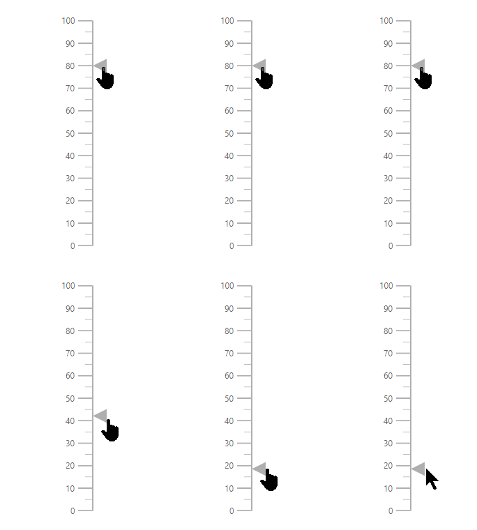
User Interaction in ASP.NET Core Linear Gauge
Tooltip
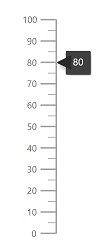
Linear Gauge displays the details about a pointer value through e-lineargauge-tooltip, when the mouse hovers over the pointer. To enable the tooltip, set Enable property as true.
@using Syncfusion.EJ2.LinearGauge

<ejs-lineargauge id="gauge">
    <e-lineargauge-tooltip Enable="true"></e-lineargauge-tooltip>
    <e-lineargauge-axes>
        <e-lineargauge-axis>
            <e-lineargauge-pointers>
                <e-lineargauge-pointer Value="80"></e-lineargauge-pointer>
            </e-lineargauge-pointers>
        </e-lineargauge-axis>
    </e-lineargauge-axes>
</ejs-lineargauge>
using System;
using System.Collections.Generic;
using System.Diagnostics;
using System.Linq;
using System.Threading.Tasks;
using Microsoft.AspNetCore.Mvc;
using EJ2_Core_Application.Models;
using Newtonsoft.Json;
using Syncfusion.EJ2.Charts;
using Syncfusion.EJ2.LinearGauge;
namespace EJ2_Core_Application.Controllers
{
public class HomeController : Controller
{
public IActionResult Index()
{
return View();
}
}
}
Tooltip format
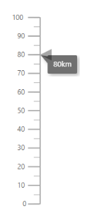
Tooltip in the Linear Gauge control can be formatted using the Format property in e-lineargauge-tooltip. It is used to render the tooltip in certain format or to add a user-defined unit in the tooltip. By default, the tooltip shows the pointer value only. In addition to that, more information can be added in the tooltip. For example, the format {value}km shows pointer value with kilometer unit in the tooltip.
using Syncfusion.EJ2.LinearGauge

<ejs-lineargauge id="gauge">
    <e-lineargauge-tooltip Enable="true" Format="{value}km"></e-lineargauge-tooltip>
    <e-lineargauge-axes>
        <e-lineargauge-axis>
            <e-lineargauge-pointers>
                <e-lineargauge-pointer Value="80"></e-lineargauge-pointer>
            </e-lineargauge-pointers>
        </e-lineargauge-axis>
    </e-lineargauge-axes>
</ejs-lineargauge>
using System;
using System.Collections.Generic;
using System.Diagnostics;
using System.Linq;
using System.Threading.Tasks;
using Microsoft.AspNetCore.Mvc;
using EJ2_Core_Application.Models;
using Newtonsoft.Json;
using Syncfusion.EJ2.Charts;
using Syncfusion.EJ2.LinearGauge;
namespace EJ2_Core_Application.Controllers
{
public class HomeController : Controller
{
public IActionResult Index()
{
return View();
}
}
}
Tooltip Template
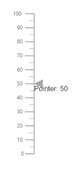
The HTML element can be rendered in the tooltip of the Linear Gauge using the Template property in e-lineargauge-tooltip. The ${value} can be used as placeholders in the HTML element to display the pointer values of the corresponding axis.
@using Syncfusion.EJ2.LinearGauge

<ejs-lineargauge id="gauge">
    <e-lineargauge-tooltip Enable="true" Template="<div>Pointer: 80 </div>"></e-lineargauge-tooltip>
    <e-lineargauge-axes>
        <e-lineargauge-axis>
            <e-lineargauge-pointers>
                <e-lineargauge-pointer Value="80"></e-lineargauge-pointer>
            </e-lineargauge-pointers>
        </e-lineargauge-axis>
    </e-lineargauge-axes>
</ejs-lineargauge>
using System;
using System.Collections.Generic;
using System.Diagnostics;
using System.Linq;
using System.Threading.Tasks;
using Microsoft.AspNetCore.Mvc;
using EJ2_Core_Application.Models;
using Newtonsoft.Json;
using Syncfusion.EJ2.Charts;
using Syncfusion.EJ2.LinearGauge;
namespace EJ2_Core_Application.Controllers
{
public class HomeController : Controller
{
public IActionResult Index()
{
return View();
}
}
}
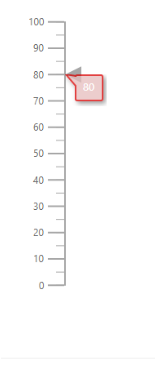
Customize the appearance of the tooltip
The tooltip can be customized using the following properties in e-lineargauge-tooltip.
-
Fill- To fill the color for tooltip. -
EnableAnimtion- To enable or disable the tooltip animation. -
Border- To set the border color and width of the tooltip. -
TextStyle- To customize the style of the text in tooltip. -
ShowAtMousePosition- To show the tooltip at the mouse position.
@using Syncfusion.EJ2.LinearGauge

<ejs-lineargauge id="gauge">
    <e-lineargauge-tooltip Enable="true" Fill="#e5bcbc">
        <e-tooltipsettings-border Width="2" Color="#d80000"></e-tooltipsettings-border>
    </e-lineargauge-tooltip>
    <e-lineargauge-axes>
        <e-lineargauge-axis>
            <e-lineargauge-pointers>
                <e-lineargauge-pointer Value="80"></e-lineargauge-pointer>
            </e-lineargauge-pointers>
        </e-lineargauge-axis>
    </e-lineargauge-axes>
</ejs-lineargauge>
using System;
using System.Collections.Generic;
using System.Diagnostics;
using System.Linq;
using System.Threading.Tasks;
using Microsoft.AspNetCore.Mvc;
using EJ2_Core_Application.Models;
using Newtonsoft.Json;
using Syncfusion.EJ2.Charts;
using Syncfusion.EJ2.LinearGauge;
namespace EJ2_Core_Application.Controllers
{
public class HomeController : Controller
{
public IActionResult Index()
{
return View();
}
}
}
Positioning the tooltip
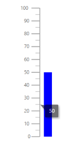
The tooltip is positioned at the End of the pointer. To change the position of the tooltip at the start, or center of the pointer, set the Position property to Start or Center.
@using Syncfusion.EJ2.LinearGauge

<ejs-lineargauge id="gauge">
    <e-lineargauge-tooltip Enable="true" Position="Center">
    </e-lineargauge-tooltip>
    <e-lineargauge-axes>
        <e-lineargauge-axis>
            <e-lineargauge-pointers>
                <e-lineargauge-pointer Value="50" Type="Bar" Color="blue"></e-lineargauge-pointer>
            </e-lineargauge-pointers>
        </e-lineargauge-axis>
    </e-lineargauge-axes>
</ejs-lineargauge>
using Microsoft.AspNetCore.Mvc;
namespace EJ2_Core_Application.Controllers
{
public class HomeController : Controller
{
public IActionResult Index()
{
return View();
}
}
}
Pointer Drag
To drag either marker or bar pointer to the desired axis value, set the EnableDrag property as true in e-lineargauge-pointer.
@using Syncfusion.EJ2.LinearGauge

<ejs-lineargauge id="gauge">
    <e-lineargauge-axes>
        <e-lineargauge-axis>
            <e-lineargauge-pointers>
                <e-lineargauge-pointer EnableDrag="true" Value="80"></e-lineargauge-pointer>
            </e-lineargauge-pointers>
        </e-lineargauge-axis>
    </e-lineargauge-axes>
</ejs-lineargauge>
using System;
using System.Collections.Generic;
using System.Diagnostics;
using System.Linq;
using System.Threading.Tasks;
using Microsoft.AspNetCore.Mvc;
using EJ2_Core_Application.Models;
using Newtonsoft.Json;
using Syncfusion.EJ2.Charts;
using Syncfusion.EJ2.LinearGauge;
namespace EJ2_Core_Application.Controllers
{
public class HomeController : Controller
{
public IActionResult Index()
{
return View();
}
}
}