Bar Chart in Angular Charts
A bar chart is ideal for comparing values across different categories, where the data is displayed horizontally and the length of each bar represents the value.
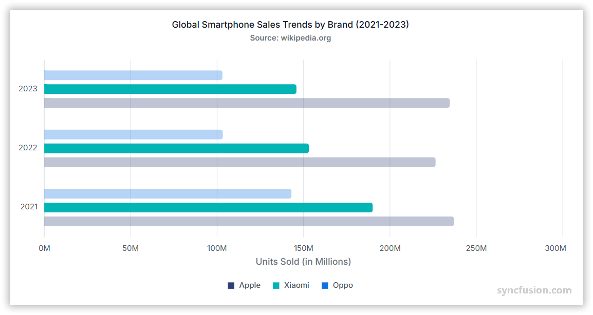
Creating a bar chart
To render a bar series in your chart:
-
Set the series type: Define the series
typeasBarin your chart configuration. -
Provide BarSeriesService: Add
BarSeriesServiceto your module’sprovidersarray so the chart can render the bar series.
The following sample renders three Bar series — Apple, Xiaomi, and a third vendor — from separate JSON datasets, showing global smart phone sales trends for 2022–2024.
import { ChartModule, ChartAllModule } from '@syncfusion/ej2-angular-charts';
import { BarSeriesService, TooltipService, CategoryService, LegendService } from '@syncfusion/ej2-angular-charts';
import { Component, OnInit } from '@angular/core';
import { appleSalesData, xiaomiSalesData, oppoSalesData } from './datasource';

@Component({
    imports: [ChartModule, ChartAllModule],
    providers: [BarSeriesService, CategoryService, LegendService, TooltipService],
    standalone: true,
    selector: 'app-container',
    template: `<ejs-chart id="chart-container" [primaryXAxis]='primaryXAxis'[primaryYAxis]='primaryYAxis' [title]='title' [legendSettings]='legendSettings' [tooltip]='tooltip' [chartArea]='chartArea'>
        <e-series-collection>
            <e-series [dataSource]='appleChartData' type='Bar' xName='year' yName='count' name='Apple' columnSpacing=0.3 legendShape='Rectangle' [cornerRadius]='cornerRadius'></e-series>
            <e-series [dataSource]='xiaomiChartData' type='Bar' xName='year' yName='count' name='Xiaomi' columnSpacing=0.3 legendShape='Rectangle' [cornerRadius]='cornerRadius'></e-series>
            <e-series [dataSource]='oppoChartData' type='Bar' xName='year' yName='count' name='Oppo' columnSpacing=0.3 legendShape='Rectangle' [cornerRadius]='cornerRadius'></e-series>
        </e-series-collection>
    </ejs-chart>`
})
export class AppComponent implements OnInit {
    public primaryXAxis?: Object;
    public appleChartData?: Object[];
    public xiaomiChartData?: Object[];
    public oppoChartData?: Object[];
    public title?: string;
    public primaryYAxis?: Object;
    public legendSettings?: Object;
    public tooltip?: Object;
    public cornerRadius?: Object;
    public chartArea?: Object;
    ngOnInit(): void {
        this.appleChartData = appleSalesData;
        this.xiaomiChartData = xiaomiSalesData;
        this.oppoChartData = oppoSalesData;
        this.primaryXAxis = {
            valueType: 'Category',
            majorTickLines: { width: 0 },
            lineStyle: { width: 0 }
        };
        this.primaryYAxis = {
            labelFormat: '{value}M',
            title: 'Units Sold (in Millions)',
            maximum: 300,
            edgeLabelPlacement: 'Shift',
            majorTickLines: { width: 0 },
            majorGridLines: { width: 0 },
            lineStyle: { width: 0 }
        };
        this.title = 'Global Smartphone Sales Trends by Brand (2022-2024)';
        this.legendSettings = {
            visible: true,
            enableHighlight: true,
            shapeWidth: 9,
            shapeHeight: 9
        };
        this.tooltip = {
            enable: true,
            enableHighlight: true,
            header: '<b>${series.name}</b>',
            format: '${point.x} : <b>${point.y}</b>'
        };
        this.cornerRadius = {
            topRight: 4,
            bottomRight: 4
        };
        this.chartArea = {
            border: {
                width: 0
            },
            margin: {
                bottom: 12
            }
        };
    }
}
import { bootstrapApplication } from '@angular/platform-browser';
import { AppComponent } from './app.component';
import 'zone.js';
bootstrapApplication(AppComponent).catch((err) => console.error(err));export let appleSalesData: Object[] = [
{ year: '2022', count: 226.4 },
{ year: '2023', count: 234.6 },
{ year: '2024', count: 232.1 }
];
export let xiaomiSalesData: Object[] = [
{ year: '2022', count: 153.1 },
{ year: '2023', count: 145.9 },
{ year: '2024', count: 168.5 }
];
export let oppoSalesData: Object[] = [
{ year: '2022', count: 103.3 },
{ year: '2023', count: 103.1 },
{ year: '2024', count: 104.8 }
];Binding data with series
You can bind data to the chart using the dataSource property within the series configuration. To display the data correctly, map the fields from the data to the chart series xName and yName properties. The following sample binds each of the three Bar series (Apple, Xiaomi, and a third vendor) to its own array from datasource.ts, mapping year to xName and count to yName.
import { ChartModule, ChartAllModule } from '@syncfusion/ej2-angular-charts';
import { BarSeriesService, TooltipService, CategoryService, LegendService } from '@syncfusion/ej2-angular-charts';
import { Component, OnInit } from '@angular/core';
import { appleSalesData, xiaomiSalesData, oppoSalesData } from './datasource';

@Component({
    imports: [ChartModule, ChartAllModule],
    providers: [BarSeriesService, CategoryService, LegendService, TooltipService],
    standalone: true,
    selector: 'app-container',
    template: `<ejs-chart id="chart-container" [primaryXAxis]='primaryXAxis'[primaryYAxis]='primaryYAxis' [title]='title' [legendSettings]='legendSettings' [tooltip]='tooltip' [chartArea]='chartArea'>
        <e-series-collection>
            <e-series [dataSource]='appleChartData' type='Bar' xName='year' yName='count' name='Apple' columnSpacing=0.3 legendShape='Rectangle' [cornerRadius]='cornerRadius'></e-series>
            <e-series [dataSource]='xiaomiChartData' type='Bar' xName='year' yName='count' name='Xiaomi' columnSpacing=0.3 legendShape='Rectangle' [cornerRadius]='cornerRadius'></e-series>
            <e-series [dataSource]='oppoChartData' type='Bar' xName='year' yName='count' name='Oppo' columnSpacing=0.3 legendShape='Rectangle' [cornerRadius]='cornerRadius'></e-series>
        </e-series-collection>
    </ejs-chart>`
})
export class AppComponent implements OnInit {
    public primaryXAxis?: Object;
    public appleChartData?: Object[];
    public xiaomiChartData?: Object[];
    public oppoChartData?: Object[];
    public title?: string;
    public primaryYAxis?: Object;
    public legendSettings?: Object;
    public tooltip?: Object;
    public cornerRadius?: Object;
    public chartArea?: Object;
    ngOnInit(): void {
        this.appleChartData = appleSalesData;
        this.xiaomiChartData = xiaomiSalesData;
        this.oppoChartData = oppoSalesData;
        this.primaryXAxis = {
            valueType: 'Category',
            majorTickLines: { width: 0 },
            lineStyle: { width: 0 }
        };
        this.primaryYAxis = {
            labelFormat: '{value}M',
            title: 'Units Sold (in Millions)',
            maximum: 300,
            edgeLabelPlacement: 'Shift',
            majorTickLines: { width: 0 },
            majorGridLines: { width: 0 },
            lineStyle: { width: 0 }
        };
        this.title = 'Global Smartphone Sales Trends by Brand (2022-2024)';
        this.legendSettings = {
            visible: true,
            enableHighlight: true,
            shapeWidth: 9,
            shapeHeight: 9
        };
        this.tooltip = {
            enable: true,
            enableHighlight: true,
            header: '<b>${series.name}</b>',
            format: '${point.x} : <b>${point.y}</b>'
        };
        this.cornerRadius = {
            topRight: 4,
            bottomRight: 4
        };
        this.chartArea = {
            border: {
                width: 0
            },
            margin: {
                bottom: 12
            }
        };
    }
}
import { bootstrapApplication } from '@angular/platform-browser';
import { AppComponent } from './app.component';
import 'zone.js';
bootstrapApplication(AppComponent).catch((err) => console.error(err));export let appleSalesData: Object[] = [
{ year: '2022', count: 226.4 },
{ year: '2023', count: 234.6 },
{ year: '2024', count: 232.1 }
];
export let xiaomiSalesData: Object[] = [
{ year: '2022', count: 153.1 },
{ year: '2023', count: 145.9 },
{ year: '2024', count: 168.5 }
];
export let oppoSalesData: Object[] = [
{ year: '2022', count: 103.3 },
{ year: '2023', count: 103.1 },
{ year: '2024', count: 104.8 }
];Series customization
The following properties can be used to customize the appearance of the bar series.
Solid fill
The fill property determines the color applied to the series. The following sample assigns a different solid color to each of the three Bar series — #1f77b4 for Apple, #ff7f0e for Xiaomi, and #2ca02c for the third series.
import { ChartModule, ChartAllModule } from '@syncfusion/ej2-angular-charts';
import { BarSeriesService, TooltipService, CategoryService, LegendService } from '@syncfusion/ej2-angular-charts';
import { Component, OnInit } from '@angular/core';
import { appleSalesData, xiaomiSalesData, oppoSalesData } from './datasource';

@Component({
    imports: [ChartModule, ChartAllModule],
    providers: [BarSeriesService, CategoryService, LegendService, TooltipService],
    standalone: true,
    selector: 'app-container',
    template: `<ejs-chart id="chart-container" [primaryXAxis]='primaryXAxis'[primaryYAxis]='primaryYAxis' [title]='title' [legendSettings]='legendSettings' [tooltip]='tooltip' [chartArea]='chartArea'>
        <e-series-collection>
            <e-series [dataSource]='appleChartData' type='Bar' xName='year' yName='count' name='Apple' fill='#1f77b4' columnSpacing=0.3 legendShape='Rectangle' [cornerRadius]='cornerRadius'></e-series>
            <e-series [dataSource]='xiaomiChartData' type='Bar' xName='year' yName='count' name='Xiaomi' fill='#ff7f0e' columnSpacing=0.3 legendShape='Rectangle' [cornerRadius]='cornerRadius'></e-series>
            <e-series [dataSource]='oppoChartData' type='Bar' xName='year' yName='count' name='Oppo' fill='#2ca02c' columnSpacing=0.3 legendShape='Rectangle' [cornerRadius]='cornerRadius'></e-series>
        </e-series-collection>
    </ejs-chart>`
})
export class AppComponent implements OnInit {
    public primaryXAxis?: Object;
    public appleChartData?: Object[];
    public xiaomiChartData?: Object[];
    public oppoChartData?: Object[];
    public title?: string;
    public primaryYAxis?: Object;
    public legendSettings?: Object;
    public tooltip?: Object;
    public cornerRadius?: Object;
    public chartArea?: Object;
    ngOnInit(): void {
        this.appleChartData = appleSalesData;
        this.xiaomiChartData = xiaomiSalesData;
        this.oppoChartData = oppoSalesData;
        this.primaryXAxis = {
            valueType: 'Category',
            majorTickLines: { width: 0 },
            lineStyle: { width: 0 }
        };
        this.primaryYAxis = {
            labelFormat: '{value}M',
            title: 'Units Sold (in Millions)',
            maximum: 300,
            edgeLabelPlacement: 'Shift',
            majorTickLines: { width: 0 },
            majorGridLines: { width: 0 },
            lineStyle: { width: 0 }
        };
        this.title = 'Global Smartphone Sales Trends by Brand (2022-2024)';
        this.legendSettings = {
            visible: true,
            enableHighlight: true,
            shapeWidth: 9,
            shapeHeight: 9
        };
        this.tooltip = {
            enable: true,
            enableHighlight: true,
            header: '<b>${series.name}</b>',
            format: '${point.x} : <b>${point.y}</b>'
        };
        this.cornerRadius = {
            topRight: 4,
            bottomRight: 4
        };
        this.chartArea = {
            border: {
                width: 0
            },
            margin: {
                bottom: 12
            }
        };
    }
}
import { bootstrapApplication } from '@angular/platform-browser';
import { AppComponent } from './app.component';
import 'zone.js';
bootstrapApplication(AppComponent).catch((err) => console.error(err));export let appleSalesData: Object[] = [
{ year: '2022', count: 226.4 },
{ year: '2023', count: 234.6 },
{ year: '2024', count: 232.1 }
];
export let xiaomiSalesData: Object[] = [
{ year: '2022', count: 153.1 },
{ year: '2023', count: 145.9 },
{ year: '2024', count: 168.5 }
];
export let oppoSalesData: Object[] = [
{ year: '2022', count: 103.3 },
{ year: '2023', count: 103.1 },
{ year: '2024', count: 104.8 }
];Gradient fill
The fill property can apply an SVG gradient to a bar series. Define the gradient within an SVG <defs> element using a unique ID, and assign it to the series in the url(#gradientId) format. Place the following SVG element in your application’s index.html file, inside the <body> element and outside the <app-container> element.
<svg>
    <defs>
        <linearGradient id="appleGradient" x1="0%" y1="0%" x2="0%" y2="100%">
            <stop offset="0%" style="stop-color:#E8E8E8;stop-opacity:0.9" />
            <stop offset="25%" style="stop-color:#D1D1D6;stop-opacity:0.85" />
            <stop offset="50%" style="stop-color:#8E8E93;stop-opacity:0.8" />
            <stop offset="75%" style="stop-color:#48484A;stop-opacity:0.85" />
            <stop offset="100%" style="stop-color:#1C1C1E;stop-opacity:0.9" />
        </linearGradient>

        <linearGradient id="xiaomiGradient" x1="0%" y1="0%" x2="0%" y2="100%">
            <stop offset="0%" style="stop-color:#FFE0B2;stop-opacity:0.9" />
            <stop offset="25%" style="stop-color:#FFCC80;stop-opacity:0.85" />
            <stop offset="50%" style="stop-color:#FF9800;stop-opacity:0.8" />
            <stop offset="75%" style="stop-color:#F57C00;stop-opacity:0.85" />
            <stop offset="100%" style="stop-color:#E65100;stop-opacity:0.9" />
        </linearGradient>

        <linearGradient id="oppoGradient" x1="0%" y1="0%" x2="0%" y2="100%">
            <stop offset="0%" style="stop-color:#E8F5E8;stop-opacity:0.9" />
            <stop offset="25%" style="stop-color:#C8E6C9;stop-opacity:0.85" />
            <stop offset="50%" style="stop-color:#4CAF50;stop-opacity:0.8" />
            <stop offset="75%" style="stop-color:#2E7D32;stop-opacity:0.85" />
            <stop offset="100%" style="stop-color:#1B5E20;stop-opacity:0.9" />
        </linearGradient>
    </defs>
</svg>import { ChartModule, ChartAllModule } from '@syncfusion/ej2-angular-charts';
import { BarSeriesService, TooltipService, CategoryService, LegendService } from '@syncfusion/ej2-angular-charts';
import { Component, OnInit } from '@angular/core';
import { appleSalesData, xiaomiSalesData, oppoSalesData } from './datasource';
@Component({
imports: [ChartModule, ChartAllModule],
providers: [BarSeriesService, CategoryService, LegendService, TooltipService],
standalone: true,
selector: 'app-container',
template: `<ejs-chart id="chart-container" [primaryXAxis]='primaryXAxis'[primaryYAxis]='primaryYAxis' [title]='title' [legendSettings]='legendSettings' [tooltip]='tooltip' [chartArea]='chartArea'>
<e-series-collection>
<e-series [dataSource]='appleChartData' type='Bar' xName='year' yName='count' name='Apple' fill='url(#appleGradient)' columnSpacing=0.3 legendShape='Rectangle' [cornerRadius]='cornerRadius'></e-series>
<e-series [dataSource]='xiaomiChartData' type='Bar' xName='year' yName='count' name='Xiaomi' fill='url(#xiaomiGradient)' columnSpacing=0.3 legendShape='Rectangle' [cornerRadius]='cornerRadius'></e-series>
<e-series [dataSource]='oppoChartData' type='Bar' xName='year' yName='count' name='Oppo' fill='url(#oppoGradient)' columnSpacing=0.3 legendShape='Rectangle' [cornerRadius]='cornerRadius'></e-series>
</e-series-collection>
</ejs-chart>`
})
export class AppComponent implements OnInit {
public primaryXAxis?: Object;
public appleChartData?: Object[];
public xiaomiChartData?: Object[];
public oppoChartData?: Object[];
public title?: string;
public primaryYAxis?: Object;
public legendSettings?: Object;
public tooltip?: Object;
public cornerRadius?: Object;
public chartArea?: Object;
ngOnInit(): void {
this.appleChartData = appleSalesData;
this.xiaomiChartData = xiaomiSalesData;
this.oppoChartData = oppoSalesData;
this.primaryXAxis = {
valueType: 'Category',
majorTickLines: { width: 0 },
lineStyle: { width: 0 }
};
this.primaryYAxis = {
labelFormat: '{value}M',
title: 'Units Sold (in Millions)',
maximum: 300,
edgeLabelPlacement: 'Shift',
majorTickLines: { width: 0 },
majorGridLines: { width: 0 },
lineStyle: { width: 0 }
};
this.title = 'Global Smartphone Sales Trends by Brand (2022-2024)';
this.legendSettings = {
visible: true,
enableHighlight: true,
shapeWidth: 9,
shapeHeight: 9
};
this.tooltip = {
enable: true,
enableHighlight: true,
header: '<b>${series.name}</b>',
format: '${point.x} : <b>${point.y}</b>'
};
this.cornerRadius = {
topRight: 4,
bottomRight: 4
};
this.chartArea = {
border: {
width: 0
},
margin: {
bottom: 12
}
};
}
}import { bootstrapApplication } from '@angular/platform-browser';
import { AppComponent } from './app.component';
import 'zone.js';
bootstrapApplication(AppComponent).catch((err) => console.error(err));export let appleSalesData: Object[] = [
{ year: '2022', count: 226.4 },
{ year: '2023', count: 234.6 },
{ year: '2024', count: 232.1 }
];
export let xiaomiSalesData: Object[] = [
{ year: '2022', count: 153.1 },
{ year: '2023', count: 145.9 },
{ year: '2024', count: 168.5 }
];
export let oppoSalesData: Object[] = [
{ year: '2022', count: 103.3 },
{ year: '2023', count: 103.1 },
{ year: '2024', count: 104.8 }
];Opacity
Control the transparency level of the bar fill using the opacity property. Values range from 0 (completely transparent) to 1 (completely opaque).
import { ChartModule, ChartAllModule } from '@syncfusion/ej2-angular-charts';
import { BarSeriesService, TooltipService, CategoryService, LegendService } from '@syncfusion/ej2-angular-charts';
import { Component, OnInit } from '@angular/core';
import { appleSalesData, xiaomiSalesData, oppoSalesData } from './datasource';

@Component({
    imports: [ChartModule, ChartAllModule],
    providers: [BarSeriesService, CategoryService, LegendService, TooltipService],
    standalone: true,
    selector: 'app-container',
    template: `<ejs-chart id="chart-container" [primaryXAxis]='primaryXAxis'[primaryYAxis]='primaryYAxis' [title]='title' [legendSettings]='legendSettings' [tooltip]='tooltip' [chartArea]='chartArea'>
        <e-series-collection>
            <e-series [dataSource]='appleChartData' type='Bar' xName='year' yName='count' name='Apple' columnSpacing=0.3 legendShape='Rectangle' [cornerRadius]='cornerRadius' opacity=0.5></e-series>
            <e-series [dataSource]='xiaomiChartData' type='Bar' xName='year' yName='count' name='Xiaomi' columnSpacing=0.3 legendShape='Rectangle' [cornerRadius]='cornerRadius' opacity=0.5></e-series>
            <e-series [dataSource]='oppoChartData' type='Bar' xName='year' yName='count' name='Oppo' columnSpacing=0.3 legendShape='Rectangle' [cornerRadius]='cornerRadius' opacity=0.5></e-series>
        </e-series-collection>
    </ejs-chart>`
})
export class AppComponent implements OnInit {
    public primaryXAxis?: Object;
    public appleChartData?: Object[];
    public xiaomiChartData?: Object[];
    public oppoChartData?: Object[];
    public title?: string;
    public primaryYAxis?: Object;
    public legendSettings?: Object;
    public tooltip?: Object;
    public cornerRadius?: Object;
    public chartArea?: Object;
    ngOnInit(): void {
        this.appleChartData = appleSalesData;
        this.xiaomiChartData = xiaomiSalesData;
        this.oppoChartData = oppoSalesData;
        this.primaryXAxis = {
            valueType: 'Category',
            majorTickLines: { width: 0 },
            lineStyle: { width: 0 }
        };
        this.primaryYAxis = {
            labelFormat: '{value}M',
            title: 'Units Sold (in Millions)',
            maximum: 300,
            edgeLabelPlacement: 'Shift',
            majorTickLines: { width: 0 },
            majorGridLines: { width: 0 },
            lineStyle: { width: 0 }
        };
        this.title = 'Global Smartphone Sales Trends by Brand (2022-2024)';
        this.legendSettings = {
            visible: true,
            enableHighlight: true,
            shapeWidth: 9,
            shapeHeight: 9
        };
        this.tooltip = {
            enable: true,
            enableHighlight: true,
            header: '<b>${series.name}</b>',
            format: '${point.x} : <b>${point.y}</b>'
        };
        this.cornerRadius = {
            topRight: 4,
            bottomRight: 4
        };
        this.chartArea = {
            border: {
                width: 0
            },
            margin: {
                bottom: 12
            }
        };
    }
}
import { bootstrapApplication } from '@angular/platform-browser';
import { AppComponent } from './app.component';
import 'zone.js';
bootstrapApplication(AppComponent).catch((err) => console.error(err));export let appleSalesData: Object[] = [
{ year: '2022', count: 226.4 },
{ year: '2023', count: 234.6 },
{ year: '2024', count: 232.1 }
];
export let xiaomiSalesData: Object[] = [
{ year: '2022', count: 153.1 },
{ year: '2023', count: 145.9 },
{ year: '2024', count: 168.5 }
];
export let oppoSalesData: Object[] = [
{ year: '2022', count: 103.3 },
{ year: '2023', count: 103.1 },
{ year: '2024', count: 104.8 }
];Border
Use the border property to customize the width, color, and dashArray (for dashed borders) of the series border. The following sample applies a 2-pixel-wide, dashed red border (color: '#ff4251', dashArray: '2,5') to every Bar series via a shared border object.
import { ChartModule, ChartAllModule } from '@syncfusion/ej2-angular-charts';
import { BarSeriesService, TooltipService, CategoryService, LegendService } from '@syncfusion/ej2-angular-charts';
import { Component, OnInit } from '@angular/core';
import { appleSalesData, xiaomiSalesData, oppoSalesData } from './datasource';

@Component({
    imports: [ChartModule, ChartAllModule],
    providers: [BarSeriesService, CategoryService, LegendService, TooltipService],
    standalone: true,
    selector: 'app-container',
    template: `<ejs-chart id="chart-container" [primaryXAxis]='primaryXAxis'[primaryYAxis]='primaryYAxis' [title]='title' [legendSettings]='legendSettings' [tooltip]='tooltip' [chartArea]='chartArea'>
        <e-series-collection>
            <e-series [dataSource]='appleChartData' type='Bar' xName='year' yName='count' name='Apple' columnSpacing=0.3 legendShape='Rectangle' [cornerRadius]='cornerRadius' [border]='border'></e-series>
            <e-series [dataSource]='xiaomiChartData' type='Bar' xName='year' yName='count' name='Xiaomi' columnSpacing=0.3 legendShape='Rectangle' [cornerRadius]='cornerRadius' [border]='border'></e-series>
            <e-series [dataSource]='oppoChartData' type='Bar' xName='year' yName='count' name='Oppo' columnSpacing=0.3 legendShape='Rectangle' [cornerRadius]='cornerRadius' [border]='border'></e-series>
        </e-series-collection>
    </ejs-chart>`
})
export class AppComponent implements OnInit {
    public primaryXAxis?: Object;
    public appleChartData?: Object[];
    public xiaomiChartData?: Object[];
    public oppoChartData?: Object[];
    public title?: string;
    public primaryYAxis?: Object;
    public legendSettings?: Object;
    public tooltip?: Object;
    public cornerRadius?: Object;
    public chartArea?: Object;
    public border?: Object;
    ngOnInit(): void {
        this.appleChartData = appleSalesData;
        this.xiaomiChartData = xiaomiSalesData;
        this.oppoChartData = oppoSalesData;
        this.primaryXAxis = {
            valueType: 'Category',
            majorTickLines: { width: 0 },
            lineStyle: { width: 0 }
        };
        this.primaryYAxis = {
            labelFormat: '{value}M',
            title: 'Units Sold (in Millions)',
            maximum: 300,
            edgeLabelPlacement: 'Shift',
            majorTickLines: { width: 0 },
            majorGridLines: { width: 0 },
            lineStyle: { width: 0 }
        };
        this.title = 'Global Smartphone Sales Trends by Brand (2022-2024)';
        this.legendSettings = {
            visible: true,
            enableHighlight: true,
            shapeWidth: 9,
            shapeHeight: 9
        };
        this.tooltip = {
            enable: true,
            enableHighlight: true,
            header: '<b>${series.name}</b>',
            format: '${point.x} : <b>${point.y}</b>'
        };
        this.cornerRadius = {
            topRight: 4,
            bottomRight: 4
        };
        this.chartArea = {
            border: {
                width: 0
            },
            margin: {
                bottom: 12
            }
        };
        this.border = {
            width: 2,
            color: '#ff4251',
            dashArray: '2,5'
        };
    }
}
import { bootstrapApplication } from '@angular/platform-browser';
import { AppComponent } from './app.component';
import 'zone.js';
bootstrapApplication(AppComponent).catch((err) => console.error(err));export let appleSalesData: Object[] = [
{ year: '2022', count: 226.4 },
{ year: '2023', count: 234.6 },
{ year: '2024', count: 232.1 }
];
export let xiaomiSalesData: Object[] = [
{ year: '2022', count: 153.1 },
{ year: '2023', count: 145.9 },
{ year: '2024', count: 168.5 }
];
export let oppoSalesData: Object[] = [
{ year: '2022', count: 103.3 },
{ year: '2023', count: 103.1 },
{ year: '2024', count: 104.8 }
];Bar spacing and dimensions
Bar spacing
Use the columnSpacing property in the series to adjust the space between bars.
import { ChartModule, ChartAllModule } from '@syncfusion/ej2-angular-charts';
import { BarSeriesService, TooltipService, CategoryService, LegendService } from '@syncfusion/ej2-angular-charts';
import { Component, OnInit } from '@angular/core';
import { appleSalesData, xiaomiSalesData, oppoSalesData } from './datasource';

@Component({
    imports: [ChartModule, ChartAllModule],
    providers: [BarSeriesService, CategoryService, LegendService, TooltipService],
    standalone: true,
    selector: 'app-container',
    template: `<ejs-chart id="chart-container" [primaryXAxis]='primaryXAxis'[primaryYAxis]='primaryYAxis' [title]='title' [legendSettings]='legendSettings' [tooltip]='tooltip' [chartArea]='chartArea'>
        <e-series-collection>
            <e-series [dataSource]='appleChartData' type='Bar' xName='year' yName='count' name='Apple' columnSpacing=0.3 legendShape='Rectangle' [cornerRadius]='cornerRadius'></e-series>
            <e-series [dataSource]='xiaomiChartData' type='Bar' xName='year' yName='count' name='Xiaomi' columnSpacing=0.3 legendShape='Rectangle' [cornerRadius]='cornerRadius'></e-series>
            <e-series [dataSource]='oppoChartData' type='Bar' xName='year' yName='count' name='Oppo' columnSpacing=0.3 legendShape='Rectangle' [cornerRadius]='cornerRadius'></e-series>
        </e-series-collection>
    </ejs-chart>`
})
export class AppComponent implements OnInit {
    public primaryXAxis?: Object;
    public appleChartData?: Object[];
    public xiaomiChartData?: Object[];
    public oppoChartData?: Object[];
    public title?: string;
    public primaryYAxis?: Object;
    public legendSettings?: Object;
    public tooltip?: Object;
    public cornerRadius?: Object;
    public chartArea?: Object;
    ngOnInit(): void {
        this.appleChartData = appleSalesData;
        this.xiaomiChartData = xiaomiSalesData;
        this.oppoChartData = oppoSalesData;
        this.primaryXAxis = {
            valueType: 'Category',
            majorTickLines: { width: 0 },
            lineStyle: { width: 0 }
        };
        this.primaryYAxis = {
            labelFormat: '{value}M',
            title: 'Units Sold (in Millions)',
            maximum: 300,
            edgeLabelPlacement: 'Shift',
            majorTickLines: { width: 0 },
            majorGridLines: { width: 0 },
            lineStyle: { width: 0 }
        };
        this.title = 'Global Smartphone Sales Trends by Brand (2022-2024)';
        this.legendSettings = {
            visible: true,
            enableHighlight: true,
            shapeWidth: 9,
            shapeHeight: 9
        };
        this.tooltip = {
            enable: true,
            enableHighlight: true,
            header: '<b>${series.name}</b>',
            format: '${point.x} : <b>${point.y}</b>'
        };
        this.cornerRadius = {
            topRight: 4,
            bottomRight: 4
        };
        this.chartArea = {
            border: {
                width: 0
            },
            margin: {
                bottom: 12
            }
        };
    }
}
import { bootstrapApplication } from '@angular/platform-browser';
import { AppComponent } from './app.component';
import 'zone.js';
bootstrapApplication(AppComponent).catch((err) => console.error(err));export let appleSalesData: Object[] = [
{ year: '2022', count: 226.4 },
{ year: '2023', count: 234.6 },
{ year: '2024', count: 232.1 }
];
export let xiaomiSalesData: Object[] = [
{ year: '2022', count: 153.1 },
{ year: '2023', count: 145.9 },
{ year: '2024', count: 168.5 }
];
export let oppoSalesData: Object[] = [
{ year: '2022', count: 103.3 },
{ year: '2023', count: 103.1 },
{ year: '2024', count: 104.8 }
];Bar width
Use the columnWidth property in the series to adjust the width of the bars.
import { ChartModule, ChartAllModule } from '@syncfusion/ej2-angular-charts';
import { BarSeriesService, TooltipService, CategoryService, LegendService } from '@syncfusion/ej2-angular-charts';
import { Component, OnInit } from '@angular/core';
import { appleSalesData, xiaomiSalesData, oppoSalesData } from './datasource';

@Component({
    imports: [ChartModule, ChartAllModule],
    providers: [BarSeriesService, CategoryService, LegendService, TooltipService],
    standalone: true,
    selector: 'app-container',
    template: `<ejs-chart id="chart-container" [primaryXAxis]='primaryXAxis'[primaryYAxis]='primaryYAxis' [title]='title' [legendSettings]='legendSettings' [tooltip]='tooltip' [chartArea]='chartArea'>
        <e-series-collection>
            <e-series [dataSource]='appleChartData' type='Bar' xName='year' yName='count' name='Apple' columnSpacing=0.3 columnWidth=0.5 legendShape='Rectangle' [cornerRadius]='cornerRadius'></e-series>
            <e-series [dataSource]='xiaomiChartData' type='Bar' xName='year' yName='count' name='Xiaomi' columnSpacing=0.3 columnWidth=0.75 legendShape='Rectangle' [cornerRadius]='cornerRadius'></e-series>
            <e-series [dataSource]='oppoChartData' type='Bar' xName='year' yName='count' name='Oppo' columnSpacing=0.3 columnWidth=0.4 legendShape='Rectangle' [cornerRadius]='cornerRadius'></e-series>
        </e-series-collection>
    </ejs-chart>`
})
export class AppComponent implements OnInit {
    public primaryXAxis?: Object;
    public appleChartData?: Object[];
    public xiaomiChartData?: Object[];
    public oppoChartData?: Object[];
    public title?: string;
    public primaryYAxis?: Object;
    public legendSettings?: Object;
    public tooltip?: Object;
    public cornerRadius?: Object;
    public chartArea?: Object;
    ngOnInit(): void {
        this.appleChartData = appleSalesData;
        this.xiaomiChartData = xiaomiSalesData;
        this.oppoChartData = oppoSalesData;
        this.primaryXAxis = {
            valueType: 'Category',
            majorTickLines: { width: 0 },
            lineStyle: { width: 0 }
        };
        this.primaryYAxis = {
            labelFormat: '{value}M',
            title: 'Units Sold (in Millions)',
            maximum: 300,
            edgeLabelPlacement: 'Shift',
            majorTickLines: { width: 0 },
            majorGridLines: { width: 0 },
            lineStyle: { width: 0 }
        };
        this.title = 'Global Smartphone Sales Trends by Brand (2022-2024)';
        this.legendSettings = {
            visible: true,
            enableHighlight: true,
            shapeWidth: 9,
            shapeHeight: 9
        };
        this.tooltip = {
            enable: true,
            enableHighlight: true,
            header: '<b>${series.name}</b>',
            format: '${point.x} : <b>${point.y}</b>'
        };
        this.cornerRadius = {
            topRight: 4,
            bottomRight: 4
        };
        this.chartArea = {
            border: {
                width: 0
            },
            margin: {
                bottom: 12
            }
        };
    }
}
import { bootstrapApplication } from '@angular/platform-browser';
import { AppComponent } from './app.component';
import 'zone.js';
bootstrapApplication(AppComponent).catch((err) => console.error(err));export let appleSalesData: Object[] = [
{ year: '2022', count: 226.4 },
{ year: '2023', count: 234.6 },
{ year: '2024', count: 232.1 }
];
export let xiaomiSalesData: Object[] = [
{ year: '2022', count: 153.1 },
{ year: '2023', count: 145.9 },
{ year: '2024', count: 168.5 }
];
export let oppoSalesData: Object[] = [
{ year: '2022', count: 103.3 },
{ year: '2023', count: 103.1 },
{ year: '2024', count: 104.8 }
];Bar width in pixels
Use the columnWidthInPixel property in the series to define the exact width of the bars in pixels. This property ensures that each bar maintains the specified width, providing a uniform appearance throughout the chart.
import { ChartModule, ChartAllModule } from '@syncfusion/ej2-angular-charts';
import { BarSeriesService, TooltipService, CategoryService, LegendService } from '@syncfusion/ej2-angular-charts';
import { Component, OnInit } from '@angular/core';
import { appleSalesData, xiaomiSalesData, oppoSalesData } from './datasource';

@Component({
    imports: [ChartModule, ChartAllModule],
    providers: [BarSeriesService, CategoryService, LegendService, TooltipService],
    standalone: true,
    selector: 'app-container',
    template: `<ejs-chart id="chart-container" [primaryXAxis]='primaryXAxis'[primaryYAxis]='primaryYAxis' [title]='title' [legendSettings]='legendSettings' [tooltip]='tooltip' [chartArea]='chartArea'>
        <e-series-collection>
            <e-series [dataSource]='appleChartData' type='Bar' xName='year' yName='count' name='Apple' columnSpacing=0.3 [columnWidthInPixel]="5" legendShape='Rectangle' [cornerRadius]='cornerRadius'></e-series>
            <e-series [dataSource]='xiaomiChartData' type='Bar' xName='year' yName='count' name='Xiaomi' columnSpacing=0.3 legendShape='Rectangle' [cornerRadius]='cornerRadius'></e-series>
            <e-series [dataSource]='oppoChartData' type='Bar' xName='year' yName='count' name='Oppo' columnSpacing=0.3 legendShape='Rectangle' [cornerRadius]='cornerRadius'></e-series>
        </e-series-collection>
    </ejs-chart>`
})
export class AppComponent implements OnInit {
    public primaryXAxis?: Object;
    public appleChartData?: Object[];
    public xiaomiChartData?: Object[];
    public oppoChartData?: Object[];
    public title?: string;
    public primaryYAxis?: Object;
    public legendSettings?: Object;
    public tooltip?: Object;
    public cornerRadius?: Object;
    public chartArea?: Object;
    ngOnInit(): void {
        this.appleChartData = appleSalesData;
        this.xiaomiChartData = xiaomiSalesData;
        this.oppoChartData = oppoSalesData;
        this.primaryXAxis = {
            valueType: 'Category',
            majorTickLines: { width: 0 },
            lineStyle: { width: 0 }
        };
        this.primaryYAxis = {
            labelFormat: '{value}M',
            title: 'Units Sold (in Millions)',
            maximum: 300,
            edgeLabelPlacement: 'Shift',
            majorTickLines: { width: 0 },
            majorGridLines: { width: 0 },
            lineStyle: { width: 0 }
        };
        this.title = 'Global Smartphone Sales Trends by Brand (2022-2024)';
        this.legendSettings = {
            visible: true,
            enableHighlight: true,
            shapeWidth: 9,
            shapeHeight: 9
        };
        this.tooltip = {
            enable: true,
            enableHighlight: true,
            header: '<b>${series.name}</b>',
            format: '${point.x} : <b>${point.y}</b>'
        };
        this.cornerRadius = {
            topRight: 4,
            bottomRight: 4
        };
        this.chartArea = {
            border: {
                width: 0
            },
            margin: {
                bottom: 12
            }
        };
    }
}
import { bootstrapApplication } from '@angular/platform-browser';
import { AppComponent } from './app.component';
import 'zone.js';
bootstrapApplication(AppComponent).catch((err) => console.error(err));export let appleSalesData: Object[] = [
{ year: '2022', count: 226.4 },
{ year: '2023', count: 234.6 },
{ year: '2024', count: 232.1 }
];
export let xiaomiSalesData: Object[] = [
{ year: '2022', count: 153.1 },
{ year: '2023', count: 145.9 },
{ year: '2024', count: 168.5 }
];
export let oppoSalesData: Object[] = [
{ year: '2022', count: 103.3 },
{ year: '2023', count: 103.1 },
{ year: '2024', count: 104.8 }
];Grouped bar charts
Use the groupName property to group the data points in bar type charts. Series that share the same groupName are rendered side by side for each category, making it easy to compare different sets of data.
import { ChartModule, ChartAllModule } from '@syncfusion/ej2-angular-charts';
import { BarSeriesService, TooltipService, CategoryService, LegendService } from '@syncfusion/ej2-angular-charts';
import { Component, OnInit } from '@angular/core';
import { appleSalesData, xiaomiSalesData, oppoSalesData } from './datasource';

@Component({
    imports: [ChartModule, ChartAllModule],
    providers: [BarSeriesService, CategoryService, LegendService, TooltipService],
    standalone: true,
    selector: 'app-container',
    template: `<ejs-chart id="chart-container" [primaryXAxis]='primaryXAxis'[primaryYAxis]='primaryYAxis' [title]='title' [legendSettings]='legendSettings' [tooltip]='tooltip' [chartArea]='chartArea'>
        <e-series-collection>
            <e-series [dataSource]='appleChartData' type='Bar' xName='year' yName='count' name='Apple' columnSpacing=0.3 legendShape='Rectangle' [cornerRadius]='cornerRadius' groupName='AppleandOppo'></e-series>
            <e-series [dataSource]='xiaomiChartData' type='Bar' xName='year' yName='count' name='Xiaomi' columnSpacing=0.3 legendShape='Rectangle' [cornerRadius]='cornerRadius'></e-series>
            <e-series [dataSource]='oppoChartData' type='Bar' xName='year' yName='count' name='Oppo' columnSpacing=0.6 legendShape='Rectangle' [cornerRadius]='cornerRadius' groupName='AppleandOppo'></e-series>
        </e-series-collection>
    </ejs-chart>`
})
export class AppComponent implements OnInit {
    public primaryXAxis?: Object;
    public appleChartData?: Object[];
    public xiaomiChartData?: Object[];
    public oppoChartData?: Object[];
    public title?: string;
    public primaryYAxis?: Object;
    public legendSettings?: Object;
    public tooltip?: Object;
    public cornerRadius?: Object;
    public chartArea?: Object;
    ngOnInit(): void {
        this.appleChartData = appleSalesData;
        this.xiaomiChartData = xiaomiSalesData;
        this.oppoChartData = oppoSalesData;
        this.primaryXAxis = {
            valueType: 'Category',
            majorTickLines: { width: 0 },
            lineStyle: { width: 0 }
        };
        this.primaryYAxis = {
            labelFormat: '{value}M',
            title: 'Units Sold (in Millions)',
            maximum: 300,
            edgeLabelPlacement: 'Shift',
            majorTickLines: { width: 0 },
            majorGridLines: { width: 0 },
            lineStyle: { width: 0 }
        };
        this.title = 'Global Smartphone Sales Trends by Brand (2022-2024)';
        this.legendSettings = {
            visible: true,
            enableHighlight: true,
            shapeWidth: 9,
            shapeHeight: 9
        };
        this.tooltip = {
            enable: true,
            enableHighlight: true,
            header: '<b>${series.name}</b>',
            format: '${point.x} : <b>${point.y}</b>'
        };
        this.cornerRadius = {
            topRight: 4,
            bottomRight: 4
        };
        this.chartArea = {
            border: {
                width: 0
            },
            margin: {
                bottom: 12
            }
        };
    }
}
import { bootstrapApplication } from '@angular/platform-browser';
import { AppComponent } from './app.component';
import 'zone.js';
bootstrapApplication(AppComponent).catch((err) => console.error(err));export let appleSalesData: Object[] = [
{ year: '2022', count: 226.4 },
{ year: '2023', count: 234.6 },
{ year: '2024', count: 232.1 }
];
export let xiaomiSalesData: Object[] = [
{ year: '2022', count: 153.1 },
{ year: '2023', count: 145.9 },
{ year: '2024', count: 168.5 }
];
export let oppoSalesData: Object[] = [
{ year: '2022', count: 103.3 },
{ year: '2023', count: 103.1 },
{ year: '2024', count: 104.8 }
];Cylindrical bar chart
To render a cylindrical bar chart, set the columnFacet property to Cylinder in the chart series. The default value is Rectangle. This property transforms the regular bars into cylindrical shapes, enhancing the visual representation of the data. The following sample sets columnFacet='Cylinder' on all three Bar series so every bar in the chart is drawn as a cylinder.
import { ChartModule, ChartAllModule } from '@syncfusion/ej2-angular-charts';
import { BarSeriesService, TooltipService, CategoryService, LegendService } from '@syncfusion/ej2-angular-charts';
import { Component, OnInit } from '@angular/core';
import { appleSalesData, xiaomiSalesData, oppoSalesData } from './datasource';

@Component({
    imports: [ChartModule, ChartAllModule],
    providers: [BarSeriesService, CategoryService, LegendService, TooltipService],
    standalone: true,
    selector: 'app-container',
    template: `<ejs-chart id="chart-container" [primaryXAxis]='primaryXAxis'[primaryYAxis]='primaryYAxis' [title]='title' [legendSettings]='legendSettings' [tooltip]='tooltip' [chartArea]='chartArea'>
        <e-series-collection>
            <e-series [dataSource]='appleChartData' type='Bar' xName='year' yName='count' name='Apple' columnSpacing=0.3 legendShape='Rectangle' [cornerRadius]='cornerRadius' columnFacet='Cylinder'></e-series>
            <e-series [dataSource]='xiaomiChartData' type='Bar' xName='year' yName='count' name='Xiaomi' columnSpacing=0.3 legendShape='Rectangle' [cornerRadius]='cornerRadius' columnFacet='Cylinder'></e-series>
            <e-series [dataSource]='oppoChartData' type='Bar' xName='year' yName='count' name='Oppo' columnSpacing=0.3 legendShape='Rectangle' [cornerRadius]='cornerRadius' columnFacet='Cylinder'></e-series>
        </e-series-collection>
    </ejs-chart>`
})
export class AppComponent implements OnInit {
    public primaryXAxis?: Object;
    public appleChartData?: Object[];
    public xiaomiChartData?: Object[];
    public oppoChartData?: Object[];
    public title?: string;
    public primaryYAxis?: Object;
    public legendSettings?: Object;
    public tooltip?: Object;
    public cornerRadius?: Object;
    public chartArea?: Object;
    ngOnInit(): void {
        this.appleChartData = appleSalesData;
        this.xiaomiChartData = xiaomiSalesData;
        this.oppoChartData = oppoSalesData;
        this.primaryXAxis = {
            valueType: 'Category',
            majorTickLines: { width: 0 },
            lineStyle: { width: 0 }
        };
        this.primaryYAxis = {
            labelFormat: '{value}M',
            title: 'Units Sold (in Millions)',
            maximum: 300,
            edgeLabelPlacement: 'Shift',
            majorTickLines: { width: 0 },
            majorGridLines: { width: 0 },
            lineStyle: { width: 0 }
        };
        this.title = 'Global Smartphone Sales Trends by Brand (2022-2024)';
        this.legendSettings = {
            visible: true,
            enableHighlight: true,
            shapeWidth: 9,
            shapeHeight: 9
        };
        this.tooltip = {
            enable: true,
            enableHighlight: true,
            header: '<b>${series.name}</b>',
            format: '${point.x} : <b>${point.y}</b>'
        };
        this.cornerRadius = {
            topRight: 4,
            bottomRight: 4
        };
        this.chartArea = {
            border: {
                width: 0
            },
            margin: {
                bottom: 12
            }
        };
    }
}
import { bootstrapApplication } from '@angular/platform-browser';
import { AppComponent } from './app.component';
import 'zone.js';
bootstrapApplication(AppComponent).catch((err) => console.error(err));export let appleSalesData: Object[] = [
{ year: '2022', count: 226.4 },
{ year: '2023', count: 234.6 },
{ year: '2024', count: 232.1 }
];
export let xiaomiSalesData: Object[] = [
{ year: '2022', count: 153.1 },
{ year: '2023', count: 145.9 },
{ year: '2024', count: 168.5 }
];
export let oppoSalesData: Object[] = [
{ year: '2022', count: 103.3 },
{ year: '2023', count: 103.1 },
{ year: '2024', count: 104.8 }
];Empty points
Data points with null or undefined values are considered empty points. Use the emptyPointSettings configuration on the series to control how empty points are rendered. Configure the emptyPointSettings as a sibling of the series dataSource inside the <e-series> tag.
Mode
Use the mode property to define how empty points are handled. Available modes are Gap (default — empty point is left as a gap), Zero (rendered as 0), Average (rendered using the series average), and Drop (the connected line is dropped at the empty point).
import { ChartModule, ChartAllModule } from '@syncfusion/ej2-angular-charts';
import { BarSeriesService, TooltipService, CategoryService, LegendService } from '@syncfusion/ej2-angular-charts';
import { Component, OnInit } from '@angular/core';
import { appleSalesData, xiaomiSalesData, oppoSalesData } from './datasource';

@Component({
    imports: [ChartModule, ChartAllModule],
    providers: [BarSeriesService, CategoryService, LegendService, TooltipService],
    standalone: true,
    selector: 'app-container',
    template: `<ejs-chart id="chart-container" [primaryXAxis]='primaryXAxis'[primaryYAxis]='primaryYAxis' [title]='title' [legendSettings]='legendSettings' [tooltip]='tooltip' [chartArea]='chartArea'>
        <e-series-collection>
            <e-series [dataSource]='appleChartData' type='Bar' xName='year' yName='count' name='Apple' columnSpacing=0.3 legendShape='Rectangle' [cornerRadius]='cornerRadius' [emptyPointSettings]='appleEmptyPointSettings'></e-series>
            <e-series [dataSource]='xiaomiChartData' type='Bar' xName='year' yName='count' name='Xiaomi' columnSpacing=0.3 legendShape='Rectangle' [cornerRadius]='cornerRadius'></e-series>
            <e-series [dataSource]='oppoChartData' type='Bar' xName='year' yName='count' name='Oppo' columnSpacing=0.3 legendShape='Rectangle' [cornerRadius]='cornerRadius' [emptyPointSettings]='oopoEmptyPointSettings'></e-series>
        </e-series-collection>
    </ejs-chart>`
})
export class AppComponent implements OnInit {
    public primaryXAxis?: Object;
    public appleChartData?: Object[];
    public xiaomiChartData?: Object[];
    public oppoChartData?: Object[];
    public title?: string;
    public primaryYAxis?: Object;
    public legendSettings?: Object;
    public tooltip?: Object;
    public cornerRadius?: Object;
    public chartArea?: Object;
    public appleEmptyPointSettings?: Object;
    public oopoEmptyPointSettings?: Object;
    ngOnInit(): void {
        this.appleChartData = appleSalesData;
        this.xiaomiChartData = xiaomiSalesData;
        this.oppoChartData = oppoSalesData;
        this.primaryXAxis = {
            valueType: 'Category',
            majorTickLines: { width: 0 },
            lineStyle: { width: 0 }
        };
        this.primaryYAxis = {
            labelFormat: '{value}M',
            title: 'Units Sold (in Millions)',
            maximum: 300,
            edgeLabelPlacement: 'Shift',
            majorTickLines: { width: 0 },
            majorGridLines: { width: 0 },
            lineStyle: { width: 0 }
        };
        this.title = 'Global Smartphone Sales Trends by Brand (2022-2024)';
        this.legendSettings = {
            visible: true,
            enableHighlight: true,
            shapeWidth: 9,
            shapeHeight: 9
        };
        this.tooltip = {
            enable: true,
            enableHighlight: true,
            header: '<b>${series.name}</b>',
            format: '${point.x} : <b>${point.y}</b>'
        };
        this.cornerRadius = {
            topRight: 4,
            bottomRight: 4
        };
        this.chartArea = {
            border: {
                width: 0
            },
            margin: {
                bottom: 12
            }
        };
        this.appleEmptyPointSettings = { mode: 'Gap' };
        this.oopoEmptyPointSettings = { mode: 'Average' };
    }
}
import { bootstrapApplication } from '@angular/platform-browser';
import { AppComponent } from './app.component';
import 'zone.js';
bootstrapApplication(AppComponent).catch((err) => console.error(err));export let appleSalesData: Object[] = [
{ year: '2022', count: null },
{ year: '2023', count: 234.6 },
{ year: '2024', count: 232.1 }
];
export let xiaomiSalesData: Object[] = [
{ year: '2022', count: 153.1 },
{ year: '2023', count: 145.9 },
{ year: '2024', count: 168.5 }
];
export let oppoSalesData: Object[] = [
{ year: '2022', count: 103.3 },
{ year: '2023', count: 103.1 },
{ year: '2024', count: null }
];Fill
Use the fill property to customize the fill color of empty points in the series. The following sample uses mode: 'Average' with fill: 'red' on the third series so the empty-point bar is rendered in red, contrasting with the normal series color.
import { ChartModule, ChartAllModule } from '@syncfusion/ej2-angular-charts';
import { BarSeriesService, TooltipService, CategoryService, LegendService } from '@syncfusion/ej2-angular-charts';
import { Component, OnInit } from '@angular/core';
import { appleSalesData, xiaomiSalesData, oppoSalesData } from './datasource';

@Component({
    imports: [ChartModule, ChartAllModule],
    providers: [BarSeriesService, CategoryService, LegendService, TooltipService],
    standalone: true,
    selector: 'app-container',
    template: `<ejs-chart id="chart-container" [primaryXAxis]='primaryXAxis'[primaryYAxis]='primaryYAxis' [title]='title' [legendSettings]='legendSettings' [tooltip]='tooltip' [chartArea]='chartArea'>
        <e-series-collection>
            <e-series [dataSource]='appleChartData' type='Bar' xName='year' yName='count' name='Apple' columnSpacing=0.3 legendShape='Rectangle' [cornerRadius]='cornerRadius' [emptyPointSettings]='appleEmptyPointSettings'></e-series>
            <e-series [dataSource]='xiaomiChartData' type='Bar' xName='year' yName='count' name='Xiaomi' columnSpacing=0.3 legendShape='Rectangle' [cornerRadius]='cornerRadius'></e-series>
            <e-series [dataSource]='oppoChartData' type='Bar' xName='year' yName='count' name='Oppo' columnSpacing=0.3 legendShape='Rectangle' [cornerRadius]='cornerRadius' [emptyPointSettings]='oopoEmptyPointSettings'></e-series>
        </e-series-collection>
    </ejs-chart>`
})
export class AppComponent implements OnInit {
    public primaryXAxis?: Object;
    public appleChartData?: Object[];
    public xiaomiChartData?: Object[];
    public oppoChartData?: Object[];
    public title?: string;
    public primaryYAxis?: Object;
    public legendSettings?: Object;
    public tooltip?: Object;
    public cornerRadius?: Object;
    public chartArea?: Object;
    public appleEmptyPointSettings?: Object;
    public oopoEmptyPointSettings?: Object;
    ngOnInit(): void {
        this.appleChartData = appleSalesData;
        this.xiaomiChartData = xiaomiSalesData;
        this.oppoChartData = oppoSalesData;
        this.primaryXAxis = {
            valueType: 'Category',
            majorTickLines: { width: 0 },
            lineStyle: { width: 0 }
        };
        this.primaryYAxis = {
            labelFormat: '{value}M',
            title: 'Units Sold (in Millions)',
            maximum: 300,
            edgeLabelPlacement: 'Shift',
            majorTickLines: { width: 0 },
            majorGridLines: { width: 0 },
            lineStyle: { width: 0 }
        };
        this.title = 'Global Smartphone Sales Trends by Brand (2022-2024)';
        this.legendSettings = {
            visible: true,
            enableHighlight: true,
            shapeWidth: 9,
            shapeHeight: 9
        };
        this.tooltip = {
            enable: true,
            enableHighlight: true,
            header: '<b>${series.name}</b>',
            format: '${point.x} : <b>${point.y}</b>'
        };
        this.cornerRadius = {
            topRight: 4,
            bottomRight: 4
        };
        this.chartArea = {
            border: {
                width: 0
            },
            margin: {
                bottom: 12
            }
        };
        this.appleEmptyPointSettings = { mode: 'Gap' };
        this.oopoEmptyPointSettings = { mode: 'Average', fill: 'red' };
    }
}
import { bootstrapApplication } from '@angular/platform-browser';
import { AppComponent } from './app.component';
import 'zone.js';
bootstrapApplication(AppComponent).catch((err) => console.error(err));export let appleSalesData: Object[] = [
{ year: '2022', count: null },
{ year: '2023', count: 234.6 },
{ year: '2024', count: 232.1 }
];
export let xiaomiSalesData: Object[] = [
{ year: '2022', count: 153.1 },
{ year: '2023', count: 145.9 },
{ year: '2024', count: 168.5 }
];
export let oppoSalesData: Object[] = [
{ year: '2022', count: 103.3 },
{ year: '2023', count: 103.1 },
{ year: '2024', count: null }
];Border
Use the border property to customize the width and color of the border for empty points. The following sample sets border: { width: 2, color: 'green' } on the third series’ empty-point settings so the empty-point bar is outlined in green.
import { ChartModule, ChartAllModule } from '@syncfusion/ej2-angular-charts';
import { BarSeriesService, TooltipService, CategoryService, LegendService } from '@syncfusion/ej2-angular-charts';
import { Component, OnInit } from '@angular/core';
import { appleSalesData, xiaomiSalesData, oppoSalesData } from './datasource';

@Component({
    imports: [ChartModule, ChartAllModule],
    providers: [BarSeriesService, CategoryService, LegendService, TooltipService],
    standalone: true,
    selector: 'app-container',
    template: `<ejs-chart id="chart-container" [primaryXAxis]='primaryXAxis'[primaryYAxis]='primaryYAxis' [title]='title' [legendSettings]='legendSettings' [tooltip]='tooltip' [chartArea]='chartArea'>
        <e-series-collection>
            <e-series [dataSource]='appleChartData' type='Bar' xName='year' yName='count' name='Apple' columnSpacing=0.3 legendShape='Rectangle' [cornerRadius]='cornerRadius' [emptyPointSettings]='appleEmptyPointSettings'></e-series>
            <e-series [dataSource]='xiaomiChartData' type='Bar' xName='year' yName='count' name='Xiaomi' columnSpacing=0.3 legendShape='Rectangle' [cornerRadius]='cornerRadius'></e-series>
            <e-series [dataSource]='oppoChartData' type='Bar' xName='year' yName='count' name='Oppo' columnSpacing=0.3 legendShape='Rectangle' [cornerRadius]='cornerRadius' [emptyPointSettings]='oopoEmptyPointSettings'></e-series>
        </e-series-collection>
    </ejs-chart>`
})
export class AppComponent implements OnInit {
    public primaryXAxis?: Object;
    public appleChartData?: Object[];
    public xiaomiChartData?: Object[];
    public oppoChartData?: Object[];
    public title?: string;
    public primaryYAxis?: Object;
    public legendSettings?: Object;
    public tooltip?: Object;
    public cornerRadius?: Object;
    public chartArea?: Object;
    public appleEmptyPointSettings?: Object;
    public oopoEmptyPointSettings?: Object;
    ngOnInit(): void {
        this.appleChartData = appleSalesData;
        this.xiaomiChartData = xiaomiSalesData;
        this.oppoChartData = oppoSalesData;
        this.primaryXAxis = {
            valueType: 'Category',
            majorTickLines: { width: 0 },
            lineStyle: { width: 0 }
        };
        this.primaryYAxis = {
            labelFormat: '{value}M',
            title: 'Units Sold (in Millions)',
            maximum: 300,
            edgeLabelPlacement: 'Shift',
            majorTickLines: { width: 0 },
            majorGridLines: { width: 0 },
            lineStyle: { width: 0 }
        };
        this.title = 'Global Smartphone Sales Trends by Brand (2022-2024)';
        this.legendSettings = {
            visible: true,
            enableHighlight: true,
            shapeWidth: 9,
            shapeHeight: 9
        };
        this.tooltip = {
            enable: true,
            enableHighlight: true,
            header: '<b>${series.name}</b>',
            format: '${point.x} : <b>${point.y}</b>'
        };
        this.cornerRadius = {
            topRight: 4,
            bottomRight: 4
        };
        this.chartArea = {
            border: {
                width: 0
            },
            margin: {
                bottom: 12
            }
        };
        this.appleEmptyPointSettings = { mode: 'Gap' };
        this.oopoEmptyPointSettings = { mode: 'Average', fill: 'red', border: { width: 2, color: 'green' } };
    }
}
import { bootstrapApplication } from '@angular/platform-browser';
import { AppComponent } from './app.component';
import 'zone.js';
bootstrapApplication(AppComponent).catch((err) => console.error(err));export let appleSalesData: Object[] = [
{ year: '2022', count: null },
{ year: '2023', count: 234.6 },
{ year: '2024', count: 232.1 }
];
export let xiaomiSalesData: Object[] = [
{ year: '2022', count: 153.1 },
{ year: '2023', count: 145.9 },
{ year: '2024', count: 168.5 }
];
export let oppoSalesData: Object[] = [
{ year: '2022', count: 103.3 },
{ year: '2023', count: 103.1 },
{ year: '2024', count: null }
];Corner radius customization
Series corner radius
The cornerRadius property on the chart series is used to customize the corner radius for bar series. This allows you to create bars with rounded corners, giving your chart a more polished appearance. You can customize each corner of the bars using the topLeft, topRight, bottomLeft, and bottomRight properties of the CornerRadius model. The following sample sets cornerRadius = { topRight: 4, bottomRight: 4 } on every Bar series so the end of each bar (away from the axis) is slightly rounded.
import { ChartModule, ChartAllModule } from '@syncfusion/ej2-angular-charts';
import { BarSeriesService, TooltipService, CategoryService, LegendService } from '@syncfusion/ej2-angular-charts';
import { Component, OnInit } from '@angular/core';
import { appleSalesData, xiaomiSalesData, oppoSalesData } from './datasource';

@Component({
    imports: [ChartModule, ChartAllModule],
    providers: [BarSeriesService, CategoryService, LegendService, TooltipService],
    standalone: true,
    selector: 'app-container',
    template: `<ejs-chart id="chart-container" [primaryXAxis]='primaryXAxis'[primaryYAxis]='primaryYAxis' [title]='title' [legendSettings]='legendSettings' [tooltip]='tooltip' [chartArea]='chartArea'>
        <e-series-collection>
            <e-series [dataSource]='appleChartData' type='Bar' xName='year' yName='count' name='Apple' columnSpacing=0.3 legendShape='Rectangle' [cornerRadius]='cornerRadius'></e-series>
            <e-series [dataSource]='xiaomiChartData' type='Bar' xName='year' yName='count' name='Xiaomi' columnSpacing=0.3 legendShape='Rectangle' [cornerRadius]='cornerRadius'></e-series>
            <e-series [dataSource]='oppoChartData' type='Bar' xName='year' yName='count' name='Oppo' columnSpacing=0.3 legendShape='Rectangle' [cornerRadius]='cornerRadius'></e-series>
        </e-series-collection>
    </ejs-chart>`
})
export class AppComponent implements OnInit {
    public primaryXAxis?: Object;
    public appleChartData?: Object[];
    public xiaomiChartData?: Object[];
    public oppoChartData?: Object[];
    public title?: string;
    public primaryYAxis?: Object;
    public legendSettings?: Object;
    public tooltip?: Object;
    public cornerRadius?: Object;
    public chartArea?: Object;
    ngOnInit(): void {
        this.appleChartData = appleSalesData;
        this.xiaomiChartData = xiaomiSalesData;
        this.oppoChartData = oppoSalesData;
        this.primaryXAxis = {
            valueType: 'Category',
            majorTickLines: { width: 0 },
            lineStyle: { width: 0 }
        };
        this.primaryYAxis = {
            labelFormat: '{value}M',
            title: 'Units Sold (in Millions)',
            maximum: 300,
            edgeLabelPlacement: 'Shift',
            majorTickLines: { width: 0 },
            majorGridLines: { width: 0 },
            lineStyle: { width: 0 }
        };
        this.title = 'Global Smartphone Sales Trends by Brand (2022-2024)';
        this.legendSettings = {
            visible: true,
            enableHighlight: true,
            shapeWidth: 9,
            shapeHeight: 9
        };
        this.tooltip = {
            enable: true,
            enableHighlight: true,
            header: '<b>${series.name}</b>',
            format: '${point.x} : <b>${point.y}</b>'
        };
        this.cornerRadius = {
            topRight: 4,
            bottomRight: 4
        };
        this.chartArea = {
            border: {
                width: 0
            },
            margin: {
                bottom: 12
            }
        };
    }
}
import { bootstrapApplication } from '@angular/platform-browser';
import { AppComponent } from './app.component';
import 'zone.js';
bootstrapApplication(AppComponent).catch((err) => console.error(err));export let appleSalesData: Object[] = [
{ year: '2022', count: 226.4 },
{ year: '2023', count: 234.6 },
{ year: '2024', count: 232.1 }
];
export let xiaomiSalesData: Object[] = [
{ year: '2022', count: 153.1 },
{ year: '2023', count: 145.9 },
{ year: '2024', count: 168.5 }
];
export let oppoSalesData: Object[] = [
{ year: '2022', count: 103.3 },
{ year: '2023', count: 103.1 },
{ year: '2024', count: 104.8 }
];Individual point corner radius
The corner radius can be customized for individual points in the chart series by binding the pointRender event on the <ejs-chart> component and setting the cornerRadius property in its event argument.
import { ChartModule, ChartAllModule } from '@syncfusion/ej2-angular-charts';
import { BarSeriesService, TooltipService, CategoryService, LegendService } from '@syncfusion/ej2-angular-charts';
import { IPointRenderEventArgs } from '@syncfusion/ej2-charts';
import { Component, OnInit } from '@angular/core';
import { appleSalesData, xiaomiSalesData, oppoSalesData } from './datasource';

@Component({
    imports: [ChartModule, ChartAllModule],
    providers: [BarSeriesService, CategoryService, LegendService, TooltipService],
    standalone: true,
    selector: 'app-container',
    template: `<ejs-chart id="chart-container" [primaryXAxis]='primaryXAxis'[primaryYAxis]='primaryYAxis' [title]='title' [legendSettings]='legendSettings' [tooltip]='tooltip' [chartArea]='chartArea' (pointRender)='pointRender($event)'>
        <e-series-collection>
            <e-series [dataSource]='appleChartData' type='Bar' xName='year' yName='count' name='Apple' columnSpacing=0.3 legendShape='Rectangle'></e-series>
            <e-series [dataSource]='xiaomiChartData' type='Bar' xName='year' yName='count' name='Xiaomi' columnSpacing=0.3 legendShape='Rectangle'></e-series>
            <e-series [dataSource]='oppoChartData' type='Bar' xName='year' yName='count' name='Oppo' columnSpacing=0.3 legendShape='Rectangle'></e-series>
        </e-series-collection>
    </ejs-chart>`
})
export class AppComponent implements OnInit {
    public primaryXAxis?: Object;
    public appleChartData?: Object[];
    public xiaomiChartData?: Object[];
    public oppoChartData?: Object[];
    public title?: string;
    public primaryYAxis?: Object;
    public legendSettings?: Object;
    public tooltip?: Object;
    public cornerRadius?: Object;
    public chartArea?: Object;
    public pointRender(args: IPointRenderEventArgs): void {
        if (args.series.index !== 1) {
            if (args.point.index === 0) {
                args.cornerRadius = { topLeft: 0, bottomLeft: 0, topRight: 10, bottomRight: 10 };
            }
            if (args.point.index === 2) {
                args.cornerRadius = { topLeft: 0, bottomLeft: 0, topRight: 10, bottomRight: 10 };
            }
        }
    };
    ngOnInit(): void {
        this.appleChartData = appleSalesData;
        this.xiaomiChartData = xiaomiSalesData;
        this.oppoChartData = oppoSalesData;
        this.primaryXAxis = {
            valueType: 'Category',
            majorTickLines: { width: 0 },
            lineStyle: { width: 0 }
        };
        this.primaryYAxis = {
            labelFormat: '{value}M',
            title: 'Units Sold (in Millions)',
            maximum: 300,
            edgeLabelPlacement: 'Shift',
            majorTickLines: { width: 0 },
            majorGridLines: { width: 0 },
            lineStyle: { width: 0 }
        };
        this.title = 'Global Smartphone Sales Trends by Brand (2022-2024)';
        this.legendSettings = {
            visible: true,
            enableHighlight: true,
            shapeWidth: 9,
            shapeHeight: 9
        };
        this.tooltip = {
            enable: true,
            enableHighlight: true,
            header: '<b>${series.name}</b>',
            format: '${point.x} : <b>${point.y}</b>'
        };
        this.chartArea = {
            border: {
                width: 0
            },
            margin: {
                bottom: 12
            }
        };
    }
}
import { bootstrapApplication } from '@angular/platform-browser';
import { AppComponent } from './app.component';
import 'zone.js';
bootstrapApplication(AppComponent).catch((err) => console.error(err));export let appleSalesData: Object[] = [
{ year: '2022', count: 226.4 },
{ year: '2023', count: 234.6 },
{ year: '2024', count: 232.1 }
];
export let xiaomiSalesData: Object[] = [
{ year: '2022', count: 153.1 },
{ year: '2023', count: 145.9 },
{ year: '2024', count: 168.5 }
];
export let oppoSalesData: Object[] = [
{ year: '2022', count: 103.3 },
{ year: '2023', count: 103.1 },
{ year: '2024', count: 104.8 }
];Events
Use the events below on the <ejs-chart> component to customize the bar series or each data point before it is rendered.
Series render
The seriesRender event fires once per series before it is rendered, and allows you to customize series properties such as data, fill, and name. Bind it on the <ejs-chart> component (for example, (seriesRender)="onSeriesRender($event)").
import { ChartModule, ChartAllModule } from '@syncfusion/ej2-angular-charts';
import { BarSeriesService, TooltipService, CategoryService, LegendService } from '@syncfusion/ej2-angular-charts';
import { ISeriesRenderEventArgs } from '@syncfusion/ej2-charts';
import { Component, OnInit } from '@angular/core';
import { appleSalesData, xiaomiSalesData, oppoSalesData } from './datasource';

@Component({
    imports: [ChartModule, ChartAllModule],
    providers: [BarSeriesService, CategoryService, LegendService, TooltipService],
    standalone: true,
    selector: 'app-container',
    template: `<ejs-chart id="chart-container" [primaryXAxis]='primaryXAxis'[primaryYAxis]='primaryYAxis' [title]='title' [legendSettings]='legendSettings' [tooltip]='tooltip' [chartArea]='chartArea' (seriesRender)='seriesRender($event)'>
        <e-series-collection>
            <e-series [dataSource]='appleChartData' type='Bar' xName='year' yName='count' name='Apple' columnSpacing=0.3 legendShape='Rectangle' [cornerRadius]='cornerRadius'></e-series>
            <e-series [dataSource]='xiaomiChartData' type='Bar' xName='year' yName='count' name='Xiaomi' columnSpacing=0.3 legendShape='Rectangle' [cornerRadius]='cornerRadius'></e-series>
            <e-series [dataSource]='oppoChartData' type='Bar' xName='year' yName='count' name='Oppo' columnSpacing=0.3 legendShape='Rectangle' [cornerRadius]='cornerRadius'></e-series>
        </e-series-collection>
    </ejs-chart>`
})
export class AppComponent implements OnInit {
    public primaryXAxis?: Object;
    public appleChartData?: Object[];
    public xiaomiChartData?: Object[];
    public oppoChartData?: Object[];
    public title?: string;
    public primaryYAxis?: Object;
    public legendSettings?: Object;
    public tooltip?: Object;
    public cornerRadius?: Object;
    public chartArea?: Object;
    public seriesRender(args: ISeriesRenderEventArgs): void {
        if (args.series.name === 'Apple') {
            args.fill = '#007AFF';
        } else if (args.series.name === 'Xiaomi') {
            args.fill = '#FF6900';
        } else {
            args.fill = '#1BA784';
        }
    };
    ngOnInit(): void {
        this.appleChartData = appleSalesData;
        this.xiaomiChartData = xiaomiSalesData;
        this.oppoChartData = oppoSalesData;
        this.primaryXAxis = {
            valueType: 'Category',
            majorTickLines: { width: 0 },
            lineStyle: { width: 0 }
        };
        this.primaryYAxis = {
            labelFormat: '{value}M',
            title: 'Units Sold (in Millions)',
            maximum: 300,
            edgeLabelPlacement: 'Shift',
            majorTickLines: { width: 0 },
            majorGridLines: { width: 0 },
            lineStyle: { width: 0 }
        };
        this.title = 'Global Smartphone Sales Trends by Brand (2022-2024)';
        this.legendSettings = {
            visible: true,
            enableHighlight: true,
            shapeWidth: 9,
            shapeHeight: 9
        };
        this.tooltip = {
            enable: true,
            enableHighlight: true,
            header: '<b>${series.name}</b>',
            format: '${point.x} : <b>${point.y}</b>'
        };
        this.cornerRadius = {
            topRight: 4,
            bottomRight: 4
        };
        this.chartArea = {
            border: {
                width: 0
            },
            margin: {
                bottom: 12
            }
        };
    }
}
import { bootstrapApplication } from '@angular/platform-browser';
import { AppComponent } from './app.component';
import 'zone.js';
bootstrapApplication(AppComponent).catch((err) => console.error(err));export let appleSalesData: Object[] = [
{ year: '2022', count: 226.4 },
{ year: '2023', count: 234.6 },
{ year: '2024', count: 232.1 }
];
export let xiaomiSalesData: Object[] = [
{ year: '2022', count: 153.1 },
{ year: '2023', count: 145.9 },
{ year: '2024', count: 168.5 }
];
export let oppoSalesData: Object[] = [
{ year: '2022', count: 103.3 },
{ year: '2023', count: 103.1 },
{ year: '2024', count: 104.8 }
];Point render
The pointRender event fires for every data point before it is rendered, allowing per-point customization such as color or corner radius. Bind it on the <ejs-chart> component (for example, (pointRender)="onPointRender($event)"). The following sample recolors individual points during render.
import {
    ChartModule,
    BarSeriesService,
    TooltipService,
    CategoryService,
    LegendService,
    IPointRenderEventArgs
} from '@syncfusion/ej2-angular-charts';
import { Component, OnInit } from '@angular/core';
import { barData } from './datasource';

@Component({
    imports: [ChartModule],
    providers: [
        BarSeriesService,
        CategoryService,
        LegendService,
        TooltipService
    ],
    standalone: true,
    selector: 'app-container',
    template: `
        <ejs-chart
            id="chart-container"
            [primaryXAxis]="primaryXAxis"
            [primaryYAxis]="primaryYAxis"
            [title]="title"
            [legendSettings]="legendSettings"
            [tooltip]="tooltip"
            [chartArea]="chartArea"
            (pointRender)="pointRender($event)">

            <e-series-collection>
                <e-series
                    [dataSource]="barData"
                    type="Bar"
                    xName="x"
                    yName="y"
                    name="Smartphone Sales"
                    [columnSpacing]="0.3"
                    legendShape="Rectangle"
                    [cornerRadius]="cornerRadius">
                </e-series>
            </e-series-collection>
        </ejs-chart>
    `
})
export class AppComponent implements OnInit {
    public primaryXAxis?: Object;
    public primaryYAxis?: Object;
    public barData?: Object[];
    public title?: string;
    public legendSettings?: Object;
    public tooltip?: Object;
    public cornerRadius?: Object;
    public chartArea?: Object;

    public pointRender(args: IPointRenderEventArgs): void {
        const colors: string[] = [
            '#BB8FCE',
            '#4ECDC4',
            '#45B7D1',
            '#F7B731',
            '#5D6D7E',
            '#E17055'
        ];

        args.fill = colors[args.point.index % colors.length];
    }

    public ngOnInit(): void {
        this.barData = barData;

        this.primaryXAxis = {
            valueType: 'Category',
            title: 'Year',
            majorTickLines: { width: 0 },
            lineStyle: { width: 0 }
        };

        this.primaryYAxis = {
            labelFormat: '{value}M',
            title: 'Smartphone Sales (Millions)',
            edgeLabelPlacement: 'Shift',
            majorTickLines: { width: 0 },
            majorGridLines: { width: 0 },
            lineStyle: { width: 0 }
        };

        this.title = 'Global Smartphone Sales by Year (2006–2011)';

        this.legendSettings = {
            visible: true,
            shapeWidth: 9,
            shapeHeight: 9
        };

        this.tooltip = {
            enable: true,
            enableHighlight: true,
            header: '<b>${series.name}</b>',
            format: '${point.x}: <b>${point.y} million</b>'
        };

        this.cornerRadius = {
            topRight: 4,
            bottomRight: 4
        };

        this.chartArea = {
            border: {
                width: 0
            },
            margin: {
                bottom: 12
            }
        };
    }
}
import { bootstrapApplication } from '@angular/platform-browser';
import { AppComponent } from './app.component';
import 'zone.js';
bootstrapApplication(AppComponent).catch((err) => console.error(err));export let barData: Object[] = [
{ x: 2006, y: 7.8 },
{ x: 2007, y: 7.2},
{ x: 2008, y: 6.8 },
{ x: 2009, y: 10.7 },
{ x: 2010, y: 10.8},
{ x: 2011, y: 9.8 }
];Troubleshooting
- If the bar series does not render, ensure
BarSeriesServiceis registered in theprovidersarray of the component or module. - If a property such as
cornerRadiusorcolumnWidthInPixelhas no effect, verify that you are using a compatible version of@syncfusion/ej2-angular-chartsand that the property is placed on the<e-series>element.