Box and Whisker Chart in Angular Charts
Box and Whisker
The box and whisker chart is a statistical visualization tool that displays the distribution of numerical data through quartiles. It shows the median, quartiles, and outliers of a dataset, making it ideal for comparing distributions across different categories or identifying data variability and outliers.
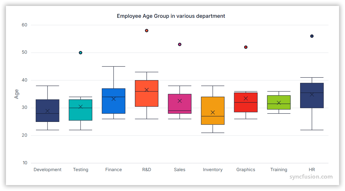
To render a box and whisker series in your chart, you need to follow a few steps to configure it correctly. Here’s a concise guide on how to do this:
-
Set the series type: Define the series type as
BoxAndWhiskerin your chart configuration. This indicates that the data should be represented as a box and whisker chart, which will plot segments to illustrate the statistical distribution of the data. -
Register the BoxAndWhiskerSeriesService provider: Register
BoxAndWhiskerSeriesService(along with any other chart services you need) in the component’sprovidersarray. -
Data requirements: The y field of the Box and Whisker series requires a minimum of five numerical values per data point to calculate the statistical quartiles (minimum, first quartile, median, third quartile, and maximum). Each array of values represents one box plot segment.
import { ChartModule } from '@syncfusion/ej2-angular-charts';
import { CategoryService, BoxAndWhiskerSeriesService, TooltipService } from '@syncfusion/ej2-angular-charts';
import { Component, OnInit } from '@angular/core';
import { data } from './datasource';

@Component({
    imports: [ChartModule],
    providers: [CategoryService, BoxAndWhiskerSeriesService, TooltipService],
    standalone: true,
    selector: 'app-container',
    template: `<ejs-chart id='chart-container' [primaryXAxis]='primaryXAxis' [primaryYAxis]='primaryYAxis' [title]='title' [tooltip]='tooltip'>
            <e-series-collection>
                <e-series [dataSource]='data' type='BoxAndWhisker' xName='x' yName='y' [marker]='marker'> </e-series>
            </e-series-collection>
    </ejs-chart>`
})
export class AppComponent implements OnInit {
    public primaryXAxis?: Object;
    public primaryYAxis?: Object;
    public title?: string;
    public data?: Object[];
    public marker?: Object;
    public tooltip?: Object;
    ngOnInit(): void {
        this.data = data;
        this.primaryXAxis = { valueType: 'Category' };
        this.primaryYAxis = { title: 'Age', maximum: 60 };
        this.title = 'Employee Age Group in Various Departments';
        this.marker = { visible: true };
        this.tooltip = { enable: true };
    }
}
import { bootstrapApplication } from '@angular/platform-browser';
import { AppComponent } from './app.component';
import 'zone.js';
bootstrapApplication(AppComponent).catch((err) => console.error(err));export let data: Object[] = [
{ x: 'Development', y: [22, 22, 23, 25, 25, 25, 26, 27, 27, 28, 28, 29, 30, 32, 34, 32, 34, 36, 35, 38] },
{ x: 'Testing', y: [22, 33, 23, 25, 26, 28, 29, 30, 34, 33, 32, 31, 50] },
{ x: 'Finance', y: [26, 27, 28, 30, 32, 34, 35, 37, 35, 37, 45] },
{ x: 'R&D', y: [26, 27, 29, 32, 34, 35, 36, 37, 38, 39, 41, 43, 58] },
{ x: 'Sales', y: [27, 26, 28, 29, 29, 29, 32, 35, 32, 38, 53] },
{ x: 'Inventory', y: [21, 23, 24, 25, 26, 27, 28, 30, 34, 36, 38] },
{ x: 'Graphics', y: [26, 28, 29, 30, 32, 33, 35, 36, 52] },
{ x: 'Training', y: [28, 29, 30, 31, 32, 34, 35, 36] },
{ x: 'HR', y: [22, 24, 25, 30, 32, 34, 36, 38, 39, 41, 35, 36, 40, 56] },
];Understanding Box Plot components
The box and whisker chart displays several key statistical components:
- Box: Represents the interquartile range (IQR) from the first quartile (Q1) to the third quartile (Q3).
- Median line: Shows the middle value of the dataset (Q2).
- Whiskers: Extend from the box to show the range of data within 1.5 times the IQR.
- Outliers: Individual points that fall outside the whisker range.
Data binding for BoxAndWhisker series
Connect your data to the chart using the dataSource property within the series configuration. This property supports JSON datasets and remote data sources. Map the data fields to the chart series using xName and yName properties to ensure proper data visualization.
import { ChartModule } from '@syncfusion/ej2-angular-charts';
import { CategoryService, BoxAndWhiskerSeriesService, TooltipService } from '@syncfusion/ej2-angular-charts';
import { Component, OnInit } from '@angular/core';
import { data } from './datasource';

@Component({
    imports: [ChartModule],
    providers: [CategoryService, BoxAndWhiskerSeriesService, TooltipService],
    standalone: true,
    selector: 'app-container',
    template: `<ejs-chart id='chart-container' [primaryXAxis]='primaryXAxis' [primaryYAxis]='primaryYAxis' [title]='title' [tooltip]='tooltip'>
            <e-series-collection>
                <e-series [dataSource]='data' type='BoxAndWhisker' xName='x' yName='y' [marker]='marker'> </e-series>
            </e-series-collection>
    </ejs-chart>`
})
export class AppComponent implements OnInit {
    public primaryXAxis?: Object;
    public primaryYAxis?: Object;
    public title?: string;
    public data?: Object[];
    public marker?: Object;
    public tooltip?: Object;
    ngOnInit(): void {
        this.data = data;
        this.primaryXAxis = { valueType: 'Category' };
        this.primaryYAxis = { title: 'Age', maximum: 60 };
        this.title = 'Employee Age Group in Various Departments';
        this.marker = { visible: true };
        this.tooltip = { enable: true };
    }
}
import { bootstrapApplication } from '@angular/platform-browser';
import { AppComponent } from './app.component';
import 'zone.js';
bootstrapApplication(AppComponent).catch((err) => console.error(err));export let data: Object[] = [
{ x: 'Development', y: [22, 22, 23, 25, 25, 25, 26, 27, 27, 28, 28, 29, 30, 32, 34, 32, 34, 36, 35, 38] },
{ x: 'Testing', y: [22, 33, 23, 25, 26, 28, 29, 30, 34, 33, 32, 31, 50] },
{ x: 'Finance', y: [26, 27, 28, 30, 32, 34, 35, 37, 35, 37, 45] },
{ x: 'R&D', y: [26, 27, 29, 32, 34, 35, 36, 37, 38, 39, 41, 43, 58] },
{ x: 'Sales', y: [27, 26, 28, 29, 29, 29, 32, 35, 32, 38, 53] },
{ x: 'Inventory', y: [21, 23, 24, 25, 26, 27, 28, 30, 34, 36, 38] },
{ x: 'Graphics', y: [26, 28, 29, 30, 32, 33, 35, 36, 52] },
{ x: 'Training', y: [28, 29, 30, 31, 32, 34, 35, 36] },
{ x: 'HR', y: [22, 24, 25, 30, 32, 34, 36, 38, 39, 41, 35, 36, 40, 56] },
];Box plot mode
The boxPlotMode property determines how the quartiles are calculated for the box and whisker series. The default value is Normal. The available options are:
- Exclusive: Excludes the median when calculating quartiles.
- Inclusive: Includes the median in quartile calculations.
- Normal: Uses the standard quartile calculation method (default method).
import { ChartModule } from '@syncfusion/ej2-angular-charts';
import { CategoryService, BoxAndWhiskerSeriesService, TooltipService } from '@syncfusion/ej2-angular-charts';
import { Component, OnInit } from '@angular/core';
import { data } from './datasource';

@Component({
    imports: [ChartModule],
    providers: [CategoryService, BoxAndWhiskerSeriesService, TooltipService],
    standalone: true,
    selector: 'app-container',
    template: `<ejs-chart id='chart-container' [primaryXAxis]='primaryXAxis' [primaryYAxis]='primaryYAxis' [title]='title' [tooltip]='tooltip'>
            <e-series-collection>
                <e-series [dataSource]='data' type='BoxAndWhisker' xName='x' yName='y' [marker]='marker' boxPlotMode='Normal'> </e-series>
            </e-series-collection>
    </ejs-chart>`
})
export class AppComponent implements OnInit {
    public primaryXAxis?: Object;
    public primaryYAxis?: Object;
    public title?: string;
    public data?: Object[];
    public marker?: Object;
    public tooltip?: Object;
    ngOnInit(): void {
        this.data = data;
        this.primaryXAxis = { valueType: 'Category' };
        this.primaryYAxis = { title: 'Age', maximum: 60 };
        this.title = 'Employee Age Group in Various Departments';
        this.marker = { visible: true };
        this.tooltip = { enable: true };
    }
}
import { bootstrapApplication } from '@angular/platform-browser';
import { AppComponent } from './app.component';
import 'zone.js';
bootstrapApplication(AppComponent).catch((err) => console.error(err));export let data: Object[] = [
{ x: 'Development', y: [22, 22, 23, 25, 25, 25, 26, 27, 27, 28, 28, 29, 30, 32, 34, 32, 34, 36, 35, 38] },
{ x: 'Testing', y: [22, 33, 23, 25, 26, 28, 29, 30, 34, 33, 32, 31, 50] },
{ x: 'Finance', y: [26, 27, 28, 30, 32, 34, 35, 37, 35, 37, 45] },
{ x: 'R&D', y: [26, 27, 29, 32, 34, 35, 36, 37, 38, 39, 41, 43, 58] },
{ x: 'Sales', y: [27, 26, 28, 29, 29, 29, 32, 35, 32, 38, 53] },
{ x: 'Inventory', y: [21, 23, 24, 25, 26, 27, 28, 30, 34, 36, 38] },
{ x: 'Graphics', y: [26, 28, 29, 30, 32, 33, 35, 36, 52] },
{ x: 'Training', y: [28, 29, 30, 31, 32, 34, 35, 36] },
{ x: 'HR', y: [22, 24, 25, 30, 32, 34, 36, 38, 39, 41, 35, 36, 40, 56] },
];Show mean
The showMean property displays the average value of the dataset as a marker within each box plot. The default value is true. When set to true, the mean appears as a distinct symbol, helping users compare both median and mean values. When set to false, the symbol does not render.
import { ChartModule } from '@syncfusion/ej2-angular-charts';
import { CategoryService, BoxAndWhiskerSeriesService, TooltipService } from '@syncfusion/ej2-angular-charts';
import { Component, OnInit } from '@angular/core';
import { data } from './datasource';
@Component({
    imports: [ChartModule],
    providers: [CategoryService, BoxAndWhiskerSeriesService, TooltipService],
    standalone: true,
    selector: 'app-container',
    template: `<ejs-chart id='chartcontainer' [primaryXAxis]='primaryXAxis' [primaryYAxis]='primaryYAxis' [title]='title' [tooltip]='tooltip'>
            <e-series-collection>
                <e-series [dataSource]='data' type='BoxAndWhisker' xName='x' yName='y' [marker]='marker' [showMean]='showMean'> </e-series>
            </e-series-collection>
    </ejs-chart>`
})
export class AppComponent implements OnInit {
    public primaryXAxis?: Object;
    public primaryYAxis?: Object;
    public title?: string;
    public data?: Object[];
    public marker?: Object;
    public showMean: boolean = false;
    public tooltip?: Object;
    ngOnInit(): void {
        this.data = data;
        this.primaryXAxis = { valueType: 'Category' };
        this.primaryYAxis = { title: 'Age', maximum: 60 };
        this.marker = { visible: true };
        this.title = 'Employee Age Group in Various Departments';
        this.tooltip = { enable: true };
    }
}
import { bootstrapApplication } from '@angular/platform-browser';
import { AppComponent } from './app.component';
import 'zone.js';
bootstrapApplication(AppComponent).catch((err) => console.error(err));export let data: Object[] = [
{ x: 'Development', y: [22, 22, 23, 25, 25, 25, 26, 27, 27, 28, 28, 29, 30, 32, 34, 32, 34, 36, 35, 38] },
{ x: 'Testing', y: [22, 33, 23, 25, 26, 28, 29, 30, 34, 33, 32, 31, 50] },
{ x: 'Finance', y: [26, 27, 28, 30, 32, 34, 35, 37, 35, 37, 45] },
{ x: 'R&D', y: [26, 27, 29, 32, 34, 35, 36, 37, 38, 39, 41, 43, 58] },
{ x: 'Sales', y: [27, 26, 28, 29, 29, 29, 32, 35, 32, 38, 53] },
{ x: 'Inventory', y: [21, 23, 24, 25, 26, 27, 28, 30, 34, 36, 38] },
{ x: 'Graphics', y: [26, 28, 29, 30, 32, 33, 35, 36, 52] },
{ x: 'Training', y: [28, 29, 30, 31, 32, 34, 35, 36] },
{ x: 'HR', y: [22, 24, 25, 30, 32, 34, 36, 38, 39, 41, 35, 36, 40, 56] },
];Series customization
Customize the appearance of box and whisker series using various styling properties to match your application’s design requirements.
Fill
The fill property determines the color applied to the series. Default value is null.
import { ChartModule } from '@syncfusion/ej2-angular-charts';
import { CategoryService, BoxAndWhiskerSeriesService, TooltipService } from '@syncfusion/ej2-angular-charts';
import { Component, OnInit } from '@angular/core';
import { data } from './datasource';

@Component({
    imports: [ChartModule],
    providers: [CategoryService, BoxAndWhiskerSeriesService, TooltipService],
    standalone: true,
    selector: 'app-container',
    template: `<ejs-chart id='chart-container' [primaryXAxis]='primaryXAxis' [primaryYAxis]='primaryYAxis' [title]='title' [tooltip]='tooltip'>
            <e-series-collection>
                <e-series [dataSource]='data' type='BoxAndWhisker' xName='x' yName='y' fill='#1E90FF' [marker]='marker'> </e-series>
            </e-series-collection>
    </ejs-chart>`
})
export class AppComponent implements OnInit {
    public primaryXAxis?: Object;
    public primaryYAxis?: Object;
    public title?: string;
    public data?: Object[];
    public marker?: Object;
    public tooltip?: Object;
    ngOnInit(): void {
        this.data = data;
        this.primaryXAxis = { valueType: 'Category' };
        this.primaryYAxis = { title: 'Age', maximum: 60 };
        this.title = 'Employee Age Group in Various Departments';
        this.marker = { visible: true };
        this.tooltip = { enable: true };
    }
}
import { bootstrapApplication } from '@angular/platform-browser';
import { AppComponent } from './app.component';
import 'zone.js';
bootstrapApplication(AppComponent).catch((err) => console.error(err));export let data: Object[] = [
{ x: 'Development', y: [22, 22, 23, 25, 25, 25, 26, 27, 27, 28, 28, 29, 30, 32, 34, 32, 34, 36, 35, 38] },
{ x: 'Testing', y: [22, 33, 23, 25, 26, 28, 29, 30, 34, 33, 32, 31, 50] },
{ x: 'Finance', y: [26, 27, 28, 30, 32, 34, 35, 37, 35, 37, 45] },
{ x: 'R&D', y: [26, 27, 29, 32, 34, 35, 36, 37, 38, 39, 41, 43, 58] },
{ x: 'Sales', y: [27, 26, 28, 29, 29, 29, 32, 35, 32, 38, 53] },
{ x: 'Inventory', y: [21, 23, 24, 25, 26, 27, 28, 30, 34, 36, 38] },
{ x: 'Graphics', y: [26, 28, 29, 30, 32, 33, 35, 36, 52] },
{ x: 'Training', y: [28, 29, 30, 31, 32, 34, 35, 36] },
{ x: 'HR', y: [22, 24, 25, 30, 32, 34, 36, 38, 39, 41, 35, 36, 40, 56] },
];Gradient Fill
The fill property can apply an SVG gradient to a Box and Whisker series. Define the gradient within an SVG <defs> element using a unique ID, and assign it to the series in the url(#gradientId) format. Place the following SVG element in your application’s index.html file, inside the <body> element and outside the <app-container> element.
<svg>
    <defs>
        <linearGradient id="gradient">
            <stop offset="0%" style="stop-color:blue;stop-opacity:5" />
            <stop offset="50%" style="stop-color:violet;stop-opacity:5" />
        </linearGradient>
    </defs>
</svg>import { ChartModule } from '@syncfusion/ej2-angular-charts';
import { CategoryService, BoxAndWhiskerSeriesService, TooltipService } from '@syncfusion/ej2-angular-charts';
import { Component, OnInit } from '@angular/core';
import { data } from './datasource';
@Component({
imports: [ChartModule],
providers: [CategoryService, BoxAndWhiskerSeriesService, TooltipService],
standalone: true,
selector: 'app-container',
template: `<ejs-chart id='chart-container' [primaryXAxis]='primaryXAxis' [primaryYAxis]='primaryYAxis' [title]='title' [tooltip]='tooltip'>
<e-series-collection>
<e-series [dataSource]='data' type='BoxAndWhisker' xName='x' yName='y' fill='url(#gradient)' [marker]='marker'> </e-series>
</e-series-collection>
</ejs-chart>`
})
export class AppComponent implements OnInit {
public primaryXAxis?: Object;
public primaryYAxis?: Object;
public title?: string;
public data?: Object[];
public marker?: Object;
public tooltip?: Object;
ngOnInit(): void {
this.data = data;
this.primaryXAxis = { valueType: 'Category' };
this.primaryYAxis = { title: 'Age', maximum: 60 };
this.title = 'Employee Age Group in Various Departments';
this.marker = { visible: true };
this.tooltip = { enable: true };
}
}import { bootstrapApplication } from '@angular/platform-browser';
import { AppComponent } from './app.component';
import 'zone.js';
bootstrapApplication(AppComponent).catch((err) => console.error(err));export let data: Object[] = [
{ x: 'Development', y: [22, 22, 23, 25, 25, 25, 26, 27, 27, 28, 28, 29, 30, 32, 34, 32, 34, 36, 35, 38] },
{ x: 'Testing', y: [22, 33, 23, 25, 26, 28, 29, 30, 34, 33, 32, 31, 50] },
{ x: 'Finance', y: [26, 27, 28, 30, 32, 34, 35, 37, 35, 37, 45] },
{ x: 'R&D', y: [26, 27, 29, 32, 34, 35, 36, 37, 38, 39, 41, 43, 58] },
{ x: 'Sales', y: [27, 26, 28, 29, 29, 29, 32, 35, 32, 38, 53] },
{ x: 'Inventory', y: [21, 23, 24, 25, 26, 27, 28, 30, 34, 36, 38] },
{ x: 'Graphics', y: [26, 28, 29, 30, 32, 33, 35, 36, 52] },
{ x: 'Training', y: [28, 29, 30, 31, 32, 34, 35, 36] },
{ x: 'HR', y: [22, 24, 25, 30, 32, 34, 36, 38, 39, 41, 35, 36, 40, 56] },
];Opacity
Control the transparency level of the box and whisker fill using the opacity property. Valid range is 0 (completely transparent) to 1 (completely opaque). Default value is 1.
import { ChartModule } from '@syncfusion/ej2-angular-charts';
import { CategoryService, BoxAndWhiskerSeriesService, TooltipService } from '@syncfusion/ej2-angular-charts';
import { Component, OnInit } from '@angular/core';
import { data } from './datasource';

@Component({
    imports: [ChartModule],
    providers: [CategoryService, BoxAndWhiskerSeriesService, TooltipService],
    standalone: true,
    selector: 'app-container',
    template: `<ejs-chart id='chart-container' [primaryXAxis]='primaryXAxis' [primaryYAxis]='primaryYAxis' [title]='title' [tooltip]='tooltip'>
            <e-series-collection>
                <e-series [dataSource]='data' type='BoxAndWhisker' xName='x' yName='y' opacity='0.5' [marker]='marker'> </e-series>
            </e-series-collection>
    </ejs-chart>`
})
export class AppComponent implements OnInit {
    public primaryXAxis?: Object;
    public primaryYAxis?: Object;
    public title?: string;
    public data?: Object[];
    public marker?: Object;
    public tooltip?: Object;
    ngOnInit(): void {
        this.data = data;
        this.primaryXAxis = { valueType: 'Category' };
        this.primaryYAxis = { title: 'Age', maximum: 60 };
        this.title = 'Employee Age Group in Various Departments';
        this.marker = { visible: true };
        this.tooltip = { enable: true };
    }
}
import { bootstrapApplication } from '@angular/platform-browser';
import { AppComponent } from './app.component';
import 'zone.js';
bootstrapApplication(AppComponent).catch((err) => console.error(err));export let data: Object[] = [
{ x: 'Development', y: [22, 22, 23, 25, 25, 25, 26, 27, 27, 28, 28, 29, 30, 32, 34, 32, 34, 36, 35, 38] },
{ x: 'Testing', y: [22, 33, 23, 25, 26, 28, 29, 30, 34, 33, 32, 31, 50] },
{ x: 'Finance', y: [26, 27, 28, 30, 32, 34, 35, 37, 35, 37, 45] },
{ x: 'R&D', y: [26, 27, 29, 32, 34, 35, 36, 37, 38, 39, 41, 43, 58] },
{ x: 'Sales', y: [27, 26, 28, 29, 29, 29, 32, 35, 32, 38, 53] },
{ x: 'Inventory', y: [21, 23, 24, 25, 26, 27, 28, 30, 34, 36, 38] },
{ x: 'Graphics', y: [26, 28, 29, 30, 32, 33, 35, 36, 52] },
{ x: 'Training', y: [28, 29, 30, 31, 32, 34, 35, 36] },
{ x: 'HR', y: [22, 24, 25, 30, 32, 34, 36, 38, 39, 41, 35, 36, 40, 56] },
];Series Border
Customize the box and whisker series border using the border property to adjust width, color, and dash pattern. The border object supports these fields:
-
width- Border thickness in pixels. -
color- Border stroke color. -
dashArray- Dash pattern for the border (for example'5','5,5', or'2,3,4').
Example: { width: 2, color: 'green', dashArray: '2,5' }.
import { ChartModule } from '@syncfusion/ej2-angular-charts';
import { CategoryService, BoxAndWhiskerSeriesService, TooltipService } from '@syncfusion/ej2-angular-charts';
import { Component, OnInit } from '@angular/core';
import { data } from './datasource';

@Component({
    imports: [ChartModule],
    providers: [CategoryService, BoxAndWhiskerSeriesService, TooltipService],
    standalone: true,
    selector: 'app-container',
    template: `<ejs-chart id='chart-container' [primaryXAxis]='primaryXAxis' [primaryYAxis]='primaryYAxis' [title]='title' [tooltip]='tooltip'>
            <e-series-collection>
                <e-series [dataSource]='data' type='BoxAndWhisker' xName='x' yName='y' [border]='border' [marker]='marker'> </e-series>
            </e-series-collection>
    </ejs-chart>`
})
export class AppComponent implements OnInit {
    public primaryXAxis?: Object;
    public primaryYAxis?: Object;
    public title?: string;
    public data?: Object[];
    public marker?: Object;
    public border?: Object;
    public tooltip?: Object;
    ngOnInit(): void {
        this.data = data;
        this.primaryXAxis = { valueType: 'Category' };
        this.primaryYAxis = { title: 'Age', maximum: 60 };
        this.title = 'Employee Age Group in Various Departments';
        this.border = { width: 2, color: 'green', dashArray: '2,5' };
        this.marker = { visible: true };
        this.tooltip = { enable: true };
    }
}
import { bootstrapApplication } from '@angular/platform-browser';
import { AppComponent } from './app.component';
import 'zone.js';
bootstrapApplication(AppComponent).catch((err) => console.error(err));export let data: Object[] = [
{ x: 'Development', y: [22, 22, 23, 25, 25, 25, 26, 27, 27, 28, 28, 29, 30, 32, 34, 32, 34, 36, 35, 38] },
{ x: 'Testing', y: [22, 33, 23, 25, 26, 28, 29, 30, 34, 33, 32, 31, 50] },
{ x: 'Finance', y: [26, 27, 28, 30, 32, 34, 35, 37, 35, 37, 45] },
{ x: 'R&D', y: [26, 27, 29, 32, 34, 35, 36, 37, 38, 39, 41, 43, 58] },
{ x: 'Sales', y: [27, 26, 28, 29, 29, 29, 32, 35, 32, 38, 53] },
{ x: 'Inventory', y: [21, 23, 24, 25, 26, 27, 28, 30, 34, 36, 38] },
{ x: 'Graphics', y: [26, 28, 29, 30, 32, 33, 35, 36, 52] },
{ x: 'Training', y: [28, 29, 30, 31, 32, 34, 35, 36] },
{ x: 'HR', y: [22, 24, 25, 30, 32, 34, 36, 38, 39, 41, 35, 36, 40, 56] },
];Events
Series render
The seriesRender event allows customization of series properties, such as data, fill, and name, before rendering on the chart. The included handler assigns args.fill = '#ff6347', applying a tomato color to the series before render.
import { ChartModule } from '@syncfusion/ej2-angular-charts';
import { CategoryService, BoxAndWhiskerSeriesService, TooltipService } from '@syncfusion/ej2-angular-charts';
import { ISeriesRenderEventArgs } from '@syncfusion/ej2-charts';
import { Component, OnInit } from '@angular/core';
import { data } from './datasource';

@Component({
    imports: [ChartModule],
    providers: [CategoryService, BoxAndWhiskerSeriesService, TooltipService],
    standalone: true,
    selector: 'app-container',
    template: ` <ejs-chart id='chart-container' (seriesRender)='seriesRender($event)' [primaryXAxis]='primaryXAxis' [primaryYAxis]='primaryYAxis' [title]='title' [tooltip]='tooltip'>
            <e-series-collection>
                <e-series [dataSource]='data' type='BoxAndWhisker' xName='x' yName='y' [marker]='marker'> </e-series>
            </e-series-collection>
    </ejs-chart>`
})
export class AppComponent implements OnInit {
    public primaryXAxis?: Object;
    public primaryYAxis?: Object;
    public title?: string;
    public data?: Object[];
    public marker?: Object;
    public tooltip?: Object;
    ngOnInit(): void {
        this.data = data;
        this.primaryXAxis = { valueType: 'Category' };
        this.primaryYAxis = { title: 'Age', maximum: 60 };
        this.title = 'Employee Age Group in Various Departments';
        this.marker = { visible: true };
        this.tooltip = { enable: true };
    }
    public seriesRender(args: ISeriesRenderEventArgs) {
        args.fill = '#ff6347';
    };
}
import { bootstrapApplication } from '@angular/platform-browser';
import { AppComponent } from './app.component';
import 'zone.js';
bootstrapApplication(AppComponent).catch((err) => console.error(err));export let data: Object[] = [
{ x: 'Development', y: [22, 22, 23, 25, 25, 25, 26, 27, 27, 28, 28, 29, 30, 32, 34, 32, 34, 36, 35, 38] },
{ x: 'Testing', y: [22, 33, 23, 25, 26, 28, 29, 30, 34, 33, 32, 31, 50] },
{ x: 'Finance', y: [26, 27, 28, 30, 32, 34, 35, 37, 35, 37, 45] },
{ x: 'R&D', y: [26, 27, 29, 32, 34, 35, 36, 37, 38, 39, 41, 43, 58] },
{ x: 'Sales', y: [27, 26, 28, 29, 29, 29, 32, 35, 32, 38, 53] },
{ x: 'Inventory', y: [21, 23, 24, 25, 26, 27, 28, 30, 34, 36, 38] },
{ x: 'Graphics', y: [26, 28, 29, 30, 32, 33, 35, 36, 52] },
{ x: 'Training', y: [28, 29, 30, 31, 32, 34, 35, 36] },
{ x: 'HR', y: [22, 24, 25, 30, 32, 34, 36, 38, 39, 41, 35, 36, 40, 56] },
];Point render
The pointRender event allows customization of each data point before rendering on the chart. The included handler inspects args.point.maximum and assigns args.fill = '#ff6347' for low maximums, else '#009cb8'.
import { ChartModule } from '@syncfusion/ej2-angular-charts';
import { CategoryService, BoxAndWhiskerSeriesService, TooltipService } from '@syncfusion/ej2-angular-charts';
import { IPointRenderEventArgs } from '@syncfusion/ej2-charts';
import { Component, OnInit } from '@angular/core';
import { data } from './datasource';

@Component({
    imports: [ChartModule],
    providers: [CategoryService, BoxAndWhiskerSeriesService, TooltipService],
    standalone: true,
    selector: 'app-container',
    template: `<ejs-chart id='chart-container' (pointRender)='pointRender($event)' [primaryXAxis]='primaryXAxis' [primaryYAxis]='primaryYAxis' [title]='title' [tooltip]='tooltip'>
            <e-series-collection>
                <e-series [dataSource]='data' type='BoxAndWhisker' xName='x' yName='y' [marker]='marker'> </e-series>
            </e-series-collection>
    </ejs-chart>`
})
export class AppComponent implements OnInit {
    public primaryXAxis?: Object;
    public primaryYAxis?: Object;
    public title?: string;
    public data?: Object[];
    public marker?: Object;
    public tooltip?: Object;
    ngOnInit(): void {
        this.data = data;
        this.primaryXAxis = { valueType: 'Category' };
        this.primaryYAxis = { title: 'Age', maximum: 60 };
        this.title = 'Employee Age Group in Various Departments';
        this.marker = { visible: true };
        this.tooltip = { enable: true };
    }
    public pointRender(args: IPointRenderEventArgs) {
        if (args.point.maximum < 38) {
            args.fill = '#ff6347';
        } else {
            args.fill = '#009cb8';
        }
    };
}
import { bootstrapApplication } from '@angular/platform-browser';
import { AppComponent } from './app.component';
import 'zone.js';
bootstrapApplication(AppComponent).catch((err) => console.error(err));export let data: Object[] = [
{ x: 'Development', y: [22, 22, 23, 25, 25, 25, 26, 27, 27, 28, 28, 29, 30, 32, 34, 32, 34, 36, 35, 38] },
{ x: 'Testing', y: [22, 33, 23, 25, 26, 28, 29, 30, 34, 33, 32, 31, 50] },
{ x: 'Finance', y: [26, 27, 28, 30, 32, 34, 35, 37, 35, 37, 45] },
{ x: 'R&D', y: [26, 27, 29, 32, 34, 35, 36, 37, 38, 39, 41, 43, 58] },
{ x: 'Sales', y: [27, 26, 28, 29, 29, 29, 32, 35, 32, 38, 53] },
{ x: 'Inventory', y: [21, 23, 24, 25, 26, 27, 28, 30, 34, 36, 38] },
{ x: 'Graphics', y: [26, 28, 29, 30, 32, 33, 35, 36, 52] },
{ x: 'Training', y: [28, 29, 30, 31, 32, 34, 35, 36] },
{ x: 'HR', y: [22, 24, 25, 30, 32, 34, 36, 38, 39, 41, 35, 36, 40, 56] },
];Troubleshooting
- Ensure
BoxAndWhiskerSeriesServiceis registered in the providers; otherwise the box and whisker series will not render. -
Quartile calculation differs from expectation: the
boxPlotModedefaults toExclusive. Switch toInclusiveorNormalto match your expected quartile formula. -
Gradient fill renders as solid color: the SVG gradient referenced by
fill='url(#gradient)'is not defined. Add a matching<linearGradient>(or<radialGradient>) inside a<defs>block in the chart template, or in a global stylesheet.