Tab
20 Aug 20187 minutes to read
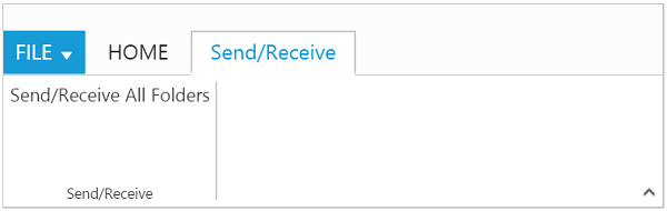
Tab is a collection of control groups which enables you to organize related commands into single view. Tabs can be added to Ribbon using tabs property. id & text properties are used to set unique ID and header text to Tab. The manipulation of given text tab in the ribbon control can be done by using addTab, removeTab, hideTab,
showTab methods and tabAdd, tabCreate, tabRemove, tabClick and tabSelect events.
<template>
    <div>
        <ej-ribbon id="Default" e-width="100%" e-expand-pin-settings.bind="ExpandPinSettings" e-collapse-pin-settings.bind="CollapsePinSettings" e-application-tab.bind="ApplicationTab" e-tabs.bind="Tabs" e-on-create.trigger="createControl()">
        </ej-ribbon>
    </div>
    <div class="content-container-fluid">
        <div class="row">
            <div class="cols-sample-area">
                <div>
                    <div id="defaultRibbon"></div>
                </div>
                <div id="sendReceive">
                    Send/Receive All Folders
                </div>
                <ul id="RibbonMenu">
                    <li>
                        <a>FILE</a>
                        <ul>
                            <li><a>Open</a></li>
                        </ul>
                    </li>
                </ul>
            </div>
        </div>
</template>export class Default {
constructor() {
this.ApplicationTab = { type: ej.Ribbon.ApplicationTabType.Menu, menuItemID: 'RibbonMenu', menuSettings: { openOnClick: false } };
this.Tabs = [{
id: "home",
text: "HOME",
groups: [{
text: "Save",
content: [{
groups: [{
text: "Save",
isBig: true,
buttonSettings: {
prefixIcon: "e-icon e-save",
contentType: ej.ContentType.ImageOnly
}
}]
}]
}, {
text: "Print",
content: [{
groups: [{
text: "Print",
isBig: true,
type: ej.Ribbon.type.toggleButton,
toggleButtonSettings: {
contentType: ej.ContentType.ImageOnly,
defaultText: "Print",
activeText: "Print",
defaultPrefixIcon: "e-icon e-print",
activePrefixIcon: "e-icon e-print",
}
}]
}]
}]
},
{
id: "sendRec",
text: "Send/Receive",
groups: [{
text: "Send/Receive",
type: "custom",
contentID: "sendReceive"
}]
}];
}
}