Gallery
27 Feb 201724 minutes to read
Galleries are used to display items that can be arranged in a grid-type layout. Items in the gallery can be customized as button/menu to display images, text, or both images and text. You can set type of group as gallery.
Gallery Items
Gallery items are collection of the items to be included in the main gallery. You can set text and toolTip to gallery item which can also be customized with buttonSettings.
Number of columns to display in gallery for each row should be specified and the Number of columns in Expanded State (expandedColumns) can be customized, if not set, columns count will be set as default.
NOTE
The
itemHeightanditemWidthfor gallery item can be set, if not set default values will be used.
<template>
    <div>
        <ej-ribbon id="default" e-width="100%" e-application-tab.bind="ApplicationTab" e-tabs.bind="Tabs">
        </ej-ribbon>
    </div>
    <div class="content-container-fluid">
        <div class="row">
            <div class="cols-sample-area">
                <div>
                    <div id="defaultRibbon"></div>
                </div>
                <ul id="ribbonmenu">
                    <li>
                        <a>FILE</a>
                        <ul>
                            <li><a>New</a></li>
                            <li><a>Open</a></li>
                        </ul>
                    </li>
                </ul>
                <style type="text/css">
                    .e-gallerycontent1 {
                        background-position: 0 -105px;
                    }
                    .e-gallerycontent2 {
                        background-position: -69px -105px;
                    }

                    .e-gallerycontent3 {
                        background-position: -136px -105px;
                    }
                    .e-gallerycontent4 {
                        background-position: 0 -53px;
                    }

                    .e-gbtnposition {
                        margin-top: 5px;
                    }
                    .e-gbtnimg {
                        background-image: url("images/ribbon/homegallery.png");
                        background-repeat: no-repeat;
                        height: 64px;
                        width: 64px;
                    }
                </style>
</template>export class default {
constructor() {
this.ApplicationTab = { type: ej.Ribbon.ApplicationTabType.Menu, menuItemID: 'ribbonmenu', menuSettings: { openOnClick: false } };
this.Tabs = [{
id: "home",
text: "HOME",
groups: [{
type: "gallery",
text: "Gallery",
content: [{
groups: [{
id: "Gallery",
columns: 2,
itemHeight: 54,
itemWidth: 73,
expandedColumns: 3,
type: ej.Ribbon.type.gallery,
galleryItems: [{
text: "GalleryContent1",
toolTip: "GalleryContent1",
buttonSettings: {
contentType: ej.ContentType.ImageOnly,
prefixIcon: "e-gallerycontent1 e-icon e-gbtnimg",
cssClass: "e-gbtnposition"
}
}, {
text: "GalleryContent2",
toolTip: "GalleryContent2",
buttonSettings: {
contentType: ej.ContentType.ImageOnly,
prefixIcon: "e-gallerycontent2 e-icon e-gbtnimg",
cssClass: "e-gbtnposition"
}
}, {
text: "GalleryContent3",
toolTip: "GalleryContent3",
buttonSettings: {
contentType: ej.ContentType.ImageOnly,
prefixIcon: "e-gallerycontent3 e-icon e-gbtnimg",
cssClass: "e-gbtnposition"
}
}, {
text: "GalleryContent4",
toolTip: "GalleryContent4",
buttonSettings: {
contentType: ej.ContentType.ImageOnly,
prefixIcon: "e-gallerycontent4 e-icon e-gbtnimg",
cssClass: "e-gbtnposition"
}
}]
}]
}]
}]
}];
}
}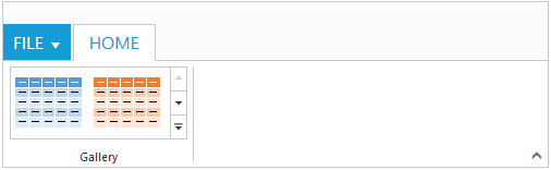
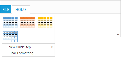
Ribbon Gallery.
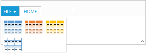
Gallery at Expanded State
Custom Gallery Items
Custom gallery items are the additional items to be displayed at gallery expanded state. You can set customItemType as button or menu, Default is button.
You can also set text and toolTip to custom gallery item which can also be customized with buttonSettings/menuSettings based on the customItemType specified.
<template>
    <div>
        <ej-ribbon id="Customtooltip" e-width="100%" e-application-tab.bind="ApplicationTab" e-tabs.bind="Tabs">
        </ej-ribbon>
    </div>
    <div class="content-container-fluid">
        <div class="row">
            <div class="cols-sample-area">
                <div>
                    <div id="defaultRibbon"></div>
                </div>
                <ul id="ribbonmenu">
                    <li>
                        <a>FILE</a>
                        <ul>
                            <li><a>New</a></li>
                            <li><a>Open</a></li>
                        </ul>
                    </li>
                </ul>
                <ul id="custommenu">
                    <li>
                        <a>New Quick Step</a>
                        <ul>
                            <li><a>Flag and Move</a></li>
                        </ul>
                    </li>
                </ul>
                <style type="text/css">
                    .e-gallerycontent1 {
                        background-position: 0 -105px;
                    }
                    .e-gallerycontent2 {
                        background-position: -69px -105px;
                    }
                    .e-gallerycontent3 {
                        background-position: -136px -105px;
                    }

                    .e-gallerycontent4 {
                        background-position: 0 -53px;
                    }

                    .e-gbtnposition {
                        margin-top: 5px;
                    }
                    .e-gbtnimg {
                        background-image: url("images/ribbon/homegallery.png");
                        background-repeat: no-repeat;
                        height: 64px;
                        width: 64px;
                    }
                </style>
</template>export class CustomToolTip {
constructor() {
this.ApplicationTab = { type: ej.Ribbon.ApplicationTabType.Menu, menuItemID: 'ribbonmenu', menuSettings: { openOnClick: false } };
this.Tabs = [{
id: "home",
text: "HOME",
groups: [{
type: "gallery",
text: "Gallery",
content: [{
groups: [{
id: "Gallery",
columns: 2,
itemHeight: 54,
itemWidth: 73,
expandedColumns: 3,
type: ej.Ribbon.type.gallery,
galleryItems: [{
text: "GalleryContent1",
toolTip: "GalleryContent1",
buttonSettings: {
contentType: ej.ContentType.ImageOnly,
prefixIcon: "e-gallerycontent1 e-icon e-gbtnimg",
cssClass: "e-gbtnposition"
}
}, {
text: "GalleryContent2",
toolTip: "GalleryContent2",
buttonSettings: {
contentType: ej.ContentType.ImageOnly,
prefixIcon: "e-gallerycontent2 e-icon e-gbtnimg",
cssClass: "e-gbtnposition"
}
}, {
text: "GalleryContent3",
toolTip: "GalleryContent3",
buttonSettings: {
contentType: ej.ContentType.ImageOnly,
prefixIcon: "e-gallerycontent3 e-icon e-gbtnimg",
cssClass: "e-gbtnposition"
}
}, {
text: "GalleryContent4",
toolTip: "GalleryContent4",
buttonSettings: {
contentType: ej.ContentType.ImageOnly,
prefixIcon: "e-gallerycontent4 e-icon e-gbtnimg",
cssClass: "e-gbtnposition"
}
}],
customGalleryItems: [{
customItemType: ej.Ribbon.customItemType.menu,
menuId: "custommenu",
menuSettings: {
openOnClick: false
}
}, {
text: "Clear Formatting",
toolTip: "Clear Formatting",
customItemType: ej.Ribbon.customItemType.button,
buttonSettings: {
cssClass: "e-extrabtnstyle"
}
}]
}]
}]
}]
}];
}
}