Controls Support
27 Feb 201724 minutes to read
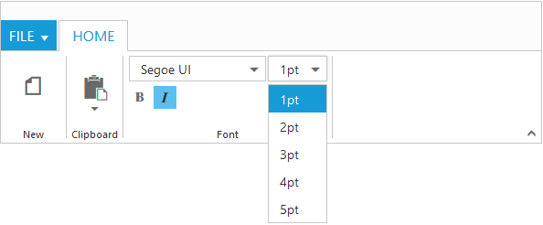
Button, Split Button, DropdownList, Toggle button, Gallery and Custom controls can be added to each groups. You can set type property in group to define the controls. Default type is button.
<template>
    <div>
        <ej-ribbon id="default" e-width="100%" e-application-tab.bind="ApplicationTab" e-tabs.bind="Tabs">
        </ej-ribbon>
    </div>
    <div class="content-container-fluid">
        <div class="row">
            <div class="cols-sample-area">
                <div>
                    <div id="defaultRibbon"></div>
                </div>
                <ul id="ribbonmenu">
                    <li>
                        <a>FILE</a>
                        <ul>
                            <li><a>New</a></li>
                            <li><a>Open</a></li>
                        </ul>
                    </li>
                </ul>
                <ul id="pasteSplit">
                    <li><a>Paste</a></li>
                </ul>
            </div>
        </div>
</template>export class default {
constructor() {
let fontfamily = ['Segoe UI', 'Arial', 'Times New Roman', 'Tahoma', 'Helvetica'];
let fontsize = ['1pt', '2pt', '3pt', '4pt', '5pt'];
this.ApplicationTab = { type: ej.Ribbon.ApplicationTabType.Menu, menuItemID: 'ribbonmenu', menuSettings: { openOnClick: false } };
this.Tabs = [ {
id: "home",
text: "HOME",
groups: [
{
text: "New",
alignType: ej.Ribbon.alignType.rows,
content: [
{
groups: [
{
id: "new",
text: "New",
toolTip: "New",
buttonSettings: {
contentType: ej.ContentType.ImageOnly,
imagePosition: ej.ImagePosition.ImageTop,
prefixIcon: "e-ribbon e-icon e-new"
}
}
],
defaults: {
type: ej.Ribbon.type.button,
width: 60,
height: 70
}
}
]
},
{
text: "Clipboard",
alignType: ej.Ribbon.alignType.columns,
content: [
{
groups: [
{
id: "paste",
text: "paste",
toolTip: "Paste",
splitButtonSettings: {
contentType: ej.ContentType.ImageOnly,
prefixIcon: "e-ribbon e-icon e-ribbonpaste",
targetID: "pasteSplit",
buttonMode: "dropdown",
arrowPosition: ej.ArrowPosition.Bottom
}
}
],
defaults: {
type: ej.Ribbon.type.splitButton,
width: 50,
height: 70
}
}
]
},
{
text: "Font",
alignType: "rows",
content: [
{
groups: [
{
id: "fontfamily",
toolTip: "Font",
dropdownSettings: {
dataSource: fontfamily,
text: "Segoe UI",
width: 150
}
},
{
id: "fontsize",
toolTip: "FontSize",
dropdownSettings: {
dataSource: fontsize,
text: "1pt",
width: 65
}
}
],
defaults: {
type: ej.Ribbon.type.dropDownList,
height: 28
}
}, {
groups: [
{
id: "bold",
toolTip: "Bold",
type: ej.Ribbon.type.toggleButton,
toggleButtonSettings: {
contentType: ej.ContentType.ImageOnly,
defaultText: "Bold",
activeText: "Bold",
defaultPrefixIcon: "e-icon e-ribbon bold",
activePrefixIcon: "e-ribbon e-icon bold"
}
},
{
id: "italic",
toolTip: "Italic",
type: ej.Ribbon.type.toggleButton,
toggleButtonSettings: {
contentType: ej.ContentType.ImageOnly,
defaultText: "Italic",
activeText: "Italic",
defaultPrefixIcon: "e-ribbon e-icon e-ribbonitalic",
activePrefixIcon: "e-ribbon e-icon e-ribbonitalic"
}
}
],
defaults: {
isBig: false,
}
}
]
}
],
}];
}
}
Custom
You can set type as custom to render custom controls and Custom element id has to be specified as contentID.You can change the element defined in the custom template to appropriate Syncfusion control in the event of Ribbon create.
<template>
    <div>
        <ej-ribbon id="default" e-width="100%" e-application-tab.bind="ApplicationTab" e-tabs.bind="Tabs" e-on-create.trigger="createControl()">
        </ej-ribbon>
    </div>
    <div class="content-container-fluid">
        <div class="row">
            <div class="cols-sample-area">
                <div>
                    <div id="defaultRibbon"></div>
                </div>
                <ul id="ribbonmenu">
                    <li>
                        <a>FILE</a>
                        <ul>
                            <li><a>New</a></li>
                            <li><a>Open</a></li>
                        </ul>
                    </li>
                </ul>

                <input id="fontcolor" />
                <table id="design" class="e-designtablestyle">
                    <tr>
                        <td>
                            <input type="checkbox" id="check1" /><label for="check1">Header Row</label>
                        </td>
                        <td>
                            <input type="checkbox" id="Check2" checked="checked" /><label for="Check2">First Column</label>
                        </td>
                    </tr>
                    <tr>
                        <td>
                            <input type="checkbox" id="check4" checked="checked" /><label for="check4">Total Row</label>
                        </td>
                        <td>
                            <input type="checkbox" id="Check5" /><label for="Check5">Last Column</label>
                        </td>
                    </tr>
                </table>
            </div>
        </div>
</template>export class default {
constructor() {
let fontfamily = ['Segoe UI', 'Arial', 'Times New Roman', 'Tahoma', 'Helvetica'];
let fontsize = ['1pt', '2pt', '3pt', '4pt', '5pt'];
this.ApplicationTab = { type: ej.Ribbon.ApplicationTabType.Menu, menuItemID: 'ribbonmenu', menuSettings: { openOnClick: false } };
this.Tabs = [ {
id: "home",
text: "HOME",
groups: [{
text: "Font",
content: [{
groups: [{
id: "fontcolor",
toolTip: "Font Color",
contentID: "fontcolor"
}],
// defaults settings to controls
defaults: {
height: 30,
type: ej.Ribbon.type.custom
}
}]
}, {
text: "Operators",
content: [{
groups: [{
id: "design",
type: ej.Ribbon.type.custom,
contentID: "design"
}]
}]
}]
}];
}
createControl() {
var ribbon = $("#Ribbon").data("ejRibbon");
$("#fontcolor").ejColorPicker({ value: "#FFFF00", modelType: "palette", cssClass: "e-ribbon", toolIcon: "e-fontcoloricon" });
}
}