Rows in ASP.NET MVC TreeGrid
21 Jul 202224 minutes to read
The TreeGrid rows displays the information of each row from the bounded data source.
Row Template
Row template is used to customize the TreeGrid rows based on requirements. In TreeGrid, RowTemplateId and AltRowTemplateId properties are used for customizing the row.
-
RowTemplateId is used to customize all the rows in TreeGrid. For this property, ID of the row template is to be provided.
-
AltRowTemplateId is used to customize the alternative rows in TreeGrid. For this property, ID of the alternative row template is to be provided.
<style>
.border {
    border-color: #BDBDBD;
    border-width: 1px;
    border-style: solid;
}
</style>

<script id="rowTemplateScript" type="text/x-jsrender">
        <tr>
            <td class="border" style='height:99px;'>
                <div>{{:#data['EmployeeID']}}</div>
            </td>
            <td class="border" style='height:99px;'>
                <div style="font-size:14px;">
                   {{:#data['Name']}}
                    <p style="font-size:8px;">{{:#data['Designation']}}</p>
                </div>
            </td>
            <td class="border" style='height:99px;'>
                <div>
                    <div style="position:relative;top:-25px;display:inline-block;">
                        <img src="../Images/treegrid/.png" />
                    </div>
                    <div style="display:inline-block;">
                        <div style="padding:5px;">{{:#data['Address']}}</div>
                        <div style="padding:5px;">{{:#data['Country']}}</div>
                        <div style="padding:5px;font-size:12px;">{{:#data['Contact']}}</div>
                    </div>
                </div>
            </td>
            <td class="border" style='height:99px;'>
                <div>{{:#data['DOB']}}</div>
            </td>

        </tr>
    </script>

<script id="altRowTemplateScript" type="text/x-jsrender">
    <tr>
        <td class="border" style='height:99px;'>
            <div>{{:#data['EmployeeID']}}</div>
        </td>
        <td class="border" style='height:99px;'>
            <div style="font-size:14px;">
                {{:#data['Name']}}
                <p style="font-size:8px;">{{:#data['Designation']}}</p>
            </div>
        </td>
        <td class="border" style='height:99px;'>
            <div>
                <div style="position:relative;top:-25px;display:inline-block;">
                    <img src="../Images/treegrid/.png" />
                </div>
                <div style="display:inline-block;">
                    <div style="padding:5px;">{{:#data['Address']}}</div>
                    <div style="padding:5px;">{{:#data['Country']}}</div>
                    <div style="padding:5px;font-size:12px;">{{:#data['Contact']}}</div>
                </div>
            </div>
        </td>
        <td class="border" style='height:99px;'>
            <div>{{:#data['DOB']}}</div>
        </td>
    </tr>
</script>


@(Html.EJ().TreeGrid("TreeGridContainer")
          .AltRowTemplateId("altRowTemplateScript")
          .RowTemplateId("rowTemplateScript")
          .RowHeight(99)
          .Columns(co =>
              {
                  co.Field("EmployeeID").HeaderText("Employee ID").Add();
                  co.Field("Name").HeaderText("Employee Name").Add();
                  co.Field("Address").HeaderText("Employee Details").Add();
                  co.Field("DOB").HeaderText("DOB").EditType(TreeGridEditingType.Datepicker).Add();
              }
          )
          .SizeSettings(ss => ss.Width("100%").Height("350px"))
          .Datasource(ViewBag.datasource)
        )
@(Html.EJ().ScriptManager())
public ActionResult TreeGridRowTemplate()
{
var data = this.getRowData();
ViewBag.datasource = data;
return View();
}
private List<RowData> getRowData()
{
List<RowData> DataCollection = new List<RowData>();
RowData Record1 = new RowData()
{
Name = "Robert King",
FullName = "Robert King",
Designation = "Chief Executive Officer",
EmployeeID = "EMP001",
Address = "507 - 20th Ave. E.Apt. 2A, Seattle",
Contact = "(206) 555-9857",
Country = "USA",
DOB = "2/15/1963",
DOJ = "5/1/1983",
Children = new List<RowData>()
};
RowData parent = new RowData()
{
Name = "David William",
FullName = "David William",
Designation = "Vice President",
EmployeeID = "EMP004",
Address = "722 Moss Bay Blvd., Kirkland",
Country = "USA",
Contact = "(206) 555-3412",
DOB = "5/20/1971",
DOJ = "1/5/1991",
Children = new List<RowData>()
};
//..
Record1.Children.Add(parent);
//..
return DataCollection;
}
public class RowData
{
public string Name { get; set; }
public string FullName { get; set; }
public string Designation { get; set; }
public string EmployeeID { get; set; }
public string Address { get; set; }
public string Contact { get; set; }
public string DOB { get; set; }
public string DOJ { get; set; }
public string Country { get; set; }
public List<RowData> Children { get; set; }
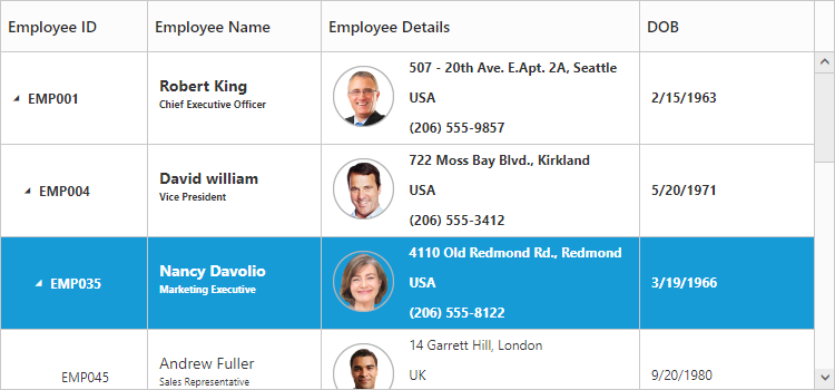
}The output of TreeGrid with Row Template is as follows.
Click here to view online sample for TreeGrid Row Template
NOTE
In TreeGrid, the given row template is parsed for default row functionality like row selection, alt row and other default row customization. Using
ParseRowTemplateproperty we can disable the row template parsing. If we disable that property, TreeGrid is rendered with given row template.
Row Height
The RowHeight property is used to change the height of row in TreeGrid, default value of this property is 30.
The following code example explains how to change the row height in TreeGrid
@(Html.EJ().TreeGrid("TreeGridContainer")
    .RowHeight(50)
     //.
  )
@(Html.EJ().ScriptManager())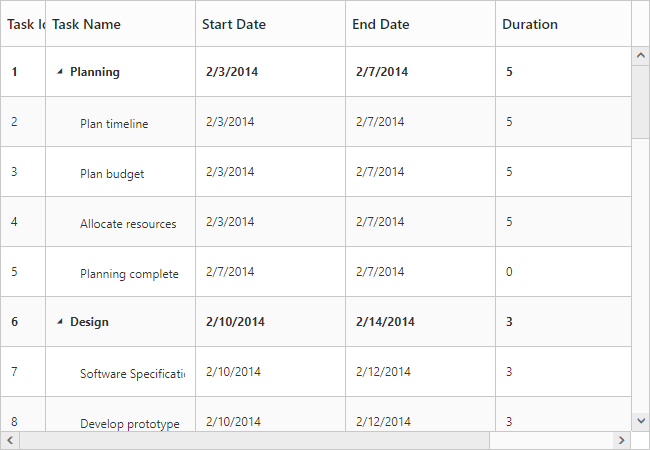
The above screenshot shows TreeGrid render with row height of 50.
Alternate row styling
Alternate row style is used to enable the different background color for every alternate row. The EnableAltRow property is used to enable the alternate row style in TreeGrid, default value of this property is true.
The following code explains about enabling the alternate row style in TreeGrid
@(Html.EJ().TreeGrid("TreeGridContainer")
    .EnableAltRow(true)
     //.
  )
@(Html.EJ().ScriptManager())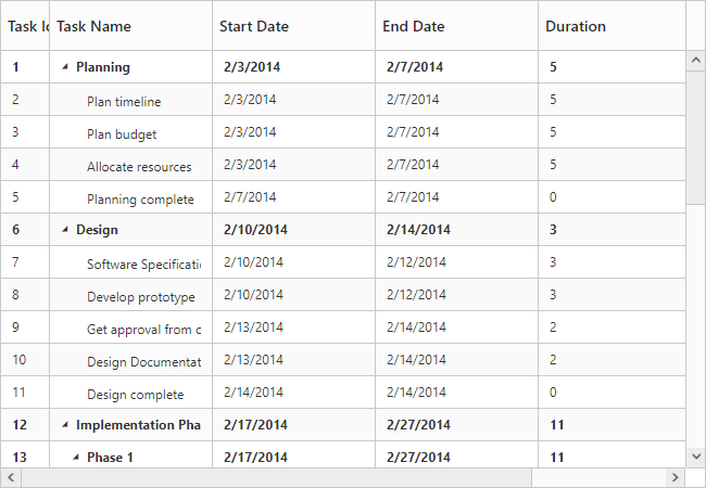
The above screenshot shows TreeGrid with alternate row style.
Row Drag and Drop
It is possible to dynamically re-arrange the rows in the TreeGrid control by using the AllowDragAndDrop property. Using this property row drag option can be enabled or disabled. Rows can be inserted above, below or as a sibling or as a child to the existing row with the help of this feature. A default tooltip is rendered while dragging the TreeGrid row and this tooltip can be customized by the DragTooltip property. This property has inner properties such as ShowTooltip, TooltipItems and TooltipTemplate.
The ShowTooltip property is used to enable or disable the tooltip and the default value of this property is false.
The following code explains about enabling the row drag and drop with the default tooltip in the TreeGrid.
@(Html.EJ().TreeGrid("TreeGridContainer")
.Columns(co =>
{
co.Field("TaskId").headerText("Task Id"). Add();
co.Field("TaskName").headerText("Task Name").Add();
})
.AllowDragAndDrop(true)
.DragTooltip(tooltip =>
{
tooltip.ShowTooltip(true);
}))
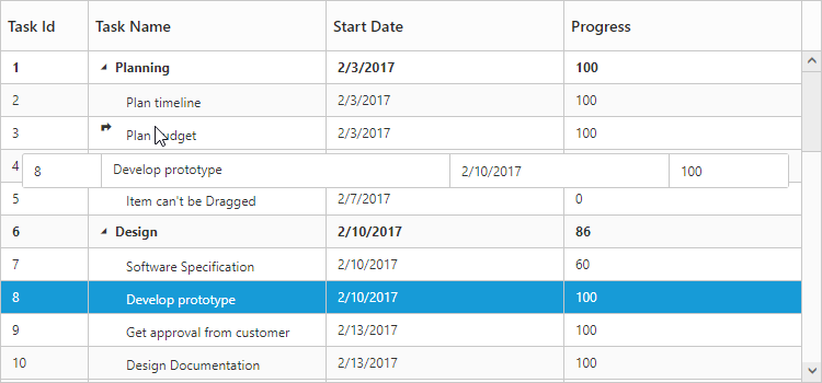
@(Html.EJ().ScriptManager())The following screenshot depicts a row drag and drop in the TreeGrid.
Customizing Drag tooltip
The default drag tooltip in TreeGrid can be customized by using TooltipTemplate property. We can provide JsRender template or HTML formatted string as the value for this property.
The following code shows how to render row drag tooltip with JsRender template.
<script id="customTooltip" type="text/x-jsrender">
	<tr>
		<td style='height:30px'>
			<div>{{:#data['TaskId']}}</div>
		</td>
		<td style='height:30px'>
			<div>{{:#data['TaskName']}}</div>
		</td>
	</tr>
</script>

 @(Html.EJ().TreeGrid("TreeGridContainer")
    //...
    .DragTooltip(tt =>
      {
        tt.ShowTooltip(true);
        tt.TooltipTemplate("#customTooltip");
      })
    )
  @(Html.EJ().ScriptManager())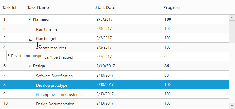
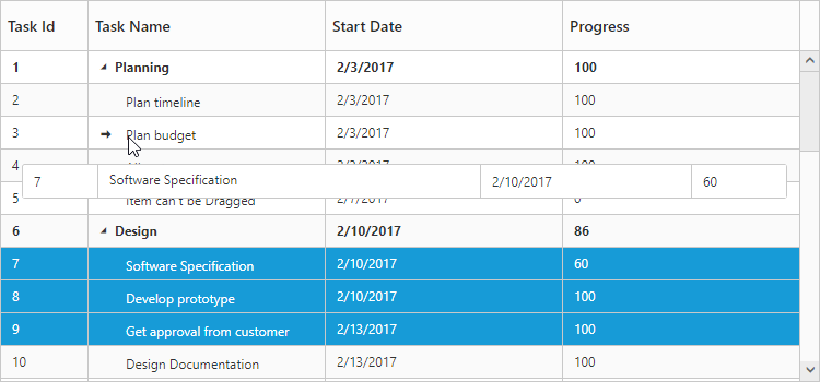
Multiple row drag and drop
TreeGrid provides support for multiple row reordering with mouse drag and drop interaction. The selected rows can be dropped above and below as siblings or as child records similar to single row reordering.
In TreeGrid we can enable the multiple row drag and drop by setting SelectionSettings.SelectionType as Multiple or Checkbox and also we should enable the AllowDragAndDrop.
Please find the code example below to enable multiple drag and drop in TreeGrid.
@(Html.EJ().TreeGrid("TreeGridContainer")
       .AllowDragAndDrop(true)
       .SelectionSettings(ss=>
           ss.SelectionType(TreeGridSelectionType.Multiple))
    )
We can also customize row drag and drop actions by using below properties
-
canDrag – It is used to enable/disable the row drag action for draggedRecords collection in
RowDragStartclient side event. -
canDrop – It is used to enable/disable the row drop action for draggedRecords collection in
RowDropActionBeginclient side event.
Click here to view the demo sample for multiple drag and drop action.
Details row
Details row is used to provide a additional information about each row of TreeGrid. You can specify the detail row JsRender template id or HTML element as string to DetailsTemplate property. However you need to enable the details template by setting ShowDetailsRow property as true.
The following code example shows how to enable details tow in TreeGrid.
<script id="descriptionTemplate" type="text/x-jsrender">
        <div style="position: relative; display: inline-block; float: left; font-weight: bold; width: 10%">
            <img src="../images/treegrid/{{:Name}}.png" style="margin-left: 10px;margin-top:15px;" />
        </div>
        <div style="padding-left: 10px; display: inline-block; width: 88%; text-wrap: normal;font-size:12px;font-family:'Segoe UI';margin-top:2px;">
            <div class="e-description" style="word-wrap: break-word;">
                <b>{{:Name}}</b> was born on {{:~_treeGridDateFormatter("DOB")}}. Now lives at {{:Address}},{{:Country}}. {{:Name}} holds a position of <b>{{:Designation}}</b> in our WA department, (Seattle USA). Joined our company on {{:~_treeGridDateFormatter("DOJ")}}.
            </div>
            <div class="e-description" style="word-wrap: break-word;margin-top:5px;">
                <b style="margin-right:10px;">Contact:</b>{{:Contact}}
            </div>
        </div>
</script>

@(Html.EJ().TreeGrid("TreeGridRowDetails")
  .DetailsTemplate("descriptionTemplate")
  )
@(Html.EJ().ScriptManager())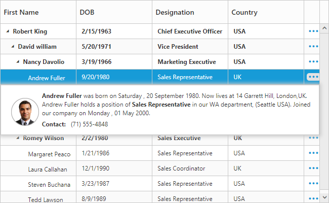
The above screenshot shows details row in TreeGrid.
The visibility of the details view of a record can also be toggled with any custom actions by using the method ShowHideDetailsRow.
Click here to view the demo sample for details row template.
Disable details row info column
On enabling details template, details row info column will be added in TreeGrid. It is used for show or hide the detail row of respective row.
You can disable that column while enabling details template using ShowDetailsRowInfoColumn property. If you disable details row info column, then the details row will render next to the respective row.
The following code example shows how to hide detail info column in TreeGrid.
@(Html.EJ().TreeGrid("TreeGridRowDetails")
  .DetailsTemplate("descriptionTemplate")
  .ShowDetailsRowInfoColumn(false)
  )
@(Html.EJ().ScriptManager())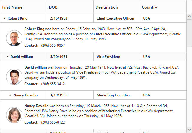
The above screenshot shows details row rendered next to the respective row.
Defining row height for detail template
In TreeGrid, it is provide a support to change the detail template height using DetailsRowHeight property.
The following code example shows how to set details row height in TreeGrid.
@(Html.EJ().TreeGrid("TreeGridRowDetails")
  .DetailsTemplate("descriptionTemplate")
  .DetailsRowHeight(150)
  )
@(Html.EJ().ScriptManager())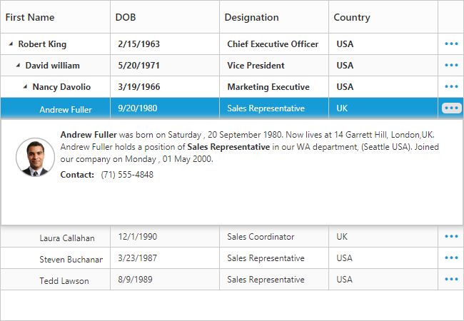
The above screenshot shows details row rendered with height of 150px.
Customize detail row
In TreeGrid, while rendering the details row the DetailsDataBound event will be triggered. Using this event we can customize the detail template for specific row.
The below code example shows how to customize details row for specific row.
@(Html.EJ().TreeGrid("TreeGridContainer")
        //...
        .DetailsTemplate("descriptionTemplate")
        .ClientSideEvents(cs =>
        {
            cs.DetailsDataBound("detailsDataBound");
        }))
@(Html.EJ().ScriptManager())

<script type="text/javascript">

function detailsDataBound(args) {
  if (args.data.Name == "Andrew Fuller")
    $(args.detailsElement).css("background-color", "rgba(133, 133, 173,1)");
  }
</script>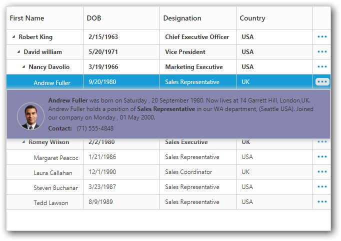
The above screenshot shows details row customization for specific row.
While opening and closing the details row, the DetailsShown and DetailsHidden events are triggered. Using this event we can prevent the details row show and hide action for specific row.
The below code example shows how to prevent details row show action for specific row.
@(Html.EJ().TreeGrid("TreeGridContainer")
        //...
        .DetailsTemplate("descriptionTemplate")
        .ClientSideEvents(cs =>
        {
            cs.DetailsShown("detailsShown");
        }))
@(Html.EJ().ScriptManager())

<script type="text/javascript">

function detailsShown(args) {
  if (args.data.Name == "Andrew Fuller")
        args.cancel = true;
}
</script>
Expand/Collapse Row
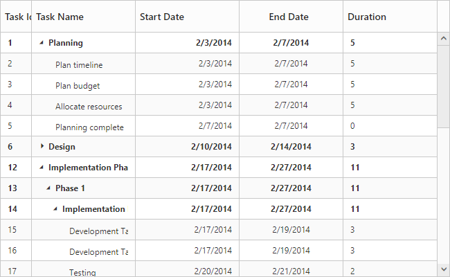
In TreeGrid, parent rows are expanded/collapsed by using expand/collapse icons, expand all/collapse all toolbar items and by using the expandCollapseRow method. By default all records in TreeGrid will be rendered in expanded state.
Collapse parent records at initial load
It is possible to display all the records in collapsed state by setting EnableCollapseAll property as true.
The following code example shows how to use this property.
@(Html.EJ().TreeGrid("TreeGridContainer")
        //..
        .EnableCollapseAll(true)
        )
@(Html.EJ().ScriptManager())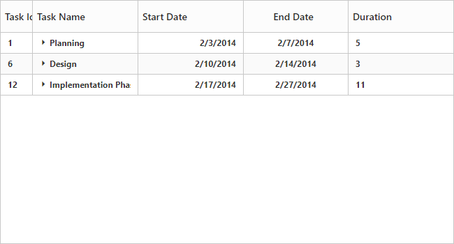
The above screenshot shows TreeGrid render with collapsed state.
Define expand/collapse state of every record
In TreeGrid, it is possible to render records either in collapsed state or in expanded state, and this can done by mapping the expand state to the records from the data source by using ExpandStateMapping property.
The following code example shows how to use this property.
@(Html.EJ().TreeGrid("TreeGridContainer")
        //..
        .ExpandStateMapping("expandState")
        .Datasource(ViewBag.datasource)
        )
@(Html.EJ().ScriptManager())
public class TreeGridController : Controller
{
//
// GET: /Default/
public ActionResult Default()
{
var DataSource = TreeGridDefaultData.GetData();
ViewBag.datasource = DataSource;
return View();
}
public class TreeGridDefaultData
{
public static List<DefaultData> GetData()
{
List<DefaultData> list = new List<DefaultData>();
list.Add(new DefaultData()
{
Id = 6,
Name = "Design",
ExpandState = false,
Children = (new List<DefaultData>()
{
new DefaultData()
{
Id = 7,
Name = "Software Specification",
ExpandState = false,
},
//..
})
});
return list;
}
}
}The below screenshot shows the output of above code example..
Expand/Collapse all the rows dynamically
All the rows in TreeGrid will be expanded/collapsed by clicking ExpandAll and CollapseAll toolbar items or by using expandAll and collapseAll methods. We can invoke this methods
dynamically on any action like external button click.
The below code example shows how to use this methods.
<button id="expandAll">Expand All</button>
<button id="collapseAll">Collapse All</button>

@(Html.EJ().TreeGrid("TreeGridContainer")
  //..
  .ToolbarSettings(tool =>
        {
            tool.ShowToolbar(true);
            tool.ToolbarItems(new List<TreeGridToolBarItems>()
          {
              TreeGridToolBarItems.ExpandAll,
              TreeGridToolBarItems.CollapseAll,
          });
        }))
@(Html.EJ().ScriptManager())

<script type="text/javascript">
$("#expandAll").click(function () {
    var treegridObj = $("#TreeGridContainer").ejTreeGrid("instance");
        treegridObj.expandAll();
});

$("#collapseAll").click(function () {
    var treegridObj = $("#TreeGridContainer").ejTreeGrid("instance");
        treegridObj.collapseAll();
});
</script>
Dynamically expand/Collapse the specific level row
The TreeGrid control provides the support to dynamically expand/collapse the specific level of rows by using expandAtLevel and collapseAtLevel methods. This methods are used to expand/collapse the rows which are in specific level.
The below code example shows how to use this methods.
<button id="expandAtLevel">Expand At Level</button>
<button id="collapseAtLevel">Collapse At Level</button>

@(Html.EJ().TreeGrid("TreeGridContainer")
 //..
 )
@(Html.EJ().ScriptManager())

<script type="text/javascript">

$("#expandAtLevel").click(function () {
    var treegridObj = $("#TreeGridContainer").ejTreeGrid("instance");
        treegridObj.expandAtLevel(1);
});

$("#collapseAtLevel").click(function () {
    var treegridObj = $("#TreeGridContainer").ejTreeGrid("instance");
        treegridObj.collapseAtLevel(1);
});
</script>
Customize expand/collapse action
In TreeGrid, while expanding the parent row Expanding and Expanded event will be triggered with current expanding row detail. Similarly Collapsing and Collapsed event will be triggered while collapsing the parent row. Using this event and its arguments we can customize the expand/collapse action.
The following code example shows how to prevent the particular row from expand/collapse action using Expanding and Collapsing event.
@(Html.EJ().TreeGrid("TreeGridContainer")
        //...
        .DetailsTemplate("descriptionTemplate")
        .ClientSideEvents(cs =>
        {
            cs.Collapsing("collapsing");
            cs.Expanding("expanding");
        }))
@(Html.EJ().ScriptManager())

<script type="text/javascript">

function expanding(args) {
   if(args.data.progress < 50) // we can't collapse the record which has progress is less than 50
      args.cancel = true;
}

function collapsing(args) {
  if(args.data.duration > 5) // we can't expand the record which has duration is greater than 5
      args.cancel = true;
}
</script>