Screen Tips
2 Aug 202324 minutes to read
ScreenTip/Tooltip is used to reduce the controls related Help that are needed to the end user to do control related actions.
HTML Tooltip
Standard html tooltip can be set using ToolTip property of each group item.
@(Html.EJ().Ribbon("defaultRibbon")
                .Width("20%")
                .ApplicationTab(app =>
                {
                    app.Type(ApplicationTabType.Menu).MenuItemID("ribbon");
                })
                .RibbonTabs(tab =>
                {
                    tab.Id("home").Text("HOME").TabGroups(tabgroup =>
                    {
                        tabgroup.Text("Clipboard").Content(ctn =>
                        {
                            ctn.ContentGroups(contentGroup =>
                            {
                                contentGroup.Id("cut").Text("Cut").ToolTip("Remove the selection and put it on clipboard").Add();
                                contentGroup.Id("copy").Text("Copy").ToolTip("Put a copy of selection on clipboard").ButtonSettings(new ButtonProperties()
                                {
                                    ContentType = ContentType.TextAndImage,
                                    PrefixIcon = "e-icon e-ribbon e-ribboncopy",
                                }).Add();
                            }).ContentDefaults(df => df.Width("70px").Height("60px")).Add();
                        }).Add();
                    }).Add();
                })
    )
    <ul id="ribbon">
        <li>
            <a>FILE</a>
            <ul>
                <li><a>New</a></li>
                <li><a>Open</a></li>
            </ul>
        </li>
    </ul>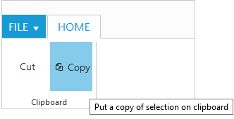
Custom Tooltip
Custom Tooltip is used to set detailed help to the user about the controls. You can setTitle, Content and PrefixIcon class to customize the tooltip with icons.
For Groups
CustomTooltip for each group controls can be specified. Such as to the controls Button, SplitButton, DropDownList etc.
@section ControlsSection {
@(Html.EJ().Ribbon("defaultRibbon")
.Width("450")
.ApplicationTab(app =>
{
app.Type(ApplicationTabType.Menu).MenuItemID("ribbon");
})
.RibbonTabs(tab =>
{
tab.Id("home").Text("HOME").TabGroups(tabgroup =>
{
tabgroup.Text("Clipboard").Content(ctn =>
{
ctn.ContentGroups(contentGroup =>
{
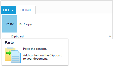
contentGroup.Id("paste").Text("Paste").CustomToolTip(new CustomToolTip()
{
Title = "Paste",
Content = "<h6>Paste the content.<br/><br/>Add content on the Clipboard to your document.</h6>",
PrefixIcon = "e-icon e-pastetip",
}).Add();
contentGroup.Id("copy").Text("Copy").CustomToolTip(new CustomToolTip()
{
Title = "Copy",
Content = "<h6>Copy the content.</h6>",
}).ButtonSettings(new ButtonProperties()
{
ContentType = ContentType.TextAndImage,
PrefixIcon = "e-icon e-ribbon e-ribboncopy",
}).Add();
}).ContentDefaults(df => df.Type(RibbonButtonType.Button).Width("70px").Height("60px")).Add();
}).Add();
}).Add();
})
)
<ul id="ribbon">
<li>
<a>FILE</a>
<ul>
<li><a>New</a></li>
<li><a>Open</a></li>
</ul>
</li>
</ul>
}
@section StyleSection{
<link href="~/Content/ej/ribbon-css/ej.icons.css" rel="stylesheet" />
<style>
.e-pastetip {
background-image: url("../Content/ej/common-images/ribbon/paste.png");
background-repeat: no-repeat;
height: 64px;
width: 64px;
}
</style>
}
For Gallery
CustomTooltip for each Gallery and CustomGalleryItems button control can be specified.
NOTE
Custom gallery item
Menuis not supported to Custom tooltip.
@section ControlsSection {
@(Html.EJ().Ribbon("defaultRibbon")
.Width("500")
.ApplicationTab(app =>
{
app.Type(ApplicationTabType.Menu).MenuItemID("ribbon");
})
.RibbonTabs(tab =>
{
tab.Id("home").Text("HOME").TabGroups(tabgroup =>
{
tabgroup.Text("Gallery").Type("Gallery").Content(ctn =>
{
ctn.ContentGroups(contentGroup =>
{
contentGroup.Id("Gallery").Type(RibbonButtonType.Gallery).ItemWidth("73").ItemHeight("54").Columns(2).ExpandedColumns(3).GalleryItems(gallery =>
{
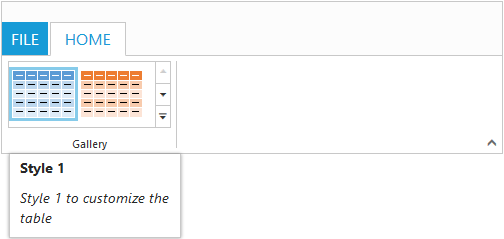
gallery.Text("Style 1").CustomToolTip(new CustomToolTip()
{
Title = "Style 1",
Content = "<I>Style 1 to customize the table</I>",
}).ButtonSettings(new ButtonProperties()
{
ContentType = ContentType.ImageOnly,
PrefixIcon = "e-icon e-gallerycontent1 e-gbtnimg",
CssClass = "e-gbtnposition"
}).Add();
gallery.Text("Style 2").CustomToolTip(new CustomToolTip()
{
Title = "Style 2",
Content = "<I>Style 2 to customize the table</I>",
}).ButtonSettings(new ButtonProperties()
{
ContentType = ContentType.ImageOnly,
PrefixIcon = "e-icon e-gallerycontent2 e-gbtnimg",
CssClass = "e-gbtnposition"
}).Add();
gallery.Text("Style 3").CustomToolTip(new CustomToolTip()
{
Title = "Style 3",
Content = "<I>Style 3 to customize the table</I>",
}).ButtonSettings(new ButtonProperties()
{
ContentType = ContentType.ImageOnly,
PrefixIcon = "e-icon e-gallerycontent3 e-gbtnimg",
CssClass = "e-gbtnposition"
}).Add();
gallery.Text("Style 4").CustomToolTip(new CustomToolTip()
{
Title = "Style 4",
Content = "<I>Style 4 to customize the table</I>",
}).ButtonSettings(new ButtonProperties()
{
ContentType = ContentType.ImageOnly,
PrefixIcon = "e-icon e-gallerycontent4 e-gbtnimg",
CssClass = "e-gbtnposition"
}).Add();
}).CustomGalleryItems(galleryItems =>
{
galleryItems.Text("Clear Formatting").ToolTip("Clear Formatting").CustomItemType(CustomItemType.Button).CustomToolTip(new CustomToolTip()
{
Title="Clear Format",
Content = "<I>To clear formatting</I>"
}).ButtonSettings(new ButtonProperties()
{
CssClass="e-extrabtnstyle"
}).Add();
galleryItems.CustomItemType(CustomItemType.Menu).MenuId("extraMenu").MenuSettings(new MenuProperties()
{
OpenOnClick = false
}).Add();
}).Add();
}).Add();
}).Add();
}).Add();
})
)
<ul id="ribbon">
<li>
<a>FILE</a>
</li>
</ul>
<ul id="extraMenu">
<li>
<a>New Quick Step</a>
<ul>
<li><a>Flag and Move</a></li>
</ul>
</li>
</ul>
}
@section StyleSection{
<link href="~/Content/ej/ribbon-css/ej.icons.css" rel="stylesheet" />
<style type="text/css">
.e-gallerycontent1 {
background-position: 0 -105px;
}
.e-gallerycontent2 {
background-position: -69px -105px;
}
.e-gallerycontent3 {
background-position: -136px -105px;
}
.e-gallerycontent4 {
background-position: 0 -53px;
}
.e-gbtnposition {
margin-top: 5px;
}
.e-gbtnimg {
background-image: url("../Content/ej/common-images/ribbon/homegallery.png");
background-repeat: no-repeat;
height: 64px;
width: 64px;
}
.e-extracontent .e-extrabtnstyle {
padding-left: 28px;
text-align: left;
}
</style>
}