How can I help you?
Cards
Customization
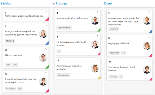
Cards can be customized with appropriate mapping fields from the database. The customizable mapping properties are listed as follows
| Mapping Fields | Description |
|---|---|
|
Content |
Map the column name to use as content to cards. |
|
Tag |
Map the column name to use as tag. Multiple tags can be given with comma separated. E.g. "API","SQL, Database". |
|
Color |
Map the column name to use as colors to highlight cards left border. |
|
ColorMapping |
Map the colors to use with column values which is mapped with fields.color . |
|
ImageUrl |
Map the column name to use as image to cards. |
|
PrimaryKey |
Map the column name to use as primary key to cards. |
|
PriorityKey |
Map the column name to use as priority key to cards. |
|
Title |
Map the column name to use as title to cards. Default title is primaryKey . |
|
AllowTitle |
Set as true to enable title for card. |
The following code example describes the above behavior.
@(Html.EJ().Kanban("Kanban")
                    .DataSource((IEnumerable<object>)ViewBag.datasource)
                    .Columns(col =>
                    {
                        col.HeaderText("Backlog").Key("Open").Add();
                        col.HeaderText("In Progress").Key("InProgress").Add();
                        col.HeaderText("Done").Key("Close").Add();
                    })
                    .AllowTitle(true)
                    .AllowSelection(true)
                    .KeyField("Status")
                    .Fields(field =>
                    {
                        field.Color("Type")
                            .Content("Summary")
                            .ImageUrl("Image")
                            .Tag("Tags")
                            .Priority("RankId")
                            .PrimaryKey("Id");
                    })
                    .CardSettings(card=>
                    {
                        card.ColorMapping(color =>
                        {
                            color.Add("#cb2027", "Bug,Story")
                                .Add("#67ab47", "Improvement")
                                .Add("#fbae19", "Epic")
                                .Add("#6a5da8", "Others");
                        });
                    })

    )
namespace MVCSampleBrowser
{
public partial class KanbanController : Controller
{
//
// GET: /Kanban/
public ActionResult KanbanFeatures()
{
var DataSource = new NorthwindDataContext().Tasks.Take(30).ToList();
ViewBag.datasource = DataSource;
return View();
}
}
}The following output is displayed as a result of the above code example.
Template
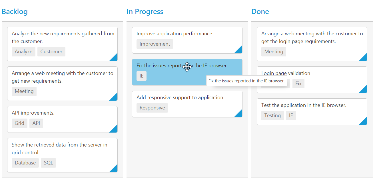
Templates are used to create custom card layout as per the user convenient. HTML templates can be specified in the Template property of the CardSettings as an ID of the template’s HTML element.
You can use JsRender syntax in the template. For more information about JsRender syntax, please refer this link.
The following code example describes the above behavior.
<script id="template" type="text/x-jsrender">
            <table>
            <tr>
                <td class="photo">
                    <img src="{{:Priority}}.png">
                </td>
                <td class="details">
                    <table>
                        <colgroup>
                            <col width="30%">
                            <col width="70%">
                        </colgroup>
                        <tbody>
                            <tr>
                                <td class="CardHeader">   Name: </td>
                                <td>{{:Assignee}}</td>
                            </tr>
                            <tr>
                                <td class="CardHeader">   Task: </td>
                                <td>{{:Type}}</td>
                            </tr>
                        </tbody>
                    </table>
                </td>
            </tr>
            </table>
</script><!--CSS for card template-->
<style>
.e-templatetable {
width: 100%;
}
.details > table {
margin-left: 2px;
border-collapse: separate;
border-spacing: 2px;
width: 100%;
}
.details td {
vertical-align: top;
}
.details {
padding: 8px 8px 10px 0;
}
.photo {
padding: 8px 6px 10px 6px;
text-align: center;
}
.CardHeader {
font-weight: bolder;
padding-right: 10px;
}
</style>@(Html.EJ().Kanban("Kanban")
.DataSource((IEnumerable<object>)ViewBag.datasource)
.Columns(col =>
{
col.HeaderText("Backlog").Key("Open").Add();
col.HeaderText("In Progress").Key("InProgress").Add();
col.HeaderText("Done").Key("Close").Add();
})
.KeyField("Status")
.Fields(field =>
{
field.Color("Type")
.PrimaryKey("Id");
})
.CardSettings(card=>
{
card.ColorMapping(color =>
{
color.Add("#cb2027", "Bug,Story")
.Add("#67ab47", "Improvement")
.Add("#fbae19", "Epic")
.Add("#6a5da8", "Others");
});
card.Template("#template");
})
)namespace MVCSampleBrowser
{
public partial class KanbanController : Controller
{
//
// GET: /Kanban/
public ActionResult KanbanFeatures()
{
var DataSource = new NorthwindDataContext().Tasks.Take(30).ToList();
ViewBag.datasource = DataSource;
return View();
}
}
}The following output is displayed as a result of the above code example.
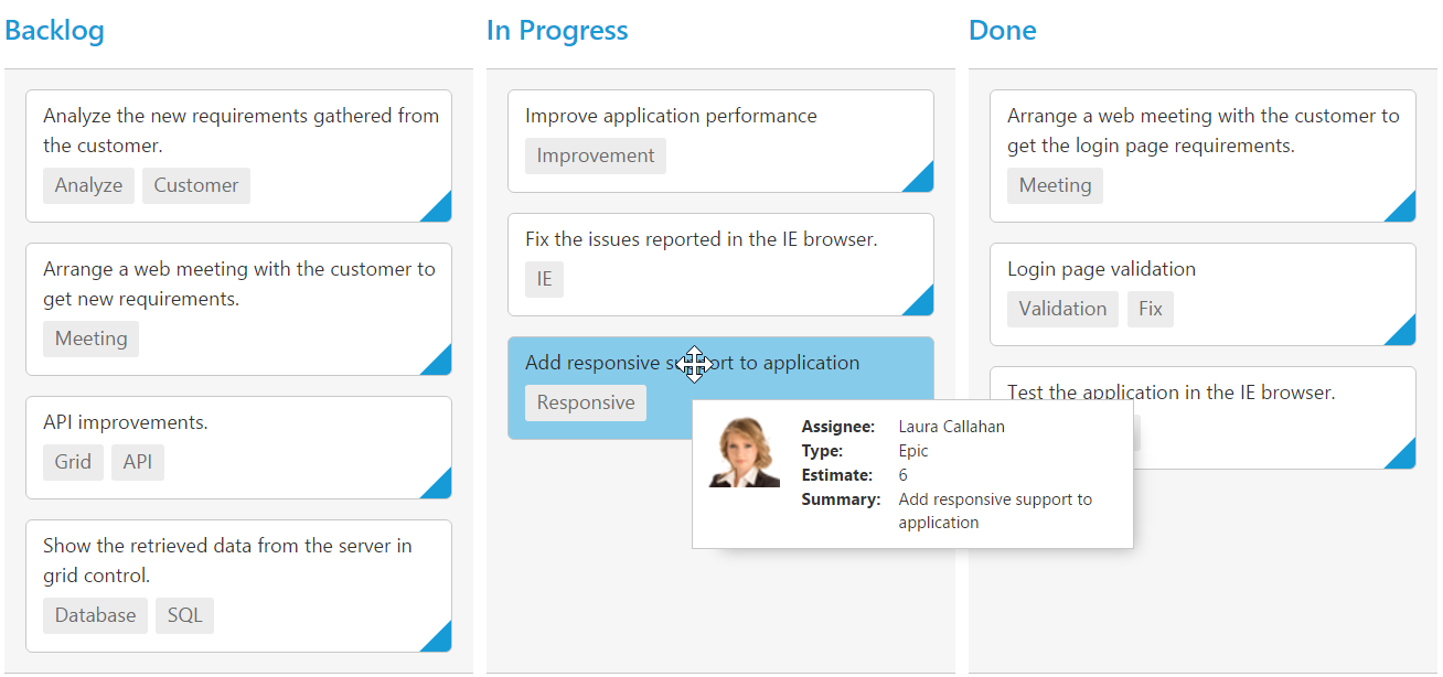
Tooltip
You can enable HTML tooltip for Kanban card elements by setting ‘Enable property as true in TooltipSettings`.
The following code example describes the above behavior.
@(Html.EJ().Kanban("Kanban")
                    .DataSource((IEnumerable<object>)ViewBag.datasource)
                    .TooltipSettings(tooltip=>tooltip.Enable(true))
                    .Columns(col =>
                    {
                        col.HeaderText("Backlog").Key("Open").Add();
                        col.HeaderText("In Progress").Key("InProgress").Add();
                        col.HeaderText("Done").Key("Close").Add();
                    })

                    .KeyField("Status")
                    .Fields(field =>
                    {
                        field.Content("Summary")
                            .Tag("Tags")
                            .PrimaryKey("Id");
                    })


    )
namespace MVCSampleBrowser
{
public partial class KanbanController : Controller
{
//
// GET: /Kanban/
public ActionResult KanbanFeatures()
{
var DataSource = new NorthwindDataContext().Tasks.Take(30).ToList();
ViewBag.datasource = DataSource;
return View();
}
}
}The following output is displayed as a result of the above code example.
Template
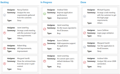
By making use of template feature with tooltip, all the field names that are mapped from the dataSource can be accessed to define the Template tooltip for card. The TooltipSettings.Enable must be enabled first.
The following code example describes the tooltip template.
<script id="tooltipTemp" type="text/x-jsrender">
            <div class='e-kanbantooltiptemplate'>
                <table>
                    <tr>
                        <td class="photo">
                            <img src="{{:ImgUrl}}">
                        </td>
                        <td class="details">
                            <table>
                                <colgroup>
                                    <col width="30%">
                                    <col width="70%">
                                </colgroup>
                                <tbody>
                                    <tr>
                                        <td class="CardHeader">Assignee:</td>
                                        <td>{{:Assignee}}</td>
                                    </tr>
                                    <tr>
                                        <td class="CardHeader">Type:</td>
                                        <td>{{:Type}}</td>
                                    </tr>
                                    <tr>
                                        <td class="CardHeader">Estimate:</td>
                                        <td>{{:Estimate}}</td>
                                    </tr>
                                    <tr>
                                        <td class="CardHeader">Summary:</td>
                                        <td>{{:Summary}}</td>
                                    </tr>
                                </tbody>
                            </table>
                        </td>
                    </tr>
                </table>
            </div>
</script><!--toolTip template releated css -->
<style>
.details >table {
width: 100%;
margin-left:2px;
border-collapse: separate;
border-spacing: 1px;
}
.e-kanbantooltiptemplate {
width: 250px;
padding: 3px;
}
.e-kanbantooltiptemplate > table {
width: 100%;
}
.e-kanbantooltiptemplate td {
vertical-align: top;
}
td.details {
padding-left: 10px;
}
.CardHeader {
font-weight: bolder;
}
</style>@(Html.EJ().Kanban("Kanban")
.DataSource((IEnumerable<object>)ViewBag.datasource)
.TooltipSettings(tooltip=>tooltip.Enable(true).Template("#tooltipTemp"))
.Columns(col =>
{
col.HeaderText("Backlog").Key("Open").Add();
col.HeaderText("In Progress").Key("InProgress").Add();
col.HeaderText("Done").Key("Close").Add();
})
.KeyField("Status")
.Fields(field =>
{
field.Content("Summary")
.Tag("Tags")
.PrimaryKey("Id");
})
)namespace MVCSampleBrowser
{
public partial class KanbanController : Controller
{
//
// GET: /Kanban/
public ActionResult KanbanFeatures()
{
var DataSource = new NorthwindDataContext().Tasks.Take(30).ToList();
ViewBag.datasource = DataSource;
return View();
}
}
}The following output is displayed as a result of the above code example.
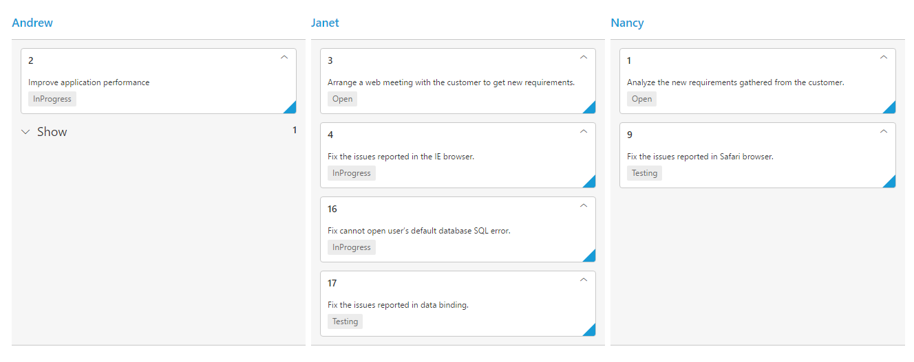
Collapsible Cards
You can set particular cards collapsed state in Kanban by defining the CollapsibleCards property. Based on the CollapsibleCards object value, it maps the cards to the collapsible area.
You can set CollapsibleCards as object which consists of Field and Key properties. The Field property map the datasource field to be used in CollapsibleCards. The Key property map the specific column key to be in collapsed state.
| Mapping Fields | Description |
|---|---|
|
CollapsibleCards.Field |
Map the collapsible card's field mapping. |
|
CollapsibleCards.Key |
Map the collapsible card's key mapping which is available in datasource value of field mapped in collapsibleCards.field . |
NOTE
- If the
CollapsibleCardswithFieldis in the dataSource andKeyvalues specified will available in column values, then the cards will be rendered inside the collapsible card’s division.
The following code example describes the collapsible cards.
@(Html.EJ().Kanban("Kanban")
                    .DataSource((IEnumerable<object>)ViewBag.datasource)
                    .Columns(col =>
                    {
                       col.HeaderText("Andrew").Key("Andrew Fuller").Add();
                       col.HeaderText("Janet").Key("Janet Leverling").Add();
                       col.HeaderText("Nancy").Key("Nancy Davloio").Add();
                    })
                   .AllowTitle(true)
                   .AllowSelection(false)
                   .KeyField("Assignee")
                   .Fields(field =>
                   {
                       field.PrimaryKey("Id");
                       field.Content("Summary");
                       field.Tag("Status");
                       field.CollapsibleCards(collapsibleCards =>
                       {
                          collapsibleCards.Field("Status").Key("Close");
                       });
                    })
    )
namespace MVCSampleBrowser
{
public partial class KanbanController : Controller
{
//
// GET: /Kanban/
public ActionResult KanbanFeatures()
{
var DataSource = new NorthwindDataContext().Tasks.Take(30).ToList();
ViewBag.datasource = DataSource;
return View();
}
}
}The following output is displayed as a result of the above code example.