Easy Customization
26 Apr 20182 minutes to read
The GroupButton wrapper and each GroupButton items can be easily customized according to your need using the options available in Groupbutton control.
Button Size
You can render the Groupbutton in different sizes by using the predefined size options for rendering a groupbutton with different sizes. Each size option has different height and width. Mainly it avoids the complexity in rendering groupbutton with complex CSS class.
|
Normal |
Creates button with content size. |
|
Mini |
Creates button with Built-in mini size height, width specified. |
|
Small |
Creates button with Built-in small size height, width specified. |
|
Medium |
Creates button with Built-in medium size height, width specified. |
|
Large |
Creates button with Built-in large size height, width specified. |
Apart from the above mentioned predefined size option, you can set your own width and height of GroupButton by using Height and Width property.
In the View page, add the following GroupButton elements to configure GroupButton for configure the size
<%--Set the different size options and custom size Groupbutton control as follows--%>

 @Html.EJ().GroupButton("GroupButton").Size(ButtonSize.Mini).Items(item =>
                   {
                       item.Add().Text("Save");
                       item.Add().Text("Open");
                       item.Add().Text("Delete");
                   })
Mini sized Groupbutton {:.caption}

<%--Set the different size options and custom size Groupbutton control as follows--%>

@Html.EJ().GroupButton("GroupButton").Size(ButtonSize.Medium).Items(item =>
                   {
                       item.Add().Text("Save");
                       item.Add().Text("Open");
                       item.Add().Text("Delete");
                   })
Medium sized Groupbutton {:.caption}
Orientation
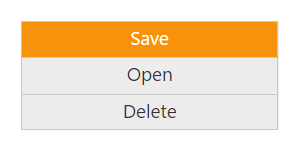
Groupbutton element can be rendered either in vertical or horizontal orientation by means of the Orientation property available in GroupButton.
You can change the orientation of Groupbutton as given in the below code snippet.
@Html.EJ().GroupButton("GroupButton").Orientation(Orientation.Vertical).Items(item =>
                   {
                       item.Add().Text("Save");
                       item.Add().Text("Open");
                       item.Add().Text("Delete");
                   })