How can I help you?
Cell
Auto wrap
Auto wrap enables the Grid to wrap the cell content or header content to next line when the content exceeds the boundary of the cell width. To enable auto wrap, set the AllowTextWrap property as true.
We can specify the mode of auto wrap using WrapMode property of the TextWrapSettings.
Three types of WrapMode are available and they are.
- Both
- Header
- Content
NOTE
- By default the
WrapModewill be set asBoth.- While using the
TextWrapSettingsthen it is must to set theAllowTextWrapastrue.- For the
WrapModeproperty you can assignenumvalue (Syncfusion.JavaScript.WrapMode.Both).
Both
When the WrapMode of TextWrapSettings property is set as Both then the auto wrap will be enabled for both grid content and header.
The following code example describes the above behavior.
@(Html.EJ().Grid<Object>("FlatGrid")
            .Datasource((IEnumerable<object>)ViewBag.DataSource)
            .AllowPaging()
            .AllowTextWrap()
            .TextWrapSettings(wrap => { wrap.WrapMode(WrapMode.Both); })
            .Columns(col =>
            {
                col.Field("OrderID").Width(100).Add();
                col.Field("EmployeeID").Width(100).Add();
                col.Field("Freight").Width(100).Add();
                col.Field("ShipCity").Width(150).Add();
                col.Field("ShipAddress").HeaderText("Ship Address").Width(100).Add();
            }))
namespace MVCSampleBrowser.Controllers
{
public class GridController : Controller
{
public ActionResult GridFeatures()
{
var DataSource = new NorthwindDataContext().OrdersViews.ToList();
ViewBag.DataSource = DataSource;
return View();
}
}
}The following output is displayed as a result of the above code example.
Header
When the WrapMode of TextWrapSettings property is set as Header then the auto wrap will be enabled only for Grid header alone.
The following code example describes the above behavior.
@(Html.EJ().Grid<Object>("FlatGrid")
            .Datasource((IEnumerable<object>)ViewBag.DataSource)
            .AllowPaging()
            .AllowTextWrap()
            .TextWrapSettings(wrap => { wrap.WrapMode(WrapMode.Header); })
            .Columns(col =>
            {
                col.Field("OrderID").Width(100).Add();
                col.Field("EmployeeID").Width(100).Add();
                col.Field("Freight").Width(100).Add();
                col.Field("ShipCity").Width(150).Add();
                col.Field("ShipAddress").HeaderText("Ship Address").Width(100).Add();
            }))
namespace MVCSampleBrowser.Controllers
{
public class GridController : Controller
{
public ActionResult GridFeatures()
{
var DataSource = new NorthwindDataContext().OrdersViews.ToList();
ViewBag.DataSource = DataSource;
return View();
}
}
}The following output is displayed as a result of the above code example.
Content
When the WrapMode of TextWrapSettings property set as Content then the auto wrap will be enabled only for the Grid content alone.
The following code example describes the above behavior.
@(Html.EJ().Grid<Object>("FlatGrid")
            .Datasource((IEnumerable<object>)ViewBag.DataSource)
            .AllowPaging()
            .AllowTextWrap()
            .TextWrapSettings(wrap => { wrap.WrapMode(WrapMode.Header); })
            .Columns(col =>
            {
                col.Field("OrderID").Width(100).Add();
                col.Field("EmployeeID").Width(100).Add();
                col.Field("Freight").Width(100).Add();
                col.Field("ShipCity").Width(150).Add();
                col.Field("ShipAddress").HeaderText("Ship Address").Width(100).Add();
            }))
namespace MVCSampleBrowser.Controllers
{
public class GridController : Controller
{
public ActionResult GridFeatures()
{
var DataSource = new NorthwindDataContext().OrdersViews.ToList();
ViewBag.DataSource = DataSource;
return View();
}
}
}The following output is displayed as a result of the above code example.
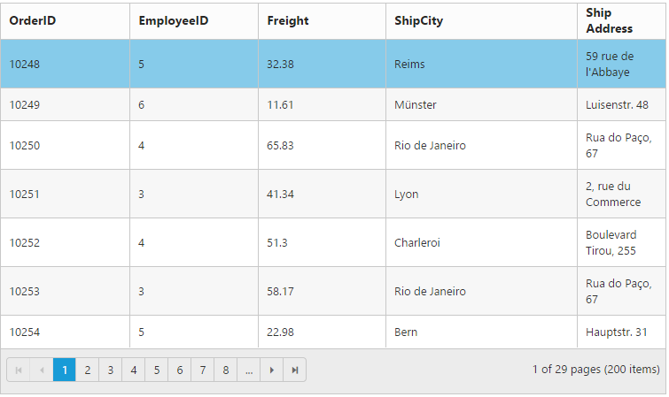
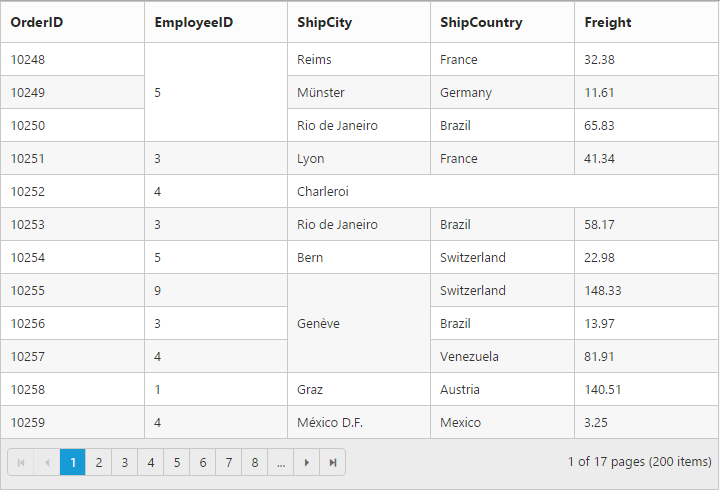
Cell Merging
The grid has options to merge the grid cells based on the required conditions. This can be enabled by setting the AllowCellMerging property as true and the merge conditions can be defined in MergeCellInfo event. In this event, you can get the column details and data of that particular row and column which is helpful in defining conditions.
You can merge the rows and cells of grid, using the rowMerge, colMerge and merge functions available in MergeCellInfo event’s argument.
NOTE
The following features are not supported with Cell Merging
- Normal Mode Editing
- Inline Mode Editing
- Inline TemplateForm Mode Editing
- Grouping
- Virtual Scrolling
- Frozen Columns
- Cell Selection Modes
- Column Selection
The following code example describes the above behavior.
@(Html.EJ().Grid<Object>("FlatGrid")
                .Datasource((IEnumerable<object>)ViewBag.DataSource)
                .AllowPaging()
                .AllowCellMerging()
                .Columns(col =>
                {
                    col.Field("OrderID").Add();
                    col.Field("EmployeeID").Add();
                    col.Field("ShipCity").Add();
                    col.Field("ShipCountry").Add();
                    col.Field("Freight").Add();
                })
                .ClientSideEvents(eve => { eve.MergeCellInfo("mergeCellInfo"); })
               )
namespace MVCSampleBrowser.Controllers
{
public class GridController : Controller
{
public ActionResult GridFeatures()
{
var DataSource = new NorthwindDataContext().OrdersViews.ToList();
ViewBag.DataSource = DataSource;
return View();
}
}
}<script type="text/javascript">
function mergeCellInfo(args)
{
if (args.column.field == "EmployeeID" && args.rowData.OrderID == 10248)
args.rowMerge(3);
else if (args.column.field == "ShipCity" && args.rowData.OrderID == 10252)
args.colMerge(3);
else if (args.column.field == "ShipCity" && args.rowData.OrderID == 10255)
args.merge(0, 3);
}
</script>The following output is displayed as a result of the above code example.
Custom Attribute
You can add custom attribute for the particular column’s td element by using CustomAttributes property of the column.
Based on custom attribute you can customize the style and appearance of the td element or handling jQuery functionalities.
You can use JsRender syntax in the template. For more information about JsRender syntax, please refer this link.
The following code example describes the above behavior.
@(Html.EJ().Grid<Object>("FlatGrid")
                .Datasource((IEnumerable<object>)ViewBag.DataSource)
                .AllowPaging()
                .Columns(col =>
                {
                    col.Field("OrderID").Add();
                    col.Field("CustomerID").Add();
                    col.Field("EmployeeID").Add();
                    col.Field("ShipCity").CustomAttributes(custom => { custom.AddAttribute("title","'{{:ShipCity }}'"); }).Add();
                    col.Field("ShipCountry").Add();
                })
               )
namespace MVCSampleBrowser.Controllers
{
public class GridController : Controller
{
public ActionResult GridFeatures()
{
var DataSource1 = new NorthwindDataContext().OrdersViews.ToList();
ViewBag.DataSource = DataSource1;
return View();
}
}
}The following output is displayed as a result of the above code example.
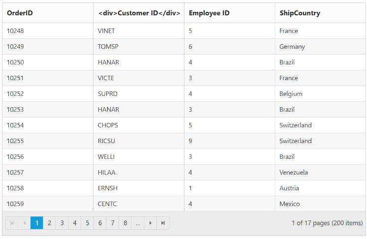
Displaying HTML content
This will helps you to show actual HTML value in grid content and header. To disable HTML code, set the DisableHtmlEncode property of Columns as true.
The following code example describes the above behavior.
@(Html.EJ().Grid<Object>("FlatGrid")
                .Datasource((IEnumerable<object>)ViewBag.DataSource)
                .AllowPaging()
                .Columns(col =>
                {
                    col.Field("OrderID").Add();
                    col.Field("CustomerID").HeaderText("<div>Customer ID</div>").disableHtmlEncode(true).Add();
                    col.Field("EmployeeID").HeaderText("<div>Employee ID</div>").disableHtmlEncode(false).Add();
                    col.Field("ShipCountry").Add();
                })
               )
namespace MVCSampleBrowser.Controllers
{
public class GridController : Controller
{
public ActionResult GridFeatures()
{
var DataSource1 = new NorthwindDataContext().OrdersViews.ToList();
ViewBag.DataSource = DataSource1;
return View();
}
}
}The following output is displayed as a result of the above code example.
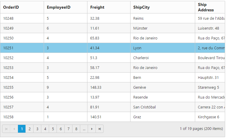
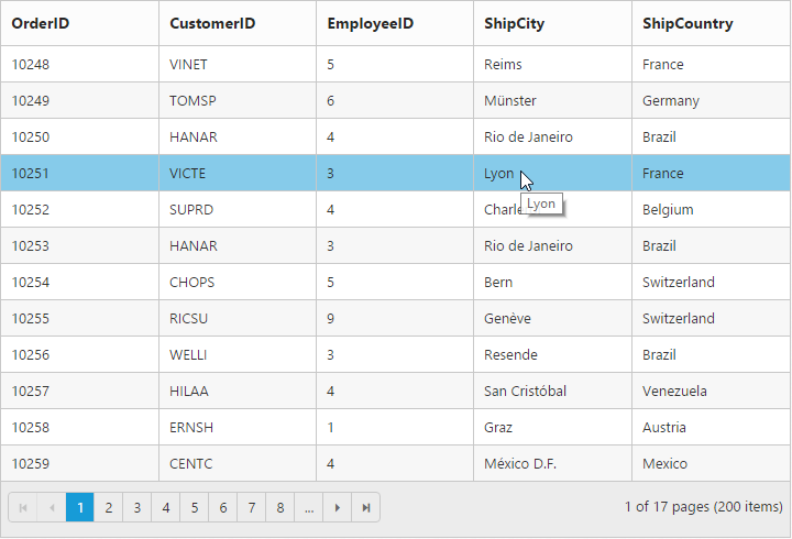
Tooltip
When you move the cursor over the particular cell it provides an information about the corresponding cell value.
Template
HTML templates can be specified in the Tooltip property of the particular column cell as a string (HTML element) or ID of the template’s HTML element.You can use JsRender syntax in the template. For more information about JsRender syntax, please refer this link.
NOTE
It’s a standard way to enclose the template within the
scripttag withtypeas “text/x-jsrender”.
TheTooltiptemplate must containvalueproperty to bind the corresponding cell text in tooltip
The following code example describes the above behavior.
@(Html.EJ().Grid<Object>("FlatGrid")
                .Datasource((IEnumerable<object>)ViewBag.DataSource)
                .AllowPaging()
                .Columns(col =>
                {
                    col.Field("OrderID").Add();
                    col.Field("EmployeeID").Add();
                    col.Field("ShipCity").Tooltip("#colTip").Add();
                    col.Field("Freight").Add();
                })
                )
namespace MVCSampleBrowser.Controllers
{
public class GridController : Controller
{
public ActionResult DetailTemplate()
{
var DataSource = new NorthwindDataContext().EmployeeViews.ToList();
ViewBag.datasource = DataSource;
return View();
}
}
}<script type="text/template" id="colTip">
{{:value}}
</script>The following output is displayed as a result of the above code example.
ClipMode
When the cell value contains a long text that will not fit into the grid column cell, the ClipMode property is used. By using the ClipMode, the cell value will be displayed with ellipsis or with clipped content when the text overflows inside a column cell.
NOTE
By default the
ClipModewill be set asClip.
List of types
- Clip
- Ellipsis
- EllipsisWithTooltip
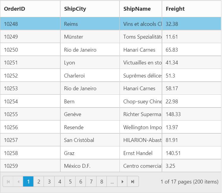
Clip
When the content overflows, the remaining content will be hidden in the particular cell
The following code example describes the above behavior.
@(Html.EJ().Grid<Object>("FlatGrid")
                .Datasource((IEnumerable<object>)ViewBag.DataSource)
                .AllowPaging()
                .Columns(col =>
                {
                    col.Field("OrderID").Add();
                    col.Field("ShipCity").Add();
                    col.Field("ShipName").ClipMode(ClipMode.Clip).Add();
                    col.Field("Freight").Add();
                })
                )
namespace MVCSampleBrowser.Controllers
{
public class GridController : Controller
{
public ActionResult DetailTemplate()
{
var DataSource = new NorthwindDataContext().EmployeeViews.ToList();
ViewBag.datasource = DataSource;
return View();
}
}
}The following output is displayed as a result of the above code example.
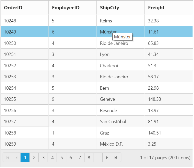
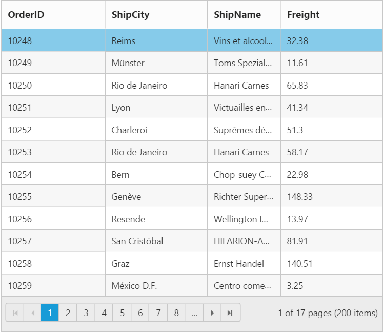
Ellipsis
Ellipsis will be displayed when the content overflows its column width. Here the Tooltip will not be shown for corresponding columns.
The following code example describes the above behavior.
@(Html.EJ().Grid<Object>("FlatGrid")
                .Datasource((IEnumerable<object>)ViewBag.DataSource)
                .AllowPaging()
                .Columns(col =>
                {
                    col.Field("OrderID").Add();
                    col.Field("ShipCity").Add();
                    col.Field("ShipName").ClipMode(ClipMode.Ellipsis).Add();
                    col.Field("Freight").Add();
                })
                )
namespace MVCSampleBrowser.Controllers
{
public class GridController : Controller
{
public ActionResult DetailTemplate()
{
var DataSource = new NorthwindDataContext().EmployeeViews.ToList();
ViewBag.datasource = DataSource;
return View();
}
}
}The following output is displayed as a result of the above code example.
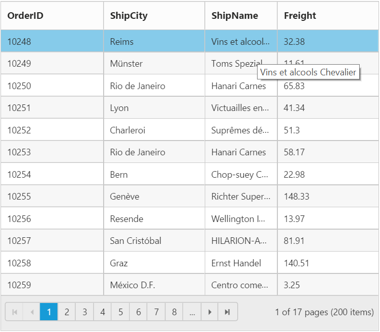
Ellipsis With Tooltip
Ellipsis will be displayed when the content overflows its column width. Here tooltip will be shown only for the corresponding column cells that shows ellipsis.
NOTE
If
ClipModeis set asEllipsisWithTooltip, thenTooltipmust be given.
The following code example describes the above behavior.
@(Html.EJ().Grid<Object>("FlatGrid")
                .Datasource((IEnumerable<object>)ViewBag.DataSource)
                .AllowPaging()
                .Columns(col =>
                {
                    col.Field("OrderID").Add();
                    col.Field("ShipCity").Add();
                    col.Field("ShipName").Tooltip("#colTip").ClipMode(ClipMode.EllipsisWithTooltip).Add();
                    col.Field("Freight").Add();
                })
                )
namespace MVCSampleBrowser.Controllers
{
public class GridController : Controller
{
public ActionResult DetailTemplate()
{
var DataSource = new NorthwindDataContext().EmployeeViews.ToList();
ViewBag.datasource = DataSource;
return View();
}
}
}<script type="text/template" id="colTip">
{{:value}}
</script>The following output is displayed as a result of the above code example.