How can I help you?
Label
Label is a block of text that can be displayed over a node or connector. Label is used to textually represent an object with a string that can be edited at run time. You can add Multiple Labels to a node/connector.
Create Label
You can add a label to a node/connector by defining the label object and adding that to the Labels collection of node/connector. The Text property of label defines the text to be displayed. The following code illustrates how to create a Label.
@*Initializes diagram control*@
<div>
   @Html.EJ().Diagram("diagram", ViewData["diagramModel"] as Syncfusion.JavaScript.DataVisualization.Models.DiagramProperties)
</div>
DiagramProperties model = new DiagramProperties();
model.Nodes.Add(new BasicShape()
{
Name = "node",
Width = 100,
Height = 100,
OffsetX = 100,
OffsetY = 100,
BorderColor = "black",
FillColor = "#1BA0E2",
//Initializes labels collection
Labels = new Collection(){
new Label()
{
//Defines the text to be displayed
Text= "Label"
}
}
});
model.Connectors.Add(new Connector()
{
Name = "connector1",
SourcePoint = new DiagramPoint(200, 50),
TargetPoint = new DiagramPoint(300, 150),
Segments = new Collection() {
new Segment() { Type = Segments.Orthogonal, Direction = "bottom", Length = 50 } },
//Initializes labels collection
Labels = new Collection(){
new Label()
{
//Defines the text to be displayed
Text= "Label",
FillColor = "white"
}
}
});
ViewData["diagramModel"] = model;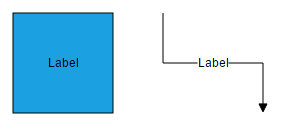
To explore more label properties, refer to Label Properties.
Update Label at runtime
The client side API updateLabel is used to update the labels at run time.
The following code example illustrates how to change the label properties.
var diagram = $("#diagram").ejDiagram("instance");
var selectedObject = diagram.model.selectedItems.children[0];
diagram.updateLabel(selectedObject.name, selectedObject.labels[0], { text: "label", fillColor: "red" });
Alignment
Label can be aligned relative to the node boundaries. It has margin, offset, horizontal and vertical alignment settings. It is quite tricky when all four alignments are used together but gives you more control over alignment.
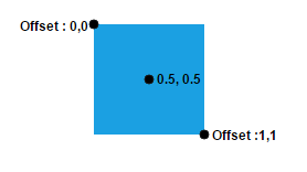
Offset
The Offset property of label is used to align the labels based on fractions. 0 represents top/left corner, 1 represents bottom/right corner, and 0.5 represents half of width/height.
The following image shows the relationship between the label position (black colored circle) and offset (fraction values).
Horizontal and vertical alignments
The HorizontalAlignment property of label is used to set how the label is horizontally aligned at the label position determined from the fraction values. The VerticalAlignment property is used to set how label is vertically aligned at the label position.
The following tables illustrates all the possible alignments visually with offset (0, 0).
| Horizontal Alignment | Vertical Alignment | Output with Offset(0,0) |
|---|---|---|
| Left | Top | 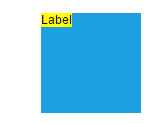 |
| Center | 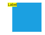 |
|
| Right | 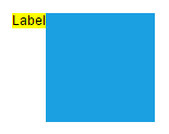 |
|
| Left | Center | 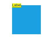 |
| Center | 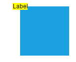 |
|
| Right | 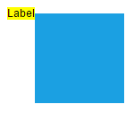 |
|
| Left | Bottom | 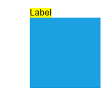 |
| Center |  |
|
| Right | 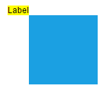 |
The following codes illustrates how to align labels.
DiagramProperties model = new DiagramProperties();
      model.Nodes.Add(new BasicShape()
      {
          Name = "node",
          Width = 100,
          Height = 100,
          OffsetX = 100,
          OffsetY = 100,
          BorderColor = "black",
          FillColor = "#1BA0E2",
          Labels = new Collection(){
              new Label(){
			            Text= "Label",
			            // Sets offset to label
			            Offset= new DiagramPoint(0,0.5f),
			            // Sets to align label horizontally relative to given offset
			            HorizontalAlignment= HorizontalAlignment.Left,
			            // Sets to align label vertically relative to given offset
			            VerticalAlignment= VerticalAlignment.Center,
			            // Sets text alignment to label
			            TextAlign= TextAlign.Center
		            }
          }
      });
      ViewData["diagramModel"] = model;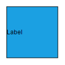
Margin
Margin is an absolute value used to add some blank space in any one of its four sides. You can displace the labels with the Margin property.
The following code example illustrates how to align a label based on its Offset, HorizontalAlignment, VerticalAlignment and Margin values.
DiagramProperties model = new DiagramProperties();

      model.Nodes.Add(new BasicShape()
      {
          Name = "node",
          Width = 100,
          Height = 100,
          OffsetX = 100,
          OffsetY = 100,
          BorderColor = "black",
          FillColor = "#1BA0E2",
          Labels = new Collection(){
              new Label(){
			            Text= "Label",
			            Offset=new DiagramPoint(0.5f,1),
			            HorizontalAlignment= HorizontalAlignment.Center,
			            VerticalAlignment= VerticalAlignment.Top,
			            //Sets margin to add label outside a node
			            Margin= new LabelMargin(){Top=10}
		            }
          }
      });
      ViewData["diagramModel"] = model;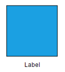
Text Alignment
The TextAlign property of label allows you to set how the text should be aligned (left, right, center, or justify) inside the text block. The following codes illustrate how to set textAlign for a label.
DiagramProperties model = new DiagramProperties();

      model.Nodes.Add(new BasicShape()
      {
          Name = "node",
          Width = 100,
          Height = 100,
          OffsetX = 100,
          OffsetY = 100,
          BorderColor = "black",
          FillColor = "#1BA0E2",
          Labels = new Collection(){
              new Label(){
			      Text= "Text Align is set as Left",
                  // Sets text alignment for a label
                  TextAlign = TextAlign.Left
		      }
          }
      });
      ViewData["diagramModel"] = model;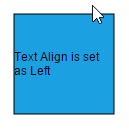
| TextAlign | Image |
|---|---|
| Left |  |
| Right | 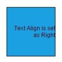 |
| Center | 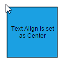 |
| Justify | 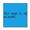 |
Wrapping
When text overflows node boundaries, you can control it by using text wrapping. So, it is wrapped into multiple lines. The Wrapping property of label defines how the text should be wrapped. The following code illustrates how to wrap a text in a node.
DiagramProperties model = new DiagramProperties();

      model.Nodes.Add(new BasicShape()
      {
          Name = "node",
          Width = 100,
          Height = 100,
          OffsetX = 100,
          OffsetY = 100,
          BorderColor = "black",
          FillColor = "#1BA0E2",
          Labels = new Collection(){
              new Label(){
			      Text= "Text-Wrapping",
                  //Enables Text-wrapping
                  Wrapping = TextWrapping.Wrap
		      }
          }
      });
      ViewData["diagramModel"] = model;
| Values | Description | Image |
|---|---|---|
| NoWrap | Text will not be wrapped | 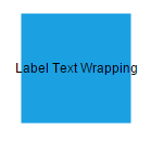 |
| Wrap | Text-wrapping occurs when the text overflows beyond the available node width. | 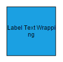 |
| WrapWithOverflow (Default) | Text-wrapping occurs when the text overflows beyond the available node width. However, the text may overflow beyond the node width in the case of a very long word. | 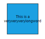 |
Appearance
You can change the font style of the labels with the font specific properties(FontSize,FontFamily,FontColor.,). The following code illustrates how to customize the appearance of a label.
DiagramProperties model = new DiagramProperties();

      model.Nodes.Add(new BasicShape()
      {
          Name = "node",
          Width = 100,
          Height = 100,
          OffsetX = 100,
          OffsetY = 100,
          BorderColor = "black",
          FillColor = "#1BA0E2",
          Labels = new Collection(){
              new Label(){
	               Text= "Label Text",
			       //Sets styles to a label
			       FontSize= 12,
			       FontFamily= "TimesNewRoman",
			       FontColor= "black",
			       Bold= true,
			       Italic= true,
			       TextDecoration= TextDecorations.Underline
		       }
          }
      });
      ViewData["diagramModel"] = model;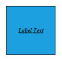
The fill and border appearances of the text can also be customized with appearance specific properties of label.The following code illustrates how to customize background and border of a label.
DiagramProperties model = new DiagramProperties();

     model.Nodes.Add(new BasicShape()
     {
         Name = "node",
         Width = 100,
         Height = 100,
         OffsetX = 100,
         OffsetY = 100,
         BorderColor = "black",
         FillColor = "#1BA0E2",
         Labels = new Collection(){
             new Label(){
	           Text= "Label Text",
               //Customizes background and borders of a label
			   FillColor= "white",
			   BorderColor= "black",
			   BorderWidth= 1
		    }
         }
     });
     ViewData["diagramModel"] = model;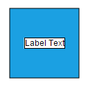
Drag
A Label can be displaced from its original position to any preferred location interactively. Dragging is disabled by default. You can enable label dragging with the Constraints property of node/connector. The following code illustrates how to enable label dragging.
DiagramProperties model = new DiagramProperties();

     model.Nodes.Add(new BasicShape()
     {
         Name = "node",
         Width = 100,
         Height = 100,
         OffsetX = 100,
         OffsetY = 100,
         BorderColor = "black",
         FillColor = "#1BA0E2",
         Constraints=NodeConstraints.Default | NodeConstraints.DragLabel,
         //Initializes labels collection
         Labels = new Collection(){
             new Label()
             {
				   //Defines the text to be displayed
				   Text= "Label"
			 }
     }
     });

     model.Connectors.Add(new Connector()
     {
         Name = "connector1",
         SourcePoint = new DiagramPoint(200, 50),
         TargetPoint = new DiagramPoint(300, 150),
         Segments = new Collection() {
             new Segment() { Type = Segments.Orthogonal, Direction = "bottom", Length = 50 } },
         Constraints=ConnectorConstraints.Default | ConnectorConstraints.DragLabel,
         //Initializes labels collection
         Labels = new Collection(){
             new Label()
             {
				 //Defines the text to be displayed
				 Text= "Label",
                 FillColor = "white"
			 }
          }
     });
     ViewData["diagramModel"] = model;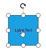
Rotate
You can rotate the labels to any desired angle. Labels are rotated to the angle that is defined by the RotateAngle property of label. The following code illustrates how to rotate a label.
DiagramProperties model = new DiagramProperties();

     model.Nodes.Add(new BasicShape()
     {
         Name = "node",
         Width = 100,
         Height = 100,
         OffsetX = 100,
         OffsetY = 100,
         BorderColor = "black",
         FillColor = "#1BA0E2",
         Constraints = NodeConstraints.Default | NodeConstraints.DragLabel,
         //Initializes labels collection
         Labels = new Collection(){
             new Label()
             {
                 Text="Label",
				        //Sets label's rotation Angle
			            RotateAngle=45
			        }
     }
     });
     ViewData["diagramModel"] = model;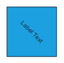
NOTE
There is no built-in support to rotate labels interactively.
Edit
Diagram provides support to edit a Label at runtime, either programmatically or interactively. By default, label is in View mode. But it can be brought to edit mode in two ways;
- By double-clicking the label.
- By selecting the item and pressing the F2 key.
Double-clicking any label will enables editing of that. Double-clicking the node enables first label editing. When the focus of editor is lost, the label for the node is updated.
You can programmatically edit the label by changing the Mode of the label. The following code illustrates how to edit the label programmatically.
var diagram = $("#diagram").ejDiagram("instance");
var node = diagram.model.selectedItems.children[0];
//Sets label mode as Edit
var options = {
	mode: ej.datavisualization.Diagram.LabelEditMode.Edit
};
diagram.updateLabel(node.name, node.labels[0], options);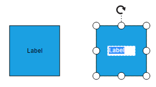
Read Only labels
Diagram allows to create read only labels. You have to set the ReadOnly property of label to enable/disable the read only mode. The following code illustrates how to enable readOnly mode.
DiagramProperties model = new DiagramProperties();

     model.Nodes.Add(new BasicShape()
     {
         Name = "node",
         Width = 100,
         Height = 100,
         OffsetX = 100,
         OffsetY = 100,
         BorderColor = "black",
         FillColor = "#1BA0E2",
         Constraints = NodeConstraints.Default | NodeConstraints.DragLabel,
         //Initializes labels collection
         Labels = new Collection(){
             new Label()
             {
                 Text="Label",
                 ReadOnly=true
			 }
     }
     });
     ViewData["diagramModel"] = model;
Drag Limit
Diagram label dragging can be restricted by enabling/disabling DragLimit constraints of the connectors. Also we can define the drag limit in all direction using DragLimit property of the connector. Drag limit only applicable for connector labels.
DiagramProperties model = new DiagramProperties();

    Collection Labels = new Collection();
    Labels.Add(new Label()
    {
        // Defines the drag limit property in all direction
        DragLimit = new LabelMargin()
        {
            Left = 30,
            Right = 30,
            Bottom = 30,
            Top = 30
        }
    });
    model.Connectors.Add(new Connector()
    {
        Name = "node",
        // Enable DragLimit constraints to the connector.
        Constraints = ConnectorConstraints.Default | ConnectorConstraints.DragLabel | ConnectorConstraints.DragLimit,
        Labels = Labels
    });
    ViewData["diagramModel"] = model;
Multiple labels
You can add any number of labels to a node or connector. The following code illustrates how to add multiple labels to a node.
DiagramProperties model = new DiagramProperties();
     model.Nodes.Add(new BasicShape()
     {
         Name = "node",
         Width = 100,
         Height = 100,
         OffsetX = 100,
         OffsetY = 100,
         BorderColor = "black",
         FillColor = "#1BA0E2",
         //Initializes labels collection
         Labels = new Collection(){
             new Label()
             {
                 Text="Left",
                 Offset=new DiagramPoint(0.12f, 0.1f)
			 },
             new Label(){
                 Text="Center",
                 Offset= new DiagramPoint(0.5f, 0.5f)
             },
             new Label(){
                 Text="Right",
                 Offset=new DiagramPoint(0.82f, 0.9f)
             }
     }
     });
     ViewData["diagramModel"] = model;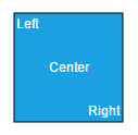
Limitation
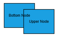
- To enable faster rendering, labels are rendered in a separate layer because of this, all the labels always stay on top. When two nodes are overlapped, text of underlying node is not hidden by the overlapped node.
| Expected behavior | Current behavior |
|---|---|
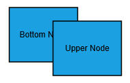 |
 |