How can I help you?
Getting Started with ASP.NET MVC ComboBox
This section explains how to create a simple ComboBox component and configure its available functionalities.
1.Create an MVC Project and add necessary assemblies, scripts, and CSS files given in MVC-Getting Started Documentation.
2.Add ComboBox control using the helper from EJ namespace.
Initialize the ComboBox
The ComboBox can be initialized as:
<div class="frame">
        <div class="control">
            @{
                Html.EJ()
                    .ComboBox("select")
                    .Width("100%")
                    .Datasource((IEnumerable<CarsList>)ViewBag.datasource)
                    .ComboBoxFields(f=>f.Text("text"))
                    .Placeholder("Select")
                    .Render();
            }
        </div>
</div>public class CarsList
{
public string text { get; set; }
public static List<CarsList> GetCarsList()
{
List<CarsList> car = new List<CarsList>();
car.Add(new CarsList { text = "Audi S6" });
car.Add(new CarsList { text = "Austin-Healey" });
car.Add(new CarsList { text = "Alfa Romeo" });
car.Add(new CarsList { text = "Aston Martin" });
car.Add(new CarsList { text = "BMW 7" });
car.Add(new CarsList { text = "Bentley Mulsanne" });
return car;
}
public ActionResult Default()
{
ViewBag.datasource = GetCarsList();
return View();
}
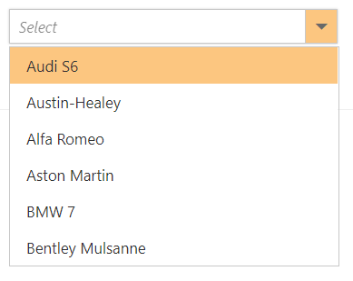
}Output for ComboBox control is as follows.

Binding data source
After initializing, populate the ComboBox with data using the DataSource property. Here, an array of string values is passed to the ComboBox component.
<div class="frame">
        <div class="control">
            @{
                string[] datasource = new string[] { "Badminton", "Cricket", "Football", "Golf", "Tennis" };
                Html.EJ()
                    .ComboBox("select")
                    .Width("100%")
                    .Datasource(datasource)
                    .Placeholder("Select a game")
                    .Render();
            }
        </div>
    </div>
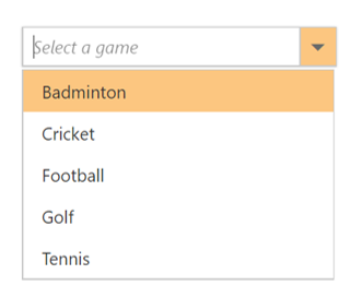
Output for ComboBox control is as follows.

Custom values
The ComboBox allows the user to give input as custom value which is not required to be present in the predefined set of values. By default, this support is enabled by the AllowCustom property. In this case, both text field and value field are considered as same. The custom value will be sent to post back handler when a form is about to be submitted.
<div class="frame">
        <div class="control">
            @{
                Html.EJ()
                    .ComboBox("select")
                    .Width("100%")
                    .Datasource((IEnumerable<Flowers>)ViewBag.datasource)
                    .AllowCustom(true)
                    .ComboBoxFields(f=>f.Text("text").Value("text"))
                    .Placeholder("Select")
                    .Render();
            }
        </div>
</div>public class CarsList
{
public string text { get; set; }
public static List<CarsList> GetCarsList()
{
List<CarsList> car = new List<CarsList>();
car.Add(new CarsList { text = "Audi S6" });
car.Add(new CarsList { text = "Austin-Healey" });
car.Add(new CarsList { text = "Alfa Romeo" });
car.Add(new CarsList { text = "Aston Martin" });
car.Add(new CarsList { text = "BMW 7" });
car.Add(new CarsList { text = "Bentley Mulsanne" });
return car;
}
public ActionResult Default()
{
ViewBag.datasource = GetCarsList();
return View();
}
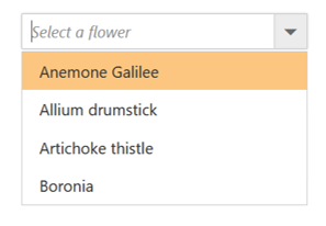
}Output for allowCustom ComboBox control is as follows.

Configure the popup list
By default, the width of the popup list automatically adjusts according to the ComboBox input element’s width, and the height of the popup list is ‘300px’.
The height and width of the popup list can also be customized by using the popupHeight and popupWidth properties respectively.
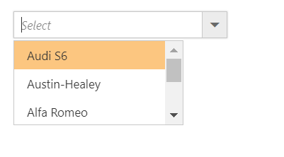
In the following sample, popup list’s width and height are configured.
<div class="frame">
        <div class="control">
            @{
                Html.EJ()
                    .ComboBox("select")
                    .Width("100%")
                    .Datasource((IEnumerable<CarsList>)ViewBag.datasource)
                    .PopupHeight("200px")
                    .PopupWidth("200px")
                    .Placeholder("Select")
                    .Render();
            }
        </div>
</div>public class CarsList
{
public string text { get; set; }
public static List<CarsList> GetCarsList()
{
List<CarsList> car = new List<CarsList>();
car.Add(new CarsList { text = "Audi S6" });
car.Add(new CarsList { text = "Austin-Healey" });
car.Add(new CarsList { text = "Alfa Romeo" });
car.Add(new CarsList { text = "Aston Martin" });
car.Add(new CarsList { text = "BMW 7" });
car.Add(new CarsList { text = "Bentley Mulsanne" });
return car;
}
public ActionResult Default()
{
ViewBag.datasource = GetCarsList();
return View();
}
}Output for ComboBox control is as follows.
