Columns
29 Jun 201824 minutes to read
Column definitions specified in the Columns option defines how the data in the DataSource have to be displayed, formatted and edited in TreeGrid. The values in the DataSource can be mapped to the appropriate column using the Field property of the corresponding column object.
Editing type
The edit type of a column can be defined using the EditType property of the column object.
The following example shows how to define the EditType in a column,
<ej:TreeGrid ID="TreeGridContainer">
<Columns>
        <ej:TreeGridColumn EditType="Boolean"></ej:TreeGridColumn>
        <ej:TreeGridColumn EditType="Numeric"></ej:TreeGridColumn>
</Columns>
</ej:TreeGrid>
The column editors can be further customized by using the EditOptions property of column object.
The following example shows how to define additional properties to the date picker control,
<ej:TreeGrid ID="TreeGridContainer">
<Columns>
    <ej:TreeGridColumn Field="StartDate" EditType="Datepicker">
        <DateEditOptions HighlightWeekend="true" />
    </ej:TreeGridColumn>
</Columns>
</ej:TreeGrid>
Formatting
The values in each column can be formatted using the Format property of the column object.
The following code example shows how to format the numeric and date values in TreeGrid column,
<ej:TreeGrid ID="TreeGridContainer">
<Columns>
    <ej:TreeGridColumn Field="Percentage" HeaderText= "Percentage" Format="{0:P0}"></ej:TreeGridColumn>
    <ej:TreeGridColumn Field="Currency" HeaderText= "Currency" Format="{0:C2}"></ej:TreeGridColumn>
    <ej:TreeGridColumn Field="startDate" HeaderText= "Start Date" Format="{0:MM/dd/yyyy}"></ej:TreeGridColumn>
    <ej:TreeGridColumn Field="endDate" HeaderText= "End Date" Format="{0:MM/dd/yyyy hh:mm:ss}"></ej:TreeGridColumn>
</Columns>
</ej:TreeGrid>
NOTE
1.For more numeric format strings, please refer this link.
2.For more date format strings, please refer this link.
Defining column width
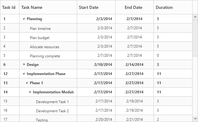
In TreeGrid, it is possible to define width for a specific column by setting Width property to the column object.
The below code snippet shows how to set width for specific column,
<ej:TreeGrid ID="TreeGridContainer">
<Columns>
    <ej:TreeGridColumn Field="taskID" HeaderText= "Task Id" Width="50"></ej:TreeGridColumn>
    <ej:TreeGridColumn Field="taskName" HeaderText= "Task Name" Width="150"></ej:TreeGridColumn>
    <ej:TreeGridColumn Field="startDate" HeaderText= "Start Date" Width="100"></ej:TreeGridColumn>
    <ej:TreeGridColumn Field="endDate" HeaderText= "End Date" Width="100"></ej:TreeGridColumn>
    <ej:TreeGridColumn Field="duration" HeaderText= "Duration" Width="100"></ej:TreeGridColumn>
    </Columns>
</ej:TreeGrid>
The below screenshot shows the TreeGrid rendered with specific column width values.
Defining common width for the columns
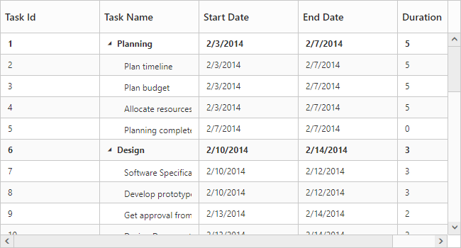
The TreeGrid control provides the support to set same width for all the available columns and this can be done by using CommonWidth property.
<ej:TreeGrid ID="TreeGridContainer" CommonWidth="140">
</ej:TreeGrid>
The below screenshot shows TreeGrid render with common width.
Headers
Header text
Using the HeaderText property, you can provide the title for a specific column. The below code snippet shows how to set HeaderText for TreeGrid columns.
<ej:TreeGrid ID="TreeGridContainer">
<Columns>
    <ej:TreeGridColumn Field="taskID" HeaderText= "Task Id"></ej:TreeGridColumn>
    <ej:TreeGridColumn Field="taskName" HeaderText= "Task Name"></ej:TreeGridColumn>
    <ej:TreeGridColumn Field="startDate" HeaderText= "Start Date"></ej:TreeGridColumn>
    <ej:TreeGridColumn Field="endDate" HeaderText= "End Date"></ej:TreeGridColumn>
    </Columns>
</ej:TreeGrid>
Text wrapping
It is possible to wrap the header text or the title of the column when the content exceeds the column width using HeaderTextOverflow property. By default this property is set to None.
To enable wrapping of header text, you have to set the HeaderTextOverflow property as Wrap.
The below code snippet demonstrates this.
<ej:TreeGrid ID="TreeGridContainer"   HeaderTextOverflow="Wrap">
</ej:TreeGrid>
Click here to view the online demo sample for text wrapping.
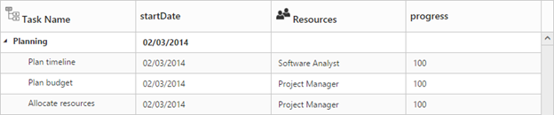
Header Template
TreeGrid column’s header template was defined by using HeaderTemplateID property. The value of this property should be a valid JsRender template.
The following code snippet shows how to set the header template for TreeGrid columns,
<ej:TreeGrid ID="TreeGridContainer">
<Columns>
    <ej:TreeGridColumn Field="taskName" EditType="String" HeaderTemplateID="#projectName" ></ej:TreeGridColumn>
    <ej:TreeGridColumn Field="startDate" EditType="Datepicker"></ej:TreeGridColumn>
    <ej:TreeGridColumn Field="resourceId"EditType="Dropdown" HeaderTemplateID="#resource" ></ej:TreeGridColumn>
    <ej:TreeGridColumn Field="progress" EditType="Numeric"></ej:TreeGridColumn>
    </Columns>
</ej:TreeGrid>
<asp:ScriptManager ID="ScriptManager" runat="server" />
<script type="text/x-jsrender" id="resource">
        <div>
            <div class="name">
                <img src="13.4.0.53/themes/web/images/treegrid/icon-03.png" width="20" height="20" />
            </div>
            <div style="position:relative; top:3px;">
                Resources
            </div>
        </div>
    </script>

    <script type="text/x-jsrender" id="projectName">
        <div>
            <div>
                <img src="13.4.0.53/themes/web/images/treegrid/icon-01.png" width="20" height="20" />
            </div>
            <div style="position:relative; top:3px;">
                Task Name
            </div>
        </div>
    </script>
The below screenshot depicts column headers with custom templates.
Click here to view the online demo sample for header template.
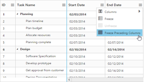
Frozen Columns
Specific columns can be frozen by enabling the IsFrozen property of the respective column object. The columns which are frozen remain static while scrolling the content horizontally. You can also freeze or unfreeze a column during runtime, by selecting Freeze or Unfreeze menu item in the column menu. These set of menu options will be displayed in all the columns when the IsFrozen property is enabled in any of the columns. However you can control the visibility of these menu options in a particular column by enabling/disabling the AllowFreezing property of that specific column.
<ej:TreeGrid ID="TreeGridContainer" ShowColumnChooser="true">
<Columns>
    <ej:TreeGridColumn Field="TaskId" HeaderText= "ID" Width="100"></ej:TreeGridColumn>
    <ej:TreeGridColumn Field="TaskName" HeaderText= "Task Name" Width="200"></ej:TreeGridColumn>
    <ej:TreeGridColumn Field="startDate" HeaderText= "Start Date"></ej:TreeGridColumn>
    <ej:TreeGridColumn Field="EndDate" HeaderText= "End Date"></ej:TreeGridColumn>
    <ej:TreeGridColumn Field="Duration" HeaderText= "Duration"></ej:TreeGridColumn>
    </Columns>
</ej:TreeGrid>
The below screenshot depicts TreeGrid with frozen columns,
It is also possible to freeze all the preceding columns at run-time by choosing Freeze Preceding Columns option in the column menu or by using the freezePrecedingColumns method, the column field name, for which the columns preceding it to be frozen should be passed as the method parameter.
Freeze columns using method
Columns can also be frozen or unfrozen on any custom actions using the freezeColumn method.
The column’s field name which is to be frozen/unfrozen should be passed as the method parameter, along with the freeze state.
<ej:TreeGrid ID="TreeGridContainer" >
</ej:TreeGrid>
<asp:ScriptManager ID="ScriptManager" runat="server" />
<script type="text/javascript">

var treegridObj = $("#TreeGridContainer").data("ejTreeGrid");
treegridObj.freezeColumn(field, true);

</script>
Click here to view the online demo sample for frozen column.
Resizing
You can resize the column width to view the hidden text of the cell. This feature can be enabled by setting the AllowColumnResize property to true.
<ej:TreeGrid ID="TreeGridContainer" AllowColumnResize="true">
</ej:TreeGrid>
Column resize mode
In TreeGrid, it is possible to provide different column resizing mode by using ResizeMode property of ColumnResizeSettings property.
The below are the types of column resize modes available in TreeGrid,
- Normal - Columns are stretched with control width at load time. When resizing the column, the current column width is updated based on next column.
- Next column - Columns are stretched with control width at load time. When resize the column the current column width is updated based on stretching columns in control width.
- Fixed Columns - Column are rendered with given width value at load time. Only the current column width is changed while resizing the column.
The following code snippet explains how to set column resize mode in TreeGrid,
<ej:TreeGrid ID="TreeGridContainer" AllowColumnResize="true">
<ColumnResizeSettings ColumnResizeMode="FixedColumns" />
</ej:TreeGrid>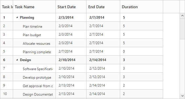
The above screenshot shows the TreeGrid rendered with FixedColumns resize mode.
Click here to view the online demo sample for column resizing.
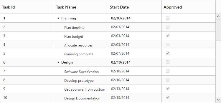
Checkbox column
It is possible to display a column value as checkbox in TreeGrid by enabling the DisplayAsCheckbox property and by setting the EditType property as Boolean for that column.
If the DisplayAsCheckbox property was set as false, then the column value will be displayed as string with the value mapped from the data source.
The following code snippet explains how to display a checkbox column in TreeGrid,
<ej:TreeGrid ID="TreeGridContainer" ShowColumnChooser="true">
<Columns>
    <ej:TreeGridColumn Field="approved" HeaderText= "Approved"  EditType="Boolean" DisplayAsCheckbox="true"></ej:TreeGridColumn>
</Columns>
</ej:TreeGrid>
The below screen shot depicts the Approved column in TreeGrid displayed as a checkbox column.
Column Template
Column Template is used to customize the column’s look and feel based on requirement.
The following code example shows you how to display the icon in the TreeGrid column,
-
TemplateID - Using the
TemplateIDproperty, you can specify the Id of the script element, which contains the template for the column. -
Template - HTML templates can be specified in the
Templateproperty of the particular column as a string (HTML element).
Column template support was enabled for that column by setting IsTemplateColumn as true.
The following code example show how to define template for the column,
// JsRender template definition.
    <script type="text/x-jsrender" id="columnTemplate">

           <div style="display:inline-block;position:relative;left:10px;top:1px">
               <img src="../images/gantt/.png" height="40" />
           </div>

    </script>

<ej:TreeGrid ID="TreeGridContainer" RowHeight="50">
<Columns>
    <ej:TreeGridColumn Field="taskID" HeaderText="Task Id" Width="45"></ej:TreeGridColumn>
    <ej:TreeGridColumn Field="taskName" HeaderText="Task Name"></ej:TreeGridColumn>
    <ej:TreeGridColumn HeaderText="Resource" IsTemplateColumn="true" TemplateID="columnTemplate" TextAlign="Center"></ej:TreeGridColumn>
    </Columns>
</ej:TreeGrid>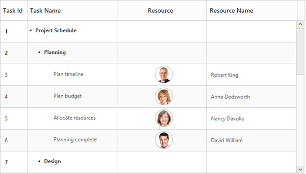
Click here to view the online demo sample for frozen column.
Column Menu
Column menu can be displayed in column header by setting ShowColumnChooser property as true.
The following are the items displayed in the column menu,
- Column Chooser – Displays all the column names, you can enable or disable a column by check or uncheck the respective column name in the column chooser menu.
-
Sort Ascending & Sort Descending – Used to sort the items in the column. These menu options will be displayed only when you set the
AllowSortingproperty as true. To perform multilevel sorting, theAllowMultiSortingproperty should be enabled. -
Freeze, Unfreeze & Freeze Preceding Columns – Used to freeze or unfreeze the columns. These set of menu options will be displayed in all the columns when the
IsFrozenproperty is enabled in any of the columns. However, you can control the visibility of these menu options in a particular column by enabling/disabling theAllowFreezingproperty of that specific column.
<ej:TreeGrid ID="TreeGridContainer" ShowColumnChooser="true" AllowSorting="true" AllowMultiSorting="true">
<Columns>
    <ej:TreeGridColumn Field="duration" HeaderText="Duration" Visible="false"></ej:TreeGridColumn>
</Columns>
</ej:TreeGrid>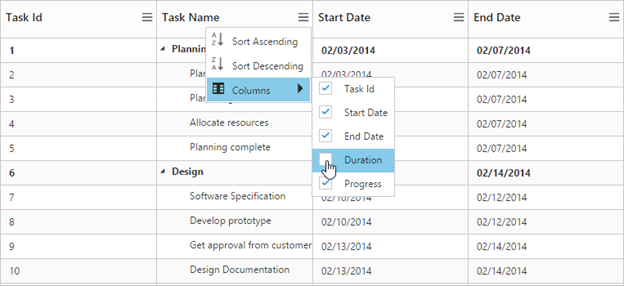
The column menu also provides support for some of the additional column options such as,
- Insert column left
- Insert column right
- Delete column
- Rename column
The column options can be enabled or disabled with the ShowColumnOptions property, default value of this property is false.
The following code example shows how to enable the column option in TreeGrid,
<ej:TreeGrid ID="TreeGridContainer" ShowColumnOptions="true">
</ej:TreeGrid>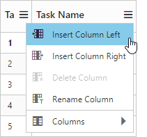
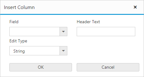
The above screenshot shows insert column dialog in TreeGrid
The TreeGrid columns can also be renamed or deleted at run-time on any custom actions using the renameColumn and deleteColumn methods.
Customize insert column dialog fields
It is possible to add or remove the Columns properties in insert column dialog using ColumnDialogFields property. In insert column dialog Field, HeaderText and EditType properties are necessary to create a new column, so these fields are unable to remove from insert column option.
The following code example shows how to customize the insert column option in TreeGrid,
<ej:TreeGrid ID="TreeGridContainer" ShowColumnOptions="true" AllowSorting="true" ColumnDialogFields="field,headerText,editType,width,visible, allowSorting,textAlign,headerTextAlign">
</ej:TreeGrid>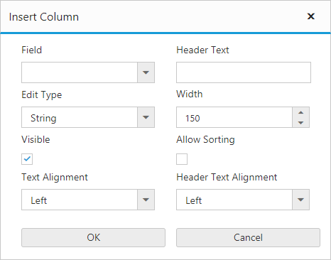
The above screenshot shows customized insert column dialog in TreeGrid.
Hide specific column in column chooser list
It is possible to hide the specific column in column chooser list by settings ShowInColumnChooser as false in the column definition.
The following code example shows how to hide specific column in column chooser list,
<ej:TreeGrid ID="TreeGridContainer" ShowColumnChooser="true">
<Columns>
    <ej:TreeGridColumn Field="taskID" HeaderText="Task Id" ShowInColumnChooser="false"></ej:TreeGridColumn>
</Columns>
</ej:TreeGrid>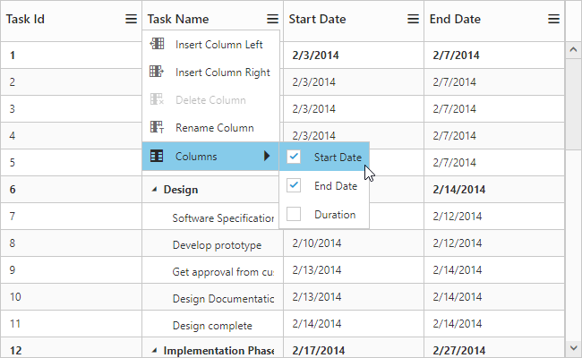
The above screenshot shows TreeGrid column chooser rendered without Task Id column.
Show/Hide columns using method
It is possible to toggle the visibility of the columns using the hideColumn and showColumn methods. The column’s header text should be passed as the method parameter which is to be shown/hidden.
<ej:TreeGrid ID="TreeGridContainer">
</ej:TreeGrid>
<asp:ScriptManager ID="ScriptManager" runat="server" />
<script type="text/javascript">
	var treegridObj = $("#TreeGridContainer").data("ejTreeGrid");
	treegridObj.hideColumn("Task Name");
	treegridObj.showColumn("Order ID");
</script>
Click here to view the online demo sample for column menu.
Command Column
Default action buttons
Using command columns in TreeGrid, we can display a separate column to perform CRUD operations. It is also possible to perform any custom actions by using custom command buttons. Command column can be defined in TreeGrid by using the Commands property.
A command column can be customized by using the Type and ButtonOptions properties.
- Type: Using this property we can add required action buttons in TreeGrid command column such as edit,delete,save and cancel.
- ButtonOptions: Using this property we can customize the button in the command column with the properties available in Button.
<ej:TreeGrid ID="TreeGridContainer">
<Columns>
<ej:TreeGridColumn HeaderText="Manage Records">
    <Command>
    <ej:TreeGridCommands Type="edit">
        <ButtonOptions Text="Edit" Width="58" />
    </ej:TreeGridCommands>
    <ej:TreeGridCommands Type="delete">
        <ButtonOptions Text="Delete" Width="58" />
    </ej:TreeGridCommands>
    <ej:TreeGridCommands Type="save">
        <ButtonOptions Text="save" Width="58" />
    </ej:TreeGridCommands>
    <ej:TreeGridCommands Type="cancel">
        <ButtonOptions Text="cancel" Width="58" />
    </ej:TreeGridCommands>
    </Command>
</ej:TreeGridColumn>
</Columns>
</ej:TreeGrid>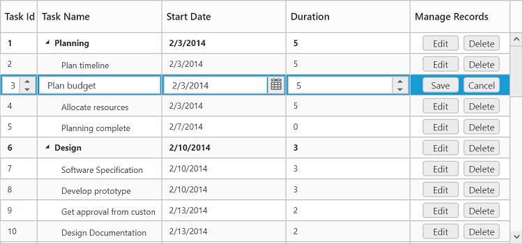
Click here to view the online demo sample for command column.
Custom buttons
We can also add custom buttons to the command column by specifying text value other than default buttons to the type property. We can also bind actions to the custom button using the Click client-side event of Button.
<ej:TreeGrid ID="TreeGridContainer">
<Columns>
<ej:TreeGridColumn HeaderText="Manage Records">
    <Command>
    <ej:TreeGridCommands Type="Details">
        <ButtonOptions Text="Edit" Width="58" Click="onClick" />
    </ej:TreeGridCommands>
    </Command>
</ej:TreeGridColumn>
</Columns>
</ej:TreeGrid>
<asp:ScriptManager ID="ScriptManager" runat="server" />
<script type="text/javascript">
        function onClick(args) {
            var $tr = $(args.e.target).closest('tr'),
                 treeObj = $("#TreeGridContainer").data("ejTreeGrid"),
                 rowIndex = treeObj.getIndexByRow($tr),
                 record = treeObj.model.currentViewData[rowIndex];
            alert("Task Name: " + record.item.TaskName);
        }
</script>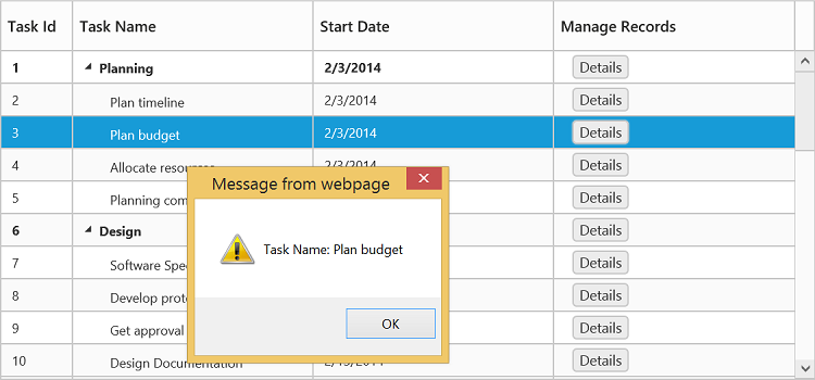
Tree column/ Expander column
The position of the expander column/tree column can be changed by using the TreeColumnIndex property.
The following code example shows how to change the position of the expander column,
<ej:TreeGrid ID="TreeGridContainer" TreeColumnIndex="2">
</ej:TreeGrid>
The TreeColumnIndex can also be changed at run-time by using the columnIndex method.
Visibility
The visibility of TreeGrid column can be customized by usingVisible property. TreeGrid columns column be hidden by setting Visible property as false.
The following code example explains how to hide the fourth column,
<ej:TreeGrid ID="TreeGridContainer">
<Columns>
    <ej:TreeGridColumn Field="taskID" HeaderText= "Task Id" Width="45"></ej:TreeGridColumn>
    <ej:TreeGridColumn Field="taskName" HeaderText= "Task Name"></ej:TreeGridColumn>
    <ej:TreeGridColumn Field="startDate" HeaderText= "Start Date"></ej:TreeGridColumn>
    <ej:TreeGridColumn Field="endDate" HeaderText= "End Date" Visible="false"></ej:TreeGridColumn>
    <ej:TreeGridColumn Field="progress" HeaderText= "Progress"></ej:TreeGridColumn>
    </Columns>
</ej:TreeGrid>
Read-only
A column can be made read-only by setting the AllowEditing property as false.
NOTE
By setting
Columns.AllowEditingasfalsethat specific column alone is made as read-only, and by setting theEditSettings.AllowEditingasfalsethe entire TreeGrid is made read-only.
The below code snippet demonstrates this,
<ej:TreeGrid ID="TreeGridContainer">
<Columns>
    <ej:TreeGridColumn Field="taskID" HeaderText= "Task Id" Width="45"></ej:TreeGridColumn>
    <ej:TreeGridColumn Field="taskName" HeaderText= "Task Name" AllowEditing="false"></ej:TreeGridColumn>
    <ej:TreeGridColumn Field="startDate" HeaderText= "Start Date"></ej:TreeGridColumn>
    <ej:TreeGridColumn Field="endDate" HeaderText= "End Date"></ej:TreeGridColumn>
    </Columns>
</ej:TreeGrid>
Validation Rules
At some occasions, we will need to validate the data before updating it to the database. In TreeGrid it is possible to validate the data while performing adding and editing actions. The validation rules must be provided in the column definition using ValidationRules property. TreeGrid has built-in support for the below validation rules.
- maxlength – Makes the value require a given maximum text length.
- minlength – Makes the value require a given minimum text length.
- required – Makes the value required.
- number – Makes the value require a decimal number.
- range – Makes the value require a given value range.
The below code example explains defining the validation rules for the column.
<ej:TreeGrid ID="TreeGridContainer">
            <Columns>
                <ej:TreeGridColumn HeaderText="Task Id" Field="taskID" Width="45">
                    <ValidationRule>
                        <ej:KeyValue Key="required" Value=true />
                    </ValidationRule>
                </ej:TreeGridColumn>
                <ej:TreeGridColumn HeaderText="Task Name" Field="taskName">
                    <ValidationRule>
                        <ej:KeyValue Key="maxlength" Value="5" />
                        <ej:KeyValue Key="minlength" Value="2" />
                    </ValidationRule>
                </ej:TreeGridColumn>
                <ej:TreeGridColumn HeaderText="progress" Field="Progress">
                    <ValidationRule>
                        <ej:KeyValue Key="customCompare" Value="[-1,101]" />
                    </ValidationRule>
                </ej:TreeGridColumn>
            </Columns>
</ej:TreeGrid>
Custom validation error messages can also be defined in the column object. The below code example explains defining the custom error message.
<Columns>
     <ej:TreeGridColumn HeaderText="taskID" Field="Task Id">
        <ValidationRule>
            <ej:KeyValue Key="required" Value=true />
            <ej:KeyValue Key="number" Value=true />
            <ej:KeyValue Key="messages" Value="{"required", "This field was must"}" />
        </ValidationRule>
    </ej:TreeGridColumn>
</Columns>
Custom Validation rules
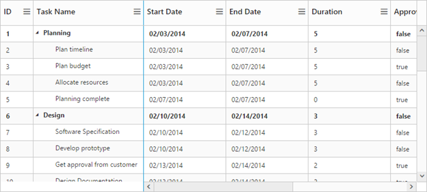
Apart by the in-built validation rules, any custom validation rules can also be defined for the column. The below code example explains defining custom validation rule for a column.
<script type="text/javascript">
   // Custom validation rule definition
   $.validator.addMethod("customCompare", function(value, element, params) {
       return element.value > params[0] && element.value < params[1]
   }, "progress value must be between 0 and 100");
</script>
<ej:TreeGrid ID="TreeGridContainer">
<Columns>
    <ej:TreeGridColumn HeaderText="progress" Field="Progress" EditType="Numeric">
        <ValidationRule>
            <ej:KeyValue Key="customCompare" Value="[-1,101]" />
        </ValidationRule>
    </ej:TreeGridColumn>
</ej:TreeGrid>
The below image displays the TreeGrid with validation rule applied for a date column.
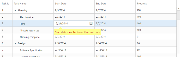
Click here to view the online demo sample for TreeGrid validation support.
Column Reorder
Column reorder support was used to change the order of the column by mouse interactions. In TreeGrid, AllowColumnReordering property was used to enable this support and the default value of this property was false.
The following code example explains how to enable column reorder in TreeGrid,
<ej:TreeGrid ID="TreeGridContainer" AllowColumnReordering="true">
</ej:TreeGrid>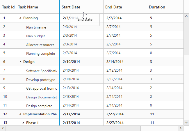
The above screenshot shows the column reorder in TreeGrid.
The TreeGrid columns can also be reordered by using the reorderColumn method, where the column field name and the target index should be passed as the method parameters.
Click here to view the online demo sample for column re-ordering.
Text Alignment
In TreeGrid, it is possible to align both content and header text of particular column by using the TextAlign and HeaderTextAlign property of columns.
There are four possible ways to align content and header text of column, they are
- Left
- Right
- Center
- Justify
NOTE
The
TextAlignproperty will affect both content and header text of the TreeGrid, whenHeaderTextAlignis not set in the column definition.
The following code example explains how to set text alignment for content and header text in TreeGrid,
<ej:TreeGrid ID="TreeGridContainer">
<Columns>
    <ej:TreeGridColumn Field="taskID" HeaderText= "Task Id" Width="45"></ej:TreeGridColumn>
    <ej:TreeGridColumn Field="taskName" HeaderText= "Task Name"></ej:TreeGridColumn>
    <ej:TreeGridColumn Field="startDate" HeaderText= "Start Date" TextAlign="Left"></ej:TreeGridColumn>
    <ej:TreeGridColumn Field="endDate" HeaderText= "End Date" TextAlign="Center"></ej:TreeGridColumn>
    <ej:TreeGridColumn Field="duration" HeaderText= "Duration"></ej:TreeGridColumn>
    </Columns>
</ej:TreeGrid>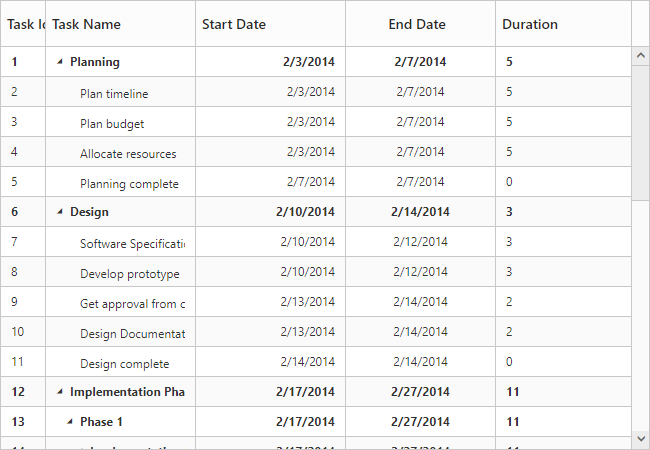
The above screenshot shows TreeGrid render with text alignment and header text alignment.
Customize the column at initial load
In TreeGrid, it is possible to customize the column at load time using Load event.
The following code examples shows how to customize the column at load time,
<ej:TreeGrid ID="TreeGridContainer" Load="load">
<Columns>
    <ej:TreeGridColumn Field="taskID" HeaderText= "Task Id" Width="45"></ej:TreeGridColumn>
    <ej:TreeGridColumn Field="taskName" HeaderText= "Task Name"></ej:TreeGridColumn>
    <ej:TreeGridColumn Field="startDate" HeaderText= "Start Date" TextAlign="Left"></ej:TreeGridColumn>
    <ej:TreeGridColumn Field="endDate" HeaderText= "End Date" TextAlign="Center"></ej:TreeGridColumn>
    <ej:TreeGridColumn Field="duration" HeaderText= "Duration"></ej:TreeGridColumn>
    </Columns>
</ej:TreeGrid>

<asp:ScriptManager ID="ScriptManager" runat="server" />
<script type="text/javascript">

function load(args) {
	var columns = args.model.columns;
	columns[0].isFrozen = true;
	columns[3].textAlign = "center";
	columns[4].visible = false;
}

</script>
The above screenshot shows TreeGrid rendered with customized column.
Get Column Object
The column object which consists the list of columns available in TreeGrid and we can get the particular column details by using the getColumnByHeaderText and getColumnByField methods.
Similarly we can get the column index by using the getColumnIndexByField method. To use this method we have to pass the field name as parameter. And we can get the field name of the column by using its HeaderText value by using getFieldNameByHeaderText method.