Controls Support
27 Sep 20176 minutes to read
Button, SplitButton, DropDownList, ToggleButton, Gallery and Custom controls can be added to each ContentGroup . You can set Type property in ContentGroup to define the controls. Default Type is Button.
Built in Controls
The following table describes about the built in controls Type and their corresponding control settings.
| Type | Control Settings | Example |
|---|---|---|
| Button | Button - ButtonSettings | ButtonSettings Width="70" ContentType="ImageOnly" PrefixIcon="e-icon e-ribbon e-new" |
| SplitButton | SplitButton - SplitButtonSettings | SplitButtonSettings Width="70" ContentType="ImageOnly" TargetID="pasteSplit" ButtonMode="Dropdown" ArrowPosition="Bottom" |
| ToggleButton | ToggleButton - ToggleButtonSettings | ToggleButtonSettings ActiveText="Italic" DefaultText="Italic" ContentType="ImageOnly" |
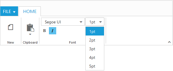
| DropDownList | DropDownList - DropDownSettings | DropdownSettings DataSource="size" Text="1pt" Width="65" |
NOTE
You can specify type either to
ContentGroupor toContentDefault.
<ej:Ribbon ID="defaultRibbon" runat="server" Width="100%">
		<ApplicationTab MenuItemID="ribbonmenu" Type="Menu">
			<MenuSettings OpenOnClick="false"></MenuSettings>
		</ApplicationTab>
		<RibbonTabs>
			<ej:RibbonTab Id="home" Text="HOME">
				<TabGroupCollection>
					<ej:TabGroup Text="New" AlignType="Columns">
						<ContentCollection>
							<ej:TabContent>
								<ContentGroupCollection>
									<ej:ContentGroup Id="new" Text="New" ToolTip="New" Type="Button">
										<ButtonSettings Type="Button" ContentType="ImageOnly" ImagePosition="ImageTop" PrefixIcon="e-icon e-ribbon e-new" Click="executeAction" />
									</ej:ContentGroup>
								</ContentGroupCollection>
								<ContentDefaults Width="60" Height="70" Type="Button" />
							</ej:TabContent>
						</ContentCollection>
					</ej:TabGroup>
					<ej:TabGroup Text="Clipboard" AlignType="Columns">
						<ContentCollection>
							<ej:TabContent>
								<ContentDefaults Width="50" Height="75" Type="SplitButton" />
								<ContentGroupCollection>
									<ej:ContentGroup Id="paste" ToolTip="Paste">
										<SplitButtonSettings ButtonMode="Dropdown" ArrowPosition="Bottom" TargetID="pasteul" ContentType="TextAndImage" PrefixIcon="e-icon e-ribbon e-ribbonpaste" />
									</ej:ContentGroup>
								</ContentGroupCollection>
							</ej:TabContent>
						</ContentCollection>
					</ej:TabGroup>
					<ej:TabGroup Text="Font" AlignType="Rows">
						<ContentCollection>
							<ej:TabContent>
								<ContentDefaults Height="28" Type="DropDownList" />
								<ContentGroupCollection>
									<ej:ContentGroup Id="fontFamily" ToolTip="Font" Type="DropDownList">
										<DropdownSettings Text="Segoe UI" Width="150"></DropdownSettings>
									</ej:ContentGroup>
									<ej:ContentGroup Id="fontsize" ToolTip="FontSize" Type="DropDownList">
										<DropdownSettings Text="1pt" Width="65"></DropdownSettings>
									</ej:ContentGroup>
								</ContentGroupCollection>
							</ej:TabContent>
							<ej:TabContent>
								<ContentGroupCollection>
									<ej:ContentGroup Id="bold" Text="Bold" ToolTip="Bold" Type="ToggleButton">
										<toggleButtonSettings ContentType="ImageOnly" ActiveText="Bold" ActivePrefixIcon="e-icon e-ribbon bold" DefaultPrefixIcon="e-icon e-ribbon bold" />
									</ej:ContentGroup>
									<ej:ContentGroup Id="italic" Text="Italic" ToolTip="Italic" Type="ToggleButton">
										<toggleButtonSettings ContentType="ImageOnly" ActiveText="Italic" ActivePrefixIcon="e-icon e-ribbon e-ribbonitalic" DefaultPrefixIcon="e-icon e-ribbon e-ribbonitalic" />
									</ej:ContentGroup>
								</ContentGroupCollection>
								<ContentDefaults Type="Button" IsBig="false" />
							</ej:TabContent>
						</ContentCollection>
					</ej:TabGroup>
				</TabGroupCollection>
			</ej:RibbonTab>
		</RibbonTabs>
	</ej:Ribbon>
	<ul id="ribbonmenu">
		<li><a>FILE</a>
			<ul>
				<li><a>Open</a></li>
			</ul>
		</li>
	</ul>
	<ul id="pasteul">
		<li><a>Paste</a></li>
	</ul>
protected void Page_Load(object sender, EventArgs e)
{
var fontList = new List<string> { "Segoe UI", "Arial", "Times New Roman", "Tahoma", "Helvetica" };
var fontsize = new List<string>() { "1pt", "2pt", "3pt", "4pt", "5pt" };
this.fontFamily.DropdownSettings.DataSource = fontList;
this.fontsize.DropdownSettings.DataSource = fontsize;
}
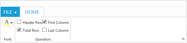
Custom
You can set Type as Custom to render custom controls and Custom element id has to be specified as ContentID.You can change the element defined in the custom template to appropriate Syncfusion control in the event of Ribbon Create.
<ej:Ribbon ID="defaultRibbon" runat="server" Width="600" Create="createControl">
		<ApplicationTab MenuItemID="ribbonmenu" Type="Menu">
			<MenuSettings OpenOnClick="false"></MenuSettings>
		</ApplicationTab>
		<RibbonTabs>
			<ej:RibbonTab Id="home" Text="HOME">
				<TabGroupCollection>
					<ej:TabGroup Text="Font">
						<ContentCollection>
							<ej:TabContent>
								<ContentDefaults Type="Custom" Height="30" />
								<ContentGroupCollection>
									<ej:ContentGroup Id="fontcolor" ToolTip="Font Color" ContentID="fontcolor1">
									</ej:ContentGroup>
								</ContentGroupCollection>
							</ej:TabContent>
						</ContentCollection>
					</ej:TabGroup>
					<ej:TabGroup Text="Operators">
						<ContentCollection>
							<ej:TabContent>
								<ContentGroupCollection>
									<ej:ContentGroup Id="design" ContentID="design1" Type="Custom">
									</ej:ContentGroup>
								</ContentGroupCollection>
							</ej:TabContent>
						</ContentCollection>
					</ej:TabGroup>
				</TabGroupCollection>
			</ej:RibbonTab>
		</RibbonTabs>
	</ej:Ribbon>

	<ul id="ribbonmenu">
		<li><a>FILE</a>
			<ul>
				<li><a>Open</a></li>
			</ul>
		</li>
	</ul>
	<input id="fontcolor1" />
	<table id="design1" class="e-designtablestyle">
		<tr>
			<td><input type="checkbox" id="check1" /><label for="check1">Header Row</label></td>
			<td><input type="checkbox" id="Check2" checked="checked" /><label for="Check2">First Column</label></td>
		</tr>
		<tr>
			<td><input type="checkbox" id="check4" checked="checked" /><label for="check4">Total Row</label></td>
			<td><input type="checkbox" id="Check5" /><label for="Check5">Last Column</label></td>
		</tr>
	</table>
	<script>
		function createControl(args) {
			var ribbon = $("#defaultRibbon").data("ejRibbon");
			$("#fontcolor1").ejColorPicker({
				value: "#FFFF00",
				modelType: "palette",
				cssClass: "e-ribbon",
				toolIcon: "e-fontcoloricon"
			});
		}
	</script>