Appearance and Styling
29 Sep 20161 minute to read
You can customize RadialSlider control style and appearance by using available themes or cssClass property.
Theme
In order to apply styles to the RadialSlider control, refer to 2 files namely, ej.widgets.core.min.css and ej.theme.min.css. When you refer ej.web.all.min.css file, it is not necessary to include the files ej.widgets.core.min.css and ej.theme.min.css in your project, as ej.web.all.min.css is the combination of these two.
By default, there are 13 theme support available for RadialSlider component, namely:
- flat-azure
- flat-azure-dark
- fat-lime
- flat-lime-dark
- flat-saffron
- flat-saffron-dark
- gradient-azure
- gradient-azure-dark
- gradient-lime
- gradient-lime-dark
- gradient-saffron
- gradient-saffron-dark
- bootstrap
CssClass
RadialSlider control also allows you to customize its appearance using user-defined CSS. To apply custom themes you can use CssClass property, which sets the root class for RadialSlider theme.
Using this CssClass you can override the existing styles under the theme style sheet. In the following example, the value of CssClass property is set as “Purple-dark”. Purple-dark is added as root class to RadialSlider control at the runtime. From this root class you can customize the RadialSlider appearance.
Add the following code example to the corresponding ASPX page to render the RadialSlider with the customized style.
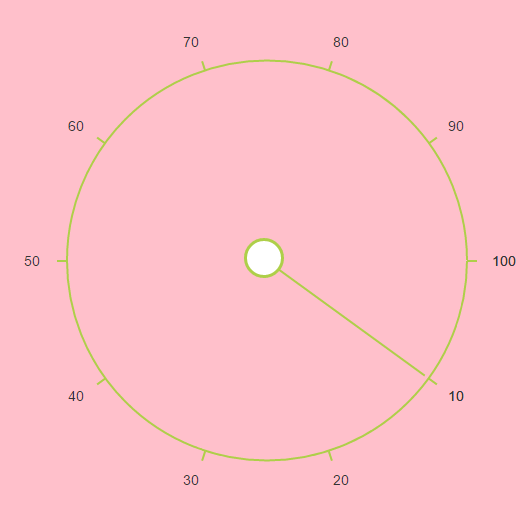
<ej:RadialSlider ID="slider" CssClass="Purple-dark" runat="server"></ej:RadialSlider>Using below style sheet,exiting theme style sheet file has been over-ridden using root class “Purple-dark”.
Add the following code in your style section.
.Purple-dark{
		    background-color:pink;
		}
The following screenshot illustrates the output of the above code.